15 Famous Logos and the Secret Meanings Behind Them
Logos surround us every day, yet most people never notice the hidden symbols and deeper meanings woven into these familiar designs. Behind many iconic brand marks lie fascinating stories of creative ingenuity and purposeful symbolism that enhance their marketing power.
Let’s explore some remarkable examples of logo design brilliance.
Amazon’s Directional Smile
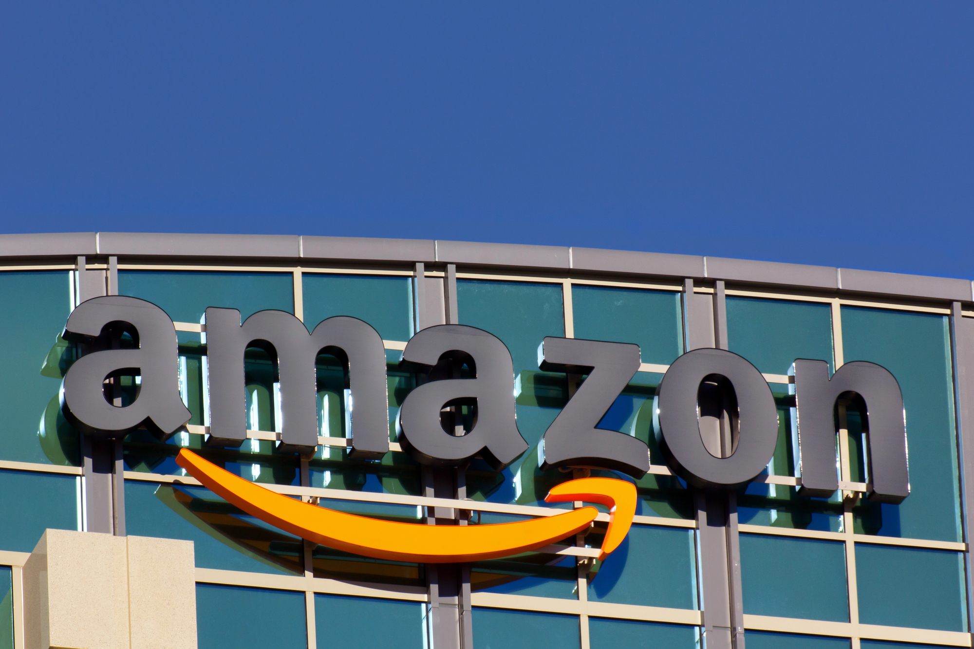
Amazon’s logo features more than just a cheerful curved line – it’s an arrow pointing from A to Z, suggesting they sell everything imaginable. The arrow also forms a smile, representing customer satisfaction.
This dual symbolism creates one of retail’s most clever visual identities.
FedEx’s Hidden Arrow
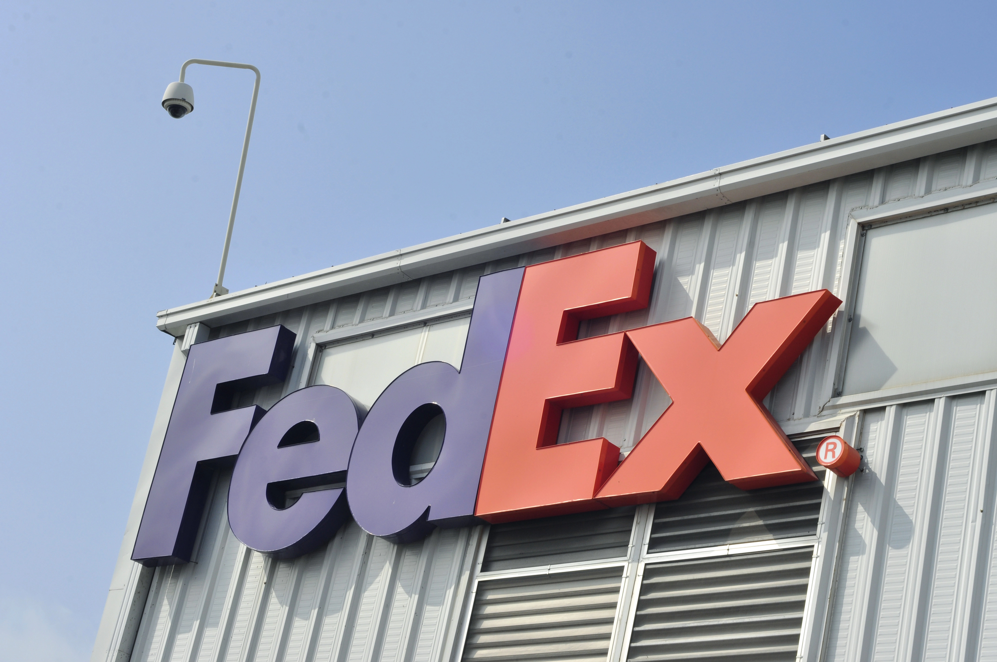
Between the letters ‘E’ and ‘x’ in FedEx lies a perfectly formed white arrow pointing forward. This subtle design element represents speed, precision, and forward momentum.
The different division colors (orange for Express, green for Ground) add another layer of strategic branding.
Like Go2Tutors’s content? Follow us on MSN.
Toyota’s Threaded History
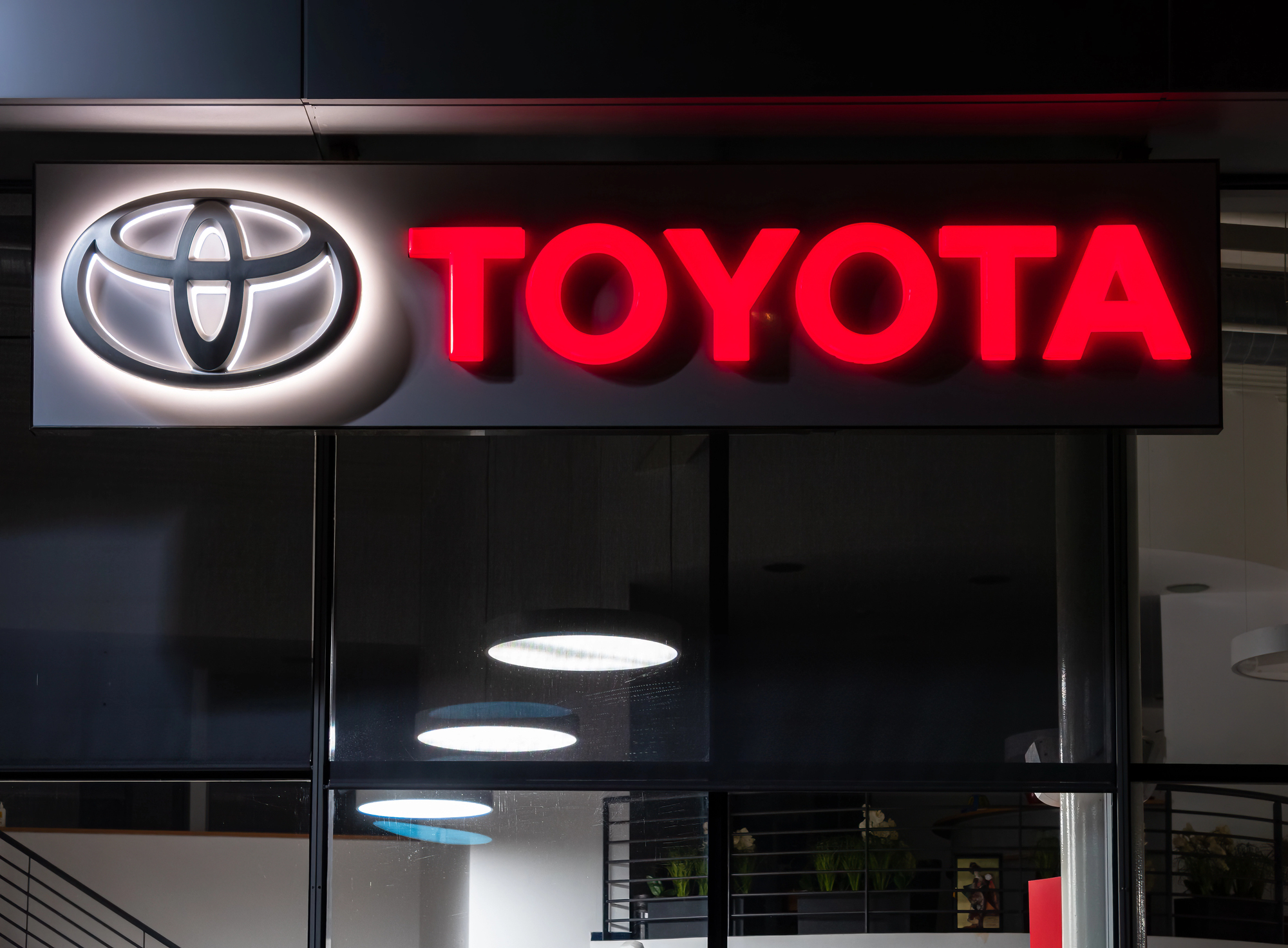
Toyota’s three overlapping ovals don’t just form a stylized ‘T’ – they represent three hearts: the heart of the customer, the heart of the product, and the heart of progress in technology.
The negative space forms every letter of “TOYOTA” when properly dissected.
Baskin Robbins’ Hidden Number
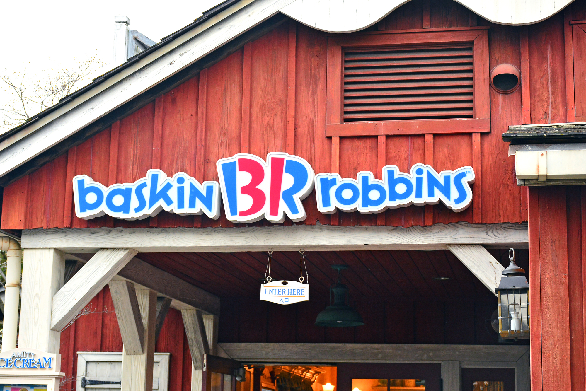
The “BR” in Baskin Robbins’ logo contains a pink number ’31’ between the letters, referencing their famous 31 flavors. This clever integration of the number demonstrates how a simple design can pack multiple layers of brand meaning.
BMW’s Spinning Heritage
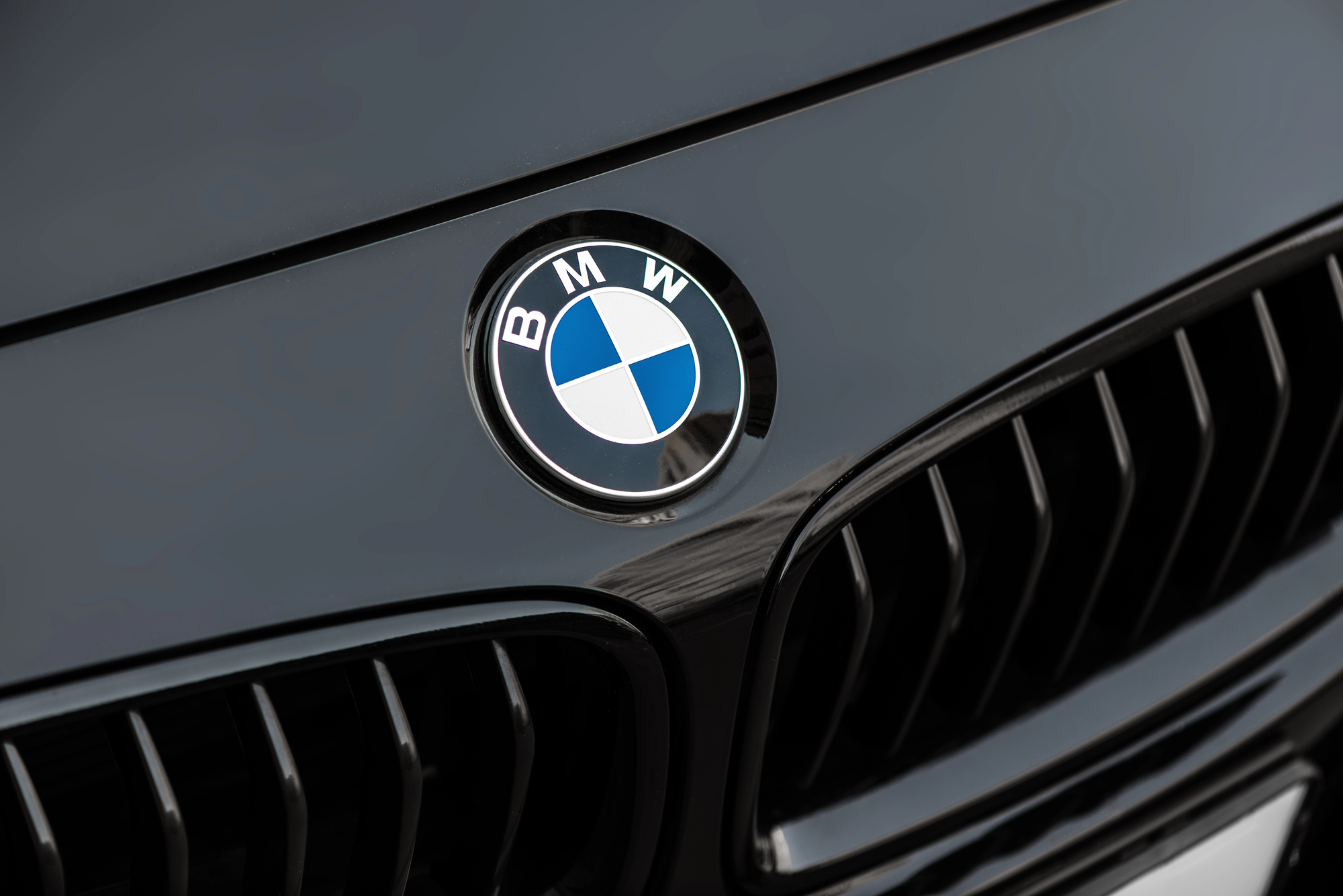
BMW’s iconic roundel isn’t just a stylized badge – it represents spinning airplane propellers against a blue sky, referencing the company’s origins in aircraft engine manufacturing.
The blue and white quarters also honor Bavaria’s state colors.
Like Go2Tutors’s content? Follow us on MSN.
Toblerone’s Mountain Bear
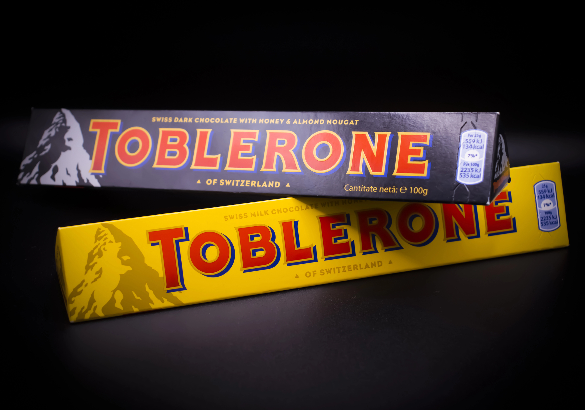
Hidden within the mountain depicted on Toblerone’s logo is the silhouette of a bear standing on its hind legs. This pays homage to Bern, Switzerland (the chocolate’s birthplace), known as the City of Bears.
The mountain itself represents the Matterhorn.
Vaio’s Analog-Digital Bridge
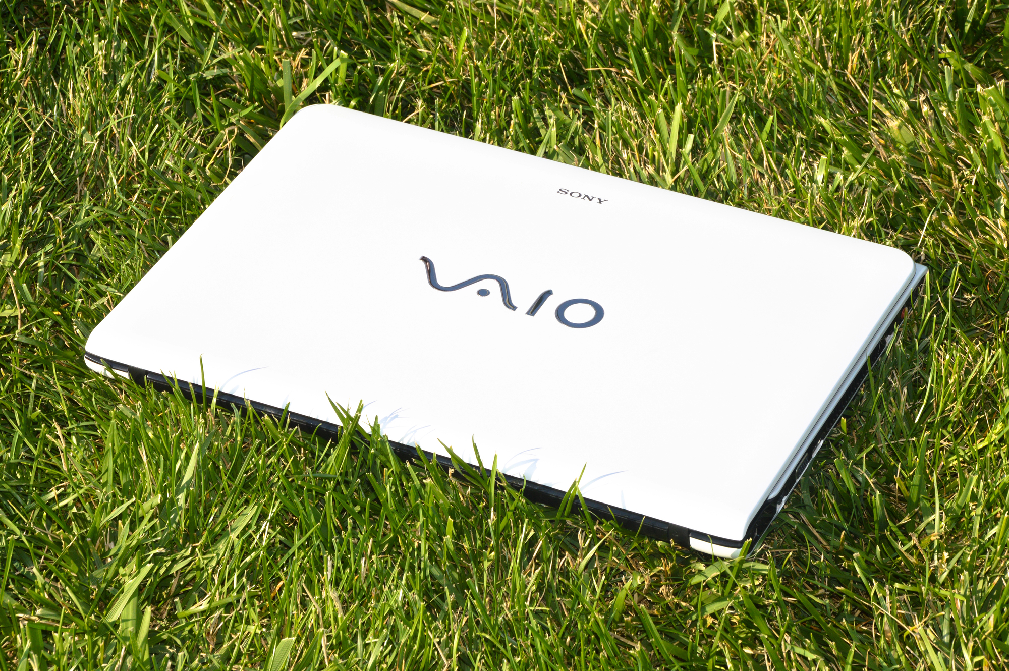
Sony Vaio’s logo represents the integration of analog and digital technology. The ‘VA’ resembles an analog wave, while the ‘IO’ represents binary code (1 and 0), symbolizing the brand’s role in bridging old and new technology.
Cisco’s Signal Tower
Cisco’s logo depicts a digital signal rising up, resembling San Francisco’s Golden Gate Bridge – a nod to the company’s birthplace and name.
The vertical lines represent electromagnetic signals rising into the digital future.
Like Go2Tutors’s content? Follow us on MSN.
LG’s Hidden Face
LG’s logo combines the letters ‘L’ and ‘G’ to create a friendly face, with the ‘L’ forming the nose and the ‘G’ making up the rest of the face.
This humanizes the brand while maintaining a clean, modern aesthetic.
Hyundai’s Hidden Meaning
Hyundai’s stylized ‘H’ isn’t just a letter – it represents two people (a customer and representative) shaking hands, symbolizing satisfaction and trust.
The oval frame suggests the company’s global expansion ambitions.
Unilever’s Brand Story
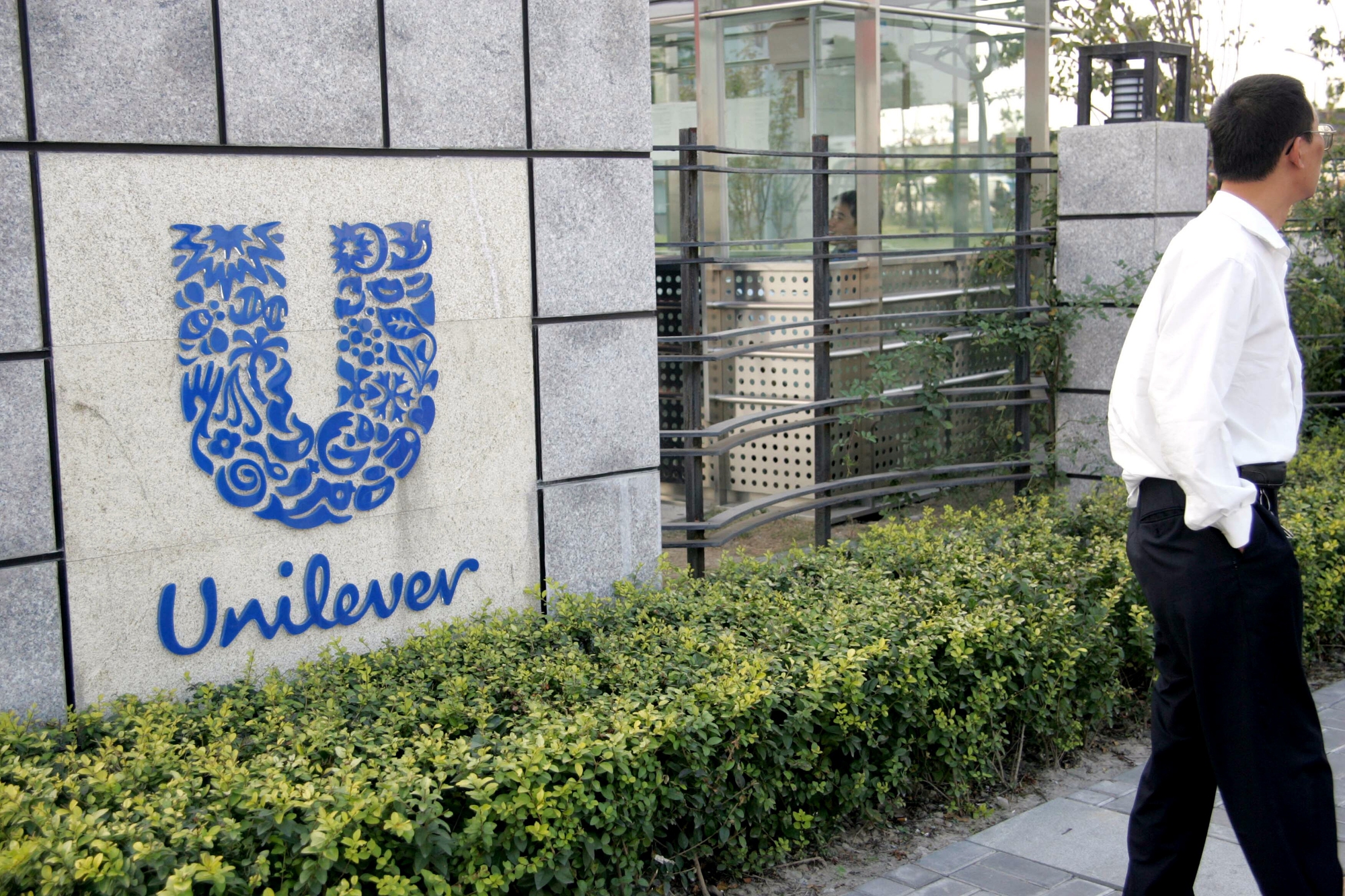
Unilever’s logo contains 25 different symbols, each representing a different aspect of their business and values. From a heart for love to a fish for sustainable fishing, every icon tells part of the company’s story.
Like Go2Tutors’s content? Follow us on MSN.
Sun Microsystems’ Ambigram
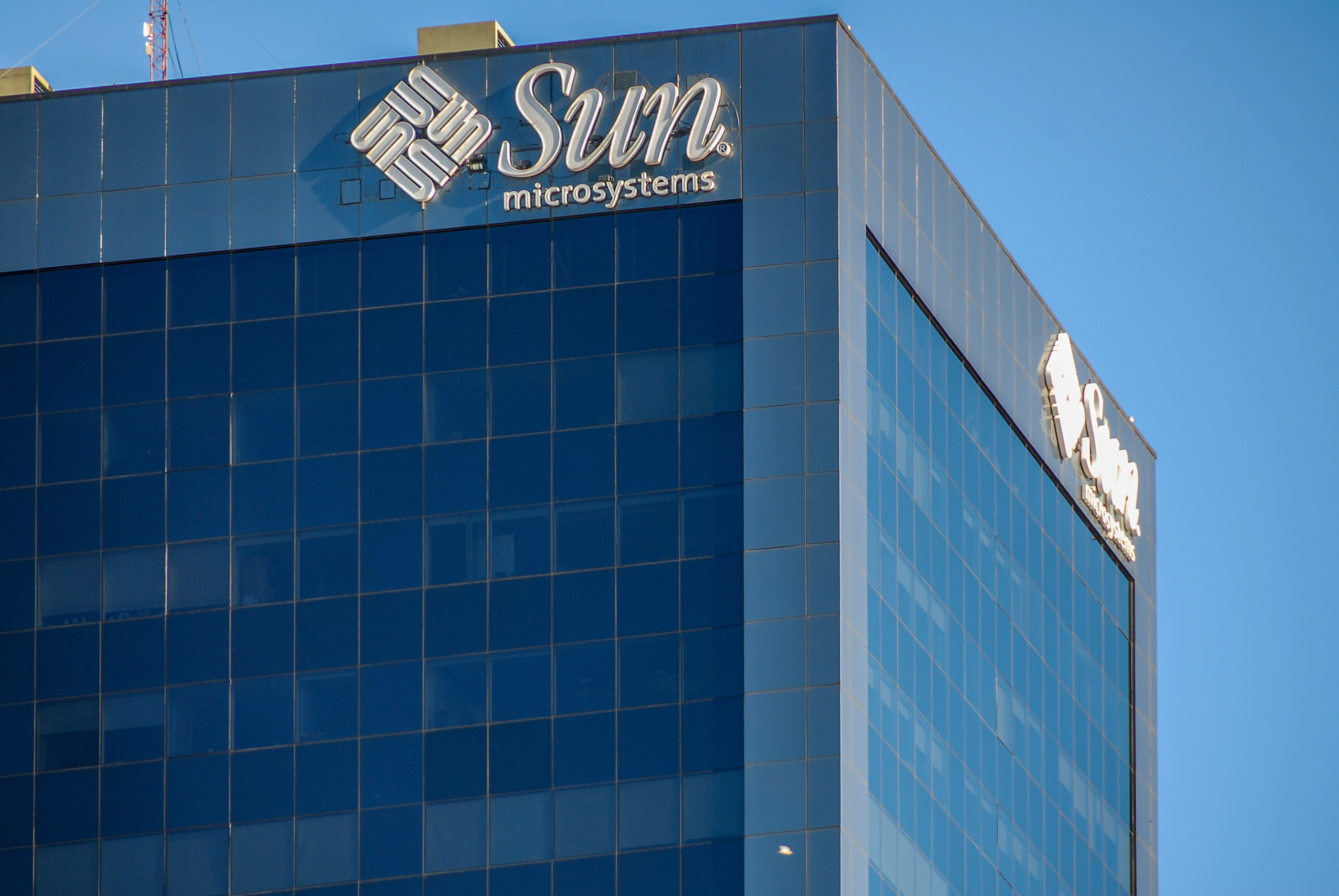
The Sun logo is an ambigram – it can be read from any angle, always spelling “sun.” The cleverly interconnected letters ‘u’ and ‘n’ create a continuous pattern representing the company’s innovative approach to connectivity.
Goodwill’s Smiling Face
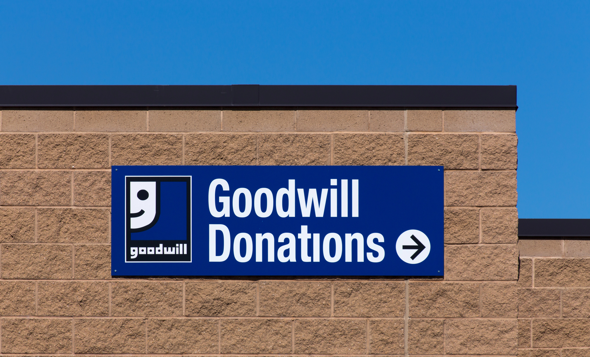
Half of Goodwill’s logo is a smiling face, created from a lowercase ‘g’. This simple yet effective design represents the organization’s mission to help people while creating a friendly, approachable brand identity.
NBC’s Proud Peacock
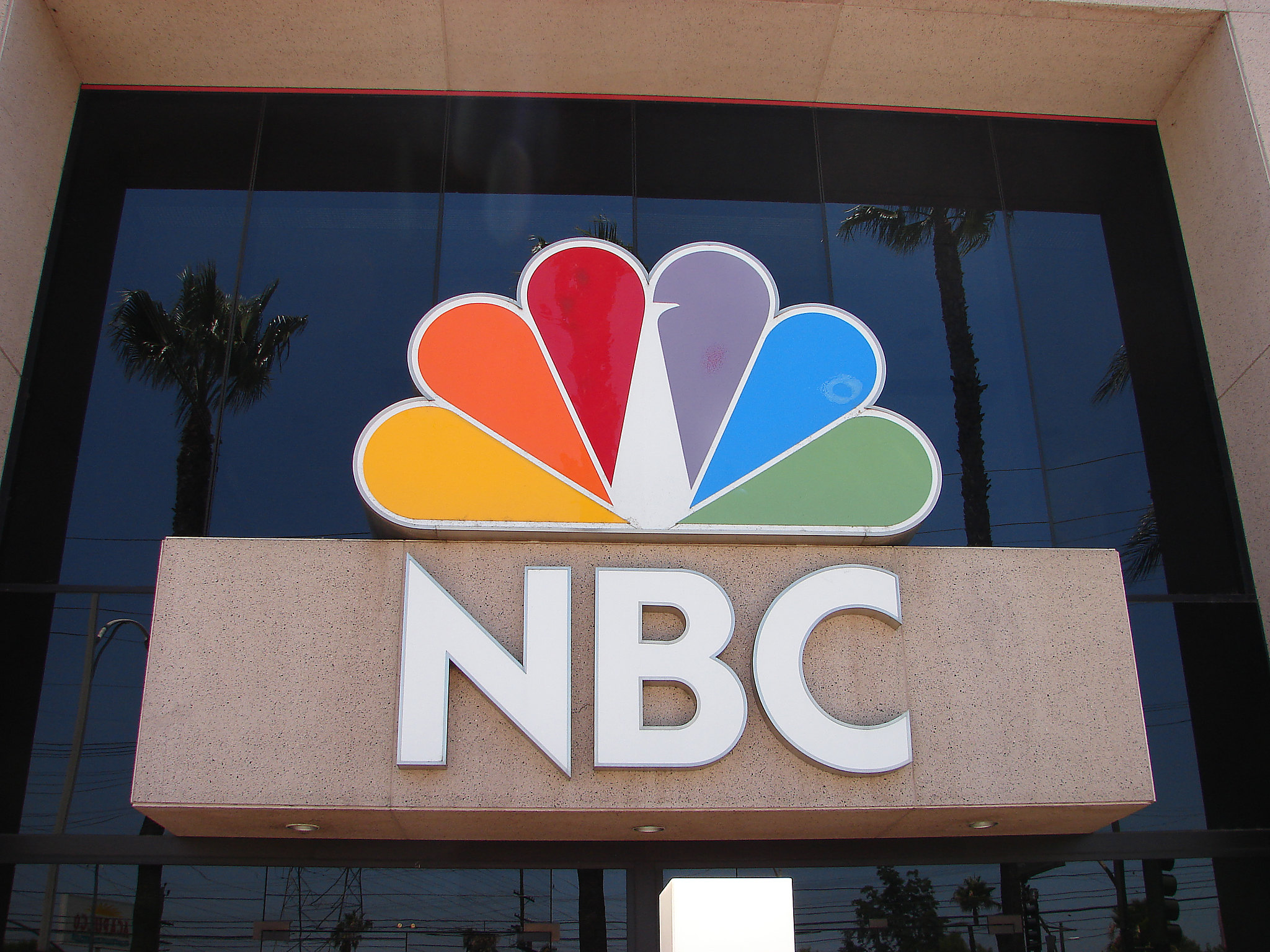
NBC’s peacock logo contains six colorful feathers, each representing the network’s original divisions. The bird faces right, symbolizing forward movement, while its proud display of colors marked NBC’s transition to color broadcasting.
Like Go2Tutors’s content? Follow us on MSN.
Tostitos’ Hidden Party
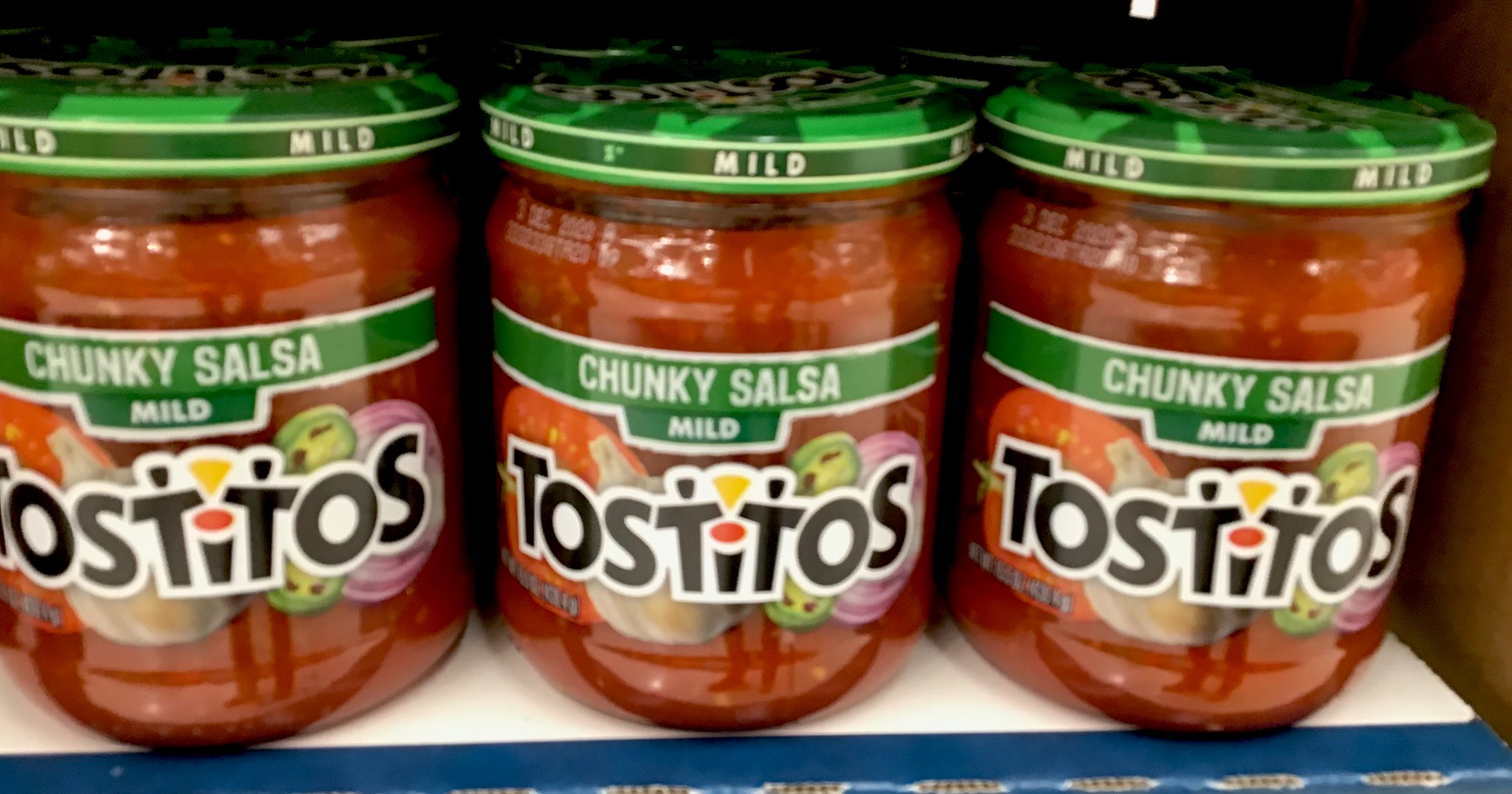
The two ‘T’s in Tostitos form people sharing chips and salsa (the dot of the ‘i’). This subtle design element emphasizes the social, sharing aspect of their products, making the brand mark a tiny celebration in itself.
The Power of Visual Storytelling
These ingenious designs prove that great logos do more than identify brands – they tell stories, convey values, and create emotional connections with consumers.
While some of these hidden meanings might go unnoticed by casual observers, they add layers of depth that make these logos truly unforgettable pieces of commercial art.
More from Go2Tutors!

- Famous Battles: How Much Do You Really Know About U.S. History?
- Top 5 Most Important Skills, According To Harvard Business School
- How Well Do You Know 90s Pop Culture? Take the Quiz
- Master the Art of Public Speaking with These Expert Tips
- Think You Know Capitals? Put Your Knowledge to the Test
Like Go2Tutors’s content? Follow us on MSN.


