20 Historic Maps That Completely Changed the Way People Saw the World
Picture yourself in a world without Google Maps or GPS. That’s a pretty unsettling image, right? For most of human history, people relied on hand-drawn maps to make sense of their surroundings and venture into the unknown. These weren’t just pieces of paper with lines and symbols – they were windows into how entire civilizations understood their place in the universe.
The maps we are about to explore did not just show people where to go – they completely transformed how humans thought about their world. From ancient clay tablets to revolutionary digital innovations, each one sparked a mini-revolution in human understanding.
Ptolemy’s World Map (150 AD)
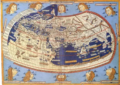
Ancient Greek scholar Ptolemy pulled off something remarkable with this one. Using mathematics and astronomical observations, he created the first map to use latitude and longitude coordinates.
At the same time, his calculations weren’t perfect – he made the world about 30% smaller than it is – but his systematic approach to mapmaking paved the way forward for modern cartography. His work was so influential that it shaped European understanding of world geography for over 1,000 years, even though most of his original maps were lost and only rediscovered during the Renaissance.
The Tabula Rogeriana (1154)
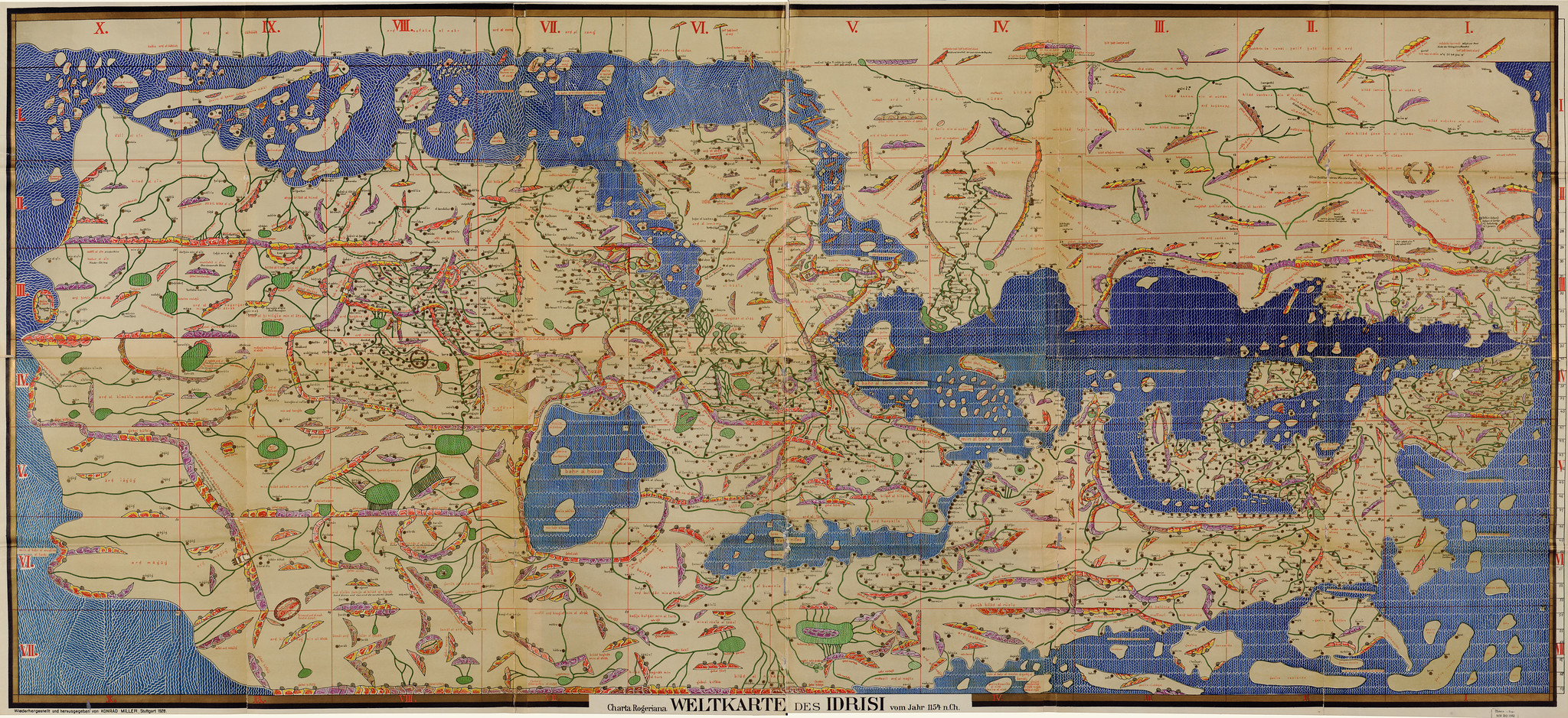
Muhammad al-Idrisi, working for the Norman King Roger II of Sicily, created this masterpiece by combining Islamic and European geographical knowledge. The map turned the traditional European view of the world upside down – literally.
It was oriented with the south at the top, following the Arabic tradition. The level of detail was mind-blowing for its time, covering areas from Britain to Southeast Asia with remarkable accuracy. The accompanying book contained detailed descriptions of major cities and trade routes that merchants relied on for centuries.
Like Go2Tutors’s content? Follow us on MSN.
Fra Mauro Map (1450)
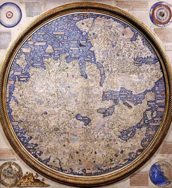
This Venetian monk threw out some major misconceptions with his revolutionary world map. Fra Mauro challenged the traditional religious-centered view of Jerusalem being at the world’s center.
Instead, he placed the rising economic powerhouse of China prominently on his map and included detailed information about African kingdoms that many Europeans didn’t even know existed. The map was so massive – about six feet across – that it took several years and a whole team of craftsmen to complete.
Martin Waldseemüller’s World Map (1507)
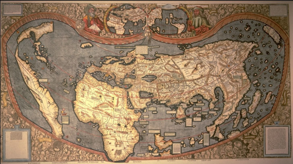
Talk about making history – this was the first map to use the name ‘America.’ Waldseemüller decided to honor explorer Amerigo Vespucci by naming the newly discovered lands after him.
The map was incredibly ahead of its time, showing the Pacific Ocean before Europeans had officially discovered it and depicting South America as a continent separate from Asia. Only one original copy survives today, purchased by the Library of Congress for a cool $10 million in 2003.
Mercator Projection (1569)
Gerardus Mercator’s map was a game-changer for navigation, and even though it had some serious drawbacks, we still debate it today. His projection allowed sailors to plot straight-line courses that matched real compass bearings – incredibly useful for ocean navigation.
The trade-off? It drastically distorted the size of landmasses near the poles. Greenland appears massive, while Africa looks much smaller than it is. Even with all its flaws, it became the standard world map view that many of us grew up seeing in classrooms.
Like Go2Tutors’s content? Follow us on MSN.
Urbano Monte’s Planisphere (1587)
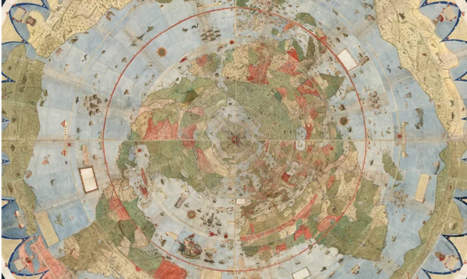
Monte created what you might call the world’s first ‘assemble-it-yourself’ global map. This massive work consisted of 60 separate sheets that could be pieced together into a circular map nearly 10 feet in diameter.
He included everything from sea monsters to detailed city layouts and even clothing styles of different cultures. The map was so ahead of its time that it showed the correct orientation of Japan centuries before most European cartographers got it right.
The Kangxi Atlas (1721)
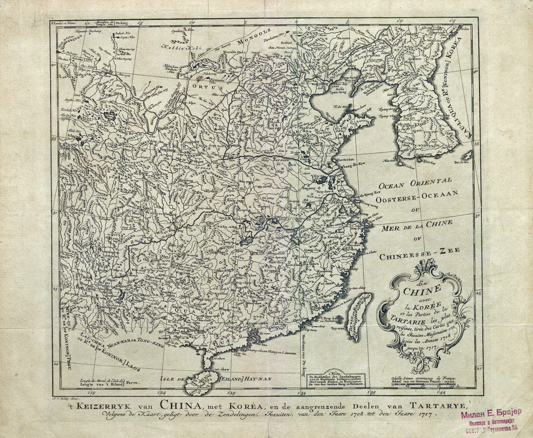
When French Jesuit missionaries collaborated with Chinese scholars under Emperor Kangxi, something remarkable happened. They combined European surveying techniques with Chinese geographical knowledge to create the first scientifically accurate map of China.
This massive undertaking required hundreds of surveyors to travel across the empire for years. The resulting atlas changed how both Eastern and Western civilizations viewed China’s geography and territorial extent.
Captain James Cook’s Pacific Maps (1772-1779)
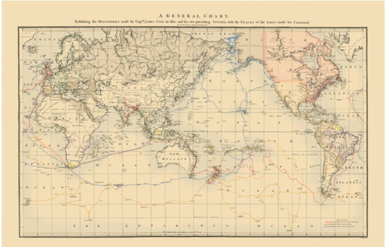
James Cook’s detailed charts of the Pacific Ocean transformed it from a mysterious void into a navigable space. His maps were so precise that they were still being used by sailors well into the 20th century.
He dispelled countless myths, including the existence of a massive southern continent that many Europeans believed in. The maps also documented countless Pacific islands for the first time, though this knowledge would, unfortunately, lead to increased colonization.
Like Go2Tutors’s content? Follow us on MSN.
Lewis and Clark’s Trail Maps (1804-1806)
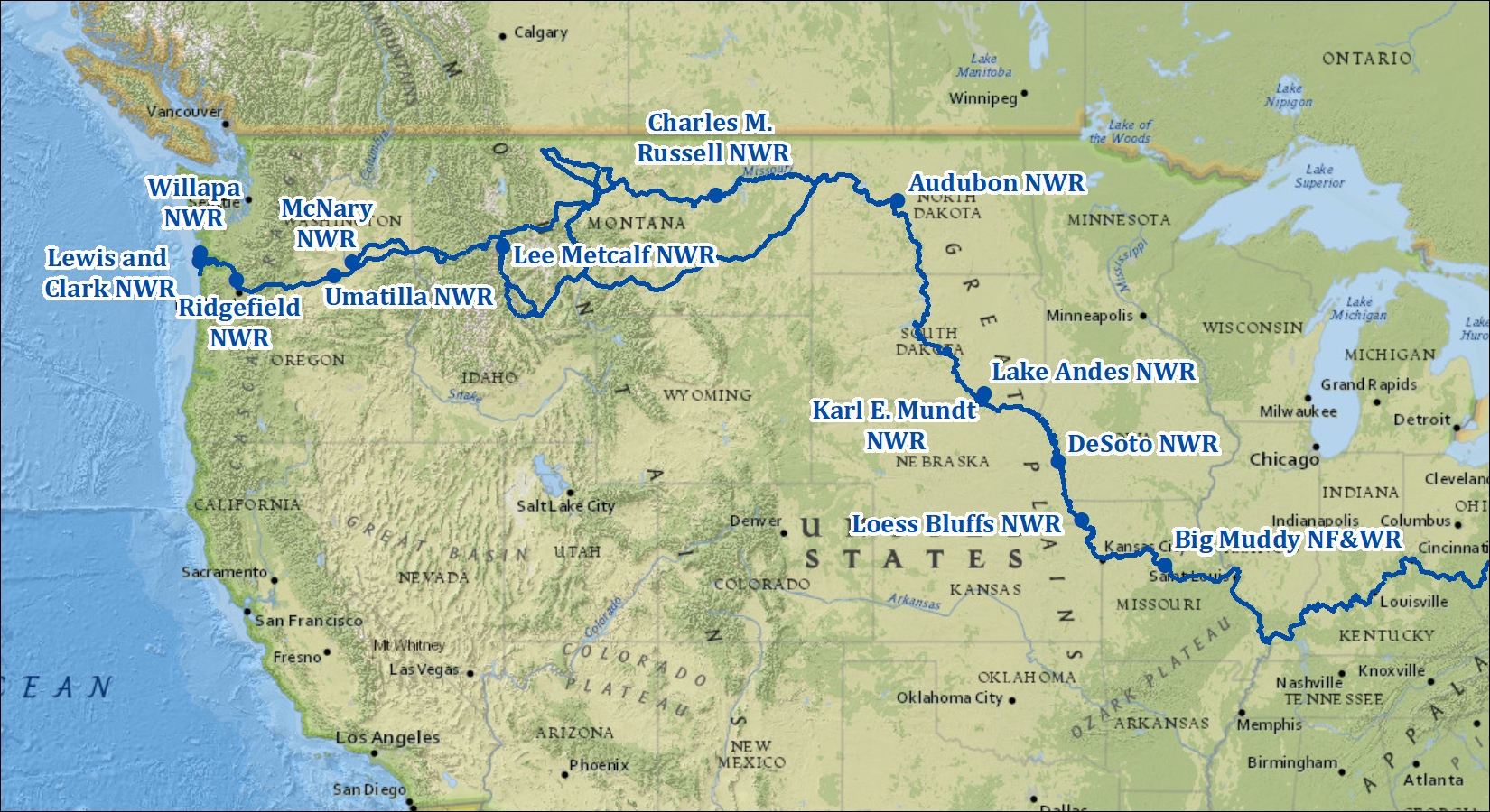
These were not just maps – they were detailed journals of America’s interior. The expedition produced about 140 maps that revealed the true scale and nature of the American West.
Their accurate depictions of river systems, mountain ranges, and Native American territories revolutionized how Americans understood their continent. The maps were so well-made that railroad companies later used them to plan their routes across the country.
Alexander von Humboldt’s Isothermal World Map (1817)

Humboldt revolutionized how we visualize climate data. His innovative map used lines to connect points of equal average temperature across the globe – we now call these isotherms.
This seemingly simple idea changed everything about how we know climate patterns. It was the first time anyone had shown that climate zones don’t simply follow latitude lines but are influenced by factors like ocean currents and mountain ranges.
John Snow’s Cholera Map (1854)
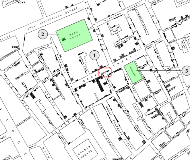
Sometimes, a map can save lives. During London’s cholera outbreak, Dr. Snow mapped each disease case and local water pumps.
This simple visualization revealed that most cases clustered around the Broad Street pump, proving that cholera spread through contaminated water, not ‘bad air’ as previously believed. It’s considered one of the first examples of spatial epidemiology and changed how we track disease outbreaks.
Like Go2Tutors’s content? Follow us on MSN.
Matthew Fontaine Maury’s Wind and Current Charts (1855)
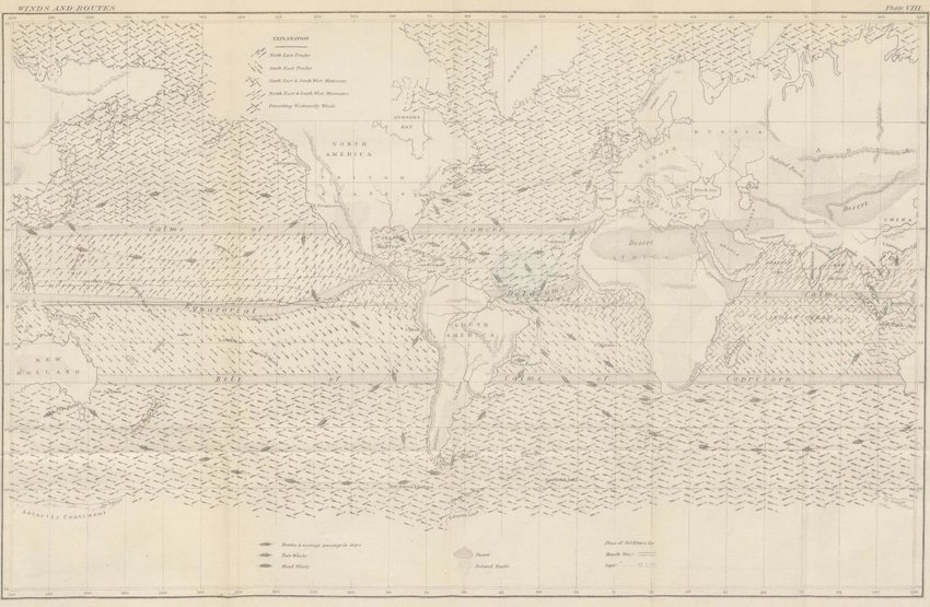
Maury created the first systematic study of ocean currents and winds, revolutionizing maritime navigation. His maps compiled data from thousands of ships’ logs to show predictable patterns in ocean conditions.
These charts helped captains cut weeks or even months off their voyage times. One ship owner was so grateful for the time and money saved that he sent Maury a check for $5,000 – equivalent to about $150,000 today.
Stanford’s London Poverty Maps (1885)
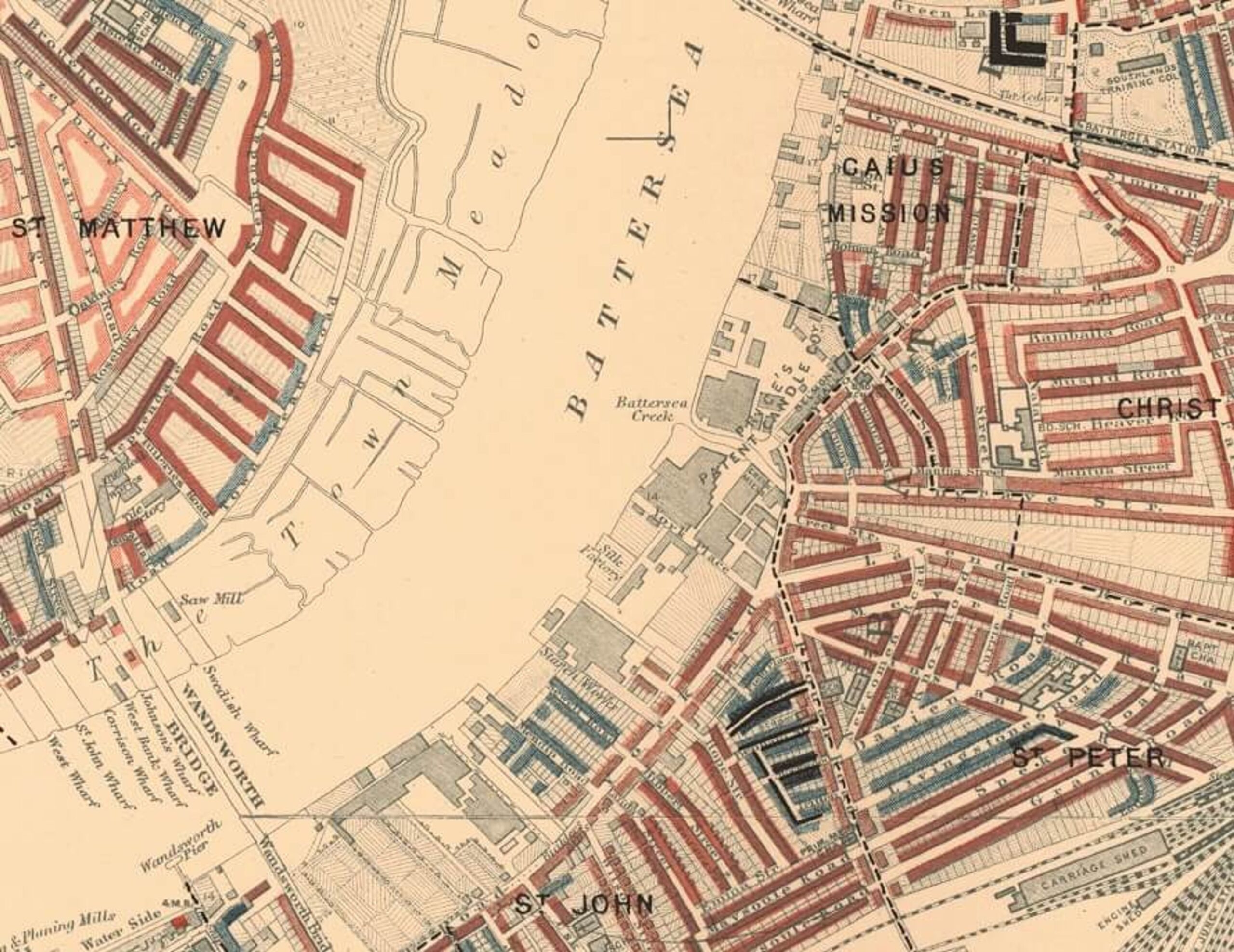
Charles Booth took mapping social issues to a new level with these detailed street-by-street surveys of London poverty. He used different colors to show varying levels of wealth and poverty, creating a visual story of urban inequality.
These maps shocked Victorian society and led to some of the first systematic efforts to address urban poverty. They’re still studied today as examples of how to use data visualization for social change.
Marie Tharp’s Ocean Floor Maps (1957)
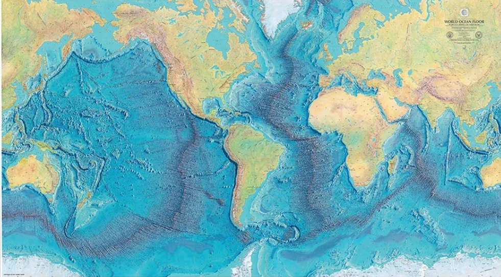
Tharp changed how we see the ocean floor. Working with data from sonar surveys, she created the first scientific map showing the Mid-Atlantic Ridge and deep ocean trenches.
Her male colleagues initially dismissed her work as ‘girl talk,’ but her maps provided crucial evidence for the theory of plate tectonics. She helped prove that the seafloor was spreading apart, revolutionizing our understanding of Earth’s geology.
Like Go2Tutors’s content? Follow us on MSN.
U.S. Geological Survey Mars Maps (1962)
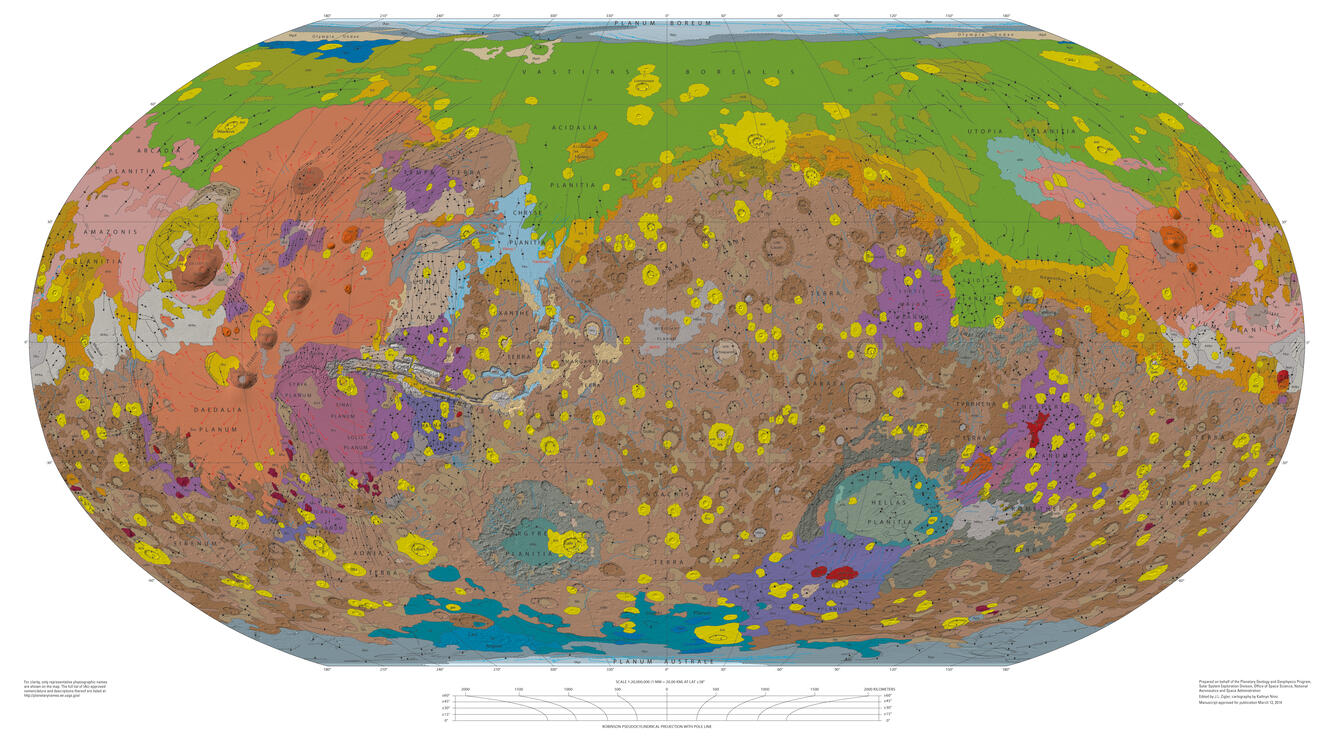
When humans decided to map another planet, everything changed. These detailed maps of Mars, created from telescope observations, showed features like the polar ice caps and dark regions we now know are vast plains.
They were essential for planning the first Mars missions and sparked public imagination about space exploration. The maps were continuously updated as new data came in from space probes.
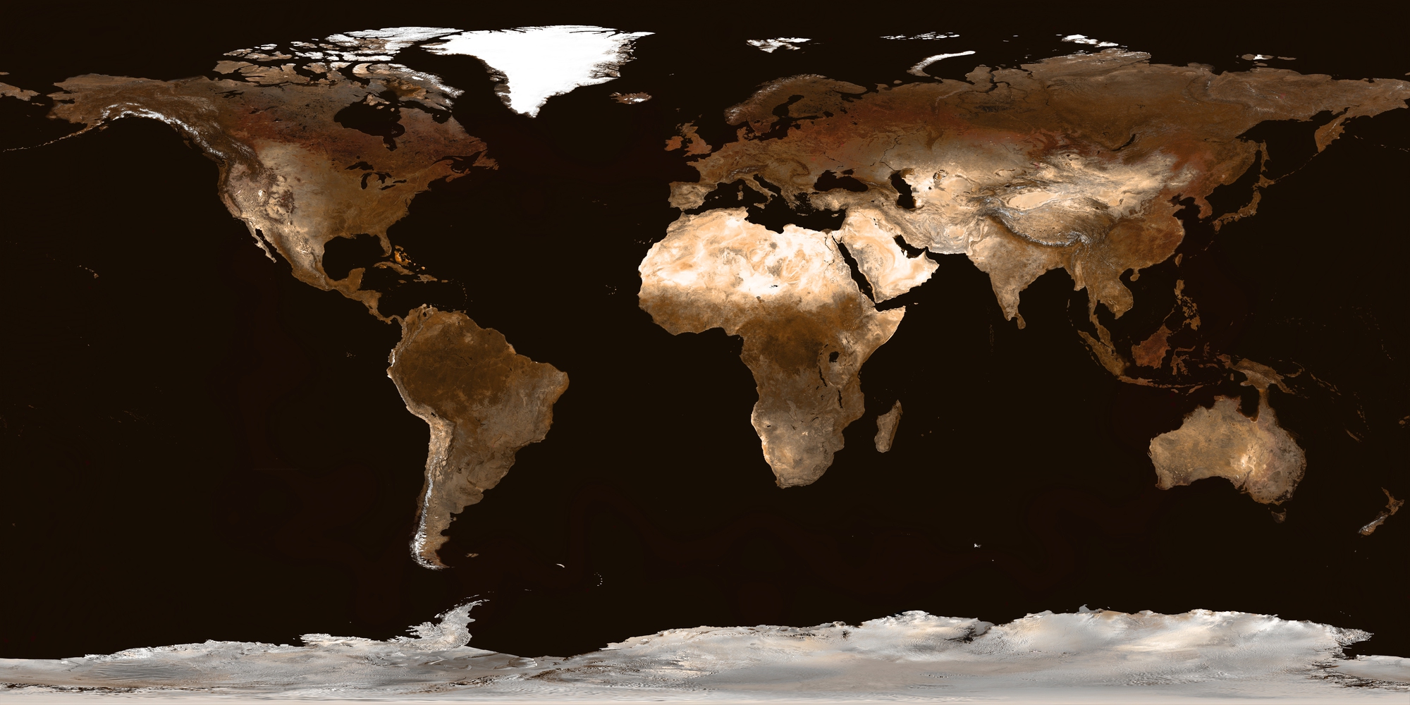
NASA’s Blue Marble (1972)
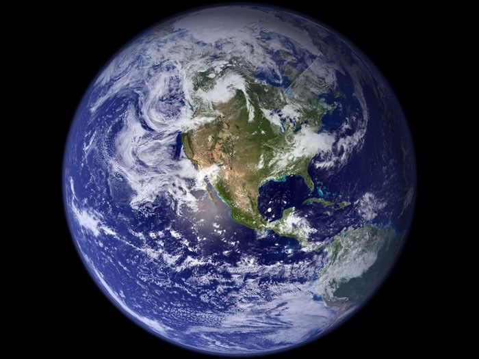
This was not technically a map, but this first complete photograph of Earth from space changed cartography forever. Taken by the Apollo 17 crew, it showed Earth as a fragile blue sphere floating in space.
This image transformed how people thought about our planet and sparked the modern environmental movement. It’s probably the most widely distributed photograph in human history.
Soviet Military City Plans (1950-1990)
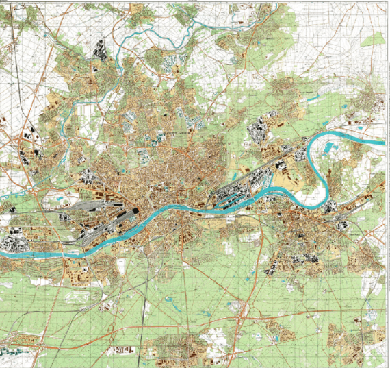
During the Cold War, Soviet cartographers secretly created incredibly detailed maps of cities worldwide, including every major U.S. city. These maps were so accurate they included details like the load-bearing capacity of bridges and the width of streets.
When they were discovered after the USSR’s collapse, Western cartographers were amazed by their precision and comprehensive coverage.
Like Go2Tutors’s content? Follow us on MSN.
OpenStreetMap (2004)
Think of it as Wikipedia for maps. This revolutionary project showed that ordinary people could create detailed, accurate maps through collaboration.
Starting with a university student frustrated with expensive map data, it now has millions of contributors worldwide. During natural disasters, OpenStreetMap volunteers often create the most up-to-date maps available for relief workers.
Google Earth (2005)
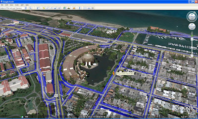
This digital globe changed everything about how we interact with maps. Combining satellite imagery with traditional maps and 3D modeling allows anyone to explore the world from their computer.
Features like historical imagery and street view have transformed fields from archaeology to urban planning. It’s made complex geographical information accessible to everyone with an internet connection.
John Harrison’s Marine Chronometer Maps (1760s)
While not a traditional map, Harrison’s precise timekeeping devices revolutionized maritime navigation and mapmaking. His chronometers finally solved the centuries-old problem of determining longitude at sea.
This allowed for the creation of far more accurate maps and safer ocean navigation. The British government offered a massive reward for solving this problem – equivalent to several million dollars today.
Like Go2Tutors’s content? Follow us on MSN.
The Digital Revolution Continues
From ancient clay tablets to smartphones, our journey through these revolutionary maps shows how each generation finds new ways to comprehend and represent our world. Today’s digital maps combine centuries of cartographic knowledge with real-time data and artificial intelligence.
They’re not just showing us where things are – they are helping us track climate change, protect endangered species, and respond to natural disasters. These historic maps remind us that every new way of seeing the world opens up new possibilities for exploring and understanding it.
More from Go2Tutors!

- 15 Unforgettable Candy Bars From The 60s and 70’s That Disappeared Too Soon
- 15 Myths About Famous Historical Figures That Aren’t True
- Famous Battles: How Much Do You Really Know About U.S. History?
- 20 Historical Artifacts That Scientists Can’t Explain
- 15 Little-Known Facts About Famous Historical Events
Like Go2Tutors’s content? Follow us on MSN.