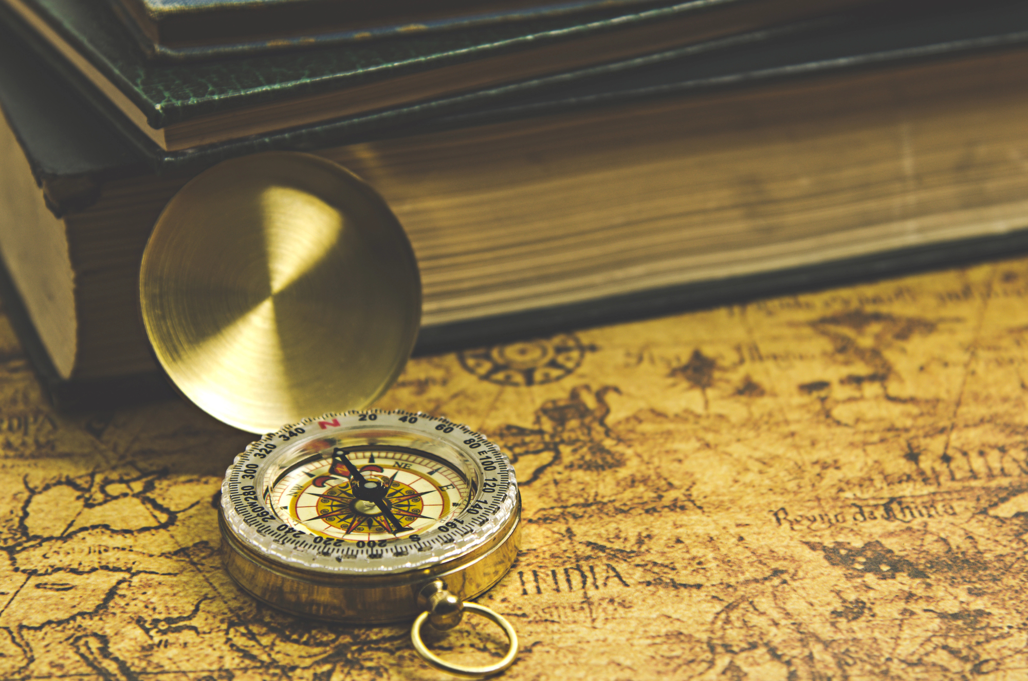
17 Ancient Maps Showing Continents Before Modern Discovery
Looking at ancient maps feels like peering through a keyhole into the minds of explorers who drew worlds they’d never seen. Long before satellites traced every coastline and GPS pinned down every coordinate, cartographers sketched continents based on whispered tales from traders, geometric theories, and pure imagination.
Some got remarkably close to reality. Others created fantastical lands that existed only in ink and hope.
These maps reveal something profound about human curiosity — the compulsion to fill blank spaces, even when the information available was sparse or entirely fictional. They show us how civilizations envisioned the world beyond their borders, sometimes with startling accuracy and sometimes with delightful absurdity.
Ptolemy’s World Map
Ptolemy got more right than anyone had a right to expect in 150 AD. His map showed three continents connected by land.
Africa stretched too far east, but it was there. The Mediterranean looked recognizable.
So did the rough outline of Europe and Asia. Not bad for someone working with secondhand stories and mathematical guesswork.
Fra Mauro Map

When Fra Mauro sat down in 1459 to create what would become one of the most detailed maps of his era, he was synthesizing decades of merchant reports, pilgrim accounts, and scholarly speculation into something that bordered on the prophetic. His circular world map placed south at the top (a convention that feels jarring now but made perfect sense to medieval minds), and within that inverted perspective, he sketched continents with a precision that still impresses modern cartographers.
The map feels like eavesdropping on conversations between Venetian traders who had sailed beyond familiar waters and returned with fragments of geographic truth. And it captures something else: the peculiar confidence of an age that believed the world, however vast, was ultimately knowable through careful observation and systematic inquiry.
Hereford Mappa Mundi

Medieval maps weren’t really about navigation. They were about salvation.
The Hereford map shows three continents arranged around Jerusalem, because that’s where the world’s center belonged. Africa appears as a landmass, though it’s decorated with creatures that never existed.
Europe and Asia get similar treatment. Geography mixed with theology produces interesting results.
Al-Idrisi’s Tabula Rogeriana
There’s something almost modern about al-Idrisi’s approach to mapmaking in 1154 — the way he gathered information systematically, cross-referenced accounts from different sources, and refused to fill gaps with fantasy when reliable data wasn’t available. Working in the court of Roger II of Sicily, he had access to an unusual mix of Christian, Islamic, and Jewish geographical knowledge, and his map reads like a careful negotiation between competing worldviews.
The result shows three continents with a level of restraint that feels refreshingly honest. Where other medieval cartographers couldn’t resist adding monsters or mythical kingdoms, al-Idrisi simply left spaces blank or marked them with careful qualifications.
His Africa extends further south than most contemporary maps dared to imagine, and his Asia stretches eastward with a confidence born of actual trade connections rather than pure speculation.
Beatus Map

The Beatus maps were spiritual documents first. They showed the world as divided among the apostles for evangelization.
Three continents, neatly arranged. But look closer and Africa appears as a real place with actual rivers.
The Nile flows where it should. Spain has the right shape. Theology demanded accuracy, apparently.
Ebstorf Map

Medieval cartographers had a peculiar relationship with scale — they’d render local European towns with meticulous attention to detail while sketching entire continents as rough approximations, as if the world grew more uncertain the further it stretched from home. The Ebstorf map embodies this beautifully, presenting the known world as the body of Christ, with his head at the top (east) and his hands extending to north and south.
It’s a wild interpretive leap that somehow makes perfect sense when you see it executed. The three continents — Europe, Asia, and Africa — are arranged not according to any navigational logic but as organs within a cosmic body.
And yet, within that fantastical framework, real geographical knowledge peeks through: rivers flow in approximately the right directions, mountain ranges appear where mountains actually exist, and coastlines hint at shapes that later exploration would confirm.
Psalter Map

Thirteenth-century mapmakers had confidence. The Psalter map shows three continents without apology.
Africa stretches south, Europe claims the northwest, Asia dominates the east. It’s remarkably clean for something drawn centuries before anyone had sailed around the Cape of Good Hope.
Sometimes geometric assumptions work out.
Catalan Atlas
The Catalan Atlas of 1375 represents something of a turning point — the moment when medieval spirituality began giving way to Renaissance practicality, though the transition was neither clean nor complete. Created by Jewish cartographers in Majorca, it bears the unmistakable marks of a trading culture that valued accurate information over theological consistency (though it manages to accommodate both).
The atlas spreads across six panels, and as your eye moves from east to west, you can almost feel the mapmakers’ confidence shifting: the eastern sections, depicting Asia and Africa, are dense with detail drawn from Marco Polo’s accounts and Arab geographical treatises, while the western edges trail off into the kind of educated guesswork that would soon give way to actual exploration.
But what strikes you most is how casually it presents three separate continents as established fact, not as theoretical possibilities. The mapmakers clearly believed they were documenting a world that existed in roughly the form they were drawing, even if the specific details remained fuzzy.
Kangnido Map
Korean cartographers in 1402 had access to information that Europeans could only dream about. Their map shows three continents with Asia properly dominant.
Africa appears as a recognizable landmass, not a theoretical afterthought. The proportions work better than most European maps of the same period.
Geography benefits from multiple perspectives, apparently.
Henry of Mainz Map
There’s something endearingly stubborn about how medieval European mapmakers kept insisting on symmetry even when their source material suggested otherwise — they’d force continents into pleasing geometric arrangements as if the world had been designed by someone with an eye for balance rather than shaped by geological chaos. The Henry of Mainz map from around 1110 exemplifies this beautifully, presenting the three known continents as neat divisions of a circular world, each allocated roughly equal space despite any evidence that such equality actually existed.
And yet the map works, in its own way; it captures something true about the human mind organizes overwhelming spatial information by finding patterns and proportions that make sense, even when reality refuses to cooperate. The continents appear not as they are, but as they need to be for the map to feel complete and comprehensible.
Sawley Map
Medieval monks had practical concerns. The Sawley map shows three continents because that’s how many the Bible suggested.
Africa gets positioned in the south, Europe in the northwest, Asia everywhere else. It’s functional rather than fanciful.
Sometimes theological requirements produce surprisingly accurate results.
Lambert of Saint-Omer Map
Working around 1120, Lambert of Saint-Omer created something that reads like a careful compromise between inherited classical knowledge and contemporary Christian doctrine — his map shows the three continents that Ptolemaic tradition demanded while arranging them in ways that satisfied medieval theological expectations. What makes his approach particularly fascinating is how he handles the problem of unknown spaces: rather than filling them with monsters or leaving them empty, he treats unexplored regions as simply that — places that exist but remain unmapped, not voids that need decorative filling.
His Africa extends southward with a matter-of-fact confidence that suggests he’d heard enough merchant reports to believe in its reality, even if the specific details remained unclear. The overall effect is of someone working within strict intellectual constraints while still trying to produce something genuinely useful for understanding how the world actually fits together.
Cotton Map
The Cotton map takes minimalism seriously. Three continents arranged around the Mediterranean.
No unnecessary decoration, no speculative geography beyond the basics. Africa appears as a southern landmass.
Europe occupies the northwest. Asia fills the remaining space. It’s almost modern in its restraint.
Anglo-Saxon Map
There’s a refreshing bluntness to Anglo-Saxon geographical thinking — they seemed less interested in creating beautiful objects than in recording useful information, which produced maps that feel more like working documents than artistic statements. Their world maps typically show the three known continents without much ceremony: Europe where they lived, Asia where luxury goods came from, and Africa as that southern place that connected to both.
The approach strips away most of the theological symbolism that dominated continental European mapmaking and focuses on spatial relationships that might actually matter to someone trying to understand how different parts of the world related to each other. It’s geography as practical knowledge rather than spiritual meditation, which explains why these maps often get proportions and positions more nearly right than their more elaborate contemporaries.
Rudimentum Novitiorum Map
Medieval publishing had interesting effects on geographical knowledge. The Rudimentum Novitiorum map from 1475 shows three continents in woodcut form.
Mass production meant wider distribution of geographic ideas. The map presents Europe, Asia, and Africa as established facts rather than scholarly theories.
Print culture was democratizing world knowledge, one impression at a time.
Borgia Map
The Borgia world map from around 1430 captures something that most medieval cartography missed — the sense that geographical knowledge was provisional, subject to revision as new information arrived, rather than a fixed doctrine that required defense. Created during the early stirrings of what would become the Age of Exploration, it shows the three known continents with a kind of confident tentativeness, if such a thing is possible.
The outlines are firm enough to suggest real knowledge, but loose enough to accommodate future corrections (which, as it turned out, were coming sooner than anyone expected). What’s particularly striking is how the map handles the relationship between Africa and Asia — it shows them as separate continents while still acknowledging the land connections that made overland trade possible.
It’s a sophisticated understanding of how continental boundaries work, even when the people drawing them had never seen most of the territories they were depicting.
Higden Map
Ranulf Higden’s world map gets right to the point. Three continents, clearly labeled, properly positioned relative to each other.
Europe in the northwest, Asia in the east, Africa in the south. It appeared in multiple manuscripts across centuries.
Sometimes the best geographical ideas are the simple ones that everyone can understand and copy accurately.
Where Knowledge Meets Imagination
These ancient maps remind us that accuracy and imagination aren’t necessarily opposites. The cartographers who drew continents they’d never seen were working with the best information available, filling crucial gaps with educated guesses and cultural assumptions.
Their mistakes were often more interesting than their successes, revealing not just what they knew about the world, but what they hoped to find there. What strikes you most about these early attempts is how often they got the basic structure right — three main landmasses arranged around interconnected waters, with shapes that hint at reality even when the details went wildly astray.
The human urge to map the unmappable produced some remarkably prescient geography, along with plenty of entertaining nonsense. Both seem equally valuable now.
More from Go2Tutors!

- The Romanov Crown Jewels and Their Tragic Fate
- 13 Historical Mysteries That Science Still Can’t Solve
- Famous Hoaxes That Fooled the World for Years
- 15 Child Stars with Tragic Adult Lives
- 16 Famous Jewelry Pieces in History
Like Go2Tutors’s content? Follow us on MSN.