33 Old Maps and Atlases With Printing Errors Collectors Fight Over
There’s something quietly electric about holding a map that got something wrong. Not a small wrong — a catastrophic, printed-and-distributed, nobody-caught-it wrong.
The kind of error that slipped past an engraver, a publisher, a whole chain of people who should have noticed, and then landed in the hands of thousands of readers who may or may not have sailed straight into a coastline that wasn’t supposed to be there.
Collectors have always had a weakness for the beautiful and the correct, but it turns out the beautiful and the incorrect hits differently. These are the maps and atlases where something went sideways — and where that wrongness became, paradoxically, the whole point.
Waldseemüller’s 1507 World Map
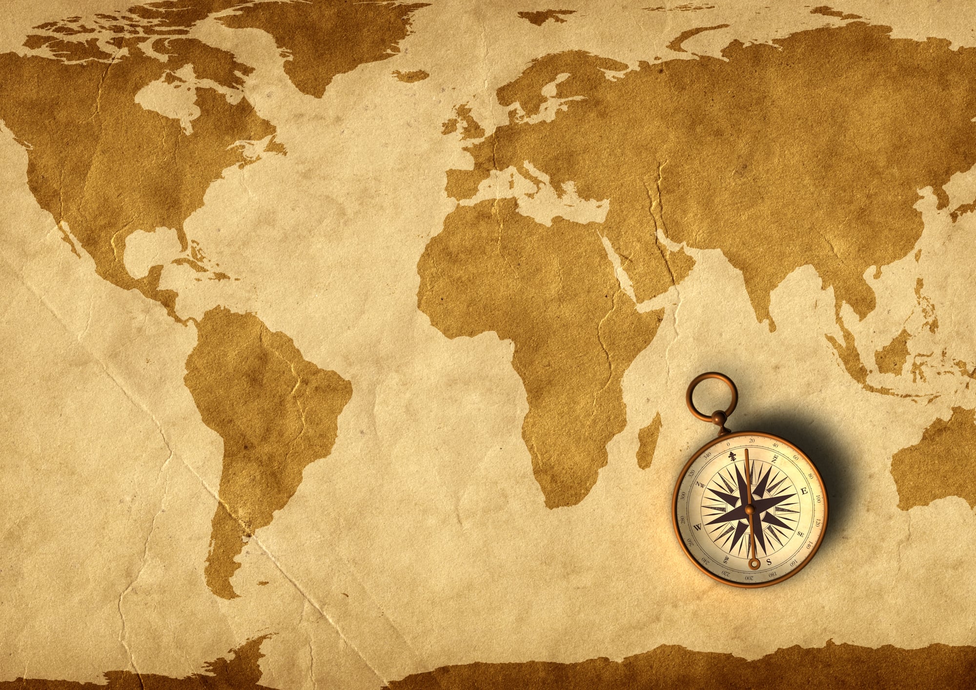
The first map to print the name “America” on it also got the continent’s shape spectacularly wrong, stretching it thin as a ribbon across the western ocean. Waldseemüller later tried to walk it back — his 1516 revision dropped the name entirely — but the 1507 version had already circulated, already stuck.
Only one copy of the 1507 edition is known to survive, which is why the Library of Congress paid $10 million for it in 2003, printing error and all.
Ortelius’s 1570 “Theatrum Orbis Terrarum” — California Variant
Abraham Ortelius printed one of the most respected atlases of the Renaissance, which makes the California confusion even richer. Some editions show California as a peninsula, correctly; others, through engraving inconsistencies across print runs, render it ambiguous enough to feed the later myth that California was an island.
The atlas went through forty-two editions, and collectors now sort carefully through which printing they’re holding.
Hondius’s 1638 Atlas With the Phantom Island of Brasil
There’s a particular stubbornness to phantom islands — they appear on map after map not because anyone confirmed them, but because no one wanted to be the first cartographer to admit the last guy was wrong. Hondius printed Brasil (not Brazil — a separate mythological island believed to lurk off Ireland’s western coast) as a firm landmass in the North Atlantic, confidently outlined, with no footnote, no hedging, no acknowledgment that no sailor had ever actually stood on it.
Copies from this print run fetch significantly more than later corrected editions, and it’s not hard to see why: the error is the history.
John Speed’s 1627 “A New and Accurat Map of the World”
John Speed’s double-hemisphere world map is a masterwork of early English cartography — decorative, ambitious, and wrong about California. Speed printed California as a full island, a mistake that would haunt English cartography for decades and was almost certainly borrowed from a Dutch source that borrowed it from another Dutch source.
The error propagated like a rumor. First editions of Speed’s atlas with the island-California plate intact are among the most actively traded pieces in the English map market.
Ptolemy’s 1482 Ulm Edition
Ptolemy’s “Geographia” had been wrong for over a thousand years before anyone printed it with moveable type, which gives the 1482 Ulm edition a specific kind of dignity. The maps show a landlocked Indian Ocean, an Africa that refuses to end, and coastlines that were confidently incorrect before Columbus was born.
The Ulm edition was the first to add woodcut maps printed directly in the book rather than drawn by hand, and the printing errors — misregistered blocks, ink spread on certain coastlines — vary enough between copies that no two are identical.
Matthias Ringmann’s Naming Error
Ringmann was the scholar who, alongside Waldseemüller, coined “America” — and he almost certainly got the attribution wrong, naming the continent after Amerigo Vespucci when Columbus had arrived first. That intellectual error became a printed one the moment Waldseemüller’s 1507 map rolled off the press.
It’s not a cartographic slip so much as a historiographical one baked permanently into geography, which makes every map that followed — every one that said “America” — a copy of the original mistake.
Mercator’s 1569 World Map — The Northwest Passage
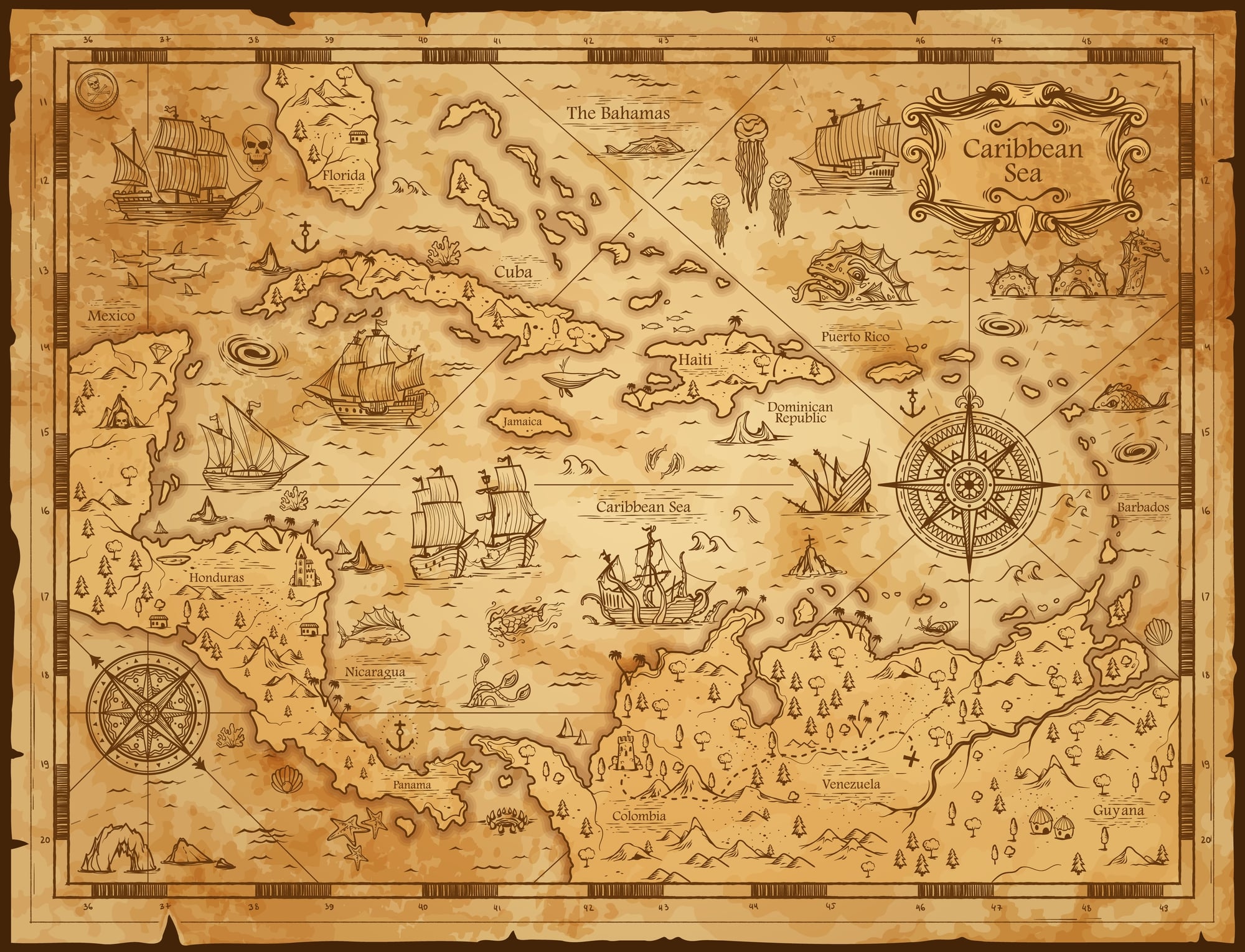
Gerardus Mercator’s 1569 projection was a genuine advance in navigation, but it also printed a navigable Northwest Passage as a near-certainty, a clean channel above North America that would have made the spice trade dramatically more convenient. It wasn’t there.
Mercator drew it from speculation and wishful inference, and sailors spent the next three centuries trying to find it — some of them dying in the attempt. Collectors prize the 1569 original partly because it’s a monument to confident wrongness printed at the highest possible level of craft.
De Fer’s 1700 Mississippi River Map
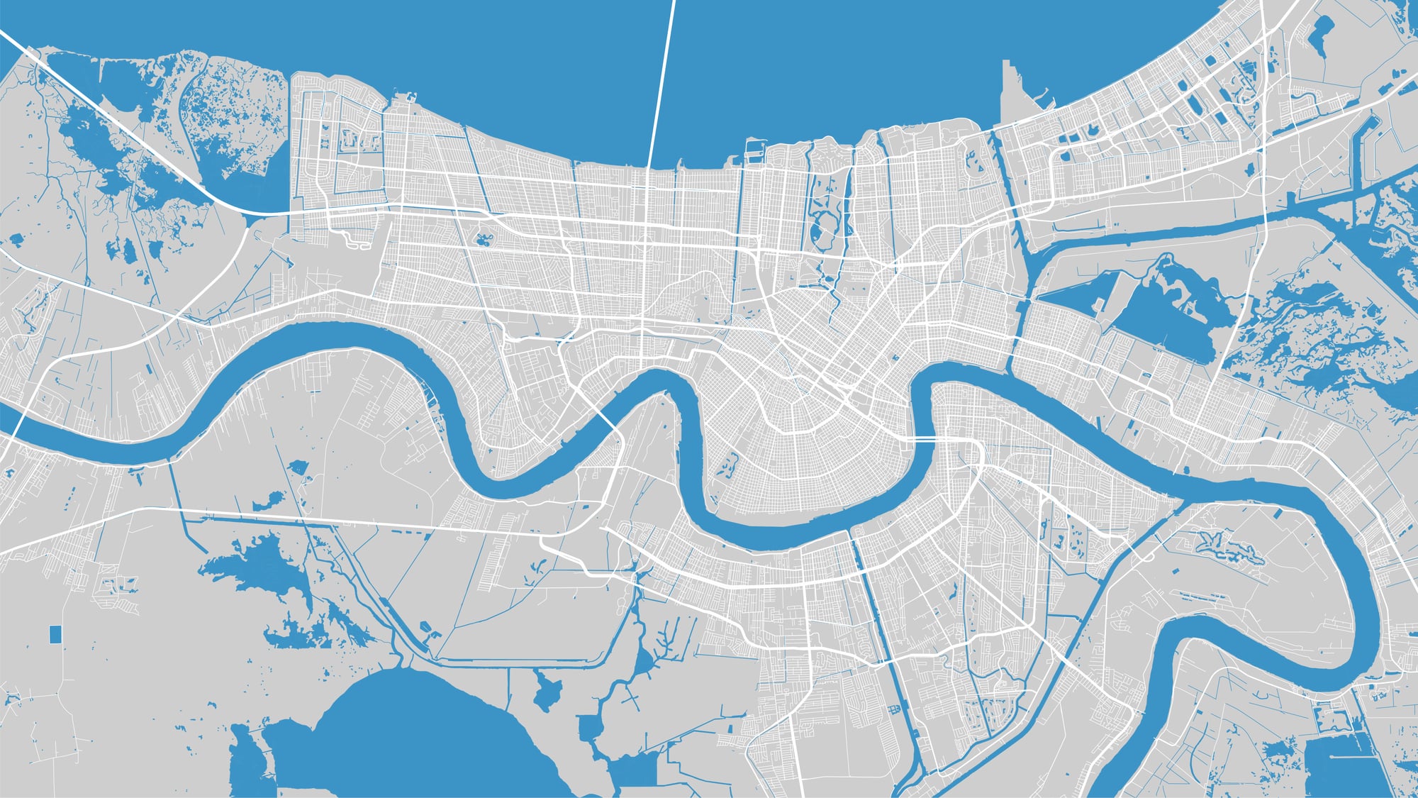
Nicolas de Fer printed a map of the Mississippi River basin in 1700 that placed the river’s course so far east of its actual position that entire territories ended up in the wrong colony, at least on paper. The error wasn’t purely cartographic — it had real political consequences during French and Spanish territorial negotiations, where maps were used as legal documents.
Copies of de Fer’s map surface at auction with enough regularity to suggest the print run was substantial, and the asking prices have been climbing steadily.
Blaeu’s 1662 “Atlas Maior” — The Upside-Down Topography
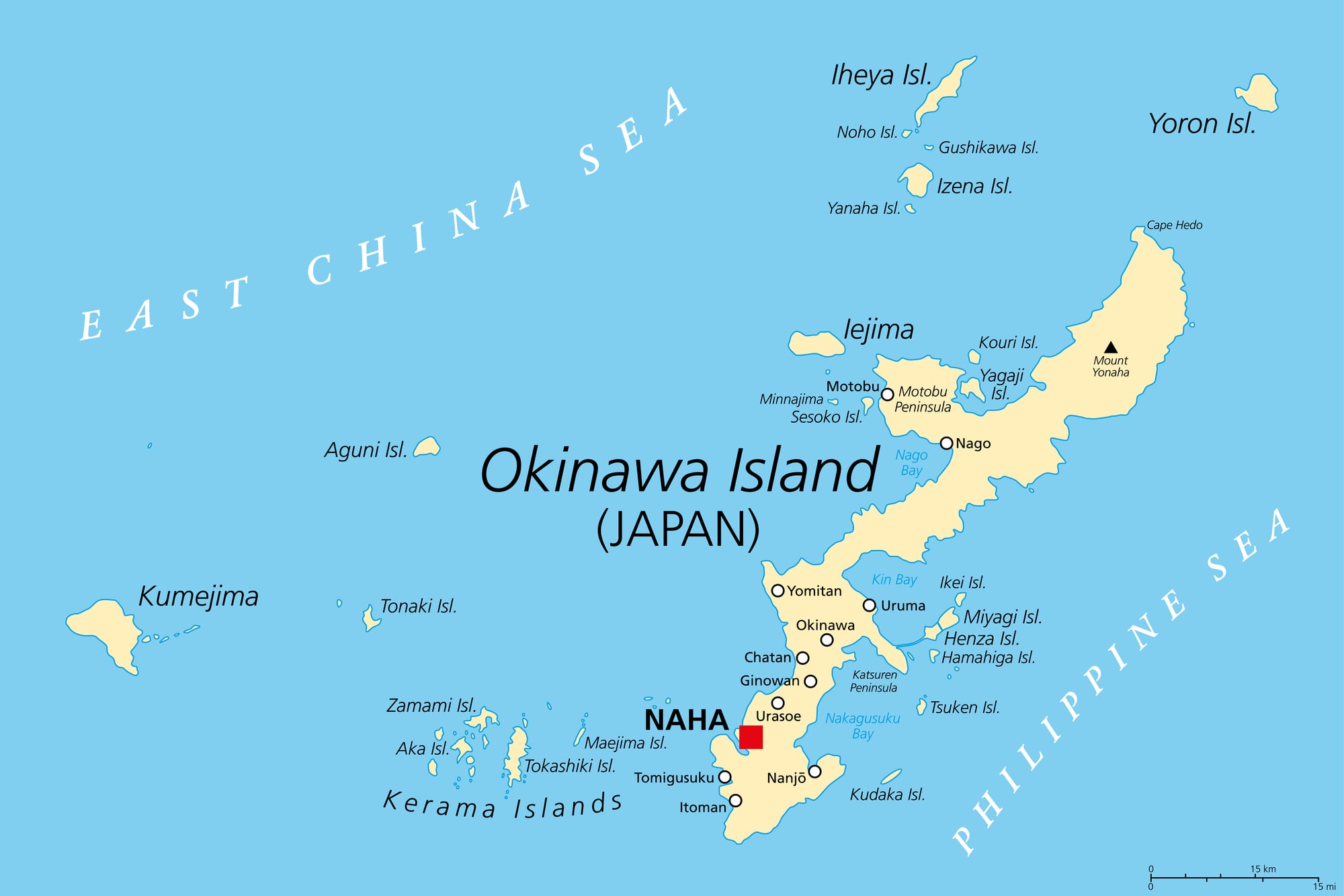
Joan Blaeu’s “Atlas Maior” was the most expensive book of the seventeenth century, and in certain printings, the engraver managing a specific plate of the Scandinavian interior reversed the relief shading — placing shadows on the wrong side of the mountain ranges so they appear to sink into the earth rather than rise from it. It’s a subtle error, the kind you miss unless you’re looking.
Collectors who know the atlas know exactly which plate to check first.
Mitchell’s 1755 Map of North America — The Boundary Line
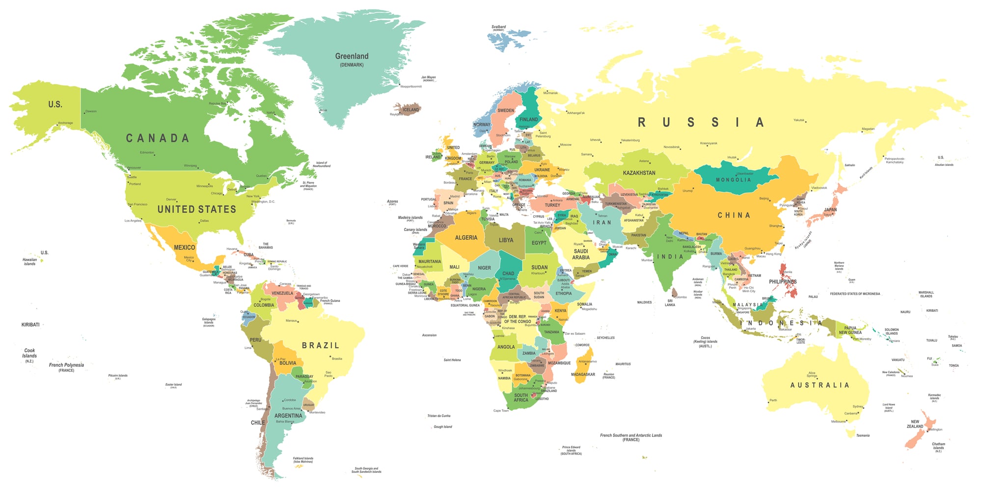
John Mitchell’s 1755 map was used in the 1783 Treaty of Paris to define the boundaries of the new United States, which would be unremarkable except that Mitchell made several significant errors in the placement of the Great Lakes and the northern boundary line. Those errors were then written into a treaty.
First printings, which contain the uncorrected boundary data, are among the most fought-over pieces in American cartographic history — less a collector’s curiosity than an actual artifact of constitutional consequence.
Coronelli’s 1688 Globe Gores — The Transposed Rivers
Vincenzo Coronelli was the official cosmographer of the Venetian Republic and one of the finest globe-makers of his era, which makes the error in his 1688 gores (the printed strips meant to be applied to a sphere) particularly striking. In a section covering the African interior, two river systems were transposed — their sources and mouths effectively swapped — an error that made it into the printed gores before anyone caught it.
Complete sets of the original gores, error intact, are rare enough that institutions and private collectors compete for the same small pool.
Sanson’s 1650 Island of California
Nicolas Sanson didn’t invent the Island of California, but he gave it one of its most authoritative printed forms — clean, well-engraved, printed in Paris with the full weight of French cartographic prestige behind it. Other mapmakers had been quietly stepping back from the island theory by 1650; Sanson doubled down.
The island appeared in his work through multiple editions, and first-state impressions from his 1650 atlas specifically attract buyers who want the most committed version of the error.
Jansson’s 1647 Atlas — The Missing Iceland
Jan Jansson’s 1647 atlas contained a plate of the North Atlantic in which Iceland was simply absent — not misplaced, not mislabeled, but gone. The current scholarly consensus is that a plate was damaged or misregistered during a press run, and the replacement plate used to finish that batch omitted Iceland entirely.
Finding a copy from that specific batch is a matter of luck and patience, which is precisely the combination that drives certain collectors to the edge of reason.
Delisle’s 1718 Map and the Sea of the West
Guillaume Delisle was a rigorous cartographer by the standards of his time, and yet his 1718 map of North America printed a vast inland sea in the western interior of the continent, a body of water that various explorers had rumored but none had confirmed. The “Sea of the West” appeared on maps for decades afterward because Delisle’s reputation made it credible.
Early impressions of the 1718 map, before Delisle himself had reason to question the feature, are the ones collectors want.
Speed’s 1611 Theatre of the Empire of Great Britaine — The Armory Error
A specific printing of John Speed’s 1611 atlas contained a decorative cartouche around the map of London in which the heraldic symbols were engraved in reverse — mirrored, as if someone had forgotten that engraving flips the image. It’s a beginner’s error on a professional plate.
The copies containing it are now worth considerably more than the corrected impressions.
Visscher’s 1651 Leo Belgicus Map
The Leo Belgicus tradition — maps of the Low Countries drawn in the shape of a lion — was a running cartographic joke with genuine artistic intent, and Claes Janszoon Visscher’s 1651 version is one of the most celebrated. But the printing registration on certain copies from the initial press run was off by enough that the lion’s body is visibly misaligned, the head sitting slightly detached from the torso.
Those misregistered copies sell for more than the properly printed ones, which tells you something about what collectors actually value.
Moll’s 1715 Map of North America — The Carolina Coastline
Herman Moll was one of the most prolific mapmakers working in London in the early eighteenth century, and his 1715 map of North America contains a Carolina coastline that appears to have been partly invented. The inlets and barrier islands along the southern coast are rendered with a confidence that the survey data of the time absolutely did not support, and at least two features shown do not correspond to any known geographic reality.
First impressions from the 1715 plate — before any corrections were attempted — are the versions that turn up in serious collections.
Homann’s 1720 Atlas — The Transylvanian Border
Johann Baptist Homann’s Nuremberg publishing house produced maps of impressive technical quality, which makes the border error in the 1720 atlas edition covering Transylvania stand out sharply. The boundary between Transylvania and Wallachia was drawn roughly forty miles east of its actual position — not a rounding error, a genuine misplacement — and the error was replicated in subsequent editions until a revision in the 1730s.
Collectors who specialize in Central European cartographic history treat the 1720 impression as a benchmark piece.
Seutter’s 1730 Globe Map — The Southern Continent
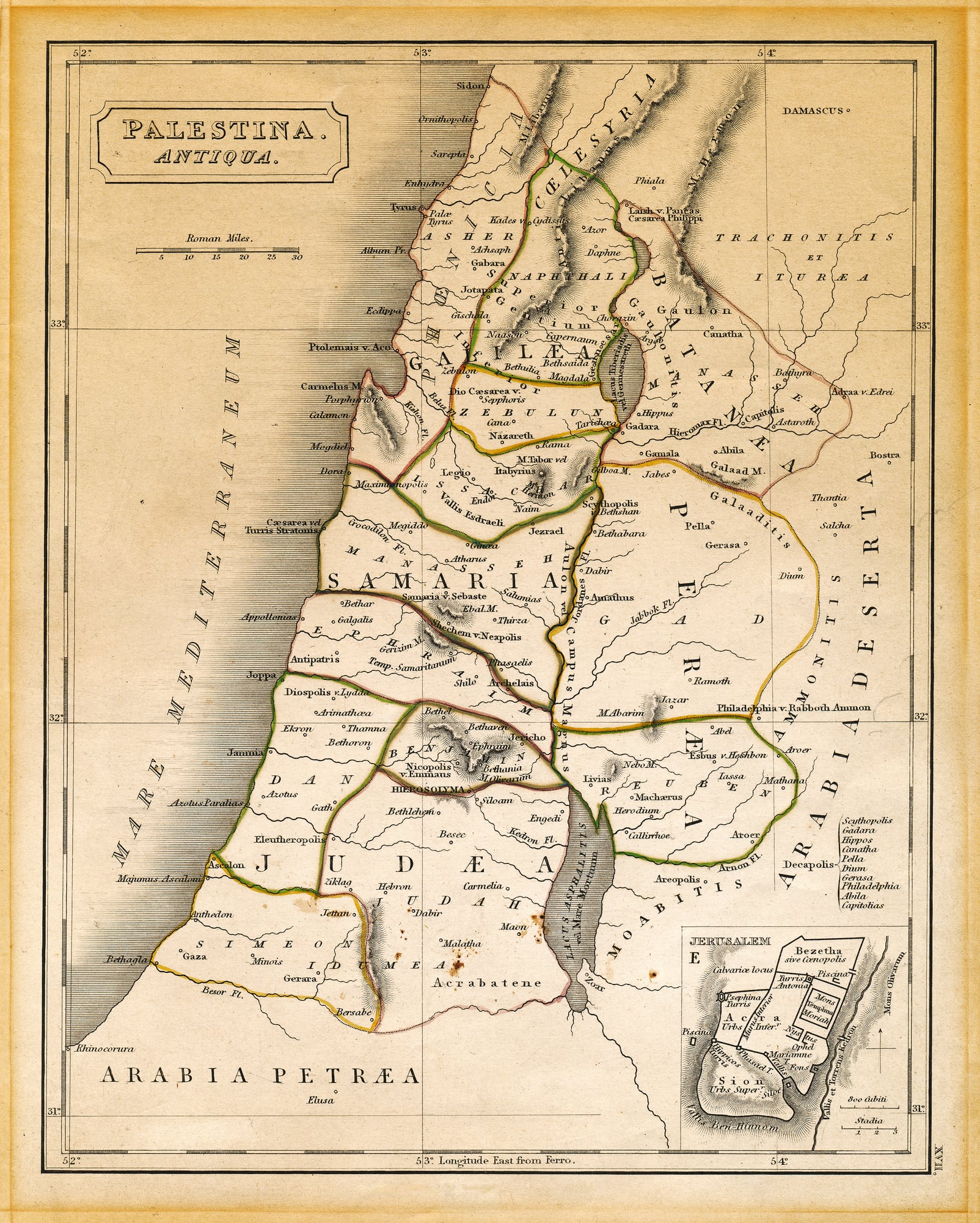
Matthäus Seutter printed a southern continent in his 1730 decorative world map that was both enormous and entirely fictional, stretching from roughly sixty degrees south latitude all the way to the pole in a shape that resembled nothing in the real Southern Ocean. Terra Australis Incognita had been a cartographic tradition for centuries, but Seutter’s version was particularly committed — richly engraved, given mountain ranges and river systems, treated as a known place.
Australia, the actual southern landmass, sits to the north of it, minding its own business.
Popple’s 1733 Map of the British Empire in America
Henry Popple’s enormous twenty-sheet map of British North America was the most detailed English map of the continent produced to that point, and it got the Great Lakes wrong in ways that would embarrass a geography student. Lake Ontario appears at roughly twice its actual length; Lake Erie is oriented at an angle that suggests the surveyor had never been within five hundred miles of it.
The map was used in colonial land disputes anyway, because it was the best available, and first impressions of the complete twenty-sheet set are extraordinarily rare.
Bellin’s 1764 Pacific Chart — The Phantom Islands
Jacques-Nicolas Bellin was the official hydrographer to the French king, and his 1764 Pacific chart contains at least three islands that do not exist. They were drawn from sailors’ accounts that were, to put it charitably, enthusiastic rather than precise, and Bellin printed them with the same authority he applied to the coastlines he had actually verified.
The phantom islands are named, annotated, given approximate depths. Collectors particularly prize the 1764 printing because Bellin’s later Pacific charts began quietly dropping them.
Ortelius’s 1587 “Theatrum” — The Korean Peninsula
The Korean peninsula in Ortelius’s 1587 edition of the “Theatrum” is a geometric mystery — rendered as a broad, nearly circular mass attached to the mainland at an angle that makes it look more like a tumor than a peninsula. This was a consistent error across several editions, borrowed from Portuguese trade charts that were themselves based on hearsay, and it persisted in European cartography for nearly a century.
The 1587 impression is the one most often cited because the error is at its most committed and the engraving is otherwise at its most refined.
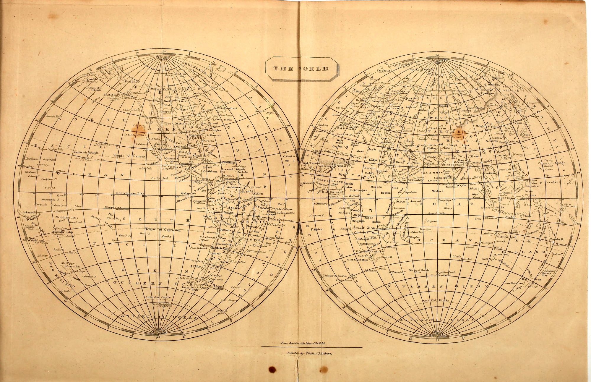
Arrowsmith’s 1802 Map of the World — The Antarctic Coastline
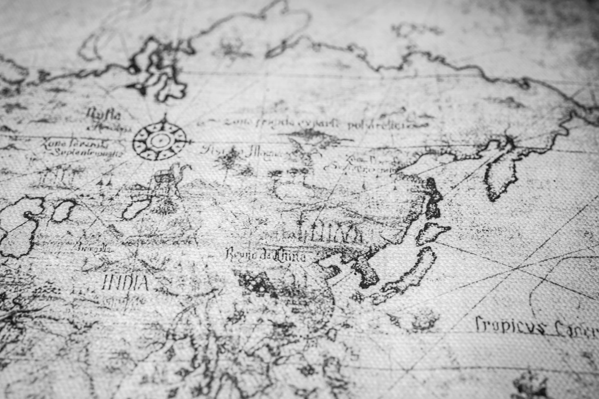
Aaron Arrowsmith was one of the finest cartographers of the early nineteenth century, and his 1802 world map printed an Antarctic coastline seventeen years before any confirmed sighting of the continent. It was speculative — drawn from inference and the logic that a southern landmass must exist to balance the northern ones — but it was printed as a solid line, not a dotted hypothesis.
When Antarctica was actually confirmed, the coastline Arrowsmith had guessed at turned out to be partially correct, which made the 1802 map retroactively fascinating rather than simply wrong.
Tallis’s 1851 Illustrated Atlas — The Height of Kilimanjaro
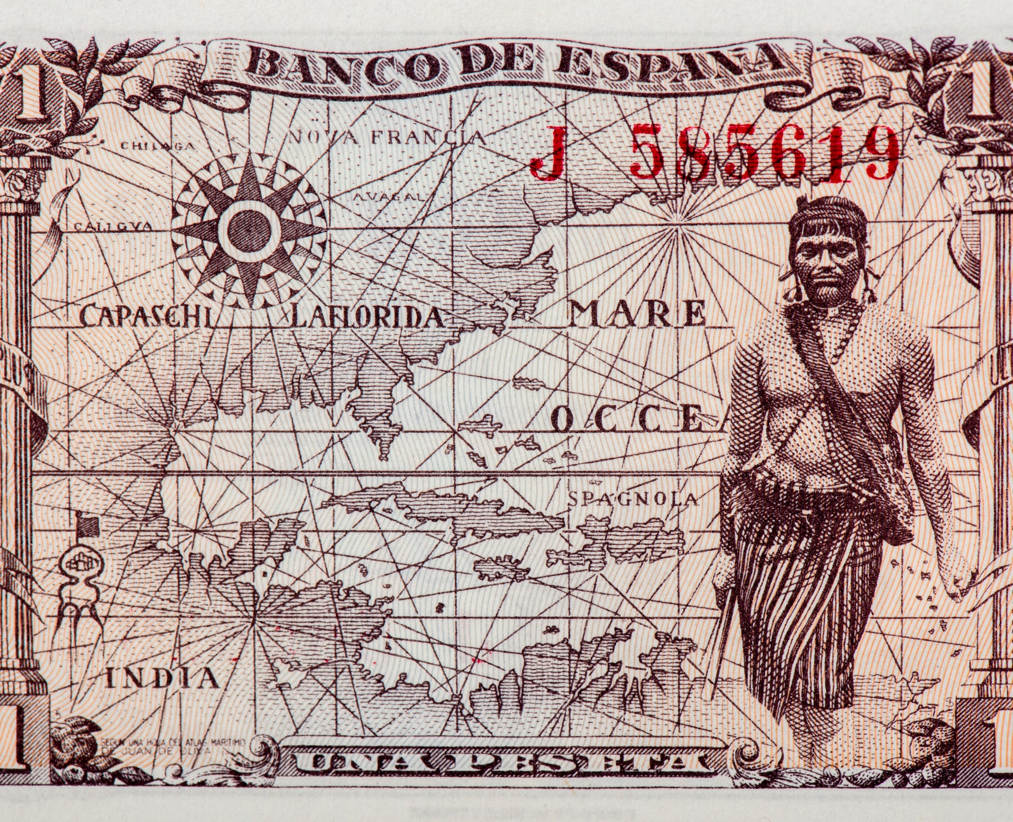
John Tallis’s illustrated atlas was a Victorian drawing-room staple, printed with decorative vignettes around the map borders and a confidence about African geography that the era’s actual knowledge of the interior didn’t warrant. The 1851 edition listed Kilimanjaro’s height at an estimate so far below the actual 19,341 feet that it placed the mountain in a category that wouldn’t have required snow at any point in the year — which any observer on the ground could have corrected immediately.
The error wasn’t unique to Tallis, but his atlas distributed it more widely than most.
Tanner’s 1823 Map of Texas
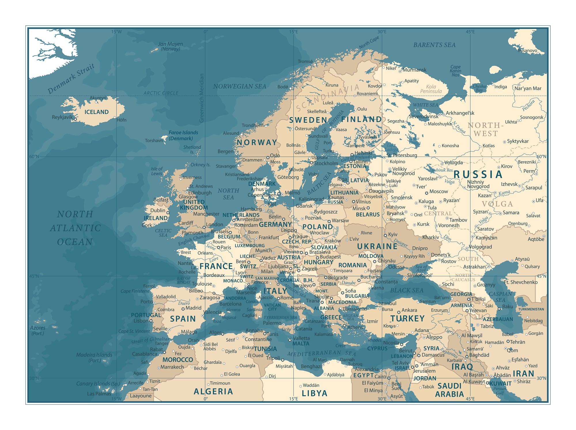
Henry Tanner’s 1823 map of Texas — then still part of Mexico — placed several rivers in positions that were off by enough to matter politically, particularly in the contested borderlands where American settlers were beginning to arrive. The error may not have been entirely innocent: certain boundary lines in Tanner’s version happened to favor American territorial claims.
First impressions of the 1823 plate, before any corrections, are a specific target for collectors who focus on the cartographic history of Texas annexation.
Colton’s 1855 Atlas — The Nebraska Territory
J.H. Colton’s 1855 atlas was a bestselling American reference work, which meant its errors traveled far. The edition printed immediately after the Kansas-Nebraska Act showed the territorial boundaries in a configuration that was already outdated by the time the ink dried — the legislation had moved faster than the engraving process.
Colton’s own corrected edition came out within months, but the first printing with the obsolete boundaries is the one that collectors prioritize, precisely because it captured a political moment mid-change.
Stieler’s 1817 Hand-Atlas — The Nile Tributaries
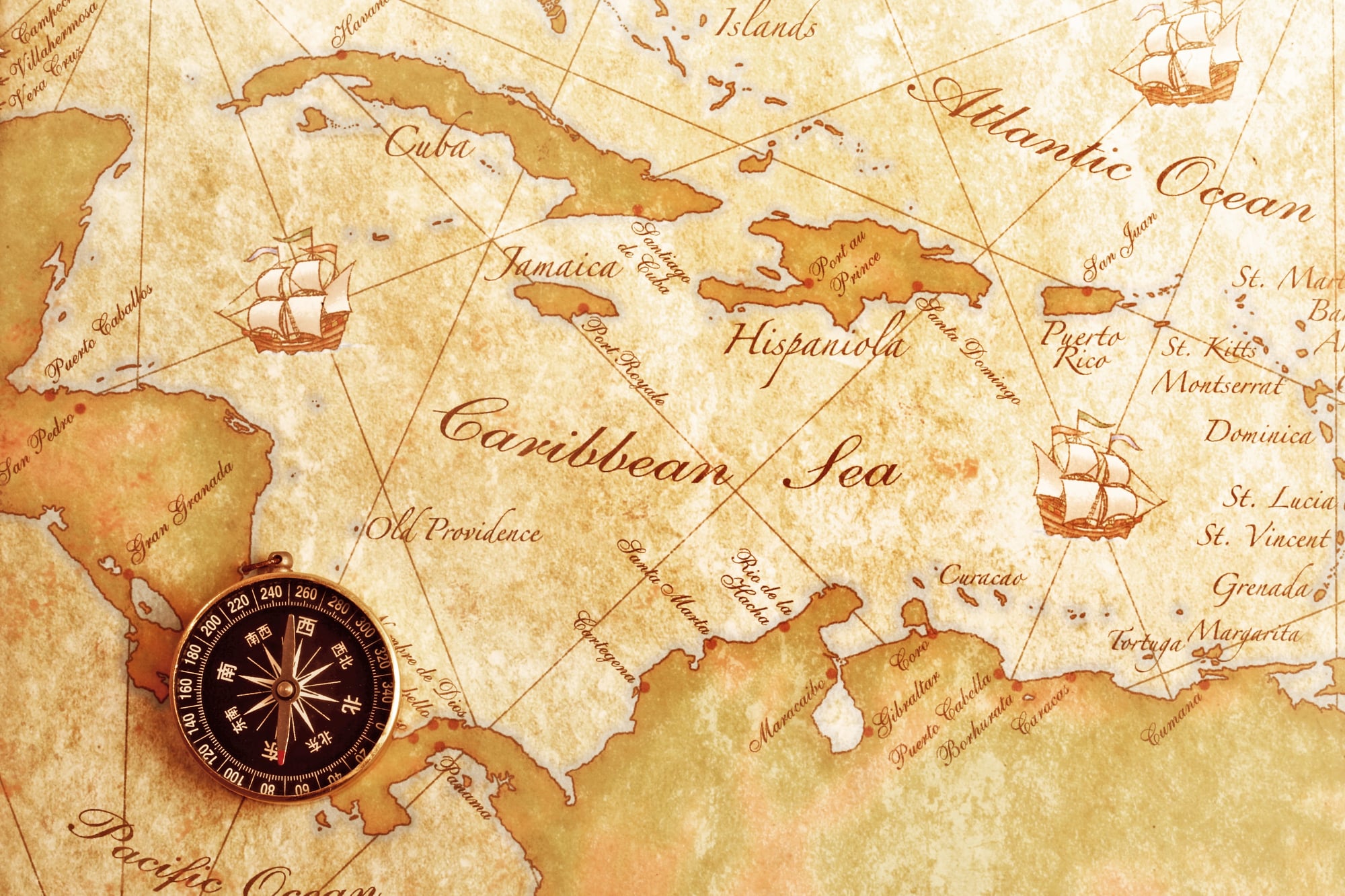
Adolf Stieler’s “Hand-Atlas” was the standard German reference atlas of the nineteenth century, methodical and rigorously corrected across dozens of editions — which is why the 1817 first edition’s treatment of the Nile tributaries is so striking. The Blue and White Nile are labeled in reverse, their sources and names swapped, an error that persisted through the first three printings before a correction was issued.
The 1817 first impression, with the swapped labels, is the piece German map collectors treat as the atlas’s most collectible state.
Bonne’s 1780 Atlas — The Scottish Highlands
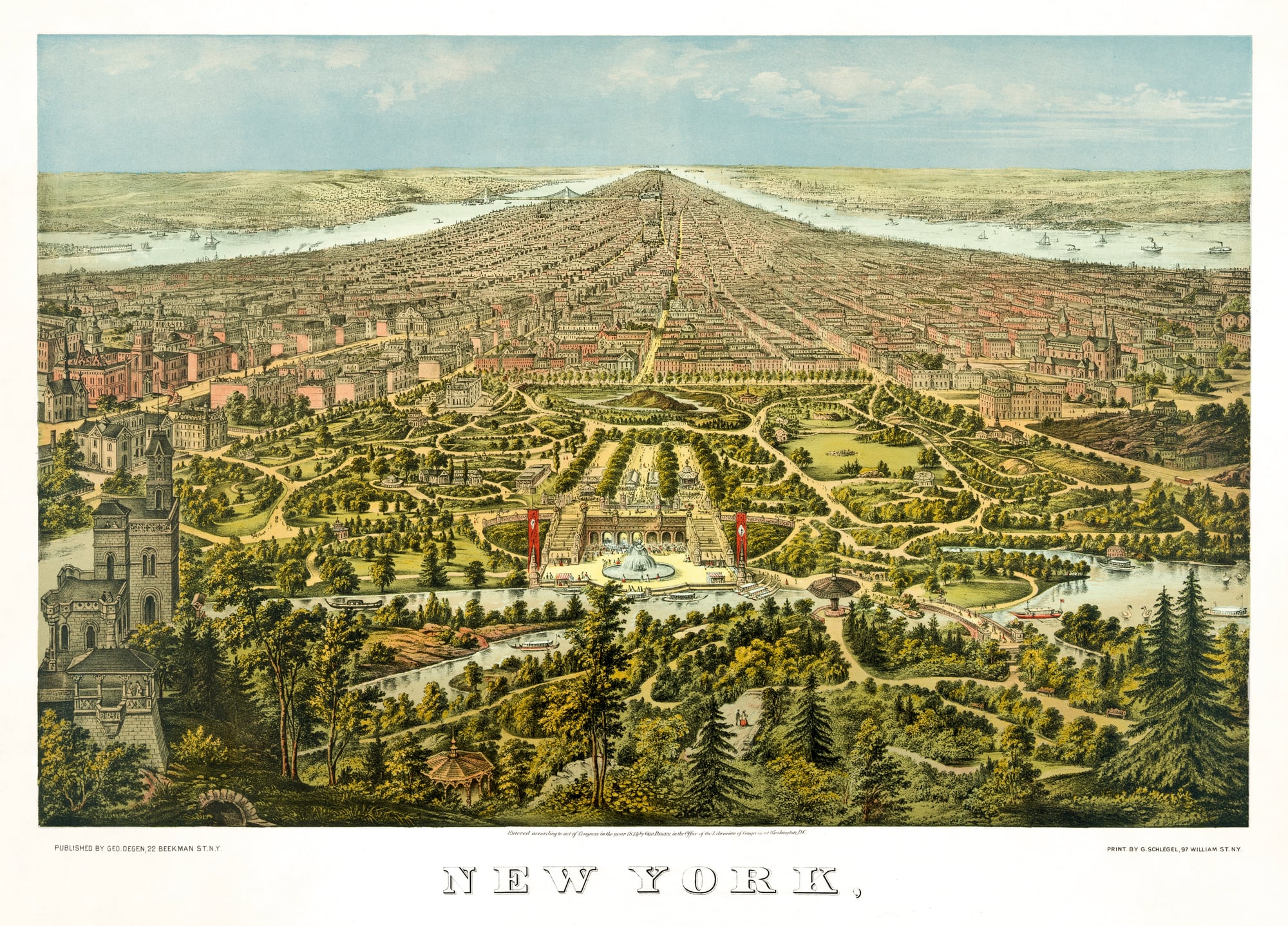
Rigobert Bonne’s 1780 atlas was produced with French precision and a peculiar blind spot for Scotland, where the western Highland topography is rendered as a nearly flat coastal shelf — the mountains simply absent, as if someone had ironed them out before printing. Scotland had been surveyed poorly by French cartographic sources, and Bonne printed what he had rather than acknowledging the gaps.
The flatness of it is almost serene, like a Scotland that decided the Highlands were more trouble than they were worth.
Dépôt De La Guerre’s 1793 Map of Egypt — Pre-Campaign Edition
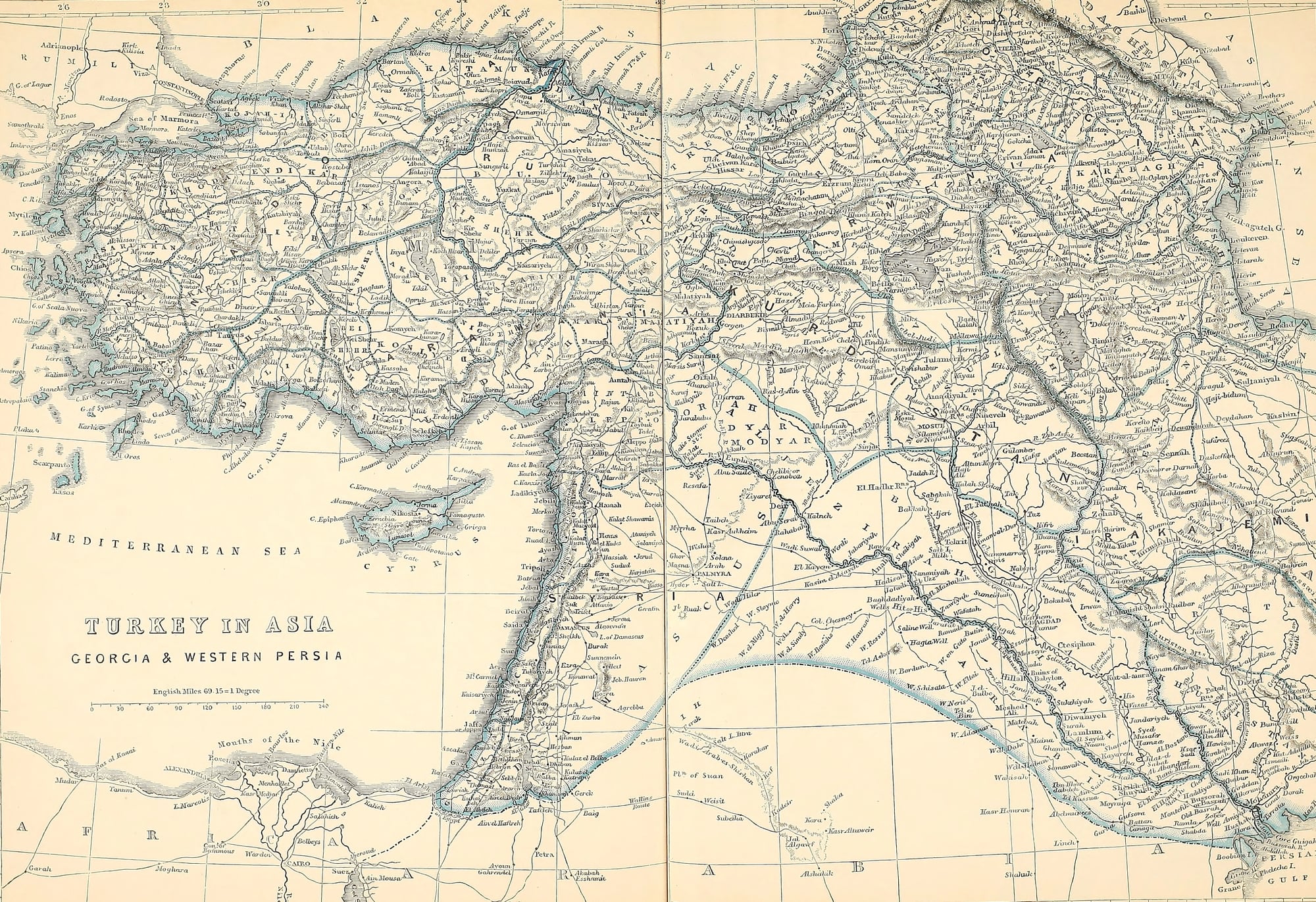
The French military surveying office produced a map of Egypt in 1793, six years before Napoleon’s Egyptian campaign would demonstrate exactly how wrong it was. The Nile Delta in the 1793 edition has a distribution of channels that doesn’t match any known state of the river, and the interior elevations are fictional in ways that would have concerned any general trying to move artillery.
When the campaign produced actual survey data, the 1793 map became an embarrassment — which is precisely why surviving copies are treated as pre-scientific artifacts rather than practical documents.
Carey and Lea’s 1822 Atlas — The Great Salt Lake Region
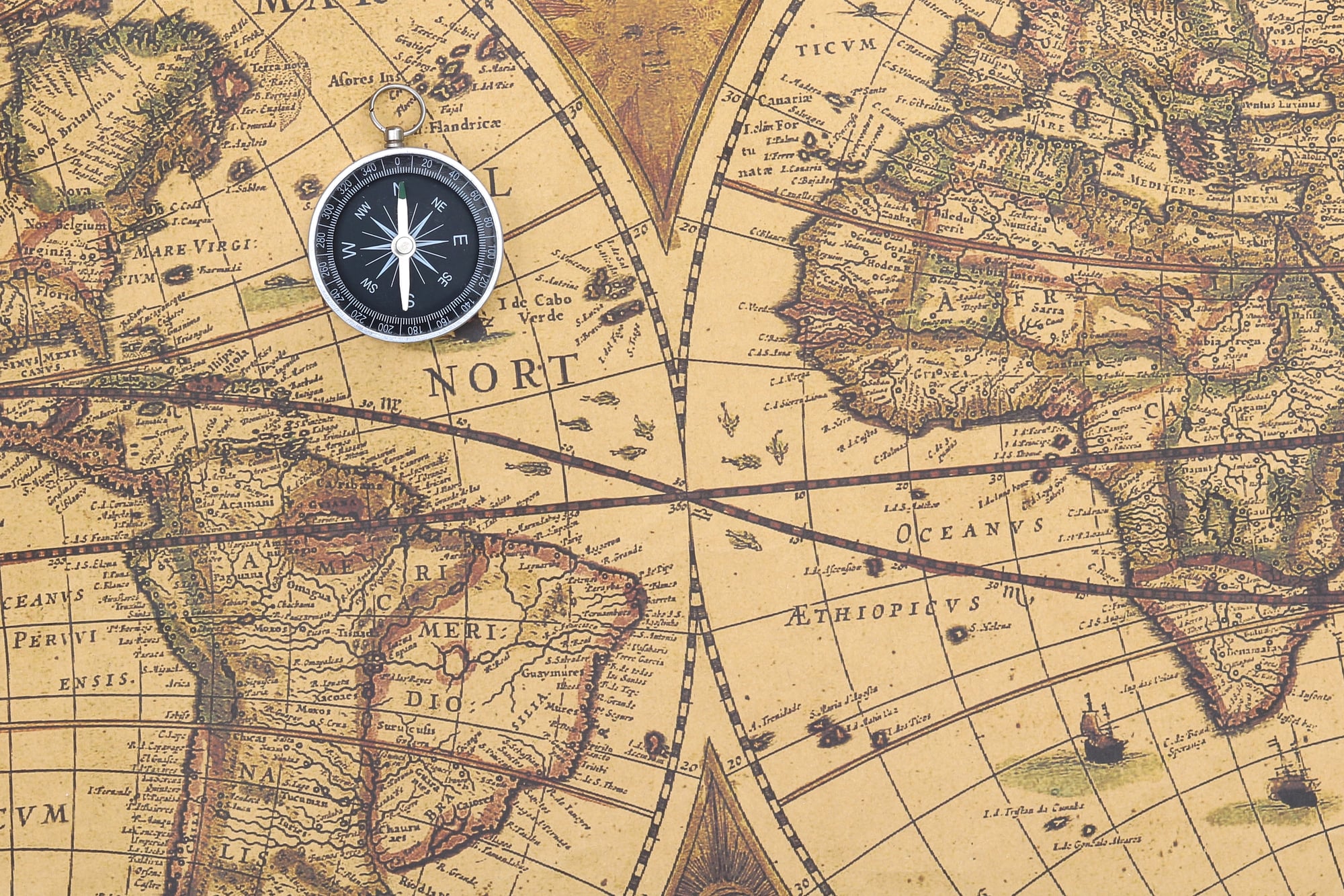
Mathew Carey and Henry Charles Lea’s 1822 American atlas represented the best available cartographic knowledge of the western interior — which is to say, it represented a great deal of speculation dressed in the clothing of fact. The Great Salt Lake region is rendered with a confidence that no American surveyor had yet earned: rivers flow in directions they do not flow, mountain ranges appear where none exist, and the great basin’s actual character — its internal drainage, its salt flats, its profound aridity — is nowhere visible.
The atlas sold widely as a practical reference work, which means its errors spread across a generation of readers who had no way to check them against the landscape itself.
Jefferys’s 1755 “Natural and Civil History of the French Dominions”
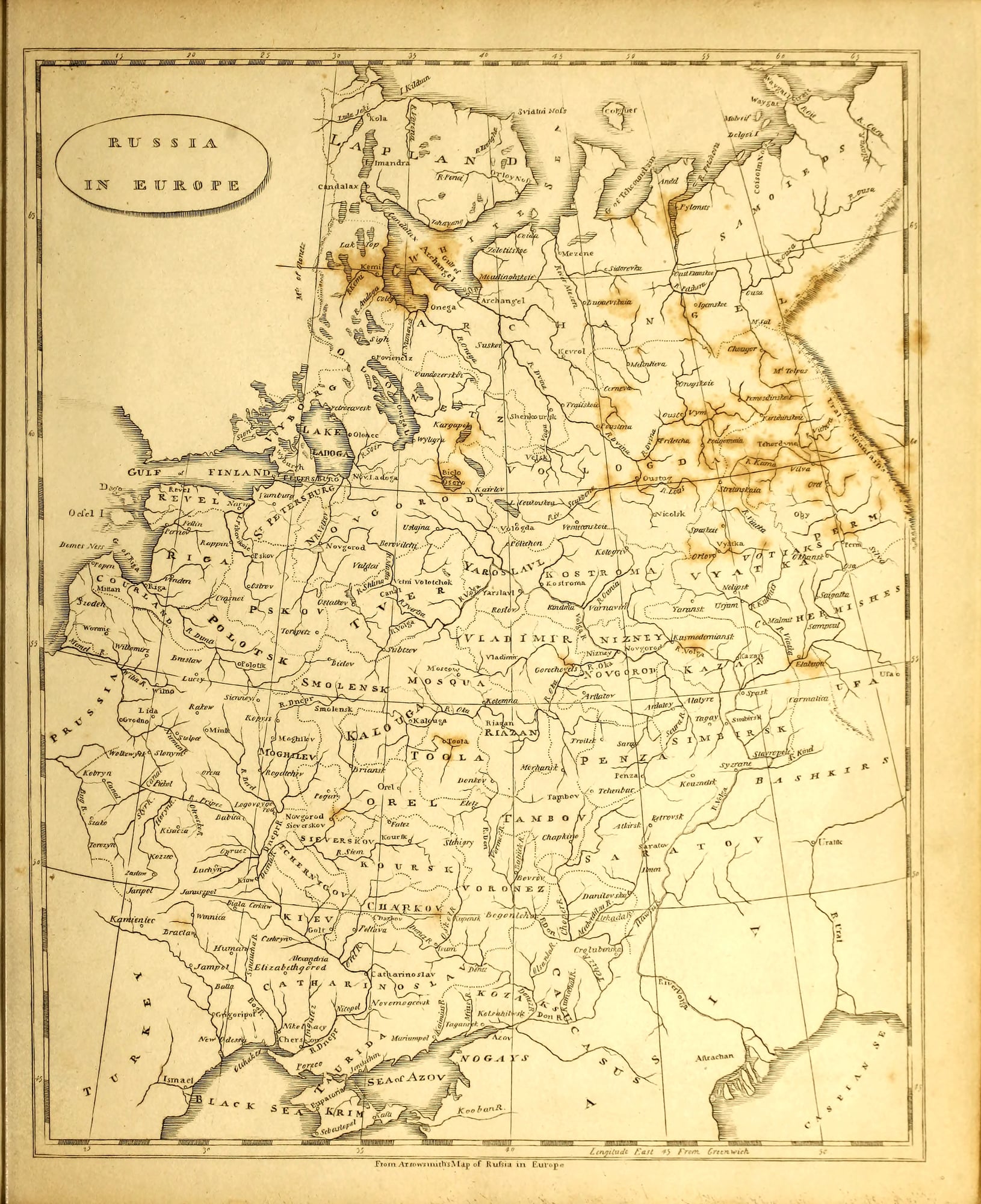
Thomas Jefferys was geographer to the future King George III, and his 1755 illustrated geographic survey of French colonial territories in North America and the Caribbean contained a map of Louisiana in which the lower Mississippi valley is drawn with an authority that the available surveys absolutely did not support. The bayous of the Mississippi Delta are simplified into a clean river mouth; the actual maze of distributaries is nowhere present.
Collectors who focus on colonial American cartography know Jefferys and know exactly which plates to examine for the characteristic confident simplification that defines his Louisiana work.
Zatta’s 1776 Atlante Novissimo — The Pacific Northwest
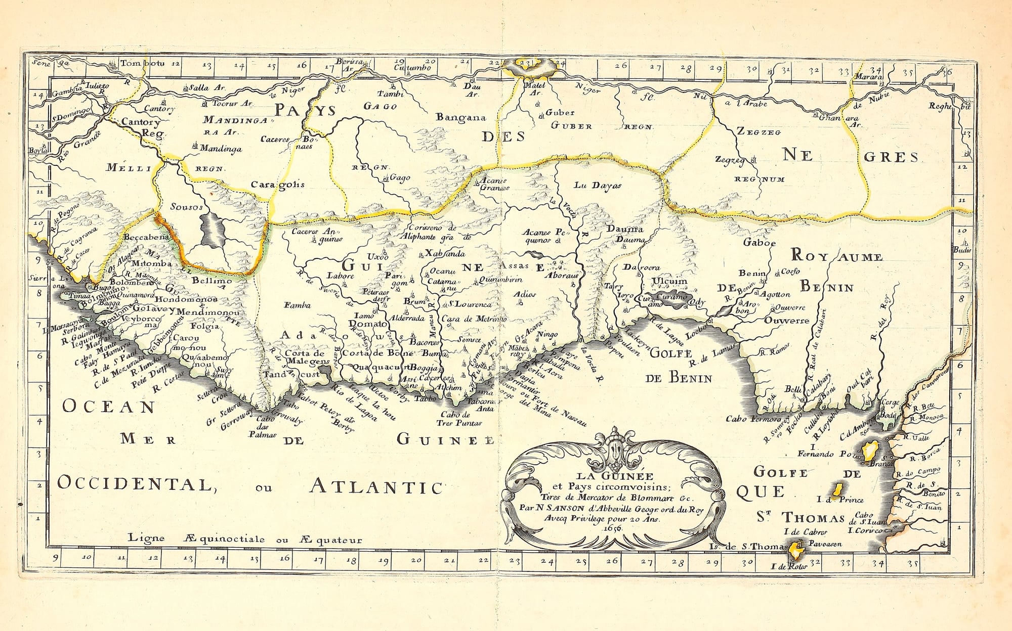
Antonio Zatta’s “Atlante Novissimo,” published in Venice between 1775 and 1785, contained a plate of the Pacific Northwest that printed a large inland waterway cutting deep into what is now British Columbia — a phantom passage that Zatta drew from dubious accounts of a supposed voyage by Juan de Fuca. The passage wasn’t there in the form Zatta showed it, but the authoritative Venetian engraving gave it credibility that kept it circulating in European geographic discourse into the 1790s.
First-state impressions from the original plates, before corrections were introduced in later volumes, are uncommon enough that specialists track their appearances at auction carefully.
Lucas’s 1823 American Atlas — The Missouri River Headwaters
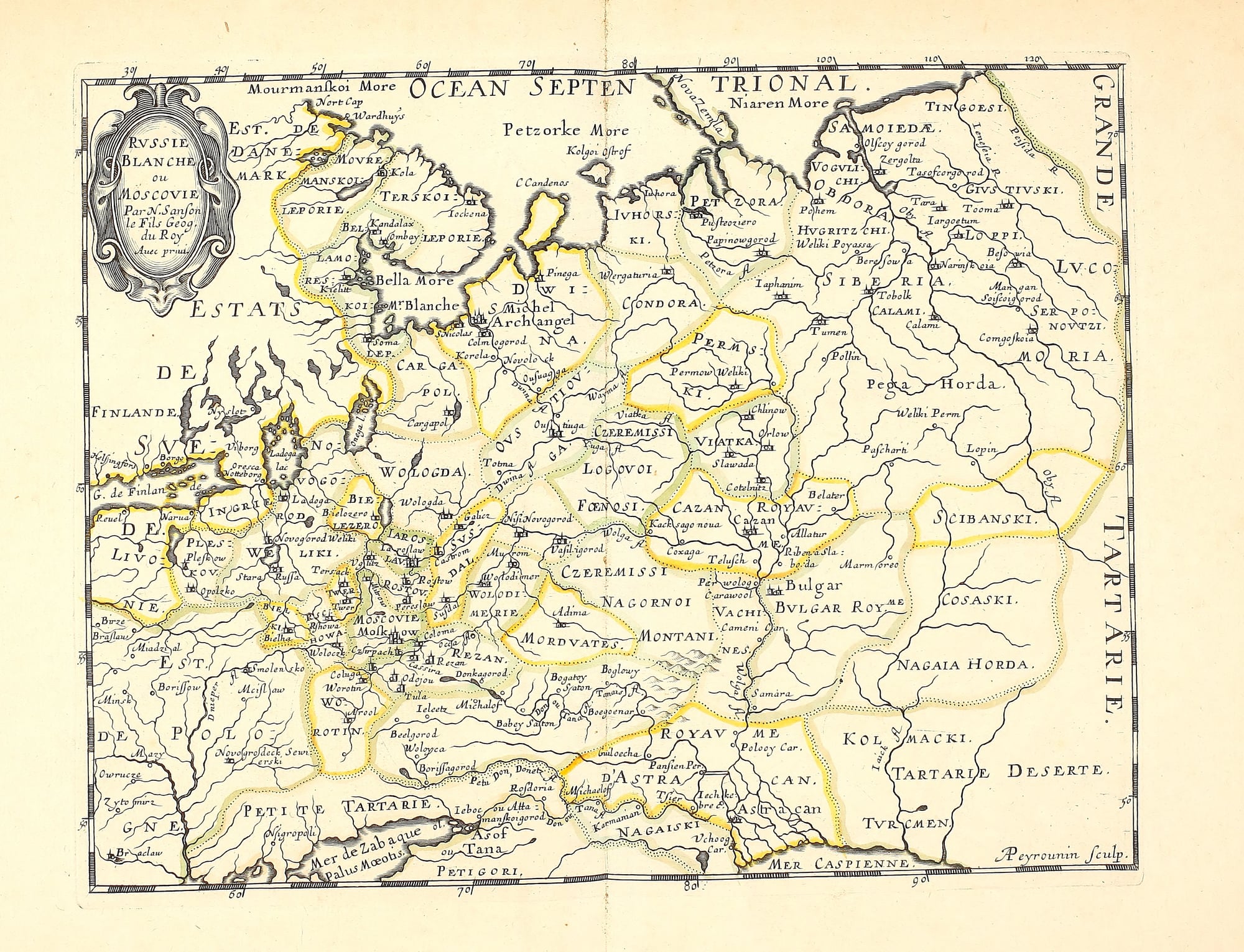
Fielding Lucas Jr. published his 1823 American atlas as a practical reference for an expanding nation, and the Missouri River headwaters shown in that edition reflect the incomplete state of post-Lewis and Clark geographic knowledge — the expedition’s journals had been published, but the information hadn’t been fully integrated into the cartographic mainstream. Lucas shows the river’s upper branches in configurations that the actual terrain doesn’t support, merging tributaries that don’t merge and separating channels that are the same river.
The 1823 printing captures the American West in a state of cartographic becoming, and collectors who specialize in the mapping of the frontier treat it as one of the more honest documents of what the country didn’t yet know about itself.
When the Error Brings the Value
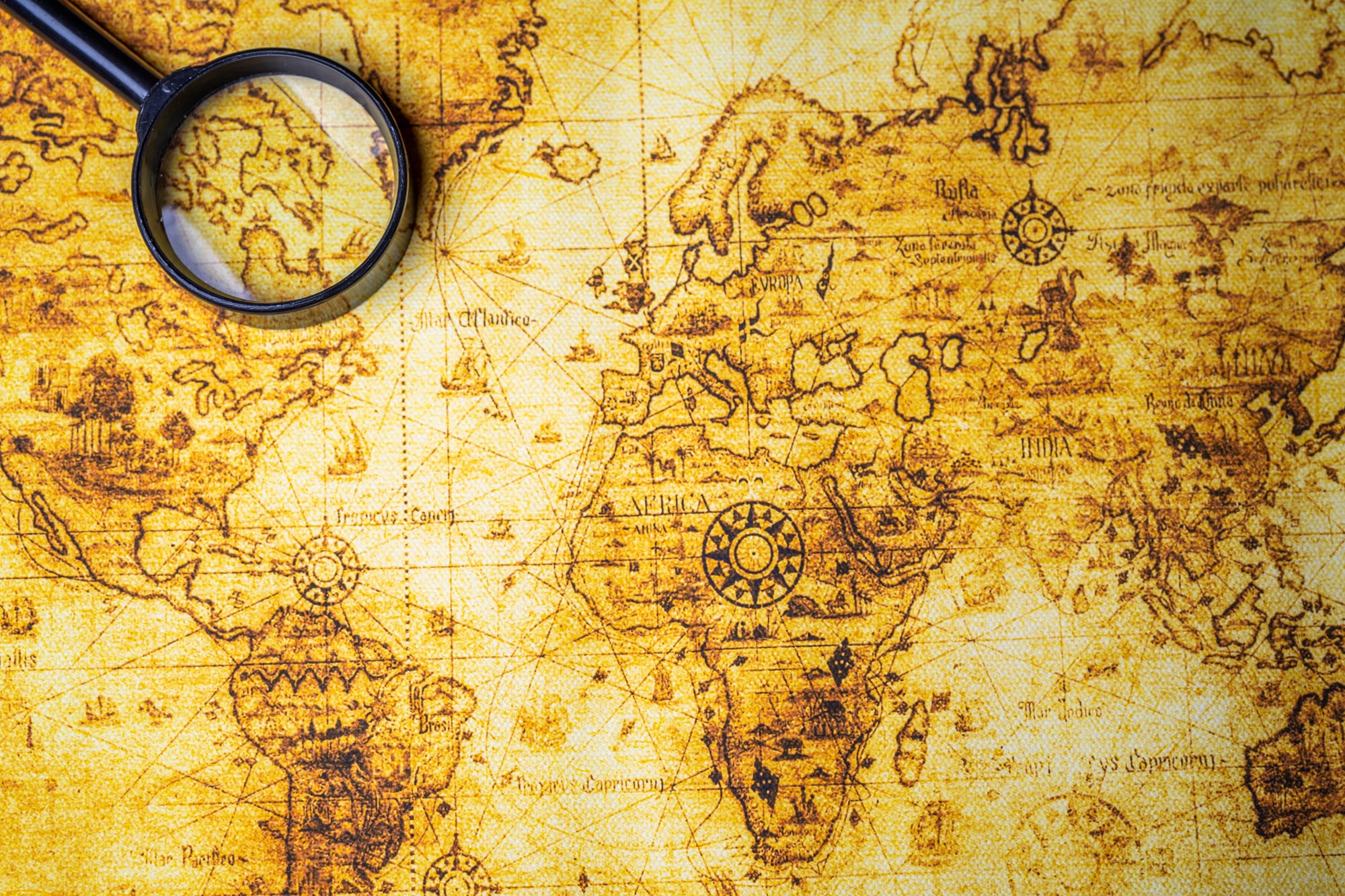
Every map in this list was wrong about something real — a coastline, a mountain, a river, a name, a border. And every one of those errors was printed with the same ink, the same copper plate, the same professional confidence as the features that happened to be correct.
That’s what makes old maps so strange as objects: they present their mistakes with exactly the same authority as their truths, and at the moment of printing, there was often no way to tell the difference.
Collectors who pursue these specific errors aren’t celebrating incompetence. They’re recognizing that a map is a document of what people believed about the world at a specific moment, and that belief — confident, committed, sometimes spectacularly wrong — is its own kind of historical fact.
The corrected editions are more accurate. The first printings are more honest about what it actually meant to try to understand the world before the world had been fully understood.
More from Go2Tutors!

- The Romanov Crown Jewels and Their Tragic Fate
- 13 Historical Mysteries That Science Still Can’t Solve
- Famous Hoaxes That Fooled the World for Years
- 15 Child Stars with Tragic Adult Lives
- 16 Famous Jewelry Pieces in History
Like Go2Tutors’s content? Follow us on MSN.