Why the ’90s Diner Aesthetic Is Making a Huge Comeback
There’s something quietly stubborn about the American diner. It refuses to become a relic.
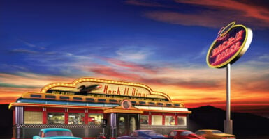
Other design eras come and go — mid-century modernism, the sleek minimalism of the 2010s, the farmhouse-everything phase that ate a decade whole — but the ’90s diner keeps resurfacing, louder each time, like a jukebox that never actually stopped playing. Walk into any newly opened breakfast spot in Austin, Nashville, or Brooklyn right now and you’ll feel it immediately: the vinyl, the neon, the laminated menus, the specific shade of teal that nobody has a name for but everyone recognizes on sight.
This isn’t nostalgia for nostalgia’s sake. Something real is driving people back to those booths.
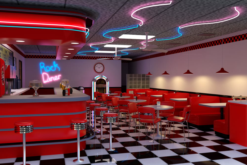
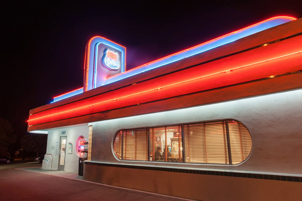
Neon Signage
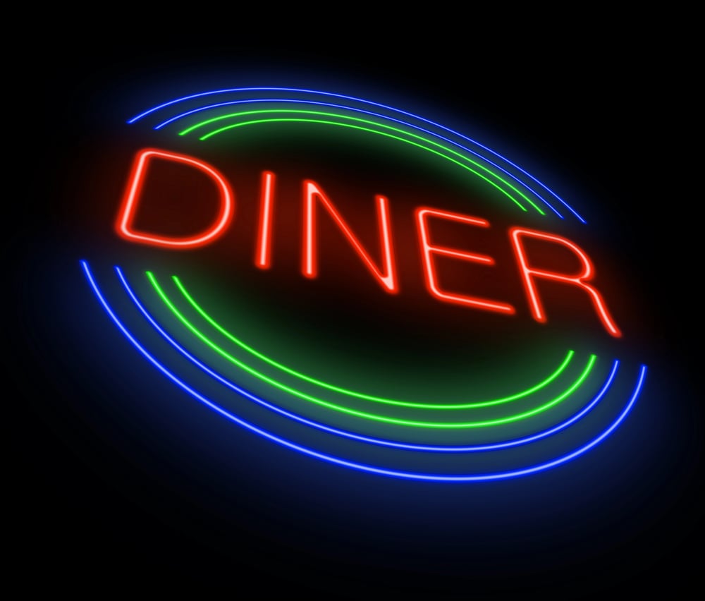
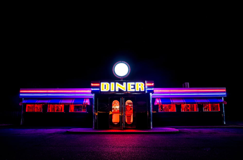
Neon is back, and it never apologized for leaving. The warm buzz of a real glass-tube sign — pink, red, electric blue — does something to a room that an LED strip simply cannot fake.
So designers are specifying handcrafted neon again, and customers are stopping on sidewalks to photograph it before they even walk inside.
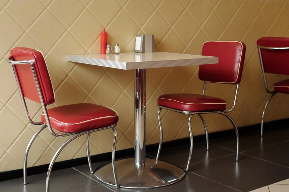
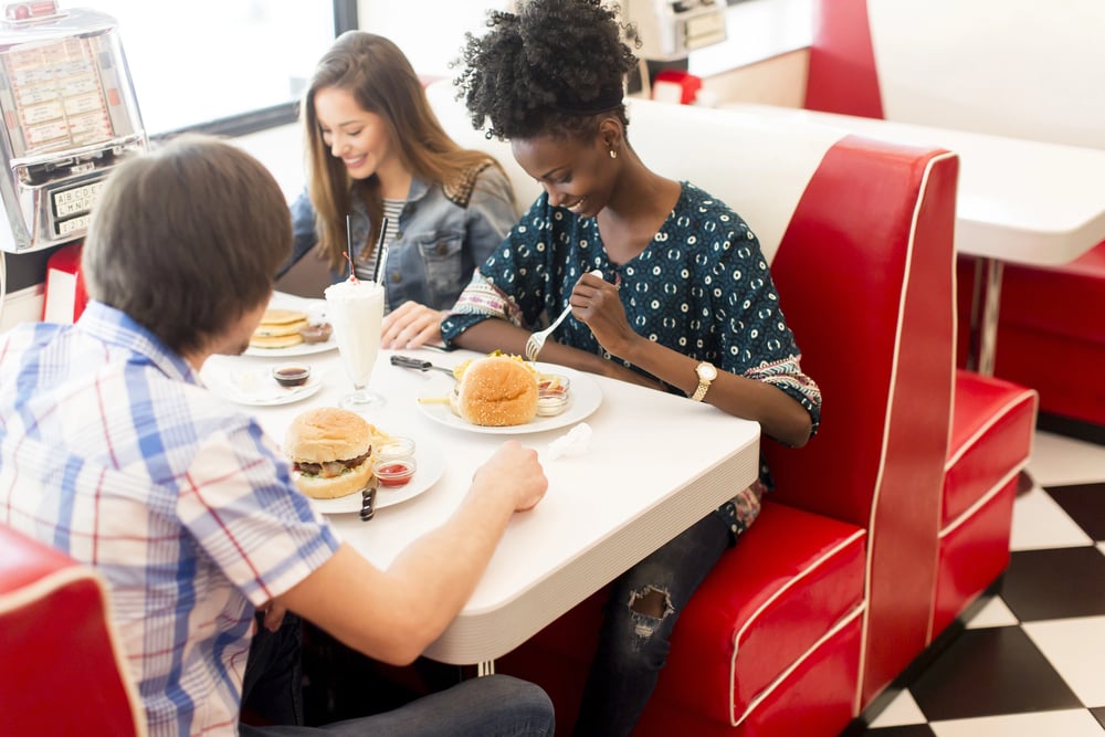
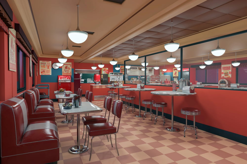
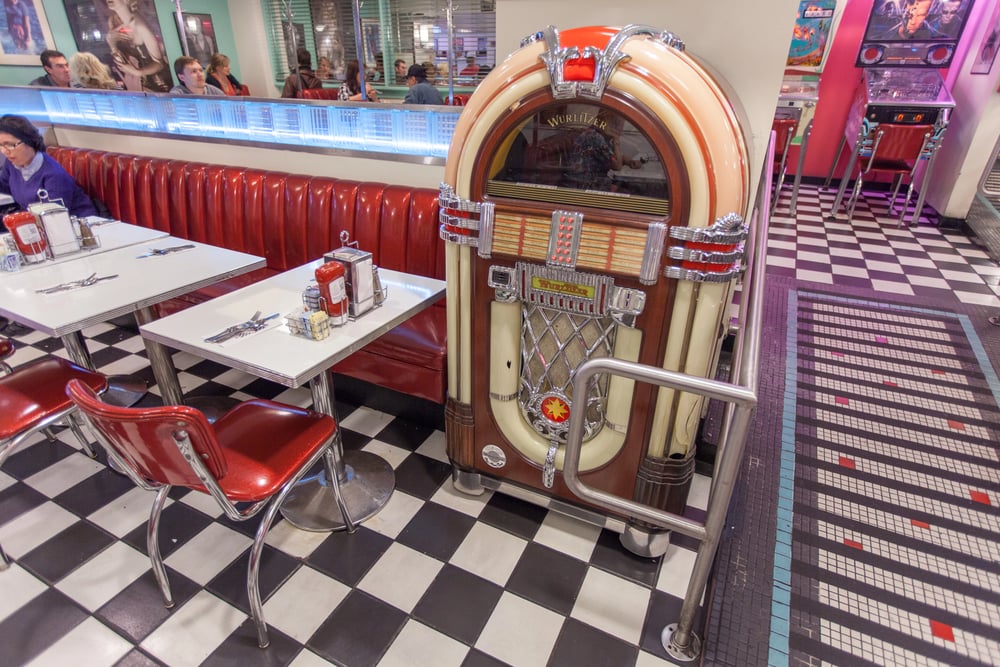
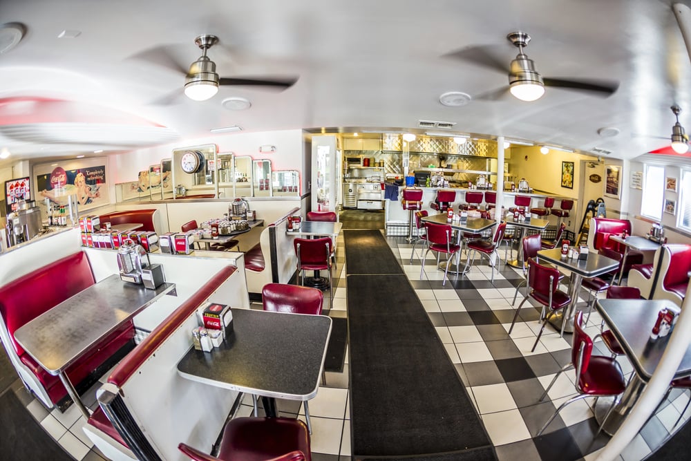
Vinyl Booths
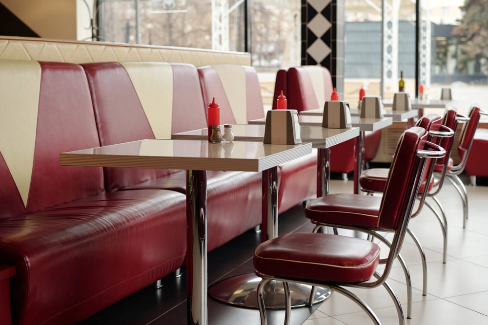
Vinyl booths are one of the most honest pieces of furniture ever made. They don’t pretend to be comfortable in a delicate way — they’re just there, solid and slightly cool to the touch, and they hold up to decades of use without asking for anything in return.
Go figure: the material everyone mocked for looking cheap is now the material people specifically request.
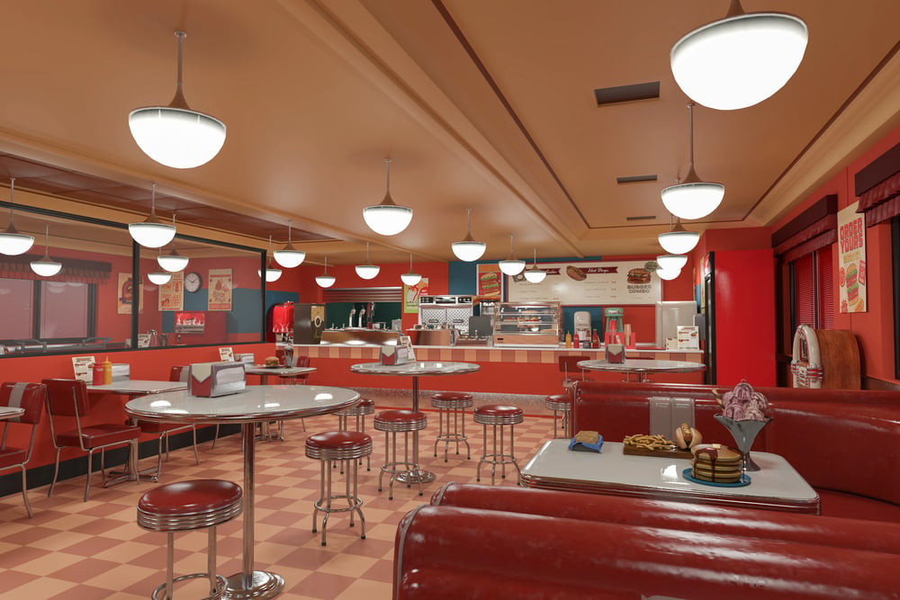
Checkerboard Floors
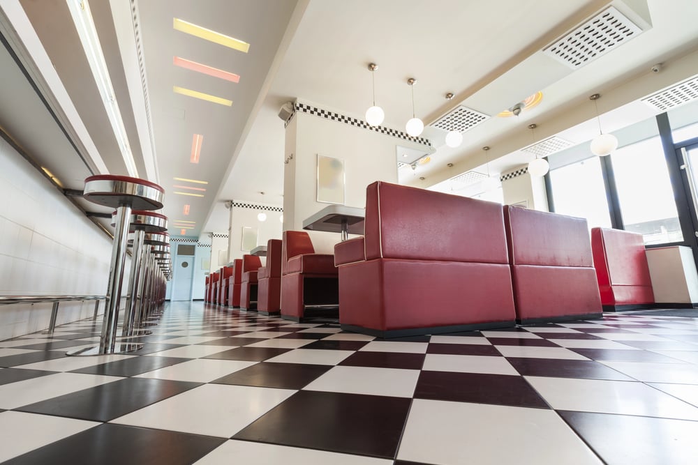
A checkerboard floor is less a design choice and more a personality statement — it tells you, before a single plate of food arrives, that this place has a point of view. The black-and-white pattern (sometimes swapped for black and cream, or occasionally a daring red and white) carries a visual confidence that polished concrete or herringbone tile simply doesn’t, and restaurants opening in 2023 and 2024 have leaned into it hard, tiling everything from entryways to full dining rooms with that relentless grid.
It reads as retro from a distance and oddly timeless up close.
Formica Countertops
Formica was dismissed as the cheap cousin of granite for about thirty years, and turns out the dismissal was entirely wrong. The speckled, slightly shiny surface of a good Formica counter — especially in that particular cream-and-gold pattern that populated every diner between 1988 and 1999 — has a warmth that cold stone never quite achieves.
Interior designers who once would have specified marble without blinking are now sourcing vintage Formica patterns and specifying them for full counter runs.
The Jukebox
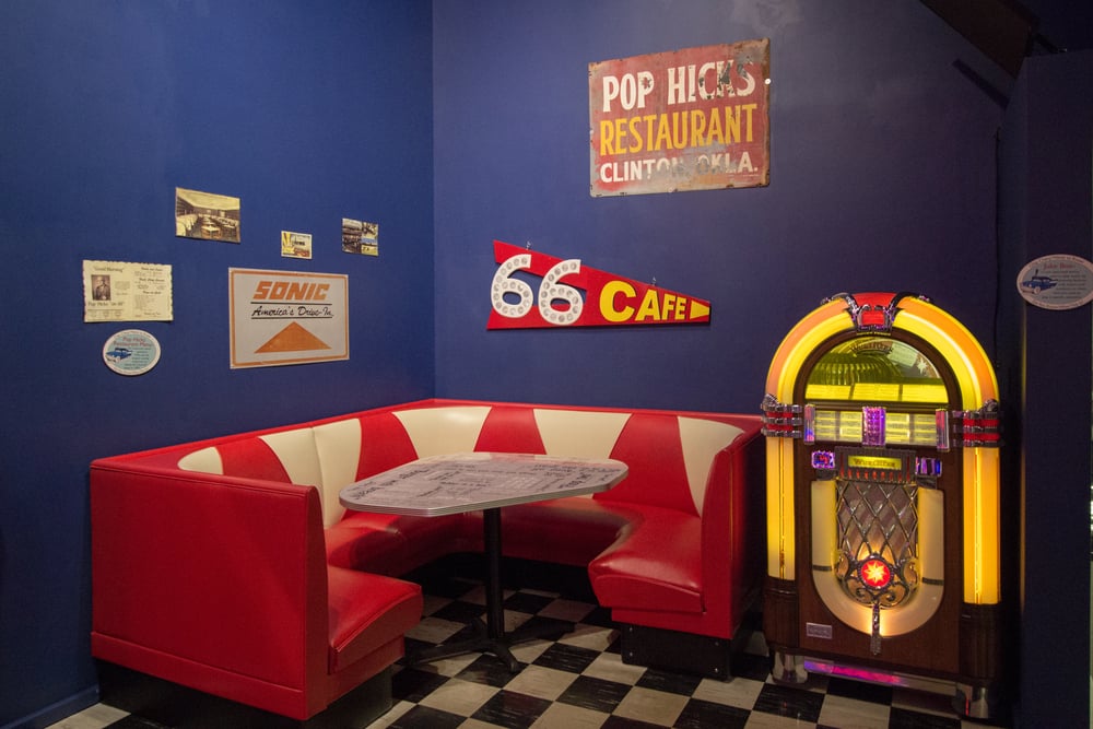
A jukebox in the corner of a room changes the entire social atmosphere of that room — not because of the music it plays, but because of the decision it forces. Someone has to walk over, someone has to choose, and suddenly the table is talking about it.
The digital touchscreen jukeboxes (brands like TouchTunes, which became ubiquitous through the 2010s) scratched that itch badly — too much choice, too little ritual — and so the vintage Wurlitzer aesthetic, bubbling chrome and colored light panels, is filling that gap again in diners that understand what they’re actually selling.
Retro Typography
The fonts of the ’90s diner weren’t designed — they were accumulated. Helvetica on the door, hand-lettered specials on a chalkboard, chrome-extruded letters bolted to the facade: it was typographic chaos that somehow cohered into something legible and deeply American.
New restaurant branding is deliberately reconstructing that layered look, reaching for condensed sans-serifs, thick outlines, and color combinations (red on yellow, white on black) that feel pulled from an old highway roadside stop rather than a brand identity deck.
Chrome Fixtures
Chrome is unforgiving: it shows every fingerprint, every water spot, every smudge left by someone who grabbed the towel rack a little too enthusiastically. And yet restaurants keep specifying it — barstools with chrome legs, coffee stations with chrome detailing, overhead pendant lights in polished chrome that throw light in six directions at once.
There’s something almost disciplined about a material that demands that much maintenance; it signals that the place takes its look seriously enough to polish things.
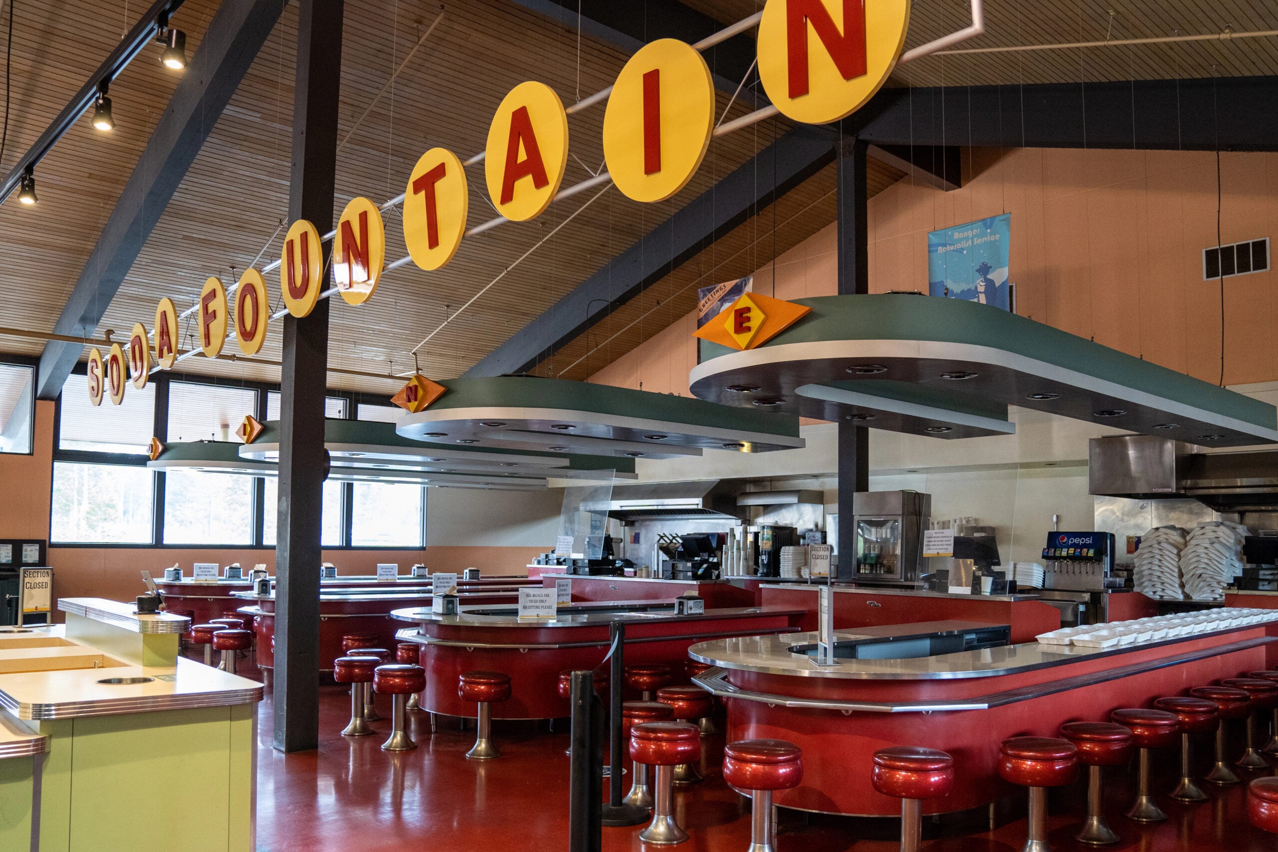
Spinning Barstool Seating
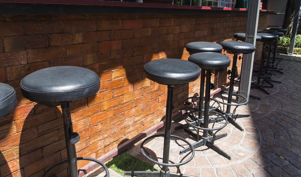
The spinning barstool is one of those design elements that operates on two levels simultaneously — it’s functional seating for a counter, and it’s also just genuinely fun to sit in, which is something most modern restaurant furniture completely forgets to be. New diners are reinstating full counter service with proper spinning stools, and the effect on the room is immediate: people sit differently, lean differently, swivel around to talk to strangers.
The counter becomes a social object rather than just overflow seating.
Laminated Menus
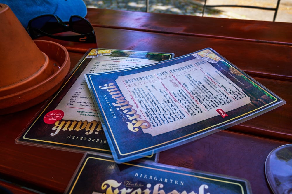
There’s a reason diners kept their menus laminated and picture-heavy for decades: it worked. Digital QR menus — which surged after 2020 and never fully retreated — are now being actively rejected by a growing share of diners who find pulling out a phone to read a menu both cold and faintly exhausting.
The laminated, oversized, photograph-laden menu is returning to restaurant supply orders not as a gimmick but as a genuine preference, the paper equivalent of a firm handshake.
Pie Displays

A rotating glass pie display case is doing active work in a restaurant even when nobody’s looking at it. It speaks to abundance, to homemade effort, to a kitchen that baked something before service and left it out as evidence — and that silent testimony is enormously persuasive, far more than any dessert description printed on a menu.
Diners that have reintroduced the rotating display (often stocked with coconut cream, cherry, and key lime — the same three pies that have anchored that case since roughly 1962) report that dessert attachment rates climb noticeably.
Milkshake Culture
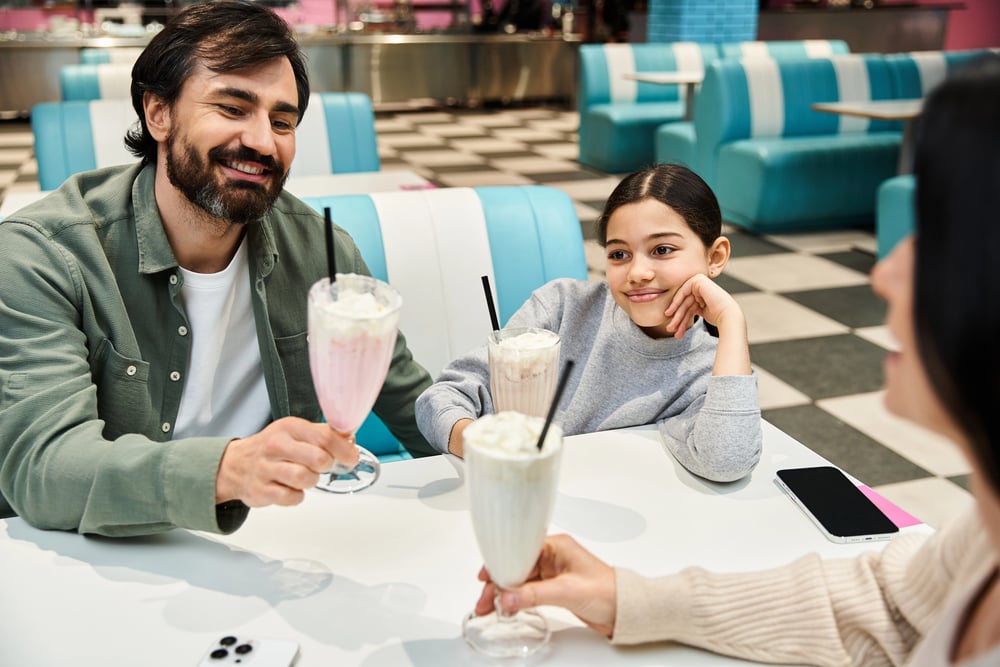
The milkshake is having a moment so extended it barely qualifies as a moment anymore. Stainless steel mixing cups, overfilled glasses with the excess left in the metal for the table, whipped cream piled to an unreasonable height — the presentation is entirely ’90s diner, and it’s filling social media feeds in a way that aesthetically minimal desserts simply don’t.
So restaurants leaning into the revival are doing so with full commitment: cherry on top, paper straw, the whole thing.
All-Day Breakfast
The all-day breakfast menu isn’t a ’90s invention — it predates the decade by generations — but the ’90s diner codified it as an expectation rather than a novelty. Eggs Benedict at 8 PM, pancakes at noon, a Denver omelet ordered alongside a club sandwich: the diner’s refusal to honor the clock is one of its great philosophical positions.
Post-pandemic dining habits, which scrambled traditional meal timing permanently for a significant portion of the population, have made all-day breakfast not just appealing but genuinely necessary for a certain kind of restaurant.
The Open Kitchen Pass
An open pass — where food is plated in full view of the dining room and handed across a counter — was standard in the ’90s diner not as a design statement but because the kitchen was small and the layout didn’t offer another option. Somehow, that constraint produced something better than most planned open kitchens: immediacy, theater, the specific satisfaction of watching your plate travel twelve feet from griddle to your hands.
Newer spots are recreating this deliberately, shrinking the distance between cook and customer.
Comfort Food Menus
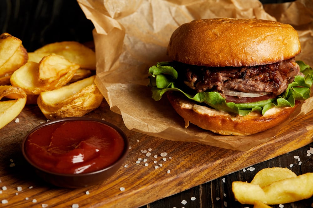
The menu of a great ’90s diner reads like a list of things a person actually wants to eat, which is a higher bar than it sounds. Meatloaf with mashed potatoes, chicken fried steak, grilled cheese with tomato soup, patty melts on rye — these aren’t dishes that require explanation or a server walking you through the concept.
Restaurants across the country are rebuilding menus around exactly this kind of legible, satisfying food, and the response from customers has been loud enough to suggest that a decade of elaborate small plates left a lot of people genuinely hungry.
The Color Palette
The specific color vocabulary of the ’90s diner — teal, cream, cherry red, mustard yellow — is not a palette that happened by accident. It came from a specific moment in American industrial design when plastic laminate technology allowed bold, durable color at low cost, and the result was a visual language that got embedded deeply enough to feel like it belongs to something larger than just a decade.
Designers pulling these colors into modern interiors describe them as “immediate” — they communicate something about warmth and welcome before anyone sits down.
Celebrity and Pop Culture Reinforcement
When a design aesthetic appears in enough television shows, films, and music videos, it stops being a trend and starts being shorthand. The ’90s diner appears — sometimes recreated, sometimes genuinely preserved — in productions ranging from Stranger Things to countless music videos where the director wanted to signal “American, nostalgic, emotionally safe.”
That kind of cultural reinforcement builds genuine demand: people walk out of a theater wanting to sit in a booth under a neon sign, and enough of them act on it to change what restaurants get built.
Social Media Friendliness
The ’90s diner is photogenic in a way that requires almost no effort, which is a significant competitive advantage in 2024. Neon against a dark ceiling, a towering milkshake, a slice of pie on a white ceramic plate beside a coffee mug with a spoon resting across it — these images take themselves, essentially.
And yet the aesthetic doesn’t feel engineered for the camera the way some modern “Instagram restaurants” do; it feels like the camera happened to notice something that was already there, which is a far more persuasive image.
The Anti-Minimalism Shift
Minimalism had a long, confident run, and it’s over. The stark white walls, the single pendant light, the menu printed on recycled cardstock in one typeface — that whole visual philosophy peaked and then began to feel less like restraint and more like indifference, like a room that didn’t particularly want you there.
The ’90s diner is the loudest possible corrective: it has opinions about every surface, none of them whispered, and people are finding that generosity of visual effort genuinely comforting.
Independent Restaurant Resurgence
The indie restaurant scene has been rebuilding steadily since 2021, and the ’90s diner format — relatively low equipment cost, high seat turnover, a menu with manageable complexity — is one of the more practical formats for a first-time operator with limited capital. So the aesthetic revival and the business model revival are arriving together, which is less a coincidence than it looks: when the economics favor a certain kind of restaurant, that kind of restaurant gets built, and then the look follows.
Generational Handoff
Millennials have nostalgia for the ’90s diner because they actually sat in one as children, which is a straightforward emotional mechanism. Gen Z’s relationship with the aesthetic is more interesting — it’s not nostalgia exactly, since most of them were too young to remember the decade with any clarity; it’s more like the appeal of inheriting something worn and characterful rather than buying something new.
The diner becomes a kind of secondhand discovery: familiar without being remembered, comfortable without being theirs.
The Return of Table Service
Table service — a server who comes to you, takes the order, brings the food, refills the coffee without being asked — fell out of fashion for a while, replaced by counter ordering systems and QR codes and app-based experiences that quietly transferred labor from the restaurant to the customer. The ’90s diner never let go of table service, and a growing share of diners are choosing restaurants specifically because a person will come to their table.
Turns out, being waited on is something people enjoy, which is saying something.
Physical Menus as Comfort Objects
A physical menu is a thing you can hold, which sounds trivial until you notice how rarely you get to hold anything in a modern transaction. The laminated diner menu — thick, slightly sticky from decades of handling, with a photograph of a Monte Cristo sandwich on page four — occupies your hands during the minutes between sitting down and deciding, and that occupation has a calming effect that nobody designed into it.
It just happened, through decades of use, to become the thing you hold while you figure out what you want.
Regional Pride and Local Identity
The diner has always been a hyperlocal institution — not a chain, not a concept, not a brand — and its revival is arriving alongside a broader cultural interest in things that belong to a specific place rather than everywhere at once. A diner in Tulsa doesn’t look exactly like a diner in Providence, even when both are working in the same aesthetic register; the regional material inflects the look in small ways, and those small differences are the point.
People are craving restaurants that feel like they could only exist where they exist.
What Stays When Everything Else Goes
Some things hold because they were always better than the alternatives, not because they happened to be fashionable at the right moment. The ’90s diner — its stubbornness, its chromium cheerfulness, its absolute commitment to feeding you something hot and recognizable — was never really gone; it was just waiting for enough people to remember that a booth in a well-lit room with good coffee and a rotating pie case is, under almost any cultural circumstances, exactly where you want to be.
More from Go2Tutors!

- The Romanov Crown Jewels and Their Tragic Fate
- 13 Historical Mysteries That Science Still Can’t Solve
- Famous Hoaxes That Fooled the World for Years
- 15 Child Stars with Tragic Adult Lives
- 16 Famous Jewelry Pieces in History
Like Go2Tutors’s content? Follow us on MSN.