17 Times a Rebrand Confused Everyone and Killed the Product
When companies decide to refresh their image, they’re often walking a tightrope between innovation and alienation. A rebrand can breathe new life into a stagnating product—or it can completely destroy decades of built-up goodwill in a matter of days.
The psychology behind our attachment to familiar brands runs surprisingly deep, with even minor changes sometimes triggering massive consumer backlash. Here is a list of 17 notorious rebrand disasters that left customers confused, frustrated, and ultimately reaching for competitors’ products instead.
New Coke
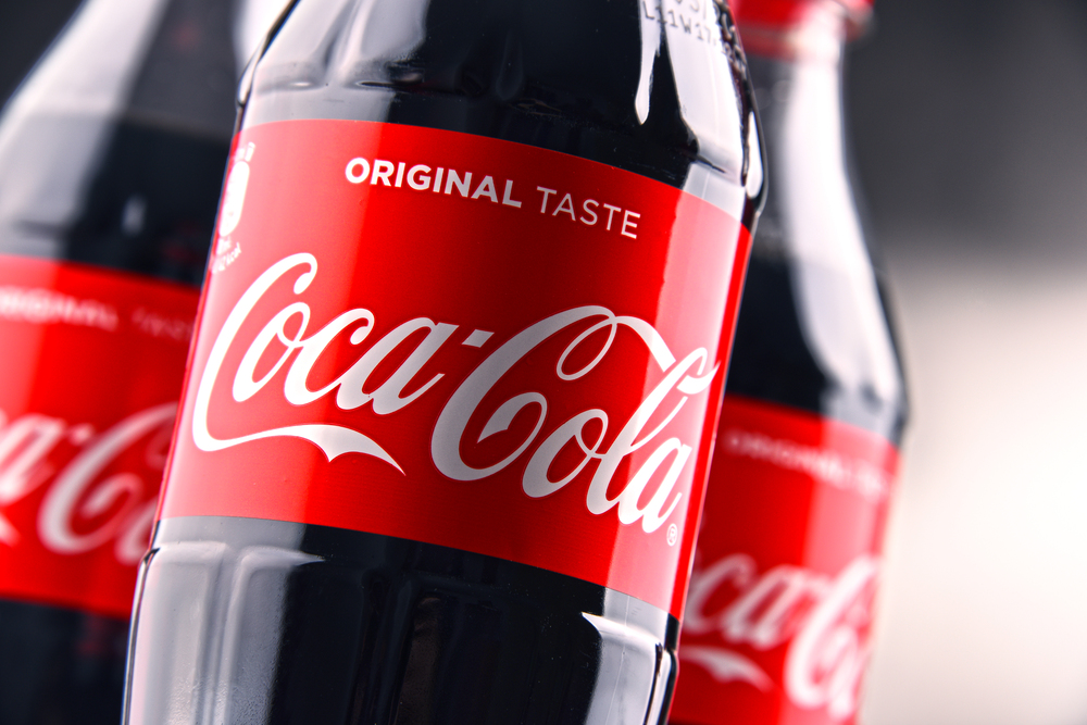
In 1985, Coca-Cola made what many consider the biggest marketing blunder of all time. The company changed its 99-year-old formula to compete with Pepsi’s sweeter taste.
Consumers were outraged at the alteration of their beloved beverage, leading to protests and hoarding of the original product. Within just 79 days, the company was forced to bring back the original formula as “Coca-Cola Classic,” effectively admitting defeat.
Tropicana’s Package Redesign
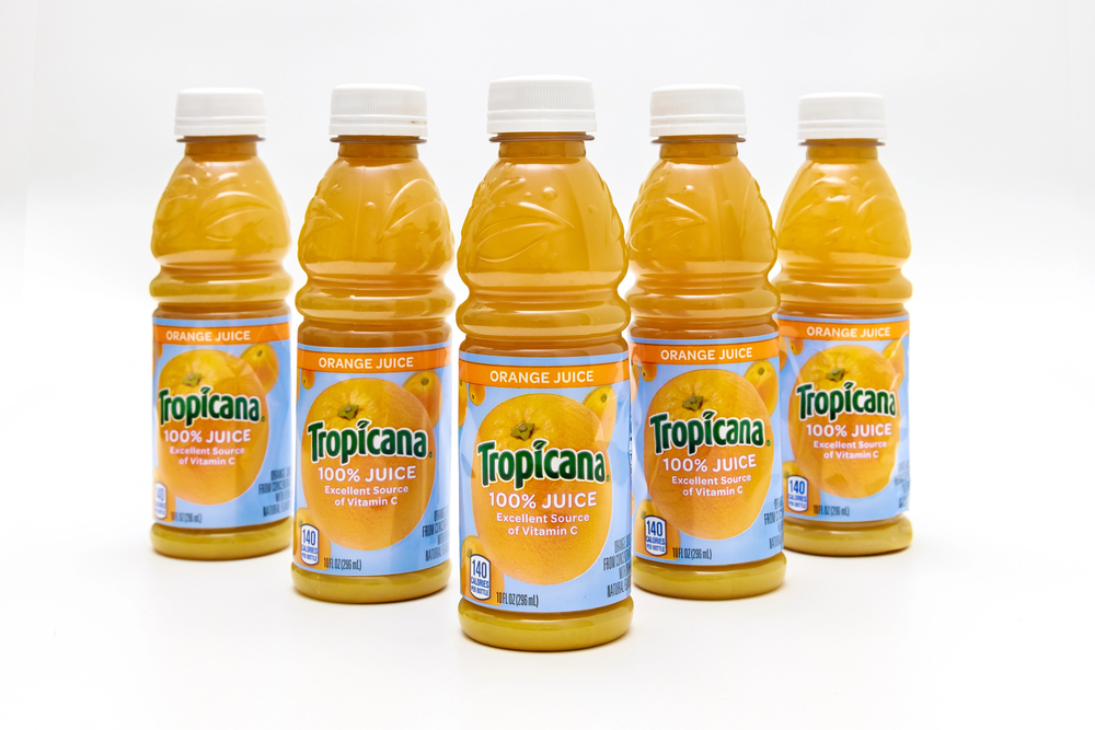
In 2009, PepsiCo made the decision to update Tropicana’s packaging, swapping out the iconic orange for a sleek, simple design that featured a straw. In just two months, sales fell 20% (about $30 million) as a result of the new design being so generic that consumers were unable to identify the brand on shelves.
When the corporation discovered that buyers were emotionally drawn to the iconic image of the orange with the straw, they promptly went back to the original design.
Like Go2Tutors’s content? Follow us on MSN.
Radio Shack to “The Shack”
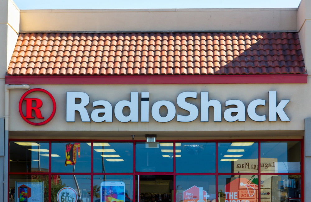
Radio Shack’s attempt to seem hip and contemporary by rebranding as “The Shack” in 2009 only highlighted how out of touch the electronics retailer had become. The awkward nickname failed to address the company’s fundamental problems of outdated inventory and business model.
This superficial change confused longtime customers while failing to attract new ones, accelerating the company’s decline into bankruptcy.
Mastercard’s Symbol-Only Logo
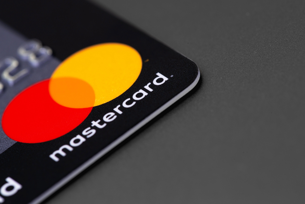
While Mastercard didn’t completely crash and burn, its 2019 move to remove its name from its logo and rely solely on the overlapping circles symbol created unnecessary confusion. Many customers, particularly in international markets, didn’t recognize the symbol-only branding.
The company had to backtrack partially, maintaining the name in many applications while using the symbol-only version selectively.
Gap’s Logo Disaster
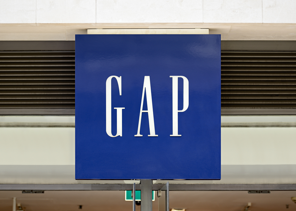
In 2010, Gap unveiled a new logo that replaced its classic blue box with a small blue square and a modern font. The rebrand lasted exactly one week before overwhelming negative feedback forced it to revert to the original.
The company had failed to understand that its logo represented comfort and reliability to its customer base, and the hastily designed replacement seemed cheap and generic.
Like Go2Tutors’s content? Follow us on MSN.
WeightWatchers to WW
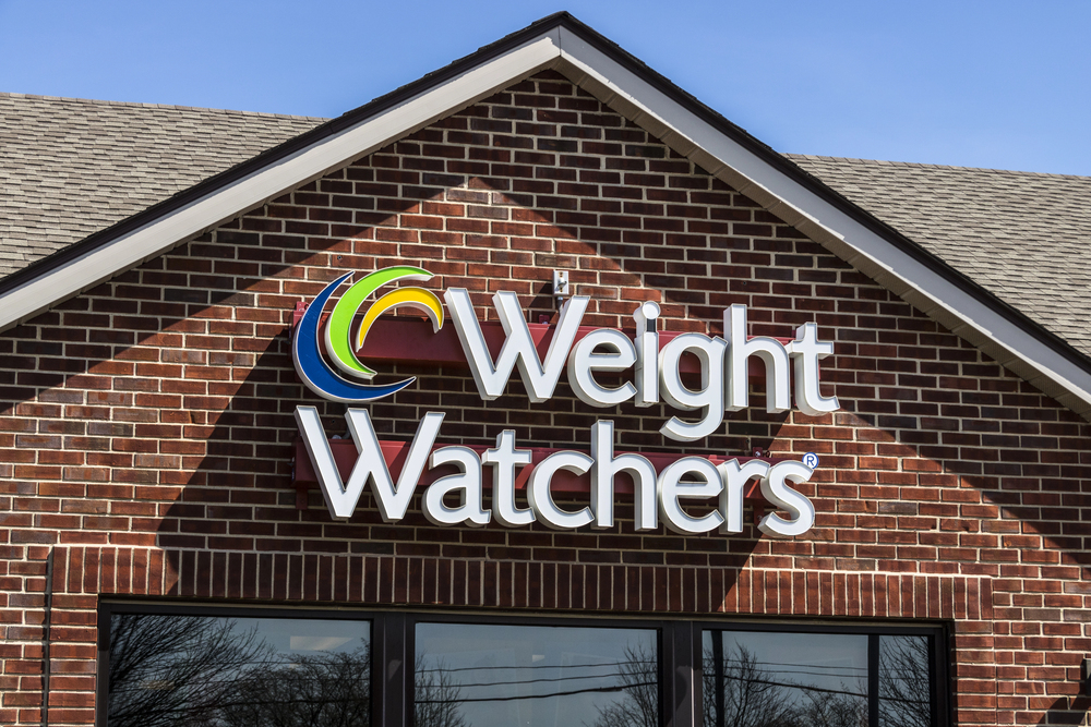
When WeightWatchers rebranded to “WW” in 2018, they hoped to pivot toward wellness rather than just weight loss. Instead, the abbreviated name confused existing customers and failed to clarify what the company actually offered.
The awkward pronunciation (“double-you double-you”) made word-of-mouth marketing nearly impossible, and the company later had to add the tagline “WeightWatchers Reimagined” to explain what WW actually meant.
SciFi Channel to Syfy
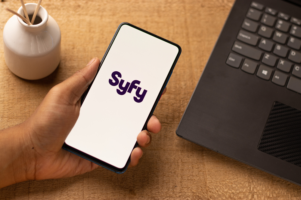
The SciFi Channel’s 2009 rebranding to “Syfy” was meant to produce a distinctive, trademarkable moniker. Regrettably, the new spelling confused devoted viewers and resembled a slang word in many foreign markets.
The change also coincided with a programming shift away from conventional science fiction, so upsetting its core fanbase who believed the channel was forsaking its origins.
Uber’s App Icon Change
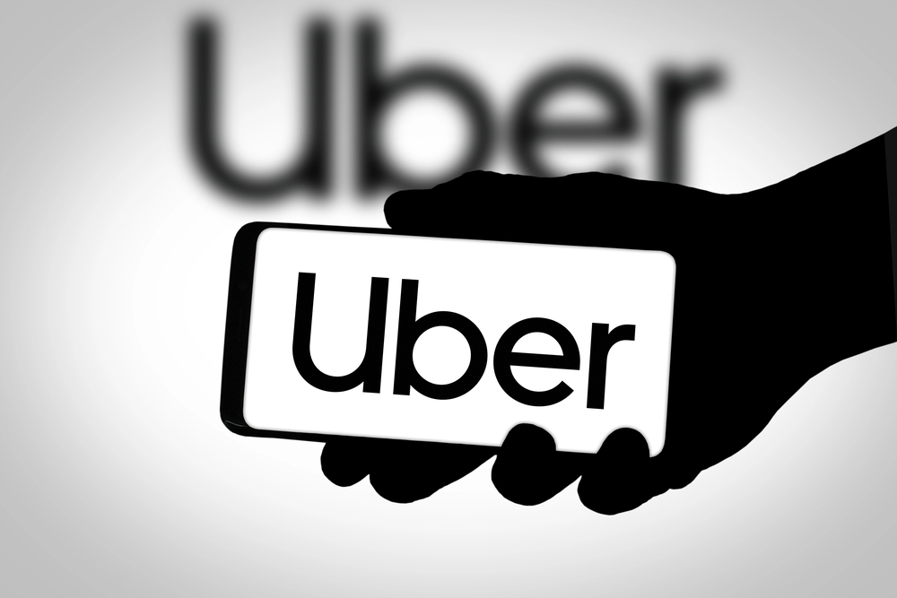
In 2016, Uber replaced its simple “U” logo with an abstract geometric pattern that customers couldn’t recognize on their phone screens. The convoluted explanation about “bits and atoms” connecting cities worldwide fell flat with users who just wanted to hail a ride.
The company eventually returned to a more recognizable design after realizing that simplicity and immediate recognition are crucial for an app-based service.
Like Go2Tutors’s content? Follow us on MSN.
Airbnb’s “Bélo” Symbol
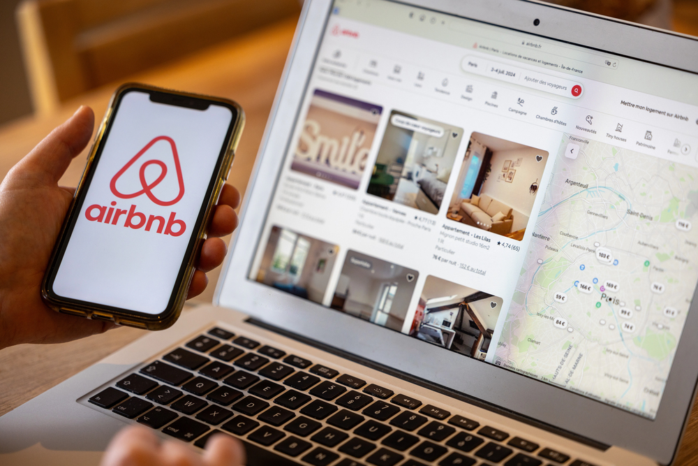
When Airbnb introduced its new logo in 2014—a symbol they called the “Bélo”—the internet immediately noticed its unfortunate resemblance to various body parts. The elaborate explanation about belonging and community was overshadowed by jokes and memes about the logo’s suggestive appearance.
While Airbnb survived the rebrand, the initial reception demonstrated how unintended interpretations can derail even carefully planned rebranding efforts.
Netflix to Qwikster
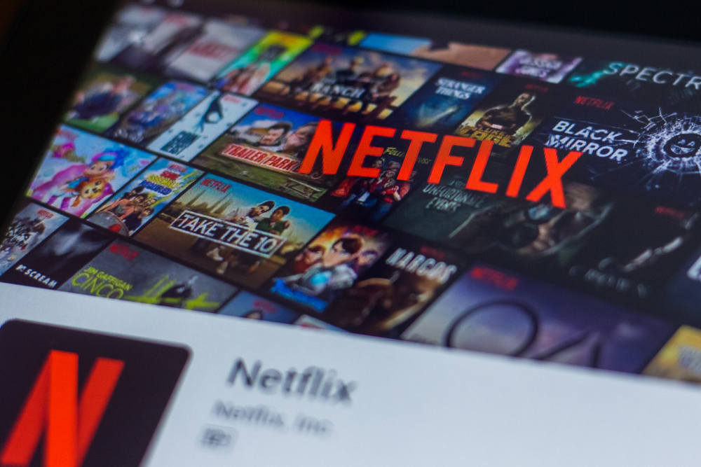
In 2011, Netflix announced it would split its DVD-by-mail service into a separate company called “Qwikster.” The confusing arrangement would have required customers to manage two accounts and pay two separate bills.
The backlash was so severe that Netflix abandoned the plan before it even launched, but not before losing 800,000 subscribers and watching its stock value plummet by 77%.
JCPenney’s Pricing Strategy Rebrand
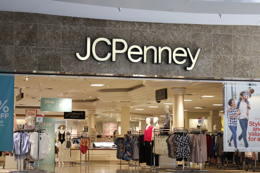
While not a visual rebrand, JCPenney’s 2012 decision to eliminate sales and coupons in favor of “everyday low prices” fundamentally altered its brand identity. Their core customers, who enjoyed the thrill of finding deals, abandoned the store in droves.
Sales dropped 25% in a year, and the company quickly reversed course, but the damage was already done.
Like Go2Tutors’s content? Follow us on MSN.
Holiday Inn’s $1 Billion Mistake
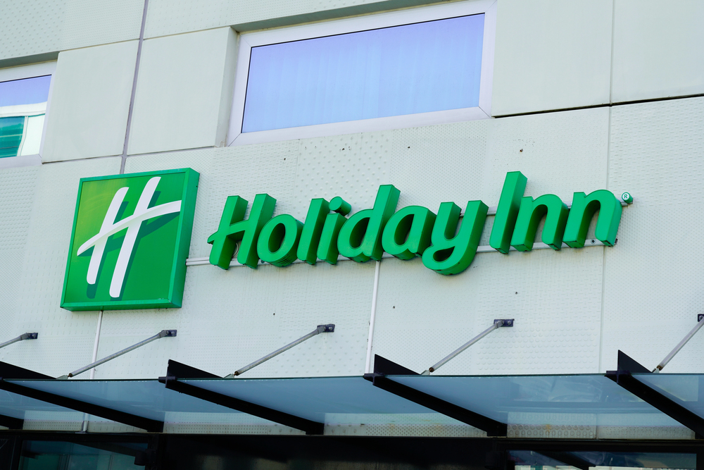
Holiday Inn spent over $1 billion on a rebrand in 2007 that included a redesigned logo and standardized look. The new script-style logo was more difficult to read from a distance on highway signs, a critical flaw for a roadside hotel chain.
The massive investment yielded little return as travelers had trouble identifying their locations, with many franchisees delaying adoption of the expensive new signage.
BP to “Beyond Petroleum”

BP’s 2000 rebrand from British Petroleum to “Beyond Petroleum” with a green and yellow sunflower logo attempted to position the oil company as environmentally conscious. This rebranding rang particularly hollow after the 2010 Deepwater Horizon disaster, making their green claims seem like empty corporate speak.
The disconnect between their messaging and their core business created lasting damage to consumer trust.
Microsoft Zune
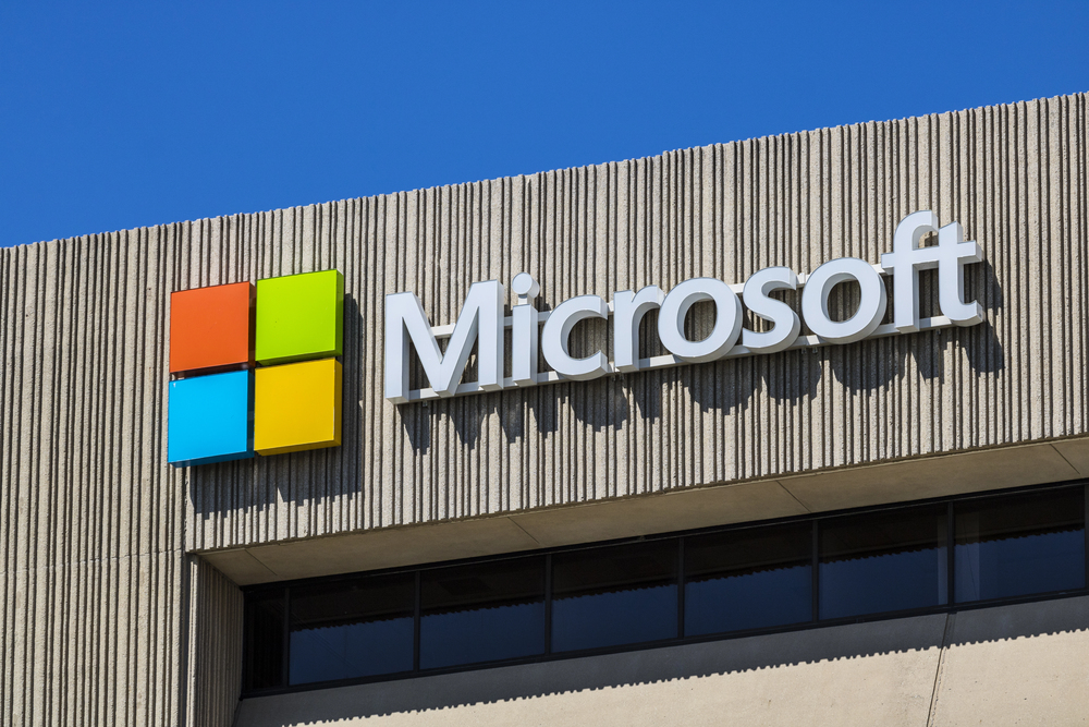
Microsoft’s attempt to compete with Apple’s iPod resulted in the Zune, which underwent a confusing series of rebrands and redesigns during its short life. The constant shifting of the product identity—from the original Zune to Zune HD to Zune Music Pass—made it difficult for consumers to understand what was being offered.
The muddled messaging contributed to poor sales and the product’s discontinuation in 2011.
Like Go2Tutors’s content? Follow us on MSN.
Pepsi’s Logo
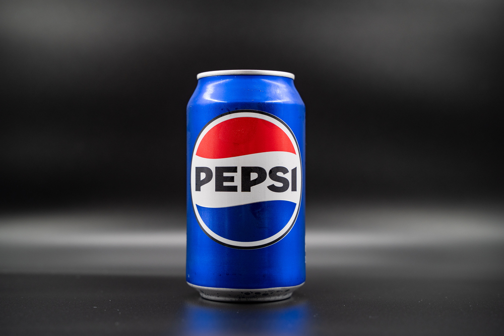
Pepsi has changed its logo numerous times, but its 2008 rebrand was particularly puzzling. The company spent $1 million on a design that looked remarkably similar to the previous one, but tilted the white band to resemble a smile.
The extensive design document, which referenced the golden ratio and Earth’s gravitational field, seemed like overthinking what should have been a simple refresh, resulting in minimal impact for a significant investment.
Overstock to O.co
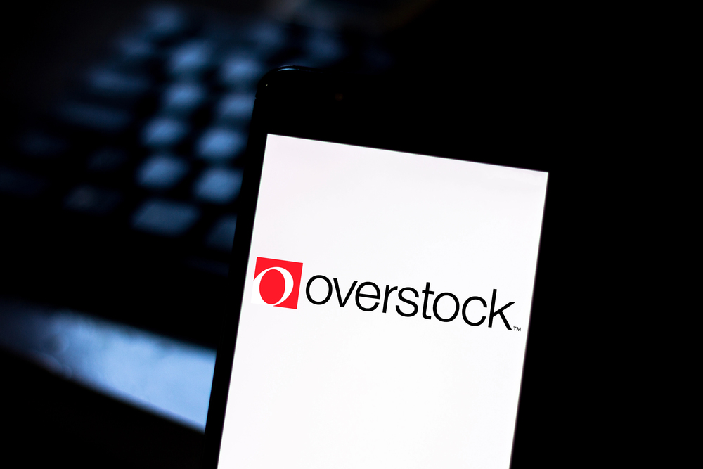
Online retailer Overstock.com briefly rebranded to O.co in 2011, creating immediate confusion. Customers couldn’t find the website, often typing O.com instead. The company quickly backpedaled on the full rebrand, maintaining O.co as a shortcut while keeping the Overstock.com name.
This halfway approach only prolonged the confusion and demonstrated the dangers of abandoning an established domain name.
Royal Mail to Consignia
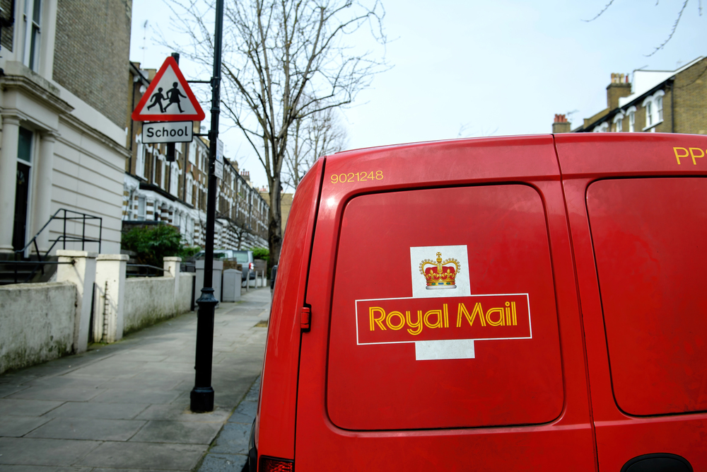
In 2001, Britain’s Royal Mail rebranded as “Consignia” at a cost of £2 million. The meaningless corporate name abandoned 500 years of heritage and recognition.
Public ridicule was swift and merciless, with one politician calling it “a dreadful name, it’s a stupid name.” After just 16 months and millions wasted, the company reverted to Royal Mail, having learned a costly lesson about the value of its historic brand equity.
Like Go2Tutors’s content? Follow us on MSN.
When Rebranding Goes Wrong
These cautionary tales share common threads: disconnection from customer expectations, abandonment of brand equity, and solutions in search of problems. Successful rebrands evolve naturally from a company’s existing strengths while unsuccessful ones often represent desperate attempts to appear relevant without addressing fundamental business issues.
The most disastrous rebrands reveal that companies sometimes forget a basic truth—brands belong not to marketers, but to the customers who have emotional investments in them.
More from Go2Tutors!

- 18 Unexpectedly Valuable Collectibles You Might Have Lying Around
- 20 Little-Known Historical Battles That Had Huge Consequences
- 20 Historical Artifacts That Scientists Can’t Explain
- 15 Inventions That Were Immediately Banned After Being Created
- 20 Actors Who Were Almost Cast in Iconic Roles
Like Go2Tutors’s content? Follow us on MSN.