Unusual Maps That Changed Exploration
Maps have always been more than just tools for getting from point A to point B. Throughout history, certain maps have challenged assumptions, sparked voyages into the unknown, and fundamentally altered how explorers understood the world.
Some were brilliantly innovative, others were spectacularly wrong, but all of them left their mark on the age of discovery. The story of exploration is really the story of maps—each one reflecting not just geography, but the dreams, fears, and wild guesses of the people who made them.
Here is a list of 13 unusual maps that genuinely changed how humans explored the planet.
The Piri Reis Map
Back in 1513, an Ottoman admiral named Piri Reis created something extraordinary in his workshop—a map drawn on gazelle skin parchment that showed the Americas with startling accuracy just 21 years after Columbus first landed there. The map combined information from about 20 different sources, including a now-lost map that Columbus himself had made, and its depiction of South America’s eastern coastline was remarkably detailed for its time.
Only about a third of the original survives today, rediscovered in 1929 at Istanbul’s Topkapi Palace, fundamentally changing how historians understood the early exchange of geographic knowledge between East and West.
Marshallese Stick Charts
Forget paper and ink—Pacific Islander navigators created maps from coconut palm ribs, shells, and fiber that represented something most cartographers never thought to chart: ocean swells. The curved sticks showed how waves bent around islands, and shells marked where those islands sat, with three main types serving different purposes: mattang for training new navigators, meddo for specific routes between islands, and rebbelib for mapping large networks of wave patterns.
Navigators memorized these charts before voyages, then crouched in their canoes to feel the wave patterns through the hull, allowing them to navigate thousands of miles of open ocean.
Like Go2Tutors’s content? Follow us on MSN.
The Waldseemüller Map
In 1507, German cartographer Martin Waldseemüller did something audacious—he slapped the name ‘America’ on a continent for the first time, honoring explorer Amerigo Vespucci. Even more remarkable, his massive wall map speculatively showed a great ocean to the west of the Americas six years before Balboa reached the Pacific in 1513, likely inferred from rumors and Vespucci’s accounts rather than direct observation.
Waldseemüller himself backed away from his bold vision in later maps, removing the name ‘America’ entirely, but by then the name had already stuck.
The Tabula Rogeriana
When you first look at this 1154 masterpiece created by Arab geographer Muhammad al-Idrisi for King Roger II of Sicily, you might think it’s upside down—and by modern standards, it is. Islamic cartographers traditionally oriented their maps with the south at the top, placing Mecca in the most prominent position.
Al-Idrisi spent 15 years creating this work, which calculated Earth’s circumference to within about 10 percent of the modern value and remained the standard for three centuries.
The Hereford Mappa Mundi
At roughly 1.58 by 1.34 meters (5 feet 2 inches by 4 feet 4 inches), this medieval monster from around 1300 is the largest surviving map of its kind, displayed today in Hereford Cathedral, England. The Hereford Mappa Mundi is more like an encyclopedia, religious text, and art installation rolled into one piece of calfskin, showing 420 cities, 15 biblical events, mythical creatures, and even dog-headed people medieval Europeans were convinced existed.
Jerusalem sits dead center because that’s where medieval Christians believed the world’s spiritual heart lay.
Like Go2Tutors’s content? Follow us on MSN.
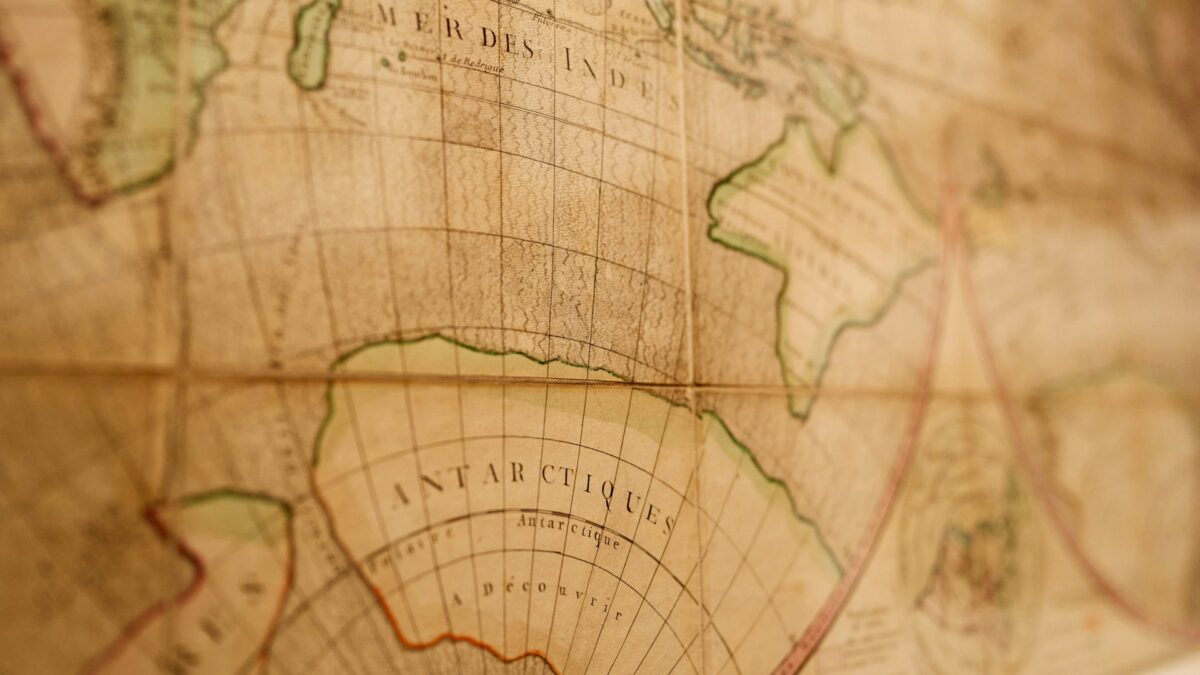
California as an Island
For over a century, European mapmakers depicted California as a massive island floating off the North American coast, and this error sent explorers on wild goose chases throughout the 1600s and early 1700s. Spanish explorer Francisco de Ulloa proved California was a peninsula in 1539, but Father Antonio de la Ascensión’s 1602 report reignited the island myth, which Dutch cartographers embraced wholeheartedly by 1622.
The fantasy persisted on maps until around 1747, when King Ferdinand VI of Spain finally ordered cartographers to end the error once and for all.
Portolan Charts
These were the Google Maps of medieval maritime trade, appearing around the 13th century—with the earliest known example being the Carta Pisana from around 1275 to 1300—and covered in spiderweb-like lines radiating from compass roses that showed sailors exact bearings between ports. Unlike fancy decorative maps made for wealthy collectors, portolan charts were working documents—practical, accurate, and absolutely essential for Mediterranean merchants.
They focused obsessively on coastlines and harbors while pretty much ignoring anything inland, representing a completely different philosophy of mapmaking.
The Fra Mauro Map
Picture a circular map over six feet across, created by a Venetian monk in the 1450s and now preserved at the Biblioteca Marciana in Venice, that accurately suggested Africa could be circumnavigated nearly 40 years before Bartolomeu Dias proved it. The map’s insights came from Arab sailor accounts rather than speculation, and it included Japan appearing on a Western map for the first time.
Fra Mauro oriented his map with south at the top, possibly following Islamic mapmaking traditions, creating a bridge between Eastern and Western cartographic knowledge.
Like Go2Tutors’s content? Follow us on MSN.
The Vinland Map
This map sparked one of cartography’s greatest controversies when Yale University revealed it in 1965, appearing to show that Vikings had reached North America nearly 500 years before Columbus. While the parchment itself dates to the 1400s, the ink contains titanium dioxide in a form not commercially available until the 1920s.
Yale confirmed in 2021 what many suspected: the Vinland Map was a 20th-century forgery, though it drew tremendous attention to genuine Norse exploration history.
The Catalan Atlas
Created in 1375 by Abraham and Jehuda Cresques in Majorca, this stunning atlas represented the cutting edge of medieval mapmaking by focusing on practical information for merchants rather than religious symbolism. Originally consisting of six vellum leaves joined accordion-style, it showed detailed trade routes across the Sahara, marked major trading posts, and included remarkably accurate depictions of Mediterranean coastlines.
The atlas combined portolan chart techniques with information from Arab geographers, creating a multicultural masterpiece that reflected Majorca’s unique position as a crossroads between Christian, Jewish, and Islamic cultures.
Mercator’s 1569 Projection
Gerardus Mercator solved a problem that had plagued sailors for centuries: how to represent a round Earth on a flat map while keeping compass bearings accurate. His projection made all straight lines on the map correspond to actual compass directions, meaning sailors could plot a course as a simple straight line and follow that bearing across the ocean.
The downside was massive distortion near the poles, making Greenland look roughly the same size as Africa when it’s actually about one-fourteenth the size.
Like Go2Tutors’s content? Follow us on MSN.
The Strait of Anian
Europeans were absolutely convinced there had to be a navigable passage through North America connecting the Atlantic and Pacific, and maps from the 16th and 17th centuries confidently showed this mythical waterway supposedly separating Asia from North America. Promoters like John Dee and Sir Humphrey Gilbert created speculative maps showing wide-open seaways to encourage explorers and attract investors hoping to find the fabled Northwest Passage.
While the strait as depicted never existed, the searches did lead to increased knowledge of northern geography—and the name became loosely associated with what we now know as the Bering Strait.
The Juan de la Cosa Map

In 1500, Spanish cartographer Juan de la Cosa created what’s considered the oldest surviving map showing the New World, drawn in ink and watercolors on large parchment and now preserved at the Museo Naval in Madrid. De la Cosa had actually sailed with Columbus on his first and second voyages, so he had firsthand knowledge of what he was depicting, notably labeling South America as ‘Tierra Firme.’
What’s particularly valuable is how it documents the very earliest phase of European exploration in the Americas, showing coastlines that were only just being discovered.
When Maps Point Forward

These unusual maps remind us that exploration has always been a conversation between what we know, what we guess, and what we desperately want to believe. Some maps like the Piri Reis and Al-Idrisi’s work pushed geographic knowledge forward through careful synthesis, while others like the California-as-an-island maps sent explorers chasing illusions.
Whether accurate or mistaken, beautiful or purely functional, each of these unusual maps shaped the course of exploration and expanded humanity’s understanding of the world we inhabit.
More from Go2Tutors!

- 16 Historical Figures Who Were Nothing Like You Think
- 12 Things Sold in the 80s That Are Now Illegal
- 15 VHS Tapes That Could Be Worth Thousands
- 17 Historical “What Ifs” That Would Have Changed Everything
- 18 TV Shows That Vanished Without a Finale
Like Go2Tutors’s content? Follow us on MSN.