Product Designs That Set the Gold Standard
Some products just work. Not in a flashy way, not because they come with a manual the size of a novel — they work because someone thought hard about what people actually need and then got out of the way.
These are the designs that other designers study, that get referenced in lectures, and that people still use decades after they launched.
The Chair That Changed How We Think About Sitting
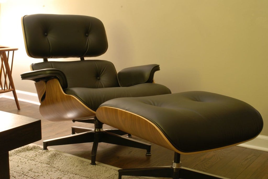
The Eames Lounge Chair, designed by Charles and Ray Eames in 1956, remains in production today. That alone says something. It was built around the idea that a chair should feel like a baseball mitt — broken in, comfortable, shaped around the person using it.
The molded plywood and leather combination wasn’t just aesthetic. It was a direct response to what the body actually needs when it rests.
The design has never needed a major update because it got the fundamentals right the first time.
A Bottle That Doesn’t Leak, Drip, or Confuse

A shape so plain it seems like an accident. Yet hold it once, then suddenly the one-handed twist feels natural, fluid even. Filling? A wide top means no spills, no fuss.
Cleaning slips right through, smooth each time. Nothing snaps off. Not a hinge, not a tube, nowhere near fragile.
Over weeks, months maybe, it fades into routine – no hiccups, no attention drawn. The quietest tool wins by vanishing.
The Keyboard That Remained
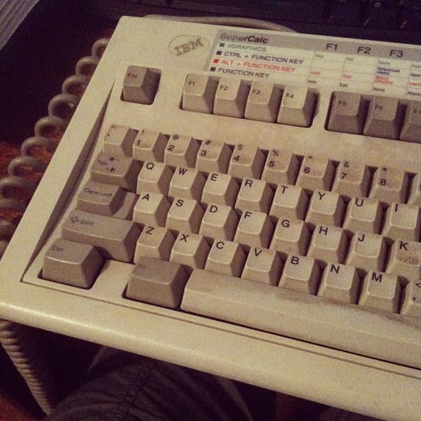
Even today some folks stick with IBM’s 1984 Model M keyboard. To hook it up to new machines, they grab special adapters instead of switching gear. That distinct snap under your fingers comes from springs that buckle when pressed – sharp feedback plus a crisp sound.
Enthusiasts swear by the feel because it hits just right. Built tough, not cheap – that machine wasn’t made to meet a budget.
Even today, some machines built in the 1980s run fine with zero upkeep. If a thing keeps going after its maker has moved on, then maybe – just maybe – it got the blueprint right.
When A Phone Changed What Phones Could Do
Touchscreens existed before 2007. So did phones with smart features. Yet Apple stepped back, looking at the whole picture differently.
Removing buttons freed up space, making room for one big display instead. Skeptics doubted people would type well on glass.
They questioned whether users would adapt. Still, the gamble paid off faster than expected.
Soon, everyone else followed, redrawing their plans around touch. Simplicity won, even when experts said it wouldn’t.
What mattered most wasn’t the details on screen. Getting out of the way came first – so intent could move freely.
Scissors Built to Never Wear Out
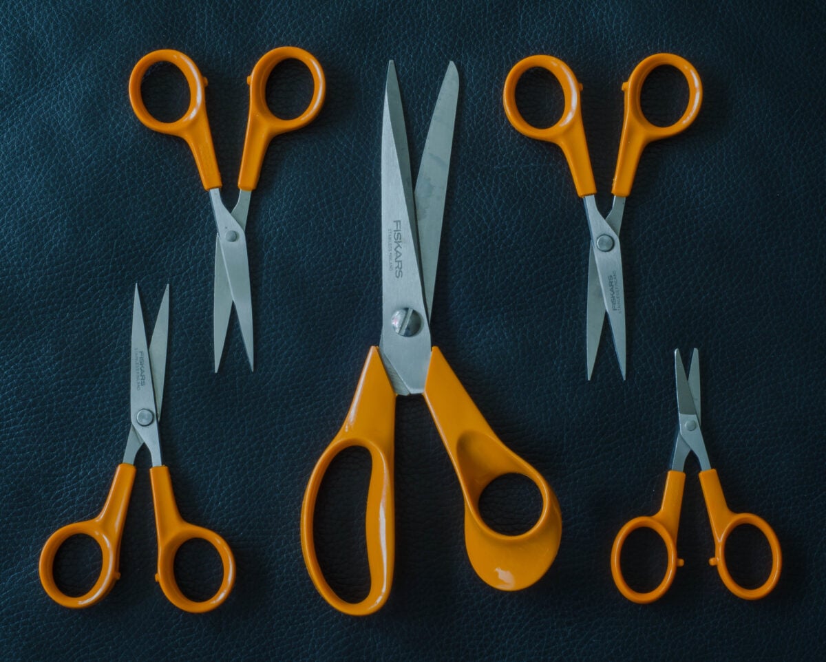
Orange-handled shears arrived by Fiskars in 1967. Long before “ergonomic” popped up everywhere, those grips fit hands naturally. Sharpness held firm thanks to stainless steel, combined with a precise grind.
Cost kept them within reach – meant for regular folks, not specialists. Still today, that bright orange grip stands out – exactly as it did before.
Made just like they always were, these shears do one job without fuss. Because they work right, yet cost little, folks keep coming back.
The Toothbrush That Made Sense
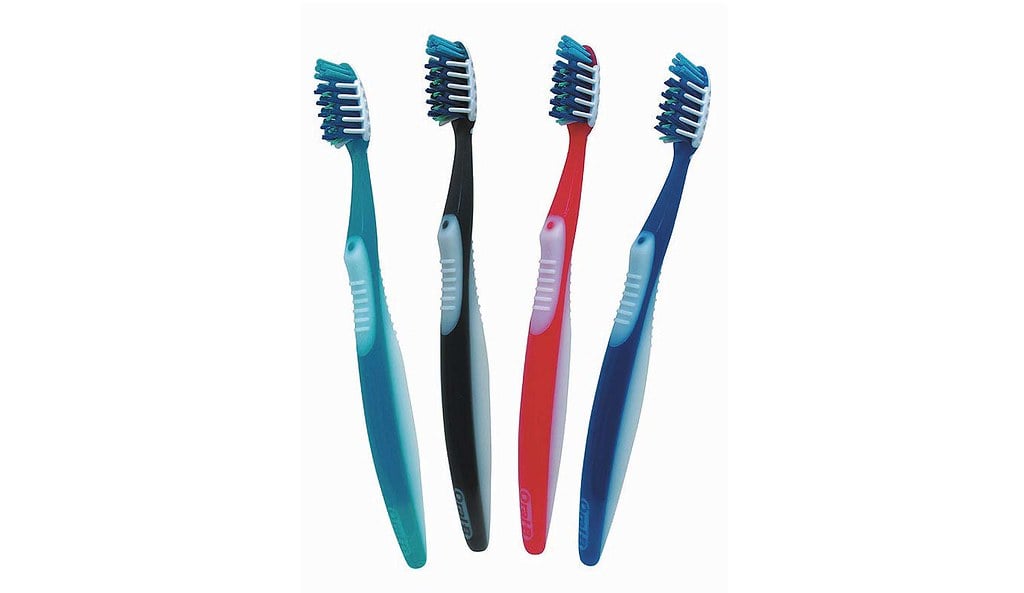
That tangle of bristles on Oral-B’s CrossAction head? Not random. Each tilt follows studies showing where gunk hides near gums and between molars. While straight-up brushes handle flat zones, this shape dives into corners.
Looks busy – because tooth decay isn’t tidy. Clever fixes sometimes seem excessive… right up until they work exactly as needed.
Luggage That Holds Its Shape

Bumps run across the outside of the Rimowa aluminum case. Not there for show – these ridges hold purpose.
Strength comes to slim metal panels because of them, yet nothing extra gets added in bulk. Nearly a century ago, that idea took shape.
Plane-building methods sparked it all back then. A single design sticks out at every terminal, unchanged through years.
Because form follows function so clearly here, it appears as if nothing else could ever fit.
A Lamp That Moves With You

Even though Luxo Jr. comes from Pixar’s imagination, the actual lamp inspired by Jac Jacobsen’s 1937 creation remains wildly imitated. Because of its parallelogram arm, the light stays flat no matter how you adjust it.
Wherever you shift it, that spot sticks. While countless budget copies flood the market, something about the original’s smooth motion feels unmatched.
Its lasting edge shows precision matters more than looks. Engineering like this doesn’t shout – just works.
The Bag That Fits Every Place

A quiet shape meets the hand when you pick it up – no mark, no name stamped on front. Inside, space without clutter takes over; zippers and thick linings stay away where they aren’t needed. Built like that on purpose: let function speak instead of flair.
You carry what matters, nothing fights back. Weight stays low, almost forgettable against your side.
Time passes, yet seams hold tight, fabric resists wear. Strength hides in choices most won’t notice.
Loyalty grows not from show, but from showing up, again and again.
Flatware Designed to Fit the Hand
Heavy ends of Iittala’s Ego cutlery, shaped by Alfredo Häberli, fall slightly behind midpoint – making them settle right in hand. Feels small? Try flimsy utensils once; suddenly it matters.
Each bite feels different because of how mass moves through the tool. Touch beats looks when it comes to lasting design, even if sight grabs first.
Getting that balance takes more doing, yet sticks around longer in memory.
A Car That Redefined Utility

Beauty was never the goal for the first Land Rover Defender. On a Welsh shoreline in 1948, someone drew lines in the sand – not for show, but because farmers needed something tough.
Its squared frame and straight metal sheets weren’t about looks; they kept costs low, repairs simple out where tools are scarce. Yet somehow, by refusing to pretend it was anything but functional, it turned into legend.
A machine that ignores fashion yet ends up shaping it – now that doesn’t happen often.
The App That Replaced Lists

Blocks were the big idea behind Notion’s design – each bit of content, like words, pictures, tables, or task lists, became a movable piece. Most earlier tools locked users into fixed layouts chosen by developers.
With Notion, control shifted. The layout wasn’t decided ahead of time.
People began seeing documents differently – not as static pages but as flexible spaces. This shift didn’t come from breakthrough tech.
A fresh mindset did it instead.
The Thermostat Learning Your Habits
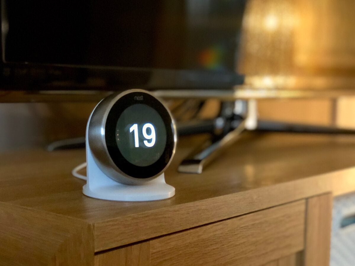
Out of nowhere, the Nest Learning Thermostat arrived in 2011 and stood out right away. Shaped like a circle, it broke pattern while most gadgets stuck to sharp corners.
Instead of making you set rules, it watched how you lived then adjusted on its own. Its display stayed clean – just facts, no clutter, nothing extra ever popped up.
Something hidden inside your walls suddenly felt important. The thermostat, once ignored, became clear, clean, simple – mainly because it was no longer messy or dull.
Most folks forgot how annoying it used to be until now. A fix arrived quietly, changing what everyone overlooked.
The Ones That Last

Restraint ties every item here together. Problem fixed, job done – that was the limit.
Not one button exists just because someone liked it in a conference room. Features never crept in to pad value on paper.
Looks didn’t chase trends that fade fast. Choices had logic behind them, solid enough to stand up to questions.
After that, silence spoke louder than claims. Focusing like that isn’t as easy as most assume.
Yet this alone decides whether something gets used – or stays recalled.
More from Go2Tutors!

- 16 Historical Figures Who Were Nothing Like You Think
- 12 Things Sold in the 80s That Are Now Illegal
- 15 VHS Tapes That Could Be Worth Thousands
- 17 Historical “What Ifs” That Would Have Changed Everything
- 18 TV Shows That Vanished Without a Finale
Like Go2Tutors’s content? Follow us on MSN.