16 Symbols We See But Misread
They’re everywhere — on keyboards, road signs, food labels, legal documents, old books. You pass over them dozens of times a day without a second thought.
But most people, if asked what a symbol actually means or where it came from, would either guess wrong or go blank. These aren’t obscure academic relics. They’re the symbols hiding in plain sight that almost everyone misreads, misnames, or misunderstands.
The Ampersand (&) Isn’t Just a Fancy “And”

Most people treat the ampersand like a stylish shorthand for the word “and.” And it is — but it’s also a lot more specific than that.
The symbol is a ligature, meaning it was formed by fusing two letters together. In this case, the letters e and t from the Latin word et, which means “and.”
If you look at older, more calligraphic versions of the ampersand, you can actually see the e and the t still nestled inside the shape. The name itself is strange too.
It comes from the phrase “and per se and” — meaning “& by itself means and” — which schoolchildren used to recite when running through the alphabet. Over time, “and per se and” got slurred into “ampersand.”
The @ Symbol Has Nothing to Do with the Internet

Before email made it famous, the @ symbol had a long and practical history as a commercial unit. Merchants used it to mean “at the rate of” — as in, 10 apples @ $0.05 each.
Some historians trace it back even further, to monks who used it as an abbreviation for the Latin preposition ad, meaning “at” or “toward.”
When Ray Tomlinson chose it for email addresses in 1971, he picked it partly because it was the only symbol on the keyboard that wouldn’t appear in a person’s name. A useful accident.
The Hashtag (#) Is Called an Octothorpe

Most people know this symbol as the pound sign, the number sign, or — more recently — the hashtag. But its proper name is the octothorpe.
The “octo” part refers to its eight endpoints. The “thorpe” part is more debated, with competing theories ranging from a Norse word for village to a playful invention by Bell Labs engineers in the 1960s.
Before Twitter made it a cultural fixture, the octothorpe had a quiet life on telephone keypads and in proofreading, where it means “insert space here.”
The Percent Sign (%) Isn’t a Division Problem

The percent sign looks like a fraction, and in a sense it is. But where it came from is messier.
Medieval merchants wrote “per cento” (meaning “per hundred”) in financial documents, and over time the phrase got compressed and abbreviated until the two zeros from “cento” detached and wrapped around a slash, giving us the % we use today.
What trips people up is the conceptual part. “50% of 200” and “200% of 50” give the same answer, but those phrasings feel wildly different — and that confusion causes real errors on tests, in cooking, and in financial decisions more often than most people admit.
© Doesn’t Mean “Copyrighted Forever”

The copyright symbol is widely misunderstood. Seeing it on something doesn’t tell you how long that protection lasts, who owns it, or whether you can use it.
Copyright protections vary by country, by the type of work, and by when it was created.
In the United States, for example, works published before 1928 are in the public domain regardless of whether they carry a © symbol. Slapping © on something also doesn’t grant legal protection by itself in many jurisdictions — registration matters.
The symbol signals intent, not ironclad ownership.
® and ™ Are Not Interchangeable

People use these two symbols almost randomly, but they mean very different things. The ™ symbol can be used by anyone claiming rights to a name, logo, or slogan — no registration required.
It’s a declaration, not a legal certification.
The ® symbol, by contrast, can only be used once a trademark has been officially registered with the relevant government body. Using ® on an unregistered mark isn’t just incorrect — in many countries, it’s illegal.
The Section Sign (§) Is Older Than You Think

That double-S looking symbol (§) shows up most often in legal documents, pointing to a numbered section of a law or code. You’ll see it in footnotes, statutes, and academic papers.
Lawyers read it aloud as “section” — as in, “see §14 of the contract.”
It’s called the silcrow or section sign, and its origins go back to medieval scribes who used a doubled-S as shorthand for signum sectionis, Latin for “sign of section.”
It’s one of those symbols that has barely changed in function over more than five hundred years.
The Pilcrow (¶) Marks Where You Can’t See

The paragraph mark — that backwards P with a double stem — is called a pilcrow. In most modern software, it’s the symbol that appears when you turn on “show formatting” in a word processor.
Each pilcrow marks where a paragraph ends and the formatting instructions for that block are stored.
Medieval scribes used it in manuscripts to mark new sections of text, often drawing it in red ink to make it stand out. In print, it became invisible — but in digital text, it’s still doing the same job in the background.
The £ Sign Doesn’t Come from the Letter L
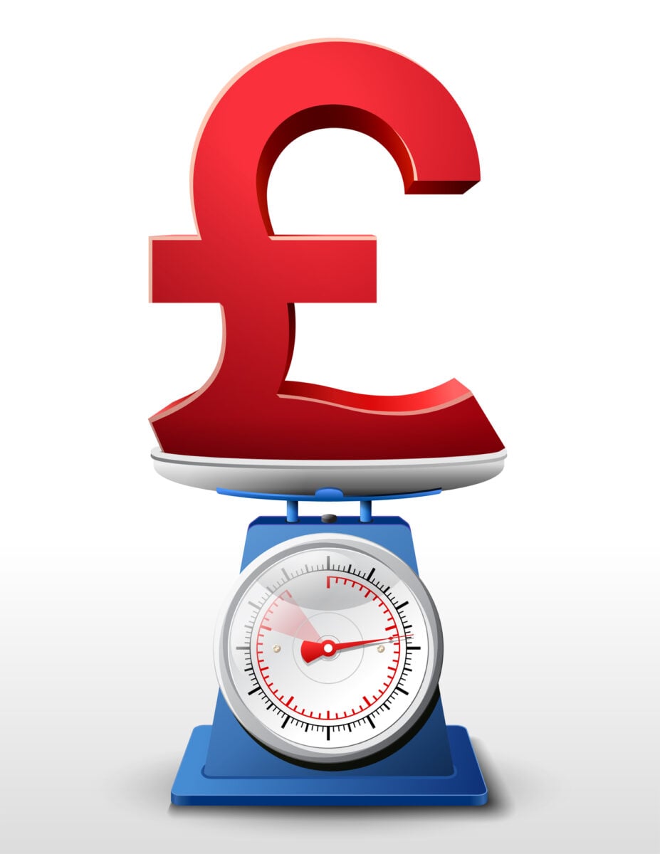
The British pound sign looks like a stylized letter L, but it’s actually derived from the letter L standing for libra — the Latin word for scales, and also the unit of weight from which the pound got its name.
The word “pound” itself traces back to the Latin libra pondo, meaning “a pound by weight.”
So when you write £50, you’re tracing a line back to Roman scales and medieval monetary systems, all compressed into a single character.
The Euro (€) Was Designed by Committee
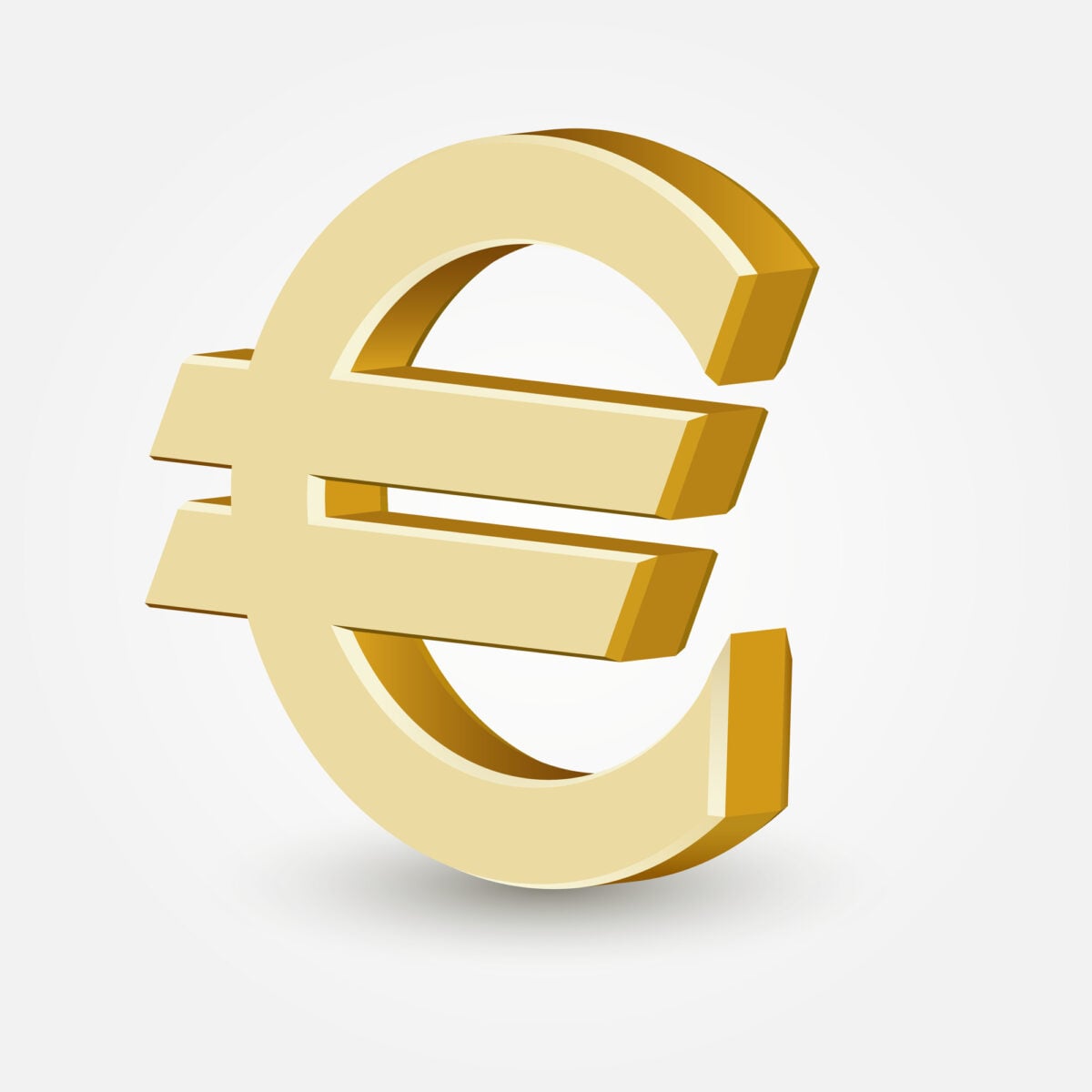
The euro sign was introduced in 1999, making it one of the youngest major currency symbols. It was designed to evoke the Greek letter epsilon (ε), referencing the birthplace of European civilization.
Two horizontal bars were added to signal stability.
The official design was chosen by the European Commission from a shortlist of ten candidates. While the commission claims the symbol was designed in-house, a Belgian graphic designer named Alain Billiet has long maintained he created it.
The dispute has never been fully resolved.
The Division Sign (÷) Is Not Universal

The obelus (÷) is what most English-speaking countries use to indicate division. But in many parts of Europe — particularly Germany and Scandinavia — that same symbol traditionally meant subtraction.
Those countries used a colon (:) for division instead.
This creates real confusion in international math textbooks and software. The ISO standard actually discourages the use of the obelus for division entirely, recommending a slash or fraction bar.
Yet it remains on every standard keyboard.
The Infinity Symbol (∞) Is Called a Lemniscate

The sideways figure-eight representing infinity is called a lemniscate, from the Latin for “ribbon” or “bow.”
The mathematician John Wallis introduced it in 1655, though why he chose that shape isn’t entirely clear.
Some historians suggest it came from the Roman numeral for 1000 (which was sometimes written as CIƆ and used to mean “many”). Others think it was borrowed from the Ouroboros, the ancient symbol of a snake eating its own tail.
In mathematics, infinity isn’t a number — it’s a concept. Two things described as “infinite” can still be different sizes, which is one of the more genuinely strange corners of set theory.
The Asterisk (*) Has a Name That Means “Little Star”

A tiny star shape has traveled through time from old Greece – its name, asterisk, rooted in asteriskos. This mark began long ago, showing up in aged texts where scribes needed to point things out.
Often it highlighted changes or additions on a page. Attention followed wherever it appeared.
Nowadays you’ll find it doing all sorts of jobs – what it stands for shifts based on where you see it. When used in written work, it points to extra notes at the bottom of a page.
Math turns it into a sign for times. Inside code or data systems, it might stand in for every item or match any letter or number. Casual writers drop it in place of blocked-out words or to show how something should be said. One shape, yet each situation gives it a fresh role.
The Tilde Means More Than Just About

Around thirty minutes might show up as ~30 minutes online, where folks toss in the tilde like it means about. Yet that’s just a modern habit, loose and quick.
Turns out, this squiggle has bounced around quite a bit over time.
A squiggle above n makes an ñ in Spanish, shifting how the sound comes out. One value might look like another – that connection often uses the tilde in math.
Home folder? That spot on a computer sometimes hides behind this symbol. Sounds that come through the nose in speech can carry its mark too. Yet in formal logic, that symbol stands for not. A single mark pulls off six separate tasks.
The Caret Points Up With Varied Meanings

Pointing skyward, the symbol ^ brings thoughts of rising or higher placement. Found in editing work, its role shows where something new fits into text.
Power notation pops up when math enters the scene – take 2^3, standing for two raised three steps high.
Computing twists its usual sense completely. Within various coding systems or terminal prompts, this mark signals either an exclusive OR logic check instead of a string’s start point.
The term traces back to Latin, rooted in “caret,” suggesting absence – pointing out gaps within written lines long ago.
The Pilcrow’s Lost Companion The Interrobang

Surprise mixed with curiosity – why not one mark instead of two? That thought led Martin Speckter, a man working in ads back in 1962, to sketch something new.
His idea merged both the gasp and the ask into a single shape. Instead of piling ?! on top of each other like cluttered notes, writers could now grab meaning in one go.
Punctuation took a quiet leap when he introduced it. Not many caught on fast, yet the symbol stuck around quietly.
One moment it showed up in certain fonts during the sixties and seventies. After that came a spot in Unicode.
Then silence, almost. Hardly anyone has actually used it. Still, the kind of phrase it fits – like “You did what‽” – keeps happening in talk among folks. That feeling is real. Just not the mark itself.
Knowing the Form Without Knowing Why

That strange feeling comes from sharing your days with marks you’ve met again and again but never learned to name. A symbol sitting quiet on a business card, doing its job without fanfare.
Hidden in legal papers, one odd glyph stands apart, unnoticed by most. At the close of each block of words you write, another mark waits just out of sight.
Just because you recognize something doesn’t mean you grasp it. These sixteen marks show how deep stories hide inside simple shapes.
When the meaning clicks, they shift from unnoticed clutter to odd little doorways – each one leading backward. A shape once ignored now hums with older life.
More from Go2Tutors!

- The Romanov Crown Jewels and Their Tragic Fate
- 13 Historical Mysteries That Science Still Can’t Solve
- Famous Hoaxes That Fooled the World for Years
- 15 Child Stars with Tragic Adult Lives
- 16 Famous Jewelry Pieces in History
Like Go2Tutors’s content? Follow us on MSN.