17 Brand Logos Designed to Manipulate You Without You Realizing
The logos that surround us daily aren’t just random designs meant to look appealing—they’re carefully crafted visual tools designed to influence our perceptions and behaviors. Major corporations invest millions in developing logos that trigger specific emotional responses, build trust, and ultimately drive consumer decisions.
These subtle psychological manipulations work beneath our conscious awareness, affecting how we perceive brands and make purchasing choices. Here is a list of 17 brand logos that employ clever psychological tactics to influence consumers.
These designs demonstrate how visual elements can be weaponized as powerful marketing tools that speak directly to our subconscious minds.
Amazon’s Smile
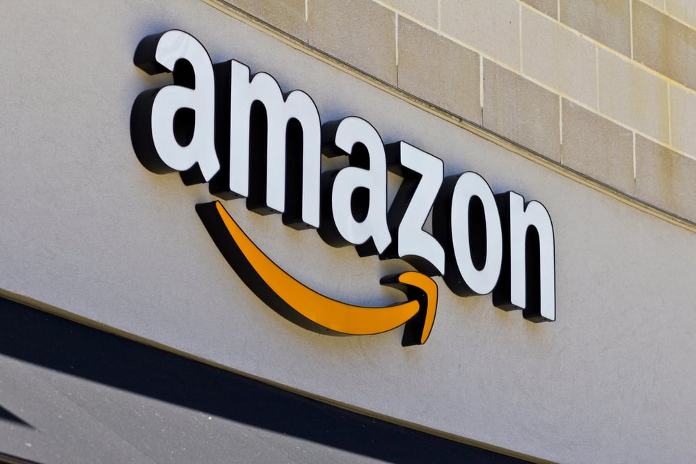
Amazon’s logo features a curved arrow connecting the letters A and Z, creating a smile that suggests the company offers everything “from A to Z.” This simple design does double duty by forming a friendly smile and signaling the breadth of their product range.
FedEx’s Hidden Arrow
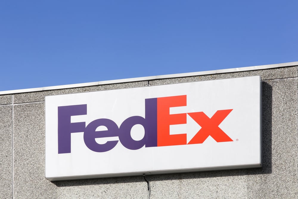
The FedEx logo contains a subtle arrow formed by the negative space between the E and X. This clever detail communicates movement, speed, and precision—even if most people only notice it subconsciously.
Like Go2Tutors’s content? Follow us on MSN.
Baskin-Robbins’ Hidden 31
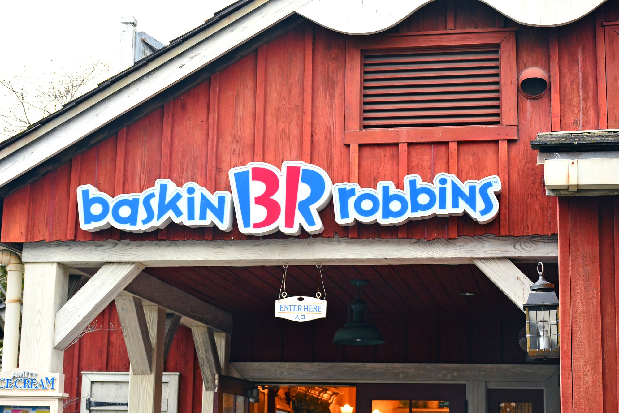
Baskin-Robbins hides the number “31” in the initials “BR,” referencing their original thirty-one flavors. This small discovery delights viewers and reinforces the playful, indulgent nature of the brand.
Apple’s Forbidden Fruit
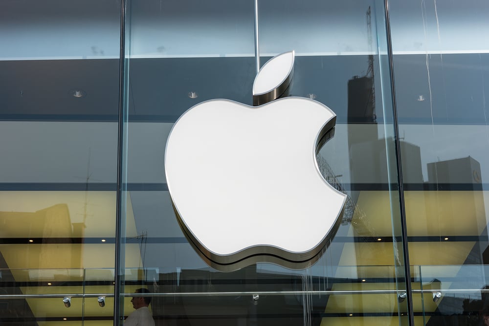
Apple’s bitten apple logo subtly references the biblical story of forbidden knowledge. It evokes temptation, innovation, and rebellion—while the bite also cleverly suggests a digital “byte.”
Coca-Cola’s Script
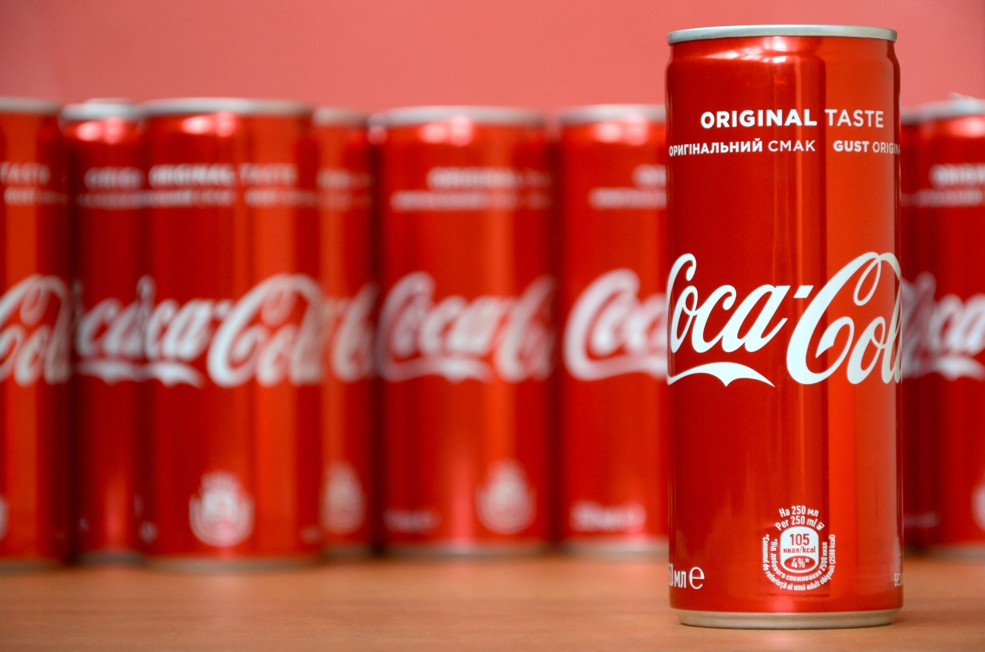
The flowing cursive script of the Coca-Cola logo conjures nostalgia, happiness, and familiarity. Curved shapes and the bold red color activate emotional centers that associate the brand with joy and refreshment.
Like Go2Tutors’s content? Follow us on MSN.
Nike’s Swoosh
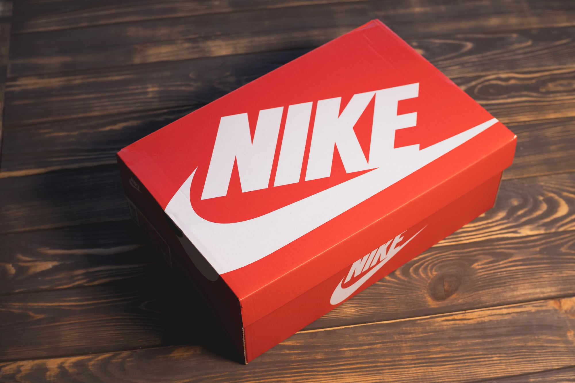
The Nike swoosh symbolizes movement, speed, and victory through its wing-like, upward-curving shape. Its minimalism lets consumers project their own aspirations onto it, giving the logo deep personal resonance.
Starbucks’ Siren
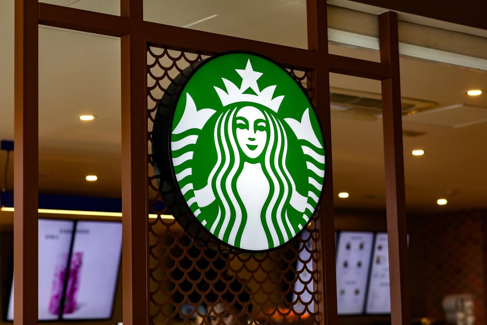
Starbucks uses a siren from Greek mythology to suggest irresistible temptation. The green circular logo also conveys freshness, community, and relaxation—beyond just a cup of coffee.
Target’s Bullseye
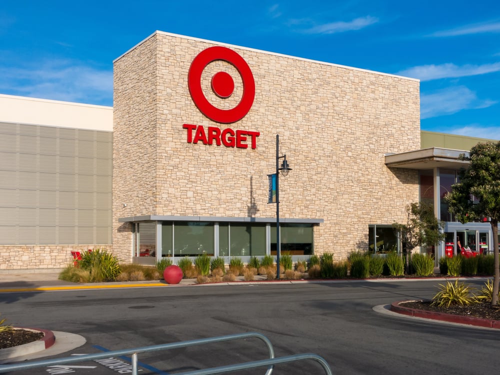
Target’s red bullseye uses concentric circles to attract attention and symbolize precision. The round, simple design is both inviting and instantly recognizable.
Like Go2Tutors’s content? Follow us on MSN.
NBC’s Peacock
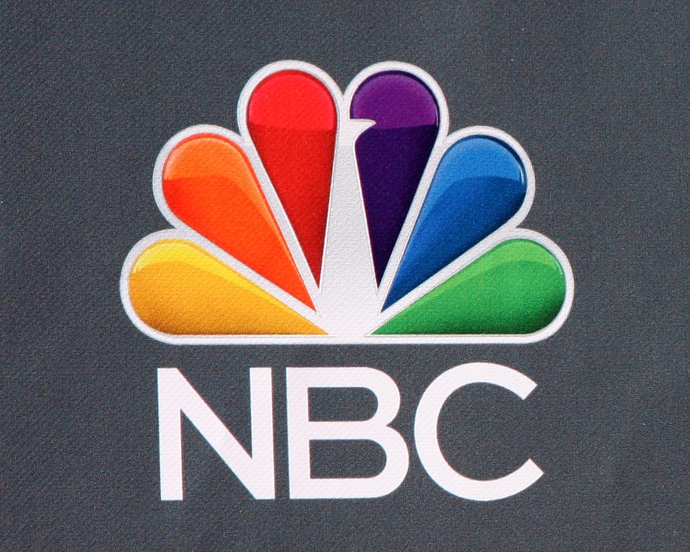
NBC’s colorful peacock implies variety, diversity, and forward-thinking. Its open feathers echo the drama of a stage curtain while the rainbow hues celebrate vibrancy and creativity.
Walt Disney’s Signature
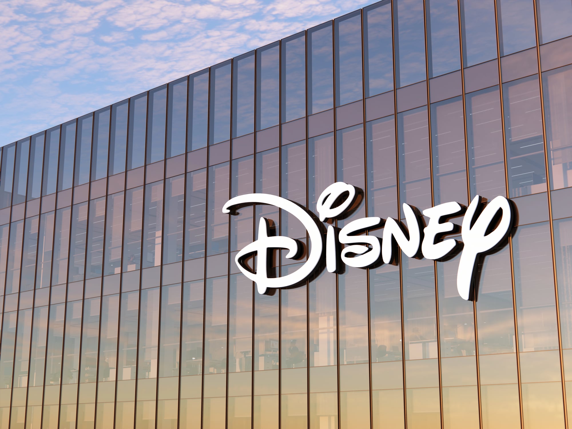
The Disney logo resembles Walt Disney’s signature, creating a personal, imaginative touch. The whimsical lettering invites viewers into a world of magic and storytelling.
Mercedes-Benz’s Three-Pointed Star
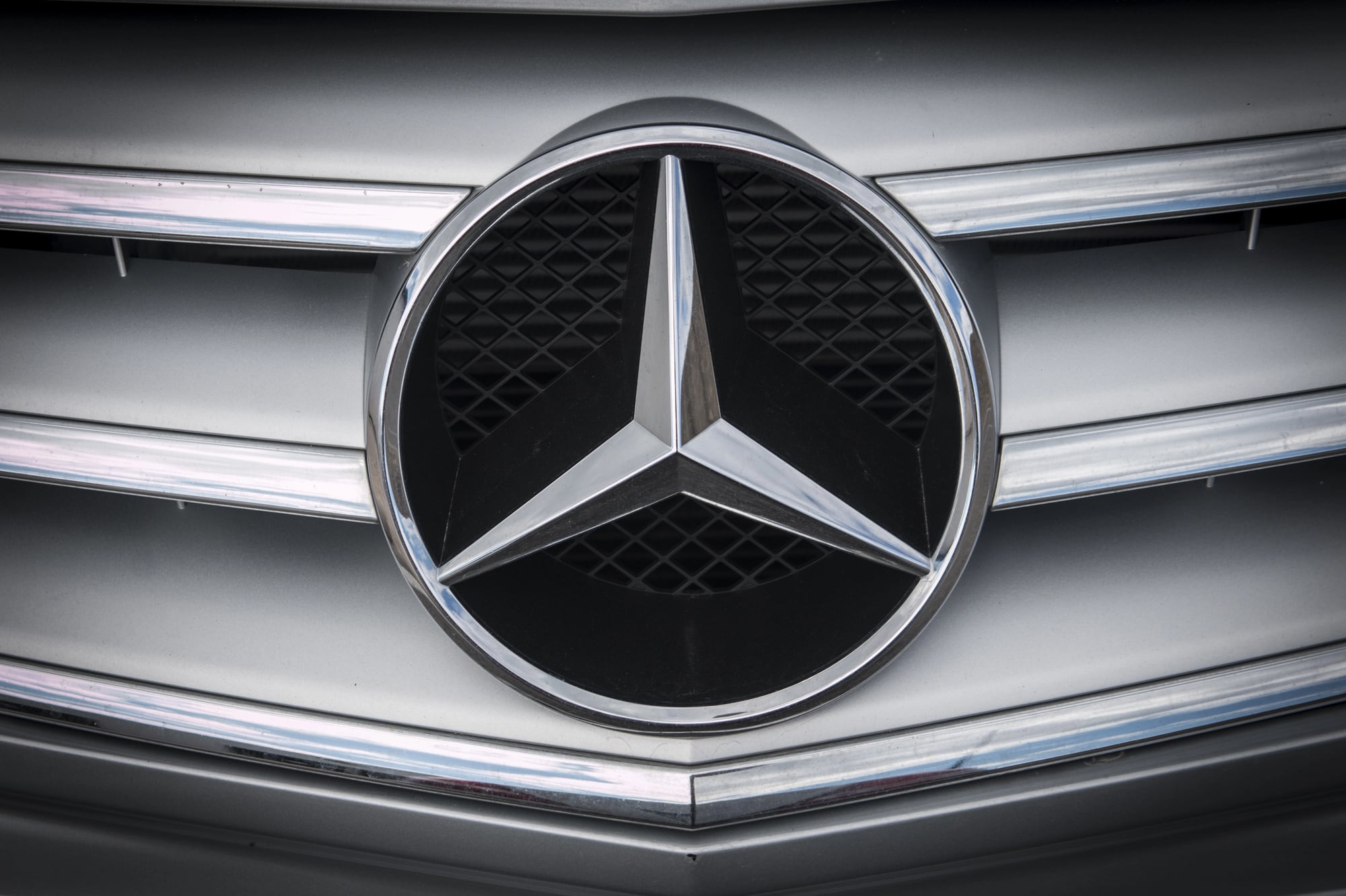
Mercedes-Benz’s star represents dominance over land, sea, and air. Its sleek, silver geometry signals precision, luxury, and global ambition.
Like Go2Tutors’s content? Follow us on MSN.
Twitter’s Bird
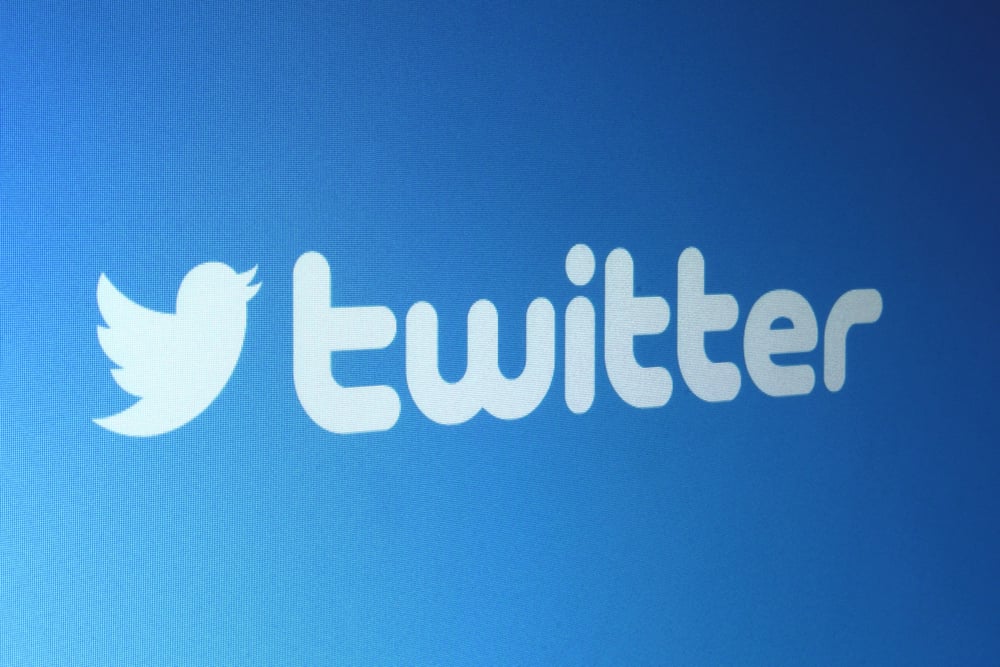
Twitter’s upward-facing bird represents communication that’s quick, light, and forward-moving. Its simple blue form exudes trust, openness, and optimism.
Toblerone’s Mountain
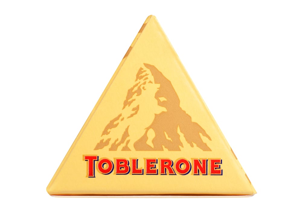
Toblerone’s logo hides a bear in the Matterhorn mountain, honoring its Swiss origins. This discovery aligns with the chocolate’s unique triangle shape, enhancing brand memorability.
Adidas’ Three Stripes
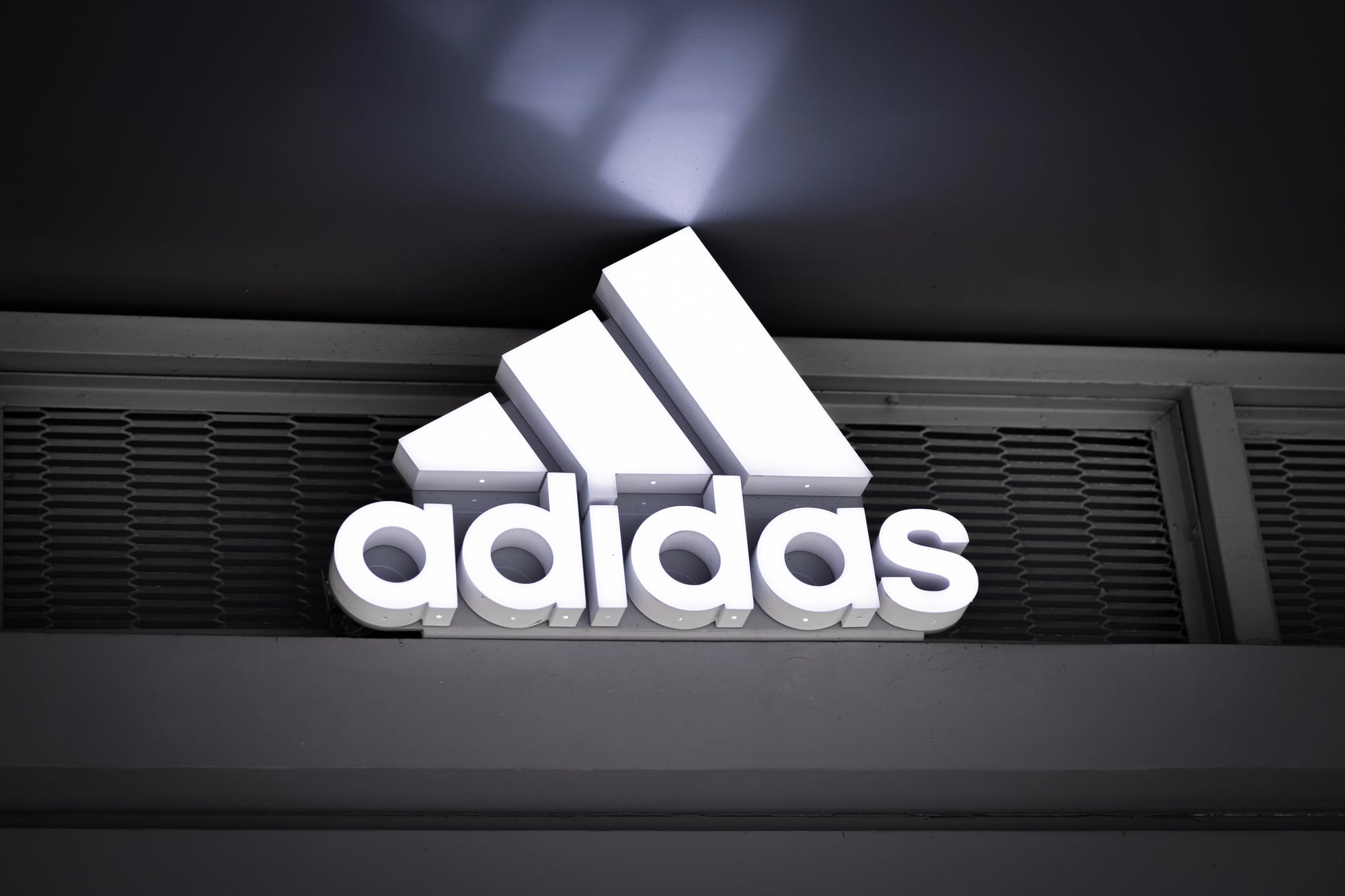
Adidas uses three ascending stripes to symbolize athletic progress and challenge. The clean, rhythmic design allows for instant global recognition without needing words.
Like Go2Tutors’s content? Follow us on MSN.
Pepsi’s Yin-Yang Circle
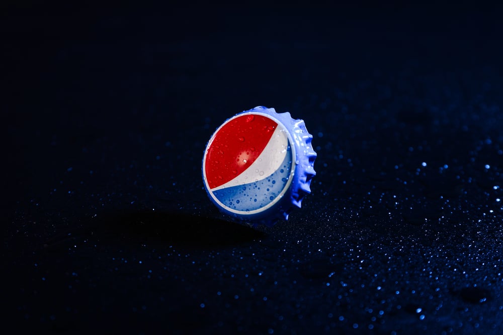
Pepsi’s circular logo incorporates a wave-like yin-yang shape suggesting harmony and motion. The red, white, and blue palette evokes American identity while geometric proportions create subconscious appeal.
Unilever’s U of Symbols
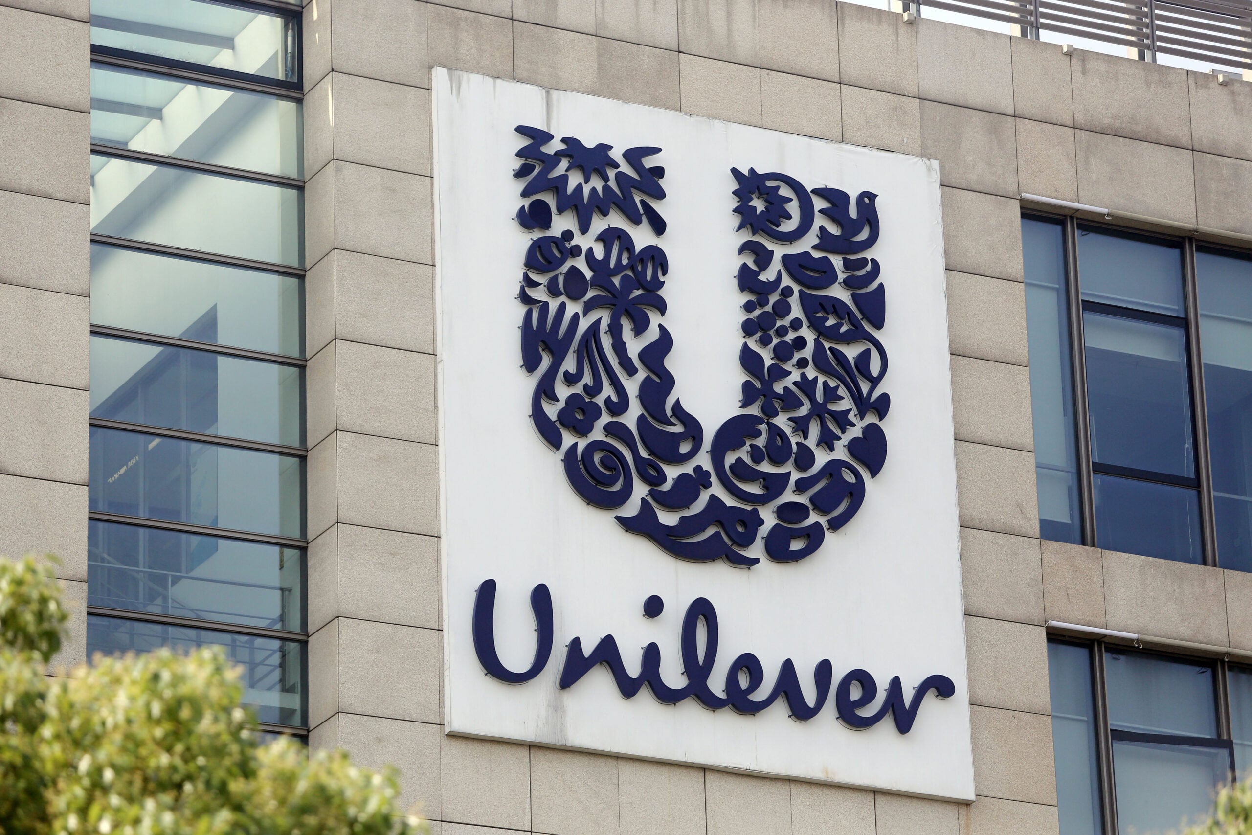
Unilever’s logo forms a “U” from dozens of mini icons representing their values and product categories. This visual narrative conveys diversity, care, and sustainability through carefully chosen imagery.
LG’s Winking Face
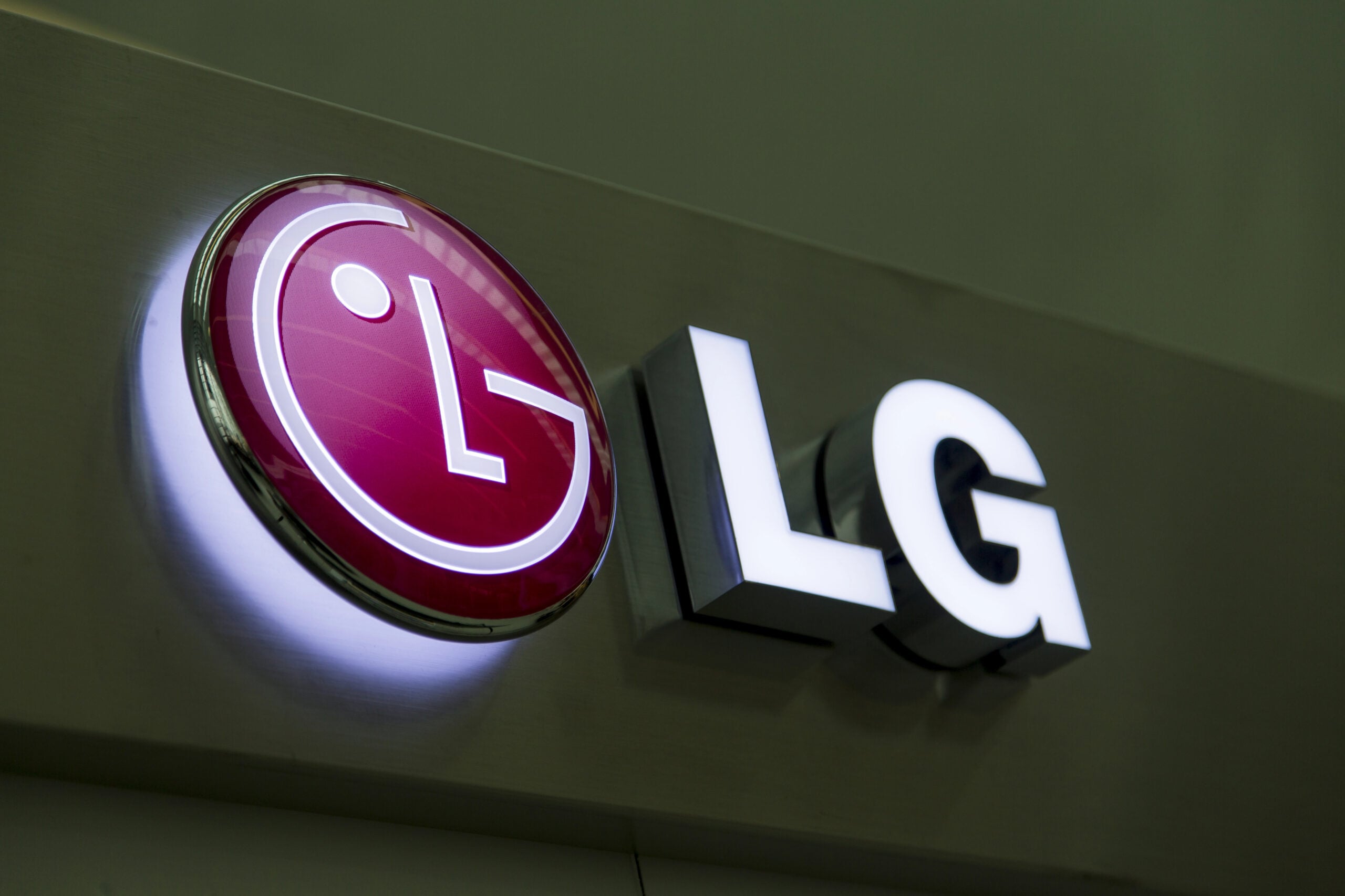
LG transforms its initials into a stylized human face, tapping into our innate ability to recognize facial features. The wink and smile reinforce friendliness and trust, while the round red form adds warmth and harmony.
Like Go2Tutors’s content? Follow us on MSN.
The Psychology Behind the Pixels
These logos aren’t just images—they’re engineered tools that shape how we feel and think. Through subtle design cues, they forge emotional connections, spark recognition, and influence decision-making, often without us realizing it.
More from Go2Tutors!

- 18 Unexpectedly Valuable Collectibles You Might Have Lying Around
- 20 Little-Known Historical Battles That Had Huge Consequences
- 20 Historical Artifacts That Scientists Can’t Explain
- 15 Inventions That Were Immediately Banned After Being Created
- 20 Actors Who Were Almost Cast in Iconic Roles
Like Go2Tutors’s content? Follow us on MSN.