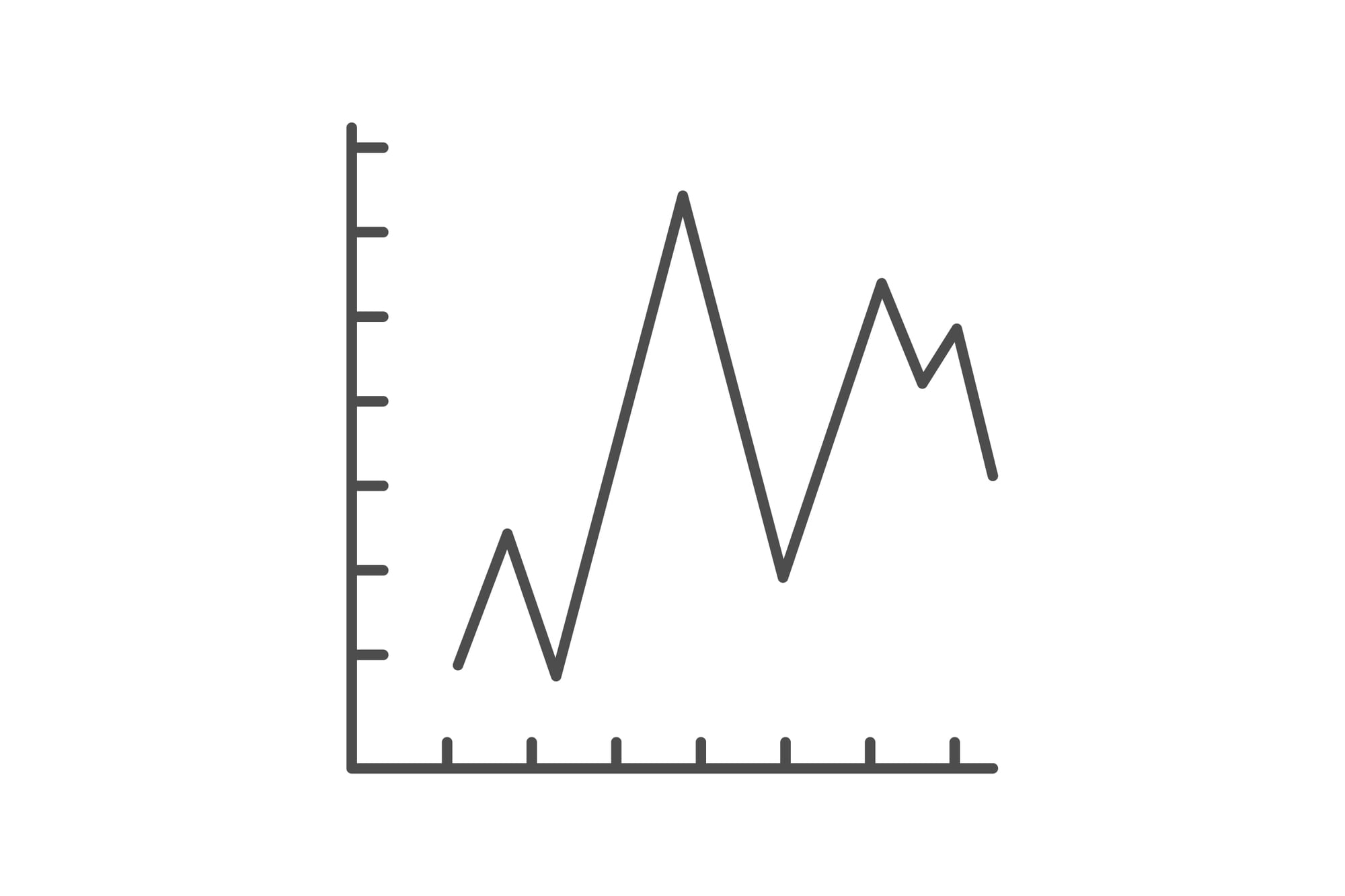
Common Charts That Hide Important Details
Look at a chart, see how clear things seem. Colors spread across lines, one look, an idea clicks – no long explanations needed.
Yet behind that ease hides something tricky. What appears on screen was picked carefully.
Some details stay, others go without notice. Not every pick means harm.
A few aim straight at confusion instead. What trips people up most?
Misleading graphs seem perfectly fine at first glance. Following standard layout rules, complete with labeled axes and clean design.
Yet the scale gets stretched, certain periods are handpicked, while key background details vanish – twisting the message hiding behind numbers.
Spotting those moves becomes easier once your eyes adjust. Suddenly, the patterns pop out all around.
Truncated Y-Axis Charts
The Y-axis is where most visual manipulation happens. When a chart starts the vertical axis at a number other than zero, small differences look massive.
A company’s revenue might increase from $10 million to $10.5 million, but if the Y-axis starts at $9.5 million, that tiny bump looks like explosive growth.
This technique shows up constantly in corporate presentations, political campaigns, and news graphics. The chart isn’t technically lying.
The numbers are accurate. But the visual impression is completely distorted.
Your brain processes the height of the bars or the steepness of the line before it registers the actual values.
Pie Charts With Too Many Slices
Pie charts work when you have three or four categories. Beyond that, they become useless.
When a pie chart has eight or ten slices, especially if several are similar in size, you can’t tell what’s actually significant.
Your eyes can’t accurately compare angles and areas the way they can compare heights or lengths.
Marketers love cramming too many categories into pie charts because it looks comprehensive. Every stakeholder gets represented.
But the result is a colorful circle that communicates almost nothing.
The smallest slices disappear, medium slices all blur together, and even the largest slice doesn’t look as dominant as it actually is.
Dual-Axis Line Graphs

Dual-axis graphs plot two different metrics on the same chart using separate Y-axes. One metric uses the left axis, another uses the right.
This setup lets you show two trends that wouldn’t normally fit together because their scales are wildly different.
The problem is that you can make any two variables look correlated by adjusting the scales. Want to show that ice cream consumption causes drowning deaths?
Just tweak the axes until the lines match up perfectly.
The chart will show a strong visual relationship that doesn’t actually exist. These graphs are perfect for pushing a predetermined conclusion.
Cumulative Charts That Imply Growth

Cumulative charts show totals over time, adding each new value to the previous sum. By definition, these charts can only go up.
Even if the actual rate is declining, the cumulative total keeps climbing.
This makes stagnation look like success. Public health data often gets presented this way.
A chart showing cumulative cases of a disease will always trend upward, even if new cases are plummeting.
Politicians use cumulative job creation numbers to show economic progress, conveniently ignoring whether the rate of job growth is accelerating or slowing down.
3D Charts That Distort Perspective
Three-dimensional charts add depth to bars, pies, or columns. This extra dimension serves no analytical purpose.
It just makes the data harder to read. The perspective distortion means elements in the foreground look larger than elements in the background, even when the values are identical.
3D pie charts are especially terrible. The slices closer to you appear bigger than slices in the back.
A category representing 20% of the data might look larger than a category representing 25% simply because of where it sits in the rotation.
The visual ranking no longer matches the actual ranking.
Logarithmic Scales Without Clear Labels
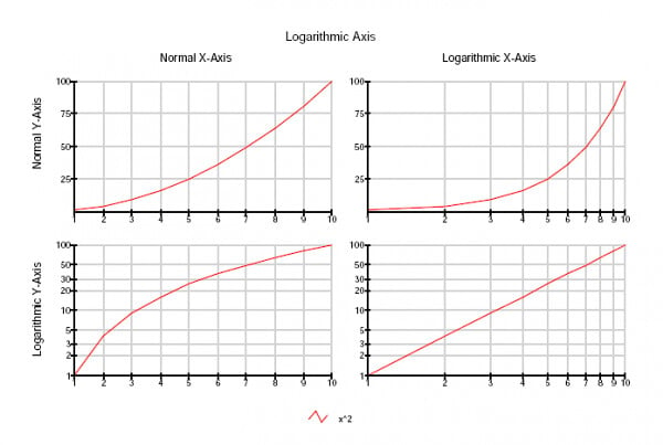
Logarithmic scales compress large ranges of data into manageable spaces. Each step up the axis represents a multiplication rather than an addition.
Going from 10 to 100 to 1,000 to 10,000 takes the same visual space as going from 1 to 2 to 3 to 4 on a linear scale.
These scales are legitimate tools for certain datasets, particularly when dealing with exponential growth. But they can also make dramatic increases look gradual.
A line that appears to be rising steadily might actually be showing explosive growth.
Without clear labeling that explains the scale, readers interpret the visual as linear and completely misunderstand the data.
Area Charts With Overlapping Regions
Area charts shade the space between a line and the baseline, making it easy to see magnitude over time.
When multiple categories stack on top of each other, you get a filled chart that shows both individual contributions and the total.
Stacked area charts work fine when the categories are clearly separated.
But overlapping or semi-transparent area charts create confusion. You can’t tell where one category ends and another begins.
The visual mixing makes it impossible to accurately judge the size of any individual category.
These charts look sophisticated but function poorly. Bar charts or line graphs would communicate the same information more clearly.
Charts With Inconsistent Time Intervals
Most time-series charts show data at regular intervals. Daily, monthly, quarterly, annually.
Your brain expects consistency. When a chart skips periods or uses irregular spacing, it distorts patterns and trends.
A gap of three months might take up the same visual space as a gap of six months.
This manipulation is subtle enough that most people don’t notice. The dates are all labeled correctly.
But compressing or expanding certain periods makes trends appear stronger or weaker than they actually are.
Politicians use this trick when displaying economic data, compressing unfavorable periods and expanding favorable ones.
Bubble Charts With Unclear Size Meanings
Bubble charts use circles of different sizes to represent a third variable alongside X and Y position.
The size of each bubble encodes data. The problem is that your brain struggles to compare areas.
Is a bubble twice as large representing twice the value, or four times the value?
Chart creators don’t always clarify whether the bubble’s radius or its area represents the data.
If radius is used, the visual impression will be dramatically different from what the numbers actually say.
A value that’s three times larger might create a circle that looks nine times bigger.
These charts regularly overstate differences between categories.
Stacked Bar Charts That Hide Baselines
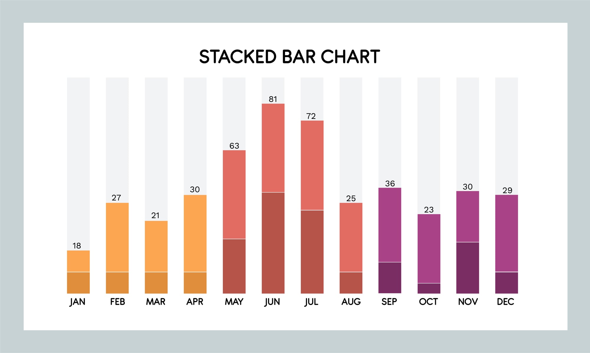
Stacked bar charts show multiple categories by placing segments on top of each other in a single bar.
The first category starts at zero, which makes it easy to compare across groups.
But every other category starts from wherever the previous segment ended, making comparisons nearly impossible.
You can easily see the total and the bottom category. Everything else is floating.
If you want to compare the third category across five different groups, you need to visually subtract the first two categories from each bar.
Most people can’t do that accurately. These charts answer some questions while making others functionally invisible.
Charts With No Error Bars or Confidence Intervals

Scientific charts often show a single data point or a clean line representing an average or prediction.
What they don’t show is the uncertainty around that number.
Error bars, confidence intervals, and ranges communicate how reliable the data actually is.
Without them, everything looks precise and definitive.
A chart showing that a treatment increases recovery rates by 15% looks impressive.
Add error bars showing that the real effect could be anywhere from 2% to 28%, and suddenly the finding looks less certain.
These measures of uncertainty don’t make charts prettier or simpler, which is exactly why they get left out.
Choropleth Maps That Ignore Population Density
Choropleth maps use color shading to show how a variable differs across geographic regions.
A map showing election results by county, with each county colored red or blue, is a choropleth map.
These maps work well for displaying data that actually relates to land area.
But when the data is about people, not land, these maps become misleading.
A county with 50,000 people gets the same visual weight as a county with 5 million people.
Large rural areas dominate the visual impression even when most of the population lives in small urban areas.
The map ends up showing geography rather than the actual distribution of whatever it claims to measure.
Moving Averages That Smooth Away Reality

Moving averages take a series of data points and average them over a rolling window.
This technique reduces noise and makes trends easier to see.
A seven-day moving average of daily website traffic will show the general pattern without all the weekend dips and weekday spikes.
The problem is that moving averages can smooth away important details.
Sudden spikes get flattened. Real changes get delayed.
By the time a new trend shows up in the moving average, it’s already been happening for days.
These charts make everything look gradual and stable, even when the underlying reality is volatile and abrupt.
When the Picture Lies

Charts are supposed to clarify. They should take complex information and make it accessible.
But a chart is only as honest as the person who made it.
Every visual choice—axis scale, time range, chart type—shapes what story the data tells.
The technical details are all correct, but the impression is wrong.
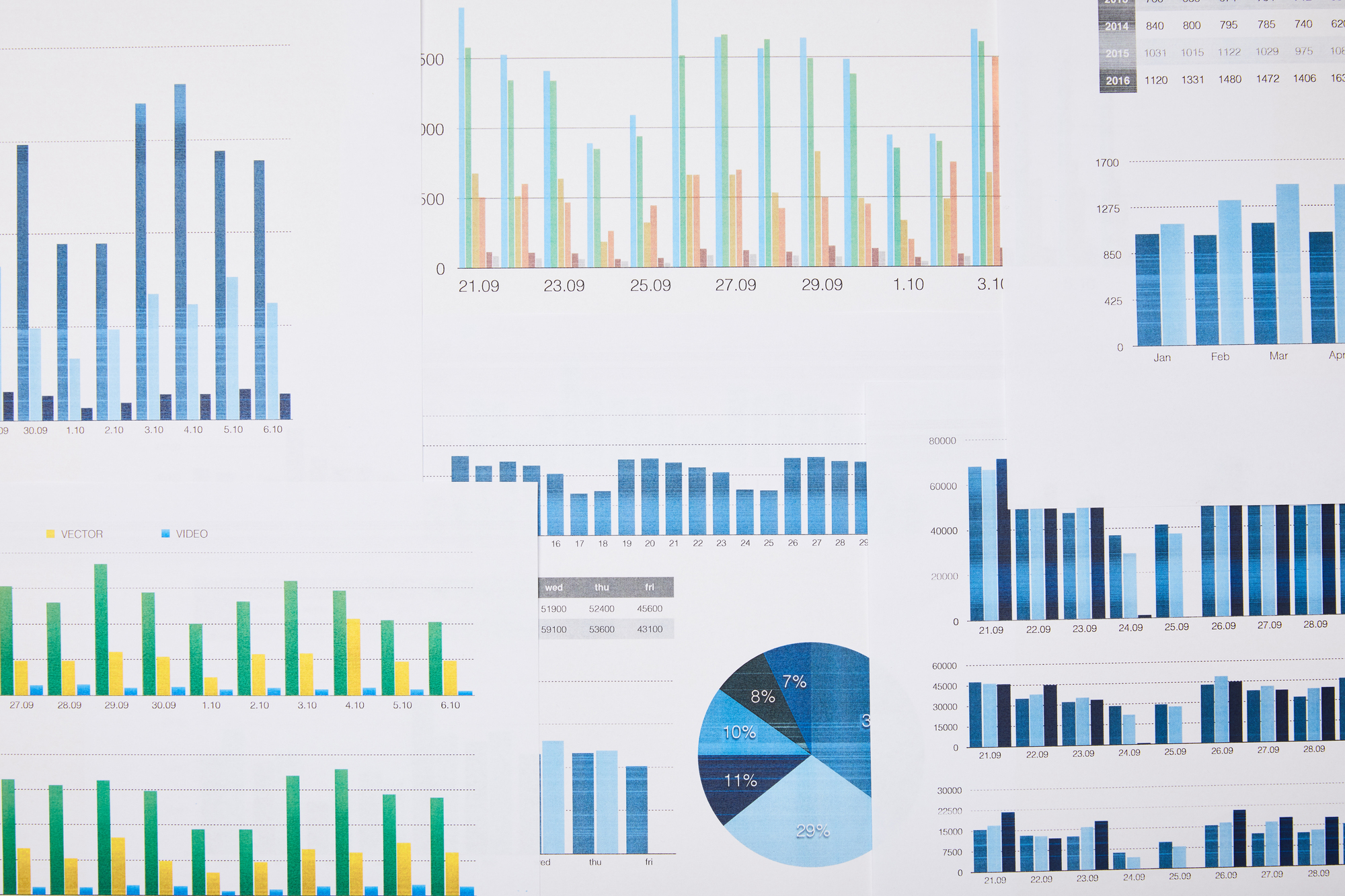
You can’t avoid charts. They’re everywhere, and they’re often the fastest way to communicate quantitative information.
But you can learn to look past the visual and check the actual numbers.
Read the axes. Notice what’s missing.
Ask whether the scale makes sense. A chart that hides important details is worse than no chart at all.
More from Go2Tutors!

- The Romanov Crown Jewels and Their Tragic Fate
- 13 Historical Mysteries That Science Still Can’t Solve
- Famous Hoaxes That Fooled the World for Years
- 15 Child Stars with Tragic Adult Lives
- 16 Famous Jewelry Pieces in History
Like Go2Tutors’s content? Follow us on MSN.