Canva Tips and Tricks You Should Learn
Design is now more accessible thanks to Canva, which can accomplish what it takes years of training for. What once took complex software and technical knowledge can now be achieved with a few clicks.
However, most people only use it for a fraction of what it can do, unaware of what it can accomplish. What can make a design go from average to great is a few simple techniques.
When you know where to look, it’s no longer a tool, but a system you can use. Here’s a closer look at Canva tips and tricks that can instantly make a big impact.
Use Grids For Perfect Layouts
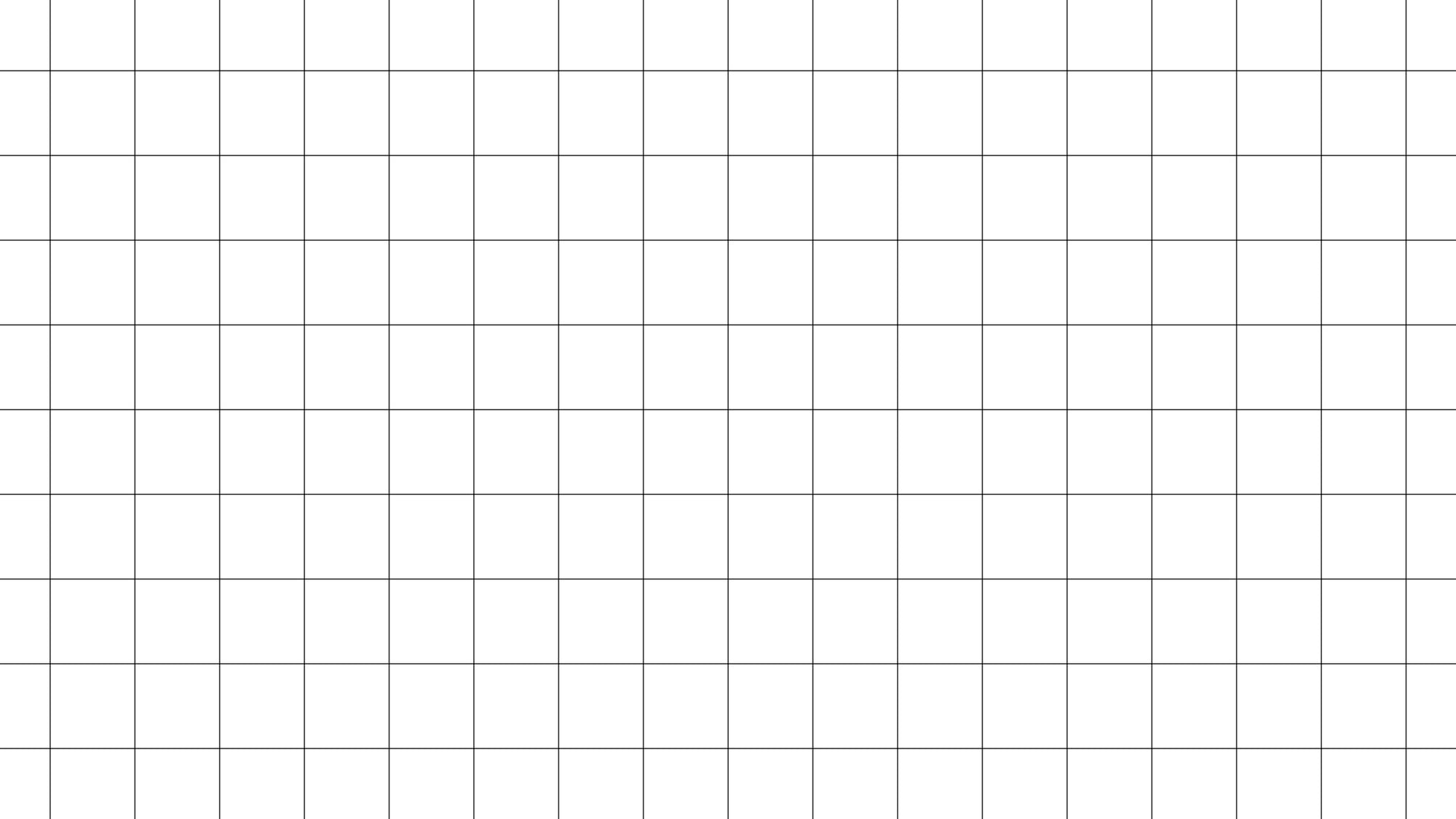
What holds a layout together? Grids do. They bring order without effort, turning chaos into clarity.
Snap each piece into position – no measuring needed. Alignment happens on its own.
Spacing stays even from top to bottom. Mistakes fade when structure leads.
A clean result appears, almost by accident.
Picture grids fit well on social feeds, slides, or mixed image sets when spacing feels important. Drop photos into slots, watch the design snap into place – no fiddling with gaps needed.
Even so, grids aren’t just about order. Through repeating patterns they shape how we see, helping eyes move without effort across a page.
When spacing follows a clear logic, attention flows where it should – smooth, steady, almost unnoticed.
Master The ‘Position’ Tool

The ‘Position’ tool is often overlooked, yet it’s one of the most powerful features in Canva. It allows you to align elements precisely, distribute spacing evenly, and layer objects without frustration.
Instead of nudging items pixel by pixel, you can center, align, or space them with a single click. This saves time and ensures consistency across your design, especially when working with multiple elements.
That said, mastering this tool can dramatically improve the overall polish of your work. Small alignment tweaks often make the biggest visual difference, even if they seem minor at first.
Use Brand Kits For Consistency
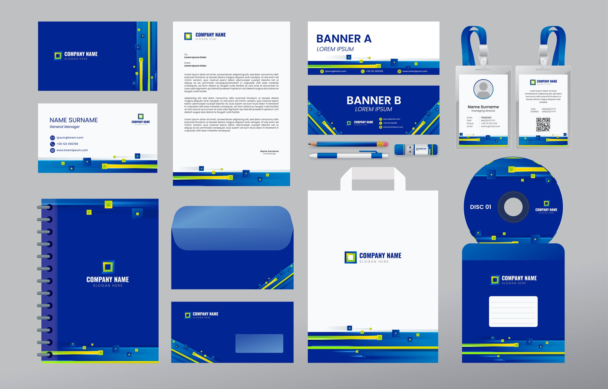
Consistency is what separates casual designs from professional ones. Canva’s Brand Kit allows you to save your colors, fonts, and logos in one place so you can reuse them easily across all your designs.
This is especially useful if you’re creating content regularly, whether for a business, a personal brand, or even your book content. Using the same visual style builds recognition over time and makes your work instantly identifiable.
Even so, the real benefit is efficiency. You spend less time choosing colors and more time focusing on the actual message, which keeps your workflow smooth and intentional.
Lock Elements To Avoid Mistakes

When working on a design with multiple layers, it’s easy to accidentally move something out of place. The ‘Lock’ feature prevents that by fixing selected elements in position while you edit other parts.
This is particularly helpful when you have background images, borders, or key text that should remain untouched. It keeps your structure intact while you refine the details.
On the other hand, it also gives you confidence to experiment. You can make changes freely without worrying about disrupting your layout, which encourages creativity.
Use Transparency For Depth
Transparency is a subtle tool that can add depth and sophistication to your designs. By lowering the opacity of an element, you can create layered effects without cluttering the space.
For example, placing semi-transparent shapes behind text can improve readability while maintaining a clean, modern look. It also works well for image overlays that need a softer finish.
Still, the key is restraint. Small adjustments in transparency can make a design feel intentional and refined, while overusing it can reduce clarity.
Take Advantage Of Keyboard Shortcuts

Keyboard shortcuts can significantly speed up your workflow. Simple commands like copying, pasting, grouping, and undoing actions save time and reduce repetitive clicking.
Over time, these small efficiencies add up, allowing you to focus more on creativity rather than navigating menus. The design process becomes smoother and less interrupted.
That said, learning a few essential shortcuts can make Canva feel much more responsive and intuitive, especially when working on larger or more detailed projects.
Use Frames For Clean Image Cropping
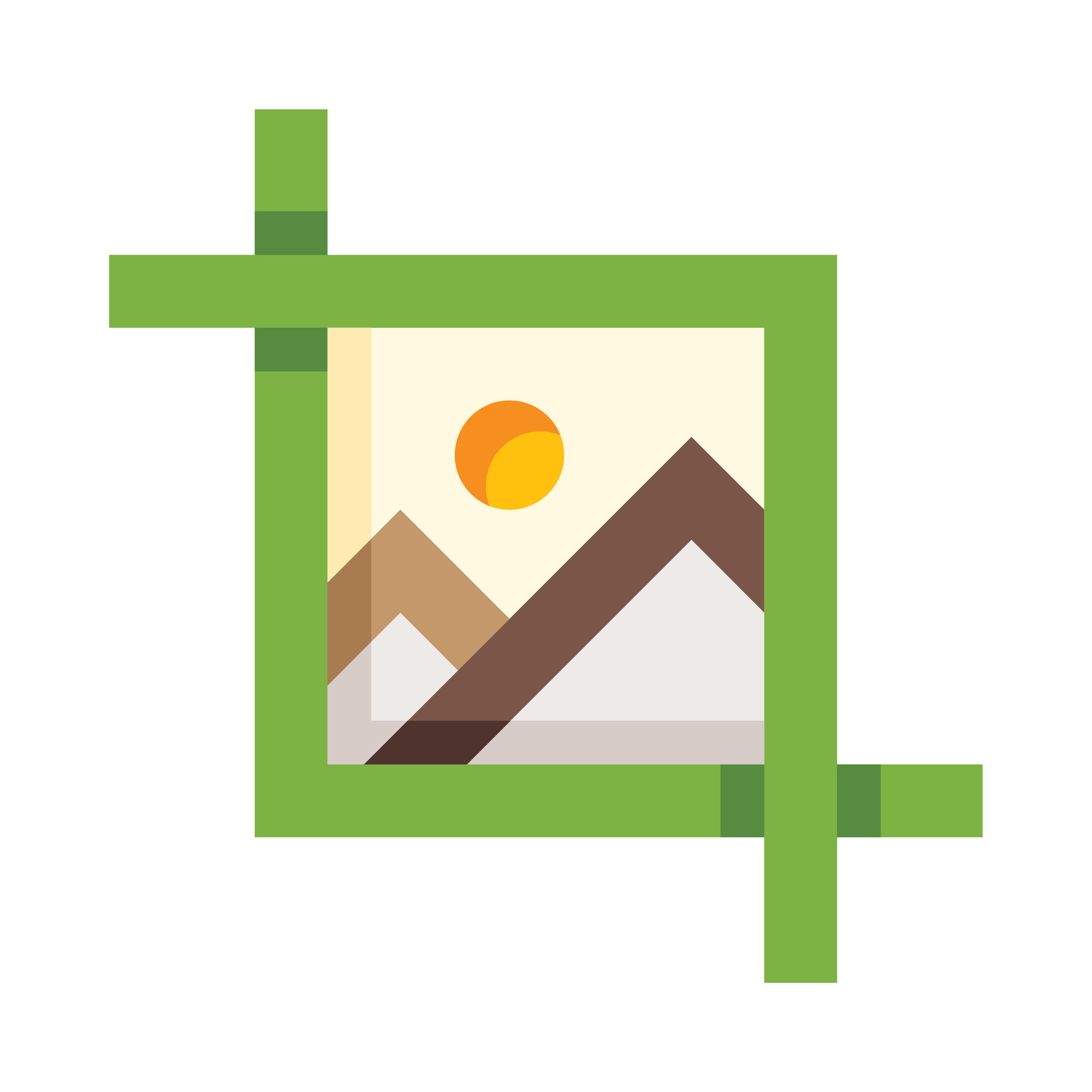
Frames are different from grids in that they allow you to place images into specific shapes. Whether it’s a circle, square, or more creative outline, frames help you crop images neatly without manual adjustments.
You can drag an image into a frame, and it will automatically fit the shape. This keeps your design consistent and visually balanced without extra effort.
Even so, frames also add a layer of creativity. They allow you to experiment with layouts that feel more dynamic and less predictable, which can make your designs stand out.
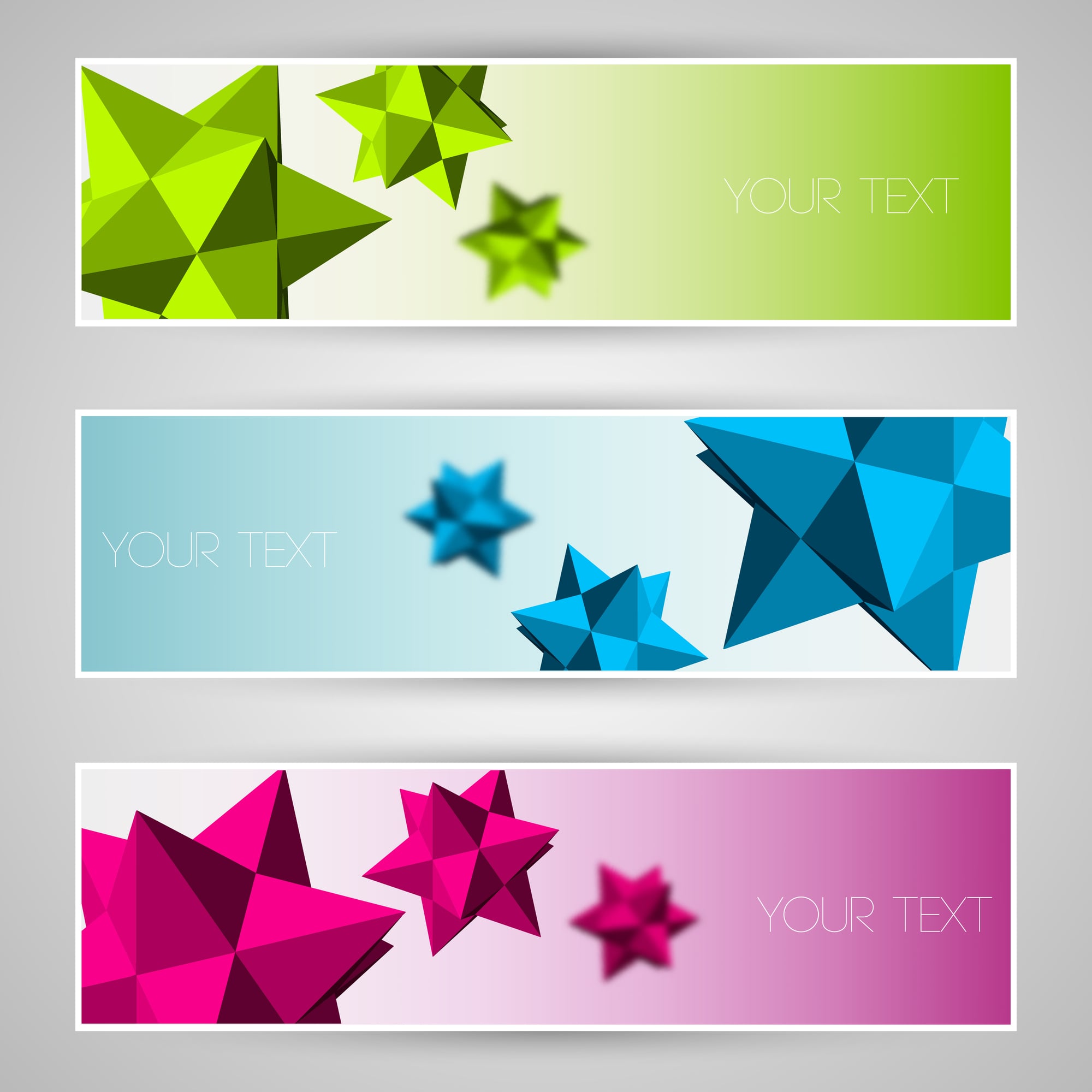
Explore Canva’s Effects And Styles
Canva includes a wide range of text effects and image styles that can transform a basic design into something more eye-catching. Shadows, outlines, spacing, and glow effects can all be applied quickly.
These effects help highlight important elements and guide the viewer’s attention to key areas of your design. They can also add personality without requiring advanced skills.
Still, it’s important to use them thoughtfully. A few well-placed effects can elevate a design, while too many can make it feel cluttered and distracting.
Use Templates As Starting Points
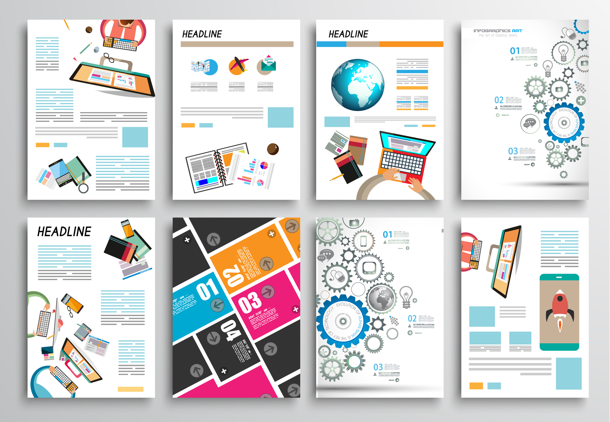
Templates are one of Canva’s biggest strengths, but they work best as a starting point rather than a finished product. Customizing colors, fonts, images, and layouts helps your design stand out from others using the same base.
By adjusting even a few elements, you can turn a common template into something unique. This approach saves time while still allowing for creative control.
That said, the goal is not to copy but to adapt. Templates provide structure, but your changes give the design its identity and purpose.
Organize Your Designs With
As your projects grow, keeping everything organized becomes essential. Canva allows you to create folders to store designs, images, and assets in a structured way.
This makes it easier to find what you need quickly, especially if you’re working on multiple projects or managing content over time. It also reduces unnecessary duplication.
Still, organization is often overlooked. A tidy workspace not only saves time but also improves focus, making the creative process more enjoyable.
Use Spacing And Line Height For Better Readability
Text is often where designs either succeed or fall short. Canva allows you to adjust spacing between letters and lines, which can dramatically improve readability. Tight text can feel cramped, while well-spaced text feels clean and easy to read.
Adjusting line height helps longer text blocks breathe, especially in posts or presentations. It prevents the design from feeling heavy or overwhelming.
Even so, this is one of the most overlooked tricks. A small spacing adjustment can instantly make your design look more professional without changing anything else.
Why These Small Tricks Make A Big Difference
Design is often a series of small choices that eventually make a big difference. What can make a design look hasty versus looking thoughtful is often a matter of alignment, white space, and repetition.
Canva offers the tools, but it’s understanding how to use those tools that can make a difference. These are not complicated skills to master, but they can make a big difference in how your designs look and feel.
They can help you move beyond simple templates and into creating designs that reflect who you are as a person. The fact is, Canva is only as powerful as the person using it.
By learning a few key skills, it’s no longer just a matter of designing fast, it’s a matter of designing well.
More from Go2Tutors!

- The Romanov Crown Jewels and Their Tragic Fate
- 13 Historical Mysteries That Science Still Can’t Solve
- Famous Hoaxes That Fooled the World for Years
- 15 Child Stars with Tragic Adult Lives
- 16 Famous Jewelry Pieces in History
Like Go2Tutors’s content? Follow us on MSN.