Most Complex Metro Maps
Getting around a big city can be tough, especially when the subway system looks like someone dropped a plate of spaghetti on a map. Some metro systems around the world have grown so large and complicated over the decades that their maps have become puzzles in themselves.
These networks weren’t designed all at once—they grew piece by piece, adding new lines, connections, and stations until the whole thing turned into a tangled web that can confuse even locals who ride it every day. Here are the metro systems with maps that’ll make your head spin.
Some have so many lines they ran out of colors, while others twist and turn in ways that make no sense until you’re actually underground.
Tokyo Metro and Toei Subway
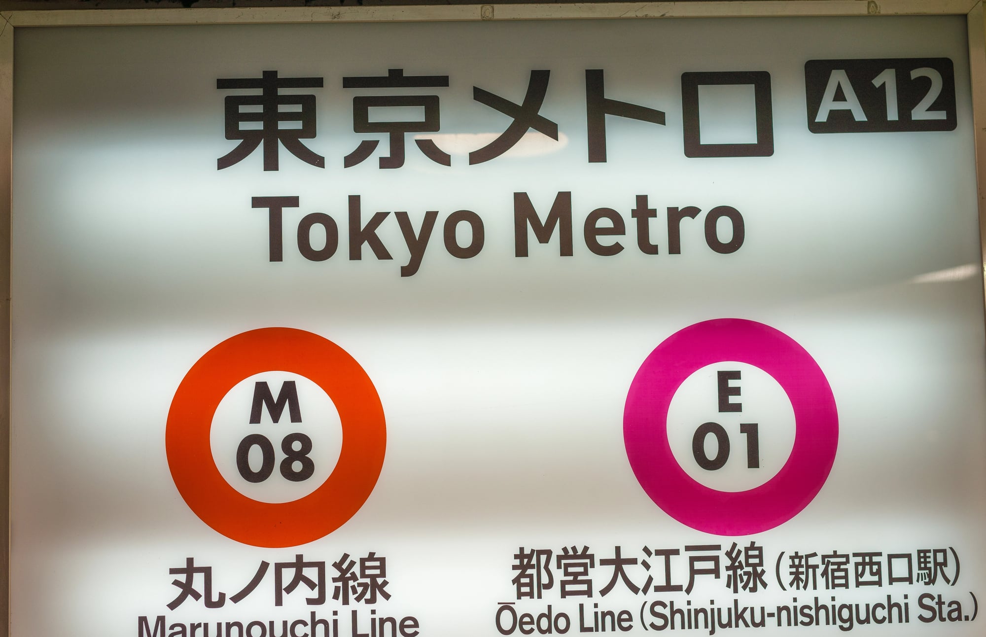
Tokyo’s subway system is actually two separate networks that work together, and the combined map looks like a rainbow exploded. The city has 13 metro lines plus several JR lines that run through the center, creating a web of connections that can overwhelm first-time visitors.
Station names often have multiple exits, sometimes dozens, and picking the wrong one can leave someone blocks away from where they needed to be. The Shinjuku station alone serves multiple lines and sees millions of passengers daily, making it one of the busiest transit hubs on Earth.
What makes it extra tricky is that different companies operate different lines, so transferring might mean leaving one paid area and entering another.
New York City Subway
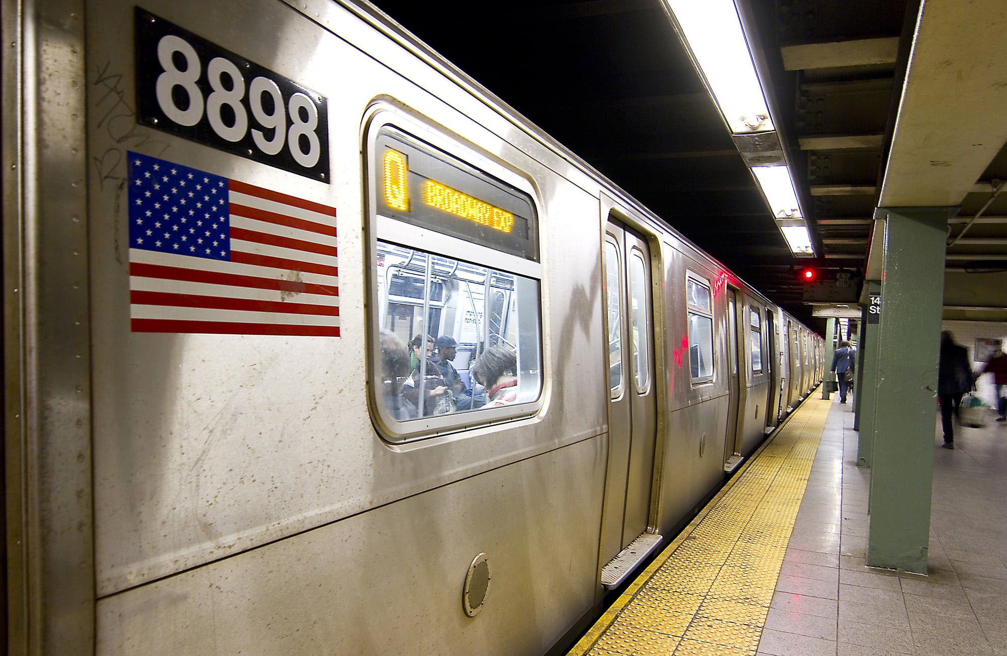
The NYC subway runs 24 hours a day across 472 stations, and its map is a colorful mess of local trains, express trains, and weekend service changes. Lines that share the same color don’t always go to the same places, which trips up tourists constantly.
The system was built by competing companies in the early 1900s before the city unified everything, so there are odd quirks like parallel tunnels that never connect. Express trains skip dozens of stops, so hopping on the wrong train can send someone miles past their destination in minutes.
Late-night and weekend service throws another wrench into things, with some trains taking completely different routes than they do during the week.
Paris Métro
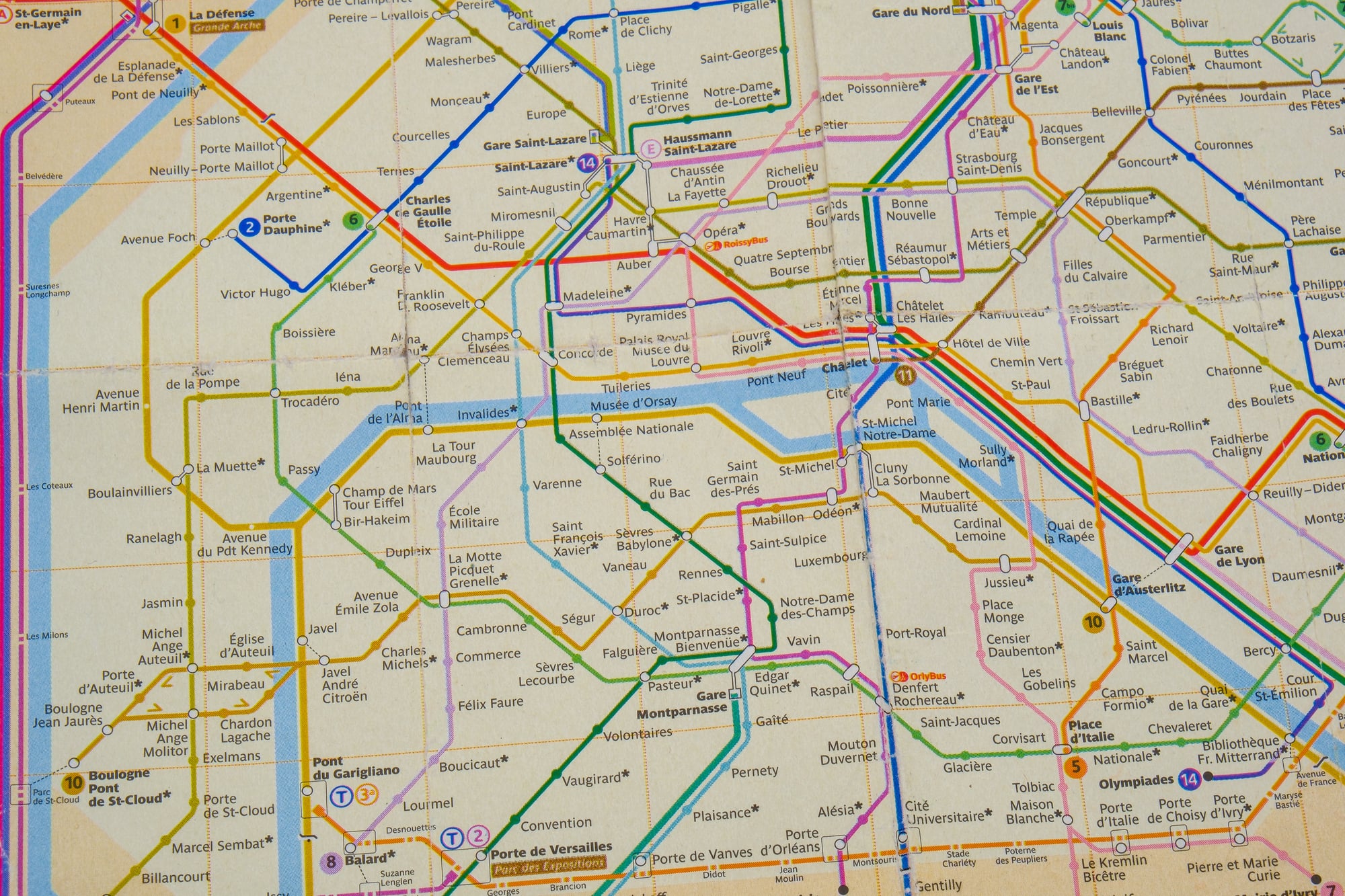
Paris crammed 16 metro lines into a relatively small area, creating a dense network where stations are rarely more than 500 yards apart. The map looks like someone scribbled all over it with different colored pens, and the lines cross each other so many times that transfers are everywhere.
Some stations have multiple names depending on which entrance someone uses, adding to the confusion. The RER commuter rail lines also show up on many metro maps, and these run much faster and cover longer distances, but mixing them up with regular metro lines can send riders to the suburbs by accident.
Certain stations require walking through long tunnels to transfer, sometimes taking five or ten minutes just to switch lines.
Seoul Metropolitan Subway

Seoul’s metro system keeps expanding, and the map now shows over 20 lines when you include all the extensions and branches. Lines are numbered, which should make things easier, but some numbers have multiple branches that split off in different directions.
The system uses different colors for each line, but several look so similar that telling them apart on a map requires squinting. Transfer stations can be massive, with some requiring a ten-minute walk underground to switch lines.
What really throws people off is that some lines are operated by different companies, so a single journey might need multiple tickets if someone isn’t using a transit card.
London Underground
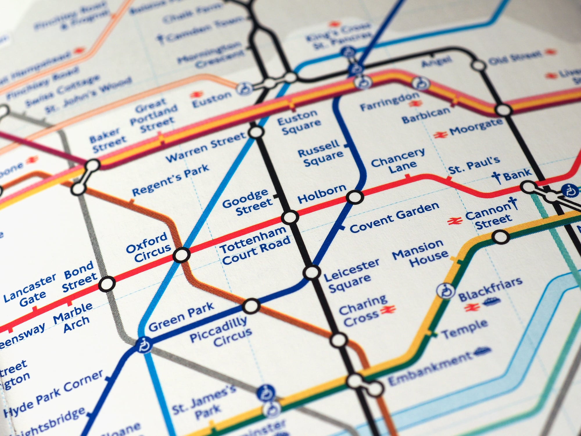
The iconic Tube map is actually designed to be simple, but it represents a system that’s anything but straightforward. The map stretches and compresses distances to make everything fit, so what looks like a short hop might actually be a long ride, while some stations that seem far apart are actually close enough to walk.
The Circle line isn’t even a circle anymore after they changed the route years ago. Weekend engineering works constantly close sections of lines, forcing riders to check for updates before every trip.
Some Zone 1 stations are so close together that walking is faster than waiting for a train, but the map doesn’t make this obvious.
Shanghai Metro

Shanghai built most of its metro system in just the last 25 years, and it’s now one of the longest networks in the world with nearly 20 lines. The map is a tangle of lines crisscrossing the city, and new extensions keep getting added every year.
Transfer stations can be absolutely enormous, with some requiring escalators, moving walkways, and several minutes of walking to switch lines. Line numbers jump around—there’s a Line 16 but no Line 15 in some versions—because of how the city planned expansion.
The sheer size means that crossing the city by metro can take well over an hour, even though the map makes it look manageable.
Moscow Metro
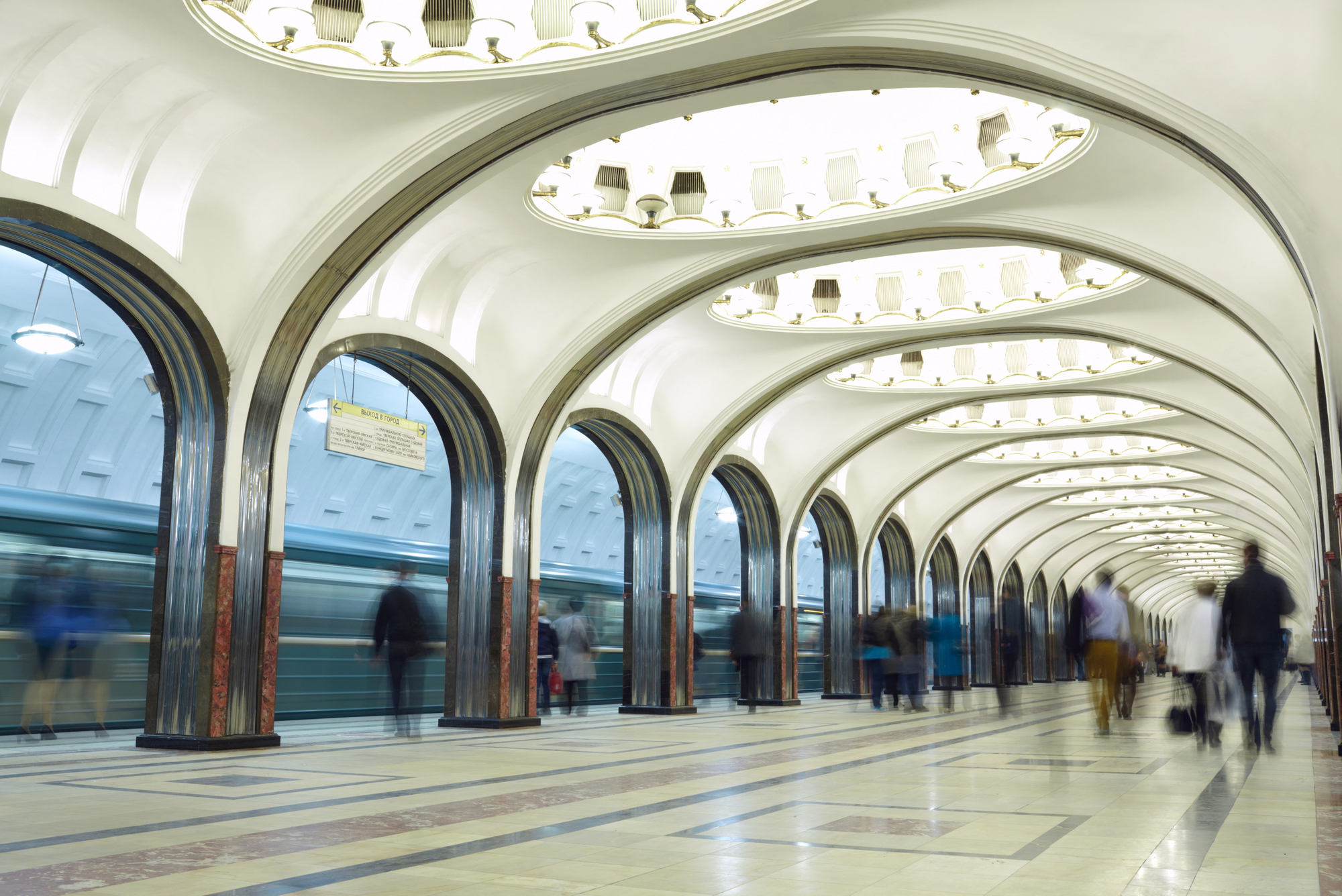
Moscow’s metro is famous for its beautiful stations, but the map itself is a complex web of lines radiating out from the center. The Circle line wraps around the city center, and almost every other line intersects with it, creating crucial transfer points that get packed during rush hour.
Station names are all in Cyrillic, which adds another layer of difficulty for visitors who can’t read Russian. The system goes deep underground—some of the deepest metro tunnels in the world—so getting to platforms can involve riding escalators for several minutes.
A newer outer circle line opened recently, making the map even more complicated.
Berlin U-Bahn and S-Bahn
Berlin’s underground U-Bahn and overground S-Bahn work together, but they’re run by different operators and show up on maps in different ways. The city was divided during the Cold War, which created odd gaps and connections that still exist today.
Some U-Bahn lines have branches that split, so riders need to check the destination sign on the train itself, not just the line number. S-Bahn lines often share tracks, meaning multiple line numbers use the same platform, which can confuse anyone not paying close attention.
The maps try to show both systems together, but it ends up looking cluttered.
Madrid Metro

Madrid’s metro is one of the longest in Europe, and its map shows lines stretching far into the suburbs. The system uses a numbering scheme, but Line 8 branches into two separate routes that don’t connect to each other.
Several lines are circular or semi-circular, adding to the visual complexity. Transfer stations are common, but some require long walks through underground passages.
The newer extensions reach towns outside Madrid proper, so the metro map has grown to cover a huge area that goes way beyond the city center.
Mexico City Metro
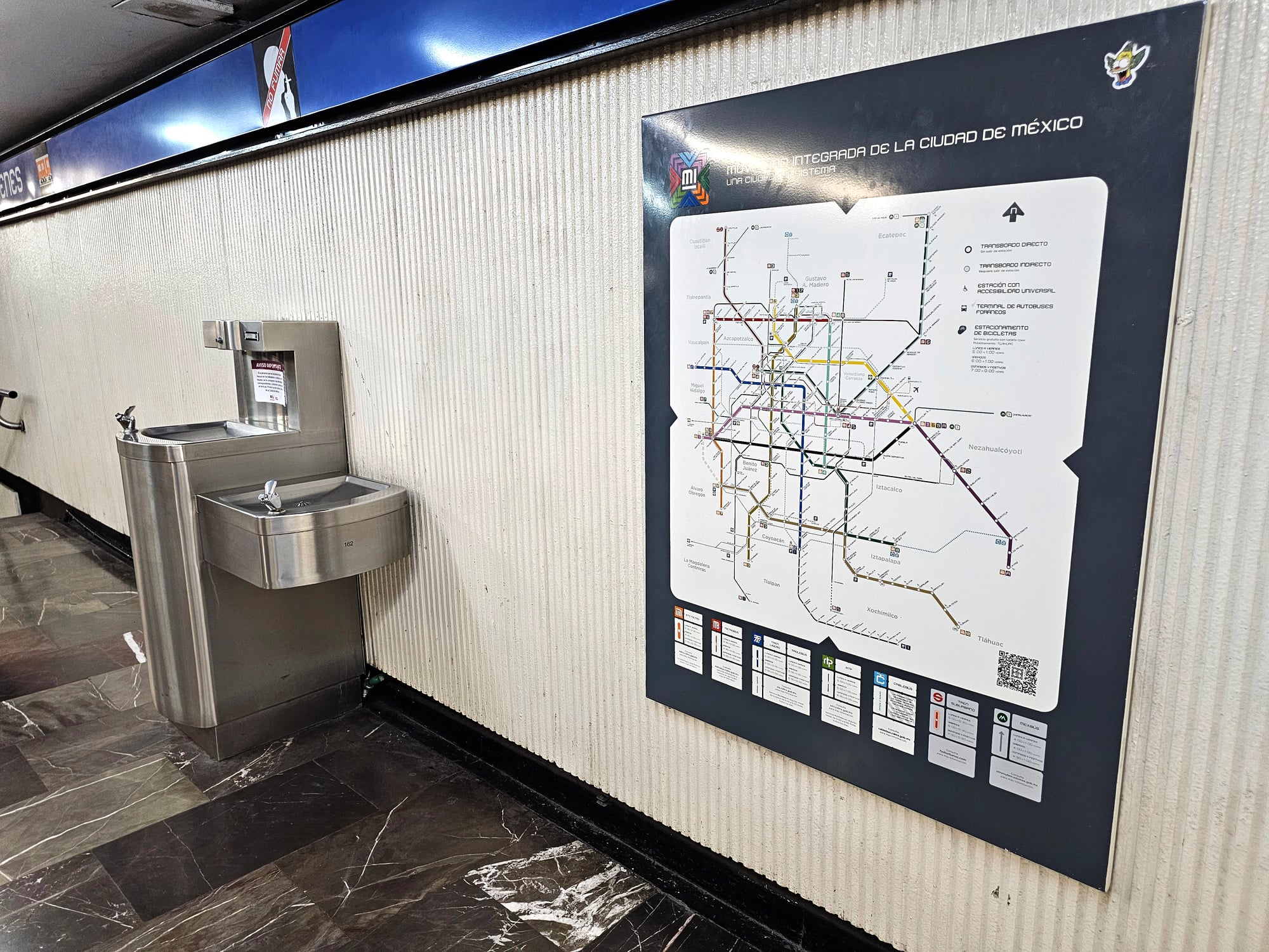
Mexico City’s metro serves one of the largest metropolitan areas in the world, and the map reflects that scale. The system uses colored lines and symbols for each station, which helps riders who might not read well, but it also makes the map look busy.
Lines 1, 2, and 3 form a rough triangle in the city center, with other lines branching out in various directions. Transfer stations during rush hour are absolutely packed, and navigating them requires pushing through crowds.
Some lines were built decades apart, so the train cars and station designs vary wildly depending on which line someone rides.
Osaka Metro
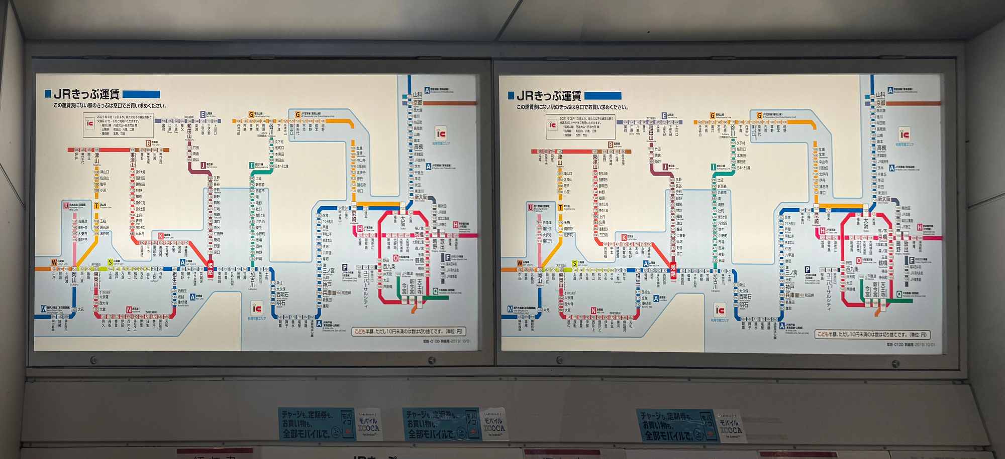
Osaka’s metro system has nine lines, which doesn’t sound like much until you realize how they overlap and intersect throughout the city. The map uses different colors, but several private rail companies also run trains through Osaka, and their lines show up on comprehensive maps too.
Umeda and Namba are major transfer points where multiple lines converge, creating underground cities of shops and restaurants that connect different stations. The system links up with trains to Kyoto and Kobe, so someone could accidentally end up in a different city if they board the wrong train.
Station numbering helps, but only if riders know which line they’re supposed to be on.
Hong Kong MTR
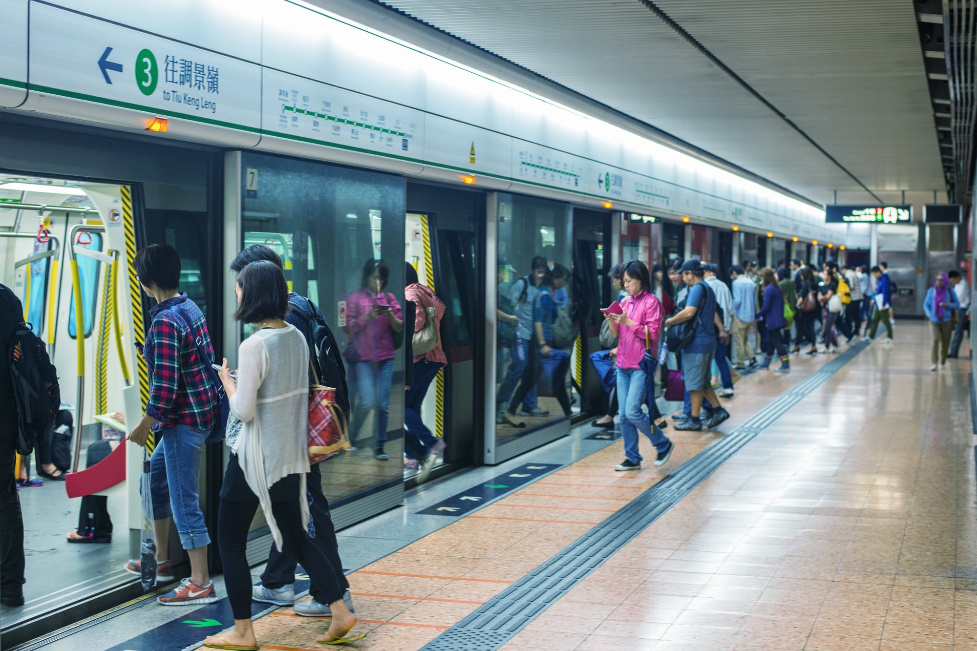
Hong Kong’s MTR is known for being efficient, but its map has grown complicated as new lines have been added. The system extends into mainland China now, with some lines crossing the border into Shenzhen.
Multiple lines run through Central and other key stations, creating important transfer points that fill up during peak hours. The map uses both English and Chinese characters, which takes up space and makes everything look more crowded.
Some lines have express services that skip stations, so riders need to pay attention to which train they’re boarding.
Barcelona Metro

Barcelona’s metro map shows 12 lines, but what makes it tricky is how many of them run parallel to each other in certain areas. The L1 and L3 lines, for example, serve different parts of the city but cross paths multiple times.
Some stations have the same name but are on different lines blocks apart, so transferring between them means going back up to street level and walking. The system also connects with separate commuter rail lines, and maps that show everything together get messy fast.
Certain lines only run partway during off-peak hours, adding another thing to remember.
Chicago ‘L’
Chicago’s elevated train system has eight color-coded lines, but several share the same tracks through downtown in an area called the Loop. The map makes it look straightforward, but trains on the same track might be heading to completely different destinations.
The Brown and Purple lines share most of their route, while the Red and Blue lines run 24 hours but other lines don’t. Some branches split off from main lines, so someone needs to check the train’s destination sign, not just its color.
Weekend and late-night schedules change routes, which catches people off guard.
Singapore MRT
Singapore’s MRT keeps expanding, and the current map shows six full lines plus the Circle line that wraps around much of the island. The system is color-coded and relatively easy to understand compared to others, but recent extensions have added complexity.
Some stations serve multiple lines, and during rush hour these become extremely crowded. The map also shows the Light Rail Transit lines that serve residential areas, adding more branches to keep track of.
New lines under construction will make future maps even busier.
Guangzhou Metro

One moment, just streets and buses; next, a web of underground rails spreads beneath Guangzhou. Now fifteen-plus lines snake across the wide urban stretch.
Color-coded tracks crisscross at hubs where crowds shift between platforms. Trains sometimes divide mid-route – one heading east, another veering south – so eyes stay on digital signs above doors.
Seamless links exist to regional rail networks, with certain stations swelling into vast transit cities below ground. Blueprints printed last year might already miss fresh routes.
Change arrives faster than paper can keep up.
Toronto TTC
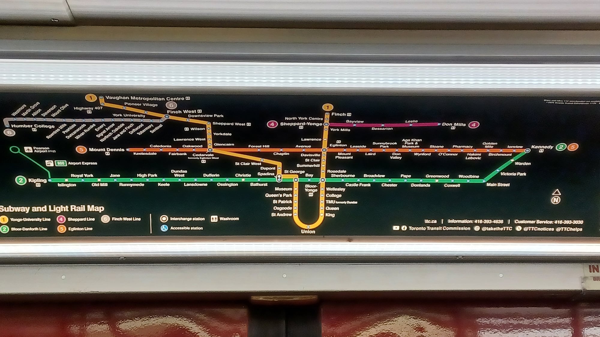
Most riders find Toronto’s subway straightforward, though chaos creeps in once streetcars and buses join the picture on most maps. Four lines make up the core network, yet crossing patterns mean switching between them can feel awkward more often than not.
A U-shaped route defines Line 1, interrupted by Line 2 slicing through it – major handoffs happen at Broom-Yonge and St. George stations. After years without change, fresh expansions plus one added line reshaped everything recently.
Trains stop running overnight, catching visitors off guard who expect round-the-clock service.
Navigating the chaos
Every morning, more tunnels dig deeper under cities, always stretching wider. Lines once quiet between small districts now pulse with crowds rushing through stations without pause.
Digital screens guide steps today, yet paper charts still overwhelm eyes tracing tangled ribbons of color across pages. Hidden patterns emerge only after months of missed turns and sudden stops underground.
Regular riders memorize gaps the official diagrams leave blank. Tourists squint at bright tangles wondering where one line gives way to another.
More from Go2Tutors!

- The Romanov Crown Jewels and Their Tragic Fate
- 13 Historical Mysteries That Science Still Can’t Solve
- Famous Hoaxes That Fooled the World for Years
- 15 Child Stars with Tragic Adult Lives
- 16 Famous Jewelry Pieces in History
Like Go2Tutors’s content? Follow us on MSN.