Nostalgic Snack Packaging That Defined Youth
Growing up meant more than just eating snacks. The packages themselves became part of childhood memories, with bright colors and fun designs that made grabbing something from the pantry feel like an adventure.
Certain packages stood out so much that just seeing them again decades later can bring back a flood of memories about summer afternoons, lunch boxes, and corner store runs with allowance money burning a pocket. These weren’t just containers for food.
They were tiny pieces of art that kids recognized from across the room and begged their parents to buy.
Capri Sun pouches
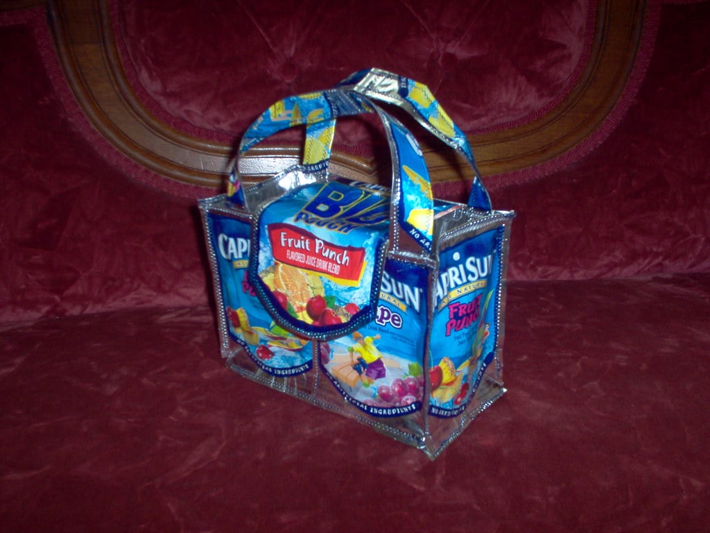
Those silver pouches with the attached straw felt like drinking from something futuristic. The packaging featured bright illustrations of fruit and kids having fun, while the metallic material kept the juice inside fresh without needing refrigeration.
Stabbing the straw through that little circle became a skill that kids either mastered or struggled with, sometimes sending juice squirting everywhere. The pouch crinkled and got smaller as someone drank, making it easy to squeeze out every last drop.
Dunkaroos containers
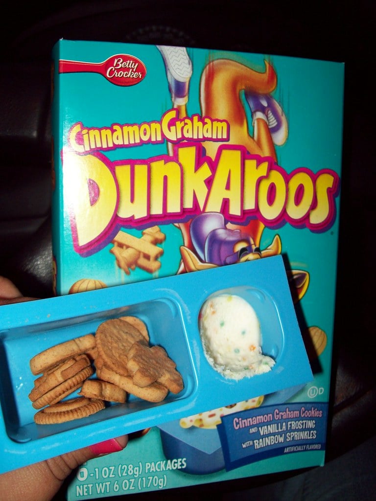
The bright red lid and yellow tub combination made Dunkaroos packaging pop on store shelves. Each container promised cookies and frosting in the same package, with a kangaroo mascot that grinned from the label.
The dual-compartment design kept cookies crispy and frosting ready for dipping, though most kids ended up with more frosting than cookies by the end. Opening that container during lunch felt special, like having dessert built right into the meal.
Squeezit bottles
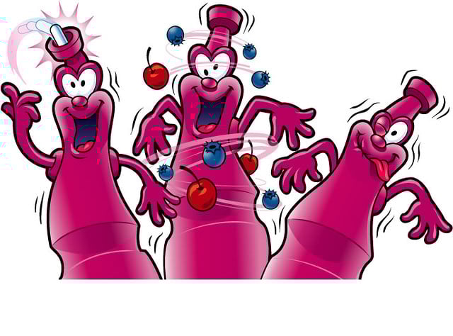
These colorful plastic bottles with twist-off caps looked more like toys than drink containers. Each flavor came in a different bright color, and the bottle itself was see-through so kids could watch the liquid level drop as they drank.
Kids squeezed them to shoot the drink into their mouths, which felt way more entertaining than just sipping from a regular bottle. Some even kept the empty bottles to play with afterward since they were so durable and fun to squeeze.
Fruit Roll-Ups boxes
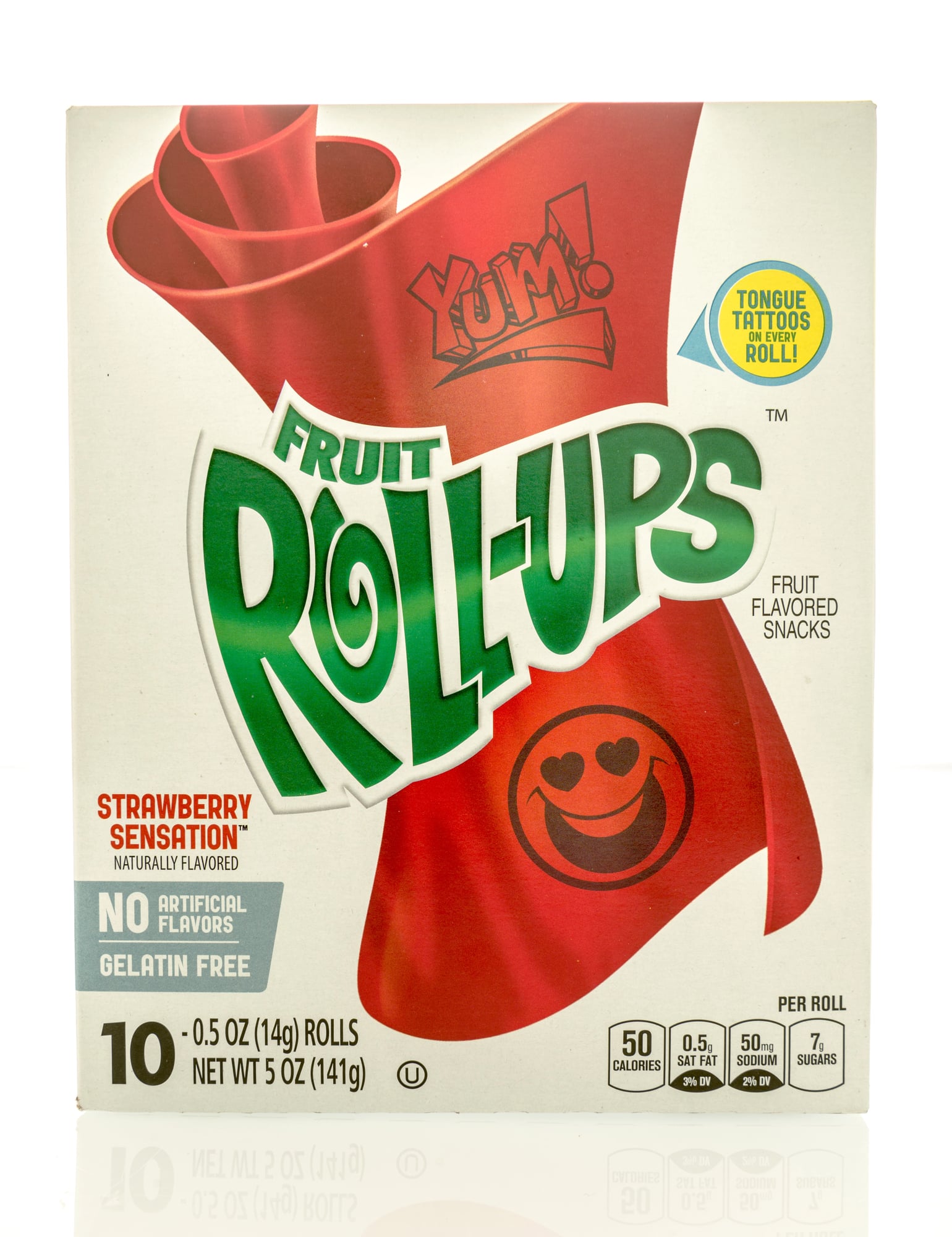
The long rectangular box with see-through windows showed the rolled-up fruit snacks inside their individual wrappers. Each wrapper had bright colors and sometimes featured characters from popular cartoons or movies.
Peeling back that cellophane wrapper to reveal the sticky fruit sheet felt satisfying, and the backing paper often had games or puzzles printed on it. Kids knew exactly what they were getting just by spotting that distinctive box design from across the grocery aisle.
Lunchables trays
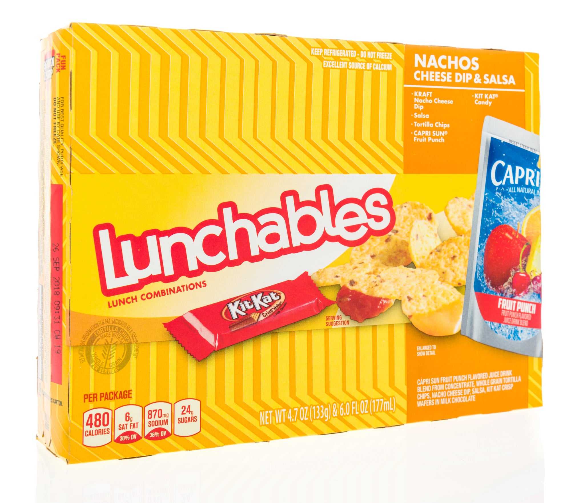
The clear plastic tray let everyone see exactly what came inside, from crackers to cheese to meat, all separated into neat compartments. That red packaging with bold letters made Lunchables impossible to miss in the refrigerated section.
The compartmentalized design turned eating into an assembly activity where kids built their own mini sandwiches. The trays felt more like activity kits than regular food, making lunch feel like playtime.
Fun Dip packets
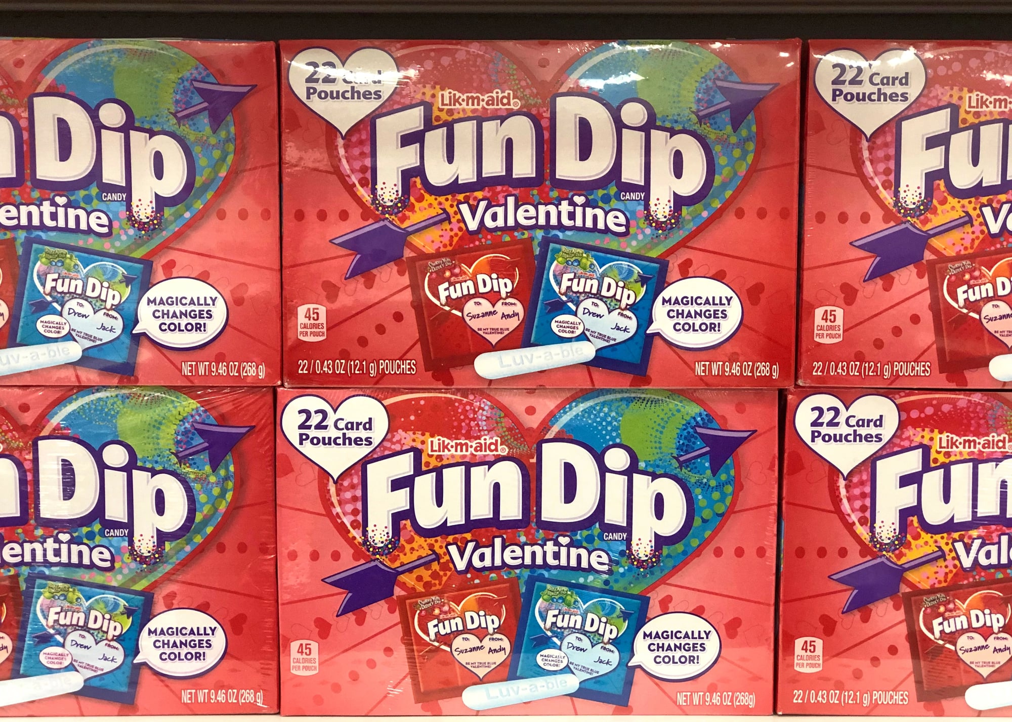
The colorful paper pouches featured tie-dye patterns and fun graphics that screamed pure sugar and good times. Each package crinkled and tore easily, revealing pouches of colored sugar powder and the chalky candy stick for dipping.
Those packets were thin enough to fit anywhere, making them perfect for pockets or small spaces in lunch boxes. The whole package design celebrated the messy, sugary fun that came with eating the candy inside.
Gushers pouches
The shiny foil pouch with bright fruit graphics promised something exciting inside. Each package showed the gummy snacks bursting with liquid centers, which was exactly what happened when someone bit into them.
Kids recognized those pouches instantly by their compact size and shiny finish. The packaging made Gushers feel more special than regular fruit snacks, like they contained something unique worth seeking out.
Bubble Tape containers
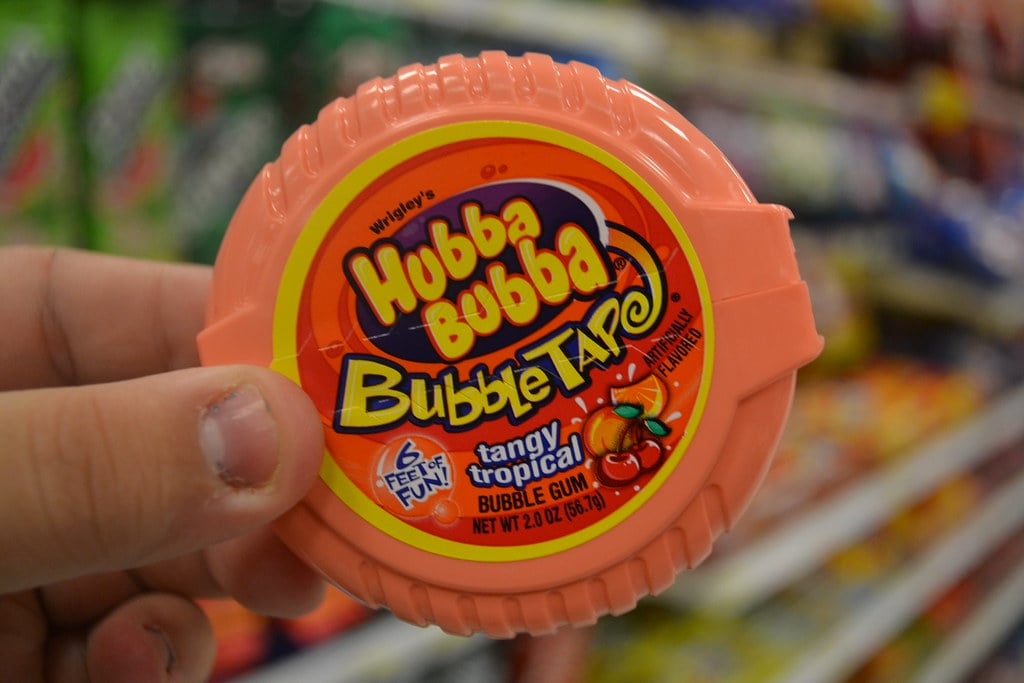
The bright pink or blue plastic container shaped like a mini tape dispenser made Bubble Tape stand out completely. The design was clever because it actually worked like a tape dispenser, with kids pulling out however much gum they wanted.
Each container had bold graphics and the product name written in fun, chunky letters. That container became a toy itself once the gum ran out, with kids finding all sorts of uses for the little plastic case.
Warheads tins
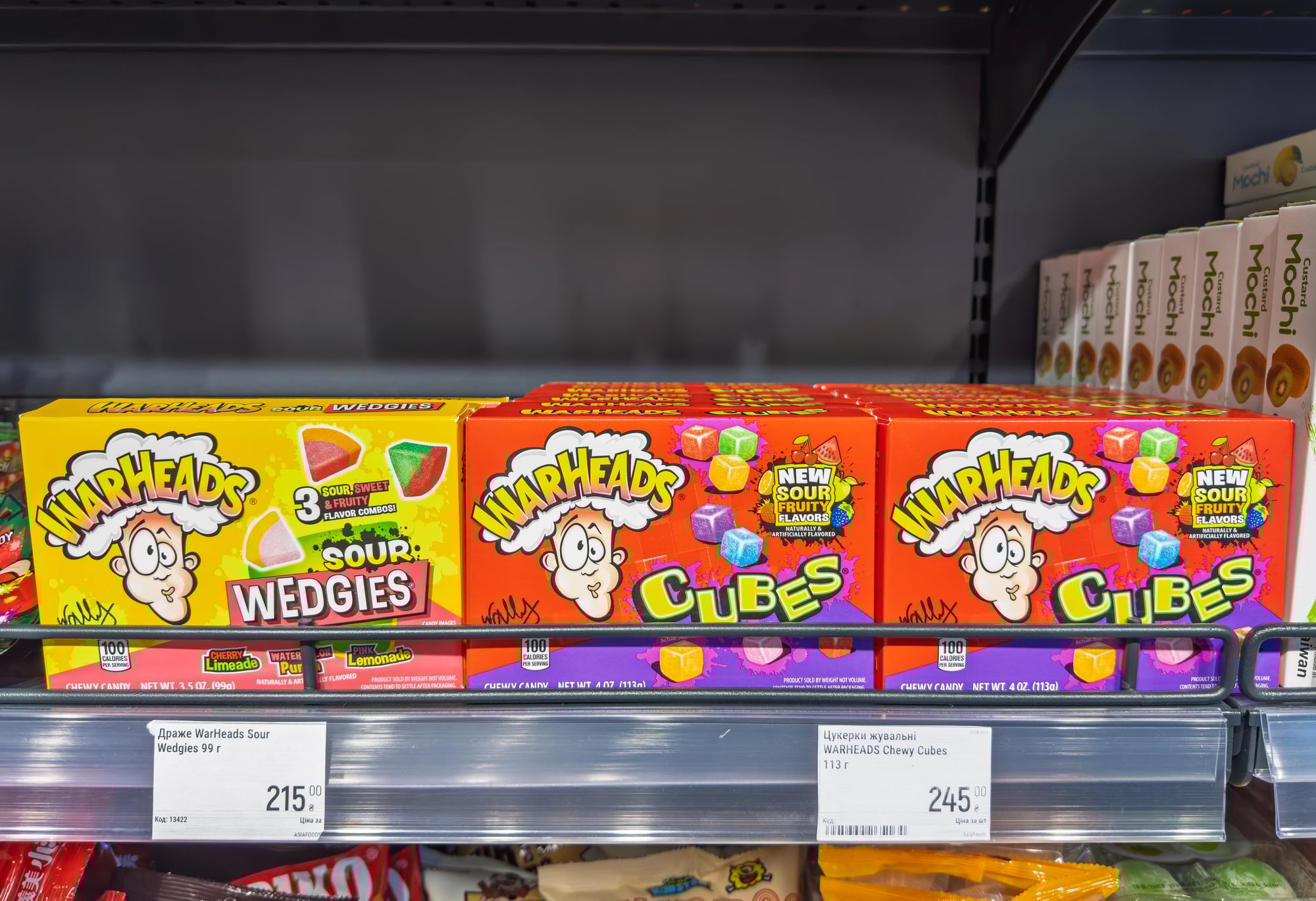
The small metal tins featured warning signs and dramatic graphics that played up how sour the candy inside would be. Each tin showed illustrations of kids with puckered faces, preparing buyers for the intense sour experience ahead.
Kids collected the empty tins and used them for storing small items long after the candy disappeared. The dramatic packaging design made eating Warheads feel like accepting a dare rather than just having a treat.
Pringles cans
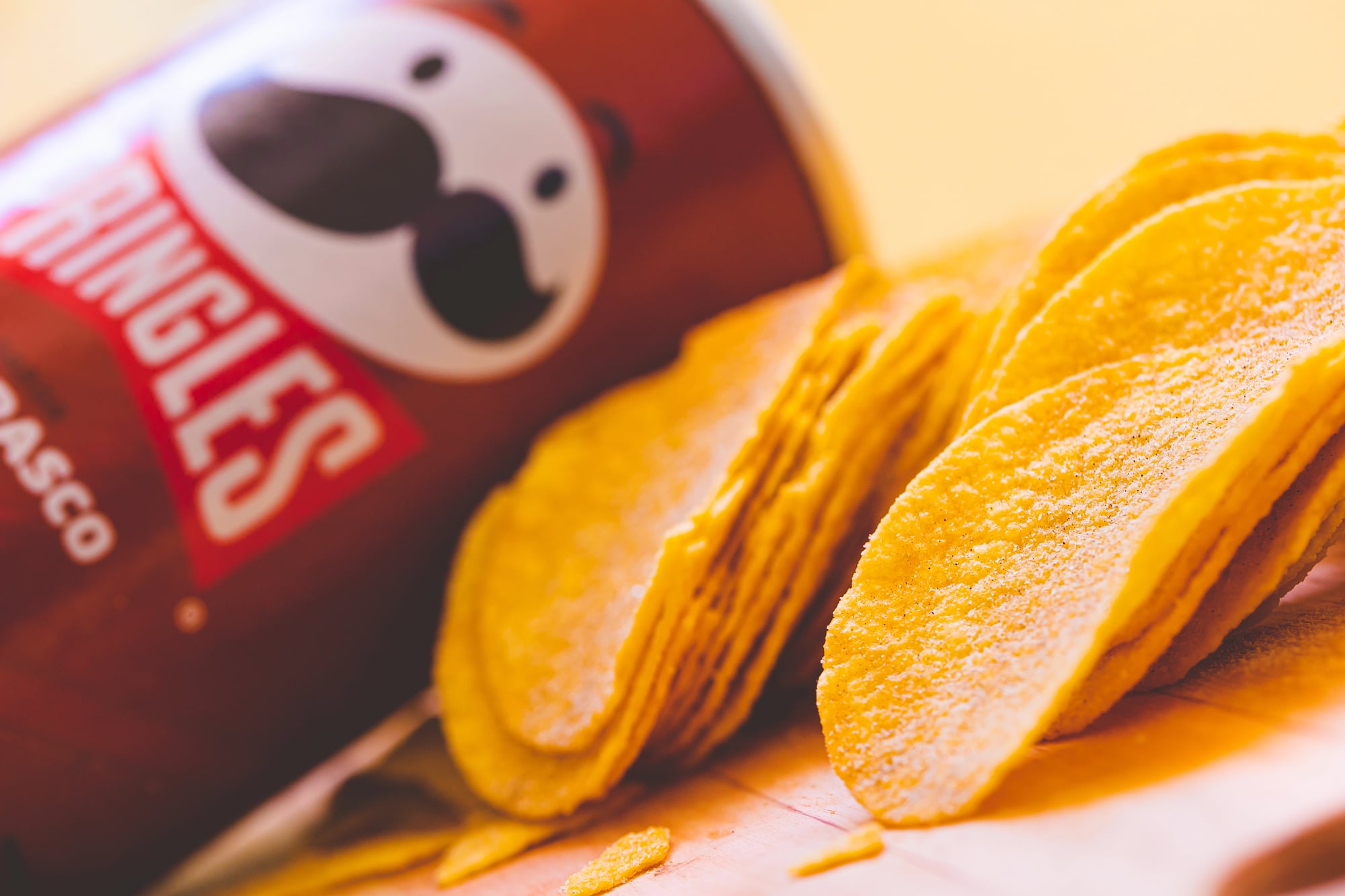
The tall cylindrical tube with a plastic lid and foil seal inside became instantly recognizable worldwide. That mustachioed mascot stared out from red packaging, and the tube shape meant Pringles never got crushed like chips in bags did.
The tube was sturdy enough to reuse for all sorts of things, from storing art supplies to making crafts. That distinctive shape meant Pringles stood out on shelves filled with regular chip bags.
Ring Pop wrappers
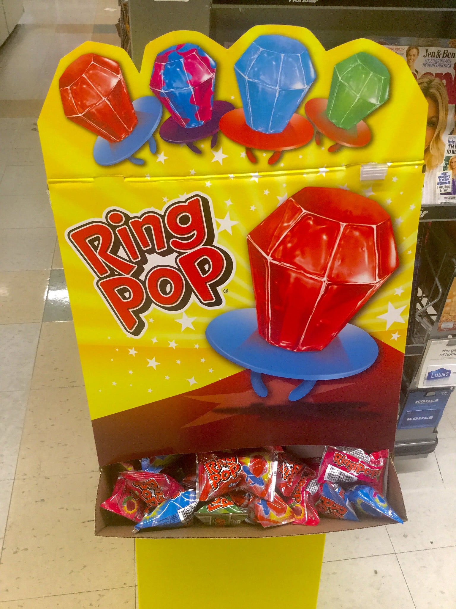
The clear plastic packaging showed off the candy ring inside, making it visible before purchase. Each wrapper had bright colors and fun graphics that emphasized wearing candy like jewelry.
Kids could see exactly which flavor they were getting through that see-through wrapper. The whole design celebrated the novelty of edible jewelry, with packaging that made the candy feel like both a treat and an accessory.
Push Pops containers
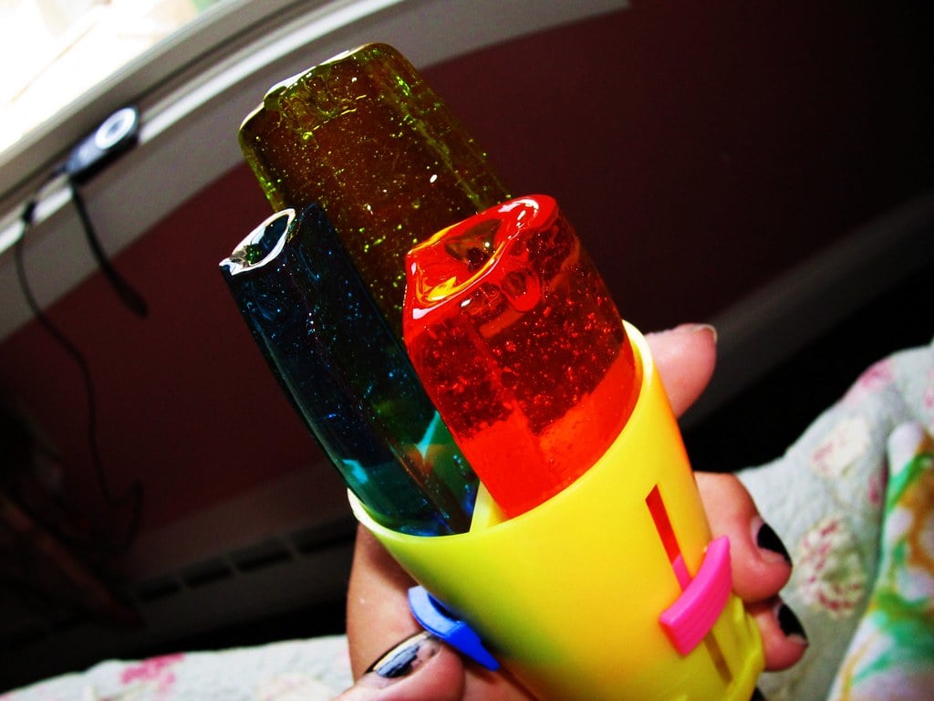
The colorful plastic tubes with push-up mechanisms made eating lollipops completely different from regular candy on a stick. Each container showed the candy color through clear plastic while bold graphics decorated the outside.
The push-up design meant kids could eat some, put the lid back on, and save the rest for later without it getting dirty or sticky. Those tubes came in so many bright colors that collecting different flavors meant having a rainbow of containers.
Hubba Bubba Max packaging
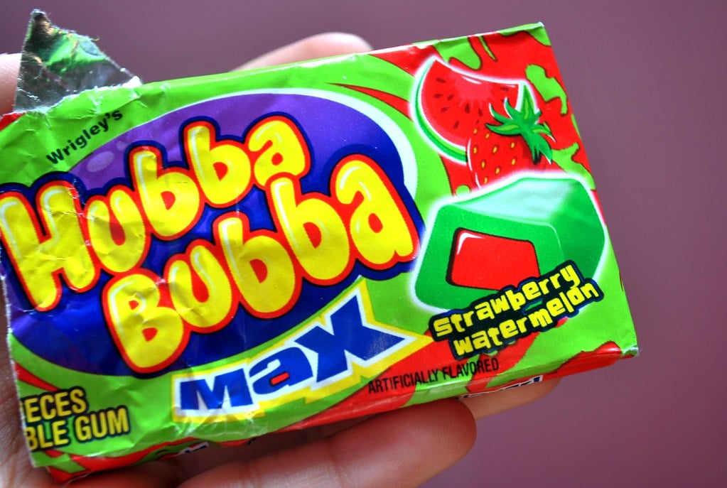
The large rectangular pack was impossible to miss with its bold colors and big letters. Each pack contained long strips of gum wrapped individually, and the outer package showed off how big and satisfying each piece would be.
Kids recognized those packs immediately by their chunky shape and bright design. The whole package promised more gum and more flavor than regular packs, and the design delivered on making it feel premium.
Fruit by the Foot boxes
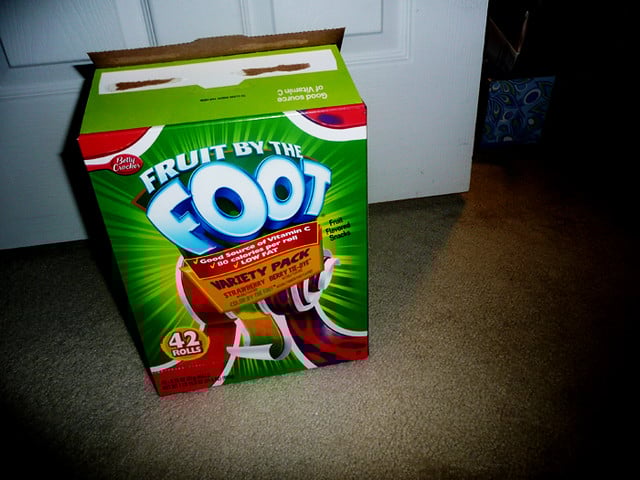
The box had a picture of a child pulling out a crazy-long fruit strip, showing off its full three-foot stretch. Flashy shades and fun drawings filled the wrap, every pack holding small rolled-up pieces.
Children enjoyed checking how the chewy length matched their own size, so the brand made that into a game-like feature. It stood upright like a slim tower, helping it stand out among other snacks on shelves.
Blow Pop wrappers
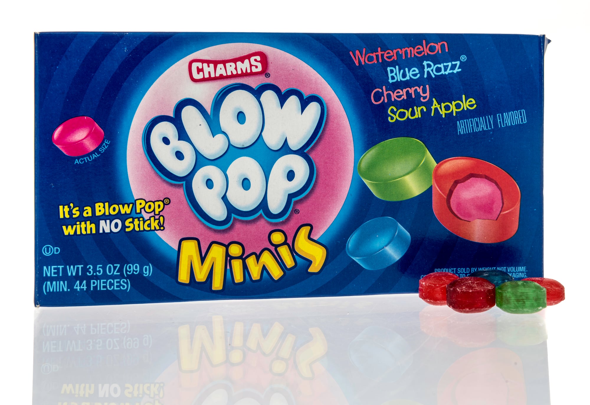
The bright paper covers used old-school art, revealing the circular candy within. Yet every wrap displayed the Blow Pop label boldly, along with a small bubble shape – suggesting chewy goodness inside.
Since each taste had its own hue, children could spot their favorite just by looking. Still, the basic look stood out over time, mainly because it highlighted the round treat clearly without making unwrapping tricky.
Nerds boxes
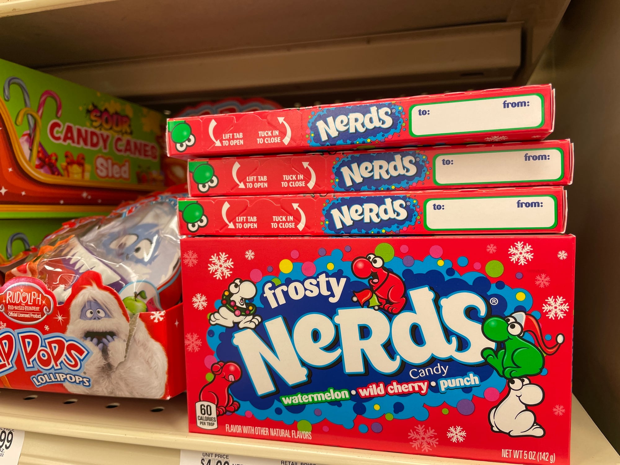
The little rectangle container divided into two sections, each with its own color, turned into a well-known look. One side offered a unique taste marked plainly on the label; meanwhile, the twin layout let you enjoy two sweets at once from a single wrap.
Children would wiggle the pack just to listen to the treats clink around prior to dumping them straight onto their tongue. This special two-part setup set the wrapper apart from every other sugary product down that grocery lane.
Pop Rocks packets
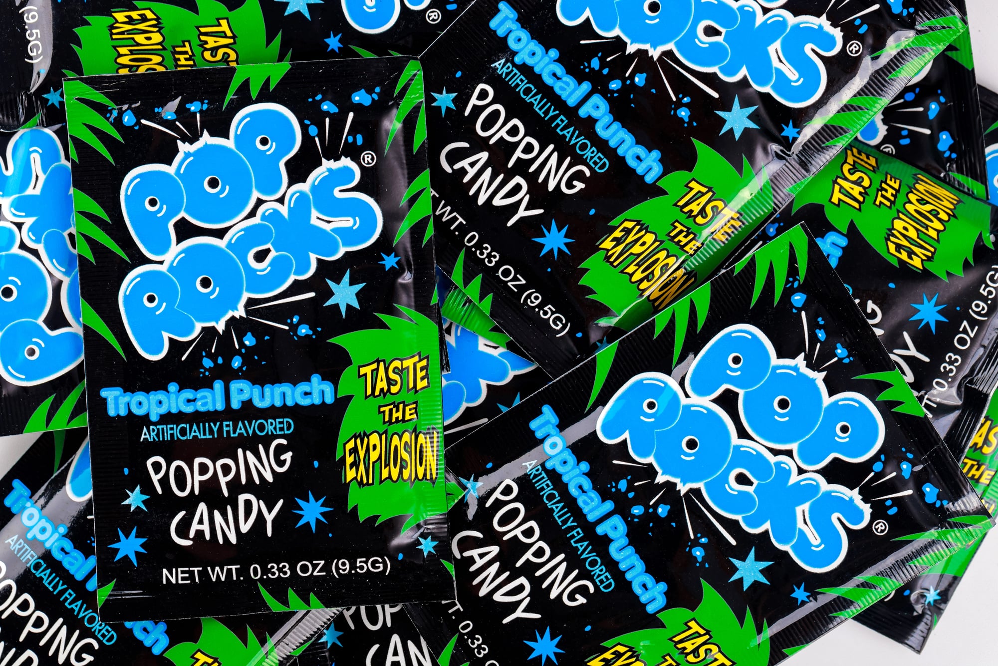
The little wrappers hissed and snapped right away, just like the treats tucked within. Each one flashed wild patterns – spiky bursts, loud shades – that hammered home the fizzy thrill.
Foil sealed tight, locking in zing till you dumped it straight onto your taste buds. Flashy look? Totally leaned into that mad-lab vibe when stuff tingles and jumps around in your mouth.
Why boxes turned into keepsakes
These colorful wrappers weren’t just about holding snacks – they sparked images in your mind that stayed way past the last bite. Their sharp looks grabbed eyes on shelves or inside backpacks, yet somehow built bonds people still feel years later.
Spotting one today can flash you right back – to swapping goodies during school meals or choosing sweets at the local shop.
More from Go2Tutors!

- The Romanov Crown Jewels and Their Tragic Fate
- 13 Historical Mysteries That Science Still Can’t Solve
- Famous Hoaxes That Fooled the World for Years
- 15 Child Stars with Tragic Adult Lives
- 16 Famous Jewelry Pieces in History
Like Go2Tutors’s content? Follow us on MSN.