15 Classic Logos That Were Replaced for No Reason
Logo redesigns can breathe new life into aging brands, but sometimes companies fix what isn’t broken. Iconic visual identities that consumers have grown to love and recognize are occasionally scrapped for questionable alternatives that leave both design experts and loyal customers scratching their heads in confusion.
Here is a list of 15 classic logos that were unnecessarily replaced, often to the dismay of the very audiences they were meant to impress.
Gap
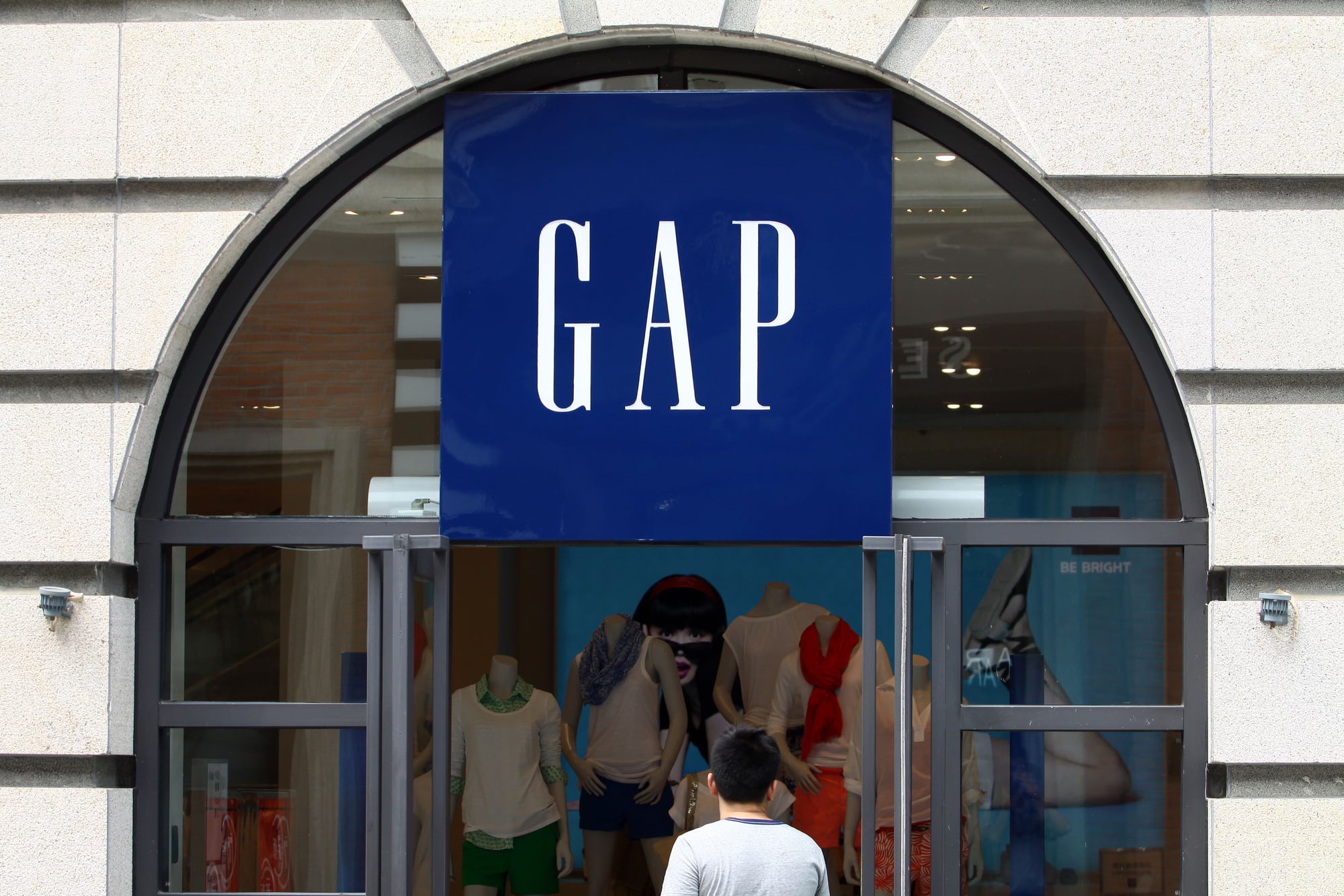
In 2010, Gap abruptly abandoned its classic blue box logo for a design featuring a small blue square behind the ‘p’ and a generic Helvetica font. The public backlash was so immediate and severe that the company reverted to its original logo after just six days.
This $100 million rebrand goes down as one of the most pointless and expensive week-long experiments in corporate history.
Tropicana

PepsiCo’s 2009 decision to replace Tropicana’s iconic orange with a straw design with a generic glass of juice caused sales to plummet by 20% in just two months. The new packaging removed all distinctive character that helped shoppers identify the brand on crowded supermarket shelves.
Facing a $30 million loss, PepsiCo quickly reinstated the original design in what became a textbook case of fixing something that wasn’t broken.
Mastercard
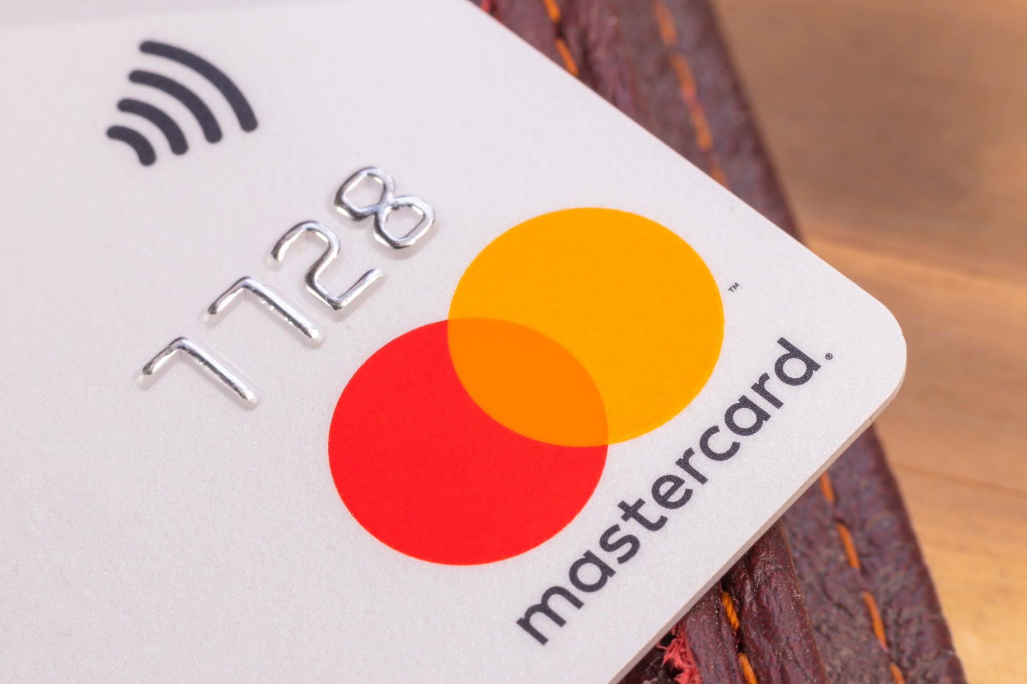
The credit card giant’s distinctive overlapping red and yellow circles had been instantly recognizable worldwide since 1968. In 2016, Mastercard simplified its logo by removing the combing effect and its name from the center, creating a minimalist version that lost much of its distinctive character.
Though not a complete disaster, the unnecessary simplification made the logo less memorable and distinctive in a crowded financial services landscape.
Animal Planet

The popular nature channel’s playful, globe-and-elephant logo was replaced in 2008 with a sideways text design that inexplicably put the ‘M’ in ‘Animal’ on its side. This bizarre choice confused viewers and offered no improvement over the beloved original.
The network later abandoned this failed experiment for a simpler wordmark, effectively admitting the unnecessary redesign had been a mistake.
Pepsi

The iconic Pepsi logo underwent a controversial $1 million redesign in 2008 that transformed its distinctive circular emblem into what many described as a ‘smiling fat man.’ The new design came with a 27-page design document explaining how the logo apparently incorporated the golden ratio, Earth’s magnetic fields, and the theory of relativity.
This overthinking of a perfectly good logo became a punchline in the design community.
JCPenney

The department store chain abandoned its distinctive serif logo for a minimalist square design in 2011 that looked more appropriate for a tech startup than a century-old retailer. The redesign coincided with a disastrous company reinvention that alienated core customers and contributed to a 25% sales drop.
JCPenney eventually returned to a version of its traditional logo after realizing the rebrand had needlessly erased decades of brand recognition.
Holiday Inn
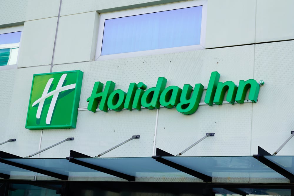
The hotel chain’s iconic script logo with its distinctive arrow was replaced in 2007 with a generic sans-serif typeface and a simple ‘H’ symbol. The new design erased 50 years of brand equity built around one of the most recognizable logos in the hospitality industry.
The redesign made the brand blend in with countless other hotel chains rather than stand out as it had for decades.
Kraft
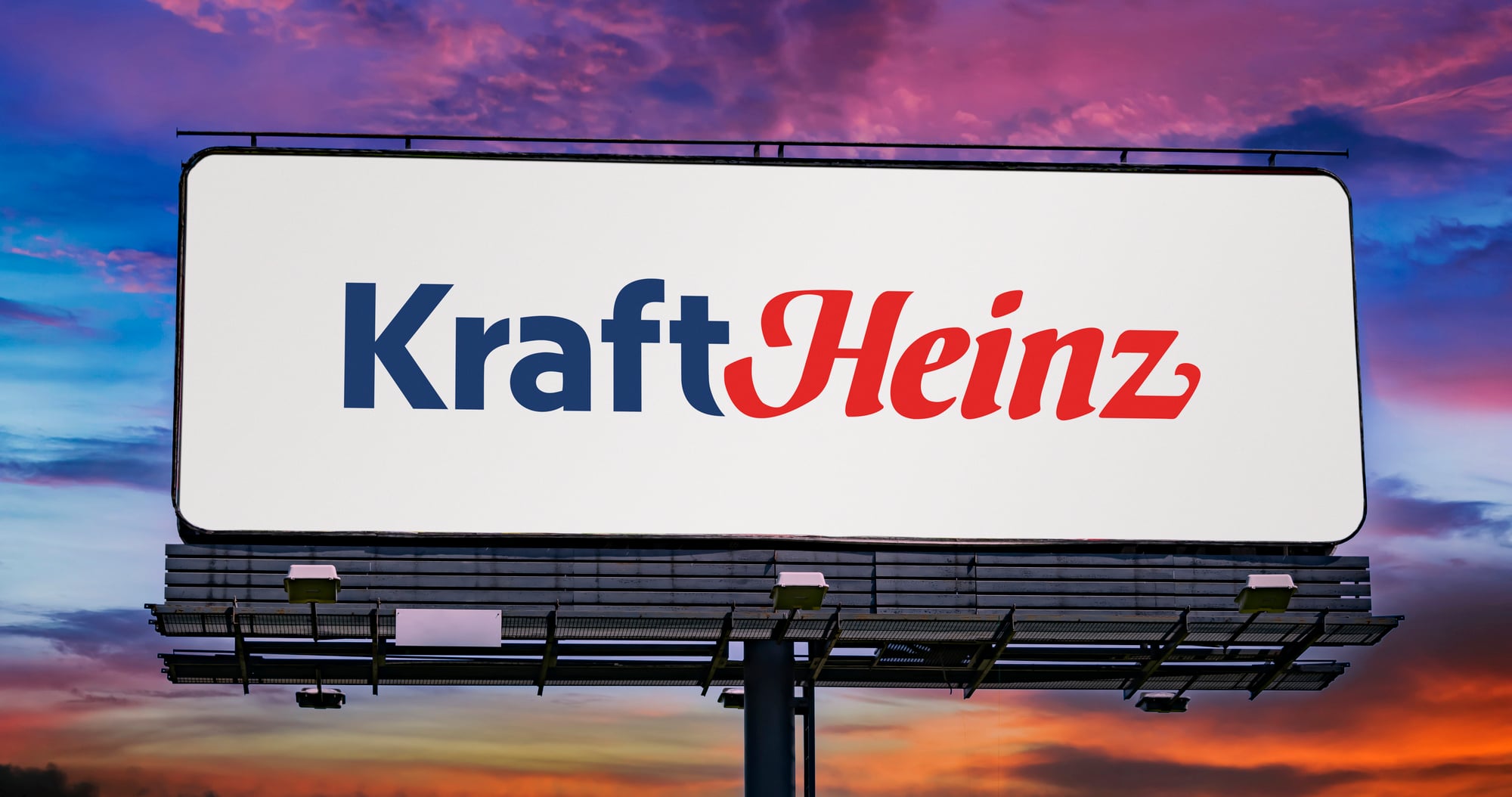
In 2009, Kraft replaced its distinctive red, white, and blue pinwheel logo with a lowercase wordmark featuring a nondescript ‘smile’ and an oddly placed burst. The redesign abandoned nearly a century of brand recognition for a generic look that could represent any company.
After merging with Heinz, the company eventually created a new corporate identity, effectively admitting the unnecessary redesign had failed to connect with consumers.
Seattle’s Best Coffee

Starbucks-owned Seattle’s Best Coffee abandoned its detailed, artisanal coffee seal for a simplistic red drop design in 2010. The drastic change stripped away all coffee references and brand character, making it look more like a blood donation center than a premium coffee brand.
The generic redesign erased decades of brand equity and was widely panned by design critics and customers alike.
Best Western

The hotel chain replaced its distinctive crown and script logo in 2015 with a simplified blue square containing the letters ‘BW.’ This minimalist approach abandoned 65 years of brand recognition for an anonymous-looking symbol that could represent any company in any industry.
The redesign removed all distinctive character from a logo that had successfully represented the brand for generations.
Weight Watchers

When Weight Watchers rebranded to ‘WW’ in 2018, it replaced its memorable logo with a nondescript acronym that abandoned decades of brand recognition. The simplified design came with the confusing tagline ‘Wellness that Works,’ losing the clear connection to its core weight loss service.
The unnecessary change confused longtime members and failed to attract the younger demographic it was targeting.
American Airlines

After 45 years with its iconic ‘AA’ eagle logo, American Airlines adopted a simplified flag design in 2013 that many critics described as clinical and soulless. The redesign transformed one of aviation’s most recognizable symbols into what resembled a generic credit card company logo.
Despite spending millions on the rebrand, the new logo lacks the character and instant recognition of its predecessor.
Uber

In 2016, Uber replaced its distinctive ‘U’ logo with an abstract ‘bit’ that looked like a backwards ‘C’ or a partially filled-in square. The confusing redesign forced users to search for the app on their phones as the new icon was completely unrecognizable.
After widespread mockery, Uber abandoned this unnecessary experiment in 2018 and returned to a simple wordmark that actually communicated who they were.
Airbnb

Airbnb’s 2014 logo redesign replaced its simple bubble script with the ‘Bélo’ symbol, which immediately drew comparisons to various body parts and became the subject of endless memes. While the company has stuck with the controversial logo, the unnecessary change created a distraction that overshadowed the brand’s message for months.
The previous script logo was working perfectly fine and didn’t need replacing.
Radio Shack

In an attempt to appear more modern, Radio Shack briefly rebranded as ‘The Shack’ in 2009 with a simplified logo that abandoned its distinctive red color and electronic connotations. The unnecessary redesign did nothing to address the company’s fundamental business challenges and confused loyal customers.
Radio Shack eventually reverted to its original name and a version of its classic logo before filing for bankruptcy in 2015.
Design Without Purpose

These unfortunate redesigns highlight the dangers of changing established visual identities without compelling reasons. While evolution is necessary for brands to stay relevant, these examples demonstrate how arbitrary changes can squander decades of built-up recognition and goodwill.
The most successful logo updates honor heritage while looking forward, rather than completely abandoning the equity that companies have spent millions to establish in the public consciousness.
More from Go2Tutors!

- The Romanov Crown Jewels and Their Tragic Fate
- 13 Historical Mysteries That Science Still Can’t Solve
- Famous Hoaxes That Fooled the World for Years
- 15 Child Stars with Tragic Adult Lives
- 16 Famous Jewelry Pieces in History
Like Go2Tutors’s content? Follow us on MSN.