15 Facts About Superhero Logos
Superhero logos aren’t just colorful designs slapped onto costumes—they’re carefully crafted symbols that have become some of the most recognizable emblems in the world. These iconic marks have evolved over decades, carrying deep meanings and fascinating backstories that most fans never hear about.
From trademark battles to design mishaps, the world of superhero logos is packed with surprising details. Here is a list of 15 fascinating facts about these legendary symbols that have captured imaginations for generations.
Superman’s Logo Was the First Trademarked Superhero Symbol

In 1945, Superman’s iconic ‘S’ shield became the first superhero logo to be officially trademarked, setting the stage for what would become a massive merchandising empire. This legal move kicked off the lucrative market for superhero licensing that we see today, with everything from t-shirts to lunch boxes bearing the famous diamond-shaped emblem.
The trademark essentially turned Superman’s chest symbol into one of the most valuable pieces of intellectual property in entertainment history.
Batman’s Original Logo Lasted Only One Issue

When Batman debuted in Detective Comics #27 in 1939, the logo on his chest was simply designed as a pair of wings without any head and with five wing points along the bottom, making it the most short-lived design in Batman history. The creators quickly realized the wingless bat looked more like a generic bird than the menacing creature they wanted to represent.
Shortly after its appearance, the logo doubled in size, the animal got its head and ears, and the number of webs increased from five to seven.
Like Go2Tutors’s content? Follow us on MSN.
Wonder Woman’s Logo Resembles Bird Wings

The intertwined W’s represent Wonder Woman’s name, and they’re both cleverly composed to mimic a bird’s spread wings—a fitting image, as in the comic books, Wonder Woman can fly. The golden double-W design isn’t just about her initials—it symbolizes freedom and flight, core aspects of the Amazonian princess’s character.
Legendary designer Milton Glazer had a hand in creating the Wonder Woman superhero logo, combining the two letters ‘W’ with a stylized wing motif.
The Batman Logo Has Gothic Influences
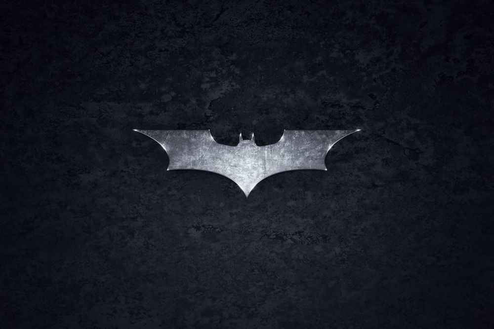
In 1941, the Batman logo acquired a Gothic style with wings that were stretched out and sharpened. This design choice wasn’t accidental—the Gothic elements perfectly matched Batman’s dark, brooding persona and the shadowy Gotham City atmosphere.
The pointed, angular design has remained a consistent theme throughout most of Batman’s logo evolution, even as other details have changed.
Superman’s ‘S’ Doesn’t Actually Stand for Superman
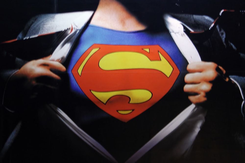
While most people assume the famous ‘S’ represents Superman, the symbol actually stands for ‘hope’ in Kryptonian culture according to various comic storylines. The scarlet ‘S’ is clearly enclosed in a diamond-shaped design against a brilliant yellow backdrop, and this superhero logo means optimism.
The diamond shape itself represents strength and resilience, making the entire emblem a powerful symbol of hope rather than just a simple letter.
Like Go2Tutors’s content? Follow us on MSN.
Green Lantern’s Logo Represents Power Sources

A Green Lantern’s power comes from his ring, and there’s more than one type of lantern, with each color representing a different team, but it’s the green ones that are the good guys. The circular lantern design on their chests mirrors the power source that gives them their abilities—their rings.
Each color in the emotional spectrum has its own lantern corps with distinct logos, creating an entire visual language around power and emotion.
Marvel’s First Logo Was Barely Noticeable

The original Marvel logo opted for simplicity, consisting merely of an M placed vertically over a C in tiny letters that appeared in a small box on the front cover, and it was somewhat overshadowed by other elements on the cover. This humble beginning is a far cry from the bold, red ‘MARVEL’ banner that dominates movie screens today.
The logo’s evolution mirrors the company’s growth from a small comic publisher to a global entertainment powerhouse.
Superhero Logos Use Minimal Advertising Yet Achieve Maximum Recognition

Super hero logos use no ads, no promotions, but they get immediately recognized by millions of audiences and cartoon fans. This recognition comes purely from storytelling and consistent visual presence across decades of comics, movies, and merchandise.
The logos have become so ingrained in popular culture that they function as instant visual shorthand for entire mythologies and value systems.
Like Go2Tutors’s content? Follow us on MSN.
Iron Man’s Logo Reflects His Arc Reactor

The circular design of Iron Man’s chest emblem mirrors the arc reactor that powers his suit and keeps him alive. This isn’t just aesthetic—it’s functional storytelling through design, where the logo literally represents the hero’s life force.
The glowing blue center in many versions of the logo directly references the reactor’s light, making it both a symbol and a practical element of the character.
Wonder Woman First Appeared in 1941 with Strong Feminist Symbolism

Wonder Woman first appeared on the cover of Sensation Comics in 1941, created by psychologist William Marston, and embodied the strength and power of a new type of heroine: a strong woman who must rule the world. Her logo has remained remarkably consistent compared to male heroes, suggesting that her original design was so perfectly conceived that it needed little modification.
The golden color choice reinforces themes of nobility and divine power.
Batman’s Logo Philosophy Emphasizes Simplicity
The biggest lesson we can all take away from Batman’s logo evolution is to truly let your logo speak for itself, as Batman simply used a bat silhouette that resembled Batman’s ensemble as he set out to fight evil. This minimalist approach proves that effective logos don’t need complex elements to be powerful.
The bat silhouette is instantly recognizable and conveys everything you need to know about the character’s nocturnal, mysterious nature.
Like Go2Tutors’s content? Follow us on MSN.
Superhero Logos Function as Instant Brand Recognition

Superhero logos are designed to inspire the people who see them, and more than just a logo, these meaningful emblems carry significant meaning. They work as modern mythological symbols that communicate complex ideas about justice, hope, and heroism in a single glance.
This symbolic power is why these logos remain effective across different cultures and generations.
The Batman Logo Changed Wing Point Numbers Frequently

The amount of wing points along the bottom varied from panel to panel in Batman’s early appearances, showing how fluid comic book design was in the early days. Artists often improvised details from issue to issue before standardization became important for merchandising.
The number of webs was constantly changing in the following years, reflecting the experimental nature of early comic book production.
Logo Colors Convey Specific Character Traits

Logo colors convey a sense of strength and relate to the character’s powers. Superman’s red, blue, and yellow create a palette of hope and strength, while Batman’s black and yellow (or gray) emphasize shadow and intimidation.
These color choices aren’t random—they’re psychological tools that help readers instantly understand each character’s personality and approach to heroism.
Like Go2Tutors’s content? Follow us on MSN.
Modern Superhero Logos Balance Classic and Contemporary Design

The updated logo speaks to the combination of classic and forward thinking that creators are embracing. Modern logo redesigns must honor decades of tradition while appealing to new audiences who expect contemporary aesthetics.
This balancing act explains why most major superhero logo updates are evolutionary rather than revolutionary—too much change risks alienating longtime fans.
Symbols That Transcend Comics

Today’s superhero logos have evolved far beyond their comic book origins to become cultural touchstones that appear on everything from skyscrapers to space missions. These symbols now represent ideals and aspirations that resonate with people who have never read a comic book.
The fact that a simple ‘S’ or bat silhouette can instantly communicate concepts of hope, justice, and heroism shows the incredible power of well-designed visual identity—proving that the best logos become part of our collective visual language.
More from Go2Tutors!

- 16 Historical Figures Who Were Nothing Like You Think
- 12 Things Sold in the 80s That Are Now Illegal
- 15 VHS Tapes That Could Be Worth Thousands
- 17 Historical “What Ifs” That Would Have Changed Everything
- 18 TV Shows That Vanished Without a Finale
Like Go2Tutors’s content? Follow us on MSN.