18 Patent Drawings That Look Nothing Like Products
Patents have always been fascinating glimpses into the minds of inventors, showing us the skeleton of an idea before it grew into something we recognize today. These technical illustrations serve a critical legal purpose, but sometimes they bear only a passing resemblance to the products that eventually made it to market.
The gap between patent drawings and final products can be startling, reflecting changes in technology, design priorities, or market realities. Here is a list of 18 patent drawings that look dramatically different from the products we came to know and love.
Apple iPhone
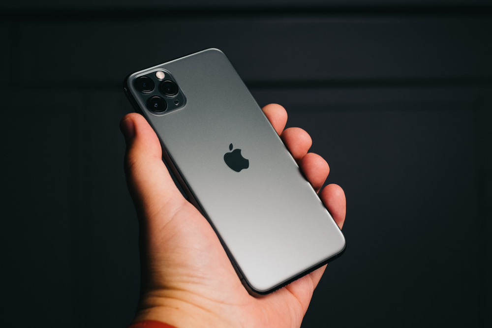
The original iPhone patent drawings from 2006 show a boxy device with sharp corners and minimal details. The actual product that revolutionized the smartphone industry featured rounded edges and a sleek interface that wasn’t evident in these clinical line drawings.
Apple’s engineers refined the ergonomics substantially between filing the patent and manufacturing the device.
Google Glass
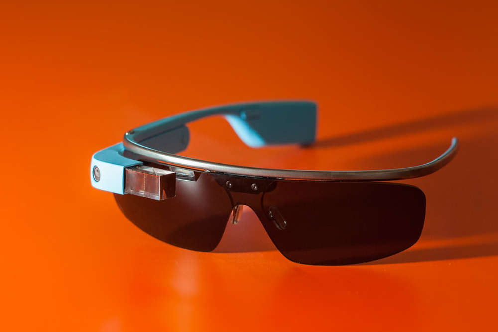
Google’s ambitious augmented reality eyewear looks almost mechanical and industrial in its patent illustrations. The drawings show a chunky apparatus with visible wiring and components, while the released product was relatively streamlined and futuristic.
Few consumers would have predicted the relatively elegant final design from these utilitarian sketches.
Tesla Model S

Early Tesla Model S patent drawings depict what looks more like a traditional sedan than the sleek electric vehicle we know today. The illustrations lack the signature aerodynamic profile and minimalist styling that became hallmarks of Tesla’s design language.
It’s like comparing a basic architectural blueprint to a finished luxury home.
Nintendo Wii Remote
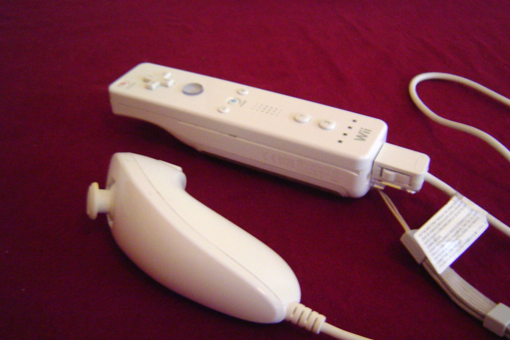
The patent drawings for Nintendo’s revolutionary motion controller show a rectangular device with basic button placements but miss the elegant simplicity of the final Wii Remote. The illustrations lack the iconic wrist strap and the polished contours that made the controller comfortable for extended gameplay sessions across generations of users.
Dyson Vacuum Cleaner

James Dyson’s original cyclone vacuum patent drawings look like something from a science textbook rather than a household appliance. The technical illustrations focus on the revolutionary bagless technology but give little indication of the colorful, distinctive aesthetic that would make Dyson products instantly recognizable in homes worldwide.
Amazon Kindle
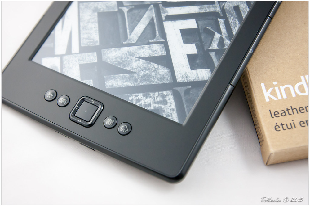
The Kindle’s patent drawings show a device with a keyboard and screen layout that bears only passing resemblance to the sleek e-reader that transformed the publishing industry. The illustrations depict something closer to a calculator than the thin, paper-like display that millions now use daily.
The functional essence is there, but the soul of the design is missing.
Segway
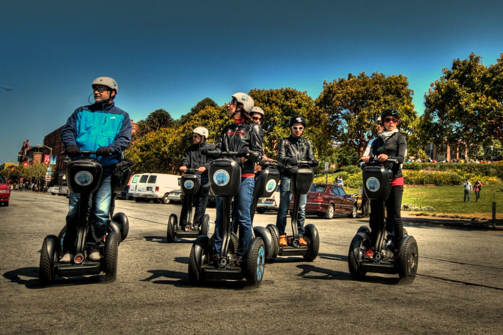
Dean Kamen’s Segway patent drawings look like a mechanical engineering project rather than a revolutionary personal transportation device. The technical illustrations focus on the self-balancing mechanism and drive system without capturing the upright, intuitive posture that made the Segway immediately recognizable.
They’re essentially stick figures compared to the final three-dimensional reality.
Fender Stratocaster Guitar

Leo Fender’s original Stratocaster patent drawings show the revolutionary electric guitar’s basic shape but miss the sensuous curves and proportions that would make it an icon. The utilitarian illustrations focus on the innovative pickup configuration and tremolo system without conveying the instrument’s aesthetic appeal that would influence design for decades to come.
Boeing 787 Dreamliner

The patent drawings for Boeing’s revolutionary composite airliner show a generic aircraft shape with little indication of the distinctive swept wings and nose profile that make the Dreamliner immediately recognizable. Aviation patents typically focus on specific innovations rather than overall appearance, making them look like simplified models from a child’s drawing.
Polaroid Camera
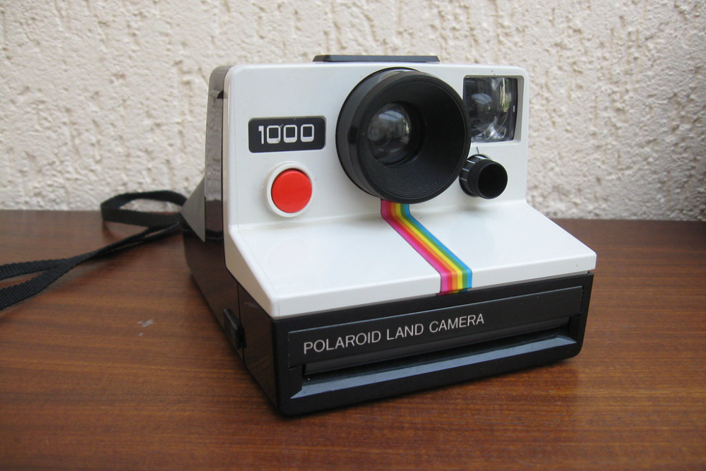
Edwin Land’s original instant camera patent drawings look more like a box with a lens than the iconic folding SX-70 model that would define the brand. The illustrations focus on the revolutionary chemical development process rather than the elegant, collapsible design that would make Polaroid cameras coveted objects of desire for decades.
Sony Walkman
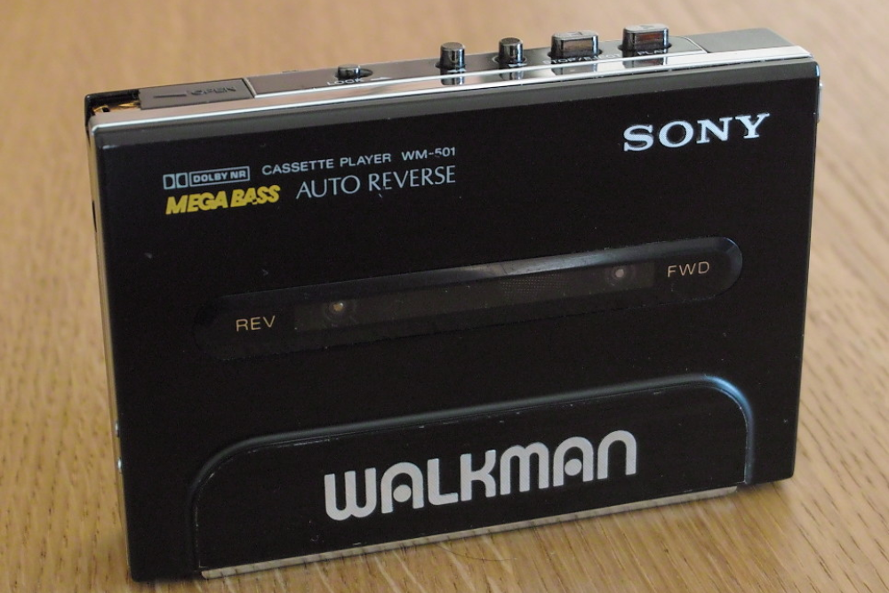
The original Walkman patent drawings depict what looks like a generic tape player rather than the revolutionary personal audio device that would transform how we consume music. The clinical illustrations give no hint of the bold colors, compact dimensions, or iconic headphones that would make the Walkman immediately recognizable worldwide.
Lego Brick

The patent drawings for the humble Lego brick show the basic interlocking mechanism but fail to convey the precise tolerances and material qualities that make these toys so satisfying to connect. The simple line drawings give no indication of the colorful, versatile building system that would spark creativity in generations of children and adults alike.
GoPro Camera
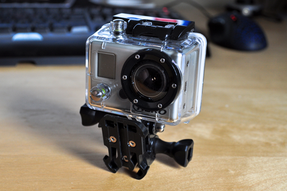
The GoPro patent drawings show a basic box with a lens rather than the rugged action camera that would revolutionize first-person video. The illustrations focus on mounting mechanisms and waterproof housing without capturing the distinctive square profile and lens position that make GoPros immediately recognizable in the wild.
Crocs Shoes
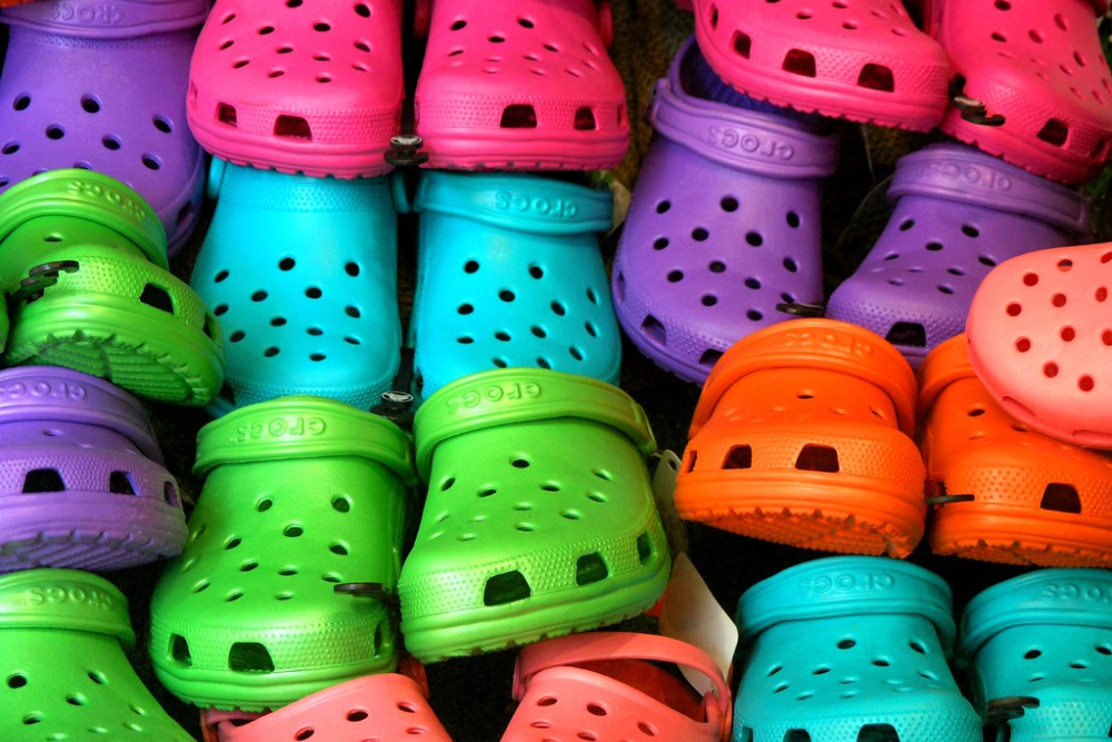
The patent drawings for Crocs show the basic clog design but miss the distinctive texture and appearance of the foam material that would make these shoes both loved and mocked worldwide. The illustrations focus on the ventilation holes and strap design without conveying the squishy comfort that converted millions of skeptics into devoted fans.
Beats Headphones

Dr. Dre’s Beats headphones look almost medical in their patent drawings, showing none of the sleek styling and bold branding that would make them status symbols. The illustrations focus on the headband mechanism and ear cup positioning without capturing the glossy finish and distinctive ‘b’ logo that turned audio equipment into fashion statements.
Post-it Notes

The patent drawings for 3M’s ubiquitous sticky notes show only the adhesive application process rather than the bright yellow squares that would become office essentials. The technical illustrations focus on the revolutionary repositionable glue strip rather than the simple brilliance of the final product that solved problems we didn’t know we had.
Rubik’s Cube
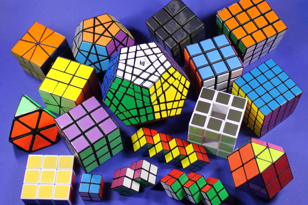
Ernő Rubik’s patent drawings show the internal mechanism of his famous puzzle but give little indication of the colorful, tactile object that would become one of the world’s bestselling toys. The technical illustrations focus on the clever pivoting structure without conveying the satisfying feel of the cube as it turns in your hands.
KitchenAid Stand Mixer

The patent drawings for the iconic KitchenAid mixer show the mechanical arrangement but miss the distinctive silhouette that has barely changed since the 1930s. The illustrations focus on the planetary mixing action rather than the curved, substantial body that has made these mixers coveted countertop statements in kitchens worldwide.
From Blueprint to Beloved
These technical drawings remind us that products evolve significantly from concept to creation. What begins as a functional sketch often transforms into something more refined, more beautiful, and more connected to human needs.
The stark difference between patent illustrations and finished products reveals the countless decisions, refinements, and improvements that happen between protecting an idea and presenting it to the world.
The journey from patent to product isn’t just about protecting intellectual property—it’s about transforming bare-bones concepts into objects people welcome into their lives.
Perhaps that’s the most important design element that patent drawings could never capture: the relationship we build with the products that earn their place in our daily routines.
More from Go2Tutors!

- The Romanov Crown Jewels and Their Tragic Fate
- 13 Historical Mysteries That Science Still Can’t Solve
- Famous Hoaxes That Fooled the World for Years
- 15 Child Stars with Tragic Adult Lives
- 16 Famous Jewelry Pieces in History
Like Go2Tutors’s content? Follow us on MSN.