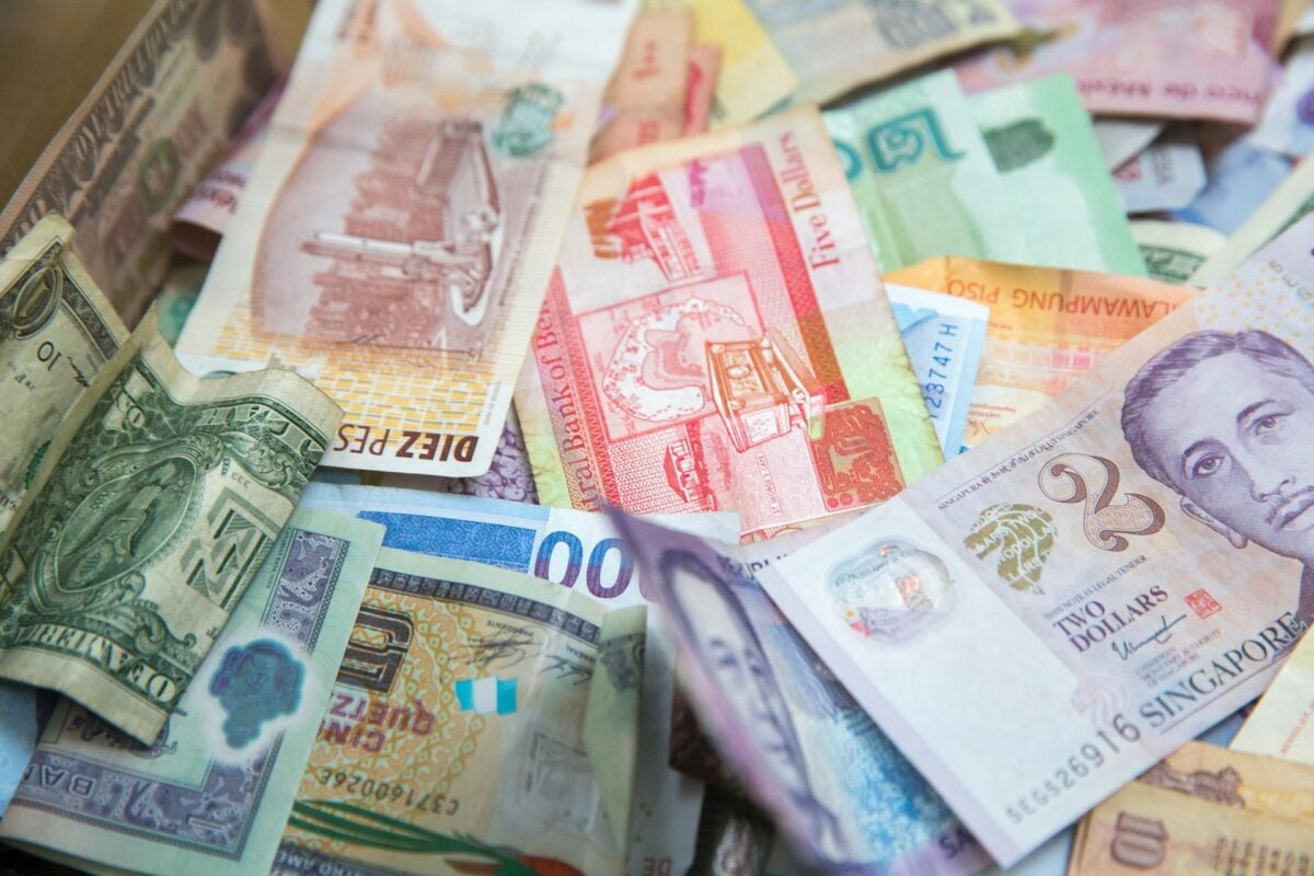
Fascinating Facts About Global Currency Designs
Walking through a foreign country, the first thing that feels genuinely different isn’t the language or the architecture — it’s the money. Pull out a bill from your wallet and really look at it.
Not at the denomination or to check if it’s real, but at the tiny decisions someone made about what deserved to be there forever. The colors, the faces, the symbols tucked into corners.
Every currency tells a story about what a country thinks matters most.
Switzerland’s Vertical Bills
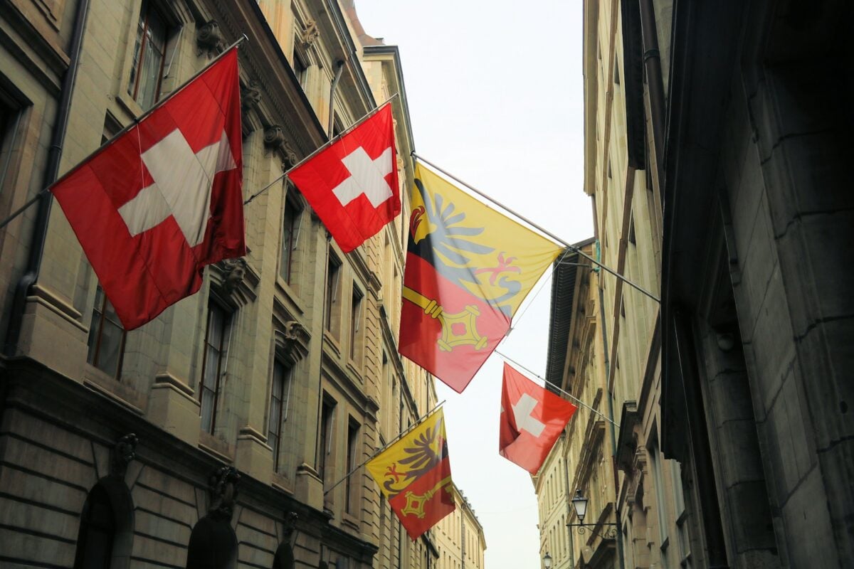
Swiss francs break the most basic rule of paper money. They’re printed vertically instead of horizontally.
No other major currency does this. The decision wasn’t arbitrary.
Switzerland redesigned their bills to make them harder to counterfeit and easier for visually impaired people to distinguish. Function over tradition.
Canada’s Scratch-and-Sniff Money
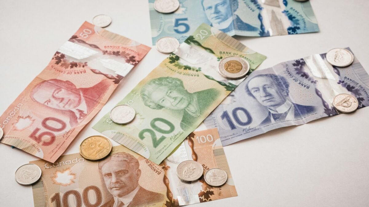
The newest Canadian bills smell like maple syrup when you scratch them. This wasn’t intentional.
The Bank of Canada investigated complaints about the scent and concluded it comes from the ink and paper combination, not added fragrance. People kept reporting it anyway.
So now Canada has accidentally aromatic money, and they’ve decided to embrace it rather than fix it.
Australia’s Plastic Pioneer Status
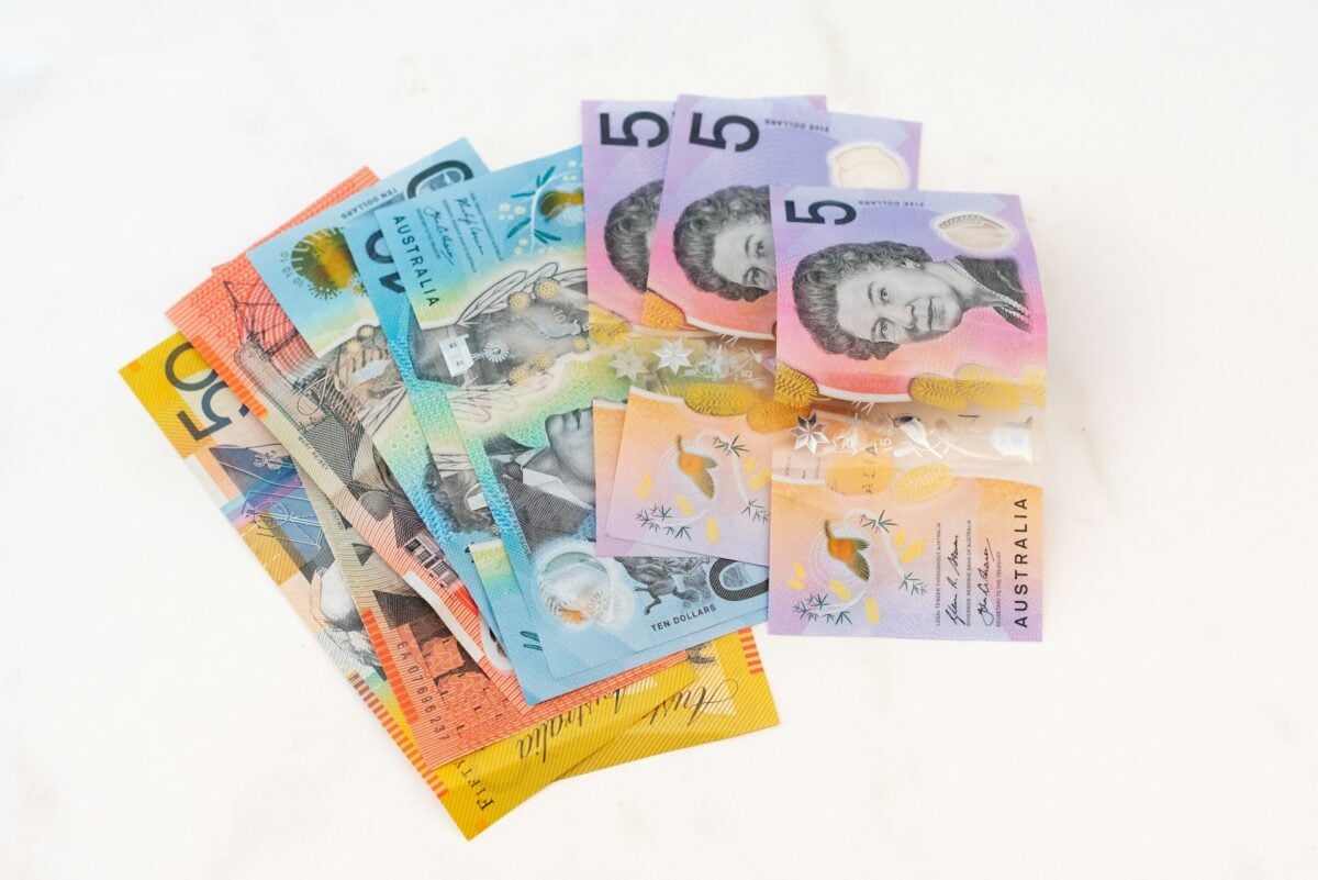
Australia didn’t just switch to polymer bills for durability (though they last four times longer than paper bills, which is something, considering how much abuse currency takes in daily life) — they did it because their paper money was embarrassingly easy to forge. And the thing about being the first country to make this switch, back in 1988, is that everyone else watched to see if it would work before following suit.
It did work, obviously, since more than 30 countries now use polymer currency, but imagine being the guinea pig for an entire monetary system overhaul; imagine the meetings where someone had to stand up and say, essentially, “Let’s make our money out of plastic and see what happens.” The Reserve Bank of Australia took that gamble. Bold move.
Japan’s Anti-Counterfeiting Hologram
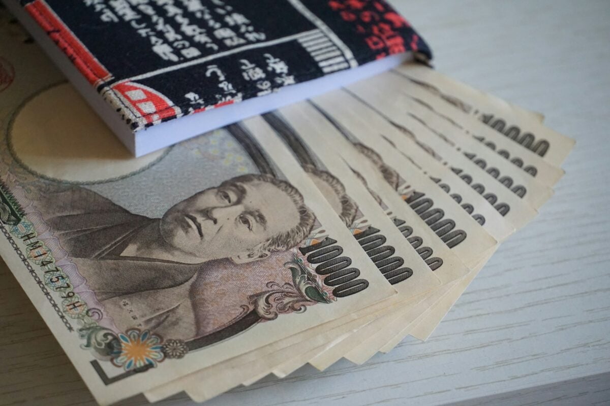
Japanese yen features a hologram that changes images when you tilt it. The 10,000 yen note shows a phoenix that appears to move its wings.
This isn’t just decoration. It’s one of the most sophisticated anti-counterfeiting measures in the world, impossible to reproduce with standard printing equipment.
Norway’s Pixelated Landscapes
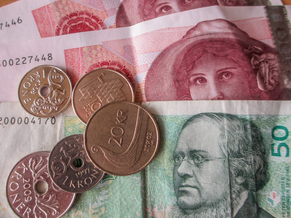
Norwegian kroner look like they were designed by a video game artist. The newer bills feature pixelated, abstract representations of the country’s coastline and northern lights instead of traditional portraits or monuments.
The design was controversial when introduced in 2017. People complained it didn’t look like “real money.”
The central bank’s response was essentially: that’s the point. Currency should evolve with the times, not stay frozen in the past.
Euro’s Hidden Map
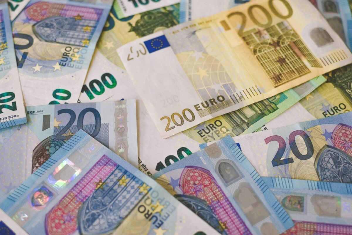
Look closely at any euro bill and you’ll find Europe staring back at you. Not obviously — this isn’t a geography lesson printed on money.
The map appears subtly in the background patterns, almost like a watermark that reveals itself only when you’re paying attention. Different denominations show different portions of the continent, and the architectural elements aren’t specific buildings but generic representations of European styles across different periods.
It’s remarkably thoughtful, this decision to create a currency that belongs to everyone by belonging to no one in particular. The bridges and windows and doorways could be anywhere in Europe, which makes them everywhere in Europe simultaneously.
New Zealand’s Transparent Windows
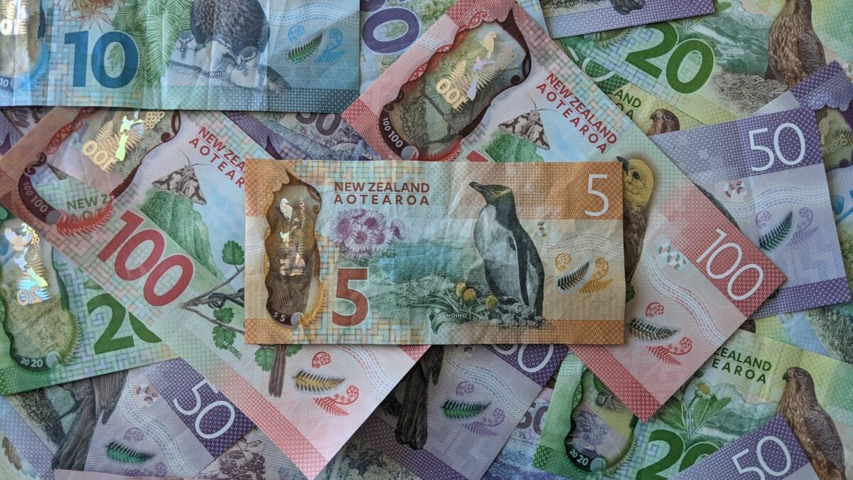
New Zealand dollars have clear plastic windows cut right through them. Not just a see-through patch — actual pits you can poke your finger through.
These windows contain micro-printing and color-changing elements that make counterfeiting nearly impossible. Plus, they look cool, which probably wasn’t the primary consideration but certainly doesn’t hurt.
United Kingdom’s Braille Dots
British pounds include raised dots that allow blind and visually impaired people to identify denominations by touch. Each note has a different pattern of dots along the edge.
This feature predates the Americans with Disabilities Act by decades. The UK added tactile elements to their currency in the 1960s, making them pioneers in accessible money design.
Singapore’s Portrait Precision
Singapore’s currency features the most precise microprinting in the world. The text is so small it requires a magnifying glass to read, but it’s perfectly legible under magnification.
Each bill contains the entire national pledge printed multiple times in letters smaller than the width of human hair. It’s both a security feature and a point of national pride — Singapore doesn’t do anything halfway, including their money.
Sweden’s Forgotten Children’s Author
Swedish kroner honor Astrid Lindgren, creator of Pippi Longstocking, on their 20-kronor note. She’s the only children’s book author to appear on active currency anywhere in the world.
The choice reflects Sweden’s values: creativity, childhood, and storytelling matter as much as politics or economics. It’s a refreshingly human approach to who deserves to be remembered on money.
Mexico’s Polymer Upgrade
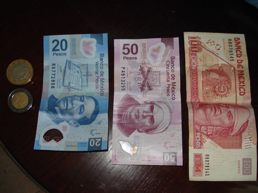
Mexico’s newest bills combine traditional paper with polymer strips for added security. The 500-peso note features a clear window with a hummingbird that appears to move when tilted.
The design celebrates Mexico’s biodiversity rather than just historical figures. Plants, animals, and ecosystems share space with cultural icons, creating currency that feels alive.
Thailand’s Color-Coded System
Thai baht uses a strict color-coding system where each denomination has its own distinct color that never changes, even through redesigns. The 100-baht note has been red for over 50 years.
This consistency helps with quick identification and reduces confusion, especially for tourists. It’s practical design that prioritizes function over artistic expression.
Bhutan’s Spiritual Symbols
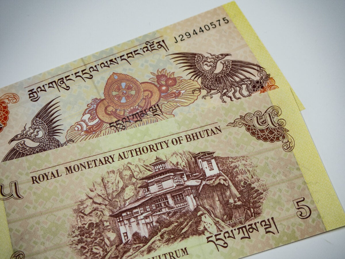
Bhutanese ngultrum incorporates Buddhist symbols and traditional architecture into every design element. Prayer wheels, stupas, and monastery illustrations appear alongside security features.
The currency reflects the country’s Gross National Happiness philosophy — money should serve spiritual and cultural values, not just economic ones.
The Universal Language of Security
Every modern currency speaks the same secret language of anti-counterfeiting measures, regardless of what pictures end up on the front. Watermarks and security threads, color-changing inks and microprinting — these features have become the true international standard, more universal than any exchange rate.
Countries may disagree on politics or trade, but they all share techniques for protecting their money from forgery. It’s a quiet form of cooperation that happens without treaties or headlines, central banks learning from each other’s innovations in an endless arms race against counterfeiters.
More from Go2Tutors!

- The Romanov Crown Jewels and Their Tragic Fate
- 13 Historical Mysteries That Science Still Can’t Solve
- Famous Hoaxes That Fooled the World for Years
- 15 Child Stars with Tragic Adult Lives
- 16 Famous Jewelry Pieces in History
Like Go2Tutors’s content? Follow us on MSN.