Why the Grocery Store Layout Is Designed to Make You Spend More
There’s a particular feeling that hits somewhere around aisle seven — the one where you came in for milk and somehow you’re now holding a block of aged cheese, a seasonal candle, and a bag of trail mix you didn’t know existed until thirty seconds ago. It doesn’t feel like manipulation.
It feels like discovery. That’s rather the point. Grocery stores are among the most meticulously engineered retail environments on earth, and almost nothing about them is accidental — not the smell, not the lighting, not the reason the milk is always so far from the door.
What follows is a walk through the design choices that empty your wallet before you even reach the checkout line.
The Produce Entrance

Fresh produce is almost always the first thing you see when you walk into a grocery store. That’s not a coincidence — it’s a calculated opening move.
The bright colors and natural textures prime your brain to feel healthy, generous, and open to spending.
The Milk at the Back
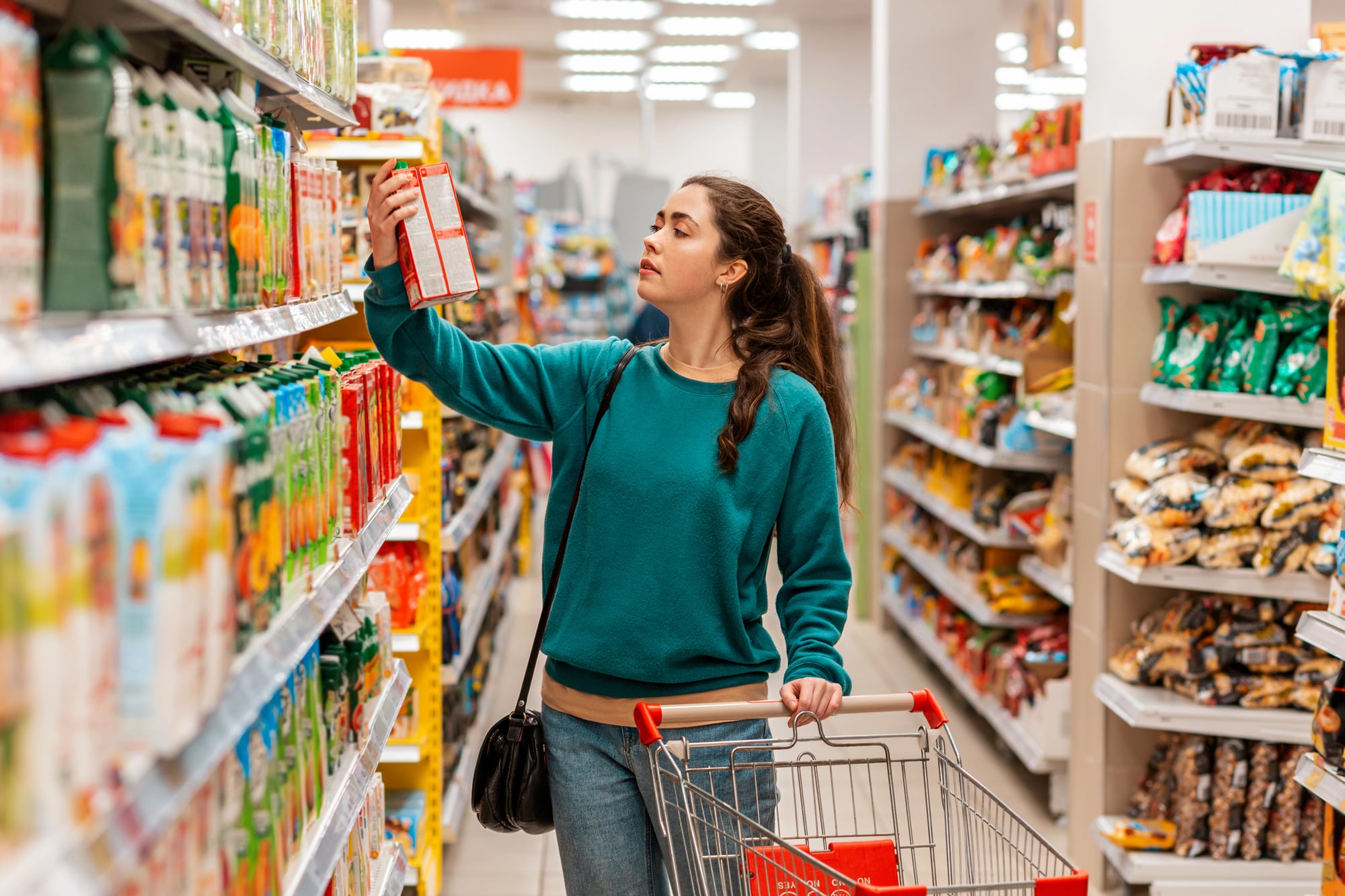
Milk is one of the most frequently purchased items in any grocery store, and yet — almost universally — it’s positioned as far from the entrance as the store’s square footage allows, which means you have to walk past hundreds of other products just to get the one thing you actually came for. So you meander through the cereal aisle, pause near the yogurt (which is conveniently right there), and pick up something called “multigrain crackers” that you’ll eat exactly once before they go stale in the back of a cabinet.
And the store knew: proximity to necessity is a liability when the goal is exposure to everything else.
The Bakery Smell
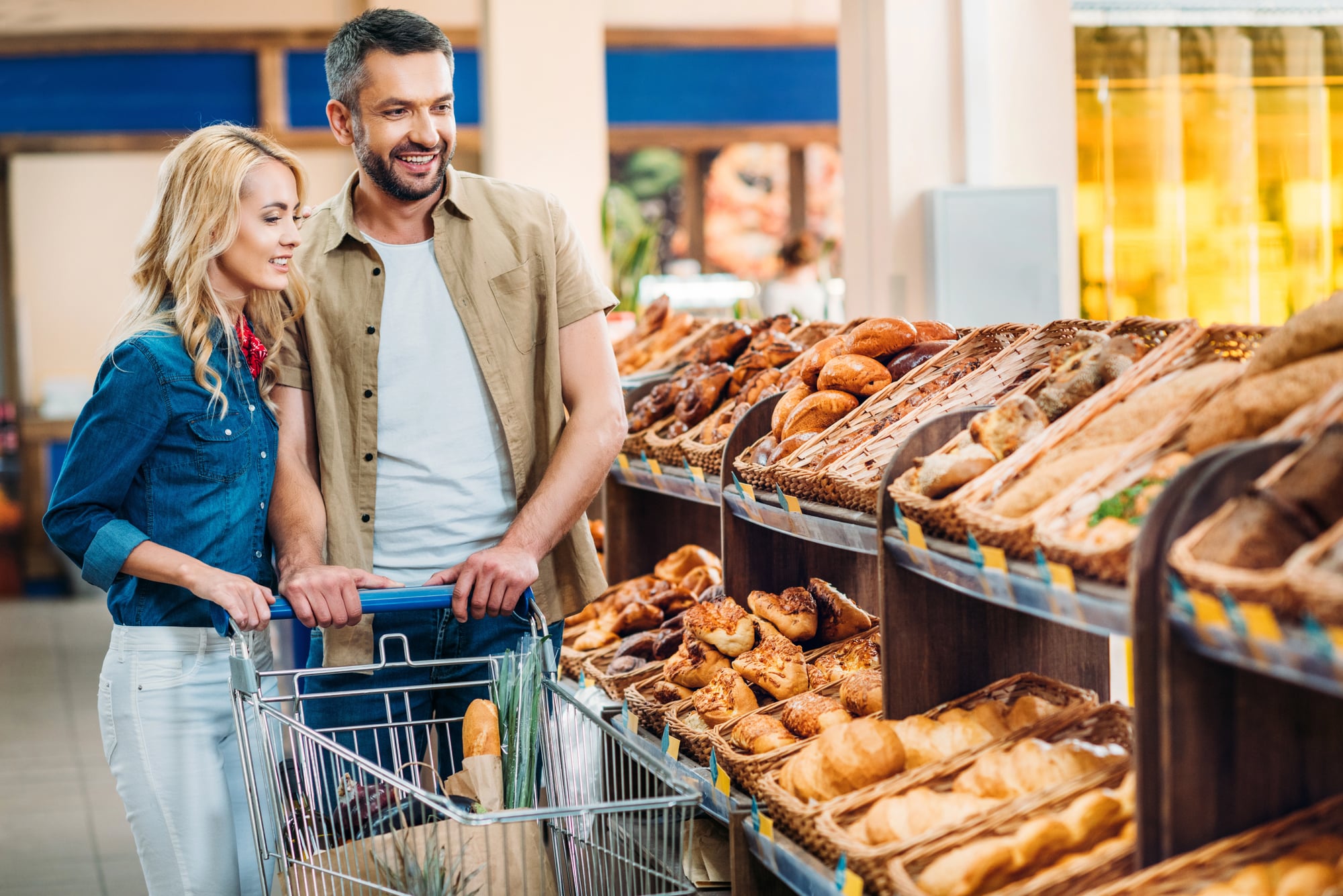
Smell is the most stubborn of the senses — it bypasses the rational parts of the brain and lands somewhere older, somewhere that responds to warmth and bread the way a cold person responds to a fire. Grocery stores have known this for decades, which is why many of them vent the bakery toward the entrance rather than tucking it away in a back corner.
The smell doesn’t ask whether you’re hungry. It just quietly rearranges your intentions.
Eye-Level Shelving
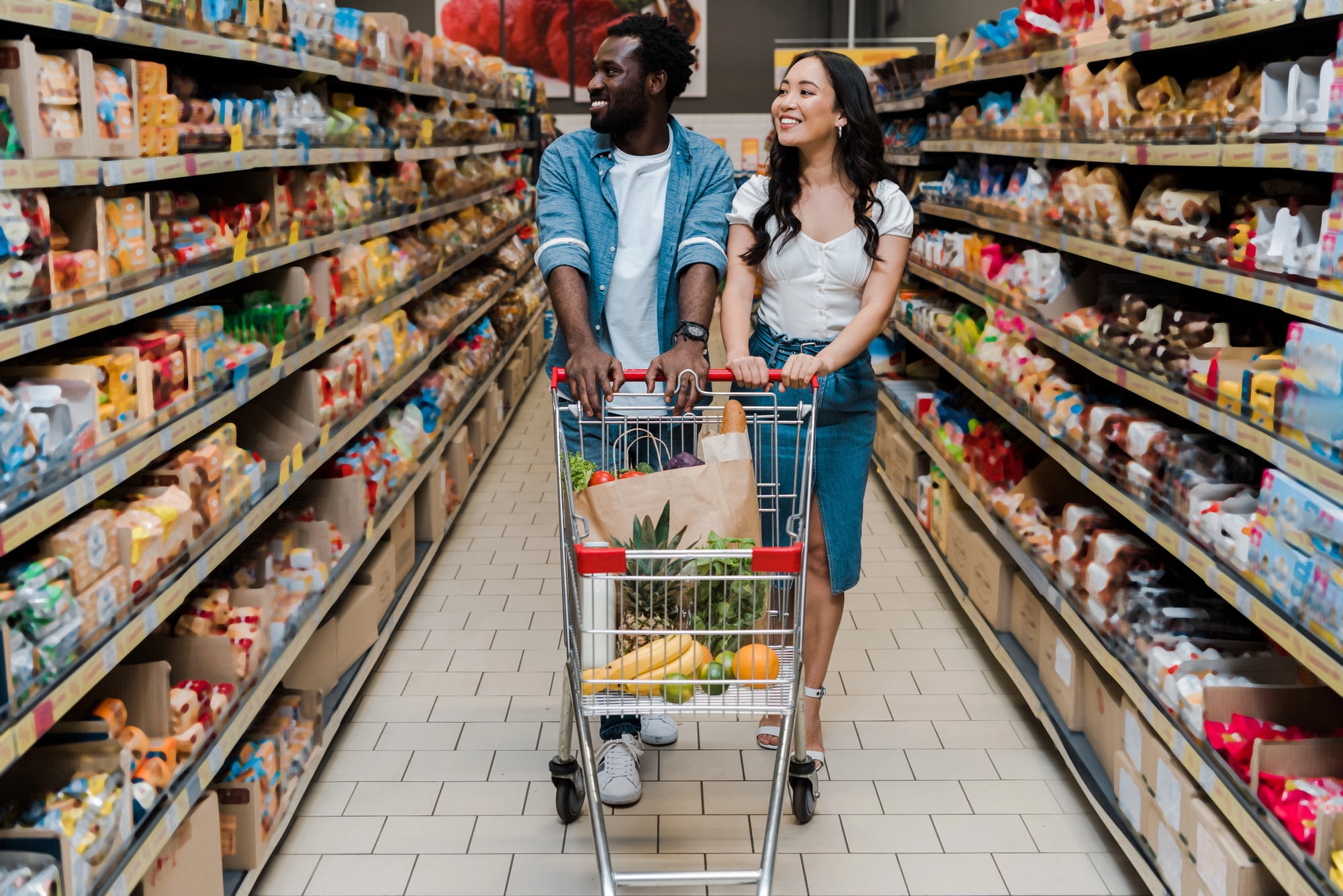
The most profitable shelf in any aisle is the one directly at eye level — full stop. That’s where brands pay premium slotting fees to place their products, and it works because most shoppers look straight ahead and reach without thinking.
Anything healthier, cheaper, or more obscure tends to live on the bottom shelf, crouched down there like it’s waiting to be discovered. Turns out, it usually isn’t.
The End Cap Illusion
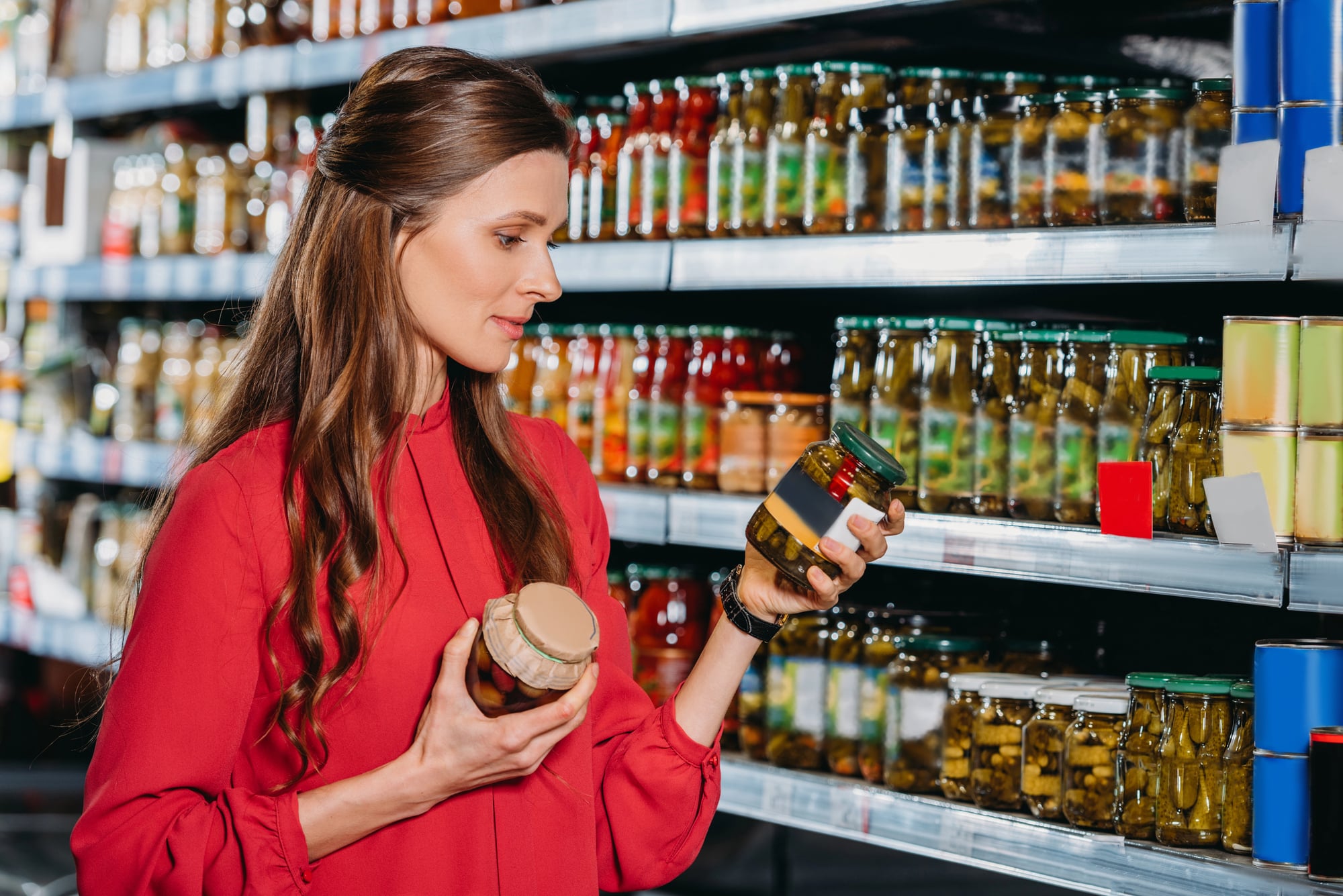
End caps — those display shelves at the very end of each aisle — feel like deals. They rarely are.
Retailers use them to spotlight products with high margins, products they need to move, or simply whatever brand paid extra for the placement. The perception of a bargain does most of the work without the store having to discount anything.
The Decompression Zone
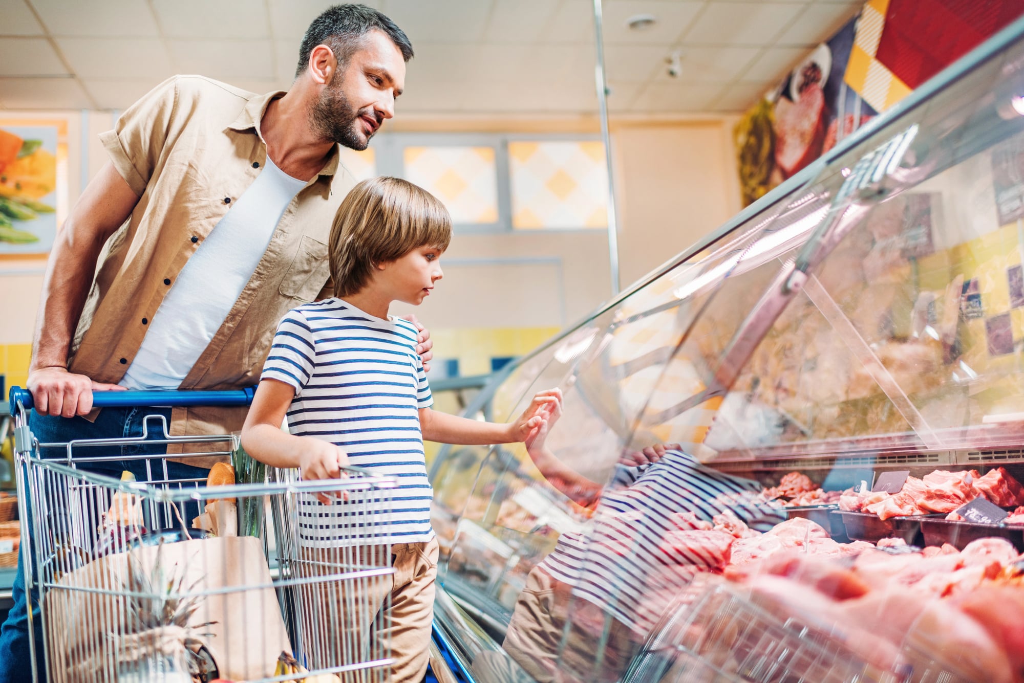
The first ten to fifteen feet inside any large grocery store is what retail designers call the “decompression zone” — and what happens there is essentially a controlled reset: your walking pace slows, your eyes adjust, your brain shifts from outside-world mode to shopping mode, and during that transition you’re nearly indifferent to whatever products are placed right in front of you. So smart stores don’t put high-margin items in that zone at all; they use it for carts, baskets, flowers, and seasonal displays that set a mood rather than demand a decision.
It’s the retail equivalent of a deep breath — and it’s very much engineered.
Cart Size
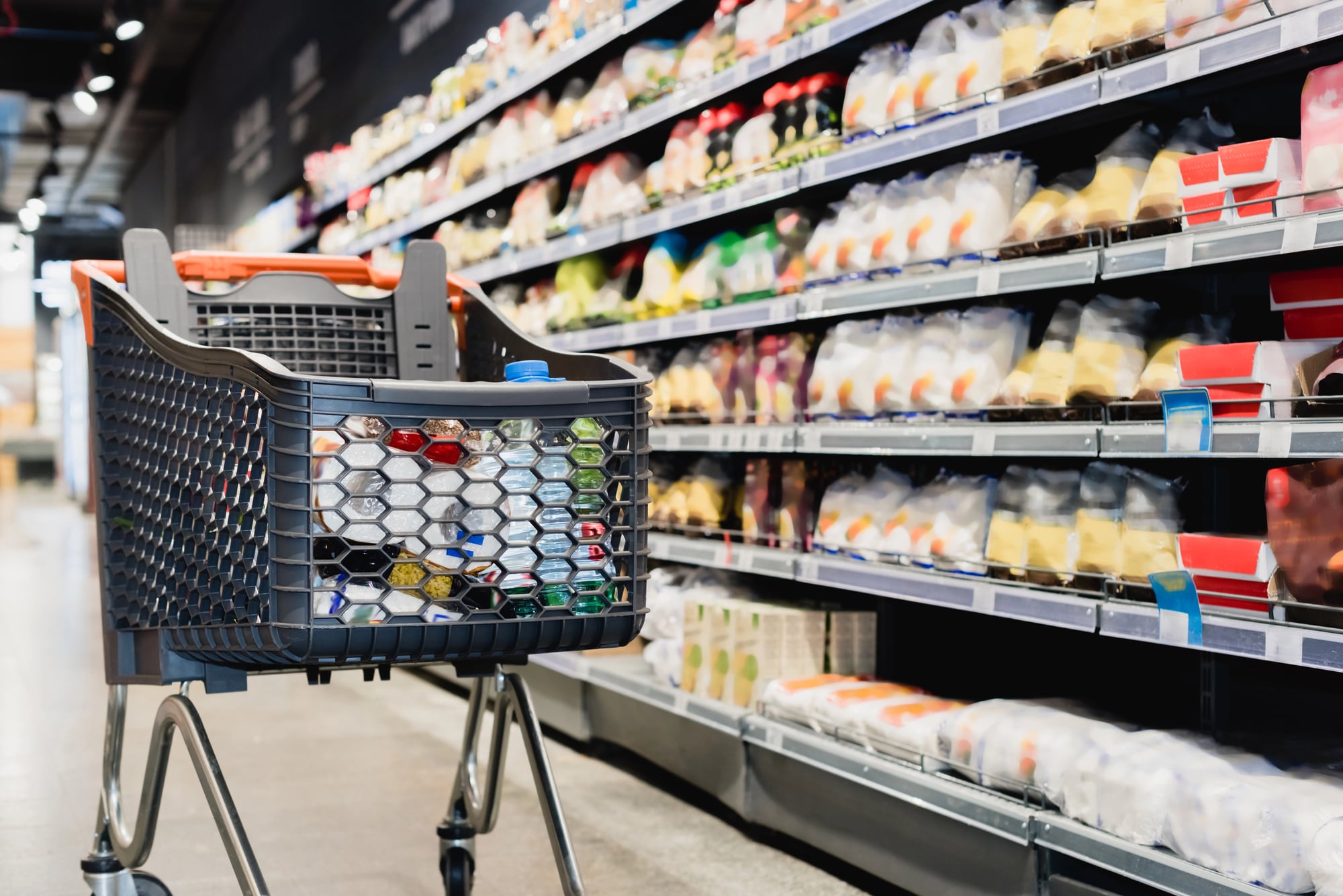
A grocery cart is, in a quiet way, a kind of psychological contract — it implies an amount of shopping you haven’t committed to yet but feel vaguely obligated to fill. Studies tracking shopper behavior have found that larger carts correlate with larger purchases, not because people need more but because an empty cart registers as a kind of failure.
The cart doesn’t pressure you. It simply waits, wide and expectant, and lets the math do its work.
Slow Music
Slower music makes you shop more slowly, and shopping more slowly makes you buy more. This has been demonstrated in peer-reviewed research since the 1980s, which makes it a remarkably old trick that still works on almost everyone.
Grocery stores pipe in tempos that feel casual and unurgent, because a relaxed shopper is a browsing shopper, and a browsing shopper is a spending shopper. To be fair, it’s not the worst way to spend an afternoon — but you’re not in control of the soundtrack.
Store Brand PlacementStore
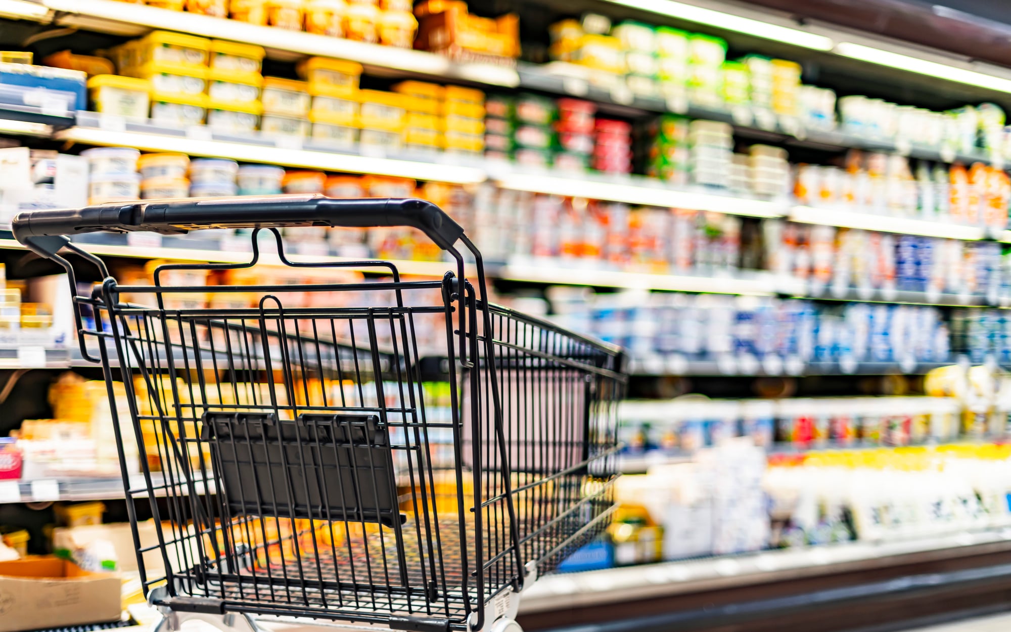
Store brands are almost always placed just below or just to the right of name brands. That’s deliberate.
The name brand catches your eye first — it anchors your sense of what that product costs — and then the store brand appears as the sensible alternative. The comparison does the persuading. The store wins either way.
Loss Leaders
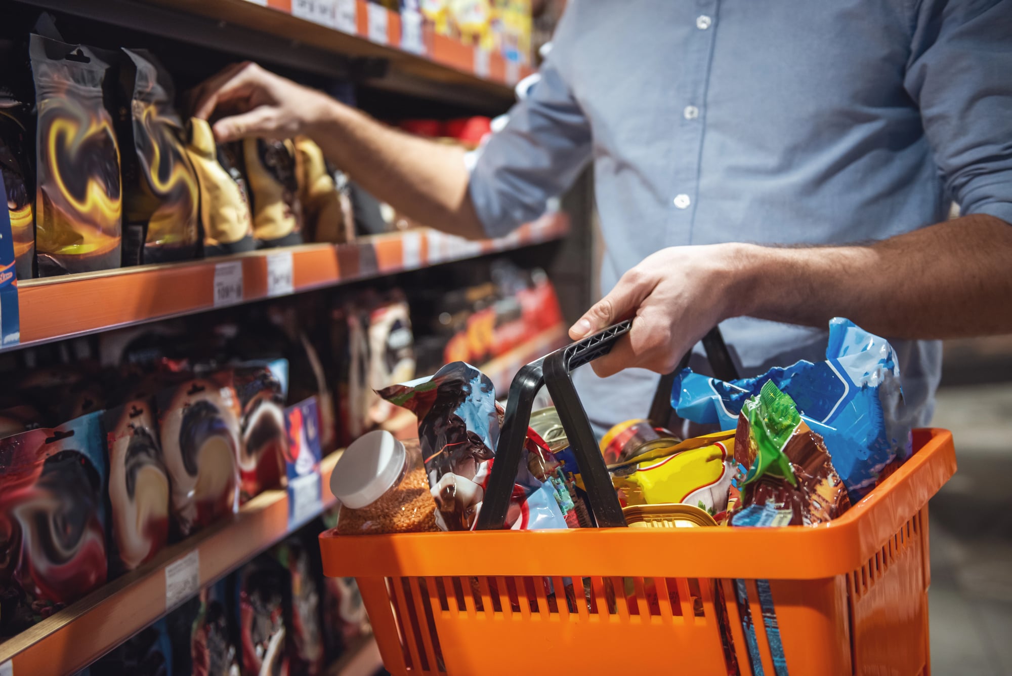
A loss leader is a product priced so low the store actually loses money on it — whole roasted chickens for five dollars, eggs below cost, certain cuts of meat that make you feel like you stumbled onto something — and the logic is that a shopper who comes in for the deal will stay long enough, and wander far enough, to buy a dozen other things at normal margin. It’s a strategy that treats one honest transaction as the beginning of a much longer negotiation, one where the store knows exactly what it’s doing and you’re mostly just glad about the chicken.
So yes, that rotisserie chicken is real. The context around it is not.
The Deli Counter
The deli counter requires you to wait, and waiting does something useful to a person: it idles the part of the brain responsible for efficient decision-making and hands the wheel over to appetite. While you stand there watching someone slice turkey, your eyes drift to the prepared salads, the cheese display, the little plastic containers of olives priced at something you would never agree to in an aisle.
Hunger and boredom are a retail combination that stores have quietly weaponized for decades.
Lighting by Department
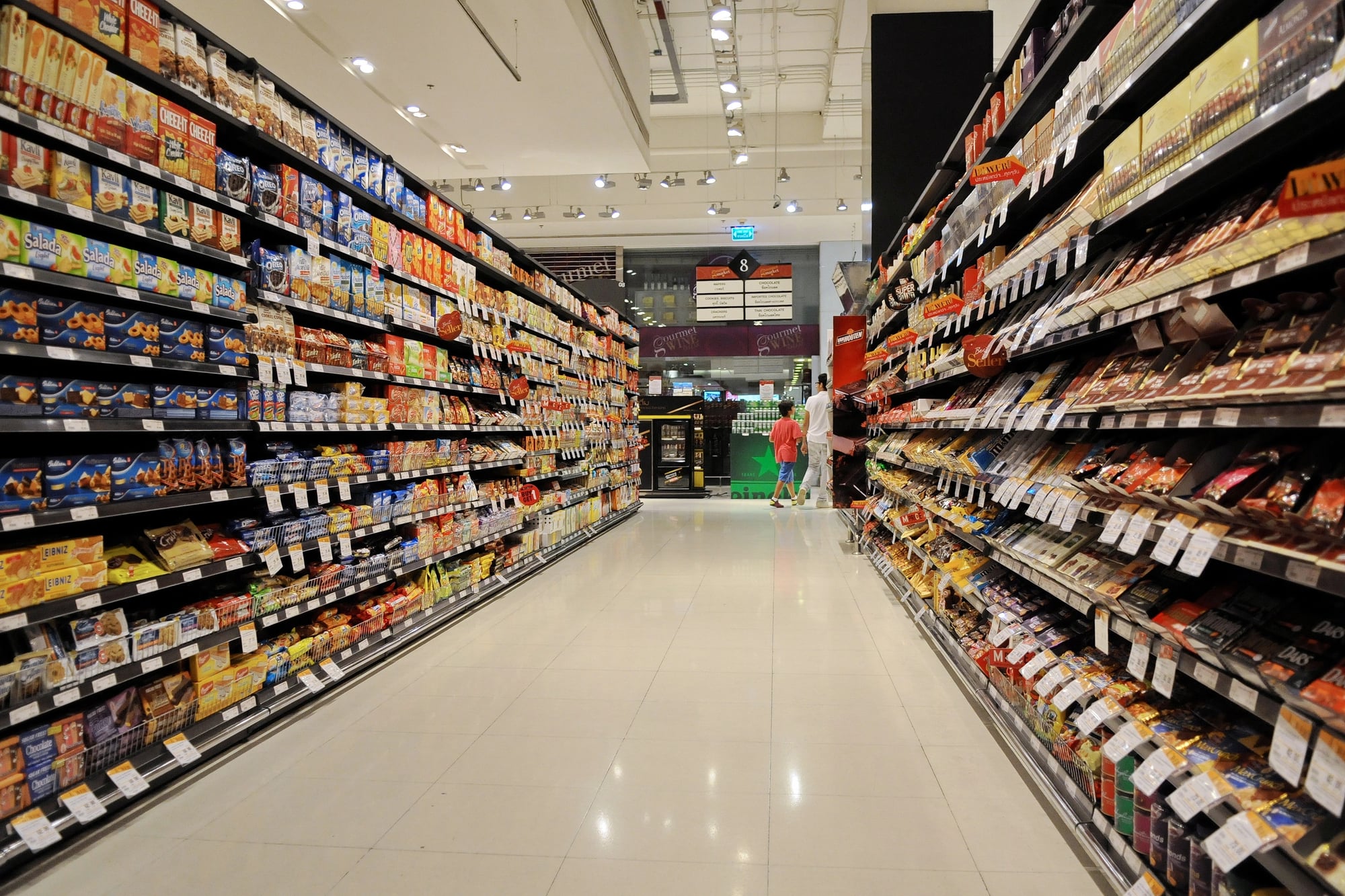
Grocery stores don’t use the same lighting throughout — and the variation is intentional, not decorative. Meat departments use warm pinkish lighting because it makes the products look fresher and more vibrant; produce gets bright white light that makes colors pop; the bakery is often warmer and softer, which reads as comfort.
The right light makes you trust the product without knowing why you trust it, which is saying something about how much faith you’re placing in a lighting fixture.
The Color Red
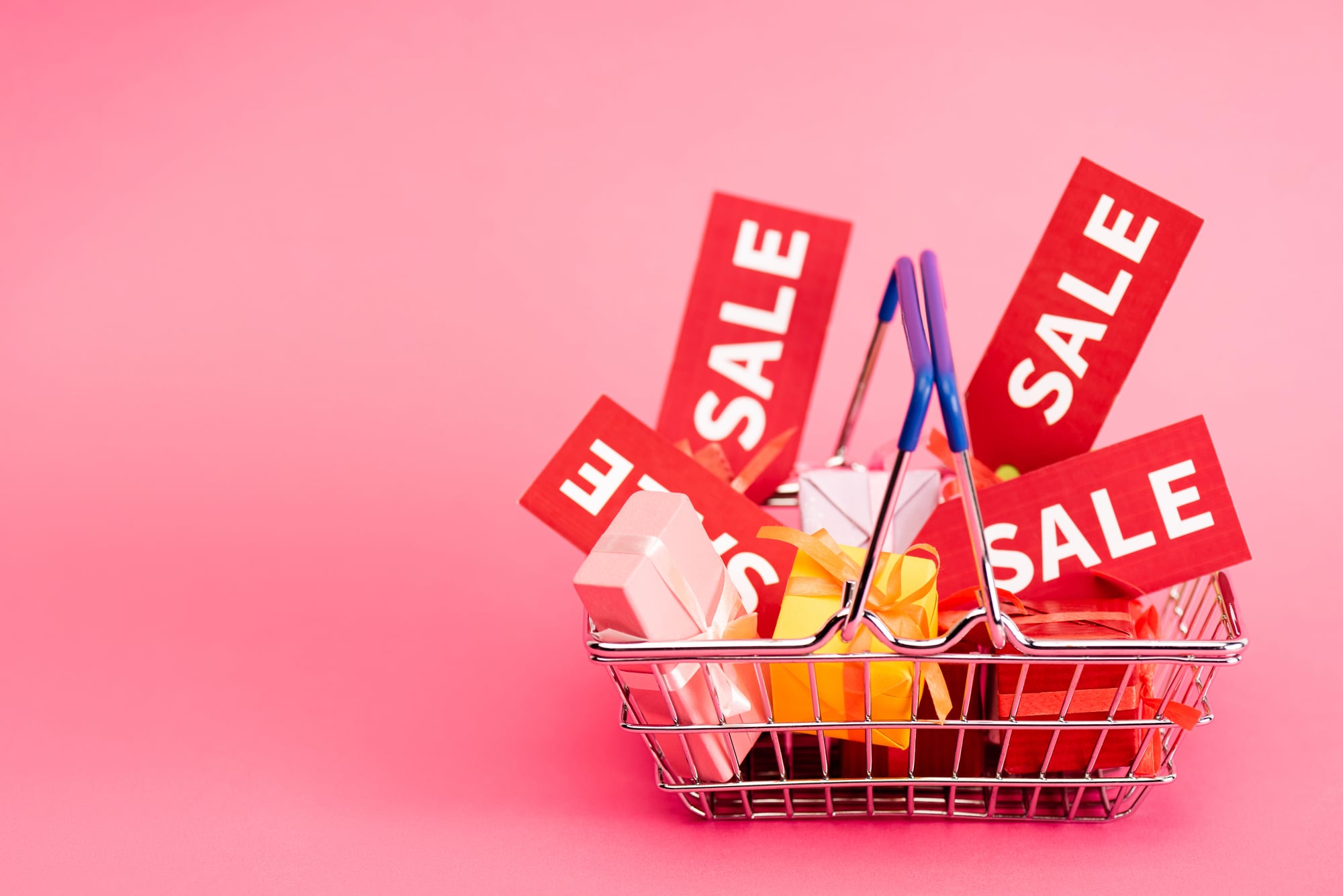
Red triggers urgency. Retailers know this and use it liberally on sale tags, clearance signage, and promotional displays.
The color doesn’t mean the deal is better — it just means the deal feels more pressing. You reach for the red-tagged item before you’ve evaluated whether you want it.
The Checkout Gauntlet
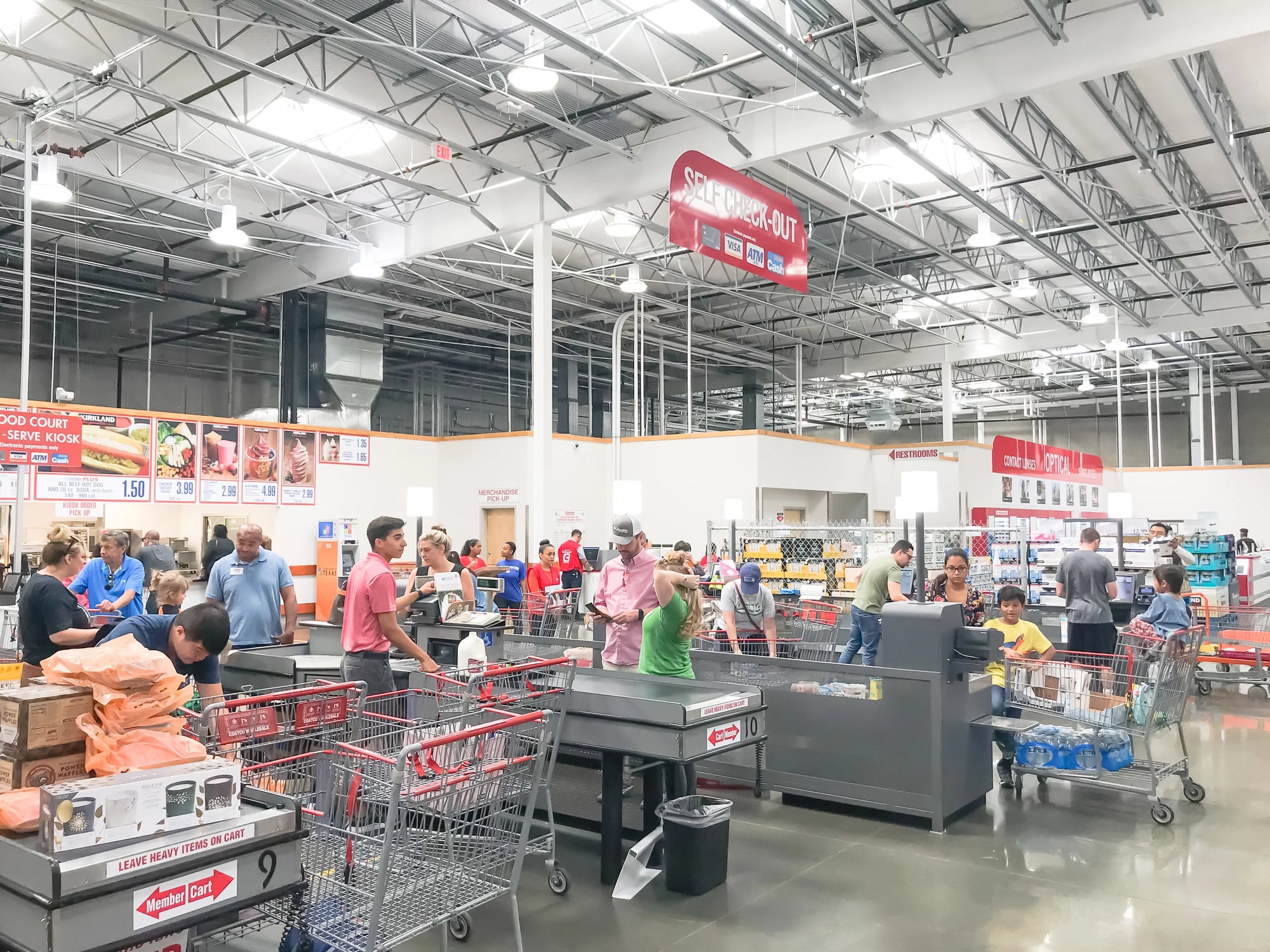
The checkout line is the last structured environment the store controls before you leave, and it is — without exaggeration — packed with products chosen specifically because people will grab them on impulse rather than deliberation: gum, batteries, travel-sized things, candy bars, glossy magazines about celebrities you’ve largely forgotten. And it works because by that point you’ve already been shopping for twenty minutes and your decision fatigue is real — the part of your brain that evaluates whether you need something has been running for a while and it’s tired, and a Snickers bar doesn’t require much justification when you’re standing still waiting for the person ahead of you to find their rewards card.
Floor Tile Patterns
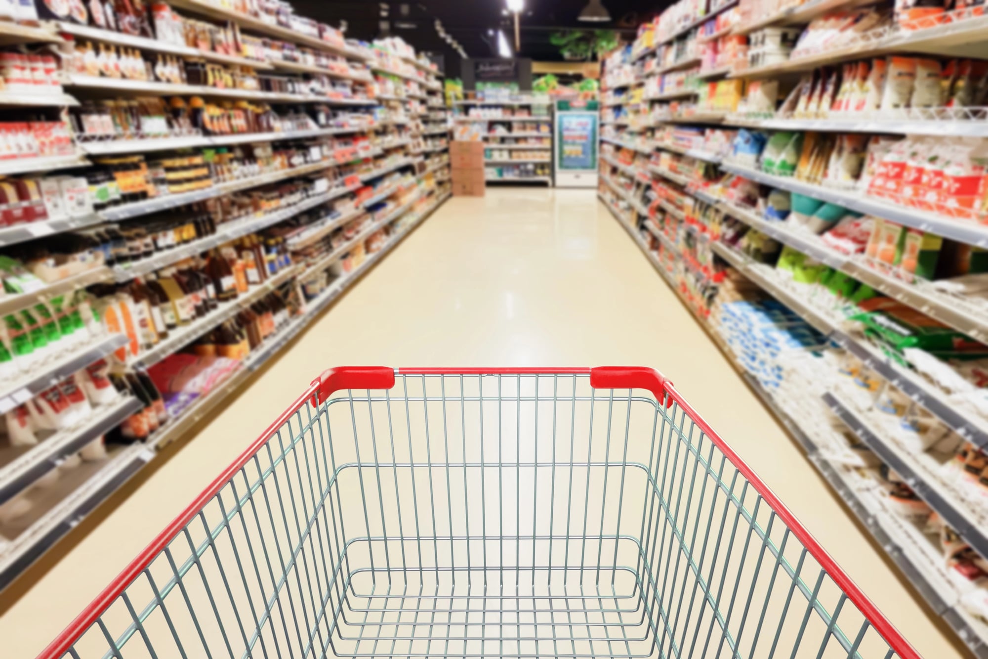
Some stores use a simple trick almost no one notices: narrower floor tiles in certain aisles — typically the ones with higher-margin products — which makes shopping carts feel like they’re moving faster because the tile seams click by more quickly underfoot, a sensory illusion that subtly slows the shopper down without their awareness. It’s the kind of detail that sounds absurd until you realize how much research went into it.
The floor is not just the floor. It’s part of the pitch.
Free Samples
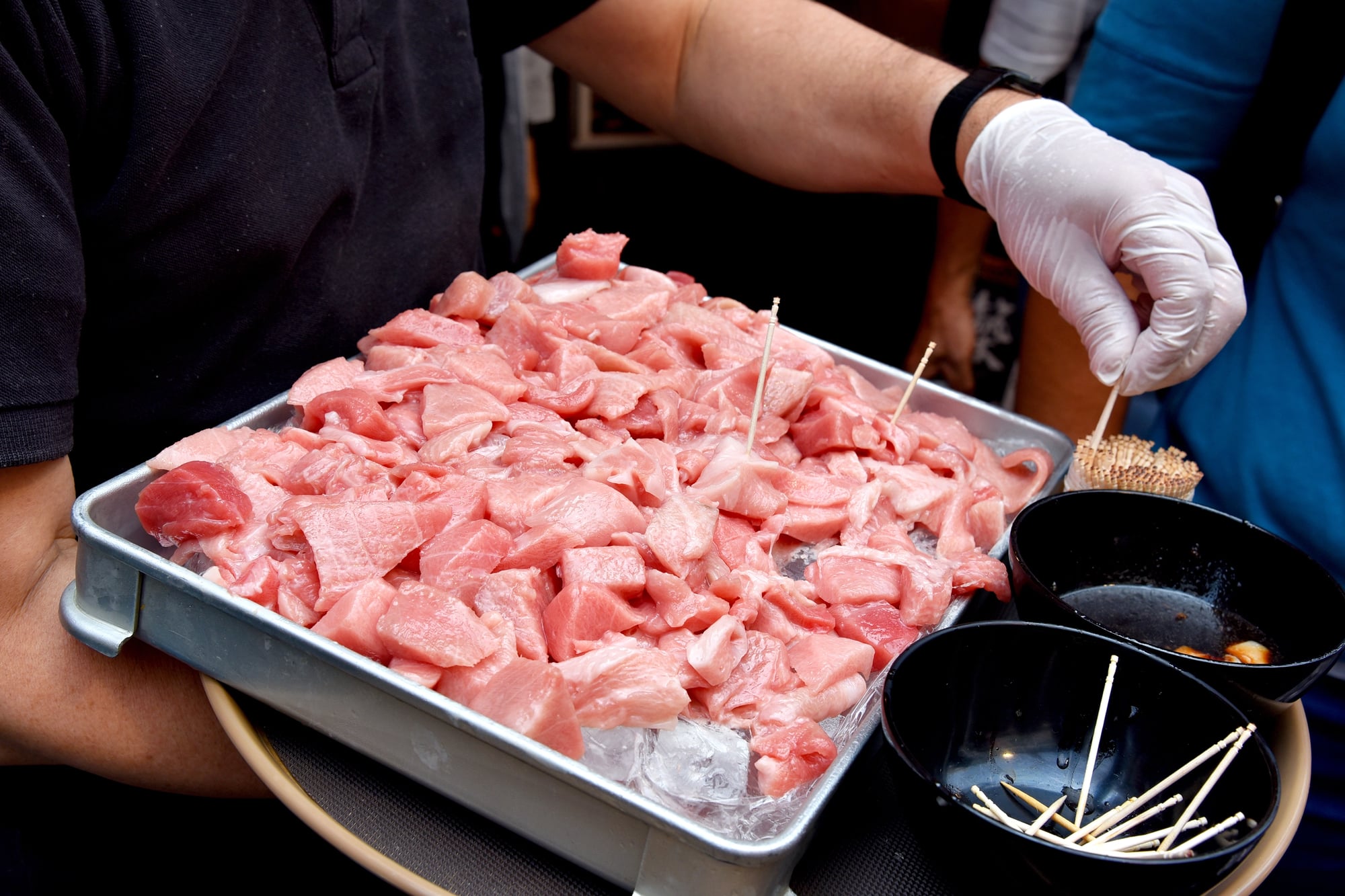
Free samples work because of reciprocity — the deeply human impulse to return a favor even when no one asked you to. Accepting a small cube of cheese from a smiling person behind a folding table creates a mild social obligation, and a meaningful percentage of people buy the product they sampled not because they loved it but because they feel vaguely indebted.
It’s one of the oldest psychological levers in retail. And the cheese is usually pretty good, which is unfortunate for your budget.
Product Bundling
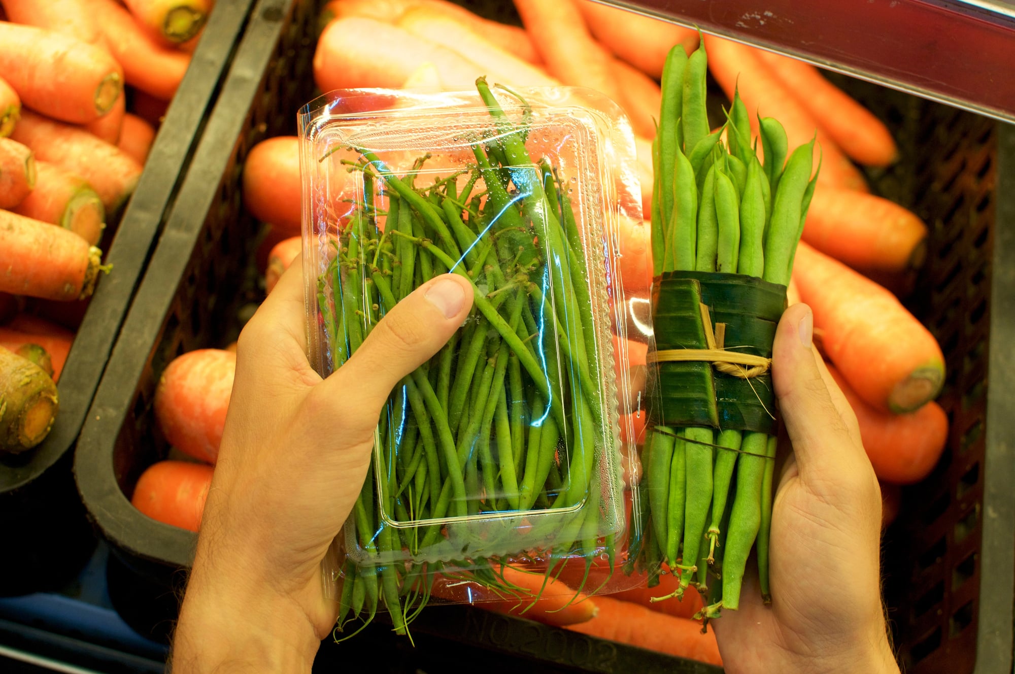
“Buy two, get one free” is not generosity. It’s a volume strategy — the store gets you to buy three of something you may have only needed one of.
The math on bundled deals frequently benefits the retailer more than the shopper. But the framing makes it feel like the shopper is winning.
No Windows, No Clocks
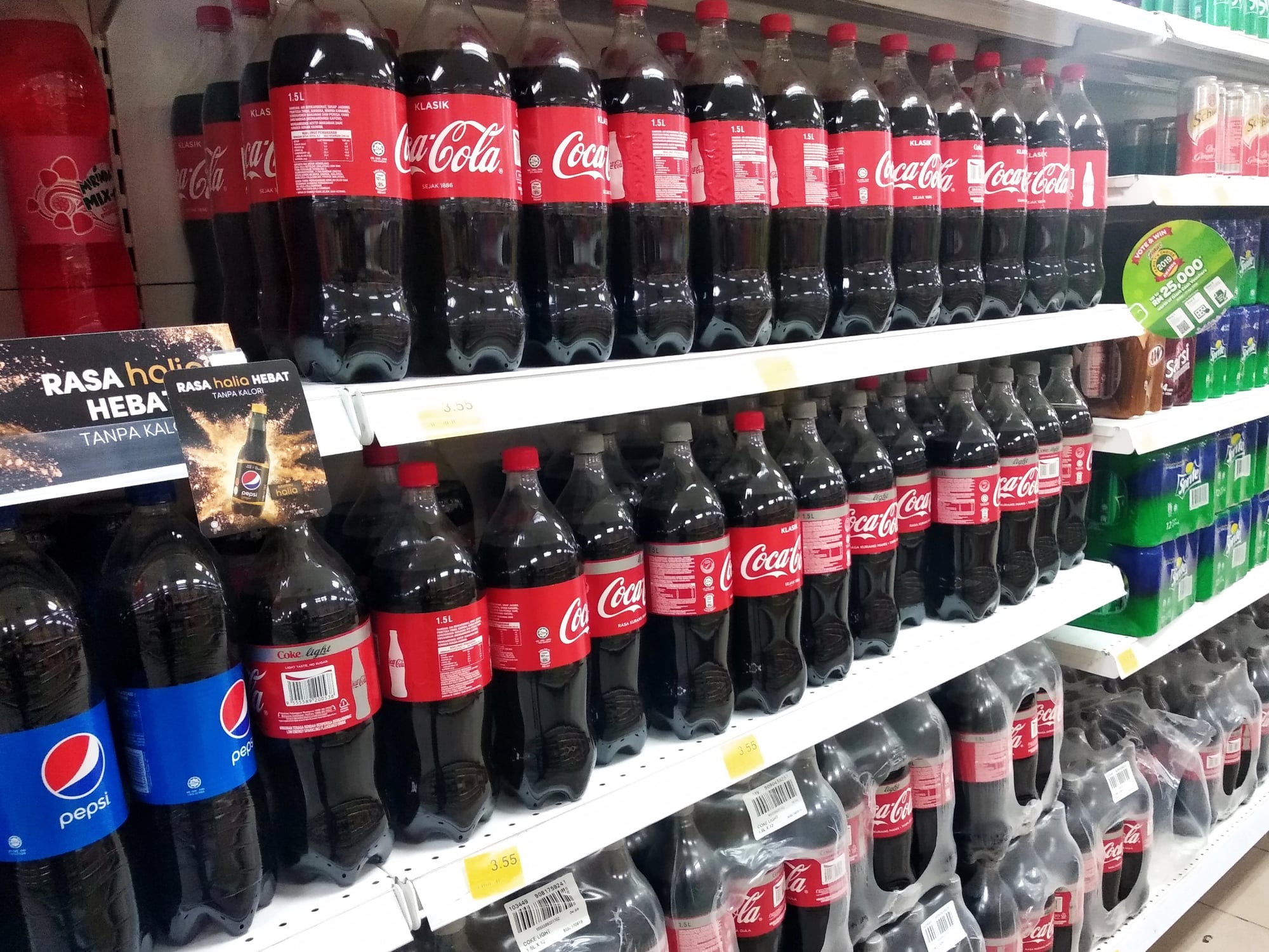
Most large grocery stores have no exterior windows and no visible clocks anywhere on the floor — and while the architectural explanation is usually something about refrigeration units and structural efficiency, the effect is that you lose track of time in a way that’s very convenient for the store: without daylight to orient you or a clock to remind you that you’ve been in here for forty-five minutes, you drift through aisles without urgency, adding things to your cart at a pace that feels leisurely but is, in fact, costly.
So the absence of something as ordinary as a window is itself a design decision. Just one you weren’t supposed to notice.
The Next Time You Walk Through Those Doors
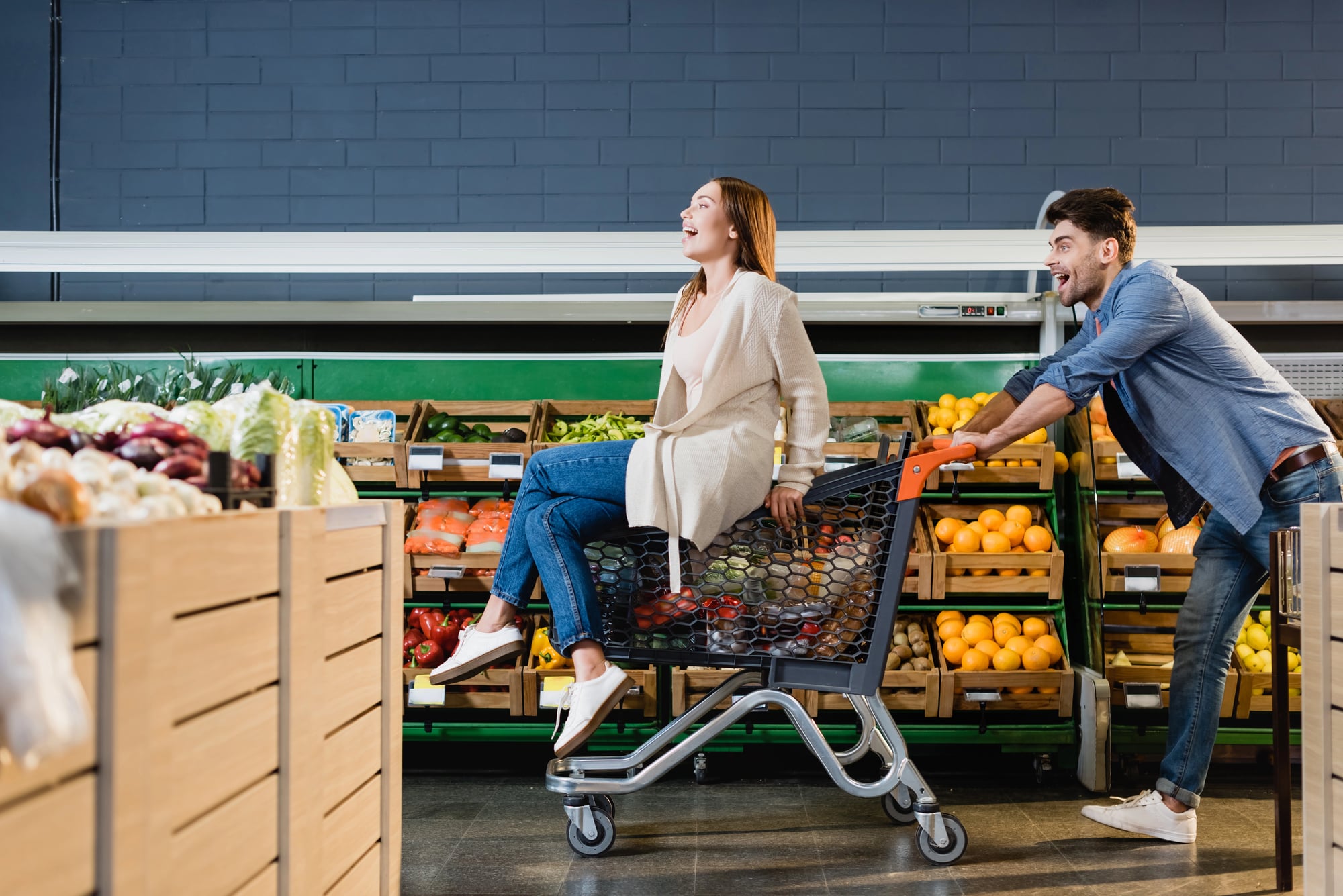
None of this means grocery stores are villains. They’re businesses, and the layouts they’ve developed are the product of decades of careful observation about how people actually behave — not how they think they behave.
The gap between those two things is where most grocery budgets quietly disappear. Knowing the mechanics doesn’t make you immune, but it does make that impulse bag of trail mix in aisle seven feel a little less like destiny and a little more like what it actually is: a very deliberate invitation you were always free to decline.
More from Go2Tutors!

- The Romanov Crown Jewels and Their Tragic Fate
- 13 Historical Mysteries That Science Still Can’t Solve
- Famous Hoaxes That Fooled the World for Years
- 15 Child Stars with Tragic Adult Lives
- 16 Famous Jewelry Pieces in History
Like Go2Tutors’s content? Follow us on MSN.