24 Iconic Brand Mascots That Were Quietly Changed or Retired
Brand mascots become so embedded in consumer consciousness that their absence creates a disorienting gap, yet corporations periodically redesign, update, or retire these characters in response to changing cultural values, demographics, and marketing strategies. Some mascots were retired due to controversy, others simply fell out of favor, and some were updated to appear more contemporary.
These shifts reveal how corporations navigate the tension between preserving brand heritage and adapting to modern sensibilities.
Aunt Jemima’s Transformation to Pearl Milling Company
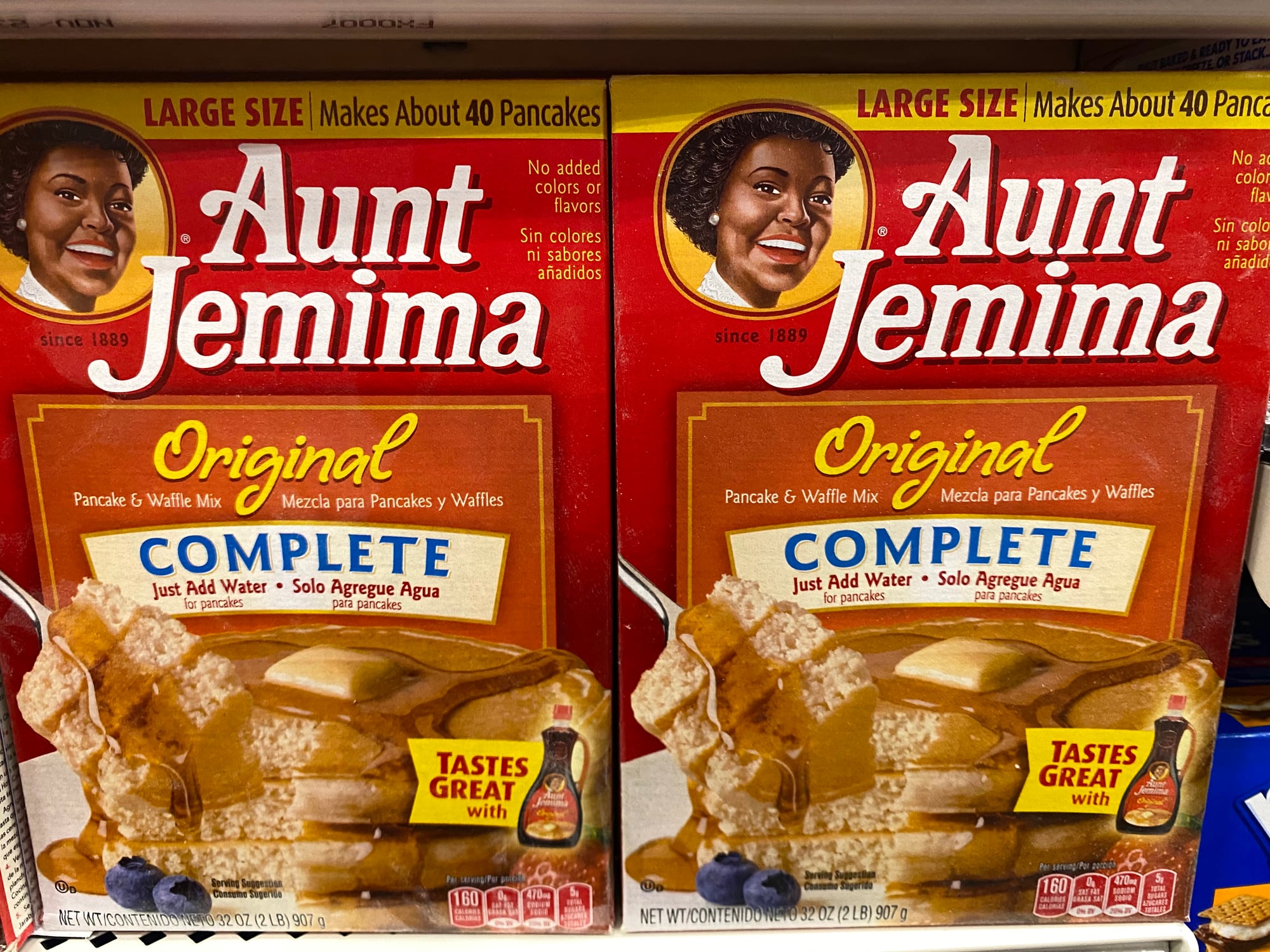
The Aunt Jemima brand, featuring a Black woman in mammy stereotyping iconography, was used since 1889. In 2020, following heightened racial consciousness and criticism of the imagery’s racist origins, the company rebranded entirely as Pearl Milling Company.
The mammy caricature that had served the brand for over a century was erased completely, with executives acknowledging the image’s problematic history.
Quaker Oats’ Racism Controversy and Imagery Updates
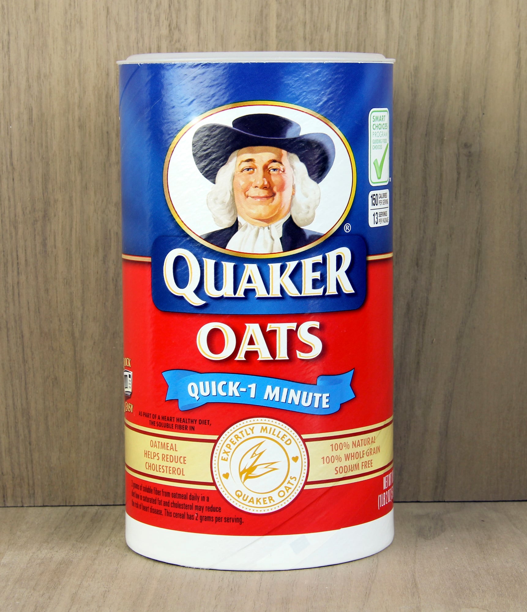
The Quaker Oats man, while not explicitly racist, emerged during an era of racist caricatures. The company faced pressure to address the problematic context of its founding branding, leading to subtle but significant updates to the mascot’s appearance and the broader campaign’s tone and diversity representation.
Eskimo Pie’s Complete Name Change
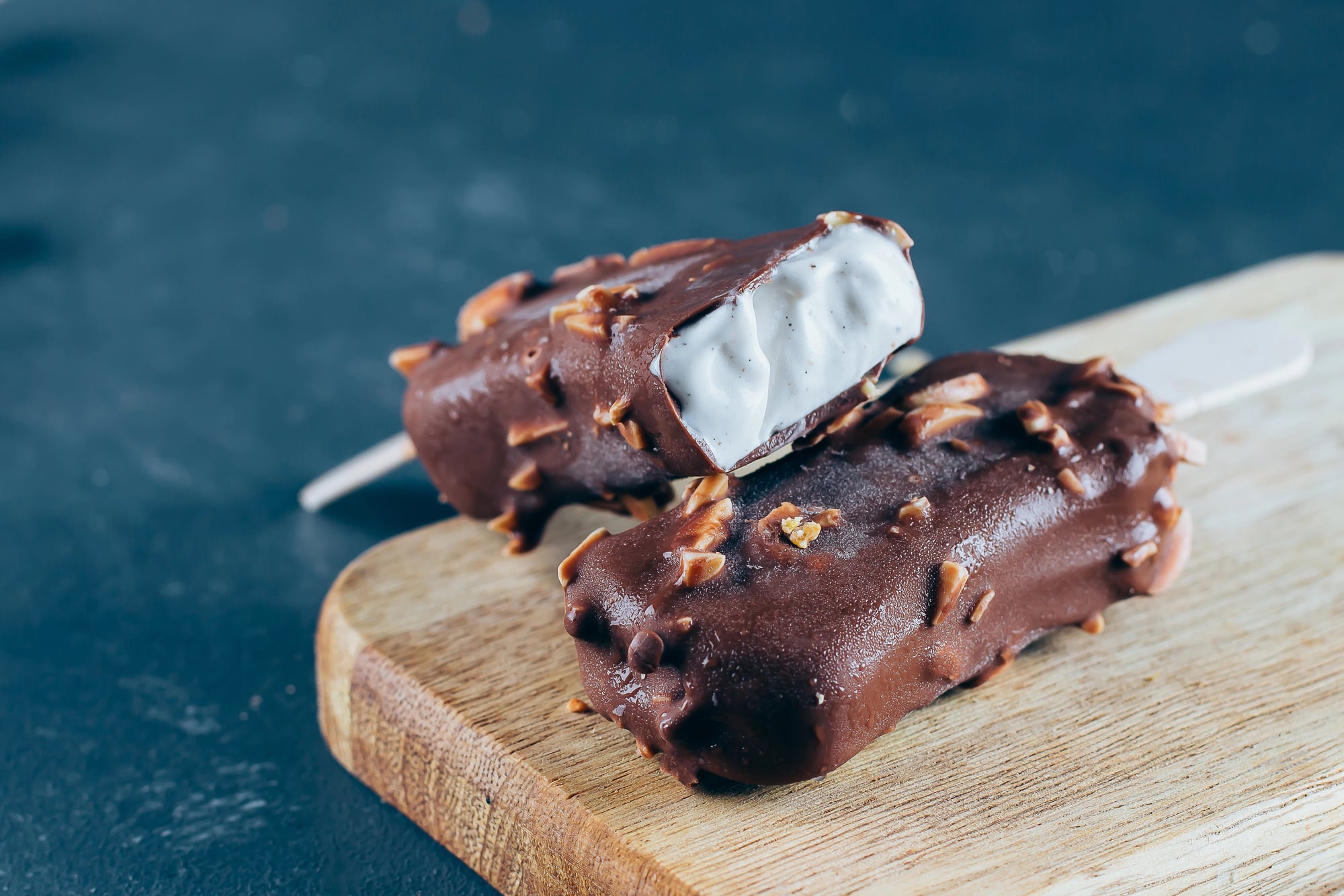
The Eskimo Pie ice cream brand was rebranded to Edy’s Pie in 2020, acknowledging that the name was an outdated and potentially offensive term for Inuit people. The name change reflected both updated geographic knowledge and sensitivity to Indigenous peoples’ preferred terminology.
Speedy Alka-Seltzer’s Disappearance
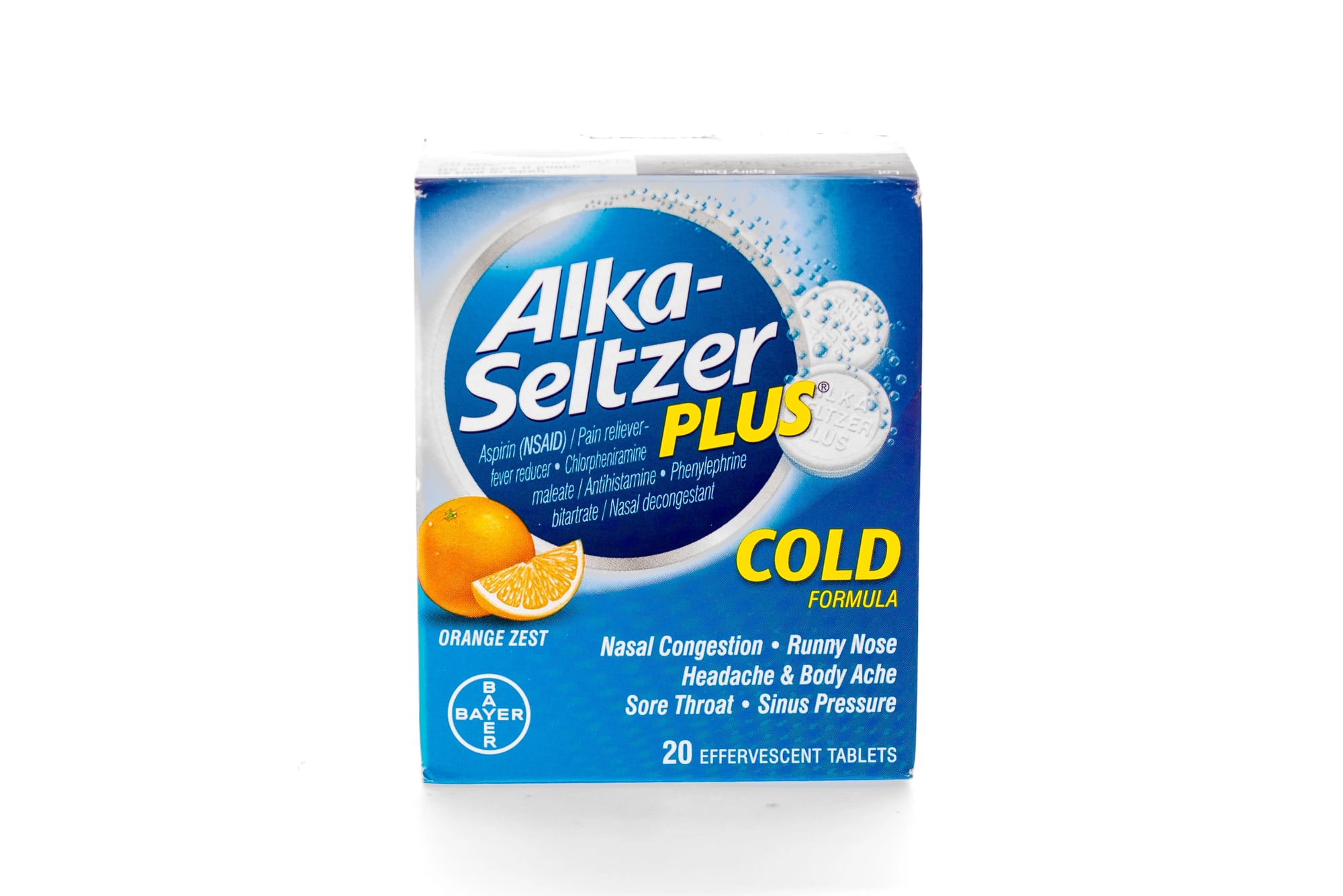
The hyperactive animated character Speedy, who delivered the jingle “Plop, plop, fizz, fizz,” dominated Alka-Seltzer advertising for decades. The mascot gradually faded from advertisements, replaced by more straightforward product messaging reflecting changes in advertising strategy and demographic targeting.
Joe Camel’s Retirement Due to Youth Targeting Controversy
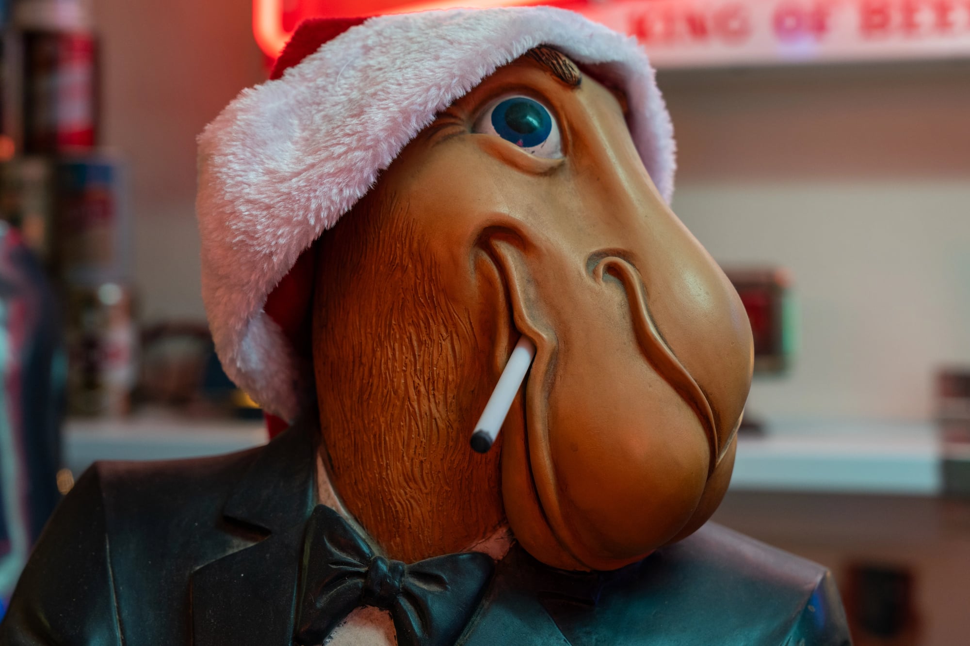
The cartoon camel mascot for Camel cigarettes was retired following accusations that the character deliberately appealed to children and minors. Regulatory pressure and public health concerns led the cig company to discontinue the mascot, removing one of advertising’s most recognizable cartoon characters.
The Frito Bandito’s Problematic Retirement
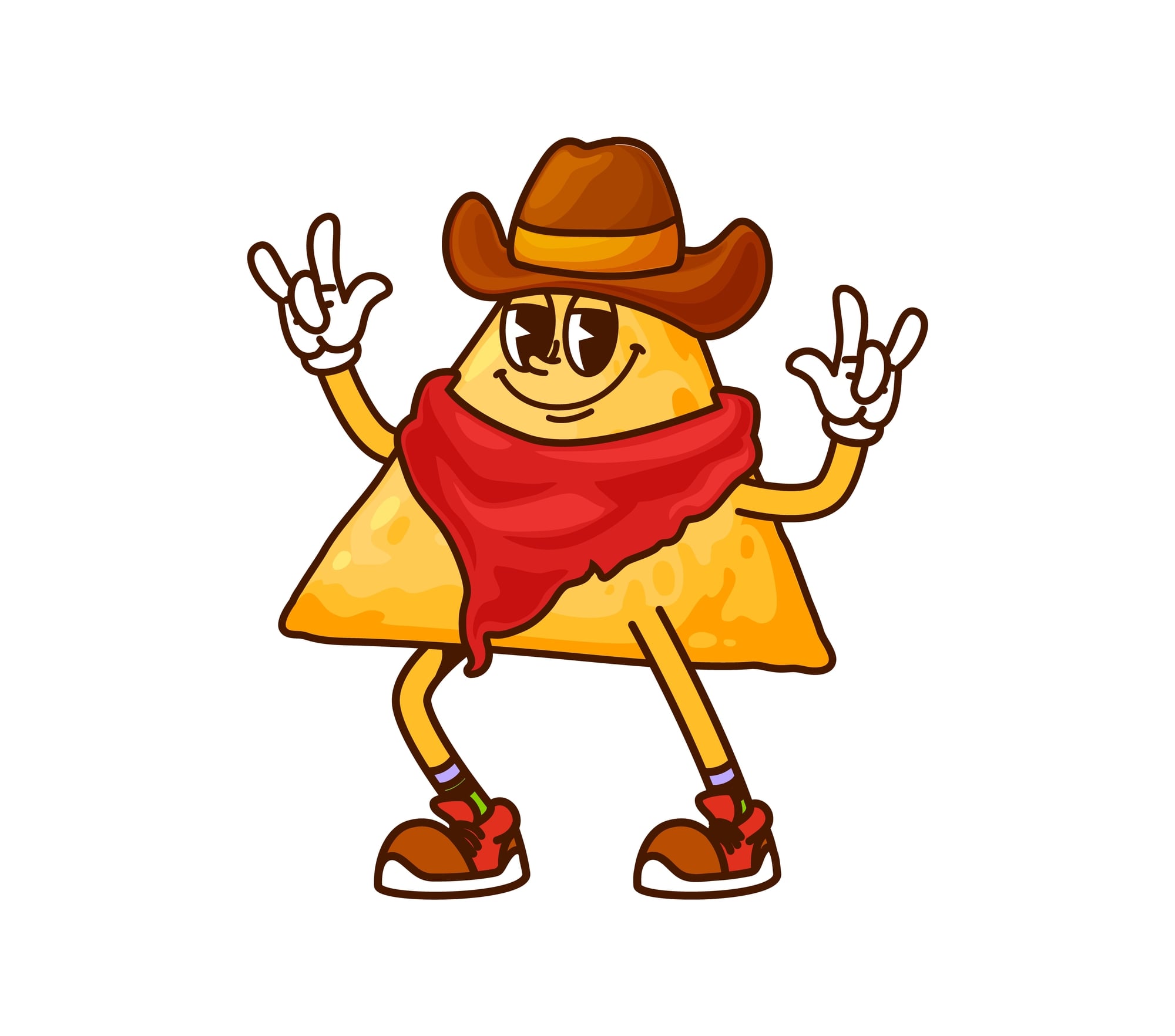
This cartoon Mexican bandito character, used to market Fritos corn chips, was retired in the early 1970s following criticism about the stereotypical and offensive portrayal of Mexican culture. The mascot represented an era of casual racism in advertising now recognized as completely unacceptable.
Rastus and Cream of Wheat’s Racial Imagery Overhaul
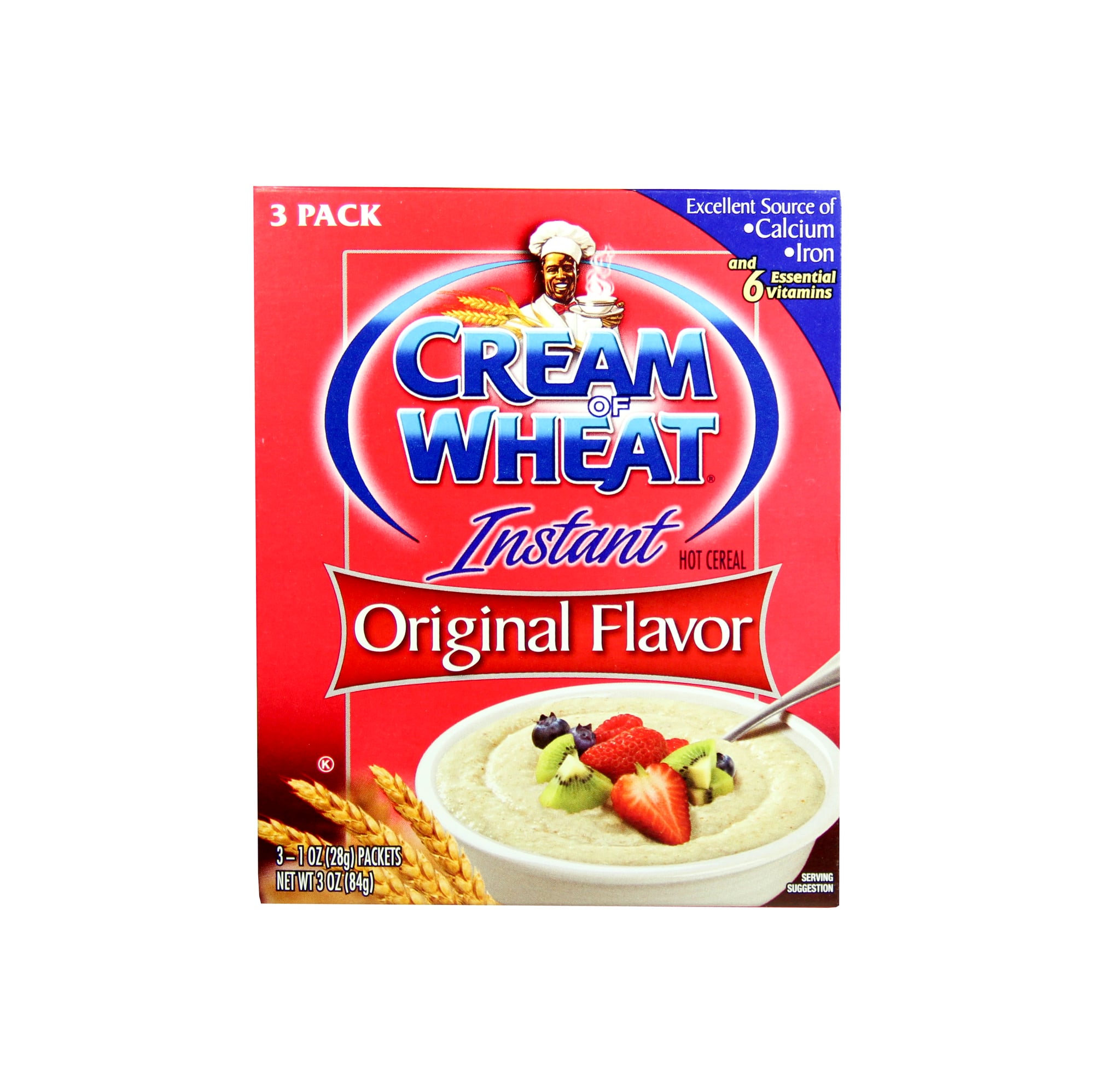
The Black chef character Rastus appeared on Cream of Wheat boxes beginning in 1896. In 2021, the company announced discontinuation of the character, acknowledging his origin in racist minstrelsy imagery.
The gradual visual evolution of Rastus never fully escaped the problematic origins, culminating in complete retirement.
Ronald McDonald’s Quiet Disappearance from Most Advertising
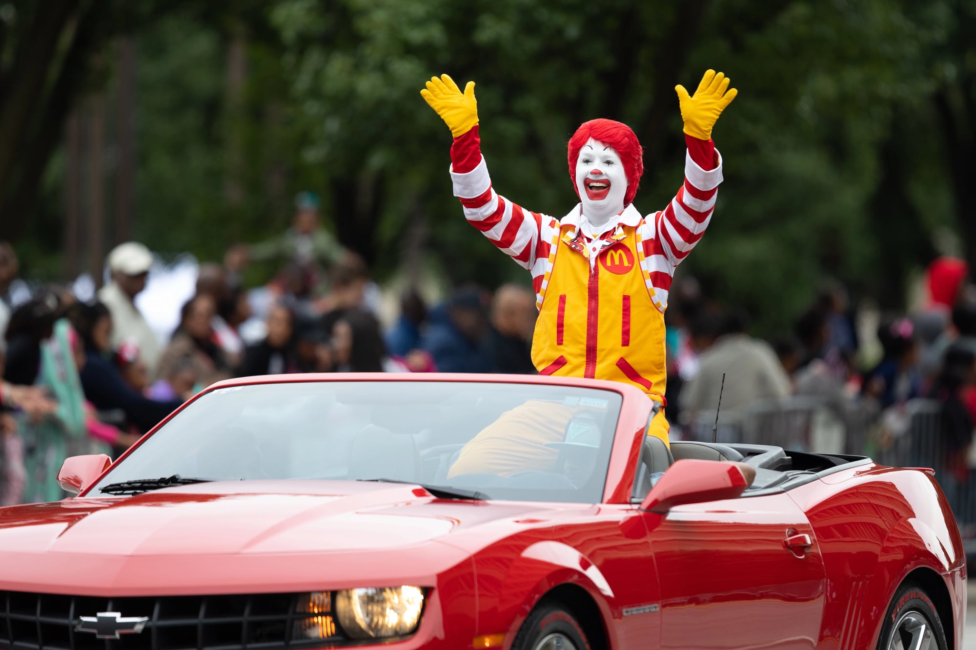
McDonald’s clown mascot Ronald McDonald, once central to the brand’s advertising, has become increasingly rare in recent campaigns. The character’s association with obesity concerns, evolving attitudes toward clown imagery, and demographic shifts led the company to de-emphasize the mascot significantly.
Sunbeam Bread’s Redhead Update
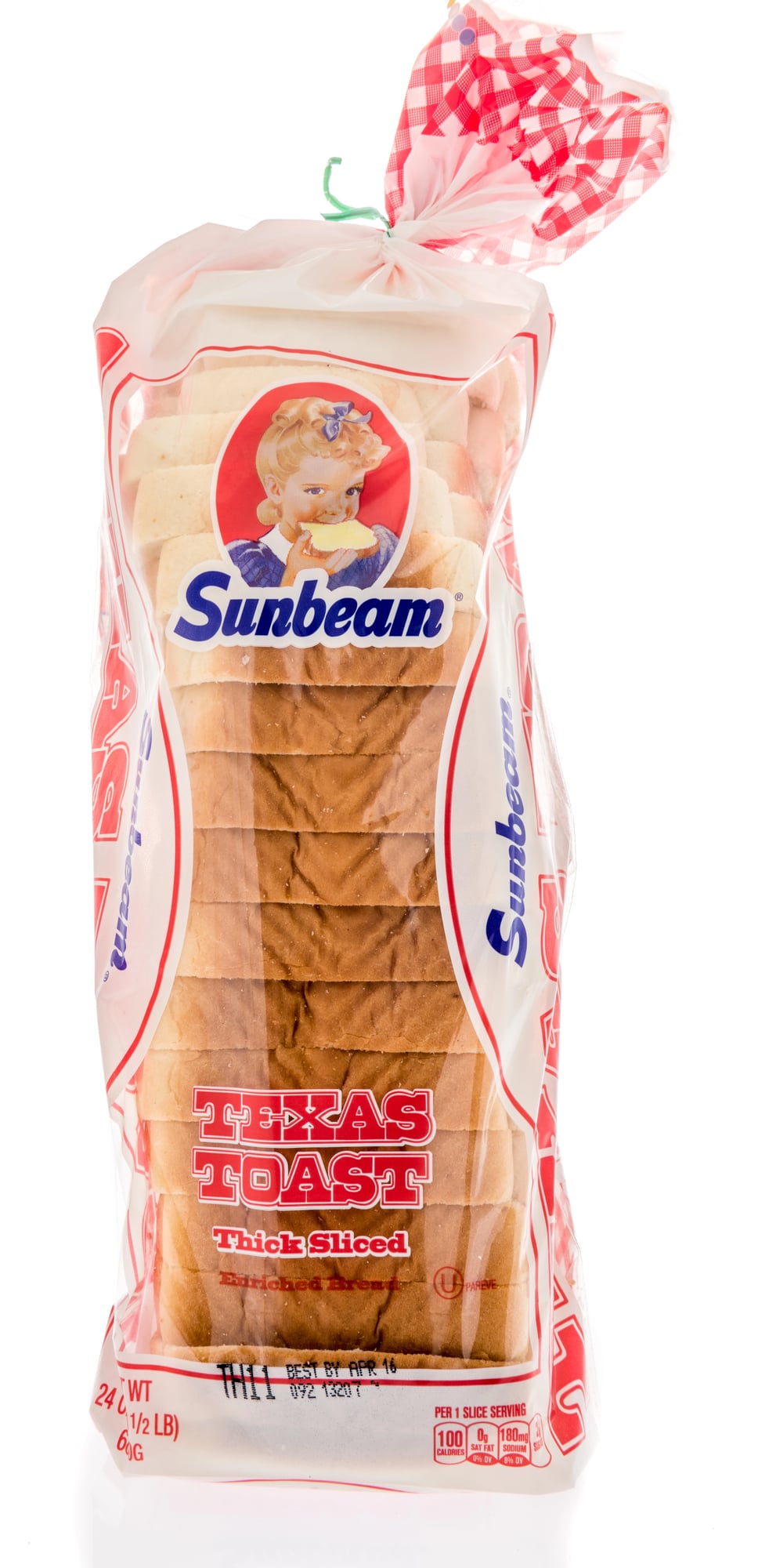
The Little Miss Sunbeam character, used since the 1940s to market Sunbeam Bread, underwent subtle updates to her appearance over decades. The character’s red hair, freckles, and white dress remained constant, but her artistic rendering evolved to appear less dated and more contemporary.
Trix Rabbit’s Multiple Reimaginings
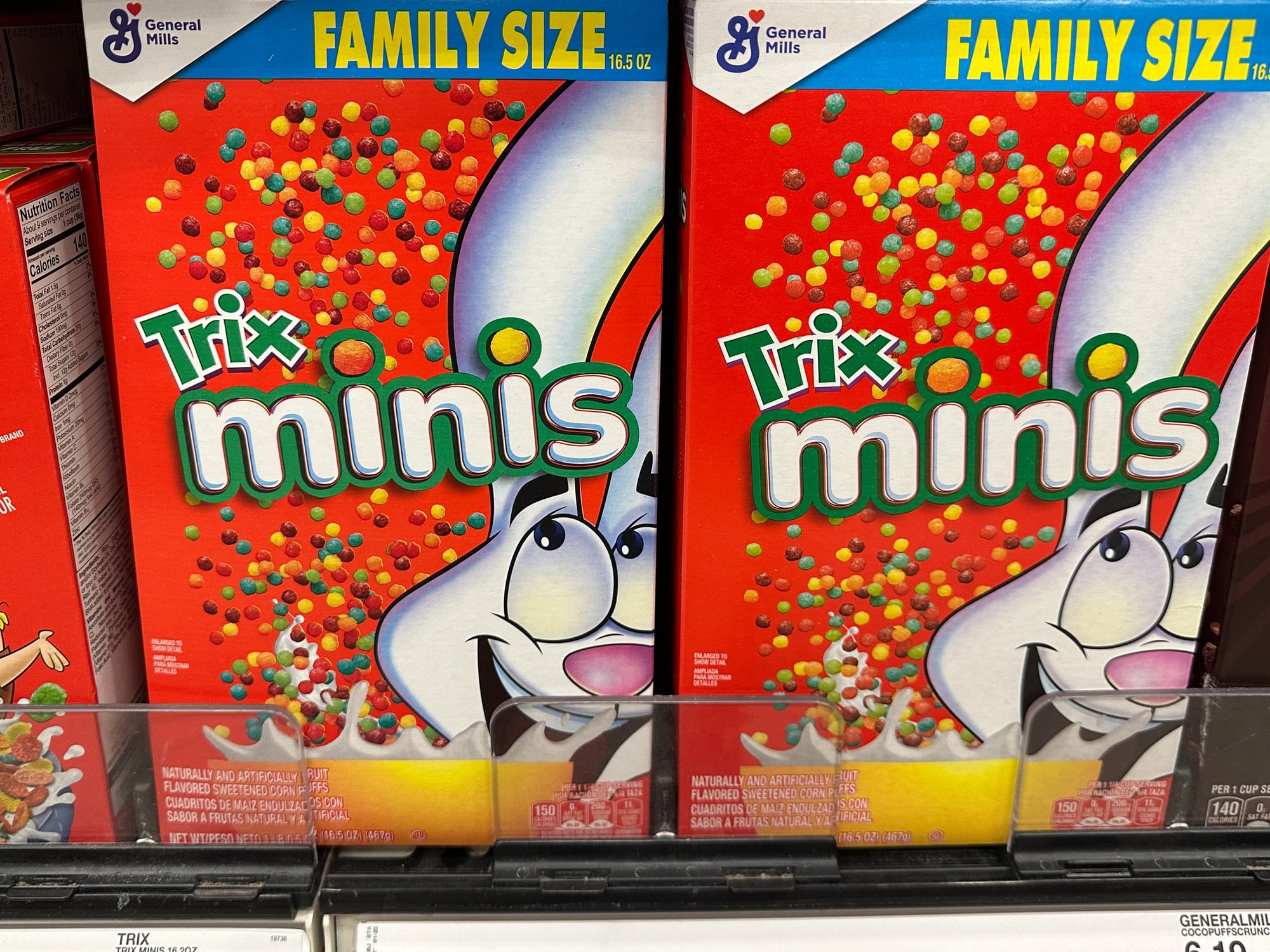
The Trix Rabbit, who has pursued cereal throughout decades of advertising, has been repeatedly redesigned. From early 2D animation to 3D animation to computer graphics, the character remains consistent in purpose but changes constantly in visual presentation as animation technology evolves.
Chiquita Banana’s Outfit Adjustments

The tropical female character representing Chiquita bananas has had her appearance subtly modified multiple times over decades. Updates to her appearance reflected changing fashion standards, body image consciousness, and marketing strategy shifts while maintaining brand recognition.
Betty Crocker’s Constant Makeovers
The Betty Crocker mascot has undergone approximately eighty makeovers since her introduction in 1921. These updates reflect evolving beauty standards, fashion trends, and demographic shifts, with the character remaining recognizable while appearing increasingly contemporary with each redesign.
Mrs. Butterworth’s Complex Racial History

The syrup bottle character has undergone subtle modifications following recognition of her problematic origins as a mammy caricature. Updates to her appearance represent corporate acknowledgment of racist branding history without complete retirement of the long-standing brand.
Smokey the Bear’s Updated Fashion

The forest fire prevention mascot Smokey the Bear has maintained his basic character across decades while his visual presentation evolves. His ranger hat, jeans, and overall appearance shift subtly as design trends change while the core mascot concept remains constant.
Tony the Tiger’s Face Lift
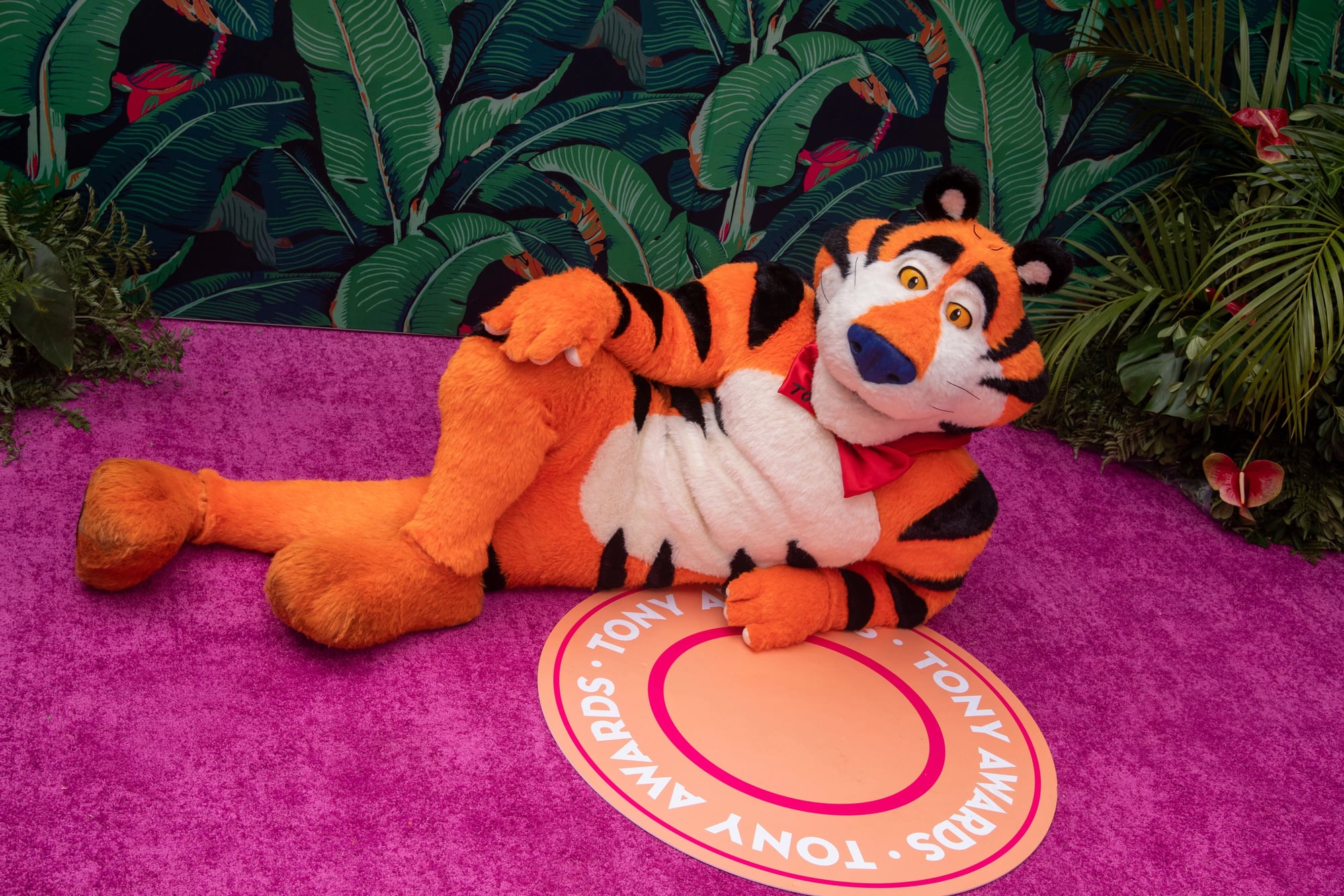
The Frosted Flakes mascot Tony the Tiger has undergone numerous updates to his appearance, with his facial features, musculature, and overall design evolving to appear less dated. The character remains immediately recognizable while appearing contemporary through regular subtle modifications.
The Pillsbury Doughboy’s Modernization
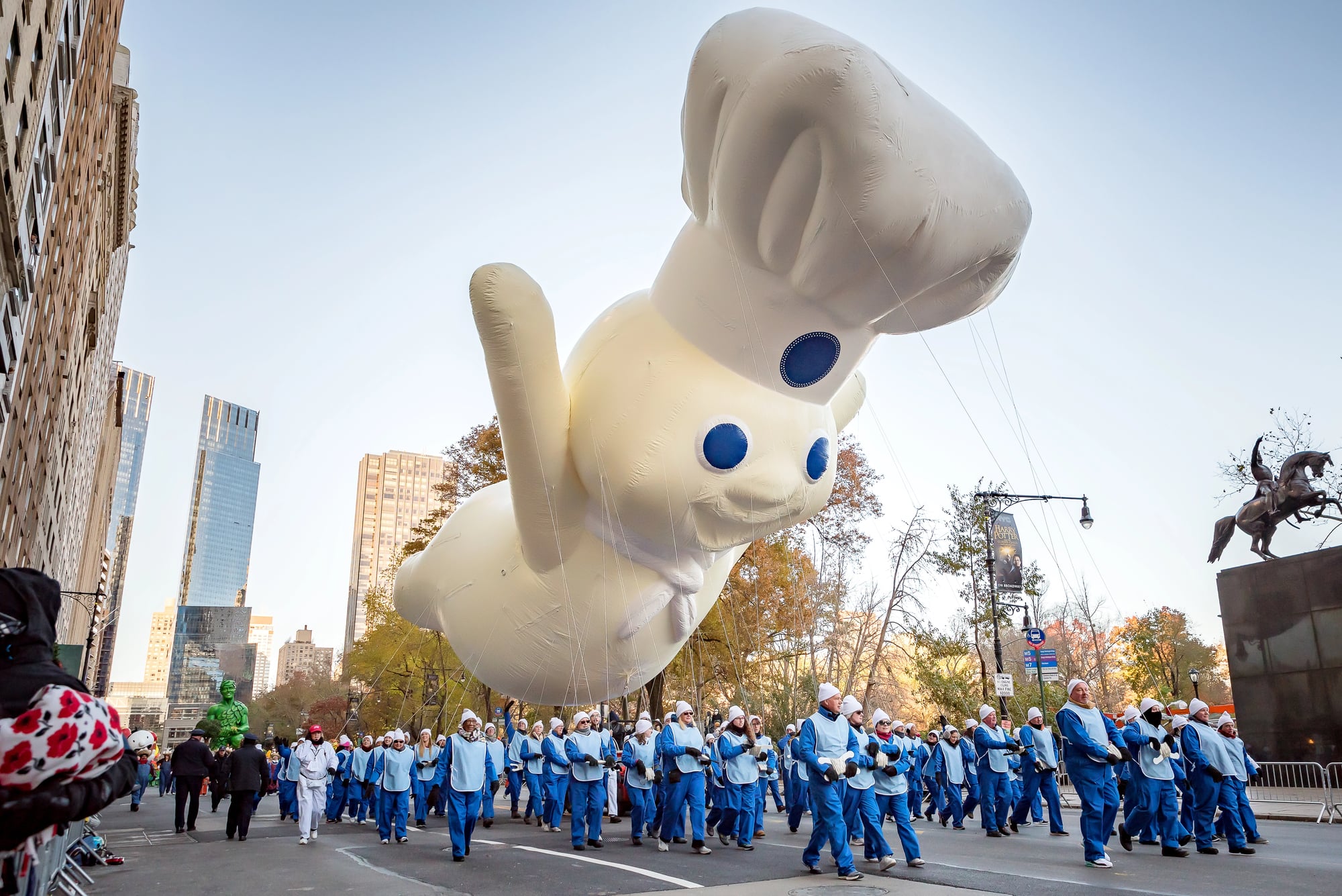
The giggling character representing Pillsbury has been redesigned multiple times to appear less 1960s-generic and more contemporary in facial features, clothing, and overall aesthetic. The character’s basic function and recognizability remain, but his specific appearance constantly updates.
Mr. Clean’s Various Visual Updates
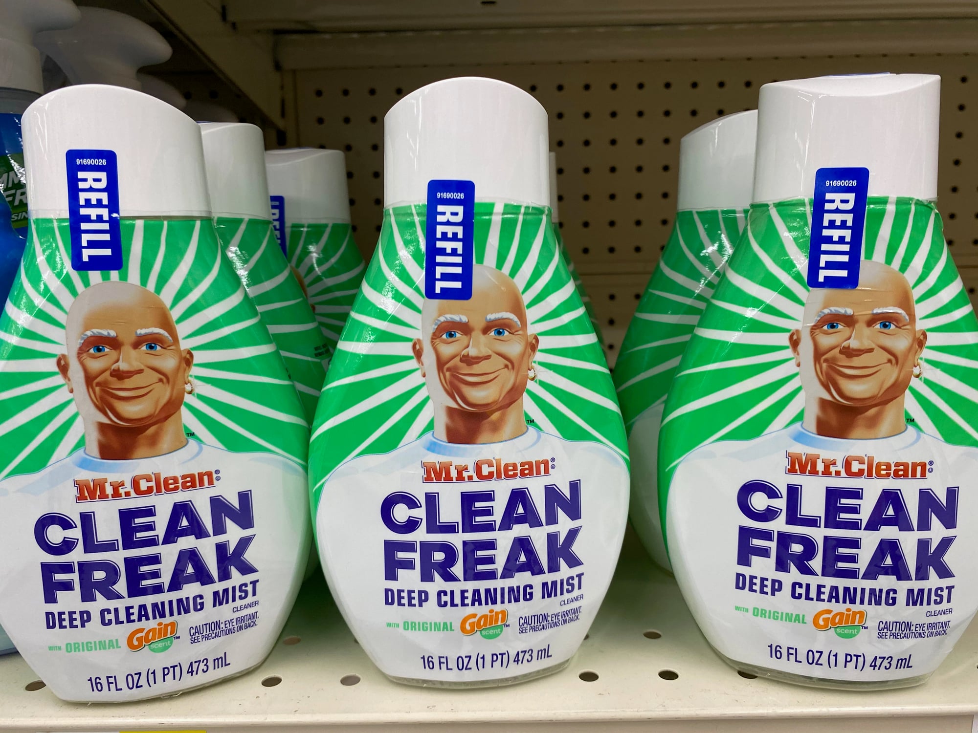
The bald, muscular character representing the cleaning product has undergone significant visual evolution from his 1950s debut. His appearance has shifted as body image ideals, masculinity representations, and design aesthetics have evolved.
The Geico Gecko’s Accent Evolution
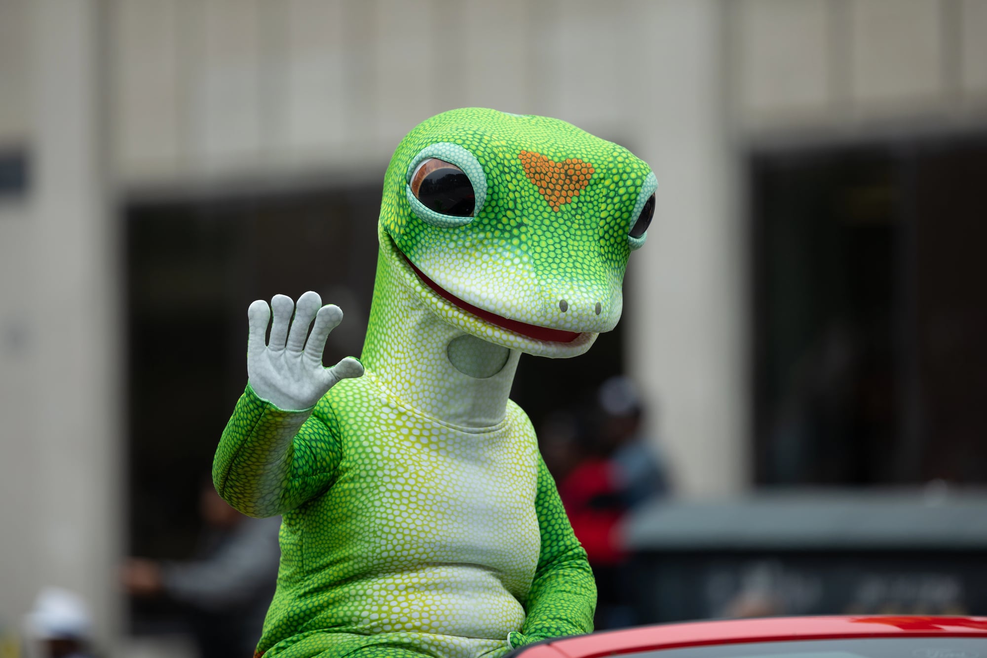
While not retired, the Geico gecko’s Australian accent and personality have been subtly modified over his two-decade existence. Updates to the character reflect changing comedic sensibilities and audience preferences while maintaining brand recognition.
Cap’n Crunch’s Age Reversal
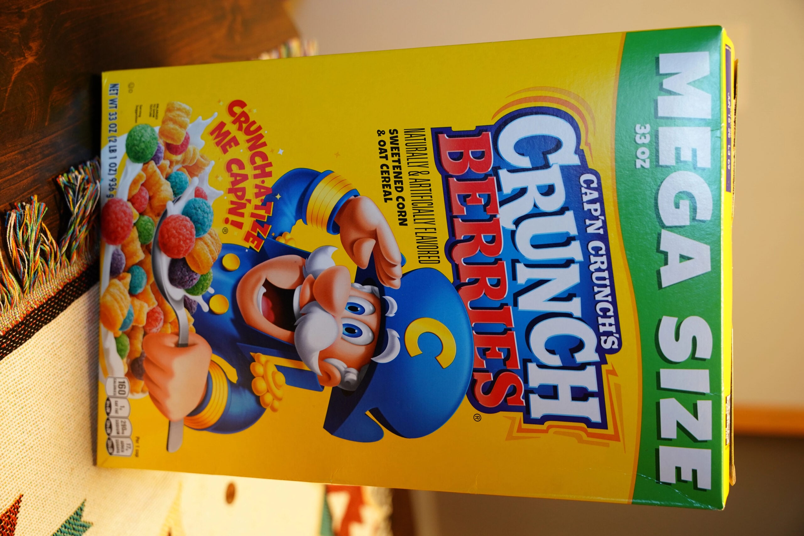
The cereal mascot Cap’n Crunch, originally depicted as an older sailor captain, has been visually modified to appear younger and more contemporary over decades. The character remains a captain with similar basic attributes while his age and appearance adjust to seem less antiquated.
Lucky the Leprechaun’s Design Updates
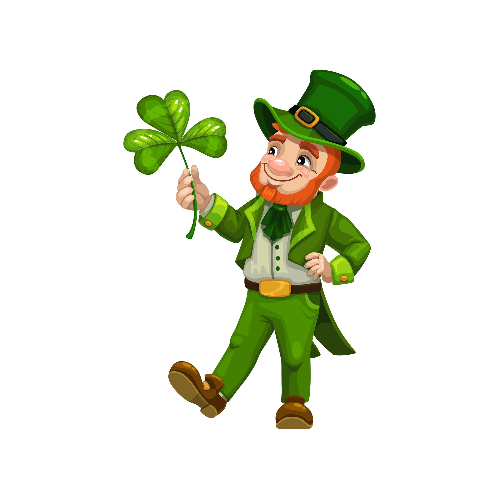
The Lucky Charms mascot has undergone multiple complete redesigns as animation technology advanced and design trends shifted. The character’s basic identity remains consistent while his visual appearance transforms dramatically from one era to another.
Toucan Sam’s Occasional Redesigns
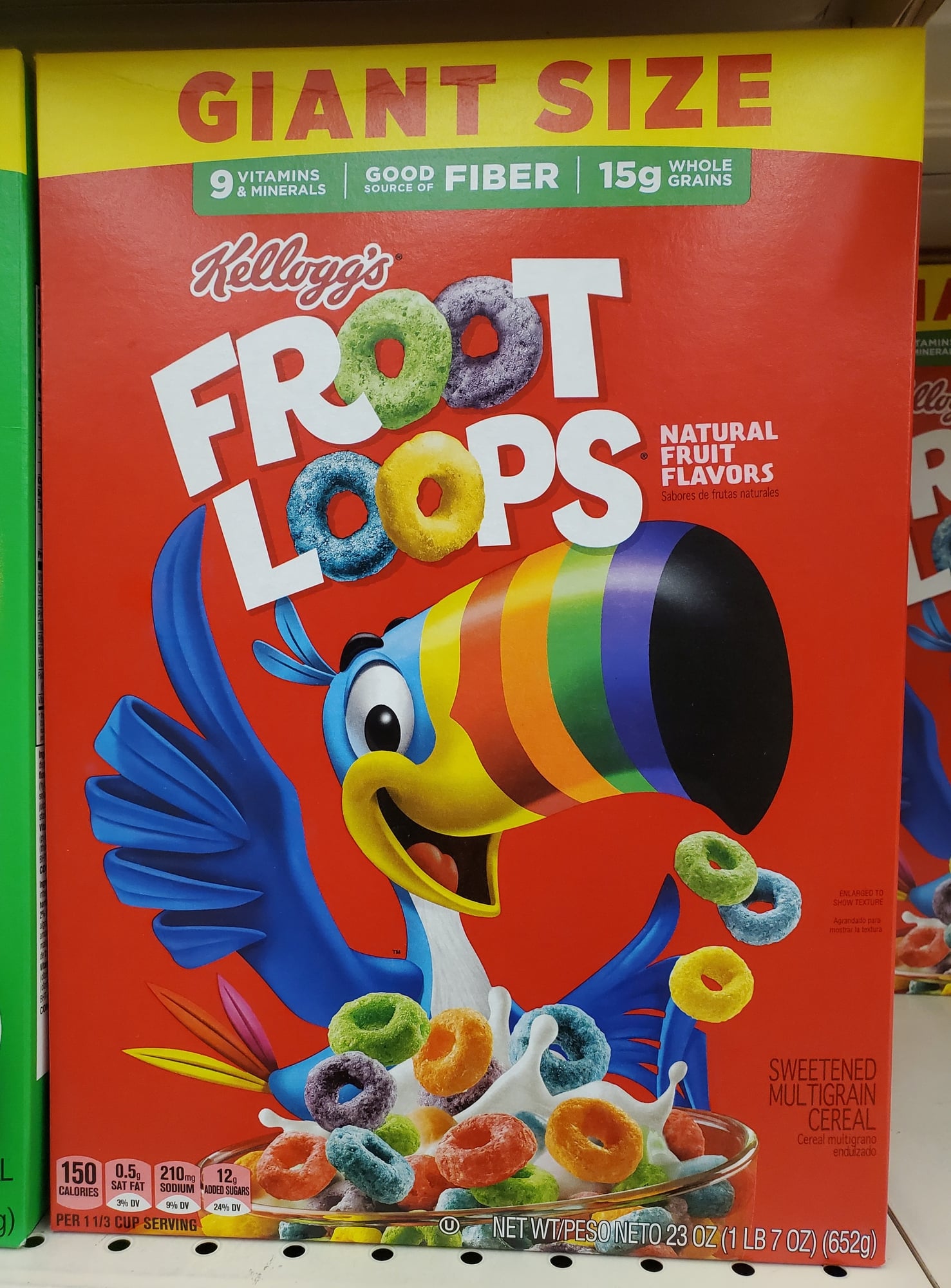
The Froot Loops mascot Toucan Sam has been periodically updated in appearance to reflect contemporary animation styles and design aesthetics. The character’s basic identity remains constant while his visual presentation evolves with technology and trends.
Kool-Aid Man’s Quiet Sidelining
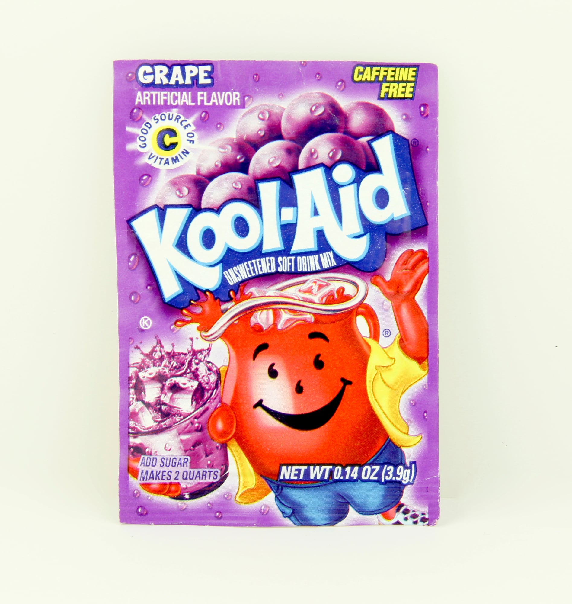
The enormous anthropomorphic jug character once central to Kool-Aid marketing has become increasingly rare in contemporary advertising. The character has been largely replaced by more straightforward product messaging and different brand approaches.
The Hamburger Helper Hand’s Controversial Absence

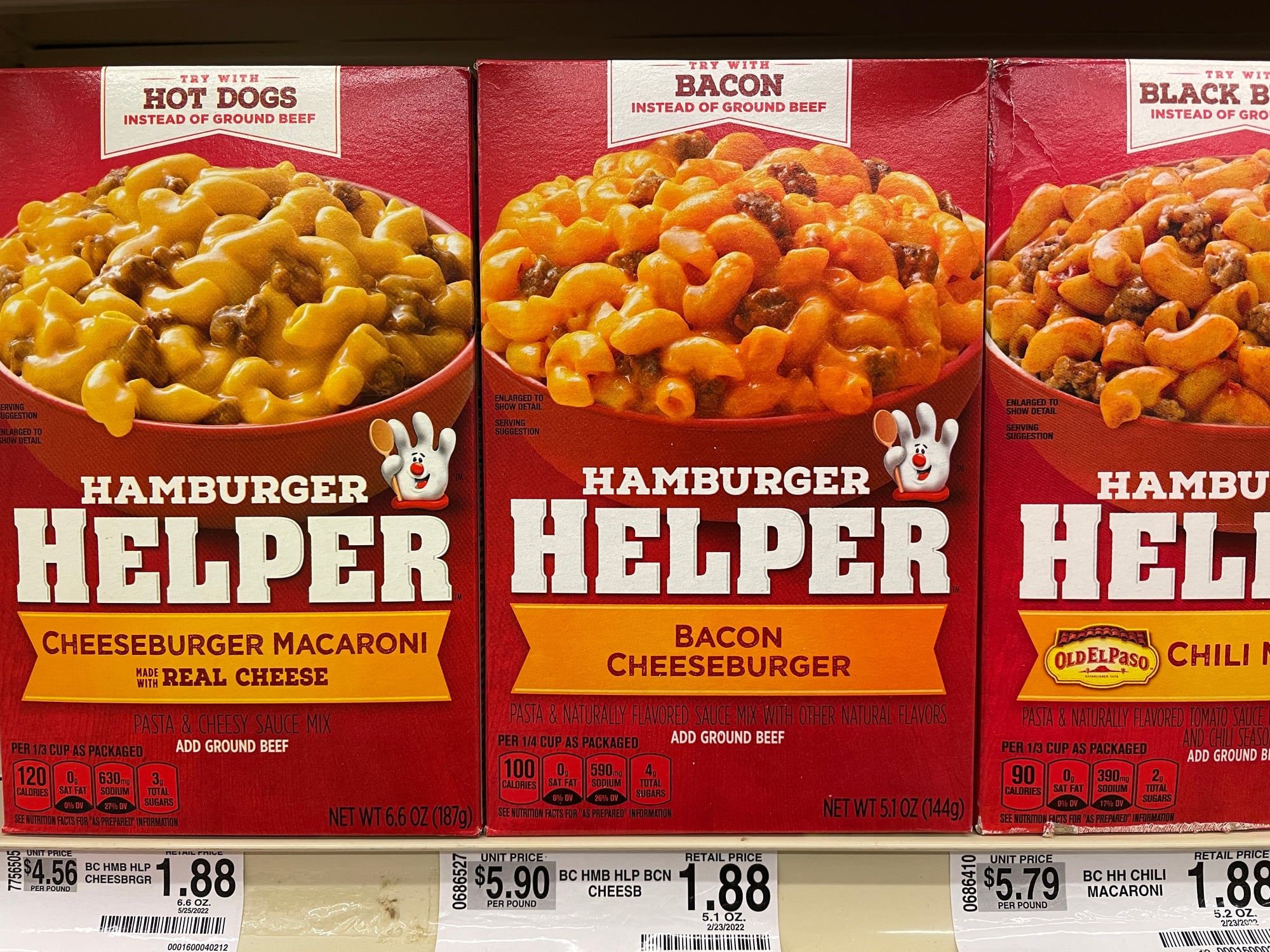
The gloved hand that helped create meals was retired for several years due to consumer research suggesting the character was perceived as creepy and unsettling. The hand has returned in updated iterations, acknowledging audience feedback about the character’s inherent uncanniness.
Campbell’s Soup Kids’ Gradual Disappearance
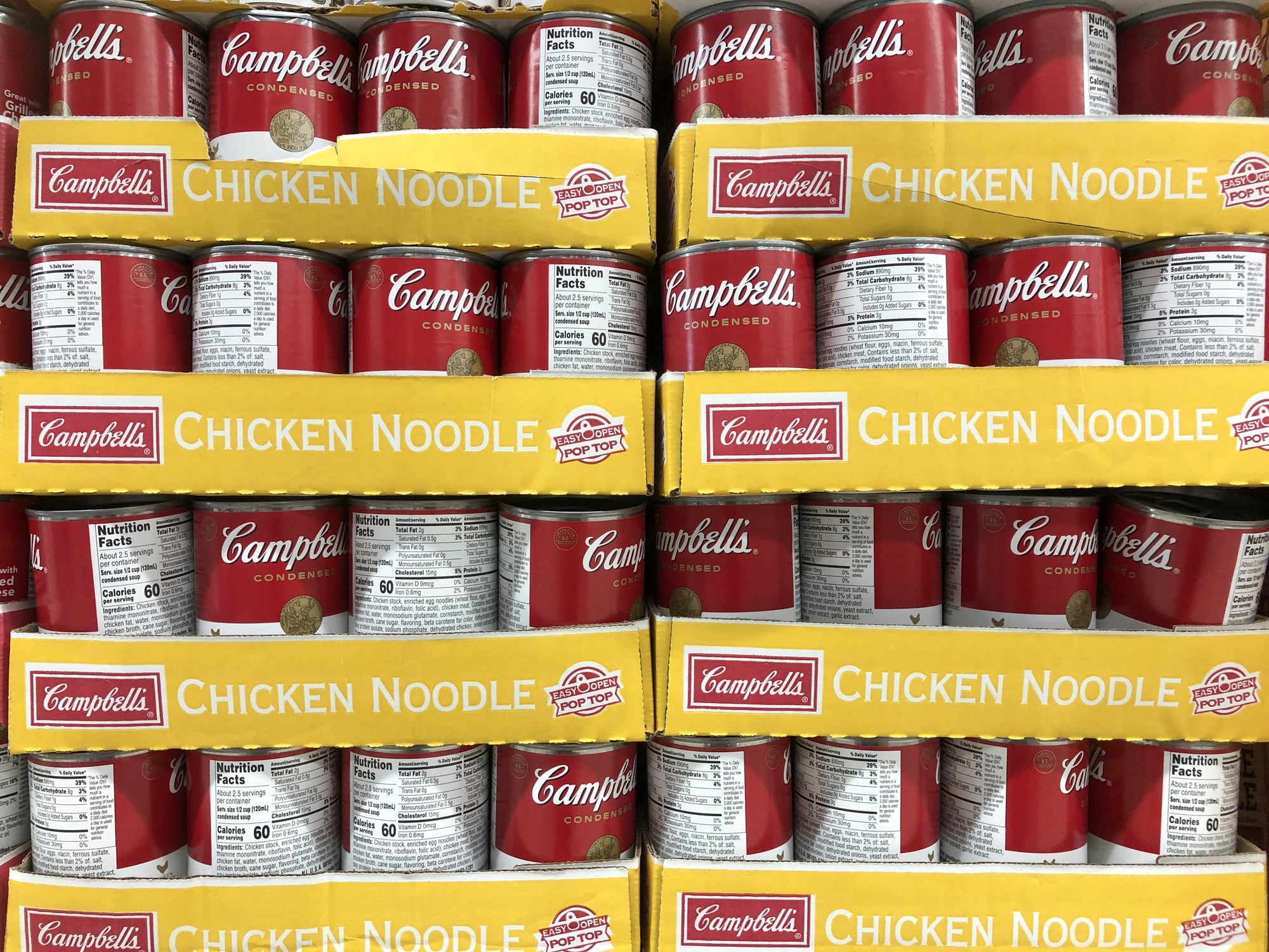
The cherubic Campbell Soup Kids, popular since 1904, have been gradually phased out in favor of more straightforward product marketing. The characters, once central to the brand, now rarely appear in contemporary advertising, replaced by lifestyle marketing and product-focused campaigns.
The Constant Evolution of Brand Identity

These mascot changes reveal corporations’ ongoing navigation between preserving brand heritage and adapting to contemporary sensibilities. Some changes occur because of evolving standards about inappropriate stereotyping; others simply reflect aging demographics and shifting preferences.
The retirement or transformation of beloved characters creates peculiar consumer disorientation—the childhood icon suddenly gone—while representing corporate flexibility and willingness to update branding in response to cultural conversation.
More from Go2Tutors!

- The Romanov Crown Jewels and Their Tragic Fate
- 13 Historical Mysteries That Science Still Can’t Solve
- Famous Hoaxes That Fooled the World for Years
- 15 Child Stars with Tragic Adult Lives
- 16 Famous Jewelry Pieces in History
Like Go2Tutors’s content? Follow us on MSN.