Actual Names For Symbols You Didn’t Know Have Names
Each morning, fingers tap keys, forming shapes whose names stay unknown. Instead of naming them, folks gesture – “you know, that twisty mark” – and trust luck.
Symbols fill screens, yet their real titles slip by unnoticed. Truth is, each symbol carries its own proper title – many even roll off the tongue in ways that feel oddly satisfying.
Brace yourself to attach real labels to shapes you’ve glanced past for years.
Ampersand

Curving gently, that small ‘&’ shape goes by the name ampersand, existing for more than two millennia. Born from scribbled versions of the Latin ‘et’ – a word meaning ‘and’ – it slowly twisted into its current form through hurried pen strokes across ages.
As time passed, overlapping lines turned letters into a single mark now familiar worldwide. Favored by typographers, spotted on logos, quietly tucked into names, few ever learned what it was actually called.
Octothorpe
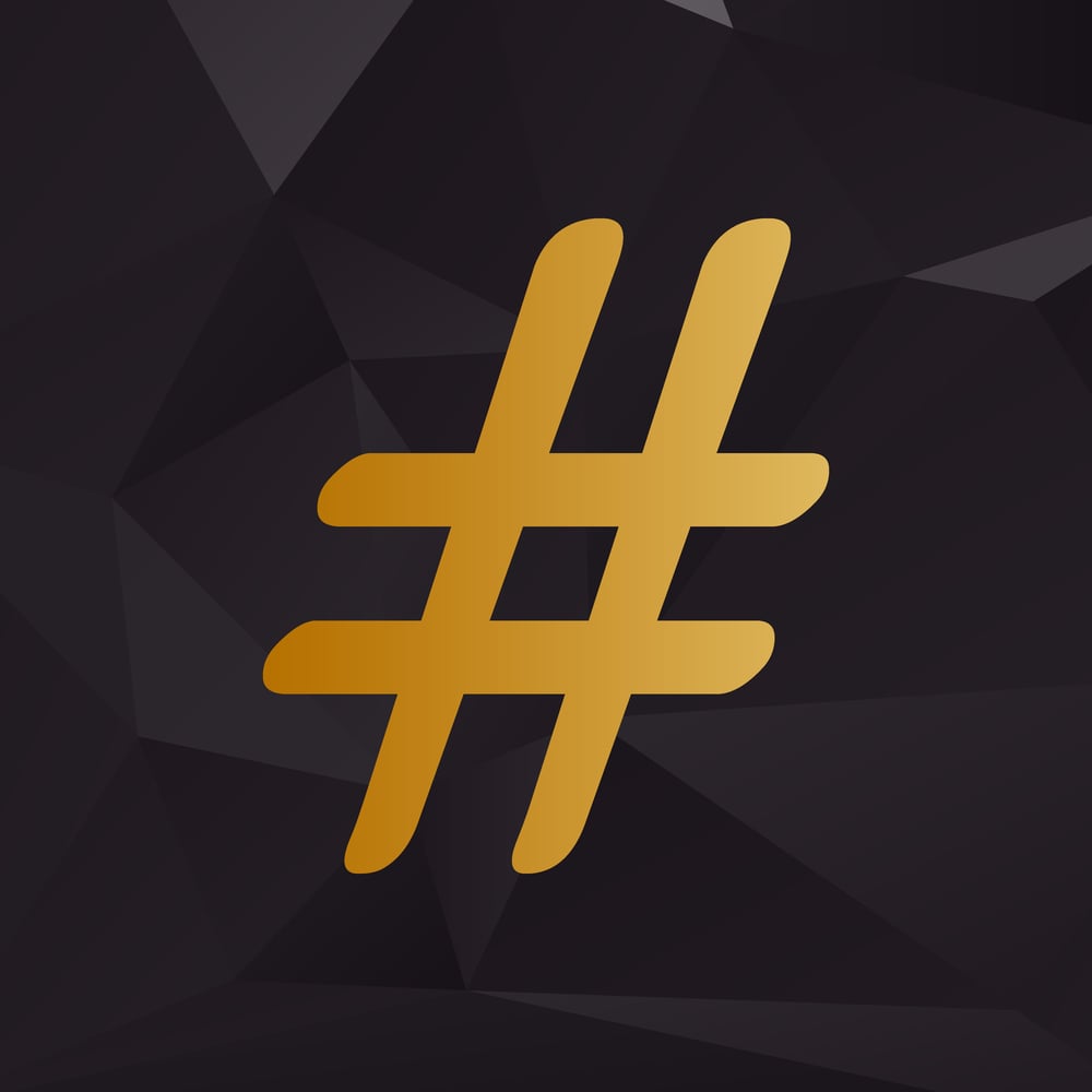
That little ” sign? Long before hashtags took over, folks called it an octothorpe. Eight tiny tips sprout out from its edges – that’s where “octo” sneaks in.
Back in the 1960s, engineers at Bell Labs slapped on the whole name just to have a proper label. Try dropping “octothorpe” mid-conversation; eyes will light up.
Pilcrow
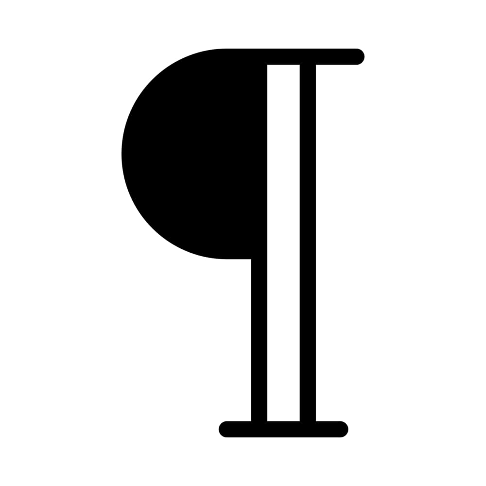
Backwards P? That odd little symbol with twin bars beside it has a name – pilcrow. When text stays bare, stripped of layout tricks, authors drop this mark to flag fresh paragraphs.
You will spot it blinking inside apps such as Microsoft Word, though only if you flip the switch for invisible characters. Often ignored, passed by silently through daily edits, most never pause long enough to wonder what it means.
Interrobang
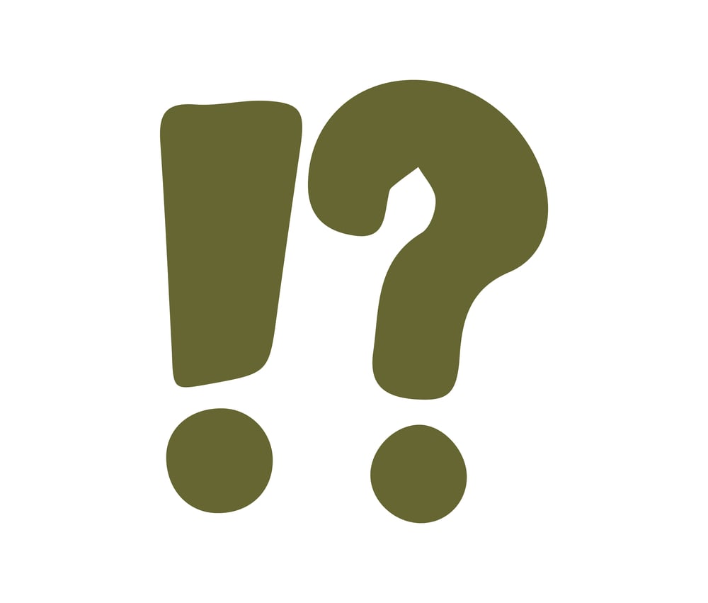
Surprise crashing into curiosity – that’s where the interrobang steps in. Born when questions scream instead of speak.
A single mark doing double duty: part doubt, part amazement. Shaped like a smashed-together ? and !, often seen as ‽.
Back in 1962, Martin Speckter saw clutter on the page and thought better. He worked ads, and knew brevity mattered.
His fix? One symbol pulling weight for both endings. Why type twice if one does more.
Caret

A tiny mark shaped like an arrow pointing up, known as a caret, traces back to a Latin term meaning ‘what’s missing.’ Centuries ago, editors would slip it into manuscripts to show where words had been left out.
Over time, its role shifted – math and computer systems began using it to signal powers in calculations. Though barely noticeable, it handles important tasks without drawing attention.
Hidden in plain sight, this modest sign keeps working steadily.
Tilde
A squiggle hovering over the n – think mañana – is named a tilde. That little curve shifts how you say the letter, morphing a flat n into something closer to ny.
Around equations or code, it hints at rough values, sometimes flipping bits behind the scenes. Despite flying under the radar, it pulls heavy weight among keys.
Though small, its reach stretches wide across screens and sentences alike.
Diaeresis
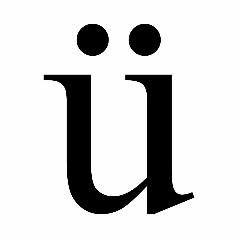
Two small dots above a vowel – seen in words such as naïve or names like Zoë – are known as a diaeresis. These marks show the vowel is meant to be spoken on its own, not merged with the previous sound.
Though they look just like umlauts, the functions aren’t the same; umlauts play a role in German grammar instead. Mistaking one for the other happens often.
Heated opinions tend to follow whenever the topic comes up.
Solidus
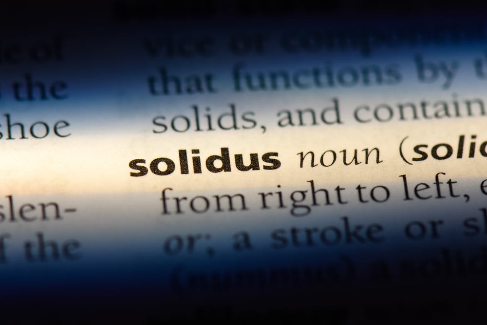
That little mark gets called a forward slash by nearly everyone, though technically it’s named the solidus. For ages, writers and printers have put it to work – first dividing amounts in old UK money such as shillings over pence.
Now you find it tucked inside fractions, URLs, even folder trails on computers. Despite being tapped out countless times each day across keyboards everywhere, its true label stays mostly ignored.
The symbol lives in plain sight, yet its actual name slips through the cracks.
Manicule
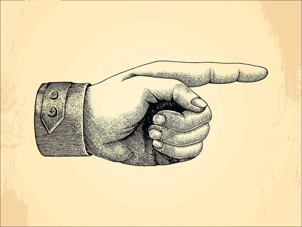
Before arrows and bullet points took over, writers used a small drawing of a pointing hand to draw attention to important text. That little hand is called a manicule, from the Latin word for ‘hand.’
Medieval scribes drew them in the margins of manuscripts to highlight passages worth noting. It looks old-fashioned now, but show someone a manicule and they will immediately understand exactly what it means.
Asterism

Most people know the asterisk ‘*,’ but fewer people have heard of the asterism. It looks like three asterisks grouped together in a triangle formation and was used in books and printed text to mark a section break or a shift in the narrative.
Typesetters used it when they wanted something more elegant than a plain line or a single star. Digital publishing has mostly replaced it, but it still appears in some literary and academic writing.
Guillemets

In French, Spanish, and several other European languages, quotation marks look completely different. Instead of the curved marks used in English, those languages use double angle brackets that point outward, like ‘«like this».’
Those brackets are called guillemets, named after the French printer Guillaume Le Bé. They look sharp and deliberate, and once noticed, they are impossible to unsee in foreign-language texts.
Fleuron
A fleuron is a small decorative symbol that looks like a flower or a leaf, and it has been used in typography for hundreds of years. Printers placed it at the end of chapters or in decorative borders to add a touch of style to a page.
It falls into a broader category of symbols called dingbats, which are purely ornamental characters with no linguistic function. The fleuron is basically the typographic version of putting a plant in the corner of a room.
Hedera
The hedera looks similar to the fleuron but has its own distinct identity. It is a heart-shaped ivy leaf symbol that ancient Greek and Roman scribes used as a word separator in manuscripts.
Before spaces between words became standard practice, readers needed something to show where one word ended and the next began. The hedera did that job quietly and gracefully for centuries before fading out of everyday use.
Lozenge
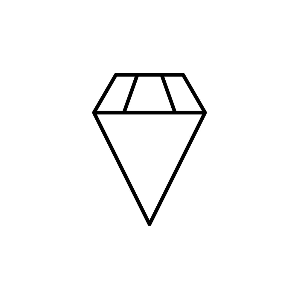
The diamond-shaped symbol ‘◇’ is called a lozenge, and it shows up more often than most people realise. In playing cards, it is the shape behind the diamond suit.
In mathematics, it can represent certain logical operations. Architects and designers use it regularly in patterns and layouts.
The name comes from an old word referring to the traditional shape of a throat pastille, which is also diamond-shaped.
Breve

A breve is the small curved mark that looks like a tiny bowl sitting above a vowel, and it tells the reader that the vowel has a short sound. Linguists and pronunciation guides use it regularly to distinguish between long and short vowel sounds.
In music, a breve represents a note that lasts twice as long as a whole note. It is tiny, easy to miss, and genuinely useful once someone understands what it is doing there.
Circumflex
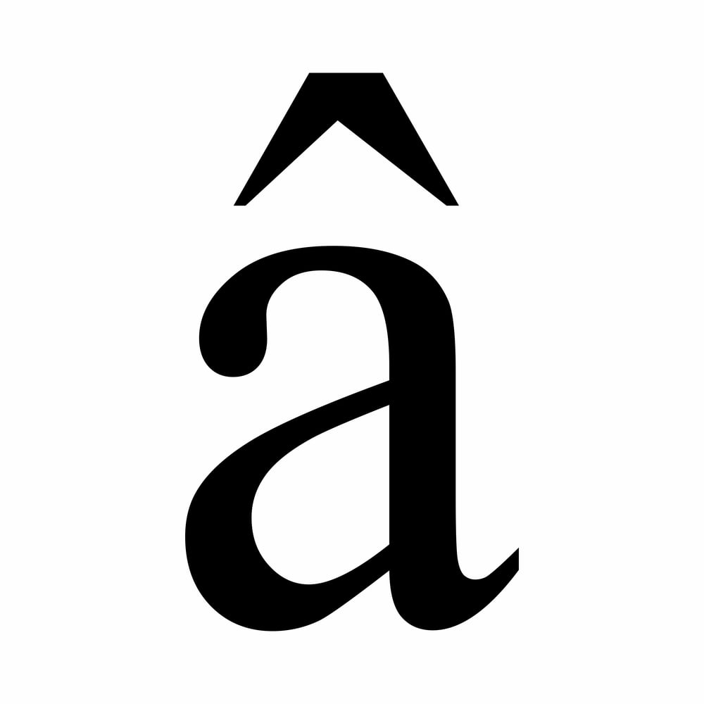
The little hat-shaped mark that sits above vowels in French words like ‘château’ or ‘fête’ is called a circumflex. It often signals that a letter ‘s’ used to follow that vowel in older versions of the word, before spelling simplified over time.
In mathematics and engineering, it appears above a variable to indicate an estimated or unit value. It is basically a tiny historical footnote sitting right on top of a letter.
What The Symbols Were Trying To Say All Along
Language has always found clever ways to carry meaning without words, and these symbols are proof of that. The pilcrow, the manicule, the interrobang: each one solved a real problem for the writers and printers who created them.
Some faded out as technology changed, while others quietly became part of everyday digital life without anyone learning their names. Knowing what to call them does not just settle trivia arguments; it connects everyday readers to centuries of human effort to communicate clearly.
More from Go2Tutors!

- The Romanov Crown Jewels and Their Tragic Fate
- 13 Historical Mysteries That Science Still Can’t Solve
- Famous Hoaxes That Fooled the World for Years
- 15 Child Stars with Tragic Adult Lives
- 16 Famous Jewelry Pieces in History
Like Go2Tutors’s content? Follow us on MSN.