Common Diagrams That Misrepresent Reality
You’ve likely come across these in school books, slides, or reports. Sharp edges, tidy shapes, balanced layouts – everything looks orderly.
Yet behind that smooth surface, meaning can get flattened out. They claim to make things clearer, though more than once they end up stripping away what matters.
What feels simple might actually be missing the mark. This weighs heavier than most assume.
Those basic visuals mold your grasp of things – be it atomic layouts or just how vast the solar system truly is. Yet when an idea settles in mind, shifting it demands genuine work.
The Solar System’s Deceptive Spacing

Every classroom poster shows the planets lined up in neat rows, evenly spaced across the page. The reality? Space between planets is so vast that an accurate diagram would be impossible to print.
If Earth were the size of a peppercorn, the Sun would be about the size of a grapefruit roughly 26 meters away. Jupiter would sit around 135 meters from the Sun.
Neptune? Try about 780 meters. No textbook has that kind of page count. The diagrams teach you the order of planets perfectly.
But they completely fail at conveying the emptiness of space. That emptiness defines the solar system more than the planets themselves.
Food Pyramids and Nutrition Nonsense

The original food pyramid showed grains at the base, suggesting they should form the bulk of your diet. Six to eleven servings of bread, cereal, rice, and pasta daily.
Fats and oils got tiny triangles at the top, marked with warning labels. This diagram reflected agricultural lobbying more than nutritional science.
It contributed to decades of low-fat diet trends that replaced fat with sugar and refined carbohydrates. The visual hierarchy made it look like scientific consensus when it was actually political compromise.
The pyramid got replaced with MyPlate in 2011, but millions of people still carry that original image in their heads. The damage from one influential diagram takes generations to undo.
Atomic Models That Stopped Being Accurate in 1913

The Bohr model shows electrons orbiting the nucleus like planets around a sun. Neat, circular paths. Easy to draw. Completely wrong.
Electrons don’t orbit. They exist in probability clouds. Their position and momentum can’t both be known precisely.
The planetary model creates a mental image that quantum mechanics has to spend years trying to break down. But the Bohr model persists because it’s drawable.
Teachers can sketch it on whiteboards. Students can memorize it for tests. The fact that it misrepresents fundamental physics gets treated as an acceptable trade-off for visual simplicity.
The Tongue Map’s Persistent Fiction
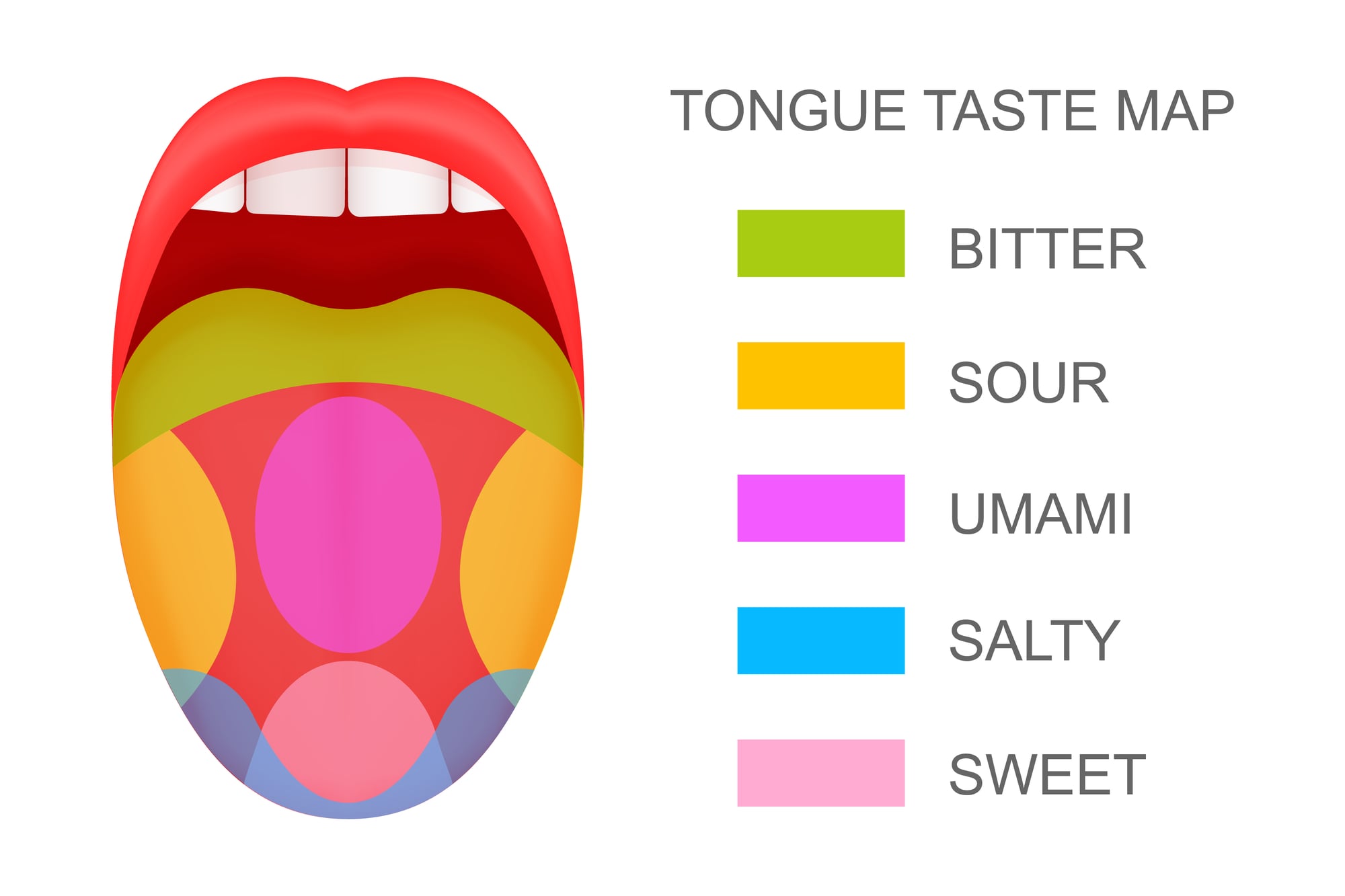
You’ve seen the diagram: sweet tastes detected at the tip of your tongue, bitter at the back, sour on the sides, salty spread across the front edges. Each region is color-coded and clearly labeled.
Complete fiction. Your tongue has taste receptors for all tastes distributed across its entire surface.
The “tongue map” originated from a mistranslation of a German paper from 1901, but the diagram was so visually satisfying that it spread through textbooks for decades. Even after scientists debunked it repeatedly, the image persisted.
Teachers still taught it. Students still memorized it. The simplicity of the diagram overpowered the complexity of actual human biology.
Maslow’s Hierarchy as a Rigid Structure
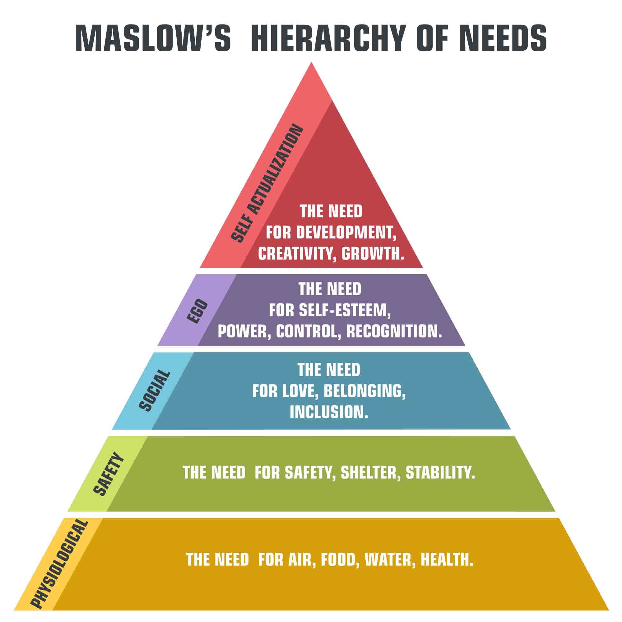
The triangle shows five neat layers: physiological needs at the base, then safety, love and belonging, esteem, and self-actualization at the peak. The implication? You must complete each level before moving to the next.
Maslow himself never created this triangle. He wrote about these needs, but he didn’t organize them into a strict hierarchy with hard boundaries.
People pursue belonging while still worried about safety. You can work on self-actualization while your physiological needs remain partially unmet.
The pyramid makes motivation look linear and predictable. Human psychology rarely cooperates with such tidy categories.
Bell Curves That Assume Normal Distribution
Statistical graphs love showing bell curves for everything from test scores to human height to IQ distributions. The normal distribution is mathematically beautiful and works for many natural phenomena.
But you see it applied to data sets that aren’t normally distributed at all. Income distribution? Not a bell curve—it’s heavily skewed.
Risk in financial markets? Fat-tailed distributions that the bell curve completely fails to capture. Using the wrong distribution in diagrams makes extreme events look far more rare than they actually are.
This contributes to financial crises, underestimated risks, and surprised experts wondering why their models failed.
Color Wheels Missing Half the Story

The basic color wheel shows red, yellow, and blue as primary colors, with orange, green, and purple as secondaries. You learned to mix paints using these combinations in elementary school.
But light works differently than pigment. Red, green, and blue are the primaries for additive color mixing.
Cyan, magenta, and yellow work better for subtractive mixing than the traditional artist’s wheel suggests. The simplified wheel teaches you something useful for mixing paints while being misleading about color theory itself.
It works until you start asking deeper questions about why colors behave the way they do.
The Brain’s Left-Right Division

Diagrams split the brain down the middle: left hemisphere for logic, language, and math; right hemisphere for creativity, intuition, and art. The visual simplicity makes the concept immediately graspable.
Brain imaging reveals a far messier reality. Both hemispheres participate in most cognitive tasks.
Language involves right hemisphere contributions. Math requires visual-spatial processing from the right side. Creativity activates networks across both hemispheres.
The left-brain/right-brain myth persists because it offers a satisfying explanation for different cognitive styles. The diagram makes neuroscience feel accessible while fundamentally misrepresenting how the brain actually works.
Evolution’s March of Progress

The classic image shows a sequence of figures walking from left to right: a hunched ape gradually standing upright, losing body hair, gaining height, until reaching modern human form. Each figure is a step on a ladder of progress.
Evolution doesn’t work that way. It’s not a ladder—it’s a branching tree. Humans didn’t evolve “from” modern apes. We share common ancestors.
Many human species existed simultaneously. The linear progression diagram erases this complexity entirely.
This visual makes evolution look teleological, as if there’s a direction and an endpoint. It suggests humans represent the pinnacle of evolutionary development. Both implications run counter to how natural selection actually functions.
The Water Cycle’s Incomplete Loop

Elementary school science classes teach a simple circle: evaporation, condensation, precipitation. Water goes up, water comes down, repeat forever.
The diagram shows clean arrows connecting three processes. Missing from this loop: groundwater that takes centuries to cycle through aquifers, water locked in glaciers for millennia, human water systems that interrupt natural flows, the role of plants in transpiration, ocean currents that transport water across continents.
The simplified cycle teaches you something true but incomplete. When you later face discussions about water scarcity, aquifer depletion, or climate change impacts on precipitation patterns, that elementary diagram becomes a liability rather than a foundation.
Maps That Distort Size and Importance

The Mercator projection has shaped geographic understanding for centuries. It makes Greenland look roughly the same size as Africa, even though Africa is actually 14 times larger.
Antarctica appears as a massive continent stretching across the bottom, distorted beyond recognition. This projection was designed for navigation, preserving angles for sailing routes.
But it became the default for classroom wall maps, subtly suggesting that northern countries are more geographically important than equatorial regions. You think you know what the world looks like.
Then you see an equal-area projection and realize how much the standard map warped your understanding of relative sizes and global geography.
Organizational Charts and Real Power Structures

Company org charts show clean boxes and lines: CEO at the top, layers of management below, everyone fitting neatly into hierarchies. The diagram suggests that authority flows through official channels and reporting relationships capture how decisions actually get made.
Real organizations run on informal networks. The person with influence isn’t always the one in the big box at the top.
Information travels through friendships, alliances, and back channels that no org chart captures. Power accumulates around expertise, relationships, and control of resources, not just job titles.
The chart serves administrative purposes but misrepresents organizational reality. Understanding this gap separates people who know how to navigate organizations from those who take the diagram at face value.
Supply and Demand Curves in Theory vs. Practice

Economics textbooks show clean supply and demand curves intersecting at equilibrium price. Move one curve, and the market adjusts smoothly to a new equilibrium. The diagram makes markets look predictable and self-correcting.
Real markets exhibit feedback loops, speculative bubbles, panic selling, irrational behavior, asymmetric information, and market power imbalances. The curves assume rational actors with perfect information making decisions in frictionless environments.
These assumptions rarely hold. The simplified diagram teaches you fundamental concepts but can lead to misplaced faith in market self-correction.
When markets fail to behave like the curves predict, the diagram leaves you without tools to understand why.
Where Simplification Serves and Where It Misleads

Diagrams strip things down – part of the deal. Their job isn’t truth, just usefulness.
It doesn’t matter if they’re off a bit; what counts is if that nudges toward clarity or pushes confusion instead. Some shortcuts help you begin. Yet others plant errors deep, making fixes feel like peeling your own skin.
Good drawings whisper their limits – not truths, just maps shaped by someone’s hand. You can’t escape simplifying complicated things. Yet awareness remains possible – what slips through the cracks matters.
A map never becomes the land it shows. Diagrams always leave part of the tale behind.
More from Go2Tutors!

- The Romanov Crown Jewels and Their Tragic Fate
- 13 Historical Mysteries That Science Still Can’t Solve
- Famous Hoaxes That Fooled the World for Years
- 15 Child Stars with Tragic Adult Lives
- 16 Famous Jewelry Pieces in History
Like Go2Tutors’s content? Follow us on MSN.