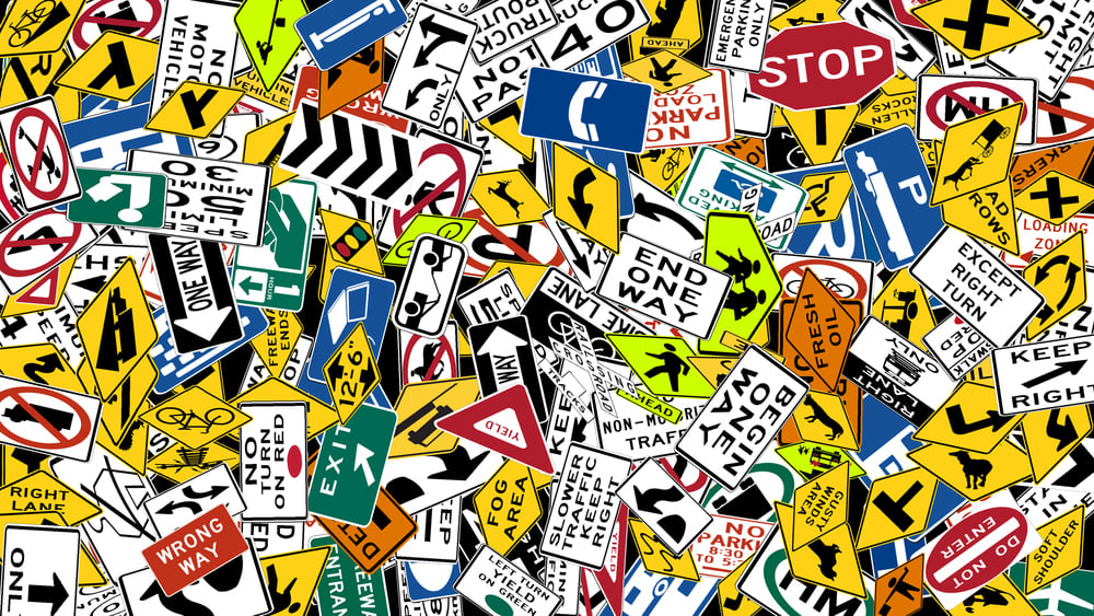
Curious Facts Behind Everyday Road Signs
Most people glance at road signs and follow what they say without much thought. Stop.
Yield. Speed limit 50.
But behind those simple instructions sits a surprisingly deep history — of psychology, politics, near-disasters, and decades of disagreement between countries that still haven’t fully agreed on the rules.
Red Wasn’t Always the Color of Danger
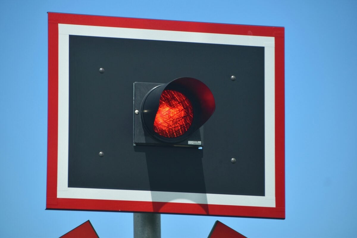
The choice of red for stop signs wasn’t as obvious as it seems today. In the early days of road signage, different countries used different colors for different things, and there was very little consistency.
Red eventually won out largely because of its long association with danger in other contexts — railway signals had been using red to mean “stop” for decades before cars existed. But there’s a practical reason too.
Red is one of the colors the human eye picks up fastest, especially in low-light conditions. It also fades more slowly than some other colors on painted surfaces, which mattered a great deal when signs were being repainted by hand.
The Octagon Had to Fight for Its Shape

The stop sign’s eight-sided shape wasn’t universally accepted at first. In the 1920s, American engineers were trying to create a system where drivers could recognize the meaning of a sign by its shape alone — even before they could read the words on it.
The original idea was to assign shapes based on how dangerous a situation was. The more sides, the more danger.
Circles were for the most critical warnings, octagons for stop signs, diamonds for general caution. It took years of back-and-forth before the octagon stuck as the standard for “stop” in most of the world.
Yellow vs. Orange — There’s a Real Difference
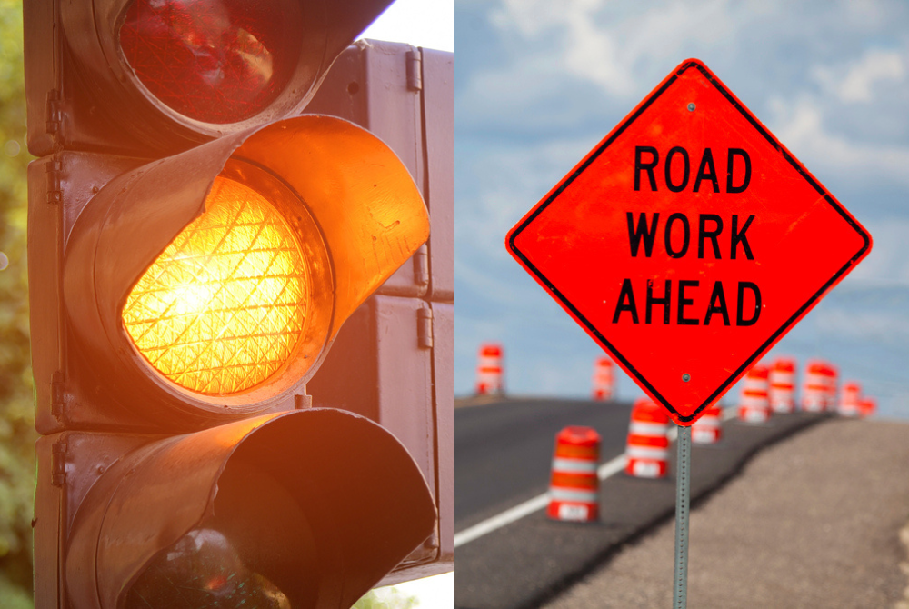
Both yellow and orange show up on road signs, and they’re not interchangeable. Yellow is used for permanent warning signs — things like sharp bends, pedestrian crossings, or merging lanes that will always be there.
Orange, on the other hand, is reserved for temporary situations. Construction zones, road work ahead, lane closures.
The idea is that your brain should process them slightly differently. A yellow sign means “this is always here, be careful.”
An orange sign means “something unusual is happening right now.”
Pictures Replaced Words on Purpose
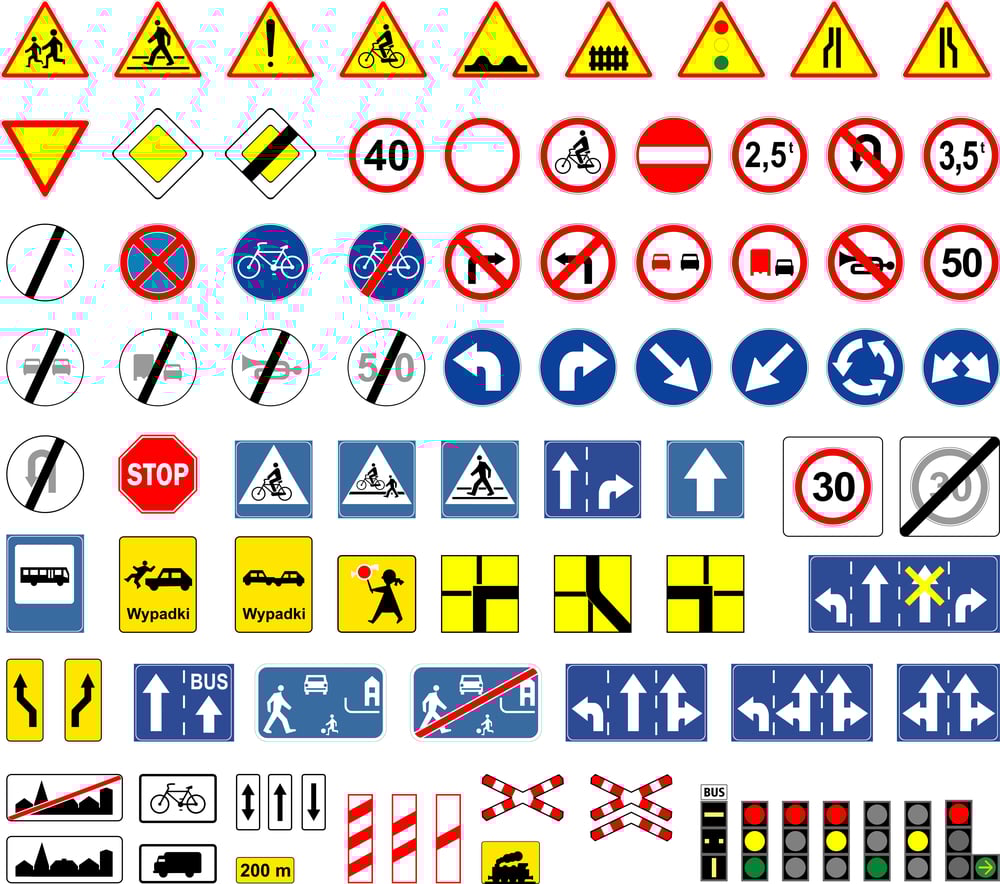
Pictogram signs — the ones that show a stick figure crossing a road or a car skidding — weren’t just a design choice. They came about because road systems started crossing national borders, and words became a problem.
A sign that says “SLOW” works fine in England. It does nothing for a French or German driver who doesn’t read English.
The push toward symbols over text came largely from Europe after World War II, when international travel by road became more common. The Vienna Convention on Road Signs and Signals in 1968 created a framework that most countries eventually adopted.
The US and UK, notably, have kept more text-heavy signs than most other nations.
Speed Limit Numbers Aren’t Random
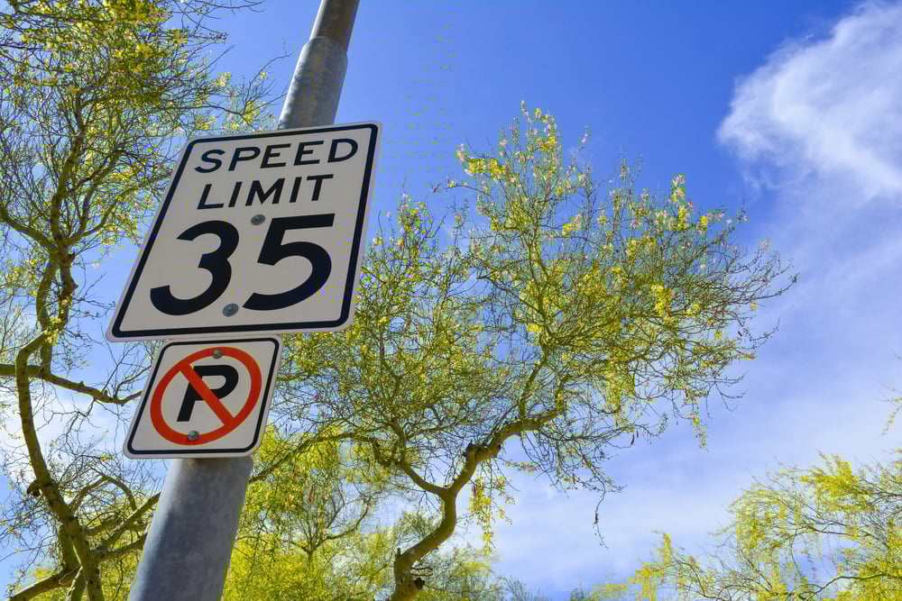
It feels like speed limits are arbitrary — why 30 here, 50 there, 70 on the motorway? But most limits are based on studies of stopping distances, road geometry, and pedestrian survival rates.
The 30 km/h or 20 mph limits in residential areas, for example, come from research showing that the chance of a pedestrian dying in a collision drops sharply below that speed. Above 50 km/h, the survival rate falls off significantly.
The numbers aren’t pulled from thin air — they reflect what engineers calculated as thresholds where injury becomes survivable.
Reflective Signs Are a Fairly Recent Invention
For most of early automotive history, road signs at night were basically invisible unless there was a street lamp nearby. Drivers relied on headlights bouncing off painted surfaces, which didn’t work particularly well.
3M developed the first retroreflective sheeting in the 1930s using glass beads embedded in adhesive film. The material bounced light back toward its source — meaning headlights would reflect directly back to the driver’s eyes.
By the 1950s, reflective sheeting had become standard on road signs in the US, and it spread globally over the following decades. The technology has improved considerably since then, but the basic principle hasn’t changed.
The Diamond Shape Is a Warning in More Ways Than One

Diamond-shaped signs in the US are used exclusively for warnings — hazards ahead, animals crossing, unusual road conditions. The shape itself communicates something before the words do.
In other countries, the same diamond shape carries different meanings. In parts of Europe, a yellow diamond on a plain white background means you’re on a priority road and have right of way.
Same shape, completely opposite emotional cue depending on where you are. It’s a good reminder of how much signage relies on learned association rather than anything inherently logical.
Sign Height Is Calculated, Not Guessed
Road signs aren’t just stuck on posts at whatever height seems reasonable. There are exact guidelines.
In the US, for example, signs along most roads are placed so the bottom of the sign is about 1.5 meters off the ground. On high-speed roads, that minimum goes up to about 2.1 meters.
The reasoning involves sight lines, vehicle heights, and the angle at which drivers read signs. Place a sign too low and trucks block it.
Too high and it falls outside the natural visual field of someone focused on the road ahead. The numbers are based on studies of where drivers actually look while driving.
The Font Was Chosen After Decades of Research

Highway Gothic — the typeface used on road signs across the US for decades — was developed in the 1940s specifically for legibility at speed. The letters are wide-set, with generous spacing between characters, because research showed that narrow fonts became unreadable at highway speeds.
In the 2000s, a new font called Clearview was introduced after researchers found that Highway Gothic became harder to read for older drivers due to the way light halos around the letters at night. Clearview used slightly different letterforms to reduce that effect.
After years of use, the US Federal Highway Administration revoked its approval in 2016 and returned to Highway Gothic — partly due to mixed evidence about whether Clearview actually improved legibility on all sign types.
Green Means Highway for a Specific Reason
The color coding on road signs follows a logic you can learn and apply anywhere in the US. Green means directional information — highway exits, distances, city names. Blue means services — rest areas, hospitals, fuel, food.
Brown means recreation or cultural sites. White means regulatory information like speed limits.
Yellow means warnings. Green was chosen for highways partly because it’s easy to read at night, and partly because it carries a psychological association with movement and flow.
Studies on color perception showed green text on a darker background was among the easiest for drivers to read at a glance.
Animal Warning Signs Reflect Local Ecology
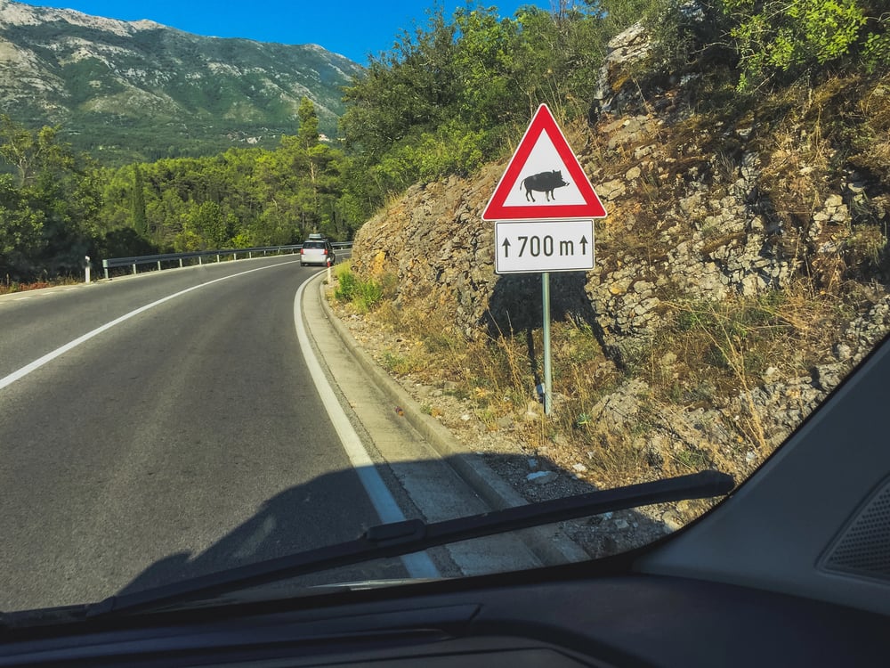
The animals on warning signs vary by region, and they tell you something about the local wildlife. Moose signs in Scandinavia and Canada.
Kangaroo and wombat signs in Australia. Deer signs across temperate Europe and North America.
Elephant crossings in parts of southern Africa and India. These signs exist because animal-vehicle collisions are a serious and measurable road hazard.
In Sweden, moose collisions cause hundreds of injuries per year. The signs are placed based on known animal movement corridors — areas where wildlife regularly crosses roads.
They’re updated when new data shows animal behavior has shifted.
Some Signs Were Quietly Retired

Nowadays, road signs change without many drivers realizing it. Some older ones disappeared because traffic patterns shifted – others proved useless through testing.
Later on, across the UK, drivers saw a warning sign with an old-style steam train near crossings – stuck in place even when those engines vanished entirely. That image took ages to go.
Over in America, travelers spotted another odd marker: a vintage gas station drawing meant to point toward fuel stops. Familiarity kept it around longer than needed.
Slow shifts happen below the surface, then symbols adjust, one by one. The world moves first, signs trail behind.
The Yield Sign Did Not Know What It Was
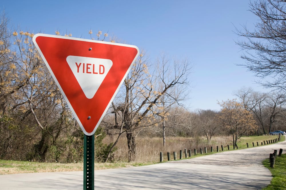
First seen in the 1950s, the yield sign started out yellow with bold black letters. Over time, it shifted into a version that was completely white.
Later still, a new look took over – red on top, white below, shaped like a triangle pointing down. This updated style lined up with signs used around the world.
Few road signs have been adjusted as often. A backward-pointing triangle gets picked just like the eight-sided stop sign – spot it easily from behind, no need to see words up front.
Downward corner? That one says give way.
Pointing skyward instead? Heads-up of something ahead. Feels odd at first, then makes sense every time.
The Signs You See But Never Really Notice
Floating through traffic, white lines boss pedestrians around without anyone really noticing. Ever glance at those modest blue numbers counting down highway exits? Tucked beneath big red prohibitions, little rectangles quietly list exceptions – buses get passes on some rules, certain hours open different doors.
These quiet additions hum along, barely seen. Most drivers take in the details without really noticing.
Because they’re designed well, these signals guide behavior quietly. Engineers say people follow them by habit, not effort.
When done right, you obey before realizing it. Their power lies in being overlooked.
What the Signs Never Mention
Pay attention here – that is the message. Not every detail makes it onto a sign, only what feels essential.
Missing pieces? Always. Sharp turns stay unmeasured by symbols.
Rainy surfaces go unnamed. Oncoming trucks remain invisible.
Each marker strips things down. Choices hide behind simplicity.
What you see skips nuance. Warning points without explaining.
Clarity trades completeness. Roads curve beyond description.
Simplicity? That’s the entire idea. Moving fast, drivers give signs about two seconds of attention.
Designers worked across decades to pack key details without cluttering sight. When you see one flash by, pause briefly – think how deeply its look was shaped to feel instantly clear.
More from Go2Tutors!

- The Romanov Crown Jewels and Their Tragic Fate
- 13 Historical Mysteries That Science Still Can’t Solve
- Famous Hoaxes That Fooled the World for Years
- 15 Child Stars with Tragic Adult Lives
- 16 Famous Jewelry Pieces in History
Like Go2Tutors’s content? Follow us on MSN.