Photos Of Vintage Fast Food Packaging We Miss Most
There’s something deeply satisfying about peeling back the layers of a perfectly wrapped fast food burger, hearing the crinkle of that waxy paper, or feeling the weight of a cardboard container that promised something delicious inside. Fast food packaging used to be an art form — bold colors, clever designs, and materials that felt substantial in your hands.
Before everything became streamlined and eco-friendly, these containers had personality. They told stories, created anticipation, and somehow made a simple meal feel like an event.
McDonald’s Styrofoam Big Mac Containers
The Big Mac clamshell was engineering perfection. Three sections kept the sesame seed bun, double patties, and special sauce exactly where they belonged until you were ready.
No soggy bottoms, no shifted toppings, no disappointment when you opened the container.
Those thick Styrofoam walls held heat like nobody’s business. Your burger stayed warm for the entire drive home, and the container itself became a perfect little plate once you cracked it open.
Burger King’s Aluminum Foil Burger Wraps
Burger King wrapped their Whoppers in heavy-duty aluminum foil that felt serious about its job. The foil molded perfectly around each burger, creating a custom-fit package that kept everything hot and contained.
Unwrapping one was like opening a present — you had to carefully peel back the metallic layers to reveal what was inside.
That foil wasn’t going anywhere once it was wrapped. No matter how you carried it, tossed it in a bag, or left it sitting on a car seat, your burger stayed exactly as the kitchen intended it.
Pizza Hut’s Red-Checkered Personal Pan Pizza Boxes
There’s something about opening a small cardboard box that makes you pause (even when you know exactly what’s waiting inside), and Pizza Hut understood this better than anyone when they designed those miniature pizza boxes for their Personal Pan pizzas. The red-and-white checkered pattern wasn’t just decoration — it was a promise that what you were about to eat came from a place that took pizza seriously, even when that pizza was meant for one person sitting alone at a school lunch table.
And the proportions were perfect: not so small that it felt cheap, not so large that it dwarfed the pizza inside, but exactly the right size to make you feel like you were getting something special rather than something scaled down.
Those boxes had weight to them, a sturdiness that suggested the pizza inside wasn’t just fast food but something worth protecting. The cardboard was thick enough that you could feel confident carrying it around, and when you finally opened it, the pizza was still steaming because the box had done its job.
So you’d eat your pizza right out of the box, using the bottom as your plate, and somehow that made the whole experience feel more legitimate than eating off a regular plate ever could.
Taco Bell’s Original Taco Holders
Picture a small paper boat designed by someone who actually understood how tacos fall apart. Taco Bell’s original taco holders cradled each hard shell taco in its own dedicated space, preventing the inevitable structural collapse that comes with the first bite.
The holder itself was sturdy enough to function as both packaging and serving dish. You could eat directly from it without worrying about taco shells cracking or fillings spilling onto your lap.
Wendy’s Foil-Wrapped Baked Potatoes
Wendy’s baked potatoes came wrapped in heavy aluminum foil that transformed them into small, perfectly heated packages. The foil wasn’t just wrapping — it was part of the cooking process, keeping the potato skin crispy while the inside stayed fluffy and hot.
Unwrapping one required patience and careful finger work to avoid burning yourself on the steam that escaped.
But that ritual of unwrapping made the potato feel more substantial than typical fast food fare. It was like receiving a home-cooked meal that happened to come from a drive-through window.
Kentucky Fried Chicken’s Striped Buckets
The red-and-white striped bucket wasn’t just a container — it was Kentucky Fried Chicken’s entire brand identity sitting on your kitchen table, and families would fight over who got to keep the empty bucket because everyone understood that something that substantial shouldn’t just be thrown away after one use (those buckets became storage containers, Halloween candy holders, and garage organizers for decades after the chicken was gone). But beyond their second life as household items, these buckets served their primary purpose better than almost any fast food packaging before or since: they kept chicken crispy, they stacked efficiently, and they made the meal feel like an event rather than just dinner.
The thick cardboard construction meant the bucket could handle the weight of a full family meal without buckling, and the wide opening made it easy for everyone to reach in and grab their preferred piece without the awkward maneuvering that comes with smaller containers.
The Colonel’s face on the side wasn’t just branding — it was a guarantee that what was inside had been prepared according to his secret recipe.
And somehow, eating chicken out of that bucket made it taste better than eating the same chicken off regular plates ever could.
McDonald’s Apple Pie Sleeves
McDonald’s apple pie sleeves were a masterclass in managing expectations. That simple cardboard tube with its warning about “extremely hot filling” didn’t just protect your fingers from molten apple filling — it created anticipation for what was essentially a handheld lava bomb disguised as dessert.
The sleeve design was brilliant in its simplicity. It covered just enough of the pie to protect you during transport while leaving both ends exposed so you could see exactly what you were getting into.
Arby’s Roast Beef Sandwich Wraps
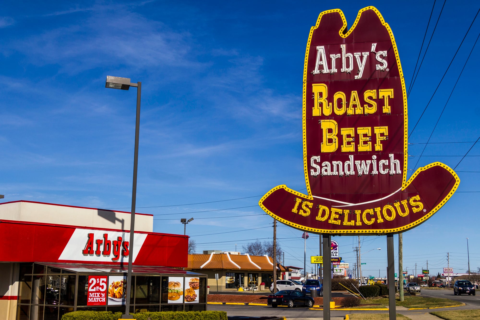
Arby’s understood that roast beef sandwiches needed different treatment than regular burgers, so they developed a wrapping system that accommodated the unique challenges of thinly sliced meat and soft buns — the paper wrapper was designed to fold in a specific way that created a secure pocket around the sandwich while still allowing easy access when you were ready to eat (and the wrapper material had just enough wax coating to prevent the sandwich juices from soaking through, but not so much that it felt plastic or artificial). The whole package felt substantial in your hands, like you were carrying actual food rather than fast food, which matched perfectly with Arby’s positioning as a step above typical burger joints.
And the wrapper served a second function that most people didn’t fully appreciate until they tried eating an unwrapped roast beef sandwich: it provided structural support that kept the filling from sliding out the back end with every bite.
So you could eat the entire sandwich while holding the wrapper, gradually unwrapping as you worked your way down, and your hands stayed clean while the sandwich stayed intact.
Which is saying something when you’re dealing with that much thinly sliced meat.
Long John Silver’s Newspaper-Lined Baskets
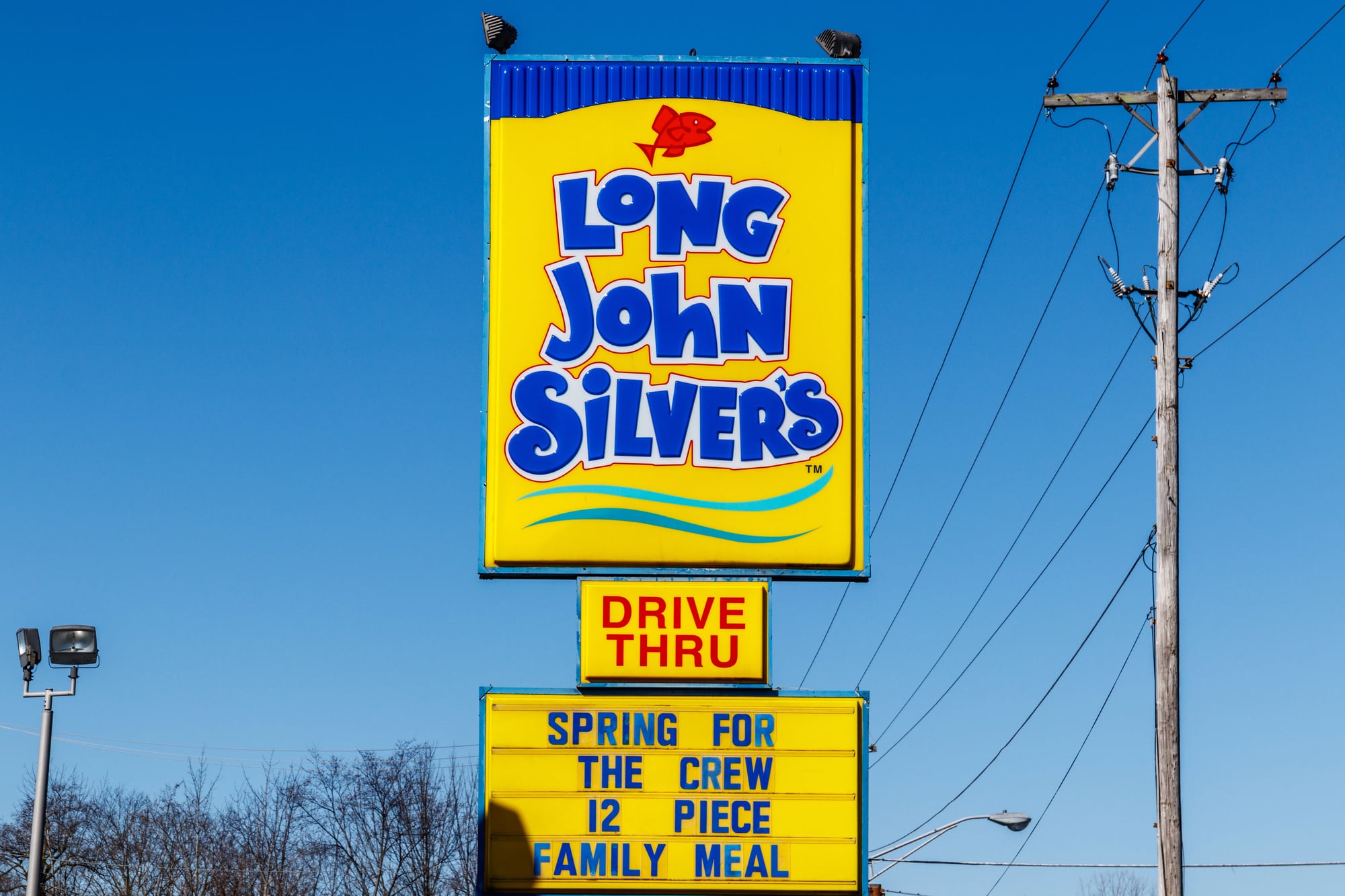
Long John Silver’s served their fish and chips in plastic baskets lined with paper designed to look like newspaper. The fake newspaper wasn’t trying to fool anyone — it was clearly food-safe paper with maritime-themed articles and advertisements that had nothing to do with actual news.
But that paper lining served a practical purpose beyond theming. It absorbed excess oil from the fried fish while still allowing the coating to stay crispy.
Plus, it gave you something to read while you ate, even if the articles were completely made up.
White Castle’s Small Square Boxes
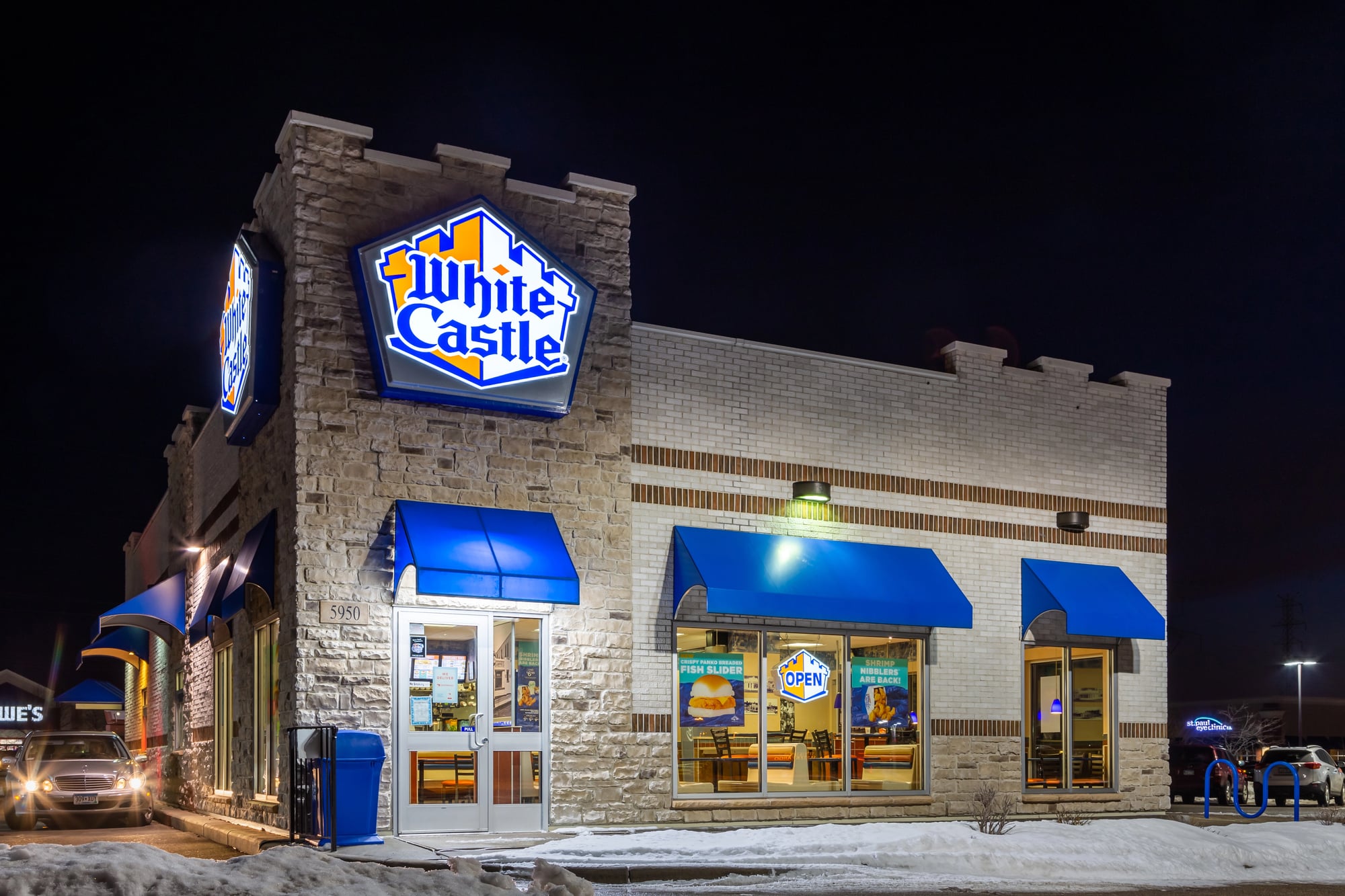
White Castle sliders came in small white boxes that perfectly matched the diminutive size of the burgers inside. These weren’t trying to make the burgers look bigger than they were — they were honest packaging that acknowledged you were probably going to eat several of these in one sitting.
The boxes were just large enough to hold two sliders side by side, and the steam rings in the top kept the buns from getting soggy during transport.
Opening a box released a cloud of onion-scented steam that was half the White Castle experience.
Dairy Queen’s Banana Split Boats
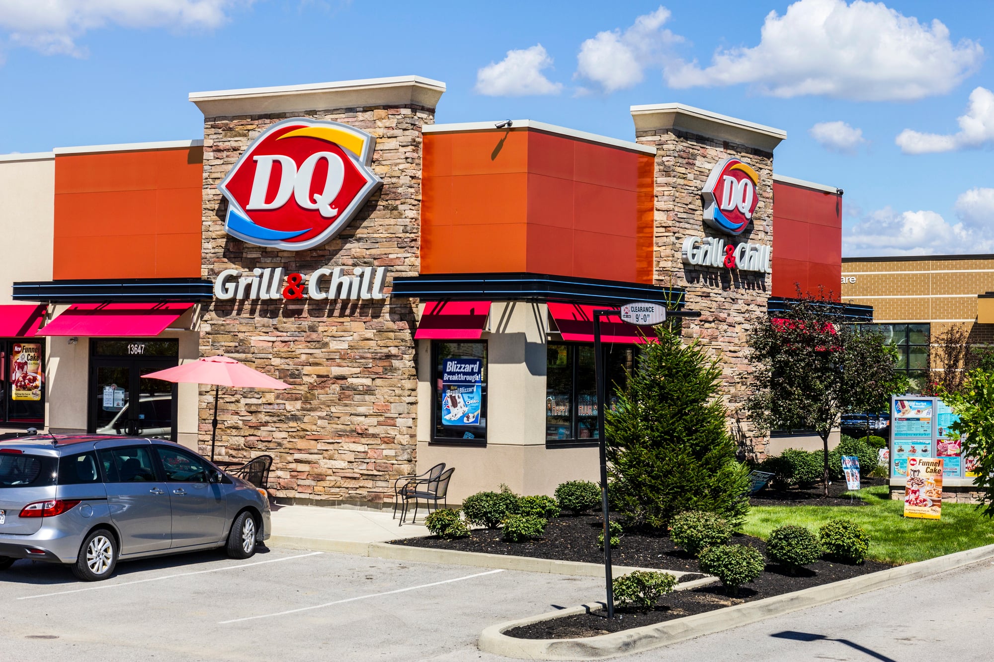
Dairy Queen’s banana split boats were elongated cardboard containers designed specifically for their signature dessert. The boat shape wasn’t just cute theming — it was functional design that kept the banana halves, ice cream scoops, and toppings arranged properly during transport.
The cardboard was coated with a material that could handle the inevitable melting without falling apart.
And the boat shape made it easy to eat the banana split with a spoon while keeping all the components contained in one neat package.
Popeyes’ Orange And Red Boxes
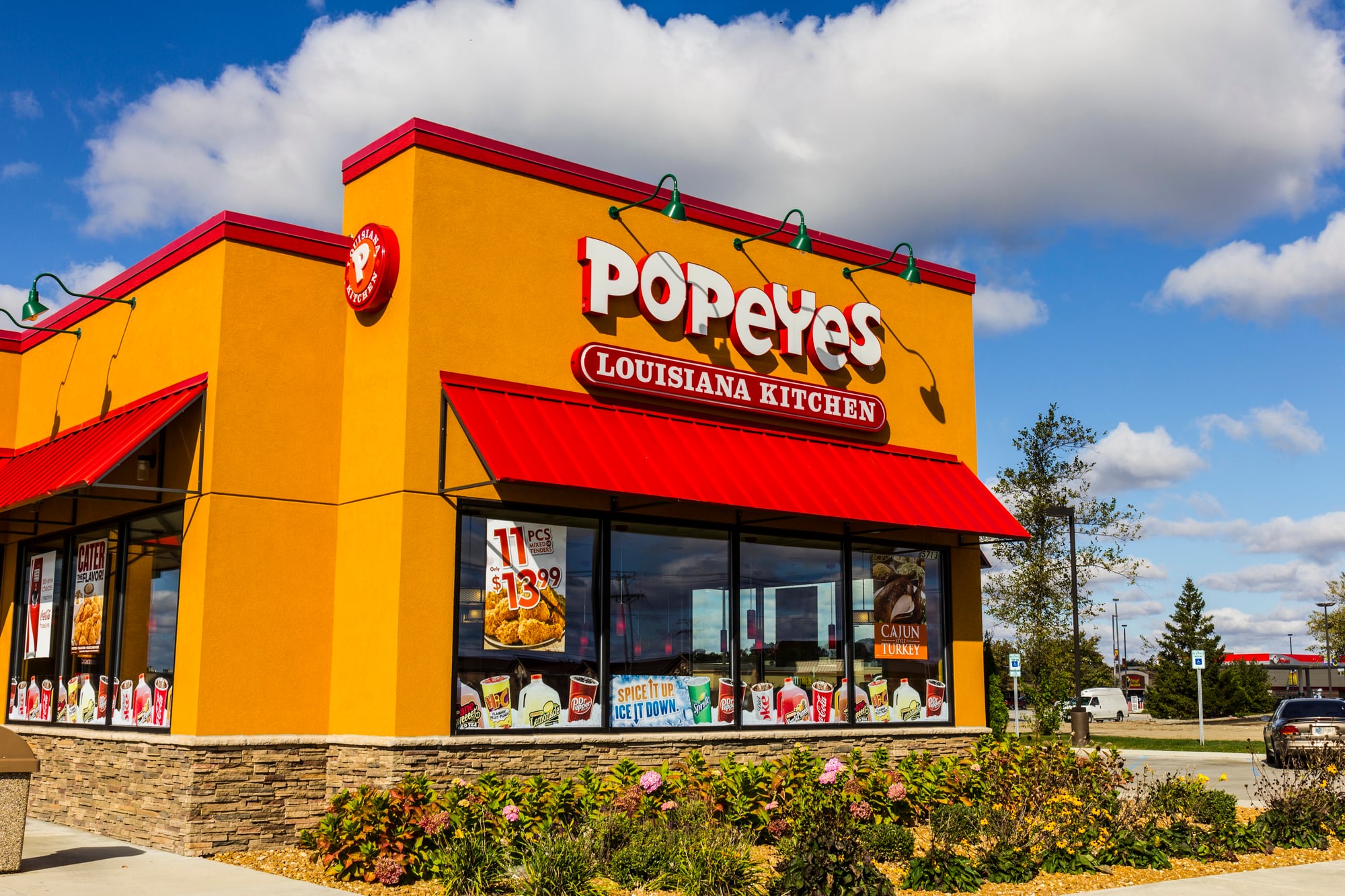
Popeyes chicken came in sturdy cardboard boxes featuring bold orange and red graphics that made no attempt at subtlety. These boxes announced themselves from across a parking lot and made it clear that whatever was inside was going to be aggressively seasoned.
The boxes were built to handle the weight and heat of bone-in fried chicken without compromising structural integrity.
And the bold design made Popeyes instantly recognizable, even when someone was carrying the boxes at a distance.
Hardee’s Star-Shaped Containers
Hardee’s used star-shaped containers for some of their menu items, playing up their star logo in three-dimensional form. These containers were more elaborate than they needed to be for functional purposes, but they made even a simple burger feel like something special.
The star shape created multiple compartments that kept different elements of the meal separated until you were ready to eat.
And the unique design made Hardee’s stand out in a crowded field of standard rectangular containers.
Carl’s Jr.’s Black And Red Packaging
Carl’s Jr. went bold with black packaging accented by red graphics, creating a look that suggested their food was somehow more serious or intense than typical fast food. The dark color scheme was unusual in an industry that typically favored bright, cheerful colors.
The packaging design matched the restaurant’s positioning as a place for people who wanted bigger, messier burgers.
And the black containers had a psychological effect — they made the food inside feel more substantial and adult-oriented than the same items would have seemed in standard packaging.
Jack In The Box’s Taco Sleeves
Jack in the Box tacos came in simple paper sleeves that acknowledged the weird reality of getting tacos from a burger chain. These sleeves weren’t trying to compete with actual Mexican restaurants — they were honest about what they contained.
The sleeves kept the deep-fried taco shells intact during transport and provided a clean way to hold what was essentially a novelty menu item.
And somehow, that unpretentious packaging made the tacos more endearing than if they had tried to look authentic.
Sonic’s Paper Boats
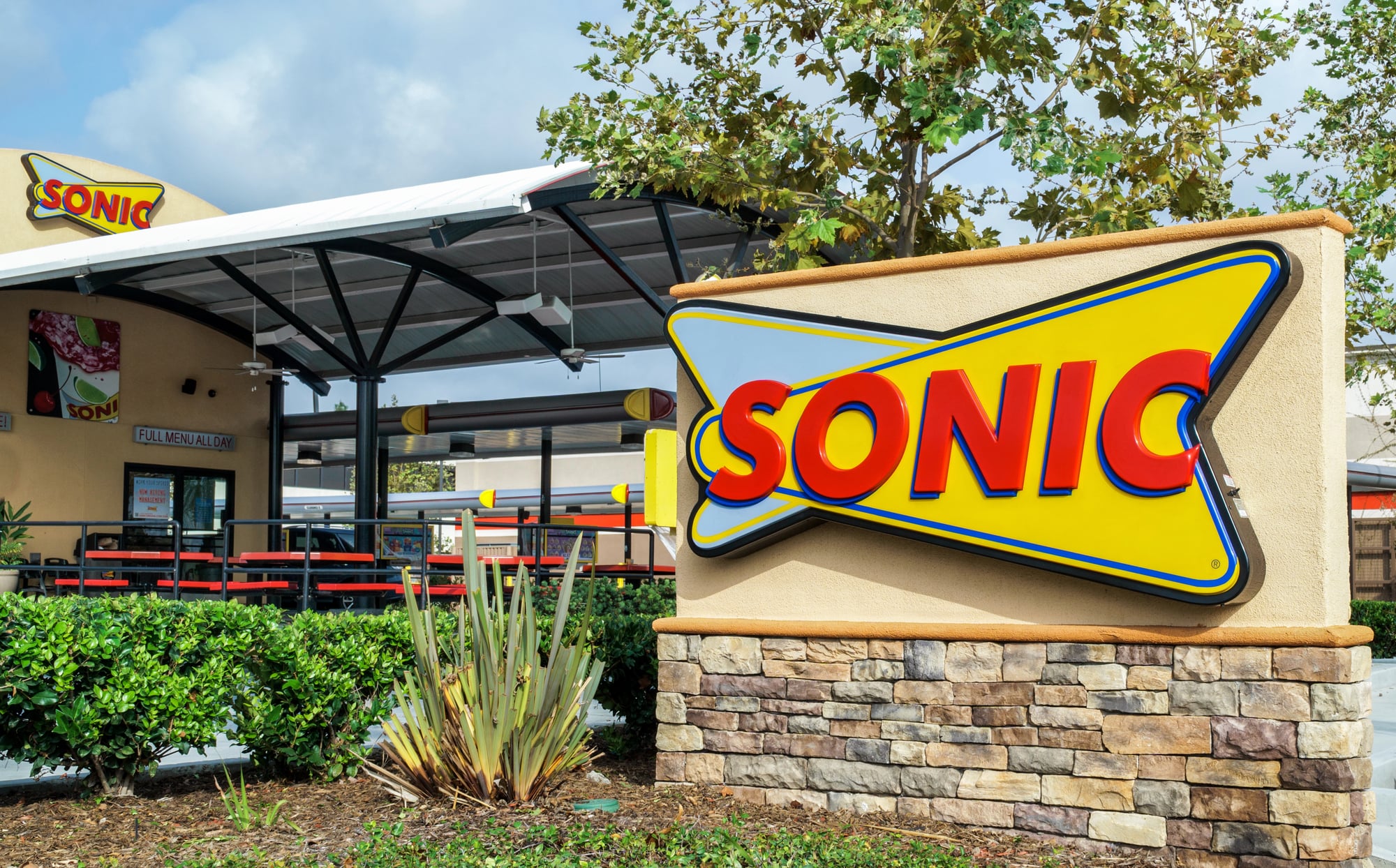
Sonic served their onion rings and tater tots in red paper boats that turned every order into a miniature carnival experience. The boat shape was purely functional — it contained round foods that would otherwise roll around loose in a bag.
But those paper boats also reinforced Sonic’s drive-in atmosphere.
Everything about the experience was designed to feel like a throwback to an earlier era of American dining, and eating out of paper boats while sitting in your car completed that nostalgic picture.
Roy Rogers’ Cowboy-Themed Containers

Roy Rogers restaurants used packaging decorated with Western imagery that reinforced their cowboy theming. The containers featured illustrations of cowboys, horses, and frontier scenes that made even a simple burger feel like part of an adventure.
The artwork wasn’t sophisticated, but it was earnest in a way that modern focus-grouped design rarely achieves.
These containers told you exactly what kind of experience Roy Rogers wanted to provide, and they delivered on that promise with every meal.
Round Table Pizza’s Medieval-Themed Boxes
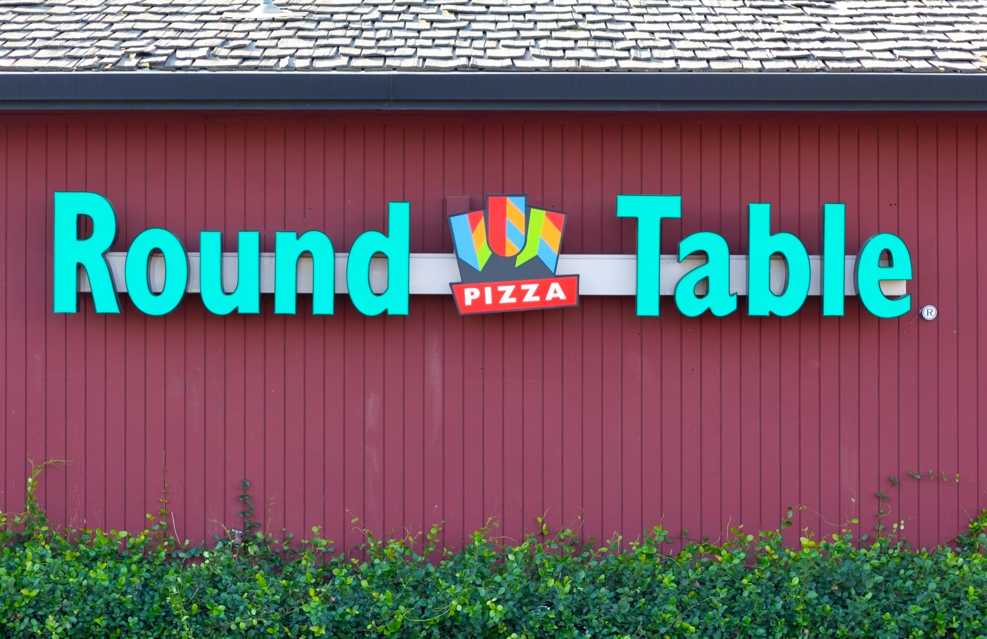
Round Table Pizza boxes featured medieval artwork and typography that transformed pizza pickup into a small theatrical experience. The boxes told the story of the Round Table legend while protecting your pizza during transport.
Opening one of these boxes felt like opening a treasure chest, complete with medieval imagery and dramatic fonts.
The theming was over the top in the best possible way, turning pizza into an adventure rather than just dinner.
What Cardboard And Foil Knew That Plastic Never Learned
These vintage packages understood something that modern fast food has largely forgotten: presentation matters, even when nobody’s watching. A meal that arrives in packaging with personality feels different than one that comes in generic containers designed purely for efficiency.
Those old containers had weight, texture, and character. They made promises about what was inside and generally kept those promises.
And when you finished eating, you sometimes kept the container because it felt too substantial to just throw away. There’s something to be said for packaging that outlasts the food it protected.
More from Go2Tutors!

- The Romanov Crown Jewels and Their Tragic Fate
- 13 Historical Mysteries That Science Still Can’t Solve
- Famous Hoaxes That Fooled the World for Years
- 15 Child Stars with Tragic Adult Lives
- 16 Famous Jewelry Pieces in History
Like Go2Tutors’s content? Follow us on MSN.