Photos of What Popular Fast Food Chains Looked Like in the 1980s
The 1980s were a strange time for fast food. Everything was bigger, brighter, and more aggressive than it needed to be.
Neon lights buzzed overhead while geometric patterns attacked your retinas from every angle. These weren’t the sleek, minimalist restaurants you see today — they were loud, proud monuments to excess that somehow made a Big Mac taste better just by existing.
Looking back at old photos of these chains feels like flipping through a time capsule that someone decorated with a highlighter set. The colors were impossibly saturated, the logos were three times their current size, and every surface seemed to be competing for your attention.
Yet there’s something oddly comforting about these spaces, even if they look completely ridiculous now.
McDonald’s
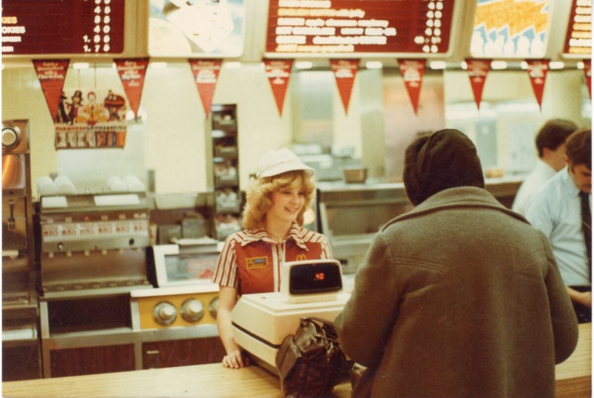
McDonald’s in the 1980s looked like a fever dream designed by someone who’d never seen the color beige. Red and yellow dominated everything — the walls, the seats, the uniforms, even the trash cans.
The golden arches weren’t just outside; they were plastered across every available surface inside too. The restaurants felt more like playgrounds than eating establishments.
Those weird, angular booths with the hard plastic seats that somehow always stuck to your legs. Ronald McDonald himself was everywhere, grinning from posters with that unsettling painted smile that looked friendly and terrifying at the same time.
Burger King
Burger King went all-in on brown and orange, which sounds terrible but somehow worked. The restaurants had this weird medieval theme going on, complete with fake wood paneling and those distinctive crown-shaped light fixtures that cast strange shadows across everything.
The salad bars were massive glass structures that dominated the dining room like transparent fortresses. And yet, despite selling burgers as their main thing, everyone remembers those salad bars — probably because they were impossible to ignore and took up half the restaurant.
Pizza Hut
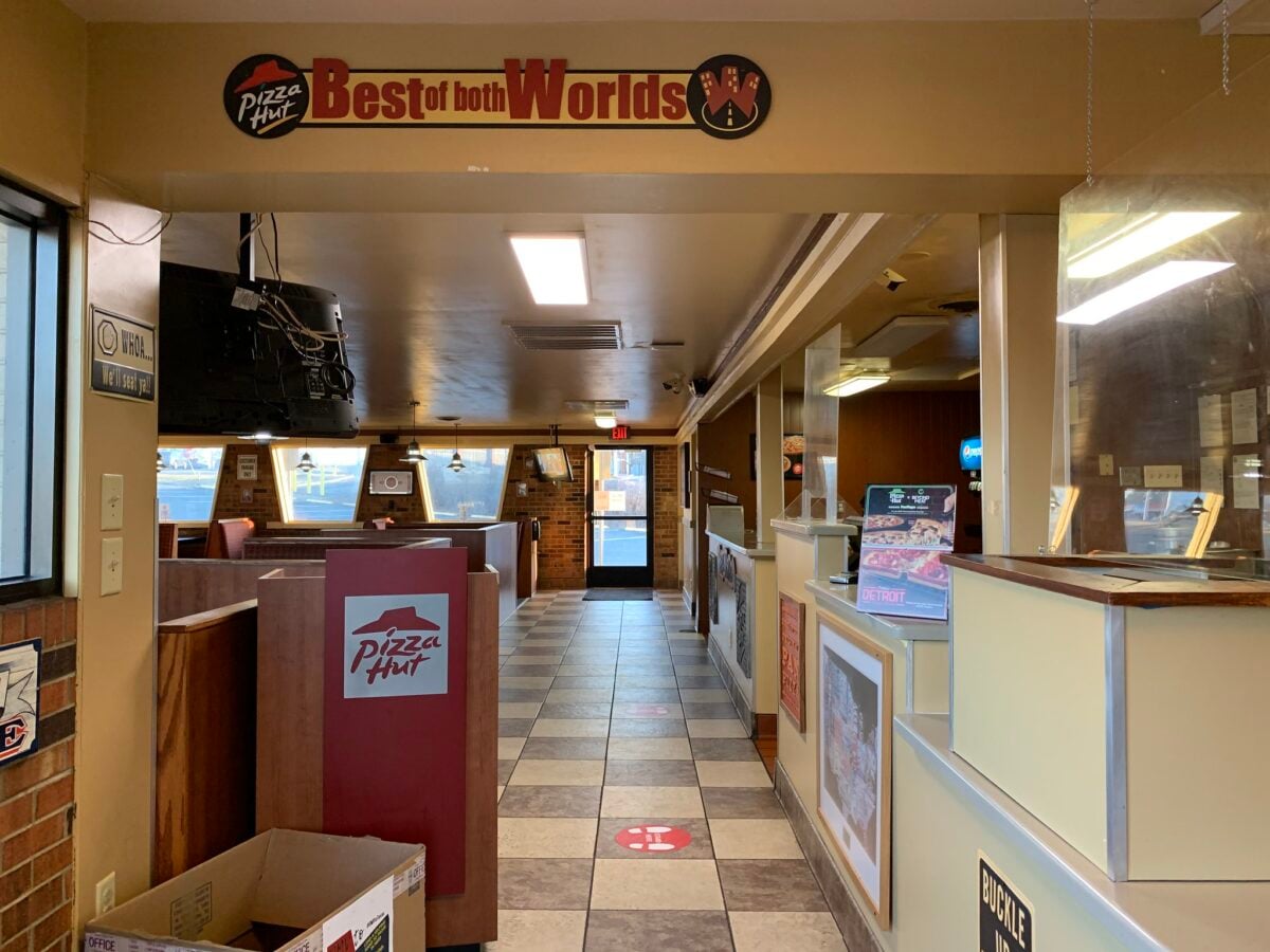
Pizza Hut restaurants were dark, mysterious caves where families gathered around wooden tables under the glow of stained glass lampshades that belonged in a completely different century (and probably a different continent). The red roofs outside were iconic, but inside felt like a cross between a medieval tavern and someone’s basement rec room that got way out of hand.
Those personal pan pizzas came sizzling to your table on metal plates that were somehow always exactly the temperature needed to burn your fingers, no matter how long you waited (and you always waited, because the anticipation of those crispy edges was half the experience). The salad bar here was different from Burger King’s — smaller, tucked into corners, almost apologetic about existing in a place dedicated to cheese and pepperoni.
So you’d load up on iceberg lettuce and those little packets of dressing that never opened cleanly, telling yourself this somehow balanced out the pizza you were about to demolish. But the real magic lived in those booths with the high backs that created little private dining rooms where conversations felt more intimate and every meal stretched longer than it needed to — which was exactly the point.
Taco Bell
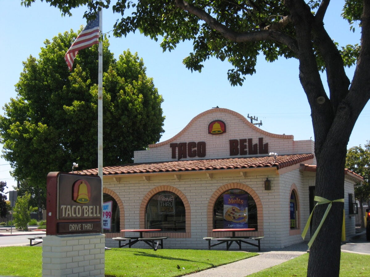
Taco Bell’s 1980s aesthetic was aggressively southwestern in the way that only a corporate boardroom could imagine the Southwest should look. Think terra cotta tiles, fake adobe walls, and enough turquoise accents to make a roadside souvenir shop jealous.
The restaurants were designed to feel like some idealized Mexican cantina, except everything was perfectly clean and the music was definitely not mariachi. Those hard plastic booth seats came in sunset colors that were probably supposed to evoke desert landscapes but mostly just looked like someone spilled a bunch of highlighters.
Kentucky Fried Chicken
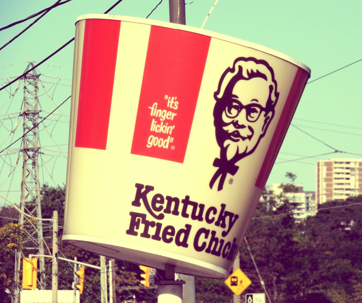
KFC stuck with a red and white checkerboard pattern that made every location look like a picnic tablecloth had exploded and taken over the building. The Colonel’s face was everywhere — not the friendly cartoon version you might see now, but actual photos of the real Harland Sanders looking stern and slightly disapproving of your eating habits.
The restaurants had this weird homestyle diner vibe that didn’t quite match the fast food reality. Wood-grain Formica tables tried to look rustic while fluorescent lighting made sure nothing actually felt cozy.
Wendy’s
Wendy’s embraced a weird Victorian theme that made no sense for a burger joint but somehow worked anyway. Dark wood, burgundy accents, and those bizarre Tiffany-style lamp fixtures created an atmosphere that was part family restaurant, part grandmother’s dining room.
The salad bars were legendary — not just because they were huge, but because they had things like sunflower seeds and cheese cubes that seemed impossibly fancy for a place that sold square hamburgers. Those newspaper-style menus with tiny print made ordering feel like you were studying for a test.
Hardee’s
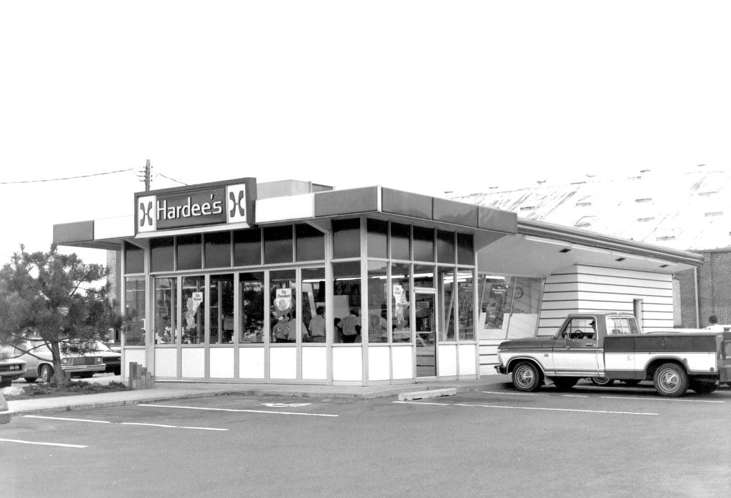
Hardee’s went with an orange and brown color scheme that screamed 1970s holdover but somehow persisted well into the Reagan years. The restaurants felt more utilitarian than their competitors — less theme park, more truck stop, which was probably intentional.
The Star logo was everywhere, usually in that distinctive orange that was somehow both aggressive and welcoming. The booths were simpler than most chains, just basic brown vinyl that got the job done without trying to transport you to another time or place.
Dairy Queen
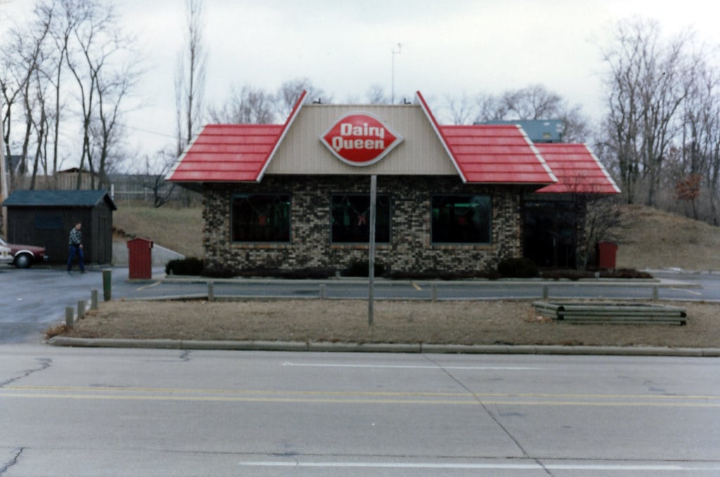
Dairy Queen locations were studied in simplicity compared to their fast food cousins. Clean white walls, red accents, and those iconic cone-shaped signs made everything feel more like an ice cream parlor than a restaurant — which made sense, since that’s essentially what they were.
The soft-serve machines were always visible from the dining area, creating theater around the ice cream process. Watching someone make a Blizzard and flip it upside down never got old, even when you’d seen it dozens of times before.
Arby’s
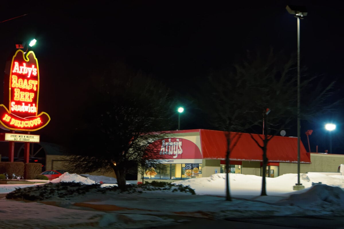
The thing about Arby’s in the 1980s is that it never quite knew what it wanted to be, and somehow that uncertainty became its defining characteristic. The restaurants had this odd western saloon meets corporate cafeteria vibe — dark wood that tried to feel rustic bumping up against fluorescent lighting that definitely didn’t, creating spaces that felt perpetually confused about their own identity.
Those ten-gallon hat logos were everywhere, promising some kind of frontier experience that roast beef sandwiches couldn’t quite deliver (though they tried, and the horseradish sauce helped). The brown and orange color scheme made everything feel slightly sepia-toned, like you were eating in an old photograph. And yet people kept coming back, maybe because there was something honest about a place that seemed as unsure about itself as everyone else felt in the 1980s.
Long John Silver’s
Long John Silver’s committed fully to a pirate theme that was both ridiculous and somehow perfect for a seafood chain. The restaurants were decorated like ship interiors, complete with rope details, nautical flags, and enough maritime kitsch to stock a themed restaurant supply warehouse.
The fish came in those red plastic baskets lined with newspaper, which made every meal feel like a seaside picnic even when you were eating in a strip mall in Ohio. The hush puppies were legendary, and the malt vinegar bottles on every table suggested a level of authenticity that the plastic treasure chests probably undermined.
Roy Rogers
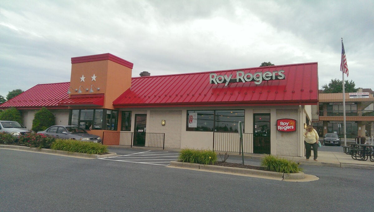
Roy Rogers restaurants looked like someone had decided the Wild West needed more fluorescent lighting and vinyl seating. The cowboy theme was everywhere — from the hat-wearing logo to the saloon-style doors that led to the kitchen areas where you could watch your burger being assembled.
The Fixin’ Bar was the chain’s signature feature, letting customers customize their burgers and sandwiches with an array of toppings that felt revolutionary at the time. Those brown and orange color schemes made everything feel appropriately rustic, even when you were eating off plastic trays.
White Castle
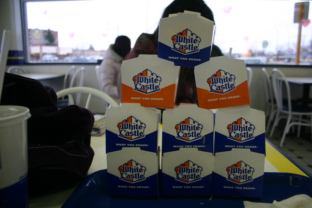
White Castle looked exactly like what it was — a small, efficient burger factory designed to get you fed and back on your way as quickly as possible. The white and blue color scheme was clean and simple, though the restaurants themselves were tiny compared to their competitors.
Those little square sliders came in cardboard boxes that somehow made them taste better. The restaurants often had minimal seating, acknowledging that most people were taking their orders to go anyway.
Everything about the design prioritized speed and efficiency over comfort.
Popeyes
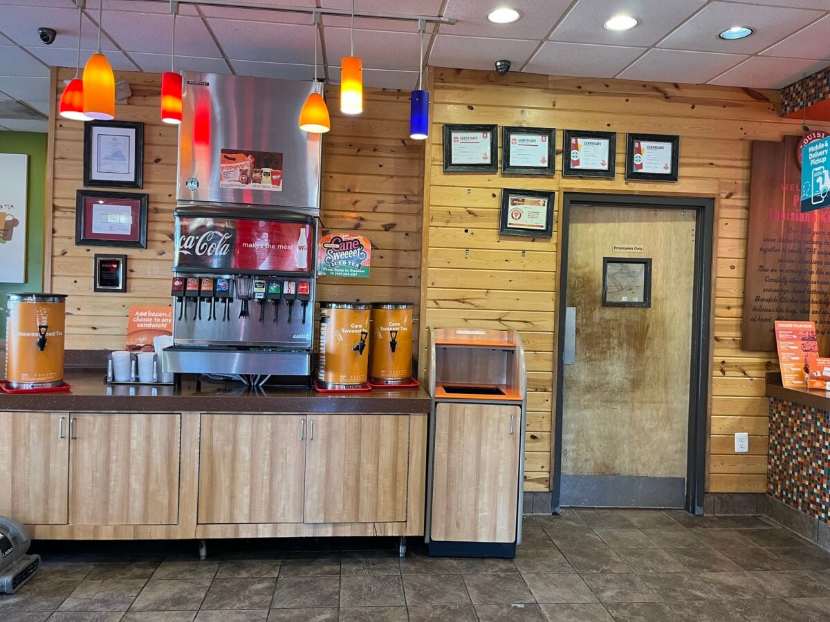
Popeyes embraced a New Orleans theme with the subtlety of a Mardi Gras parade crashing through your living room. The restaurants were decorated in bright yellows and reds, with Cajun-inspired artwork that probably bore no resemblance to actual Louisiana culture but created a festive atmosphere that made the spicy chicken seem even more authentic.
The cartoon Popeye character was everywhere, flexing his spinach-powered muscles in a way that seemed oddly appropriate for a fried chicken chain. Those red beans and rice came in little containers that made every meal feel like a complete Southern experience, even when you were nowhere near the South.
Howard Johnson’s
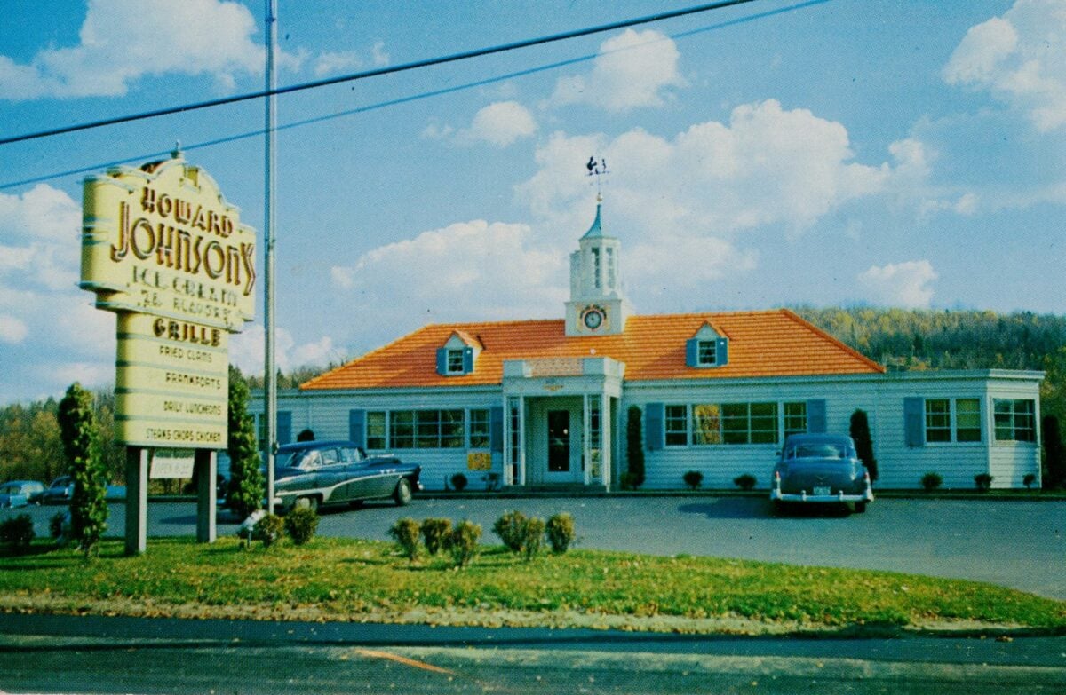
Howard Johnson’s restaurants were orange. Not orange-accented or orange-themed — just orange, everywhere, all the time, as if the color had achieved consciousness and decided to open a restaurant chain.
The Simple Simon and the Pieman logo tried to create some kind of wholesome, fairy-tale atmosphere, but mostly you just noticed the orange. Orange booths, orange walls, orange uniforms, orange signage.
Even the ice cream flavors seemed more orange than they probably were, which was saying something since they offered 28 different varieties.
When Everything Made Sense
These restaurants existed in a time when being subtle wasn’t the point. Every chain wanted to grab your attention from the highway and hold it until you’d finished your meal and maybe ordered dessert.
The colors were loud because everything else was loud too — the music, the advertising, the entire decade. Looking at these old photos now, it’s easy to laugh at the excess.
But there’s something to be said for spaces that weren’t afraid to have personality, even when that personality was questionable. These weren’t focus-grouped into submission or designed to photograph well for social media.
They were just trying to sell hamburgers and create an experience, however bizarre that experience might seem now.
More from Go2Tutors!

- The Romanov Crown Jewels and Their Tragic Fate
- 13 Historical Mysteries That Science Still Can’t Solve
- Famous Hoaxes That Fooled the World for Years
- 15 Child Stars with Tragic Adult Lives
- 16 Famous Jewelry Pieces in History
Like Go2Tutors’s content? Follow us on MSN.