Vintage Sportswear Logos That Help Date Clothing
A faded sweatshirt in a thrift store can look like it came from any decade, but the logo on the chest often reveals the truth. Sportswear brands redesigned their marks over the years, and each version belongs to a particular window of time.
Learning a few of those changes turns a rummage into a bit of detective work. Collectors also know that condition affects value, since cracked prints, stretched collars, and stained fabric reduce what a buyer will pay.
The twenty logos below give clear clues about when a piece was made.
Nike Script Swoosh
Nike adopted the Swoosh as its official mark in 1971, after Carolyn Davidson designed it for a fee of 35 dollars. Early versions paired the Swoosh with the Nike name in a script-style font.
A garment with this combination points to the 1970s, and clean lettering helps its resale value.
Nike Futura Block Lettering
Around 1978, the Nike name changed to a bold block style placed above or beside the Swoosh. The red and white combination appeared often during this era.
A shirt with this lettering and a faded, soft cotton feel is likely from the late 1970s or 1980s.
The Jordan Jumpman
Nike signed an endorsement deal with Michael Jordan in 1984, and the Jumpman silhouette became the symbol of the Jordan line. Any garment with this figure must come after that deal.
Condition, especially of the printed figure, strongly affects price.
Adidas Trefoil
The Trefoil logo was designed in 1971 and launched in 1972 in time for the Munich Olympics. It served as the company’s main mark until the 1990s and later became the symbol of the Originals line.
A tracksuit with a Trefoil on the chest is a strong candidate for the 1970s or 1980s.
Adidas Three Bars Mountain
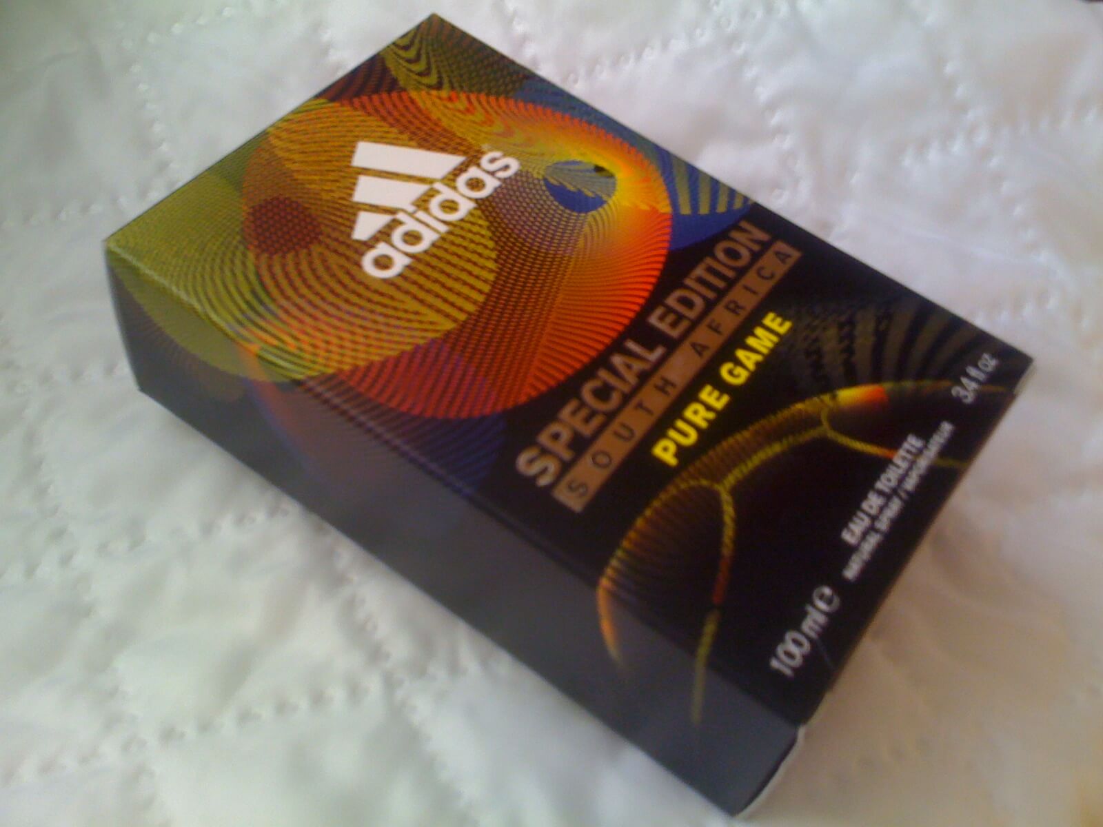
Peter Moore designed the three-bar logo, which first appeared in 1991 on the Equipment line and later replaced the Trefoil as the company’s main mark. A tag or chest print with the slanted bars points to the 1990s or after.
Fading and cracking of the print are the usual condition issues.
Adidas Three Stripes
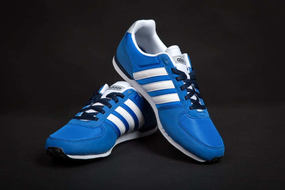
Adidas acquired its three-stripe branding from the Finnish company Karhu in 1952, reportedly for two bottles of whiskey and a modest payment. The stripes run down the sleeves and legs of many classic tracksuits.
Stripe style and color combinations help narrow the decade.
Champion Reverse Weave Tag
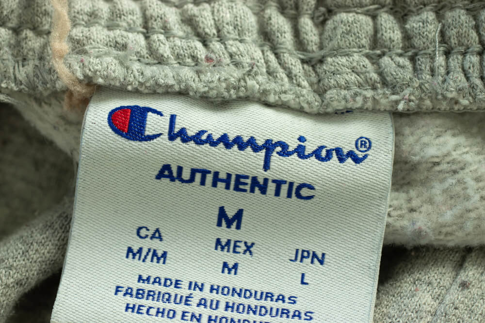
Champion’s Reverse Weave sweatshirts, patented in 1938 and again in 1952, carry a tag that proudly names the technique. The construction, cut across the grain, is meant to resist shrinkage.
A tag that mentions a patent and shows side panels suggests a classic example.
Champion Embroidered Logo

Champion’s red, white, and blue embroidered logo is associated with the company’s 1978 timeline entry. Collectors check the stitching on the sleeve or chest and compare tag details.
Chain stitching and a heavyweight feel are good signs.
Champion NBA Jerseys
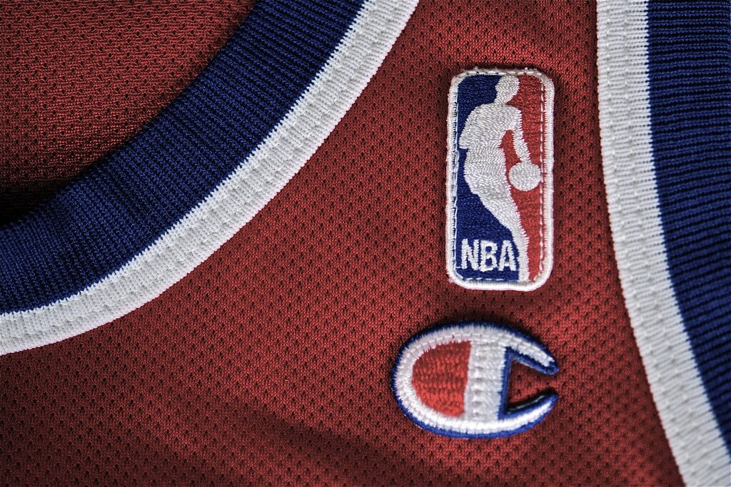
Champion served as the official NBA outfitter from 1989 to 2001, so a jersey with its tag belongs in that window. The company also outfitted the WNBA from 1997 to 2001.
Collectors value jerseys without cracked numbers or stretched collars.
Kappa Omini
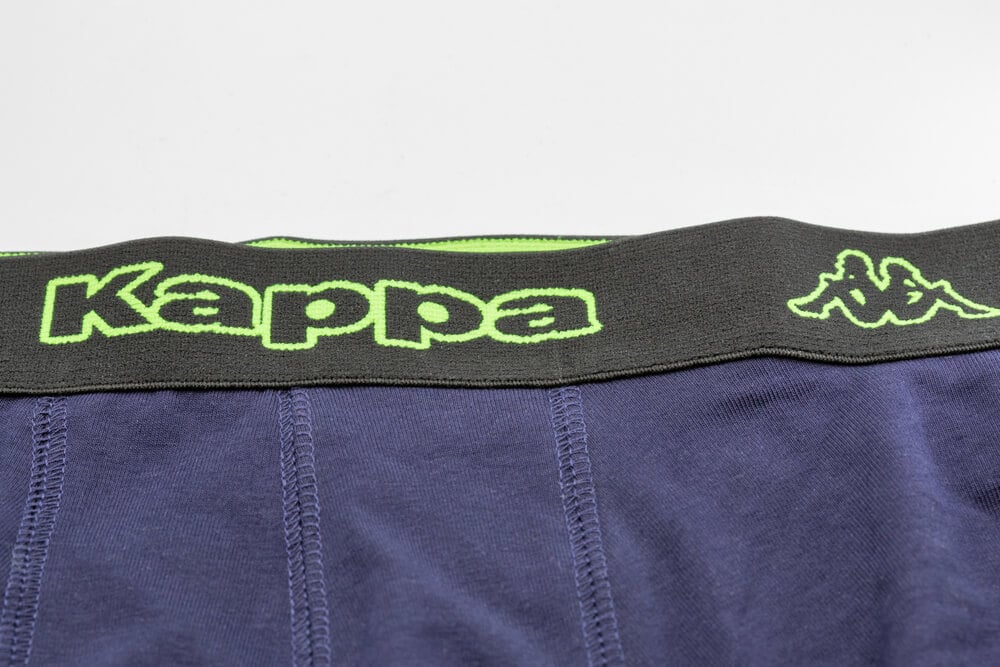
Kappa’s Omini logo dates to 1969 and shows a man and a woman sitting back to back. In 1978 it was combined with the words Kappa Sport, and in 1981 it was simplified to the Omini symbol with the Kappa name beneath.
The version on a tag helps pinpoint the decade.
Kappa Banda
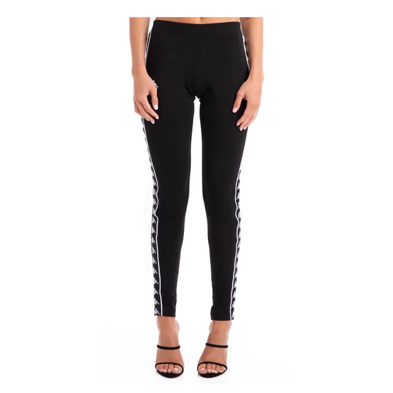
The Kappa Banda is a repeating row of the Omini figures down the side of a garment, most famously on tracksuits and soccer kits. It is associated with the brand’s strong visibility in the 1980s.
Original pieces with sharp, unpeeled prints are the ones that stand out.
Lacoste Crocodile
Lacoste launched in 1933, and the brand’s crocodile, drawn by an artist friend of René Lacoste in 1927, was among the first logos displayed on the outside of a garment. The crocodile has been refined over the decades, with changes to the shape and stitching.
A more detailed crocodile generally points to an earlier piece, since later versions were simplified.
Polo Pony
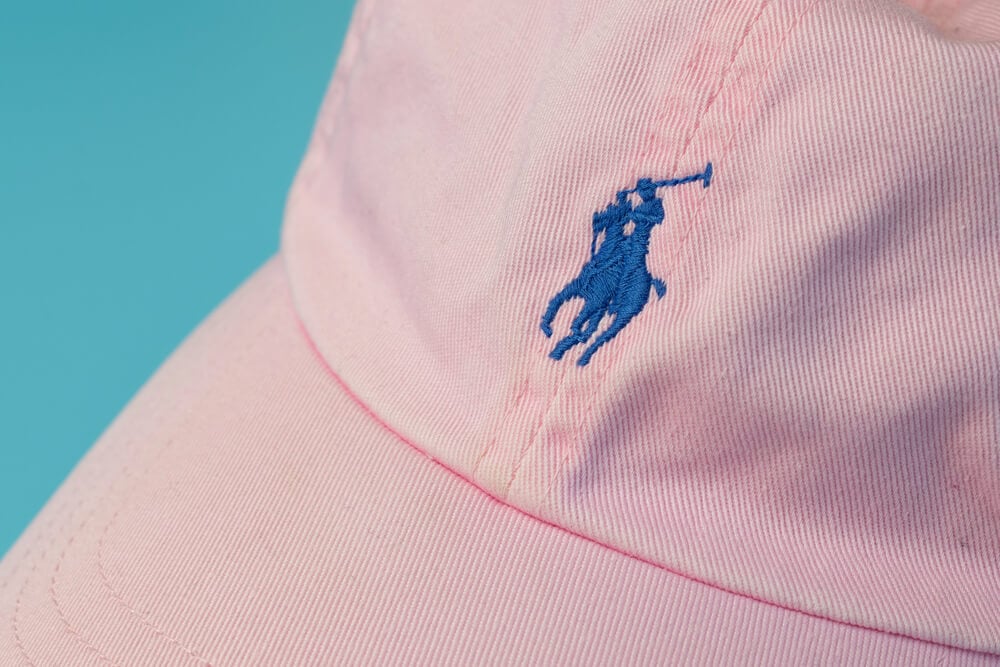
Ralph Lauren’s polo player emblem first appeared in 1971 on women’s shirts, and the classic mesh Polo shirt followed in 1972 in 24 colors. The size and stitching of the pony changed over time, with larger versions used in later decades.
Collectors compare embroidery and tags to date a shirt.
Tommy Hilfiger Flag
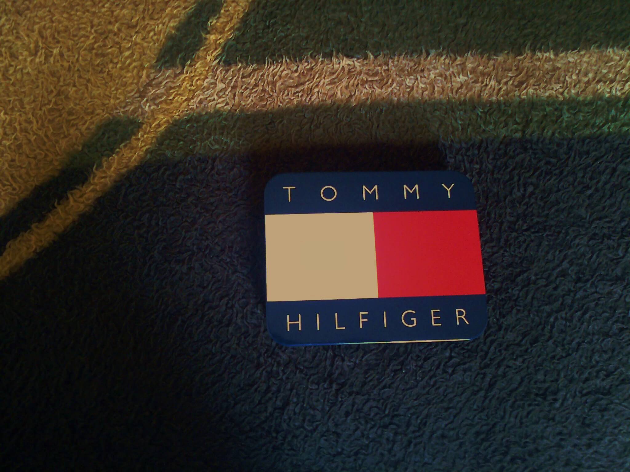
Tommy Hilfiger launched his brand in 1985 with a red, white, and navy flag logo that resembled a nautical signal. The logo grew especially popular in the 1990s.
A shirt with a large flag and bold color blocks is a strong sign of that decade.
Puma Leaping Cat

The Puma name and a leaping cat were registered in 1948, and the cat has been redrawn several times. The shape of the animal and its position beside the wordmark indicate a period.
A cracked or peeling logo reduces its appeal.
Puma Formstrip
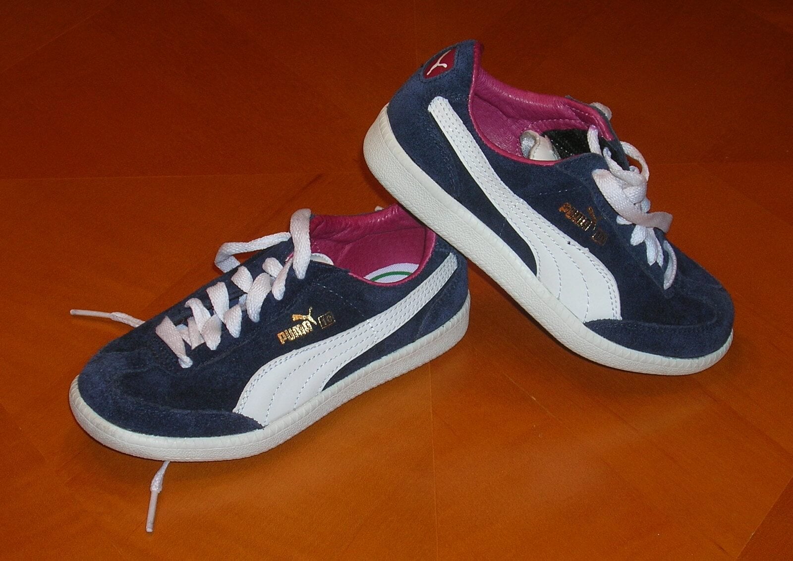
Puma patented its Formstrip in 1958, and it has appeared on the sides of shoes and apparel since. The stripe curves from the toe toward the heel.
Garments bearing it with the leaping cat date from that era or later.
Converse All Star Patch
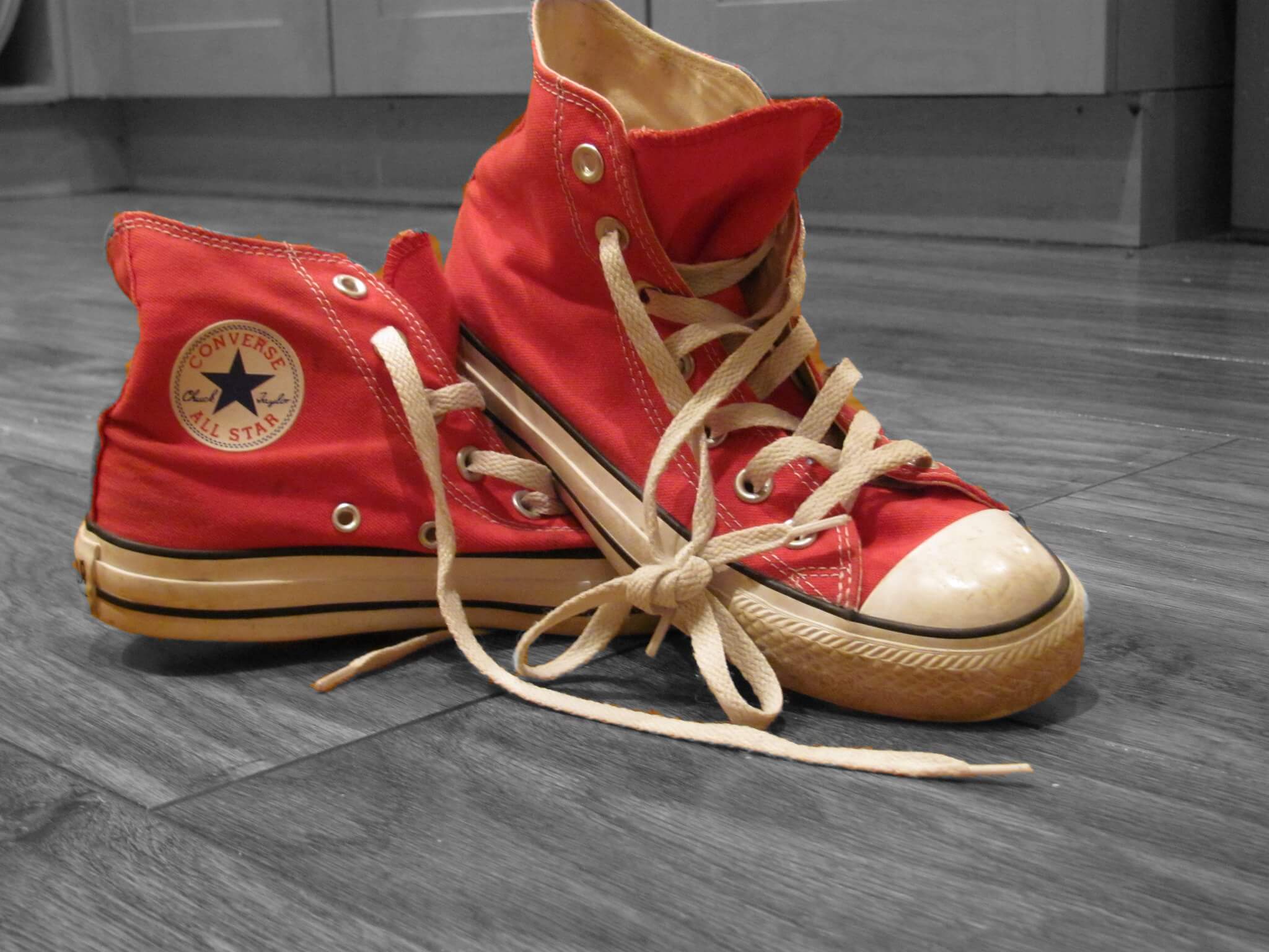
The Converse star patch took its familiar form in 1932, when Chuck Taylor’s signature was added to the ankle patch of the All Star shoe. Apparel that references the star and signature draws on that heritage.
Collectors check the patch style to date shoes and matching clothing.
Fila Wordmark
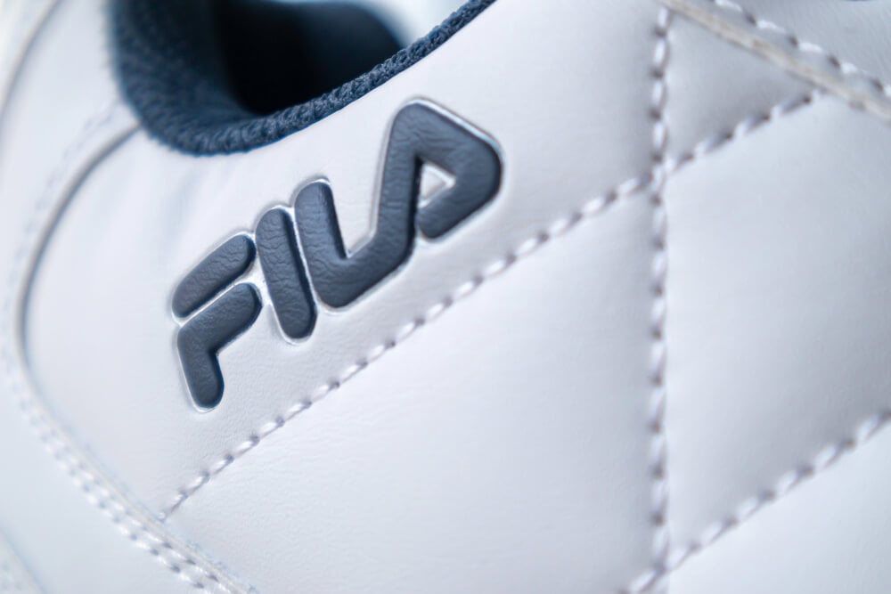
Fila began in Italy in 1911 as a knitwear business and became a household name in the 1970s through tennis partnerships. A wordmark logo produced in 1973 has stayed largely consistent since.
The clean lettering on a polo or track jacket often marks 1970s or 1980s production.
Le Coq Sportif Rooster
Le Coq Sportif was founded in 1882, and the first clothing branded with the rooster appeared in 1948. The company put a triangular logo with a rooster on a yellow jersey in 1966 and simplified it in 1972, turning the bird to face left.
The direction of the rooster is a useful dating clue.
Ellesse Lowercase Wordmark
Ellesse was founded in 1959 by Leonardo Servadio, with a name based on his initials. The lowercase wordmark became famous on colorful sportswear that is associated with the 1980s and 1990s.
Faded graphics and loose threads are the typical condition problems.
What a Logo Can and Cannot Prove

A logo narrows the date of a garment, but it rarely settles the question alone. Tags, stitching, fabric weight, and care labels all contribute to the picture.
The best identifications come from several clues pointing the same way. Brands also revive old logos for retro lines, which can fool a casual shopper.
A new shirt with a vintage mark may feel crisp, while a true original shows honest wear. Learning both signals makes the hunt more rewarding.
More from Go2Tutors!

- 27 Silver Dollars and Half Dollars Worth Keeping
- 28 Restaurant Menu Items Nobody Orders Anymore
- 17 Places Built in Seemingly Impossible Spots
- 27 Vintage Rings Worth More Than They Look
- 25 Restricted Sites Tourists Can’t Enter
Like Go2Tutors’s content? Follow us on MSN.