What Biggest Brands Looked Like When They Began
When you think of Apple, you probably picture that sleek bitten apple.
When McDonald’s comes to mind, it’s those golden arches.
These logos are so burned into our brains that it’s almost impossible to imagine them looking any other way.
But here’s the thing—most of these iconic brands started with logos that were, well, let’s just say they were a product of their time.
Some were overly complex, others looked like they belonged on a heavy metal album, and a few were just plain awkward.
The truth is, brand evolution is messy.
Companies don’t just pop up with perfect logos that last forever.
They experiment, they fail, they try again.
What we see today is the result of decades of tweaking, simplifying, and adapting to changing tastes.
Here is a list of 13 major brands and what they looked like when they first got started.
Apple
Apple’s first logo wasn’t even close to the minimalist icon we know today.
Back in 1976, co-founder Ronald Wayne designed an intricate illustration featuring Isaac Newton sitting under an apple tree.
The image was wrapped in a ribbon banner with the company name and included a quote from William Wordsworth about voyaging through strange seas of thought.
It looked more like something you’d find in a history book than on a computer.
Steve Jobs quickly realized this ornate design was way too complicated to reproduce at small sizes, so it lasted less than a year.
In 1977, graphic designer Rob Janoff created the rainbow apple with a bite taken out of it, and that’s when Apple’s visual identity really took off.
The bite was added simply so people wouldn’t mistake it for a cherry or tomato.
Microsoft
Microsoft kicked things off in 1975 with a logo that screamed disco era.
Bill Gates and Paul Allen, along with designer Simon Daniels, created a wordmark split into two lines—’Micro’ on top and ‘Soft’ below—with rounded edges and concentric lines that had a distinctly groovy vibe.
It was all caps, heavily influenced by the mid-70s aesthetic, and looked like it belonged on a roller rink poster.
By 1980, they switched to a more aggressive design inspired by heavy metal bands, complete with sharp angles and diagonal lines that made it look almost like the Metallica logo.
That didn’t last long either—just two years.
Microsoft kept reinventing itself throughout the 80s and 90s before landing on cleaner, more professional designs that matched their growing reputation as a serious tech company.
Like Go2Tutors’s content? Follow us on MSN.
Starbucks

The Starbucks mermaid wasn’t always the polished green siren we see on every street corner.
When the company opened its first store in Seattle in 1971, the logo was brown and featured a far more detailed, bare-chested mermaid with two tails.
It was intricate and reflected the brand’s nautical roots in coffee trading.
The design stayed relatively complex until 1987, when Starbucks started expanding and introduced the now-familiar green and white color scheme.
Over the years, they zoomed in closer on the mermaid, simplified the details, and eventually dropped the company name altogether in 2011.
The current logo is so recognizable that Starbucks doesn’t even need words anymore—the siren does all the talking.
McDonald’s
Before those iconic golden arches became synonymous with fast food, McDonald’s had a completely different look.
The original logo from the 1940s featured a character named Speedee, a winking chef with a hamburger for a head.
It wasn’t until the 1960s that the golden arches started appearing in the branding, inspired by the actual architectural arches that were part of the early restaurant designs.
In 1968, McDonald’s dropped Speedee and created a cleaner logo with the famous ‘M’ running through the company name.
By 1975, they refined it even further into the standalone golden arches we all recognize today.
It’s a perfect example of how a brand can take inspiration from its physical locations and turn it into a timeless symbol.
Coca-Cola

Coca-Cola’s logo is one of the rare cases where the original design has stayed remarkably consistent.
The script logo we know today dates back to 1887 and was created using Spencerian Script, a popular handwriting style of that era.
Frank Mason Robinson, the company’s bookkeeper, designed it and decided that two capital C’s would look great in advertising.
The flowing, elegant script with all those swirls has barely changed in over 130 years.
Sure, Coca-Cola experimented with bolder, straighter versions in the late 20th century, but they eventually reverted back to the 1941 design style in 2004.
It’s proof that sometimes the first attempt really is the best one, and there’s no need to fix what isn’t broken.
Like Go2Tutors’s content? Follow us on MSN.
Shell

Shell started as a trading company that literally sold seashells in the late 1800s, which explains why their logo is, well, a shell.
The original 1900 logo was a detailed, realistic drawing of a mussel shell that looked like something you’d sketch during a beach vacation.
It was functional but lacked the bold simplicity needed for a global brand.
By 1904, they switched to a more recognizable scallop shell viewed from the front.
Over the decades, Shell kept refining the design, smoothing out the edges and reducing unnecessary details.
The iconic red and yellow colors didn’t appear until 1948.
Today, the logo is so simplified and recognizable that Shell doesn’t even include the company name—just the shell shape is enough for instant recognition worldwide.
Nike
Nike’s swoosh is arguably one of the most famous logos ever created, but it started with humble beginnings.
The company was originally called Blue Ribbon Sports when it was founded in 1963 by Phil Knight and Bill Bowerman.
In 1971, they rebranded as Nike and hired graphic design student Carolyn Davidson to create a logo.
She came up with the swoosh—a simple curved line that suggested movement and speed.
The best part? She was paid just 35 dollars for the design.
The original Nike logo also included the company name in a bold font next to the swoosh, but over time, Nike grew confident enough to let the swoosh stand alone.
It’s a testament to how a simple, well-executed idea can become more powerful than any words.
Canon
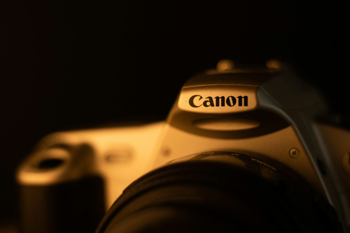
Canon’s original logo might surprise you—it featured a Buddhist goddess of mercy sitting on a lotus flower surrounded by flames with thousands of arms.
The brand was initially called Kwanon, named after this deity, and the logo reflected that spiritual connection.
It looked mystical and intricate, but not exactly practical for a camera company trying to appeal to a global market.
By 1935, Canon changed its name and adopted a simpler wordmark logo using unique typefaces.
The red color that defines Canon today was added by the mid-20th century, and the brand has stuck with bold, clean lettering ever since.
Like Go2Tutors’s content? Follow us on MSN.
It’s a dramatic shift from the ornate goddess imagery, but it worked in establishing Canon as a leader in photography and technology.

Google’s first logo appeared in 1998 and featured the company name in a basic serif font called Baskerville Bold.
The letters were colorful—red, blue, yellow, and green—but the design felt a bit stiff and academic.
For a brief period, Google even added an exclamation point at the end, spelling it ‘Google!’ in what seemed like a nod to Yahoo!’s branding style.
That didn’t last long.
Over the years, Google refined the logo multiple times, moving toward cleaner sans-serif fonts and brighter, more playful colors.
The current logo, introduced in 2015, uses a custom sans-serif typeface called Product Sans and perfectly captures Google’s friendly, accessible personality.
It’s come a long way from that clunky serif original.
Pepsi

Pepsi started with a simple red script logo on a white background when it was founded in the late 1890s.
It was straightforward and didn’t try to do too much.
In 1950, Pepsi introduced the red, white, and blue bottle cap design that became a defining feature of the brand.
This patriotic color scheme aligned perfectly with post-war American pride.
By 1962, they swapped out the fancy script for clean black lettering, and in 1972, the bottle cap evolved into a circle with colored stripes.
Over the decades, Pepsi kept tweaking the design, but the circular shape and color scheme have remained constant.
As of 2011, the striped circle stands alone without any text, showing just how recognizable the brand has become.
Volkswagen
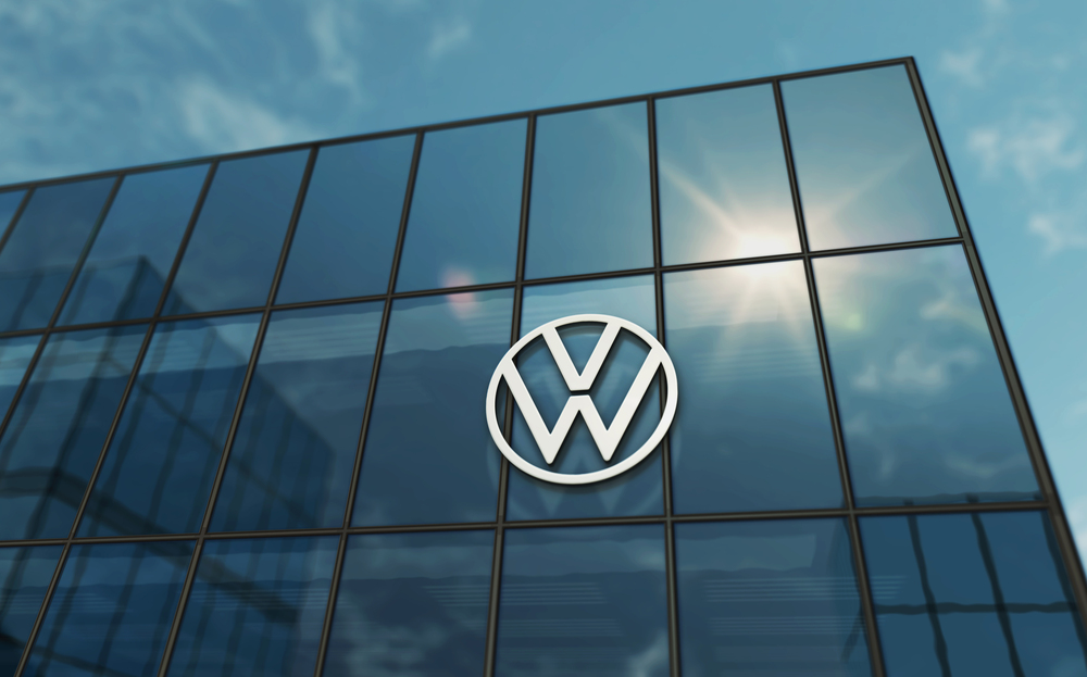
Volkswagen’s first logo from 1939 featured a gear-like circle with bumped teeth around the edge and the letters ‘V’ and ‘W’ stacked in the center.
Long arms rotated around the circle, giving it a mechanical, industrial look that fit the era.
After World War II, the logo was simplified—the gear bumps and rotating arms were eliminated, leaving just the clean ‘VW’ inside a circle.
In 2000, Volkswagen added blue and silver colors to modernize the design, but the basic structure has stayed the same for decades.
It’s a perfect example of how stripping away unnecessary elements can make a logo stronger and more memorable.
Like Go2Tutors’s content? Follow us on MSN.

Instagram launched in 2010 with a logo that featured a realistic, detailed Polaroid-style camera with a rainbow stripe running across the top.
It had depth, shading, and a retro feel that appealed to photography enthusiasts.
By 2011, they simplified it slightly, removing the full camera body and focusing on the lens and viewfinder while keeping the rainbow stripe.
The big change came in 2016 when Instagram ditched the realistic camera altogether and replaced it with a flat, minimalist outline of a camera made with white lines.
The rainbow stripe was gone, replaced by a gradient background blending warm colors like pink, orange, and purple.
The shift was controversial at first, but it aligned Instagram with modern design trends and made the logo more versatile across different platforms.
Levi’s
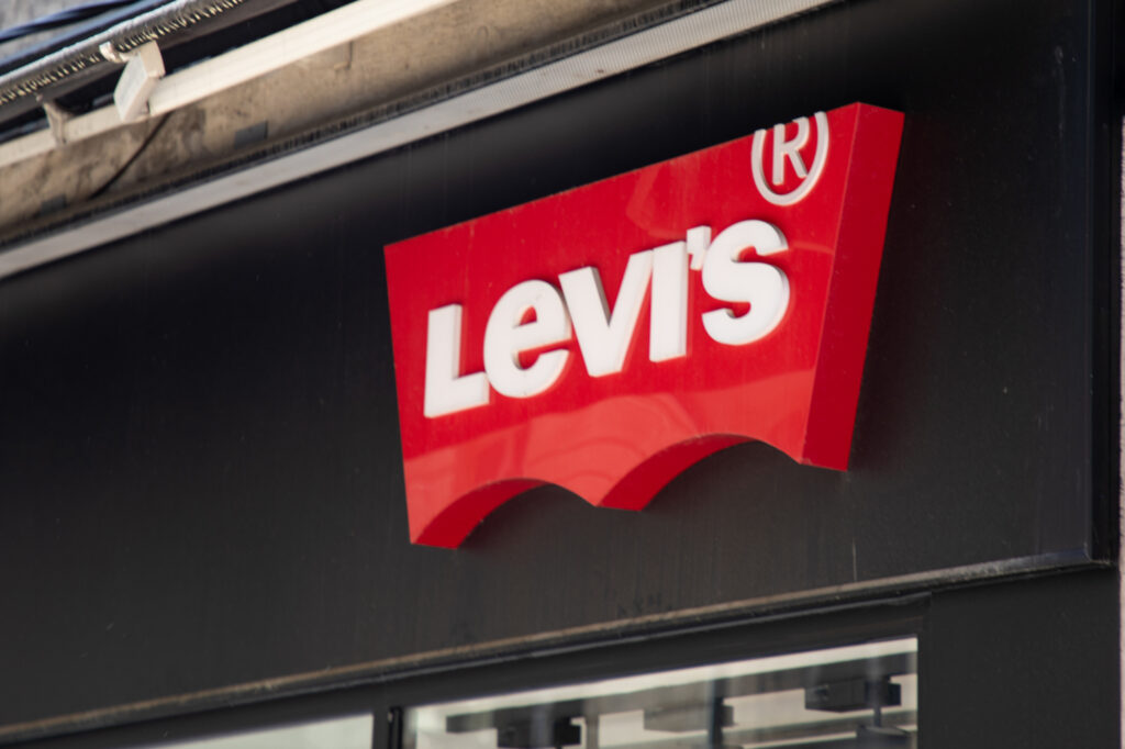
Levi’s has one of the oldest logos still in use today, and while it’s been refined over the years, the core elements have stayed consistent.
The original logo from the 1800s was detailed and wordy, featuring images of the company’s products along with lots of text explaining what they sold.
It worked fine in print ads and packaging back then, but as media evolved, the logo became too intricate for things like digital ads or mobile devices.
Over time, Levi’s simplified the design, focusing on the iconic red tab and the wordmark.
The modern Levi’s logo is clean, minimal, and instantly recognizable—proof that sometimes less really is more, especially when your brand has over a century of history behind it.
What sticks around
These logos tell a bigger story than just design trends.
They show how companies learn, adapt, and grow alongside their audiences.
The brands that lasted didn’t cling to their first attempts out of stubbornness—they evolved when it made sense.
Apple ditched Newton for simplicity.
Microsoft traded disco vibes for professionalism.
Starbucks zoomed in on what mattered most.
What’s interesting is that almost every one of these brands moved toward the same thing: simplicity.
Fewer details, cleaner lines, bolder shapes. That’s not by accident.
As these companies grew, their logos needed to work everywhere—on billboards, business cards, apps, and tiny browser tabs.
The simpler the design, the more places it could live.
More from Go2Tutors!

- 16 Historical Figures Who Were Nothing Like You Think
- 12 Things Sold in the 80s That Are Now Illegal
- 15 VHS Tapes That Could Be Worth Thousands
- 17 Historical “What Ifs” That Would Have Changed Everything
- 18 TV Shows That Vanished Without a Finale
Like Go2Tutors’s content? Follow us on MSN.