Why Certain Maps Were Classified by the Governments That Drew Them
Maps look innocent enough. A grid, some contour lines, a scattering of place names — the kind of thing you’d pin to a classroom wall or fold badly in the front seat of a car.
But certain maps have been locked in vaults, shredded, deliberately falsified, or kept from the public for decades. Not because they were wrong.
Because they were too right. The story of classified cartography is, at its core, a story about what governments fear when their geography becomes visible.
Military Installation Locations

Marking where soldiers sleep, where weapons are stored, and where aircraft are hangared is essentially handing an enemy a target list. The United States, the Soviet Union, and NATO members all withheld maps showing the precise coordinates of active bases — not just during wartime, but deep into peacetime.
To be fair, some of that information eventually became declassified; the rest filtered out through satellite imagery before any government got to decide.
Soviet Topographic Distortion
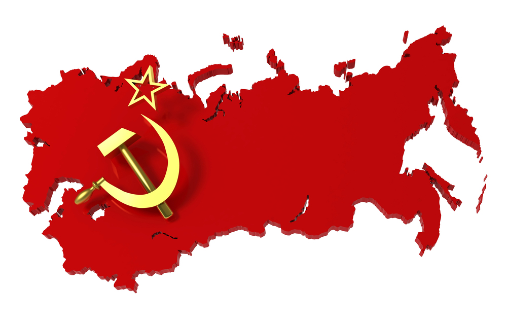
The Soviet Union didn’t just classify its maps — it deliberately corrupted them. Cities were shifted by miles on publicly available versions, rivers were redrawn, and entire geographic features were nudged out of position to disorient any foreign military relying on Soviet-published data.
It’s the cartographic equivalent of handing someone directions you’ve already sabotaged.
Nuclear Facility Mapping
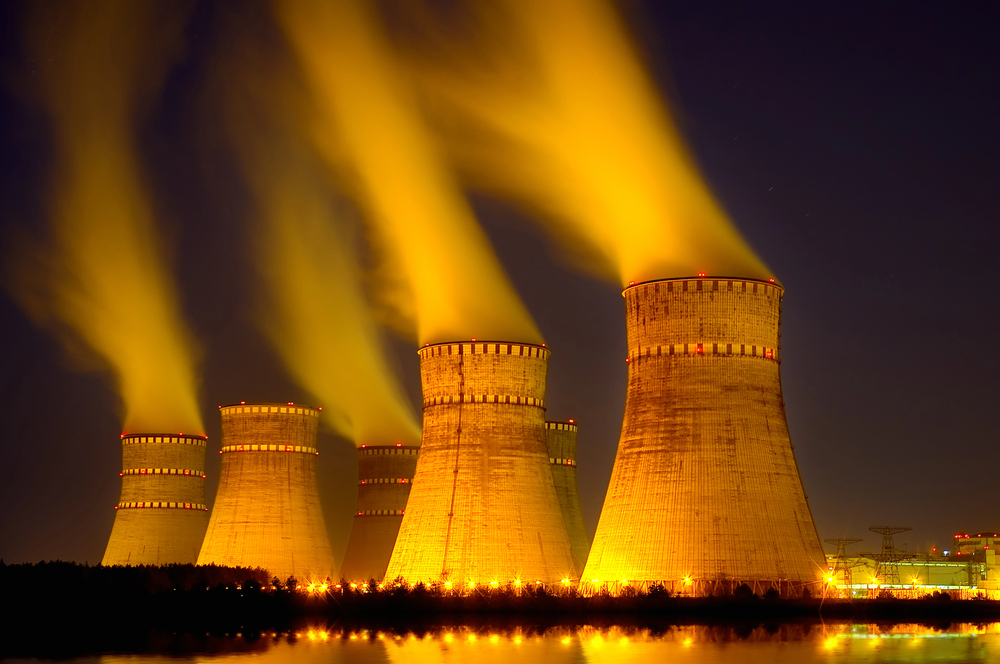
There’s something quietly alarming about a map that knows where the uranium is. Facilities like Oak Ridge in Tennessee, Hanford in Washington State, and the British site at Sellafield were either omitted entirely from published maps or buried under deliberately vague labeling during the Cold War years.
The logic was straightforward: if a strike was coming, you didn’t want the coordinates gift-wrapped.
Submarine Cable Routes
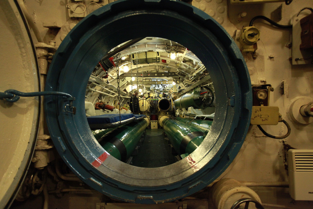
Undersea communication cables are among the most consequential pieces of infrastructure on the planet — and for a long stretch of the 20th century, their routes were classified. Cut the right cable at the right point, and you sever transatlantic communications between governments, military commands, and intelligence agencies, which is exactly the kind of leverage no nation wanted advertised.
The cables themselves were never secret; the precise geography of where they lay on the ocean floor was.
Coastal Defense Infrastructure
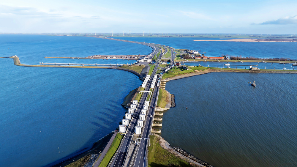
Coastlines are where invasions begin, and the governments that built gun emplacements, mine fields, and artillery batteries along their shores had no interest in publishing their exact positions. Britain during World War II stripped road signs and removed place names from public maps to disorient any invading force — a move that also, famously, disoriented more than a few British civilians trying to navigate the countryside.
Cold War-Era Tunnel Networks
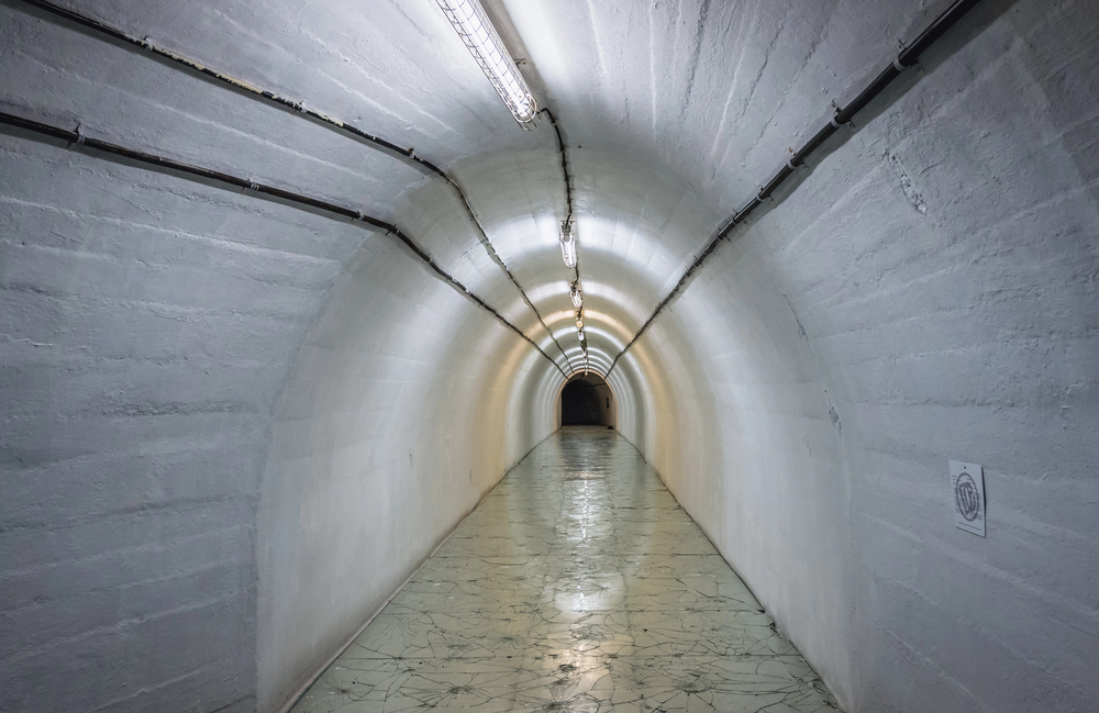
Maps showing tunnels beneath cities — built for military command continuity, nuclear survival, or covert movement — were classified almost universally. The tunnel network beneath Washington, D.C., the bunker systems under Moscow, and the labyrinthine passages below London’s government quarter were considered so tactically sensitive that their blueprints were kept at classification levels well above what most military personnel could access.
Some of those systems weren’t acknowledged publicly until the 1990s.
Aerial Photography Mosaics
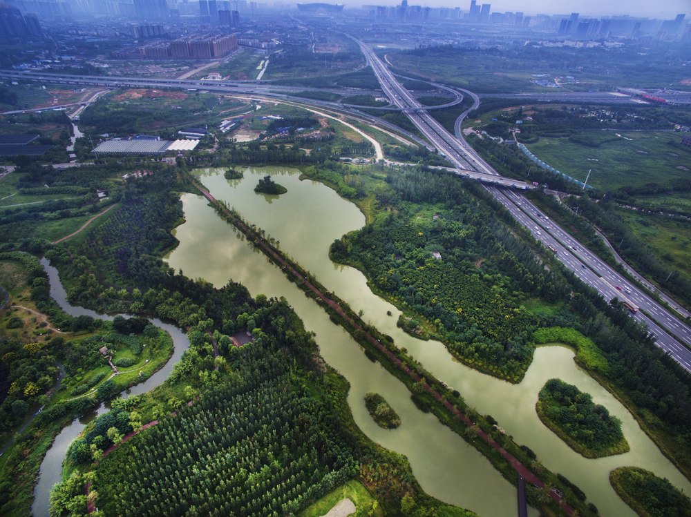
Raw aerial photography of terrain, stitched together into composite maps, is extraordinarily precise — precise enough that the altitude, composition, and approach angles for bombing runs could be calculated directly from them. The U.S. military’s aerial survey work over Europe and Asia during and after World War II produced maps of a quality that had no civilian equivalent, and those materials stayed classified long after the wars that generated them had ended.
Radar Installation Networks
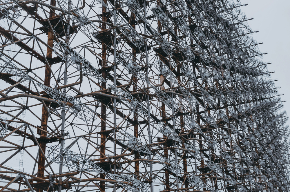
Knowing where radar stations are positioned tells an adversary exactly where to fly to avoid detection. The Distant Early Warning Line across northern Canada and Alaska, along with Britain’s Chain Home radar network, were mapped in detail internally but never released in any form that revealed the geometry of coverage gaps — because those gaps were, from an enemy’s perspective, the only part that mattered.
Population Density in Strategic Zones
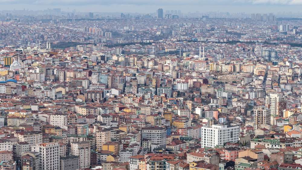
Some classified maps were less about buildings and more about people — specifically, where concentrations of population sat near industrial targets, military chokepoints, or transportation nodes. Civil defense planners in both the United States and the Soviet Union produced detailed casualty projection maps based on nuclear strike scenarios, and those documents were classified not just for strategic reasons but for the obvious political ones.
Turns out, governments don’t love publicizing maps that estimate how many of their own citizens would die in a given attack scenario.
Fallout Projection Charts
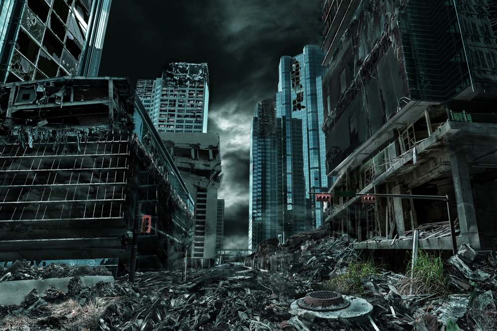
Following on from casualty modeling, fallout maps — which projected the spread of radioactive contamination from nuclear detonations based on wind patterns, terrain, and weapon yield — were classified across multiple governments during the Cold War. The British government’s internal assessments of post-strike contamination zones weren’t released for decades.
The withholding wasn’t really about military advantage; it was about preventing the kind of public panic that tends to follow when people see their own neighborhood shaded in a color labeled “lethal exposure.”
Geological Surveys Near Borders
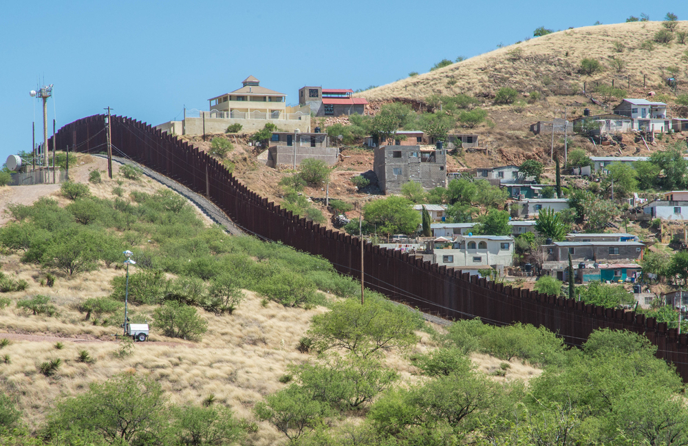
Geological maps that revealed mineral deposits, aquifer locations, or fault line vulnerabilities near contested borders were classified in countries where that information had strategic weight. India and Pakistan, for example, both restricted detailed geological survey data in border regions during periods of tension — partly because mineral resources are worth fighting over, and partly because fault lines and subterranean water sources factor directly into military engineering decisions.
Spy Satellite Ground Track Data
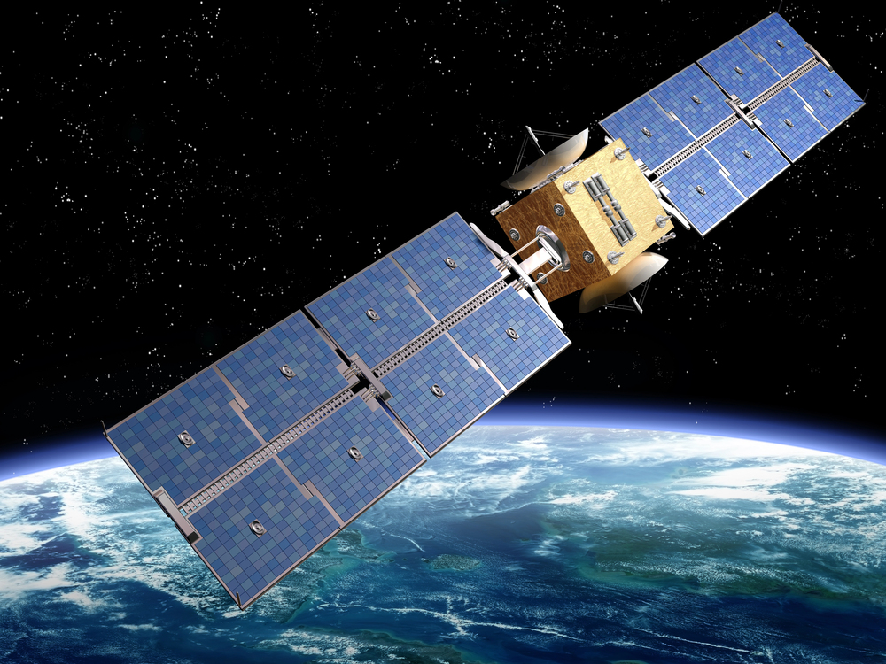
The United States’ Corona satellite program, which ran from 1959 through 1972, produced photographic maps of Soviet territory at a resolution that exposed missile silos, airfields, and naval installations in granular detail. The program itself was classified — not just the images, but the orbital paths, the ground track projections, and the analytical maps derived from the photography.
Corona wasn’t officially acknowledged until 1995, which is saying something for a program that reshaped Cold War intelligence entirely.
Infrastructure Vulnerability Assessments
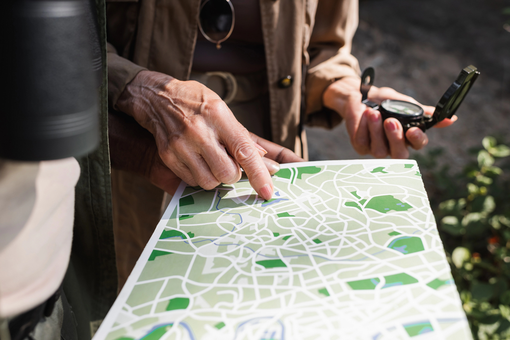
Maps that show which bridges, power stations, pipelines, or water treatment facilities are most critical to a functioning economy are, almost by definition, maps that show an adversary exactly what to destroy first. The United States infrastructure vulnerability maps produced by FEMA and the Department of Defense during the Cold War were classified at levels that made them inaccessible even to many state-level emergency planners — a fact that created its own complications when actual disasters arrived.
Classified Antarctic Surveys
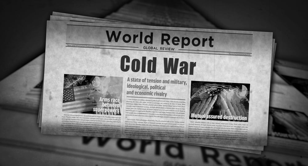
Antarctica sounds remote enough to be irrelevant, but detailed surveys of the continent were classified during the Cold War because subglacial geography — what lies beneath the ice — has genuine strategic implications for long-range navigation, submarine operations, and claims to territorial sovereignty. The U.S. Navy’s Operation Highjump in 1946-47 produced cartographic data that remained partially restricted for years because it overlapped with questions about Antarctic territorial claims that multiple governments preferred to leave deliberately ambiguous.
Choke Point and Strait Navigation Charts
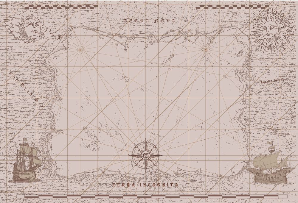
The Strait of Hormuz, the Strait of Malacca, the GIUK Gap in the North Atlantic — these narrow passages are where naval power concentrates, and the detailed navigational charts prepared for military use in those corridors were classified not because the geography was unknown, but because the military annotations layered on top of it (mine placements, sonar blind spots, recommended evasion corridors) made the charts operationally dangerous. A commercial chart of the Hormuz Strait is one thing.
A chart annotated by naval intelligence is something else.
The Maps That Told the Truth About Borders
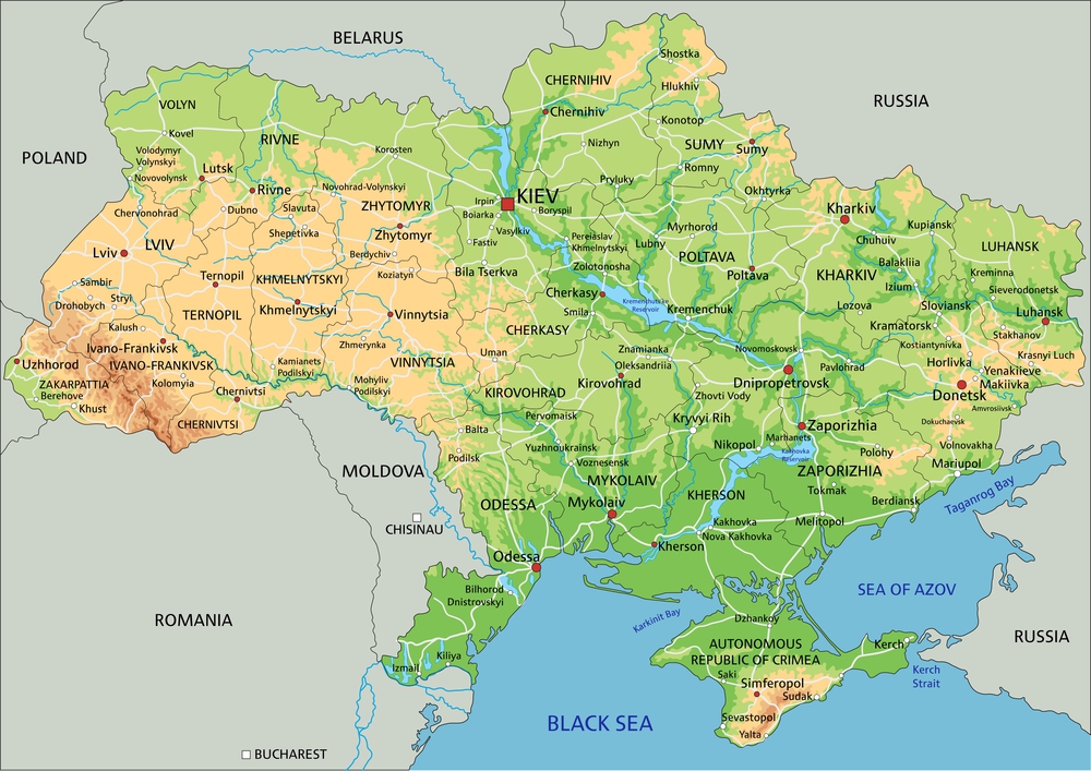
Perhaps the most politically charged category: maps that accurately depicted contested borders in ways that contradicted official government positions. China has classified or suppressed cartographic materials that show Tibet or Taiwan in ways inconsistent with Beijing’s preferred framing — and that pattern repeats across plenty of other governments dealing with territories whose status is disputed.
A map that simply renders geography accurately can be, depending on which government is looking at it, an act of insubordination.
The Paperwork That Outlasts the Secrets
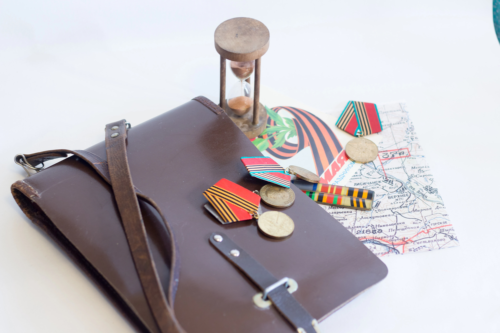
Classification doesn’t last forever — and that’s the strange, slightly ironic coda to all of this. Many of the maps described above have since been declassified, digitized, and posted online where anyone can find them.
The Soviet distorted city maps are now collector’s items. The Corona satellite imagery is searchable through the U.S. Geological Survey.
The fallout projection charts are in university archives. What was once locked in a vault now lives in a browser tab.
The geography never changed. It was always there, waiting for the paperwork to catch up with reality.
More from Go2Tutors!

- The Romanov Crown Jewels and Their Tragic Fate
- 13 Historical Mysteries That Science Still Can’t Solve
- Famous Hoaxes That Fooled the World for Years
- 15 Child Stars with Tragic Adult Lives
- 16 Famous Jewelry Pieces in History
Like Go2Tutors’s content? Follow us on MSN.