14 Secret Codes in Famous Company Logos
Corporate logos seem straightforward enough — just colorful designs meant to catch your eye while shopping. Yet many contain hidden messages, clever wordplay, and symbolic elements that most people walk past without noticing. These aren’t accidents or coincidences, but deliberate choices by designers who embed meaning into every curve and color.
Companies spend millions crafting these visual identities, often hiding references to their history, values, or services in plain sight. Here is a list of 14 secret codes in famous company logos.
Amazon

The curved arrow beneath Amazon’s name doesn’t just look friendly — it connects the ‘A’ to the ‘Z’, symbolizing that Amazon sells everything from A to Z. The arrow also resembles a smile, suggesting customer satisfaction.
This dual meaning reinforces Amazon’s mission to be the world’s largest marketplace while maintaining a welcoming brand image.
FedEx

Look closely at the space between the ‘E’ and ‘x’ in FedEx, and you’ll spot a white arrow pointing right. This subliminal element suggests forward movement, speed, and precision — exactly what you’d want from a shipping company.
The negative space arrow has become one of the most celebrated examples of clever logo design in corporate history.
Like Go2Tutors’s content? Follow us on MSN.
Baskin-Robbins

The ‘BR’ in Baskin-Robbins contains the number ’31’ hidden within the pink sections of the letters. This represents their famous 31 flavors — one for each day of the month.
The design cleverly integrates the company’s core selling point directly into their abbreviated name, making it memorable for ice cream lovers.
Toyota

Toyota’s three overlapping ovals aren’t just decorative elements. The two inner ovals represent the company and customer hearts overlapping, while the outer oval symbolizes the world embracing Toyota.
Additionally, you can spell out ‘TOYOTA’ using the various curves and lines within the logo design — a hidden typography trick that reinforces brand recognition.
Beats

The lowercase ‘b’ in Beats headphones doubles as a person wearing headphones when viewed sideways. The circular part represents the head, while the vertical line becomes the headphone band.
This subtle visual pun connects the brand name directly to their primary product category without being overly obvious.
Like Go2Tutors’s content? Follow us on MSN.
NBC

NBC’s peacock contains exactly six colored feathers, each representing one of the major divisions within the company at the time of design. The peacock itself symbolized NBC’s pride in being the first major network to broadcast in full color during the 1950s.
The bird faces right — suggesting forward progress and innovation in television broadcasting.
Vaio
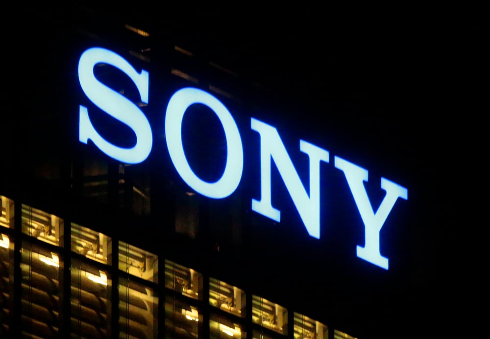
Sony’s Vaio logo represents the evolution from analog to digital technology. The ‘VA’ portion resembles an analog sine wave, while the ‘IO’ looks like binary code (1 and 0).
This clever design reflects Vaio’s position as computer products that bridge traditional and digital worlds, appealing to tech-savvy consumers who appreciate such subtlety.
Cisco

The blue lines above Cisco’s name aren’t random geometric shapes — they represent both digital signal waves and the Golden Gate Bridge in San Francisco. Since Cisco originated in San Francisco (the company name itself comes from ‘San Francisco’), this dual symbolism connects their technological expertise with their geographic roots in Silicon Valley.
Like Go2Tutors’s content? Follow us on MSN.
LG

LG’s logo contains a stylized human face when you look carefully. The ‘L’ forms the nose, while the ‘G’ creates the rest of the facial outline.
This design reinforces their tagline ‘Life’s Good’ by suggesting that their technology puts a smile on people’s faces — connecting human emotion with electronic products.
BMW
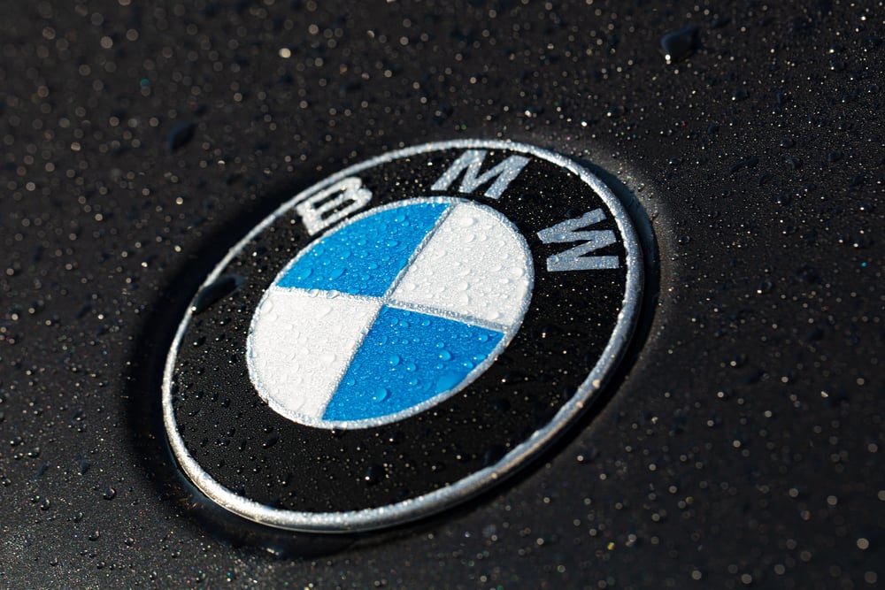
BMW’s circular logo represents a spinning airplane propeller against blue sky and white clouds. This reflects the company’s origins as an aircraft engine manufacturer during World War I before transitioning to automobiles.
The blue and white colors also represent Bavaria’s flag, honoring BMW’s German heritage and manufacturing location.
Hershey’s Kisses

Hidden within the Hershey’s Kisses logo, between the ‘K’ and ‘I’, you’ll find the silhouette of an actual Hershey’s Kiss candy. The negative space perfectly captures the distinctive shape of their flagship product.
This subtle detail reinforces product recognition while adding visual interest to an otherwise simple wordmark.
Like Go2Tutors’s content? Follow us on MSN.
Formula 1

The Formula 1 logo contains the number ‘1’ in white negative space between the ‘F’ and the red speed lines. The design suggests motion and velocity through its dynamic typography while literally spelling out the sport’s name and emphasizing the pursuit of first place in racing competition.
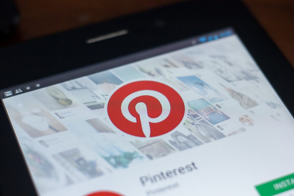
Pinterest’s ‘P’ logo doubles as a push pin when viewed from the right angle. The circular top portion represents the pinhead, while the vertical line below forms the pin shaft.
This visual metaphor perfectly captures Pinterest’s core function — pinning interesting content to digital boards for later reference and inspiration.
Goodwill

Goodwill’s logo contains a smiling face within the ‘g’ — the dot above forms the eye, while the letter’s curve creates a smile. This reflects their mission of spreading goodwill and happiness through charitable work and community service.
The simple design communicates warmth and friendliness while reinforcing their positive brand message.
Like Go2Tutors’s content? Follow us on MSN.
Symbols That Speak Without Words
These hidden elements prove that effective logo design goes far beyond pretty pictures and catchy fonts. The best corporate symbols function as visual puzzles that reward closer inspection while subconsciously reinforcing brand messages every time someone glances at them.
Whether representing company history, product features, or core values, these secret codes create deeper connections between businesses and consumers. Next time you’re walking through a store or browsing online, take a closer look — you might discover messages that have been hiding in plain sight all along.
More from Go2Tutors!

- 16 Historical Figures Who Were Nothing Like You Think
- 12 Things Sold in the 80s That Are Now Illegal
- 15 VHS Tapes That Could Be Worth Thousands
- 17 Historical “What Ifs” That Would Have Changed Everything
- 18 TV Shows That Vanished Without a Finale
Like Go2Tutors’s content? Follow us on MSN.