15 Computer Fonts That Defined the 90s
Digital typography underwent a revolution in the 1990s. Desktop publishing democratized design like never before, the internet exploded into popular culture, and personal computers became commonplace in homes. Some fonts became cultural icons during this pivotal decade, encapsulating the spirit of a time that was preoccupied with technology, experimentation, and pushing the boundaries of creativity.
These typefaces, which ranged from futuristic designs that promised a digital utopia to grunge-inspired ones that reflected the decade’s alternative music scene, became the visual language of a generation learning about the potential of personal computers. These 15 fonts encapsulated the style and mindset of the 1990s.
Times New Roman
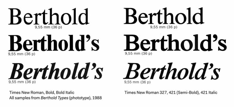
Microsoft bundled Times New Roman with Windows — making it the default choice for millions of users worldwide. This serif font became synonymous with ‘professional’ documents, from school reports to business letters. Though originally designed in 1931 for The Times newspaper, its widespread adoption in the 90s cemented its place as the go-to font for anyone trying to look serious on their computer.
Arial
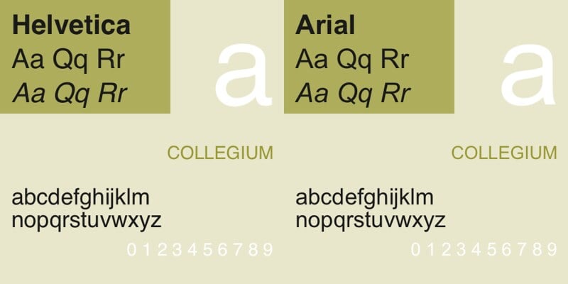
Arial served as Microsoft’s answer to Helvetica — offering a clean sans-serif alternative that didn’t require expensive licensing fees. The font appeared everywhere in the 90s, from early websites to software interfaces. Its neutral appearance made it perfect for an era when computer users were still figuring out how to make their documents look polished yet readable on screen.
Comic Sans
Perhaps no font is more emblematic of 90s casual computing than Comic Sans. Vincent Connare designed it for Microsoft to mimic comic book lettering — intending it for children’s software and informal communications. The font perfectly captured the playful spirit of early personal computing, though its overuse would later make it one of the most polarizing typefaces in design history.
Papyrus
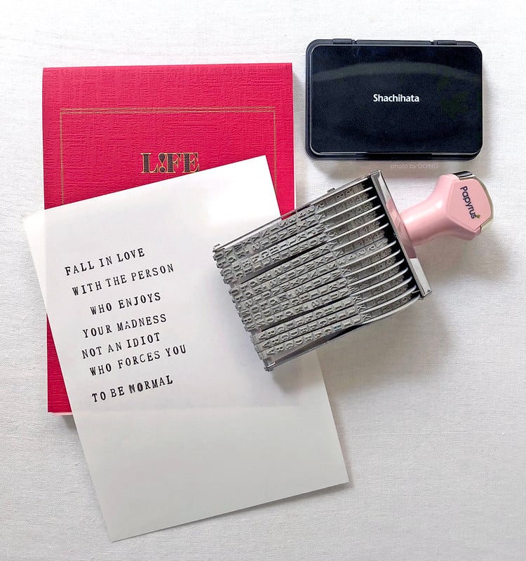
Papyrus transported computer users to ancient civilizations with its hand-carved appearance. Chris Costello’s creation became the go-to choice for anything that needed to feel exotic or historically significant. From New Age wellness centers to Egyptian-themed restaurants — Papyrus embodied the 90s fascination with alternative spirituality that the internet was just beginning to make accessible.
Impact
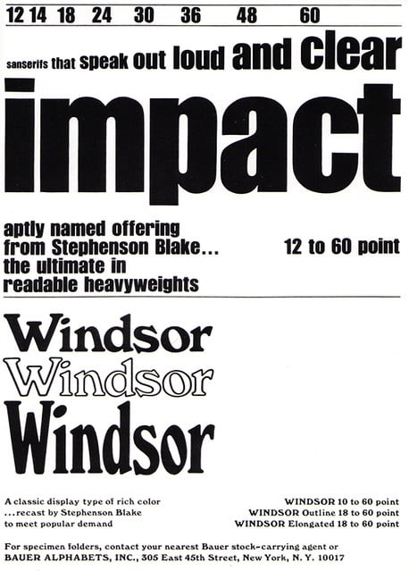
Impact delivered exactly what its name promised: maximum visual punch in minimal space. This ultra-bold condensed font became essential for headlines, posters, and any text that needed to grab attention quickly. Its aggressive styling perfectly matched the decade’s loud aesthetic — from extreme sports marketing to rave flyers announcing underground dance parties.
Courier New
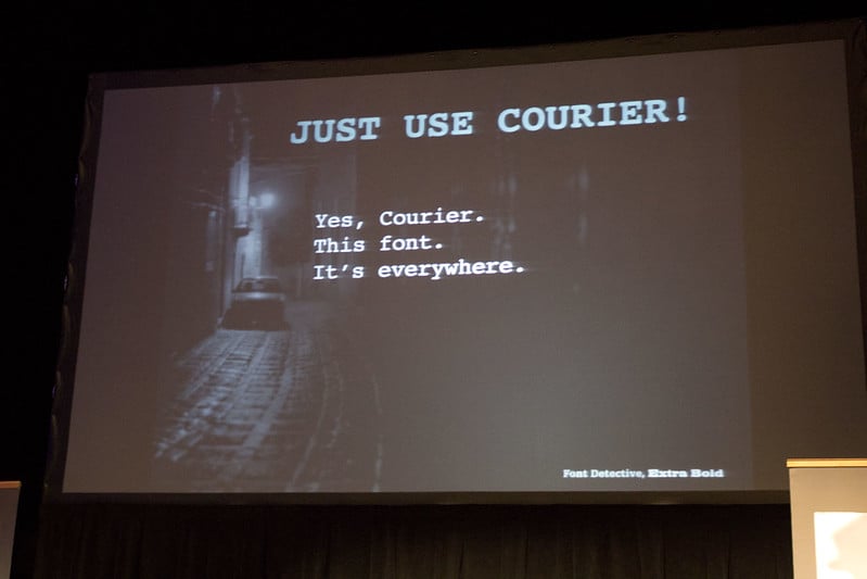
Courier New brought the typewriter aesthetic into the digital age while maintaining the monospaced character that made every letter occupy the same width. Programmers and writers embraced it for its clarity plus nostalgic connection to traditional typing. The font served as a bridge between old and new technologies — helping users feel comfortable with the transition from mechanical typewriters to computer keyboards.
Trebuchet MS
Microsoft commissioned Trebuchet MS specifically for screen reading — making it one of the first fonts designed primarily for digital display rather than print. Its humanist characteristics and excellent legibility at small sizes made it perfect for early web design. The font represented the growing understanding that digital typography required different considerations than traditional print design.
Verdana
Matthew Carter created Verdana specifically for Microsoft, optimizing every character for maximum clarity on computer screens. Its wide proportions plus generous spacing made text remarkably readable even at small sizes on low-resolution monitors. Verdana became the gold standard for digital readability — proving that fonts could be engineered specifically for the emerging digital landscape rather than simply adapted from print.
OCR A
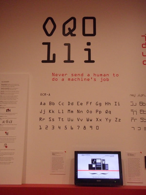
OCR A brought the aesthetic of optical character recognition into mainstream design with its distinctive machine-readable appearance. Originally developed for computers to scan text automatically — the font became popular among designers seeking a futuristic look. Its rigid, geometric forms perfectly captured the 90s obsession with automation and the promise of seamless human-computer interaction.
Chicago
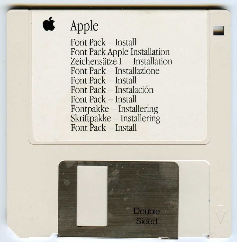
Apple’s Chicago font defined the early Macintosh experience — appearing in menus, dialog boxes, and system messages throughout the decade. Its bitmap construction gave it a distinctly digital personality that felt both friendly yet technological. Chicago represented Apple’s commitment to making computers feel approachable, contrasting sharply with the cold aesthetics that dominated other computer systems.
Chiller
Chiller embodied the decade’s fascination with horror movies and alternative culture. Its dripping, distressed letterforms looked like they belonged in a haunted house. The font became synonymous with Halloween decorations, horror movie posters, and anything meant to evoke fear or rebellion. Its deliberately crude appearance reflected the grunge movement’s rejection of polished, corporate aesthetics.
Brush Script MT
Brush Script MT brought handwritten warmth to the digital realm, mimicking the casual strokes of a felt-tip marker. The font became popular for invitations, greeting cards, and any design that needed a personal touch in an increasingly digital world. Its informal character helped bridge the gap between traditional handwriting and computer-generated text while making digital documents feel more approachable.
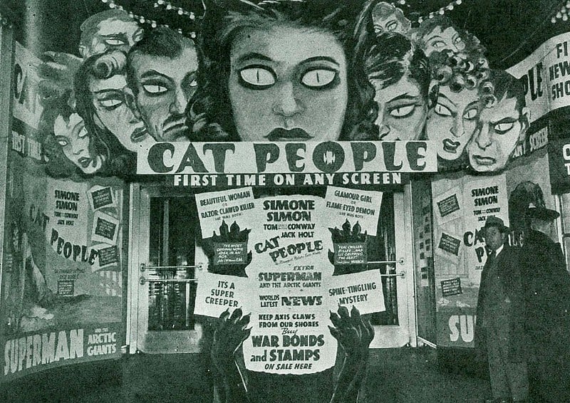
Wide Latin
Wide Latin stretched letters to their absolute limits, creating an impossibly extended appearance that demanded attention. This condensed display font became synonymous with movie titles, album covers, and anything that needed to convey drama. Its extreme proportions perfectly captured the 90s tendency toward excess in visual design, though many designers found it challenging to use effectively.
Stencil
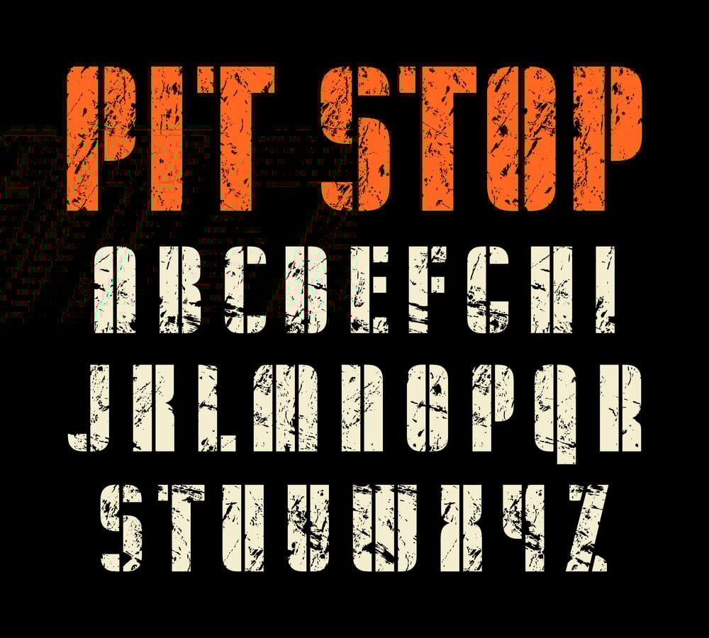
Stencil brought military and industrial aesthetics into civilian design, featuring the characteristic gaps that allowed actual stencils to function. The font became popular for everything from band logos to protest signs while embodying the decade’s appreciation for utilitarian design. Its bold, no-nonsense appearance resonated with a generation that valued authenticity over corporate polish.
Wingdings
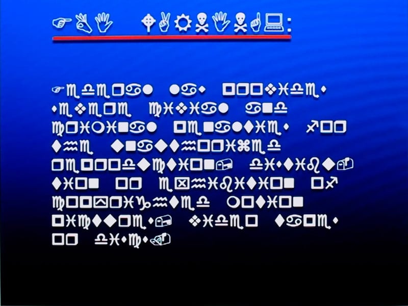
Wingdings replaced letters with symbols, arrows, and pictographs. This offered designers a way to add visual elements without using separate graphics files. The symbol font became essential for creating simple icons in an era when adding images to documents was still complicated and expensive. Wingdings represented early exploration of visual communication beyond traditional text, foreshadowing the emoji revolution that would come decades later.
Typography’s Digital Revolution
These 15 fonts recorded the first widespread use of personal computers and digital design by humans, which went beyond simple aesthetic preferences. Every style represented the aspirations, anxieties, and aesthetic sensibilities of a generation that had learned that common people could now use tools that had previously only been available to professionals to create, publish, and share their ideas. Digital culture is still influenced by the fonts that typified the 1990s, serving as a reminder that typography has always been about more than just making words readable. It’s about using the actual shapes of letters to convey the essence of a time period.
More from Go2Tutors!

- 16 Historical Figures Who Were Nothing Like You Think
- 12 Things Sold in the 80s That Are Now Illegal
- 15 VHS Tapes That Could Be Worth Thousands
- 17 Historical “What Ifs” That Would Have Changed Everything
- 18 TV Shows That Vanished Without a Finale
Like Go2Tutors’s content? Follow us on MSN.