15 Fun Facts Hidden in Famous Logos
Most people see logos dozens of times every day without giving them a second thought. You glance at that swoosh, those golden arches, or that bitten apple and move on with your life. But designers packed these simple symbols with clever tricks, hidden messages, and sneaky details that most of us completely miss.
Here’s a list of 15 fascinating secrets hiding in plain sight on some of the world’s most recognizable logos.
Amazon’s A to Z Arrow
— Illustration by wolterke
That cheerful yellow arrow underneath Amazon’s name isn’t just pointing forward—it’s connecting the letters A and Z. This subtle touch represents how Amazon sells everything ‘from A to Z’, covering every product category you can imagine. The arrow also doubles as a smile, suggesting customer satisfaction with their shopping experience.
FedEx’s Speedy Secret

— Photo by monticello
Look closely at the space between the ‘E’ and ‘x’ in FedEx, and you’ll spot a perfect white arrow pointing right. This hidden arrow symbolizes speed, precision, and forward movement—exactly what you want from a shipping company. Once you see it, you’ll never look at their trucks the same way again.
Baskin-Robbins’ Flavor Count
— Photo by homank76
The pink parts of Baskin-Robbins’ logo cleverly form the number ’31’ within the letters ‘B’ and ‘R’. This represents their famous 31 flavors concept, where customers could try a different ice cream flavor every day of the month. The design makes their signature selling point literally part of their brand identity.
Toyota’s Name Game
— Photo by Elenarts
Those three overlapping ovals in Toyota’s logo actually spell out the company name when you know what to look for. The inner ovals represent the heart of the customer and the company coming together, while the outer oval symbolizes the world embracing Toyota. It’s like hidden calligraphy in plain sight.
Hyundai’s Handshake Deal

— Photo by Krasnevsky
Most people think Hyundai’s logo is just a slanted ‘H’ for the company name, but it’s actually two people shaking hands. The customer and company representative are sealing a deal, representing trust and satisfaction between the brand and its buyers. The handshake tilts forward to suggest progress and moving into the future.
Coca-Cola’s Danish Connection

— Photo by kornienkoalex
Hidden within Coca-Cola’s flowing script lies the Danish flag, visible in the space between the ‘O’ and ‘L’ in ‘Cola’. This wasn’t intentional when the logo was first created, but Coca-Cola embraced this happy accident and even launched special campaigns in Denmark highlighting this connection. Sometimes the best design elements happen by pure chance.
NBC’s Colorful History

— Photo by Jkirsch13
NBC’s peacock logo tells the story of television’s evolution from black and white to color. Each feather represents a different color of the spectrum, celebrating NBC’s role as a pioneer in color broadcasting. The peacock faces right to symbolize the network looking toward the future of entertainment.
Beats’ Musical Profile

— Photo by ifeelstock
The circular logo for Beats headphones isn’t just a simple ‘b’—it’s actually a person wearing headphones when viewed from the side. The circle represents the head, while the ‘b’ forms the headphone band and ear cup. This clever design connects the product directly to its use in a way that’s both subtle and brilliant.
Adidas’ Mountain Peak

— Photo by monticello
Those three diagonal stripes on Adidas products form more than just a recognizable pattern—they represent a mountain. This symbolizes the challenges athletes face and overcome, with the peak representing achievement and goals reached. The mountain imagery reinforces the brand’s connection to athletic performance and pushing limits.
Wendy’s Mom Reference

— Illustration by ventanamedia
Look at Wendy’s collar in the logo, and you’ll see the word ‘Mom’ subtly worked into the ruffled design. This hidden message reinforces their marketing about fresh, homemade-quality food that tastes like mom’s cooking. The detail is so small that most people miss it completely, making it feel like discovering a secret message.
Toblerone’s Swiss Bear
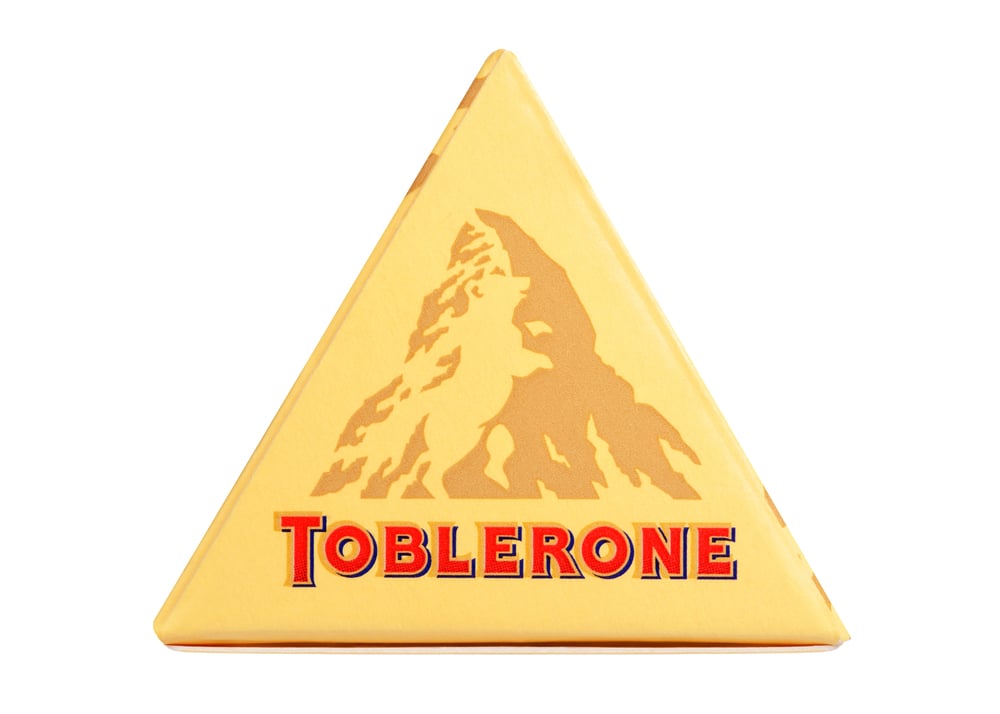
— Photo by ImageBase
The Matterhorn mountain silhouette in Toblerone’s logo hides a standing bear within its slopes, representing Bern, Switzerland—the city where Toblerone originated. Bears are Bern’s symbol, and this hidden creature pays homage to the chocolate’s Swiss heritage. The bear is formed by the negative space in the mountain’s design.
Goodwill’s Smiling Face

— Photo by wolterke
Goodwill’s lowercase ‘g’ doubles as a smiling face, with the letter’s opening forming the mouth. This cheerful hidden face reflects the organization’s mission of spreading goodwill and helping communities through their thrift stores and job programs. The smile suggests the positive impact of both donating and shopping there.
Pinterest’s Hidden Pin

— Illustration by 3D-Agentur
The ‘P’ in Pinterest’s logo is actually designed to look like a pin from above, the kind you’d stick into a corkboard or map. This connects perfectly with the platform’s concept of ‘pinning’ content to digital boards. The pin design is subtle enough that it works as a letter while still representing the core function of the service.
LG’s Winking Face

— Photo by 360ber
LG’s logo forms a friendly face when you look at it right—the ‘L’ creates the nose, the ‘G’ forms a winking eye and smiling mouth. This hidden face gives the tech brand a more human, approachable feeling compared to other corporate logos. The wink suggests the brand has a playful, confident personality.
BMW’s Aviation Origins

— Photo by Svyatkovsky
BMW’s blue and white checkered logo represents a spinning aircraft propeller against the sky, honoring the company’s origins as an aircraft engine manufacturer during World War I. The Bavarian flag colors connect the brand to its German heritage, while the propeller design hints at the precision engineering that transferred from aviation to automotive manufacturing.
The Art of Subliminal Branding
These hidden elements prove that great logo design works on multiple levels, creating instant recognition while planting deeper meanings in our subconscious. Whether intentional or accidental, these clever details make brands more memorable and help forge emotional connections with customers. The next time you’re out and about, take a closer look at the logos around you—you might be surprised by what secrets they’re hiding in plain sight.
More from Go2Tutors!

- 16 Historical Figures Who Were Nothing Like You Think
- 12 Things Sold in the 80s That Are Now Illegal
- 15 VHS Tapes That Could Be Worth Thousands
- 17 Historical “What Ifs” That Would Have Changed Everything
- 18 TV Shows That Vanished Without a Finale
Like Go2Tutors’s content? Follow us on MSN.