17 Aesthetic Trends from History We Need Back
Looking around today’s world, it’s hard not to feel like we’ve traded depth for speed, craftsmanship for convenience. The aesthetic choices that surround us daily — from our homes to our clothing to the way we document our lives — often feel rushed, disposable, forgettable.
But history offers a different blueprint. There are aesthetic trends from decades and centuries past that carried a weight, a deliberation, a simple beauty that modern life seems to have misplaced.
These aren’t just visual choices — they’re ways of seeing the world that valued permanence over instant gratification, subtlety over shock value.
Hand-Written Letters
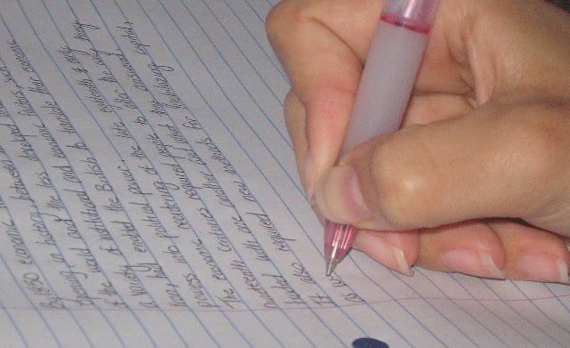
Letters forced you to think before you wrote. No backspace key, no instant send.
Just your thoughts, a pen, and the understanding that once the words hit paper, they mattered.
Art Deco Architecture

Art Deco buildings don’t apologize for taking up space. Every line serves a purpose — bold geometric patterns that climb skyward with confidence, materials that age gracefully instead of crumbling after a decade.
These structures understood that buildings should inspire the people who encounter them daily, not just house them efficiently.
Victorian Mourning Jewelry

The Victorians understood something we’ve forgotten (and perhaps it’s for the better, though maybe not entirely): grief deserves beauty. Mourning jewelry — lockets containing hair of the deceased, rings engraved with memorial dates, brooches crafted from jet stone — transformed loss into something tangible you could carry.
Not morbid, exactly. More like an acknowledgment that love doesn’t end with death, and sometimes the most profound emotions need physical form to make sense of them at all.
Apothecary Bottles and Medical Cabinets
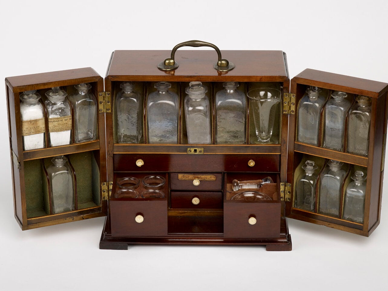
Medicine used to come in glass bottles with hand-written labels, stored in wooden cabinets with dozens of tiny drawers. Each remedy had its own small space, its own little ceremony of preparation and administration.
Compare that to today’s plastic pill bottles that all look identical.
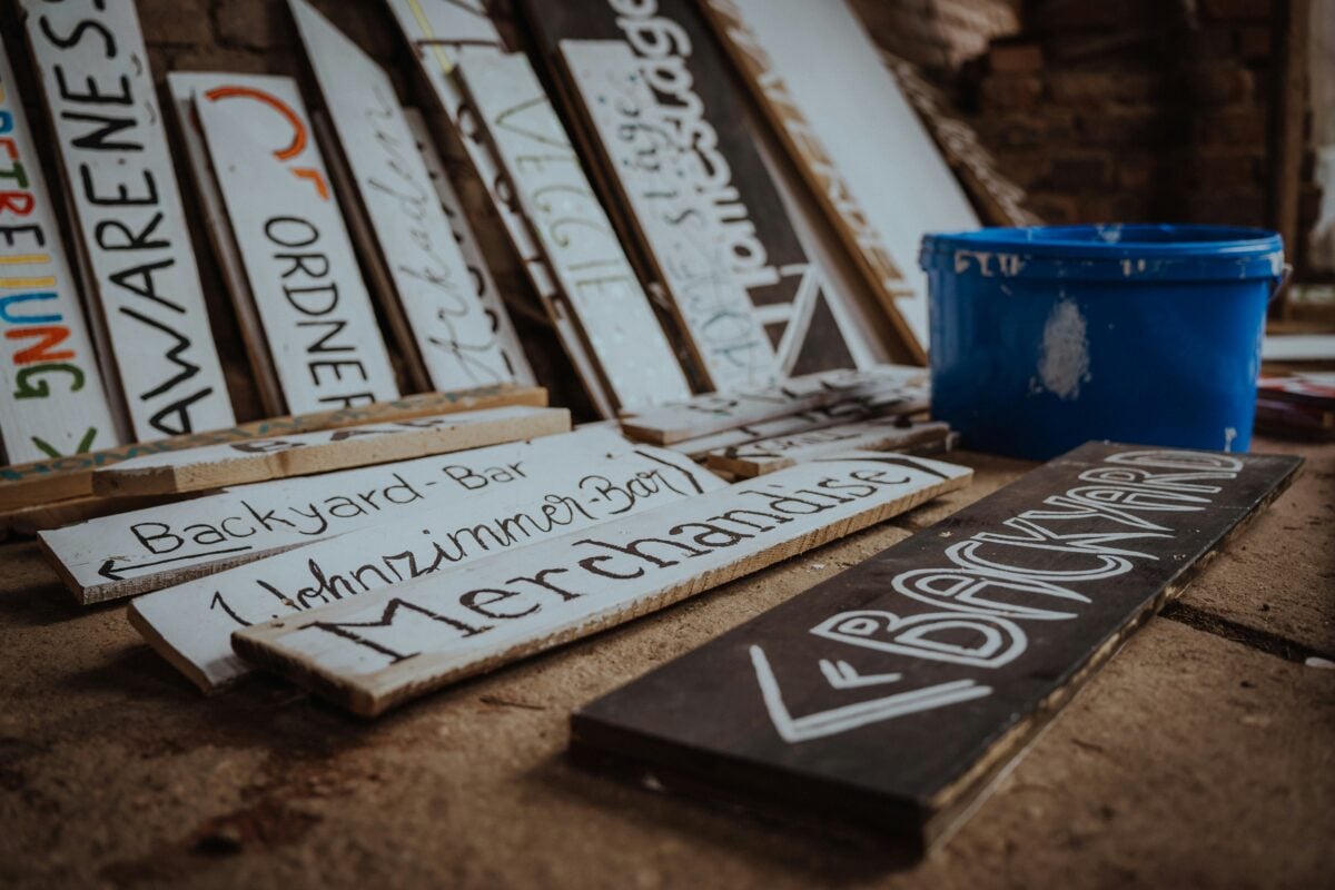
Hand-Painted Shop Signs

Every storefront told its own story through hand-painted signs. Butchers had painted pigs, bakers had golden wheat, bookshops had careful lettering that took weeks to complete.
The signs aged and weathered, which only added to their character.
Japanese Tea Ceremony Aesthetics
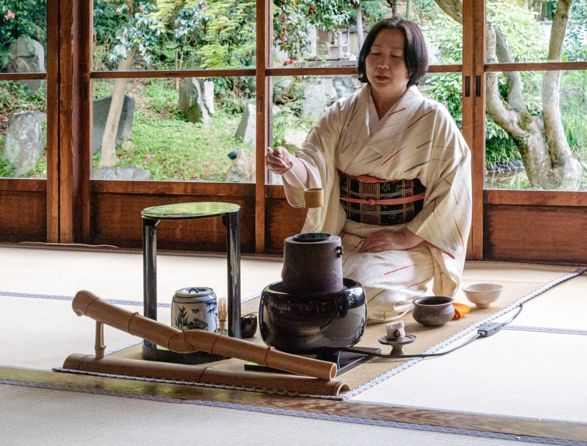
The Japanese tea ceremony elevated the everyday act of drinking tea into something approaching meditation — and the aesthetic choices surrounding it deserve attention. Every element, from the rough texture of the ceramic bowls (deliberately imperfect, showing the maker’s hand) to the way light fell across the simple wooden room, was chosen to slow time down rather than speed it up.
So much of modern design screams for attention. But the tea ceremony whispered.
And somehow, that made you listen more carefully.
Hand-Bound Books

Books used to be objects worth keeping. Hand-bound volumes with cloth covers, gold-stamped spines, and pages that felt substantial under your fingers.
Opening one required a small ritual — the resistance of the binding, the particular way the pages fell open, the smell of paper and ink that had been sitting together for years.
Pressed Flower Collections

Victorian women pressed flowers between the pages of heavy books, creating botanical collections that doubled as art. Each specimen was carefully labeled with the date and location where it was found.
The practice turned nature walks into treasure hunts and created lasting records of places and seasons.
Hand-Carved Wooden Signs
Before laser cutting and vinyl lettering, signs were carved by hand into wood, each letter shaped with deliberate care. The wood grain showed through the paint, and weather would eventually give each sign its own character — paint wearing away in some places, darkening in others, until no two signs looked exactly alike even if they started identical.
And the thing is, that weathering didn’t make them look shabby (well, not always). It made them look like they belonged exactly where they were, like they’d grown out of that particular corner or storefront rather than being dropped there by a design committee.
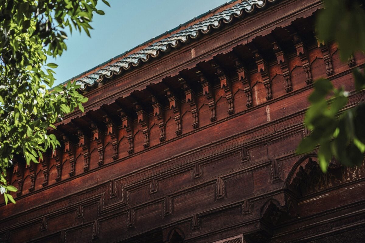
Detailed Architectural Ornamentation
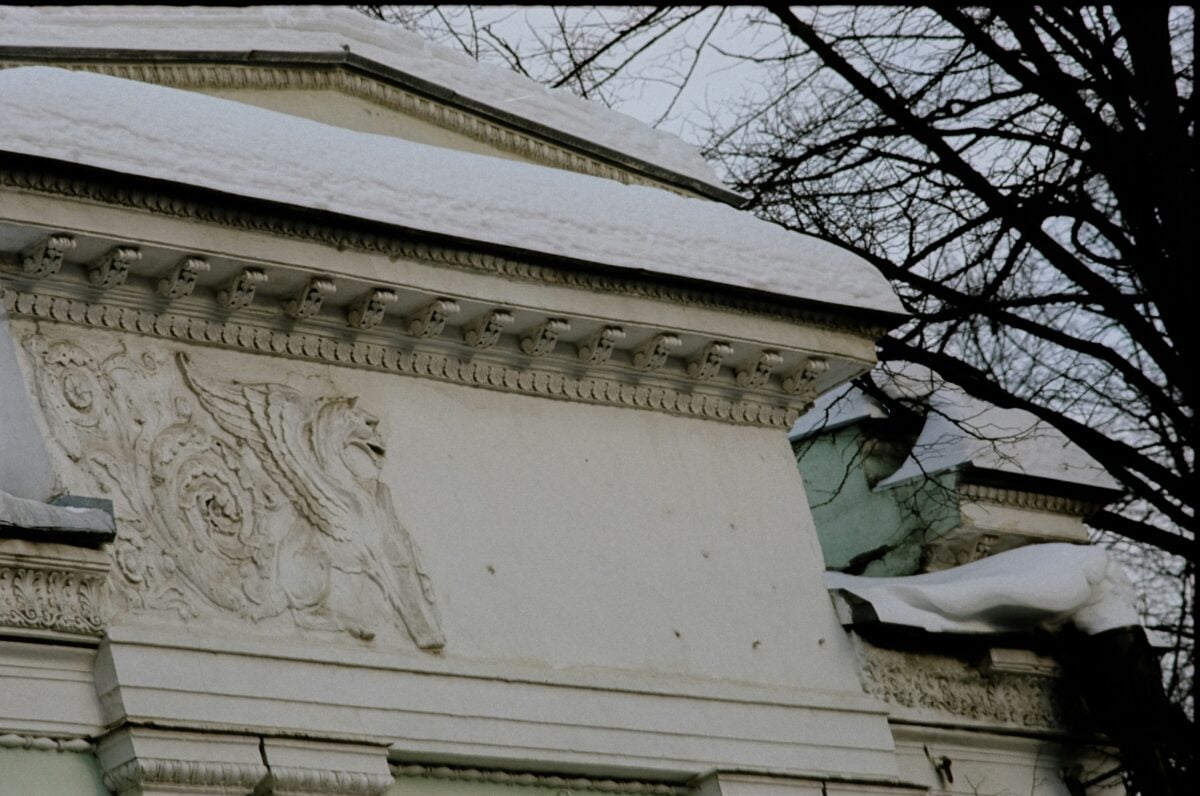
Buildings used to wear their decoration without shame. Cornices carved with intricate patterns, doorways framed by detailed stonework, window boxes that were small architectural events in themselves.
Modern minimalism has its place, but sometimes a building should celebrate being a building.
Traditional Barbershop Interiors
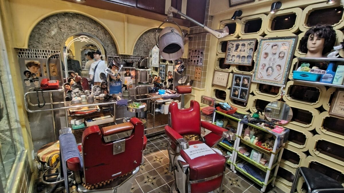
Red leather chairs, glass jars full of colorful tonics, wooden cabinets lined with straight razors and silver scissors. Everything in a traditional barbershop had weight to it — literally and figuratively.
The tools were built to last decades, the furniture was meant to be repaired rather than replaced.
Handwritten Recipe Cards

Recipes passed down through generations on index cards, stained with ingredients and marked up with personal notes. “Add extra vanilla” written in the margin, “Uncle Joe’s favorite” scrawled at the top.
Each card told the story of family meals and special occasions.
Vintage Travel Luggage
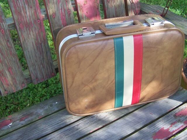
Leather suitcases covered in hotel stickers from around the world, each piece of luggage becoming a visual diary of places visited. The stickers weren’t meant to be removed — they were badges of honor, proof of adventures taken and distances traveled.
Hand-Painted Ceramics

Every plate, cup, and bowl was painted by hand, which meant no two pieces matched exactly. Slight variations in color, small differences in the way a pattern curved around a rim — these imperfections made each piece individual rather than interchangeable.
Traditional Storefront Window Displays
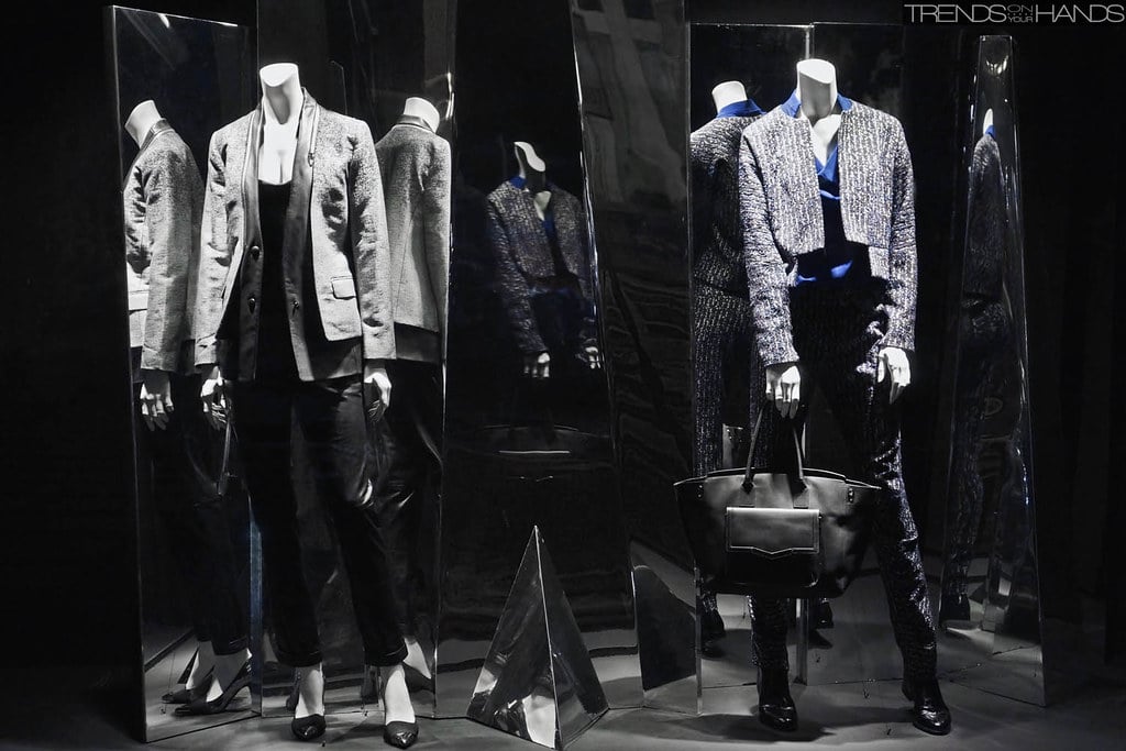
Shop windows were small theaters, changed seasonally and arranged with the care of museum exhibitions. Mannequins wore complete outfits rather than just showcasing individual items, and props created entire scenes that told stories about how the products fit into daily life.
Handmade Paper and Stationery
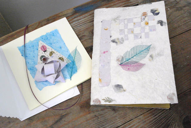
Paper used to have texture, weight, character. Handmade paper showed the screen marks from its creation, and different papers were chosen for different purposes — thin airmail paper for overseas correspondence, heavy cardstock for formal invitations, personal letterhead with raised printing that you could feel under your fingers.
Library Card Catalogs

Those wooden cabinets filled with thousands of index cards, each one typed and filed by hand. Finding a book required physical effort — pulling out drawers, flipping through cards, writing down call numbers.
The system was slower than digital search, but it connected you to every other person who had touched those same cards looking for the same information.
When Beauty Required Patience
These aesthetic trends share something that modern life seems to have forgotten: they required time. Time to create, time to appreciate, time to maintain.
They weren’t designed for quick consumption or instant gratification. They were built to last, to improve with age, to become more beautiful through use rather than less.
That patience — both in their creation and in our relationship with them — might be the most important thing we could bring back.
More from Go2Tutors!

- The Romanov Crown Jewels and Their Tragic Fate
- 13 Historical Mysteries That Science Still Can’t Solve
- Famous Hoaxes That Fooled the World for Years
- 15 Child Stars with Tragic Adult Lives
- 16 Famous Jewelry Pieces in History
Like Go2Tutors’s content? Follow us on MSN.