Rare Vintage Posters from the Early Circus Era
There’s something almost magnetic about stepping into an antique shop and spotting a weathered circus poster tucked between dusty picture frames. The faded colors and bold typography seem to whisper stories of sawdust rings, death-defying acts, and crowds gasping in collective wonder.
These aren’t just pieces of paper – they’re windows into an era when entertainment was raw, immediate, and utterly captivating. The early circus era, roughly spanning from the 1870s to the 1930s, produced some of the most striking promotional artwork in American history.
Before television, radio, or even widespread newspaper advertising, these posters served as the primary way to announce a circus’s arrival in town. They had to stop people in their tracks, convey excitement, and promise something extraordinary.
The best ones still do exactly that, more than a century later.
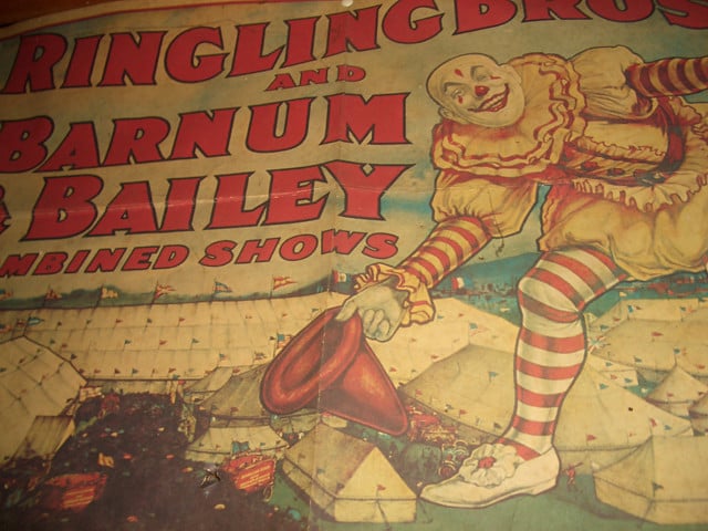
P.T. Barnum and Bailey Combined Shows
The granddaddy of all circus posters belongs to Barnum and Bailey. These lithographs were massive – often 28 by 42 inches – and designed to be impossible to ignore.
The artwork was bold and unapologetic, featuring elephants, acrobats, and wild animals in vivid reds and blues that seemed to leap off the paper.
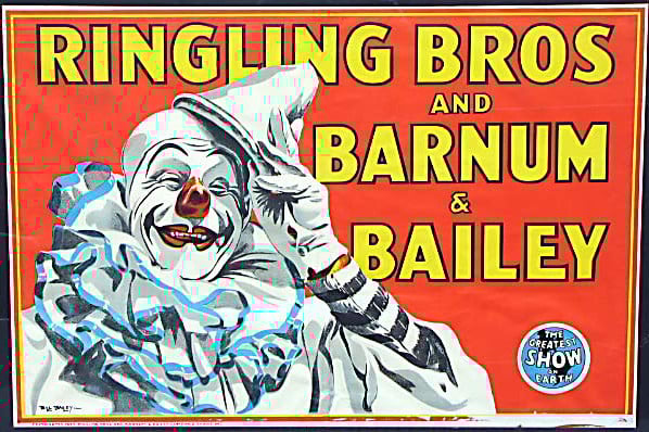
Ringling Brothers Early Years
Before the merger with Barnum and Bailey, the Ringling Brothers created their own distinctive poster style. The artwork was slightly more refined than their competitors, with cleaner lines and more sophisticated color palettes.
These posters emphasized the family-friendly nature of their shows while still promising spectacle and wonder.
Sells Brothers Circus
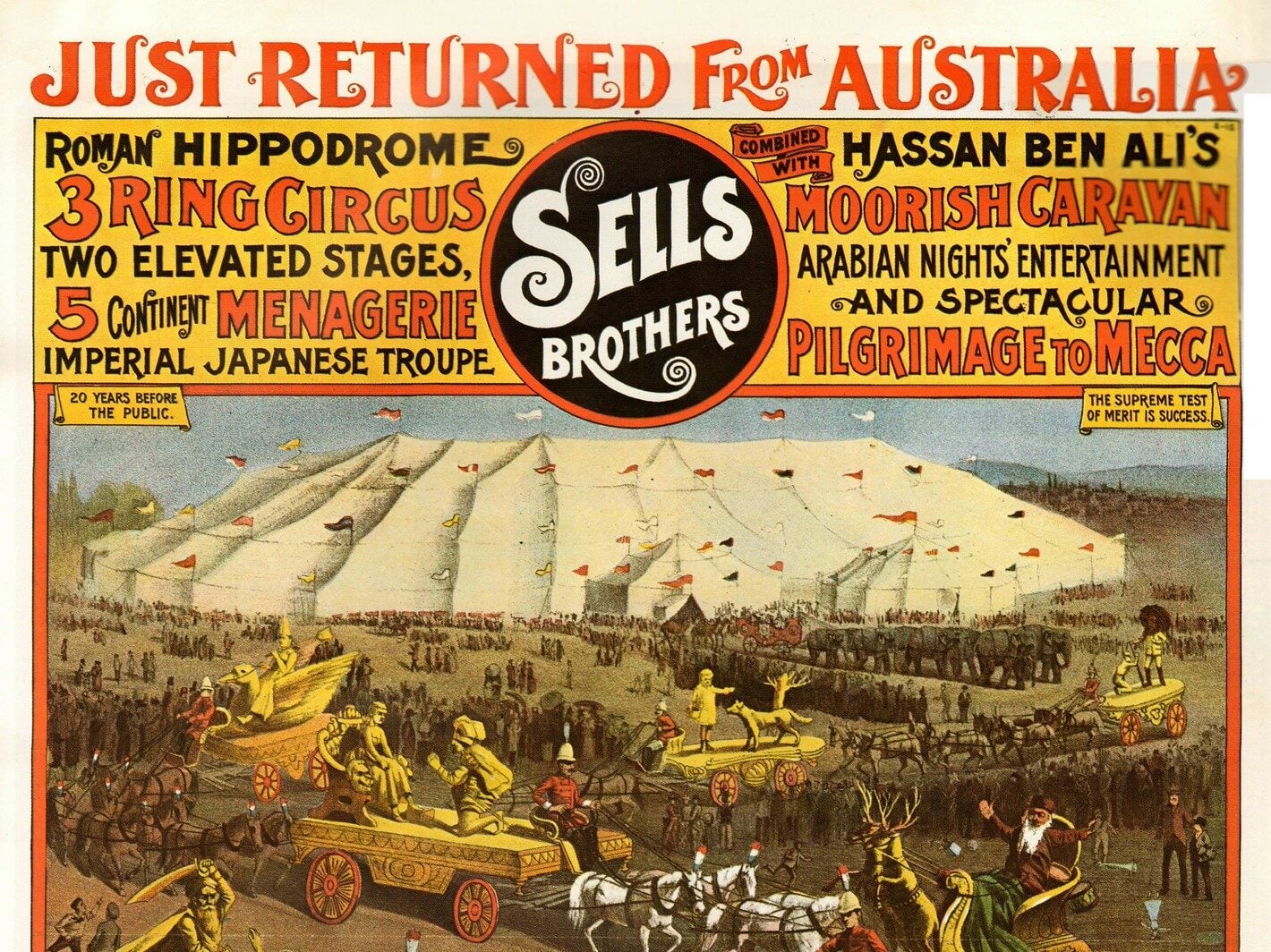
The Sells Brothers knew how to make an impression (and they weren’t shy about it, which explains why their posters practically vibrated with energy even when mounted on barn walls). Their lithographers understood something fundamental about human nature: people wanted to believe in magic, even if it was just for one evening under a canvas tent.
And so the artwork promised exactly that – tigers that seemed ready to leap through the paper, acrobats frozen mid-flight with expressions of serene confidence, and elephants that appeared both majestic and impossibly large, as if the artists had never quite mastered the art of proportion but had absolutely perfected the art of making everything feel more dramatic than reality could possibly deliver.
Adam Forepaugh Circus
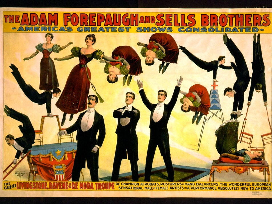
Adam Forepaugh’s posters carried a certain stubborn authenticity. The man had strong opinions about what a circus should be, and his advertising reflected that.
No flowery language or false modesty – just bold claims and bolder imagery. His lithographers favored earth tones mixed with splashes of brilliant red.
The result was advertising that felt grounded yet exciting, practical yet fantastical.
Cole Brothers Circus
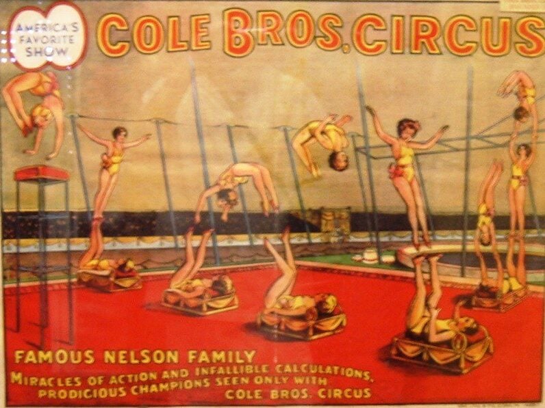
Finding a Cole Brothers poster feels like discovering a letter someone meant to keep forever. There’s an intimacy to these pieces that the larger circuses never quite managed – the way the performers seem to be performing specifically for whoever happens to be looking, the careful attention paid to faces rather than just spectacle, the sense that this particular show understood something personal about wonder.
The lithography on Cole Brothers posters tends toward warmer colors, as if the whole production had been lit by kerosene lamps rather than harsh spotlights. The typography curves gently around the imagery instead of demanding attention through sheer volume.
These posters didn’t shout. They invited.
Hagenbeck-Wallace Circus
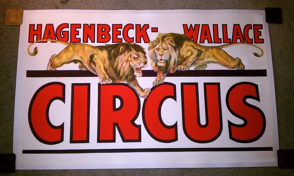
Hagenbeck-Wallace posters were refreshingly honest about what they were selling. This was a working circus that happened to create beautiful advertising, not a marketing machine that happened to put on shows.
The difference shows in every lithograph. The artwork focused on the animals – lions, elephants, horses – with the kind of detail that suggested the artists had spent real time watching these creatures perform.
No exaggeration needed when the reality was already extraordinary.
Buffalo Bill’s Wild West
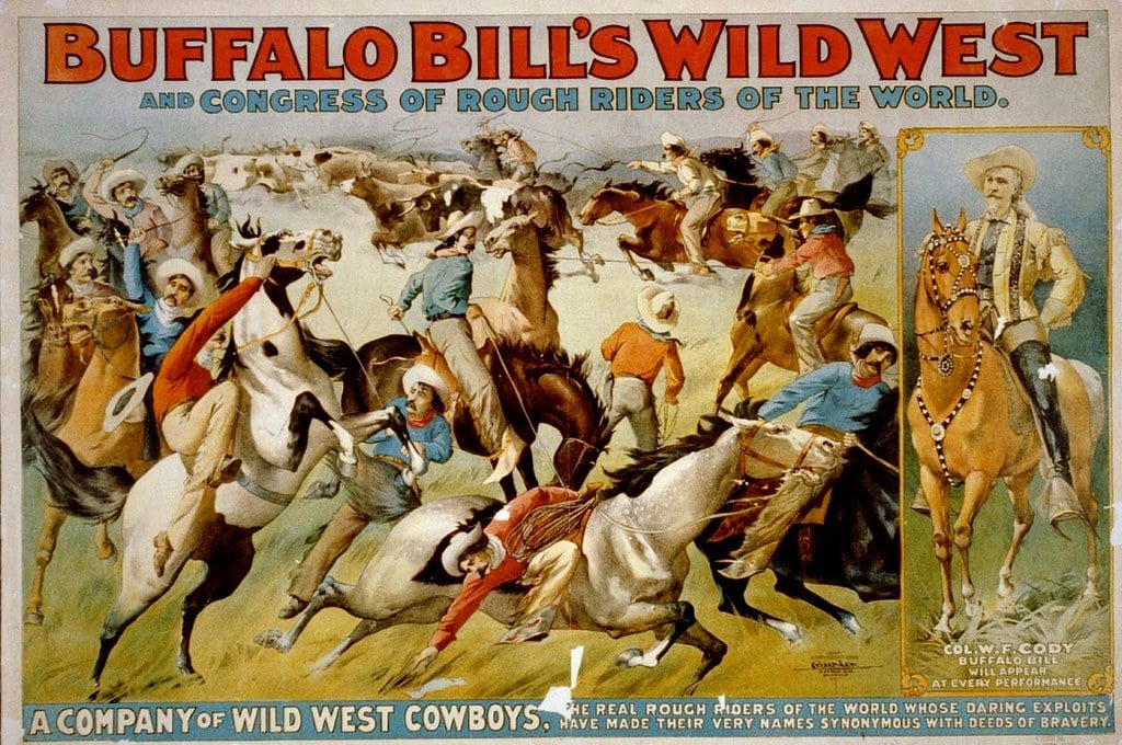
Technically not a circus, but Buffalo Bill’s Wild West show produced some of the most distinctive posters of the era. The artwork captured something essentially American – wide open spaces, frontier spirit, and the romance of the untamed West (even though by the time these shows were touring, the West was considerably more tamed than the posters suggested).
The lithography emphasized earth tones and dramatic action scenes, with Buffalo Bill himself usually featured prominently, looking every inch the frontier hero that audiences expected him to be. These posters promised adventure in a way that felt both exotic and familiar, which was exactly what made them so effective.
John Robinson’s Circus
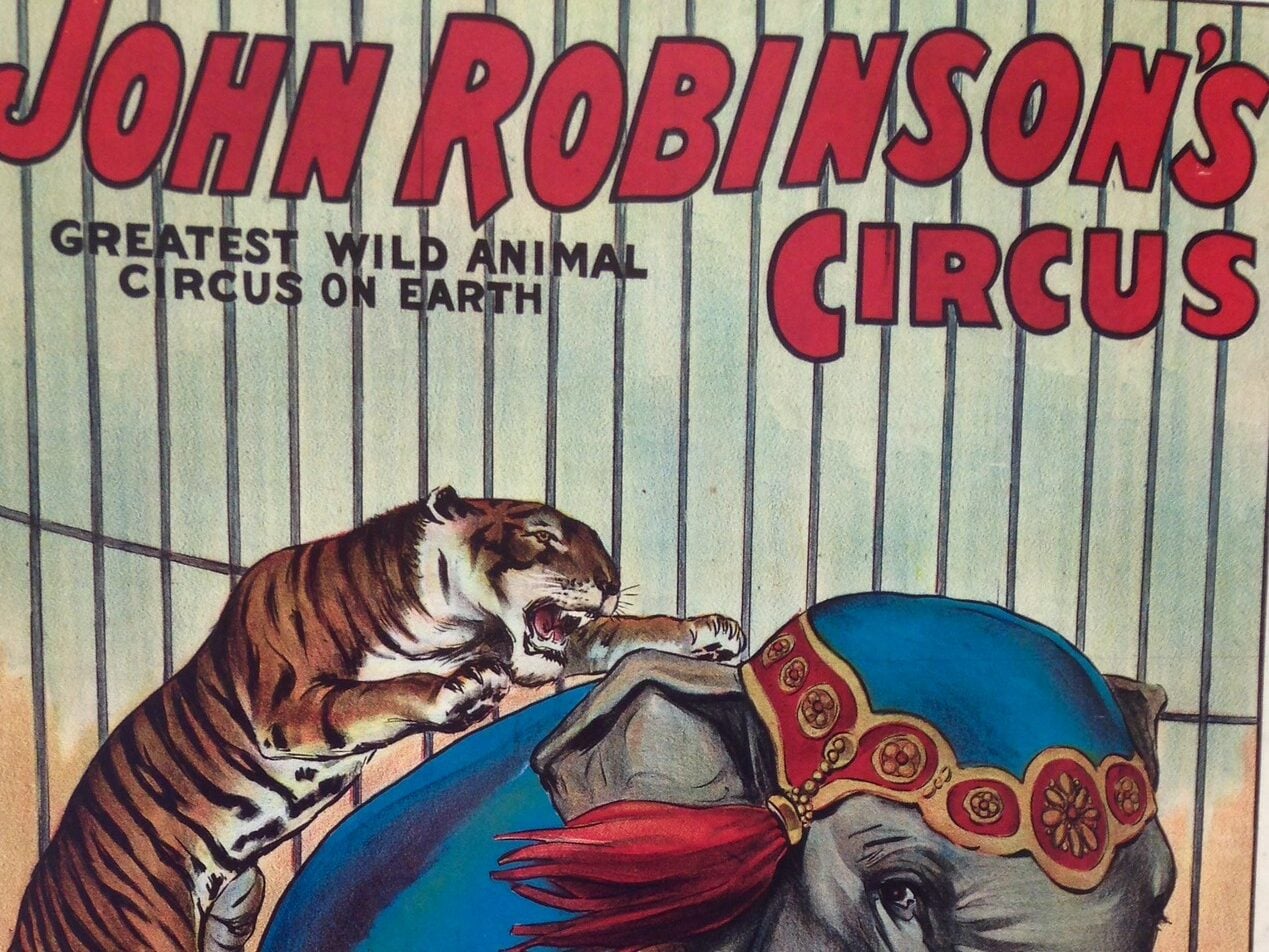
Robinson’s understood the power of understatement, which made their posters stand out in a field dominated by hyperbole. The artwork was clean, the claims modest, and the overall effect surprisingly compelling.
Sometimes the most confident performers are the ones who don’t feel compelled to prove it.
Sparks Circus
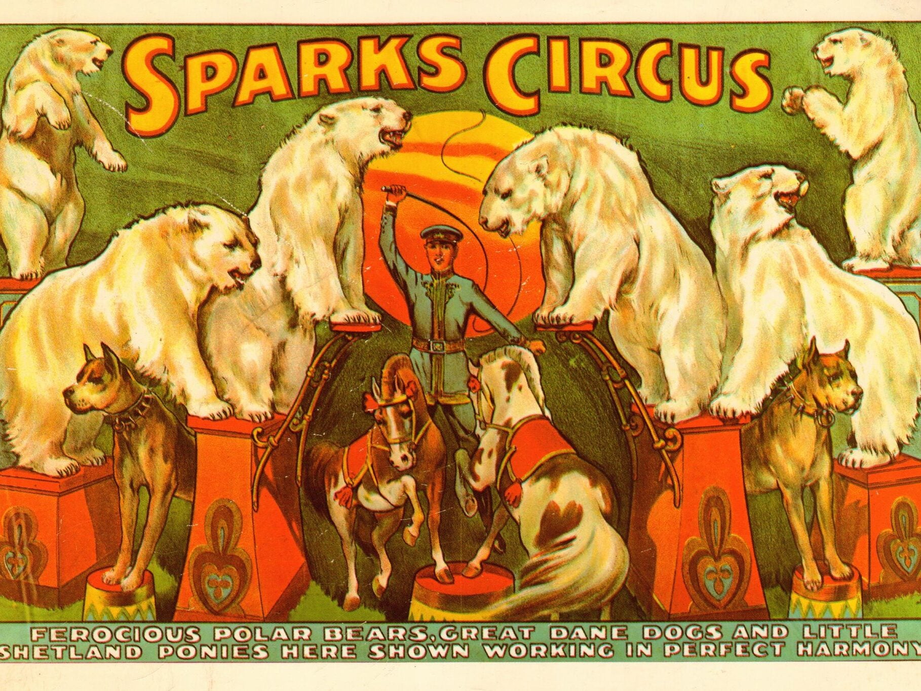
Sparks Circus posters radiate the kind of earnest enthusiasm that’s impossible to fake. You can sense the genuine excitement behind these lithographs – the artists believed in what they were advertising, and that belief transferred directly onto paper through bold colors and dynamic compositions.
The typography on Sparks posters tends to be particularly well-executed, with letters that seem to dance around the imagery rather than simply conveying information. These were craftsmen who understood that the poster itself was part of the show.
Al G. Barnes Circus
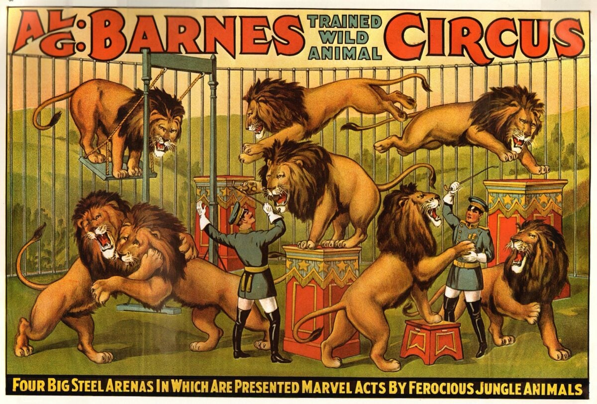
Barnes specialized in wild animal acts, and his posters reflected that focus with artwork that emphasized the untamed nature of his menagerie. The lithography was deliberately rougher than some competitors, giving the impression of barely contained wildness that could break free at any moment.
These posters promised danger alongside wonder, and they delivered that promise through imagery that felt genuinely unpredictable. The animals in Barnes posters never looked entirely comfortable with their circumstances, which was exactly the point.
Gentry Brothers Circus
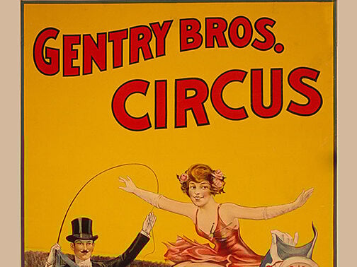
The Gentry Brothers targeted family audiences, and their posters reflected that mission through artwork that emphasized joy over danger. The lithography featured bright, cheerful colors and performers who looked genuinely happy to be there.
This was circus as celebration rather than spectacle. Children featured prominently in Gentry Brothers advertising, both as performers and as audience members, creating a sense of inclusivity that made families feel welcome rather than simply tolerated.
Walter L. Main Circus
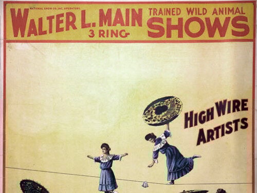
Main’s posters carried an old-world elegance that set them apart from the brasher American style. The lithography was more detailed, the color palettes more subtle, and the overall effect more refined.
These looked like posters for a European touring company that happened to be passing through American towns. The typography on Main posters was particularly sophisticated, with decorative flourishes and careful spacing that suggested someone had spent real time considering how each element worked with the others.
Mighty Haag Circus
Haag Circus posters were wonderfully unpretentious. The artwork was straightforward, the promises reasonable, and the overall tone suggested a show that knew exactly what it was and felt no need to apologize for it.
These were posters for people who wanted circus without the circus, if that makes sense.
When Paper Held Magic
These posters represent something that no longer exists: advertising as art form. The lithographers who created them were craftsmen first and marketers second.
They understood color, composition, and the peculiar challenge of making static images convey movement and excitement. Today, the surviving examples command serious prices from collectors who recognize them as genuine pieces of Americana.
But their value goes beyond mere collectibility. They’re documents of a time when entertainment was participatory, when wonder was harder to come by, and when a simple piece of paper could genuinely change the course of someone’s evening.
That kind of magic deserves to be preserved.
More from Go2Tutors!

- The Romanov Crown Jewels and Their Tragic Fate
- 13 Historical Mysteries That Science Still Can’t Solve
- Famous Hoaxes That Fooled the World for Years
- 15 Child Stars with Tragic Adult Lives
- 16 Famous Jewelry Pieces in History
Like Go2Tutors’s content? Follow us on MSN.