Photos of Major Airports in the 1960s Versus Today
Flying used to be an event. People dressed up, families gathered at the gate, and airports felt more like train stations than the sprawling retail complexes they’ve become.
Looking at photos from the 1960s compared to today reveals just how dramatically air travel has transformed — not just the planes, but the entire experience of moving through these spaces.
Los Angeles International Airport
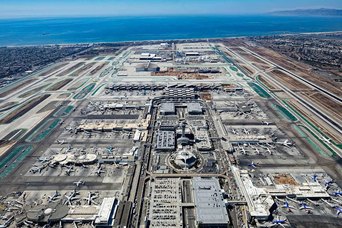
LAX in the 1960s looked like something from The Jetsons. The Theme Building with its flying saucer design dominated the skyline, surrounded by low-slung terminals and plenty of open space.
People walked across tarmacs to board planes, and the whole place had an optimistic, space-age feel.
Today’s LAX sprawls endlessly. Security checkpoints snake through multiple levels, and the original terminals have been expanded beyond recognition.
The Theme Building still stands, but it’s dwarfed by massive new construction projects that seem to stretch forever.
John F. Kennedy International Airport
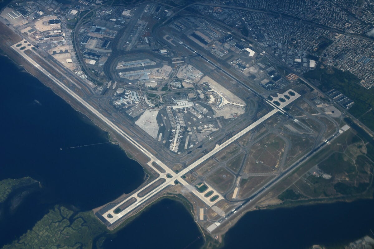
JFK’s original terminals were architectural statements, each designed by different firms to showcase distinct visions of modern travel. The TWA Flight Center, with its swooping concrete curves, felt like a cathedral dedicated to the romance of flight. Passengers moved through these spaces with a sense of ceremony (and considerably fewer belongings to carry or check).
But modern JFK is a lesson in how function can overtake form when security becomes paramount. Metal detectors, body scanners, and endless queues have replaced the open, flowing spaces that once defined the airport experience — though efforts to preserve some original architecture do remind travelers of what was lost in the transition.
Chicago O’Hare International Airport
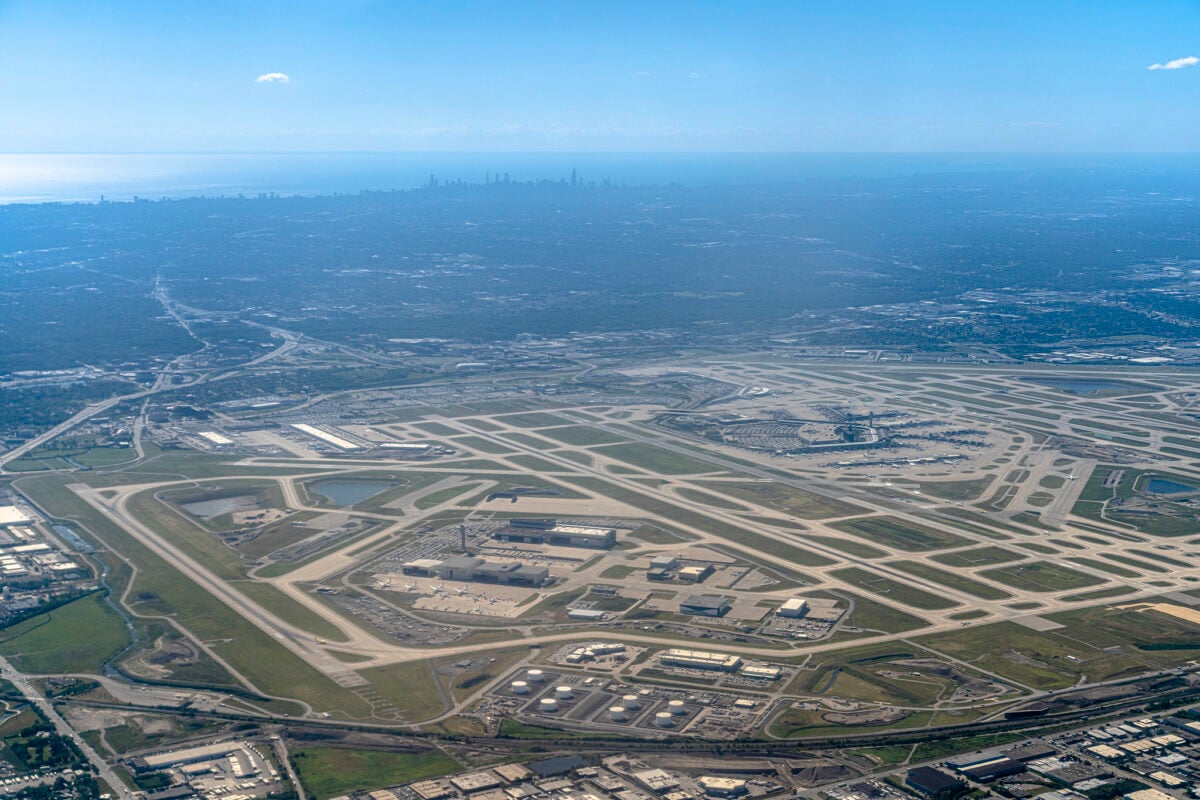
O’Hare in the 1960s was already busy, but the photos show something unmistakable: space to breathe. Wide concourses, high ceilings, and gate areas where people could actually sit comfortably while watching planes taxi outside floor-to-ceiling windows.
And cig lounges everywhere — a reminder of just how different public spaces used to be.
Modern O’Hare handles exponentially more passengers, which shows. The terminals feel packed even during off-peak hours, and finding a seat near your gate requires strategy and luck.
The expansion projects of recent decades have added capacity but somehow made the airport feel more cramped rather than more spacious.
Miami International Airport
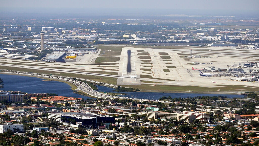
Miami’s 1960s photos capture an airport that felt distinctly regional — palm trees visible through the windows, an architecture that acknowledged its tropical setting, and a scale that matched the city’s size at the time. The passenger demographic was different too: fewer business travelers, more families heading to vacation destinations.
Today’s Miami International is a major international hub that processes millions of passengers annually. The original charm has been efficiency-engineered out of existence, replaced by the standardized airport experience you’ll find from Seattle to Singapore.
Climate control is better, but the connection to place has been largely severed.
San Francisco International Airport
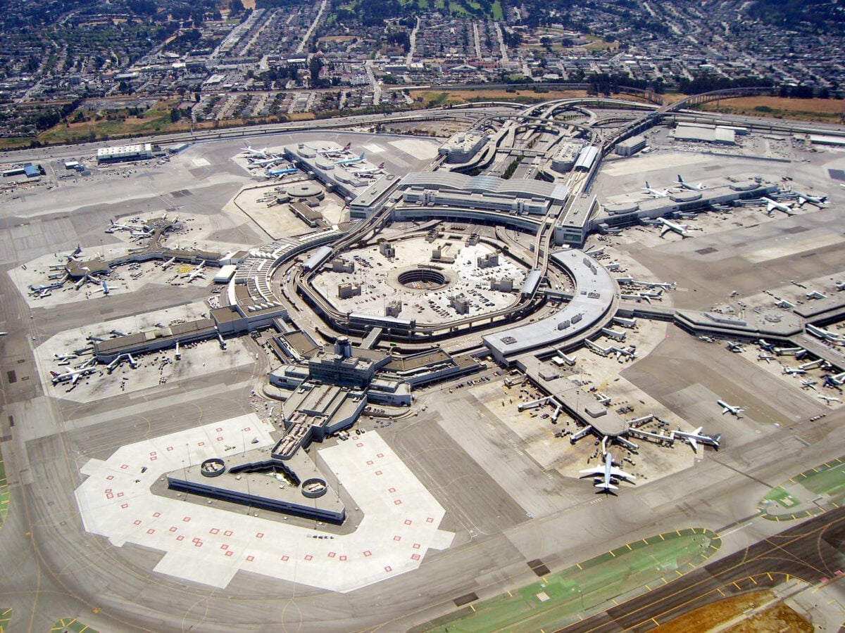
SFO’s original terminals had a West Coast openness that matched the region’s reputation for innovation and laid-back attitudes. The 1960s photos show an airport where the distinction between inside and outside felt less rigid — more glass, more natural light, more connection to the Bay Area landscape beyond the runways.
Passengers moved through these spaces without the anxiety that defines modern air travel.
So what happened to that sense of ease. Security happened, for one thing — the layers of screening and monitoring that became necessary after various incidents changed not just the procedures but the entire emotional tenor of airports.
And volume happened too: when an airport processes ten times as many passengers, the experience inevitably becomes more industrial, more focused on moving people efficiently rather than making them comfortable.
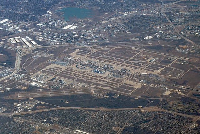
Hartsfield-Jackson Atlanta International Airport
Atlanta in the 1960s was a regional airport with national ambitions, visible in photos that show modest terminals alongside clear signs of expansion planning. The original concourses had a human scale — you could see from one end to the other, and navigating the airport didn’t require a map or moving walkways.
Hartsfield-Jackson today is the world’s busiest airport, a designation that becomes immediately obvious to anyone who tries to navigate its sprawling terminal complex. The efficiency is impressive, but the experience has become almost entirely functional.
Getting from security to your gate feels less like walking through an airport and more like traversing a small city.
Boston Logan International Airport
Logan’s 1960s terminals reflected New England’s architectural traditions while embracing modernist design principles — a combination that created spaces with both character and functionality. The airport felt connected to Boston in ways that went beyond geographic proximity; the design choices reflected regional sensibilities and local materials.
Passengers experienced a sense of arrival that was specific to the place they’d reached.
The renovated Logan maintains some of this regional character, particularly compared to airports that have embraced a more generic international style. But the security requirements and passenger volume have inevitably changed the fundamental experience — what once felt like arriving in Boston now feels more like arriving at an airport that happens to be located near Boston.
Newark Liberty International Airport
Newark’s transformation might be the most dramatic of any major American airport. The 1960s photos show an airport that was purely functional — not beautiful, not particularly innovative, but human-scaled and straightforward to navigate.
You could park close to the terminal, walk directly to your gate, and board your plane without the elaborate choreography that modern air travel requires.
Modern Newark is more sophisticated in every technical sense but considerably less pleasant to use. The airport has been expanded and renovated multiple times, yet somehow manages to feel both overcrowded and underdesigned.
The efficiency gains are real, but they’ve come at the cost of anything resembling comfort or charm.
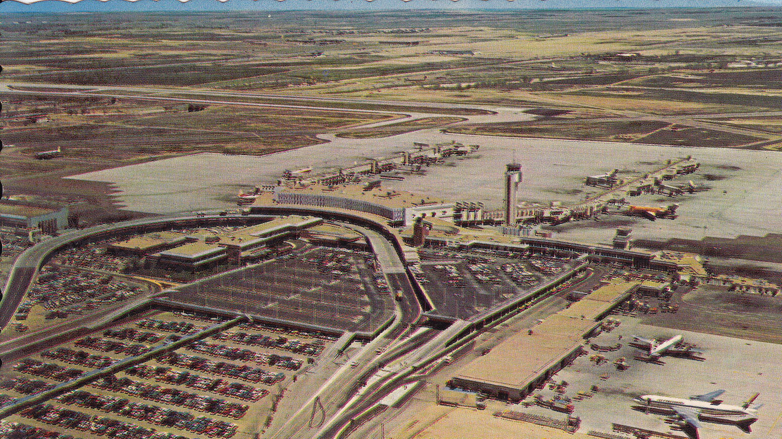
Dallas Love Field
Love Field in the 1960s embodied a certain Texas confidence — not the biggest airport, but well-designed and proud of what it offered. The terminals had personality, from the regional architectural details to the local restaurants that served actual Texas cuisine rather than generic airport food.
Flying through Love Field felt different from flying through airports in other parts of the country.
That regional distinctiveness has largely disappeared, replaced by the standardized airport experience that prioritizes efficiency over character. The food options are better in an objective sense — more variety, higher quality ingredients — but they could be found in any airport anywhere.
The sense of place has been professionally managed out of existence.
Washington Dulles International Airport
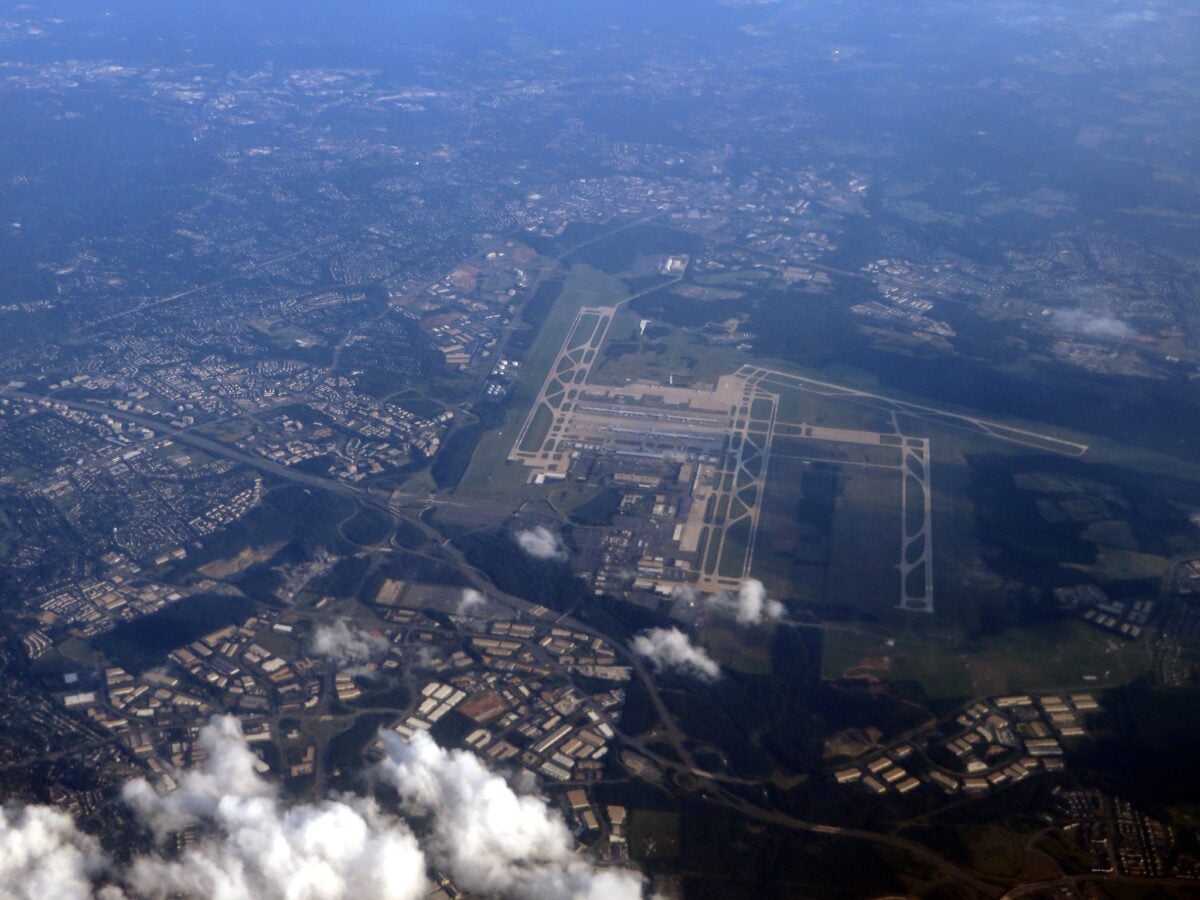
Dulles opened in 1962 with Eero Saarinen’s distinctive terminal design, and the 1960s photos show the architect’s vision in its pure form — soaring concrete curves, massive windows, and mobile lounges that transported passengers directly to planes parked on the tarmac. The entire experience was designed as a cohesive whole, from curb to cabin.
The mobile lounges are mostly gone now, replaced by more conventional gate arrangements and jetways. The additions and modifications over the decades have diluted Saarinen’s original concept, turning what was once an integrated architectural experience into a more typical airport with one very distinctive building at its center.
Denver’s Original Stapleton Airport
Stapleton represented 1960s airport design at its most pragmatic — not architecturally ambitious like some coastal airports, but extremely functional and passenger-friendly. The concourses were wide, the gate areas spacious, and the entire airport was designed around the assumption that air travel should be comfortable rather than merely efficient.
Stapleton was replaced by Denver International in 1995, but comparing the old airport to the new one illustrates how priorities shifted over the decades. DIA is larger, more modern, and handles far more passengers, but the passenger experience is arguably worse — longer walks, more crowded gate areas, and a general sense that the airport was designed more for operational efficiency than human comfort.
Philadelphia International Airport
Philadelphia’s 1960s terminals maintained a connection to the city’s colonial heritage while embracing contemporary design — a balance that created spaces with both historical resonance and modern functionality. The airport felt distinctly Philadelphian in ways that went beyond the Liberty Bell merchandise in the gift shops.
That connection to place has weakened considerably as Philadelphia International has expanded and modernized. The airport works better in most technical senses — better security, better baggage handling, better flight information systems — but it feels less connected to the city it serves.
The efficiency gains are undeniable, but something less quantifiable has been lost in the process.
A Different Kind of Journey

Airports once promised adventure. The 1960s photos capture something that goes beyond nostalgia — they document a time when air travel retained some connection to the idea of journey rather than just transportation.
The spaces were designed for people who had time to notice their surroundings, who might arrive early just to watch planes take off, who understood flying as an experience rather than a necessary inconvenience.
Modern airports serve their function admirably, moving millions of passengers safely and efficiently to their destinations. But efficiency came at a cost that’s only visible when you compare the experience to what came before.
The romance of flight didn’t disappear because people became less romantic — it disappeared because the entire system was redesigned around different priorities. Looking at these comparisons makes clear what we gained, and what we gave up in return.
More from Go2Tutors!

- The Romanov Crown Jewels and Their Tragic Fate
- 13 Historical Mysteries That Science Still Can’t Solve
- Famous Hoaxes That Fooled the World for Years
- 15 Child Stars with Tragic Adult Lives
- 16 Famous Jewelry Pieces in History
Like Go2Tutors’s content? Follow us on MSN.