Actual Names for Symbols You Never Knew
You spot them all the time – on keys, papers, walls, streets. They work without noise, so folks rarely ask what they’re named.
Yet each mark’s got a title. Some names feel odd, old, or totally outta left field.
Many people just shout “that wavy bit” or “the tiny dot.” Still, folks who work with type, ink jobs, or word rules know exactly what each one’s called – has been for ages.
A handful of labels arrived from ancient Latin, some popped up in print shops long ago, while others crawled in from tongues you’d never guess.
The Ampersand Has Roman Roots

The “&” symbol started as a ligature—a joining of two letters. Roman scribes would write the Latin word “et” (meaning “and”) so quickly that the E and T merged into one flowing shape.
Over hundreds of years, that shorthand became the curvy symbol you use in email addresses and company names. The name “ampersand” came later, from a strange twist of language.
When children recited the alphabet, they’d end with “X, Y, Z, and per se and.” That last phrase meant “and by itself means ‘and.'”
Say it fast enough times and it slurs into “ampersand.” The term entered common English usage by 1837.
The Octothorpe Might Be a Joke

That # symbol goes by many names: pound sign, number sign, hashtag. But its technical name is the octothorpe, coined by Bell Labs engineers in the 1960s when they added it to telephone keypads.
The “octo” part makes sense—it has eight points. But “thorpe”? Nobody knows for sure, and even the people who were there tell different stories.
One account claims it honored Jim Thorpe, the Olympic athlete. Another suggests it was originally “octatherp,” invented as a joke by two engineers because the “th” sound would be hard for speakers of some languages to pronounce.
Either way, the octothorpe was relatively obscure until 2007, when a developer suggested using it to group topics on Twitter. Now billions of people tap it daily, usually without knowing its actual name.
The Pilcrow Marks Paragraphs

That backward P with a double stem (¶) shows up in word processors when you reveal formatting marks. It’s called a pilcrow, a corruption of an Old French word that itself came from the Greek paragraphos.
Medieval scribes used it to mark new sections in manuscripts before the concept of indentation existed. The symbol evolved from the letter K (for kaput, Latin for “head”), then to C (for capitulum, meaning “little head” or chapter).
Over time, scribes added vertical bars and flourishes until it became the distinctive shape you see today. Modern editors and proofreaders still use it to indicate where new paragraphs should begin.
It’s one of the oldest editorial marks still in regular use.
The Interrobang Combines Questions and Excitement

When you’re shocked and questioning at the same time, you might type “?!” or “!?” But there’s actually a dedicated symbol for that exact emotion: ‽
The interrobang combines a question mark and exclamation point into one character. American advertising executive Martin Speckter invented it in 1962, arguing that written language needed a way to express excited questioning without using two marks.
The name mashes “interrogatio” (Latin for “rhetorical question” or “cross-examination”) with “bang” (printer’s slang for exclamation point). Despite Speckter’s best efforts to popularize it—it even appeared on some Remington typewriters in 1968—the interrobang never caught on widely.
But it lives on in typography circles and among punctuation enthusiasts.
The Tilde Traveled from Spain

The wavy line above the N in “señor” is a tilde, from the Spanish word meaning “title” or “inscription.” Spanish scribes created it as shorthand in the Middle Ages when they needed to save space on expensive parchment.
Originally, they’d write a small N above another N to indicate the double-N sound. Eventually, that upper N got lazy and became a simple wavy line.
The same mark appears in Portuguese and some transliteration systems for other languages. In modern usage, the tilde (~) shows up in mathematics to mean “approximately,” in file paths, and in web addresses.
But its roots are firmly in medieval Spanish manuscripts.
The Asterisk Comes from Stars

The star-shaped symbol * takes its name directly from the Greek word for “little star.” Ancient scribes used it to mark important passages or footnote references in texts.
Printers continued the tradition, using asterisks to direct readers to notes at the bottom of pages. That convention persists in modern writing, though asterisks now serve many purposes—from indicating multiplication in math to censoring profanity online.
The asterisk is one of the oldest editorial marks, appearing in manuscripts dating back more than 2,000 years. Its simple star shape made it easy to draw by hand, which helped it survive across centuries and technologies.
The At Sign Has Medieval Origins

The @ symbol seems thoroughly modern, essential for email addresses and social media handles. But it appeared in commercial documents as far back as possibly the 1500s, though its exact origins remain debated.
Merchants used it as shorthand for “at the rate of”—as in “10 apples @ 5 cents each.” The curving A with its tail likely came from scribes writing abbreviations quickly, possibly from the Latin word “ad” (meaning “at” or “to”).
The symbol nearly faded into obscurity in the 20th century before computer scientist Ray Tomlinson chose it for the first email address in 1971. He needed a character that wouldn’t appear in anyone’s name and would indicate location.
The @ was perfect—and it brought an old commercial symbol back to life.
The Caret Points to Insertions

The little wedge (^) that shows where text should be inserted is called a caret, from the Latin word meaning “it lacks.” Proofreaders and editors have used it for centuries to mark places where something got left out.
The shape comes from the Latin word “caret” written in old manuscripts. Scribes would draw the C and R so close together that they merged into a V-like shape.
That mark became standardized as the insertion symbol. In modern computing, the caret takes on new roles—representing exponents in programming languages and serving as a command character in text editors.
But its original purpose as an editing mark remains unchanged.
The Dagger Looks Dangerous for a Reason

The † symbol appears in footnotes, religious texts, and typography guides. It’s called a dagger or obelisk, from its pointed shape resembling a medieval blade.
Ancient scribes used it to mark questionable or corrupted passages in manuscripts—text that seemed “killed” or unreliable. Later, printers adopted it as a footnote symbol, typically used after the asterisk when multiple notes appear on the same page.
The double dagger (‡) serves the same purpose as a third-level footnote marker. Both symbols carry that faint air of danger from their original use marking textual problems.
The Guillemet Frames French Quotes

Those angled quotation marks (« ») that look like double arrows are guillemets, named after a 16th-century French printer named Guillaume Le Bé. In French, “guillemet” is the diminutive form of Guillaume—literally “little William.”
French, Spanish, Russian, and many other languages use guillemets instead of the curly quotes English prefers. They point inward in some languages (« like this ») and outward in others (» like this «).
The direction varies by country, but the name stays the same. English speakers often call them angle quotes or French quotes, missing the human story behind their proper name.
The Swung Dash Shows Range
That slightly curved dash (⁓) connecting two numbers or words is a swung dash, also called a tilde dash. It looks like a stretched-out tilde but serves a different purpose.
Dictionaries use it to replace the main entry word in examples, saving space on the page. It also indicates ranges or connections between concepts in linguistics and phonetics.
The swung dash differs from the similar tilde (~), en dash (–), and em dash (—), though people often confuse them. Each has its own width, curve, and purpose in professional typography.
The Section Sign Splits Legal Text

That double-S symbol (§) appears constantly in legal documents, academic citations, and formal writing. It’s the section sign, also called a silcrow—though that name fell out of use centuries ago.
Medieval scribes created it by writing two S letters vertically to mark “signum sectionis” (sign of the section in Latin). The curved S shape made it distinctive enough to spot quickly in dense legal text.
Lawyers, judges, and legal scholars use § to reference specific sections of laws and codes without writing out “section” every time. The plural form doubles the symbol: §§ for multiple sections.
It saves time and space in documents where precision matters.
The Manicule Points the Way

The little pointing hand symbol (☞) shows up in old books and documents, directing readers to important passages. It’s called a manicule, from the Latin word for “little hand.”
Scribes drew these in margins starting in the 12th century, and early printers included them in their typefaces. The manicule served as a visual bookmark, highlighting passages worth remembering.
While rare in modern typography, the manicule influenced the pointing finger emoji and cursor designs in computer interfaces. That medieval hand still points the way, just in digital form now.
The Lozenge Marks Time
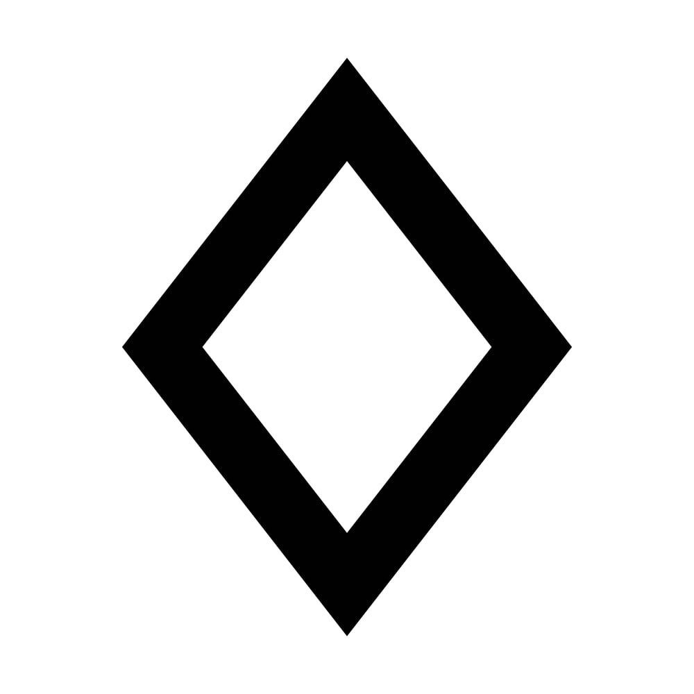
The diamond shape (◊) called a lozenge appears in mathematics, cartography, and old-fashioned typography. Its name comes from an Old French word for a diamond-shaped cake.
Printers used lozenges to mark years in date ranges (1900 ◊ 1950) or to indicate deceased persons in genealogical texts. Mathematicians adopted it to represent certain geometric concepts and set relationships.
The lozenge fell out of common use as typography evolved, but it persists in specialized fields. You’ll find it in heraldry, where it marks the coats of arms of unmarried women, and in phonetics as a symbol for certain vowel sounds.
Why Names Matter for Nameless Things

These marks do their job so quietly, hardly anyone wonders about their names. Yet learning those terms links you to ages of writers, printmakers, book designers – people who built our way of putting words on paper.
Every label holds a tale – medieval scribes hoarding paper scraps, press workers doodging odd symbols, tongues shifting through lands. Next time you punch an ampersand or see a paragraph mark, remember: these gadgets are older than they look.
More from Go2Tutors!

- The Romanov Crown Jewels and Their Tragic Fate
- 13 Historical Mysteries That Science Still Can’t Solve
- Famous Hoaxes That Fooled the World for Years
- 15 Child Stars with Tragic Adult Lives
- 16 Famous Jewelry Pieces in History
Like Go2Tutors’s content? Follow us on MSN.