Best and Worst Sports Uniforms in History
Out on the field, what players put on shapes how they’re seen. More than fabric, it carries history, pride, maybe even a bit of fear in the eyes of rivals.
A strong look sticks – linked to victory, replayed in highlights for years. When it misses the mark, though, attention drifts from play to pattern, from effort to awkward colors clashing under bright lights.
Later on, squads and groups played around with shades, shapes, and ideas – venturing well outside the usual rules. A few bold choices actually worked out fine.
The rest turned into quiet reminders of missteps. A fresh peek at standout sports jerseys through time, both loved ones and hated alike.
What makes certain designs stick around? Some choices just catch eyes more than others.
Looks shift, yet these remain talked about. A few shocks even now when seen again.
Chicago Bulls (1990s)
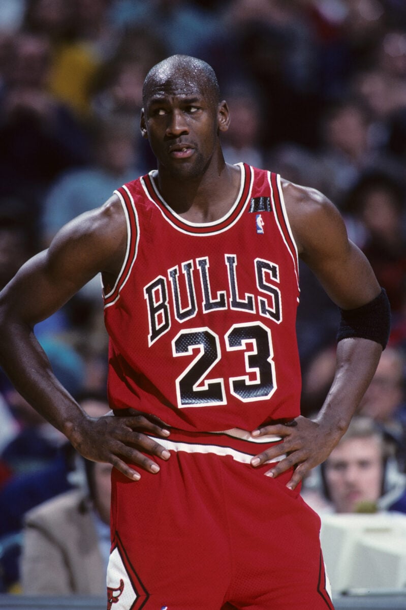
The Chicago Bulls’ 1990s uniform is a masterclass in simplicity and identity. The bold red base, sharp black and white accents, and clean lettering created a look that felt strong without being overdesigned.
It didn’t rely on trends, which is part of why it has aged so well. The uniform became inseparable from the team’s dominance during that era, reinforcing its visual impact.
Even now, it still feels current, which is rare for a design rooted in a specific time.
Chicago White Sox Shorts (1976)
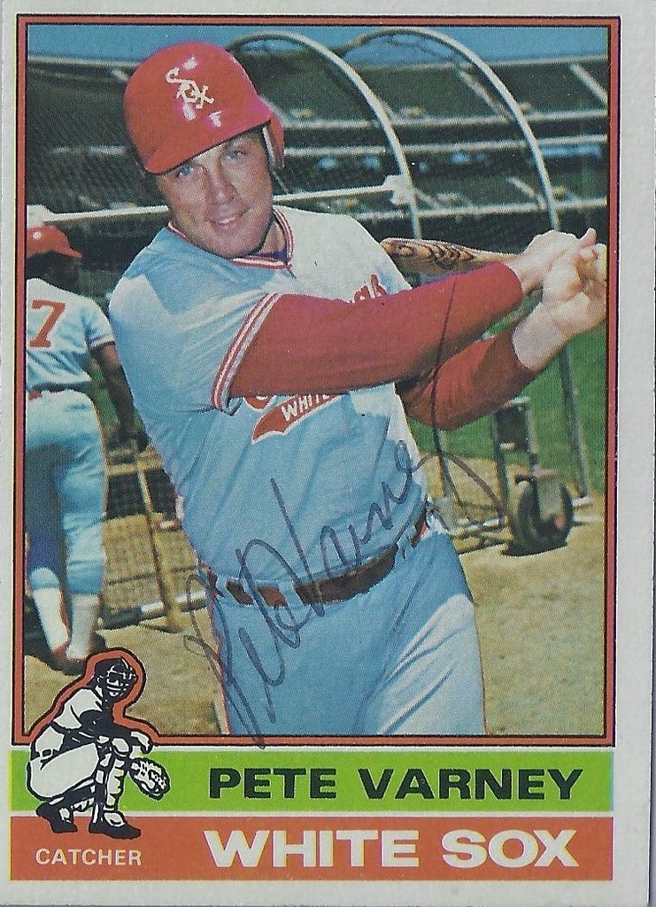
The Chicago White Sox’s decision to introduce shorts into baseball uniforms in 1976 remains one of the strangest experiments in sports. The idea was to modernize the look and improve comfort, but the result felt out of place almost immediately.
Baseball’s structure and movement didn’t align with the design, making it seem more like a novelty than a serious uniform. The players themselves were not particularly enthusiastic.
It’s a clear example of how innovation can clash with the nature of the sport itself.
Brazil National Football Team

Brazil’s national football kit stands as one of the most recognizable in the world. The bright yellow shirt paired with green trim and blue shorts creates a color combination that feels both vibrant and balanced.
It reflects the energy and style often associated with Brazilian football. Over the decades, the design has remained consistent, allowing it to build a strong visual identity.
That continuity has helped it transcend generations without losing relevance.
Vancouver Canucks “Flying V”

The Vancouver Canucks’ “Flying V” jerseys from the late 1970s and early 1980s took boldness to an extreme. The large V-shaped stripes in bright colors created a look that was impossible to ignore.
While the intention may have been to stand out, the result felt overwhelming rather than striking. The design lacked subtlety, making it difficult to take seriously.
Even so, it has gained a kind of nostalgic appreciation, proving that even missteps can find a second life.
New York Yankees Pinstripes

The New York Yankees’ pinstripe uniform is a rare example of tradition done right. The design has remained largely unchanged for decades, relying on simplicity and consistency rather than reinvention.
The vertical stripes create a clean, structured look that feels instantly recognizable. It’s not flashy, but that restraint is exactly what gives it strength.
The uniform carries a sense of history that few others can match.
Tampa Bay Buccaneers “Alarm Clock” Jerseys
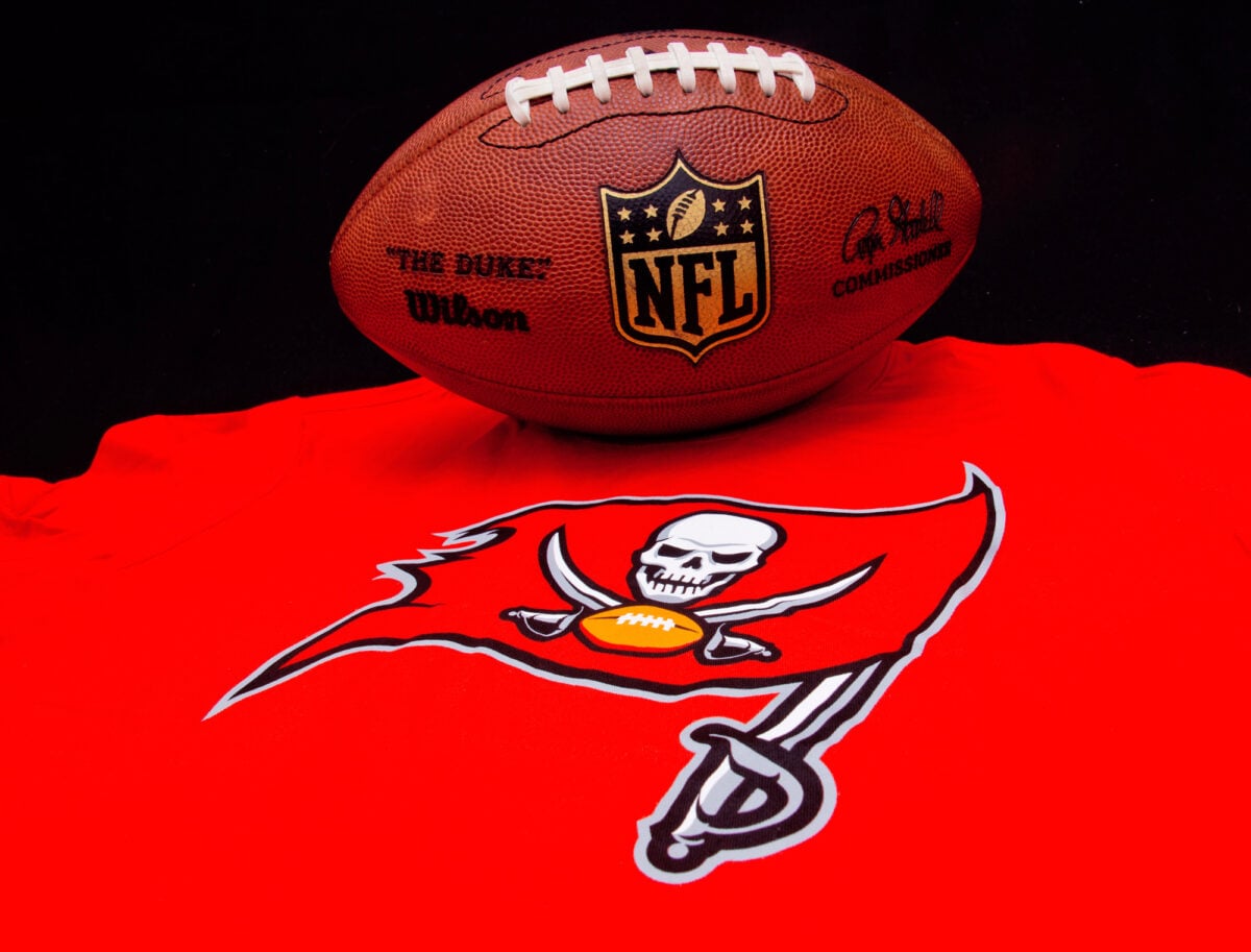
When the Tampa Bay Buccaneers redesigned their uniforms in 2014, the result was widely criticized. The oversized numbers, unusual font, and bright digital-style elements made the jerseys feel cluttered.
Instead of appearing modern, the design came across as forced. The nickname “alarm clock” quickly stuck, reflecting how out of place the numbers looked.
The team eventually moved away from the design, returning to something more traditional.
All Blacks Rugby Kit

New Zealand’s All Blacks have one of the most understated yet powerful uniforms in sports. The all-black design, paired with minimal detailing, creates a sense of focus and intensity.
It doesn’t rely on decoration to stand out, which gives it a timeless quality. The uniform also aligns perfectly with the team’s identity and reputation.
That cohesion between design and performance is what makes it so effective.
Denver Nuggets Rainbow Skyline
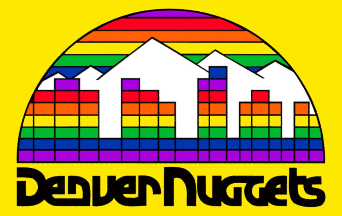
The Denver Nuggets’ rainbow skyline jerseys are often remembered with mixed reactions. While later versions gained appreciation, the original designs felt overly busy.
The combination of multiple colors across the chest created visual clutter that distracted from the rest of the uniform. It was ambitious, but not entirely cohesive.
Still, the concept itself was strong enough to evolve into something more refined over time.
AC Milan Home Kit
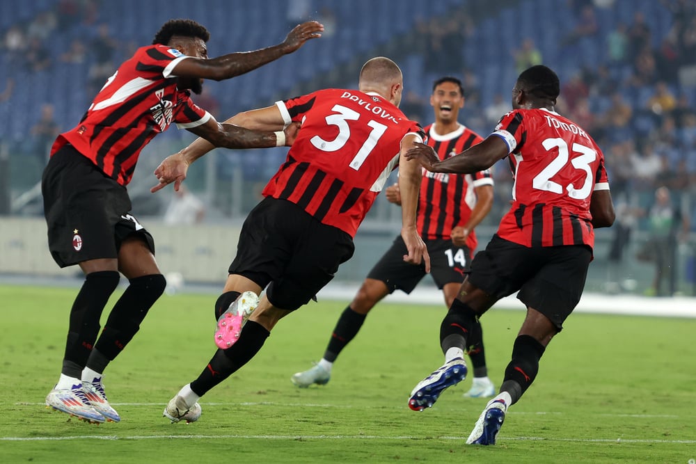
AC Milan’s red and black stripes have become synonymous with elegance and strength. The design strikes a balance between boldness and restraint, using contrast effectively without overcomplicating the look.
Over the years, slight variations have kept the uniform fresh while maintaining its identity. It’s a reminder that consistency doesn’t have to mean stagnation.
The core idea remains intact, even as details shift.
NFL Color Rush Experiments
The NFL’s Color Rush uniforms were designed to create visually striking matchups, but not all of them worked. Some teams ended up with monochromatic looks that felt excessive rather than cohesive.
Bright, saturated colors without contrast made certain uniforms difficult to watch, both in person and on screen. While a few designs succeeded, others became examples of style overtaking practicality.
It highlighted the risk of prioritizing novelty over balance.
Los Angeles Lakers Gold

The Los Angeles Lakers’ gold uniforms are instantly recognizable and deeply tied to the team’s identity. The color itself is bold, but the overall design remains clean and controlled.
Paired with purple accents, it creates a look that feels both vibrant and cohesive. Over time, the uniform has become associated with success, which only strengthens its impact.
It’s a design that feels both celebratory and grounded.
Spain Basketball Gradient Kits

Spain’s basketball uniforms during certain international competitions drew criticism for their unusual patterns. The designs featured gradients and graphic elements that made them resemble sleepwear more than athletic gear.
While the intention may have been to create something distinctive, the execution felt off. The lack of structure in the design made it harder to take seriously.
It’s a reminder that uniqueness needs direction to work effectively.
Green Bay Packers Classic Look
The Green Bay Packers have one of the most consistent uniforms in professional sports. The green and gold color scheme, combined with simple striping and a clean logo, creates a look that feels stable and familiar.
There’s a sense of continuity that connects past and present players. Even so, the design doesn’t feel outdated.
It shows how tradition can remain relevant when handled carefully.
Cameroon Sleeveless Kits

Cameroon’s sleeveless football kits in the early 2000s were bold and unconventional. While they were designed to reflect strength and athleticism, they clashed with traditional expectations of the sport.
The design also raised regulatory issues, leading to disputes with governing bodies. Even so, the kits remain memorable for their willingness to challenge norms.
They stand as an example of how far experimentation can go.
Argentina National Team Stripes

Argentina’s light blue and white striped kit is one of the most elegant designs in international football. The vertical stripes create a sense of movement, while the color palette feels calm and balanced.
The uniform has remained largely consistent, reinforcing its identity over time. It doesn’t need dramatic changes to stay relevant.
Its strength lies in its clarity and simplicity.
Pittsburgh Steelers “Bumblebee” Throwbacks
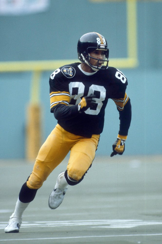
The Pittsburgh Steelers’ throwback uniforms, often referred to as “bumblebee” jerseys, are hard to ignore. The bold horizontal stripes create a look that feels more like a novelty than a competitive uniform.
While they were intended as a nod to history, the design doesn’t translate well to modern expectations. Even so, they’ve become a talking point, proving that visibility isn’t always the same as success.
Real Madrid All White

Real Madrid’s all-white kit is the definition of minimalism. The clean design allows the team’s identity to speak for itself, without unnecessary embellishment.
It creates a sense of clarity and focus that stands out precisely because it avoids excess. Over time, it has become associated with excellence and consistency.
The simplicity is not a limitation—it’s the point.
Jacksonville Jaguars Two-Tone Helmet
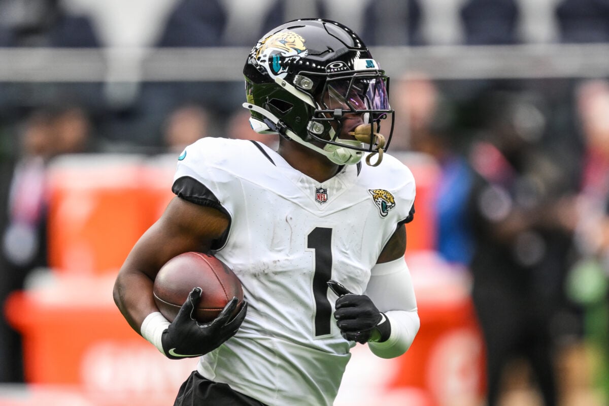
The Jacksonville Jaguars introduced a two-tone helmet that split colors across the design. While the idea was to create something unique, the result felt disjointed.
The abrupt transition between colors made the helmet look unfinished rather than innovative. It quickly became one of the more criticized elements of the uniform.
The team eventually moved away from it, returning to a more cohesive look.
When Style Meets Identity

Uniforms speak louder than colors alone – each choice hints at team pride and public image. Great looks get it right by mixing self-expression with clean lines that last seasons.
Poor attempts go overboard one way or another, muddying the message instead. What stands out most is when restraint meets purpose.
Even now, that pull between old and new lingers. Some teams try fresh ideas, landing well; others miss the mark entirely.
Glancing at past jerseys reminds us fashion shifts – but what makes a look truly work stays steady. What sticks longest feels effortless, as if the jersey grew right out of the team itself.
More from Go2Tutors!

- The Romanov Crown Jewels and Their Tragic Fate
- 13 Historical Mysteries That Science Still Can’t Solve
- Famous Hoaxes That Fooled the World for Years
- 15 Child Stars with Tragic Adult Lives
- 16 Famous Jewelry Pieces in History
Like Go2Tutors’s content? Follow us on MSN.