Desktop Widgets Everyone Installed in the 2000s
There was a period in the mid-2000s when customising your desktop felt like a genuine hobby. You’d spend an afternoon hunting down the right combination of widgets, skinning your media player, and positioning everything just right on a wallpaper you’d downloaded from DeviantArt.
The desktop wasn’t just where your files lived — it was a statement. And widgets were the main event.
The Clock Widget
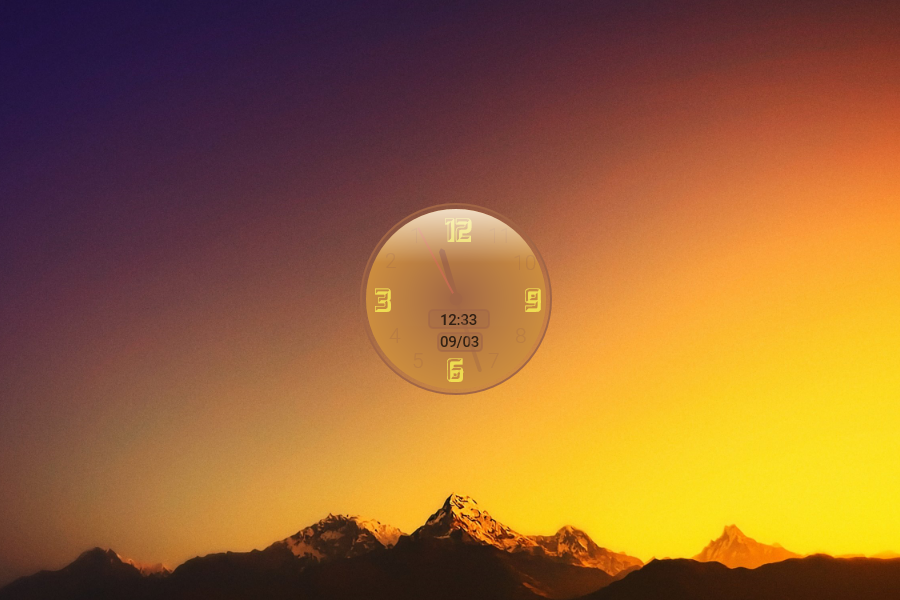
Every widget pack started with a clock. Always. It didn’t matter that your computer already displayed the time in the corner of the screen — that was a system clock, small and boring.
The widget clock was analog, or it had a brushed metal finish, or it glowed, or the numbers flipped like an airport departure board. Some people had two. The redundancy was never the point.
Yahoo! Widget Engine

Before Apple called them widgets and before Google got involved, Yahoo! Widget Engine — originally released as Konfabulator in 2003 before Yahoo acquired it — was the platform that started it all for many Windows users. It ran small JavaScript-powered applications directly on your desktop and spawned an entire community of developers building everything from weather displays to stock tickers to mini games.
When Yahoo eventually shut it down in 2012, it felt like the end of an era.
Windows Sidebar and Gadgets

Microsoft’s official answer arrived with Windows Vista in 2007. The Sidebar was a vertical panel docked to the side of your screen that held Gadgets — small apps for weather, news headlines, CPU meters, sticky notes, and slide shows.
The concept made sense on paper. In practice, the Sidebar ate RAM, slowed older machines down noticeably, and Microsoft eventually discovered serious security vulnerabilities in the Gadget platform.
Windows 8 removed it entirely. The dream died quietly.
CPU and RAM Monitors
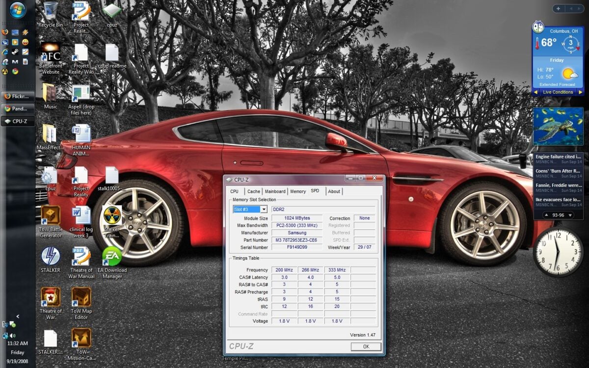
A significant portion of the 2000s desktop culture was devoted to watching your own computer struggle. CPU usage meters, RAM graphs, hard drive activity indicators — these widgets existed so you could observe, in real time, exactly how close your machine was to its limits.
They served a practical purpose on underpowered hardware, but they also just looked good. A pulsing green graph against a dark desktop had a certain aesthetic that appealed to anyone who wanted their setup to resemble a command centre.
Weather Widgets
Weather widgets were possibly the most universally installed category of the entire era. You’d enter your city, and a small display would show you the current conditions, a five-day forecast, and an animated icon — a sun, clouds, raindrops, a little lightning bolt.
The animations were the real draw. AccuWeather, The Weather Channel, and Weather Watcher all had desktop versions, and people would sometimes install multiple ones before settling on the one with the best icons.
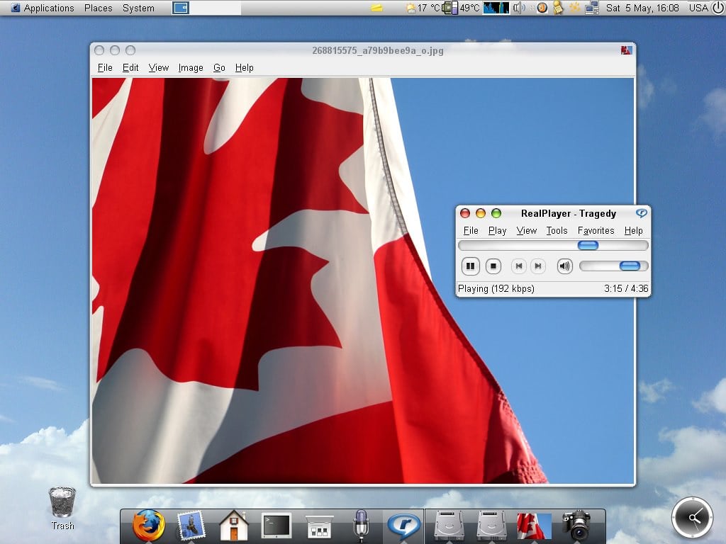
Winamp and Media Player Skins

Winamp deserves special mention because it wasn’t technically a widget, but it functioned like one. The entire point of Winamp in its prime was that you could make it look like anything — a spaceship, a cassette deck, a vintage radio, a chrome orb.
The community at Winamp.com hosted thousands of skins, and downloading and testing them was its own weekend activity. When it visualised your music with colour-shifting geometric patterns filling the whole screen, it felt like the future.
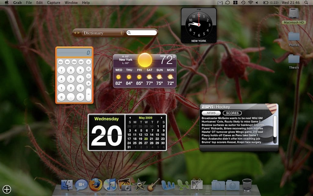
Sticky Notes
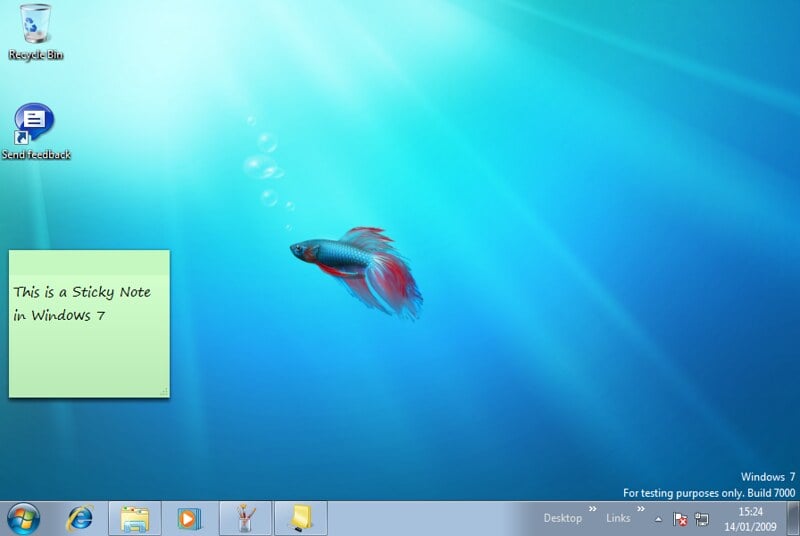
Before there were apps for everything, sticky note widgets filled an important gap. You’d scatter virtual yellow squares across your desktop with reminders, phone numbers, things you meant to google, and passwords you definitely shouldn’t have written down anywhere.
Stickies for Mac and similar tools on Windows built real user bases. Some people’s desktops were barely visible under the note coverage, which somewhat defeated the purpose but felt very organised in the moment.
Calendar and Date Widgets
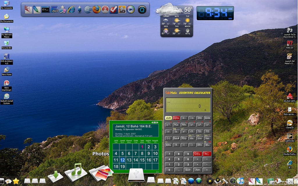
The companion to the clock widget was always a calendar. Small monthly grids would sit in a corner of the desktop, sometimes with the current date highlighted, sometimes with the ability to mark events.
They synced with nothing. They connected to nothing.
You couldn’t click a date and add a reminder. They just showed you what month it was in a more visually interesting way than the taskbar offered, and somehow that was enough.
Rainmeter
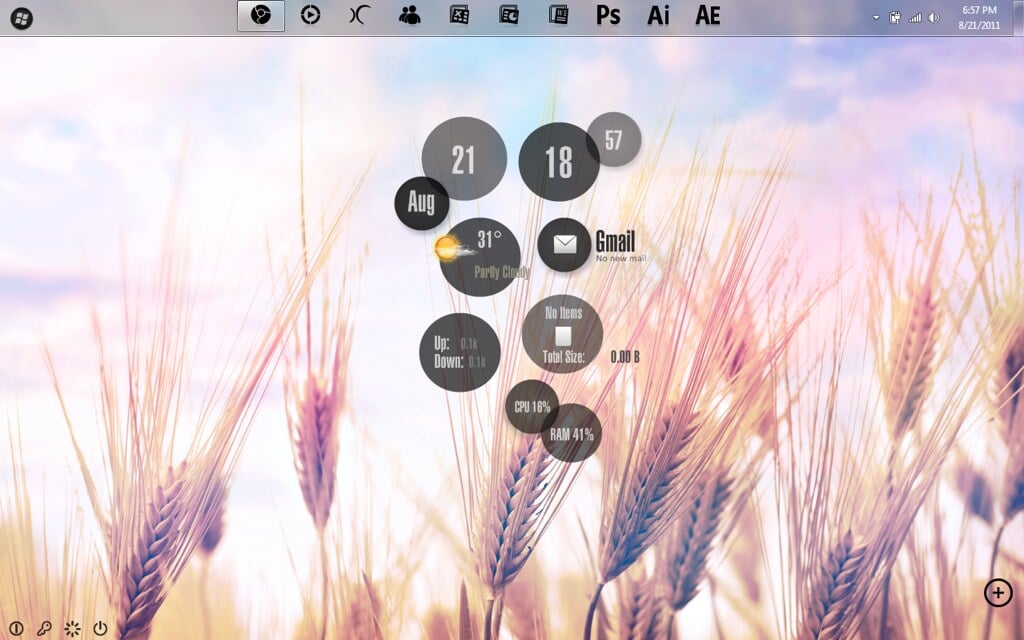
Rainmeter launched in 2001 but hit its stride through the late 2000s and into the 2010s as the most powerful desktop customisation tool available for Windows. Unlike simpler widget platforms, Rainmeter lets you build or download entire desktop themes — cohesive systems of clocks, weather panels, music players, system monitors, and launchers that turned your desktop into something that looked like it belonged in a science fiction film.
The learning curve was steep, but the community produced stunning results, and Rainmeter is still actively developed today.
RSS Feed Readers

For a few years in the mid-2000s, RSS felt like it was going to change how everyone consumed information. Desktop widgets let you pull in headlines from your favourite websites directly onto your desktop — news, blogs, sports scores, whatever you follow.
You’d glance at your desktop and see the latest posts from a dozen sites without opening a browser. Google killed Google Reader in 2013, social media absorbed the habit, and RSS quietly retreated to a niche it still occupies today.
iTunes Companion Widgets
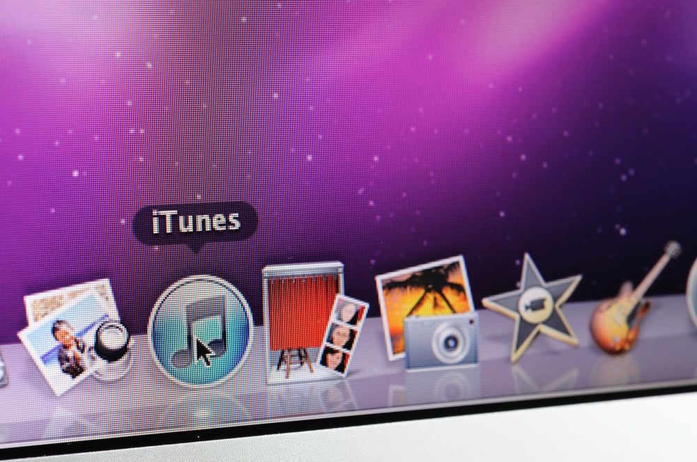
Once iTunes took over music libraries on both Mac and Windows, a whole ecosystem of companion widgets appeared. They’d show the current track, album art, playback controls, and ratings — sometimes as a compact bar at the top of the screen, sometimes as a full mini-player.
The appeal was avoiding the need to switch windows just to skip a song. Some were polished enough that they looked better than the iTunes interface itself, which in certain years was not a high bar to clear.
Battery and Power Monitors
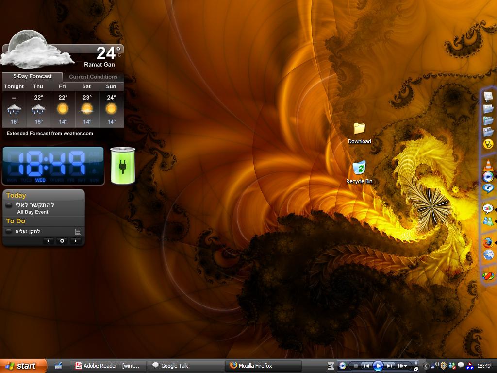
Laptop ownership was growing through the 2000s, and battery widgets became standard for anyone working away from a power socket. They’d display remaining charge as a percentage, a bar, a graphic of a battery slowly draining, or sometimes all three at once.
A few added estimates of time remaining based on current usage. The system tray already had this information, but the widget version was bigger, more visible, and — most importantly — more interesting to look at.
Flag and Language Switchers
Multilingual users and anyone who typed in more than one script often installed small flag widgets that displayed the current keyboard language and let you switch between inputs with a click. Windows had its own language bar, but it was ugly, and third-party alternatives looked significantly better.
It was a small thing, but for people who needed it, it lived permanently in their widget setup.
The Desktop Clock That Did Everything

Near the end of the widget era, developers started combining everything into single panels — clock, date, weather, calendar, and sometimes a motivational quote all in one compact display. These all-in-one widgets were partly a response to desktop clutter.
After years of adding individual widgets, some users swung to minimalism, wanting one clean panel instead of fifteen separate things scattered around a wallpaper. The cycle of accumulation and simplification that defined desktop culture in general played out in miniature, right there on the screen.
The Desktop as a Hobby

What was going on with desktop toys at that strange little age? It was not really the gadgets themselves that stood out, rather it was the way people demonstrated their love for them. In fact, playing around with the arrangement of one’s screens was something that one could consider perfectly normal or a nice little fun distraction.
Entire message boards would be devoted to just exchanging images and discussing the arrangements. If they decided to wipe their system clean, the majority would meticulously rebuild every single detail just as if they were decorating their favorite house.
It was the advent of phones that really distracted people. Home screens once again started to have widgets, the same happened to watches.
However, the desktop as a place where one could be playful – something that one could gradually shape during one’s leisure time – has been changed. It has lost something when those transparent clocks, utterly useless but perfectly placed over old wallpapers, disappeared.
More from Go2Tutors!

- The Romanov Crown Jewels and Their Tragic Fate
- 13 Historical Mysteries That Science Still Can’t Solve
- Famous Hoaxes That Fooled the World for Years
- 15 Child Stars with Tragic Adult Lives
- 16 Famous Jewelry Pieces in History
Like Go2Tutors’s content? Follow us on MSN.