Incredible Facts About the Psychology of Color
Bright shades aren’t only decoration. How someone feels can shift when red appears instead of blue.
A choice might lean one way after seeing green near it. Even without noticing, color guides actions every day.
Paint on a wall sets a quiet tone through the hours. The mark on a bottle – simple, small – still tugs at thought.
Behind every glance is meaning hiding in tones. What if color shapes your thoughts more than you think?
A few odd facts pop up when minds run into hues. Strange reactions start behind the eyes.
Feelings shift without warning. Light bends perception in quiet ways.
Tiny changes stir big moods. Each shade carries hidden weight.
Surprises wait inside ordinary sight.
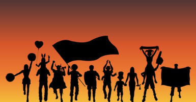
Red Makes People Hungry

Red shows up everywhere on fast food joints for a reason. It jolts your pulse, nudging you to scarf down meals faster than usual.
Watch how those walls, logos, chairs often carry that shade – it pushes hunger cues front and center. Ordering just flows easier when the surroundings hum with energy.
Ever notice how drive-thru boards practically glow in crimson? Not random at all.
Calmness comes more easily when blue is around.
Yellow Grabs Attention Faster Than Other Colors

Yellow grabs your attention fast – no surprise it shows up on warning labels and markers. Our eyes spot this hue quicker than any other.
Bright signals often lean on yellow to stand out clearly. Yet filling a room with too much of it might stir unease or irritation.
Strong reactions come easily when the shade dominates. Just a touch delivers impact without overload.
Pink Reduces Aggressive Behavior

Pink shows up in some prison cells and guest locker rooms since it tends to relax whoever enters. A strange color choice maybe, yet studies back how it saps intensity.
Energy slips away under its tint, leaving little room for rage or sharp edges. Walking into that glow can mute the drive to fight hard.
Odd as it seems, the result holds up.
Green Improves Creativity

Green views spark fresh thoughts, studies show. A leafy scene outside shifts mental gears slowly.
This hue invites wandering minds instead of rigid ones. Being near trees or plants loosens thought patterns quietly.
Ideas flow easier under such calm influence. The mind stretches further beside grass than concrete.
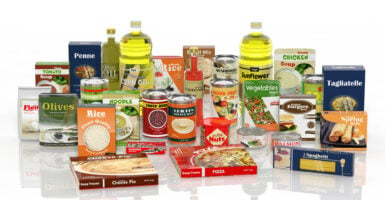
Orange Encourages Impulse Buying

Something about orange pulls people in – shops pick it for sale tags and order prompts since it sparks energy, yet stays calmer than red. This shade tricks buyers into thinking bargains are better, nudging faster choices.
Websites slap it on payment links too, chasing that same nudge. Warmth hides inside its brightness, making clicks seem easier while still standing out loud.
Black Suggests Luxury and Power

High-end brands cover their products in black packaging because the color signals sophistication and exclusivity. People automatically assume black items cost more and are higher quality than the same products in lighter colors.
Fancy cars, designer clothes, and premium gadgets lean heavily on black to communicate status. The color makes things feel serious and important.
White Creates a Sense of Cleanliness

Hospitals and tech companies love white because it makes spaces feel sterile, fresh, and modern. Apple built an entire brand identity around white and minimalism to suggest their products are simple and pure.
Too much white can feel cold and unwelcoming though, which is why most spaces mix it with warmer tones. The color works best when it’s balanced with something softer.
Purple Connects to Spirituality and Imagination

Ancient royalty wore purple because the dye was incredibly expensive and rare, but today the color still carries that special feeling. People associate purple with mystery, creativity, and things that aren’t quite ordinary.
Brands targeting artists or anyone seeking something different often use purple in their designs. It’s the color of thinking outside the box.
Brown Feels Reliable and Down to Earth

Companies selling natural or organic products use brown because it reminds people of soil, wood, and the outdoors. The color doesn’t excite people, but it makes them feel safe and grounded.
Brown isn’t trendy or flashy, which is exactly why it works for brands that want to seem trustworthy. It’s the comfort food of colors.
Gray Appears Neutral but Can Feel Depressing

Corporate offices fill with gray because it’s professional and doesn’t distract anyone. The problem is that too much gray makes spaces feel dull and drains energy from the people in them.
A little gray adds sophistication, but entire rooms of it can leave people feeling unmotivated. Balance matters more with gray than almost any other shade.
Warm Colors Make Rooms Feel Smaller
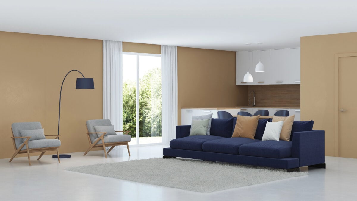
Reds, oranges, and yellows seem to push walls inward, making spaces appear cozier but also more cramped. Interior designers use warm colors in large rooms to create intimacy.
The same trick works in reverse—cool colors like blue and green make small rooms feel bigger and more open. It’s an optical illusion that changes how people experience space.
Color Preferences Shift With Age

Kids typically love bright, primary colors like red and yellow, but adults tend to prefer blues and greens as they get older. This shift happens because life experience changes how people respond to different shades.
Teenagers often go through a phase of liking black and darker colors as part of finding their identity. Taste in color isn’t fixed—it grows and changes.
Cultural Background Changes Color Meaning

White means purity in Western weddings but represents mourning in some Asian cultures. Red signals danger in many places but is the color of celebration and good luck in China.
Brands expanding globally have to rethink their color choices to avoid sending the wrong message. What feels right in one country might feel completely wrong somewhere else.
People Judge Products Within Seconds Based on Color Alone

Shoppers form opinions about items in less than 90 seconds of first seeing them, and up to 90 percent of that judgment comes from color. The actual features or quality barely register in those first moments.
Smart companies spend serious time picking the right shades because they know color makes or breaks that crucial first impression. It’s not shallow—it’s just how brains work.
Colors Stick Together

Think about how much colors shaped every decision today, from what to wear to which brand to trust. The shades surrounding everyone right now are quietly nudging thoughts and feelings in specific directions.
Understanding color psychology doesn’t take away its power—it just reveals how much the world is painted on purpose.
More from Go2Tutors!

- The Romanov Crown Jewels and Their Tragic Fate
- 13 Historical Mysteries That Science Still Can’t Solve
- Famous Hoaxes That Fooled the World for Years
- 15 Child Stars with Tragic Adult Lives
- 16 Famous Jewelry Pieces in History
Like Go2Tutors’s content? Follow us on MSN.