Olympic Medals With Very Odd Designs
Medals at the Olympics normally look much alike – round, shiny, metal, rooted in habit. Still, now and then, cities hosting the games stretch their imagination, nudging aside old ideas of medal design.
Culture from the region might shape them, or nearby resources play a role, sometimes even signals about nature care and belonging find space. Some stand out sharply next to typical versions, feeling unlike anything seen before.
Through years, such picks gave rise to keepsakes people talk about, recalled less for the winners than for how wildly they stepped off script. A few Olympic medals caught attention – not for the winners, but how they looked.
Some broke molds with shapes nobody saw coming. Others went wild with colors or materials.
A twist here, a surprise there – they didn’t play it safe. These weren’t your typical shiny discs handed out after races.
Each one carried something odd, fresh, different. The details made them memorable.
Not tradition – something else entirely.
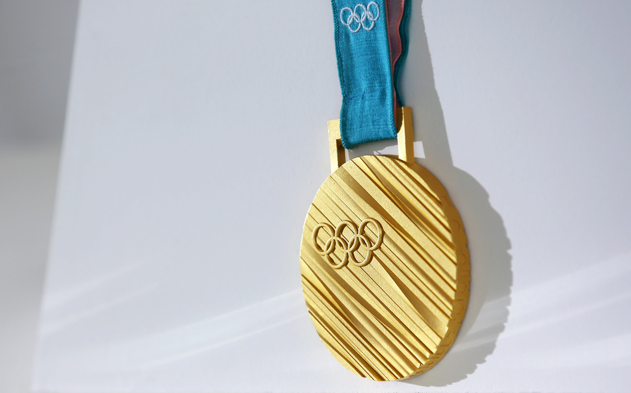
Albertville 1992
The Albertville Winter Olympics introduced one of the most distinctive medal designs in Olympic history. Instead of being made entirely from metal, the medals featured a central piece of glass crafted by a French crystal manufacturer.
This combination created a striking contrast between transparency and solid metal. At the time, it was a bold departure from tradition.
The use of glass added an artistic quality, making the medals feel more like crafted objects than purely symbolic awards. It also raised practical questions around durability, which only added to the intrigue surrounding the design.
Even so, the medals held up well, reinforcing the idea that innovation doesn’t have to come at the expense of function.
Lillehammer 1994
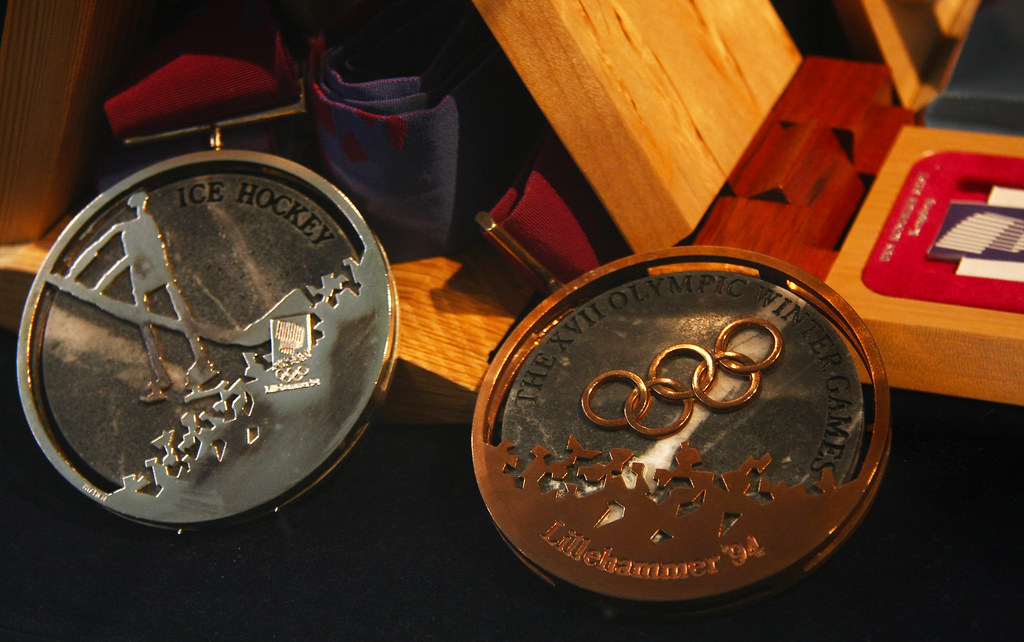
The Lillehammer medals continued the trend of unconventional materials by incorporating granite. Each medal included a slice of stone, reflecting Norway’s natural landscape and rugged terrain.
The design emphasized a connection to place rather than just prestige. This approach gave the medals a grounded, almost tactile identity.
Holding one felt noticeably different compared to traditional designs, reinforcing the idea that materials can shape perception just as much as appearance. It also added a quiet authenticity, tying each medal directly to the environment it represented.
Nagano 1998
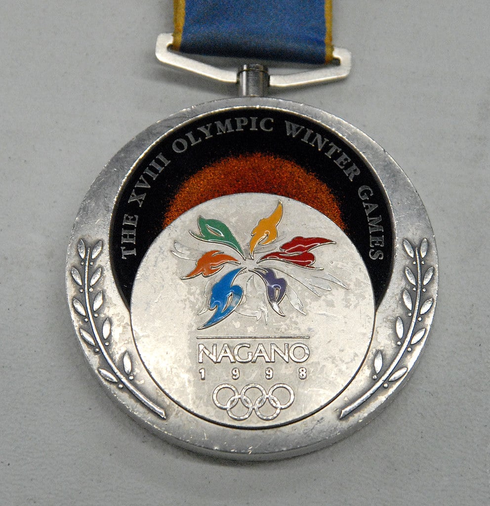
Nagano’s medals were designed with layered lacquer and intricate detailing, drawing from traditional Japanese craftsmanship. The structure included multiple components, giving the medals a more complex, almost assembled appearance.
While still circular, the design felt more decorative than usual. It highlighted artistry over uniformity, creating a piece that felt closer to traditional craftwork than mass-produced metal.
This emphasis on heritage gave the medals a cultural depth that extended beyond the event itself.
Sydney 2000
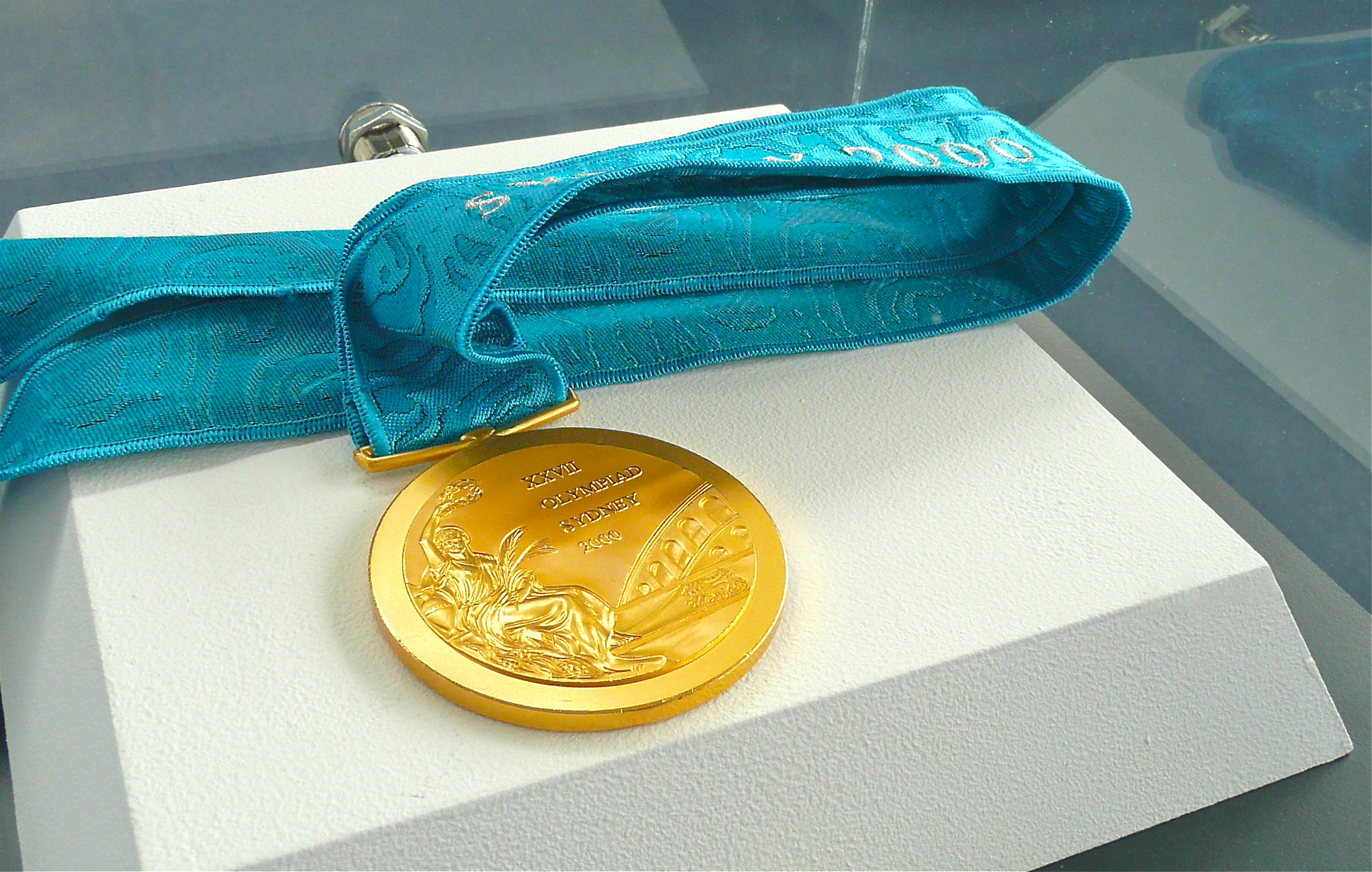
Sydney’s medals sparked discussion due to their depiction of a Roman amphitheater rather than a structure tied to Australian culture. While visually detailed, the choice of imagery felt out of place for some observers.
Even so, the design remains notable for how it balanced tradition with subtle regional elements. It also highlighted the tension between Olympic continuity and local identity, something future host cities would approach more deliberately.
That conversation alone made the medals memorable.
Athens 2004
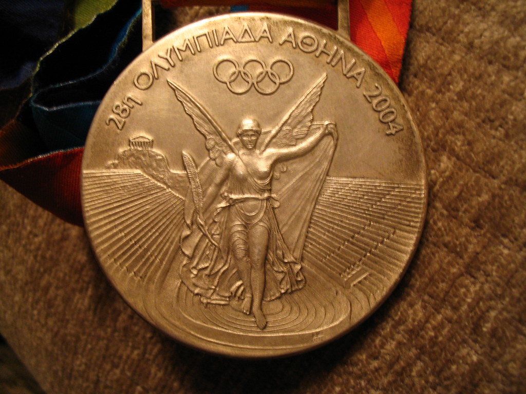
Athens reimagined the traditional medal imagery by updating long-standing design elements. The front side moved away from earlier depictions and introduced a more refined representation tied to Greek heritage.
This shift wasn’t dramatic in shape or material, but it marked a conceptual change. It showed that even subtle updates can feel significant when tradition is involved, especially in a location so closely tied to Olympic origins.
The result felt both respectful and quietly modern.
Beijing 2008
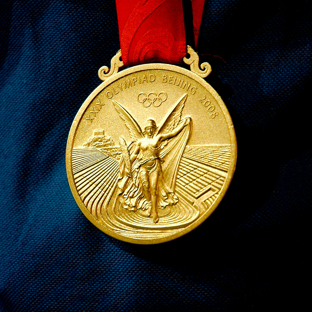
Beijing’s medals incorporated jade, a material deeply rooted in Chinese culture. The stone was set into the metal, creating a visual contrast and adding symbolic meaning tied to purity and virtue.
The inclusion of jade made the medals feel both ancient and modern at the same time. It was a design that carried cultural depth while still fitting within Olympic expectations.
Bridging past and present in a tangible way. The craftsmanship involved also elevated the medals into something closer to art.
Vancouver 2010
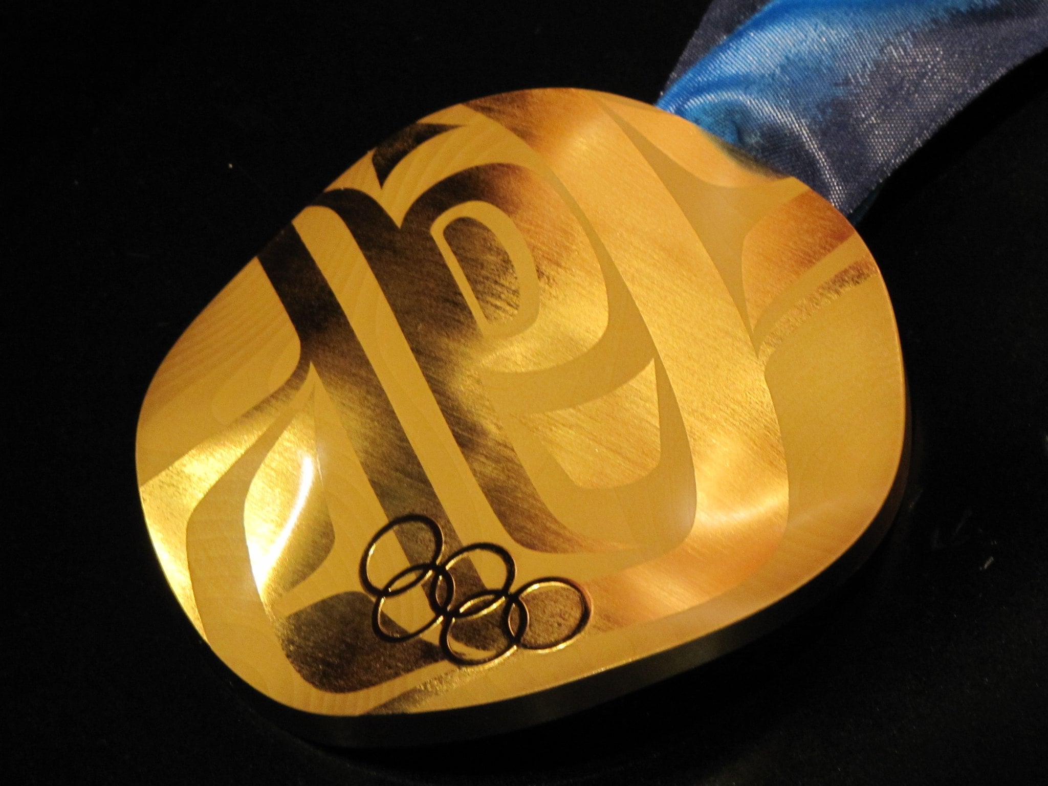
The Vancouver medals featured a flowing, wave-like surface rather than a flat design. Each medal was slightly different, meaning no two were exactly alike.
This introduced a sense of individuality rarely seen in Olympic awards. The textured surface added movement and depth, making the medals visually dynamic.
It also reflected the surrounding landscape, subtly echoing mountains and ocean currents in its design language. That connection gave the medals a sense of place without needing obvious symbols.
London 2012

London’s medals were among the largest and heaviest ever produced. While their overall design remained relatively traditional, their scale made them stand out immediately.
This emphasis on size gave the medals a physical presence that matched the significance of the achievement. Athletes often commented on the weight, which added a literal sense of gravity to the moment.
It served as a reminder that design can influence how an achievement feels, not just how it looks.
Sochi 2014

The Sochi Winter Olympics introduced medals with transparent sections that revealed geometric patterns inside. This layered design created a sense of depth and modernity.
The combination of materials gave the medals a futuristic feel. It reflected a willingness to experiment with structure as well as appearance.
Pushing beyond surface-level design. The transparency also added a visual lightness, contrasting with the usual solidity of medals.
Rio 2016
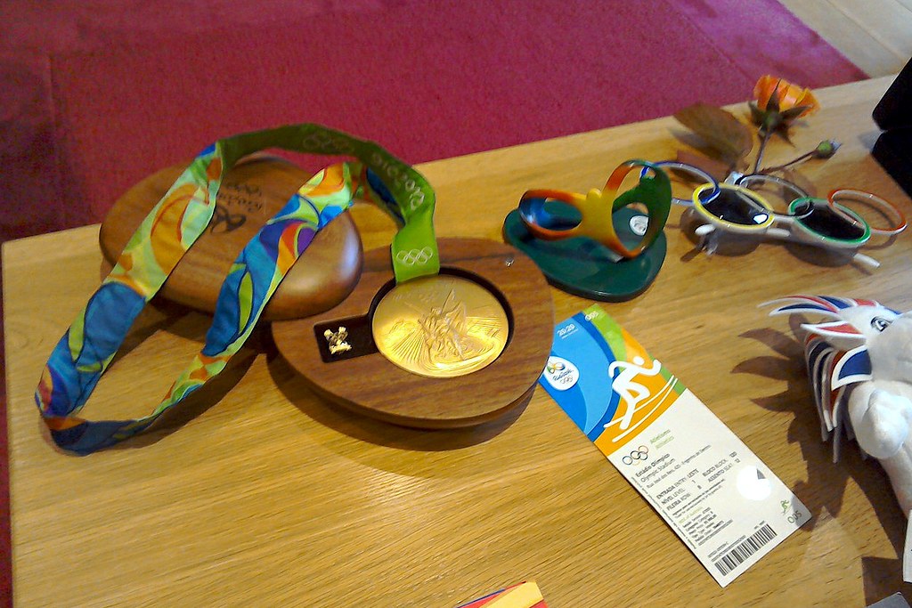
Rio’s medals focused heavily on sustainability, using recycled materials in their production. While the design itself remained relatively simple, the story behind it made it stand out.
This shift in focus highlighted changing priorities. The medals became not just symbols of victory, but also statements about environmental responsibility and global awareness.
It marked a subtle shift toward values that extend beyond sport.
PyeongChang 2018
The PyeongChang medals featured textured surfaces inspired by traditional Korean writing and wood grain patterns. The design emphasized subtle detail rather than bold departures.
Even so, the tactile quality made them feel unique. Running a hand across the surface revealed layers of meaning that weren’t immediately visible.
Rewarding closer attention. It showed how design can invite interaction rather than just observation.
Tokyo 2020
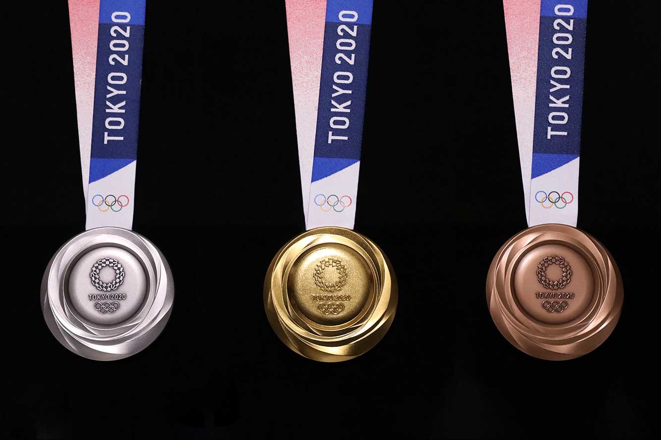
Tokyo’s medals were created entirely from recycled electronic devices, including old phones and gadgets. This approach turned everyday discarded items into objects of global significance.
The design itself remained clean and modern, but the concept behind it made it one of the most talked-about medal sets. It reflected a forward-thinking approach to both design and sustainability.
While quietly reminding people of the hidden value in everyday materials. The idea that something so ordinary could be transformed into a symbol of excellence added an extra layer of meaning.
Why These Designs Still Stand Out

Something sticks about these medals beyond their shine – it’s the weight of what they stand for. One after another, they capture times when old ways brushed up against bold tries, making room for change while keeping core values intact.
As years passed, the way they looked began shifting opinions on what an Olympic medal could be, quietly inviting fresh ideas into a long-held ritual. Still ready to change, today’s game makers borrow from old ideas but twist them into something new.
Built on centuries of rules, yet somehow never stuck in the past. Because reinvention sneaks in through small shifts – keeping the Olympics breathing like a thing that grows instead of one frozen in time.
More from Go2Tutors!

- The Romanov Crown Jewels and Their Tragic Fate
- 13 Historical Mysteries That Science Still Can’t Solve
- Famous Hoaxes That Fooled the World for Years
- 15 Child Stars with Tragic Adult Lives
- 16 Famous Jewelry Pieces in History
Like Go2Tutors’s content? Follow us on MSN.