Secrets Behind Classic TV Show Set Designs
Television sets looked so real that audiences believed they were peering into genuine homes, offices, and starships. Yet behind those familiar walls were half-built rooms, fake doors, and lights arranged with surgical precision.
Here’s a list of the subtle tricks, technical workarounds, and pure creativity that made these iconic TV sets feel authentic—despite being illusions held together by plywood and paint.
Friends Apartment
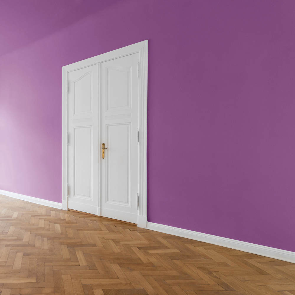
The lavender walls weren’t chosen on a whim—they were strategic. Early tests with neutral tones made the actors blend into the background under bright lighting, so the production team turned to purple to make every scene pop.
Every item in Monica’s kitchen was fixed in place to prevent accidental movement, from the hanging pans to the magnets on the fridge. Even so, the place looked perfectly lived-in, balancing chaos with control.
The Brady Bunch House
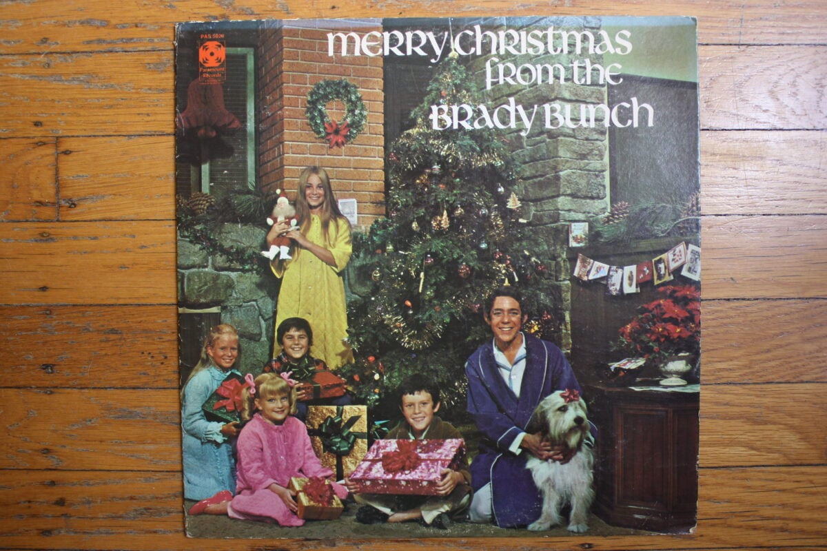
The staircase, one of the show’s most memorable features, went absolutely nowhere. Just a few steps—and then a wall.
The interior was built wider than a normal home to allow space for cameras, lights, and crew to move freely. The exterior, though, came from a real house in California used for a single establishing shot.
Still, it became one of the most recognizable TV homes of its era, despite existing mostly in fiction.
I Love Lucy Apartment
The Ricardos’ apartment was constantly redesigned—walls shifted, rooms changed size, and entire sections vanished between episodes. It was practical, not careless.
The flexible layout allowed cameras and lighting to adapt to new scripts each week. Lucy’s kitchen, often only half functional, still looked completely real.
Even so, the magic worked because viewers were too busy laughing to notice a missing corner or reattached wall.
The Office (U.S.)
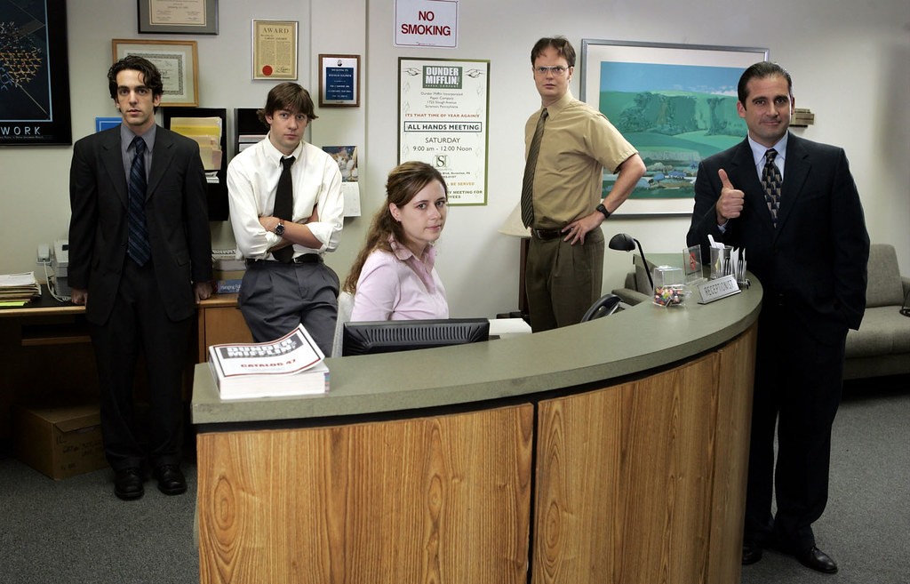
The first season was filmed in a genuine office, complete with humming fluorescent lights and that familiar stale atmosphere. Later, the team built a near-perfect replica on a soundstage.
Every desk, computer, and filing cabinet was placed for camera angles rather than realism—though, oddly, most of the computers actually worked. The actors even typed on live spreadsheets during takes to keep the background natural.
Tedious, but effective.
Cheers Bar
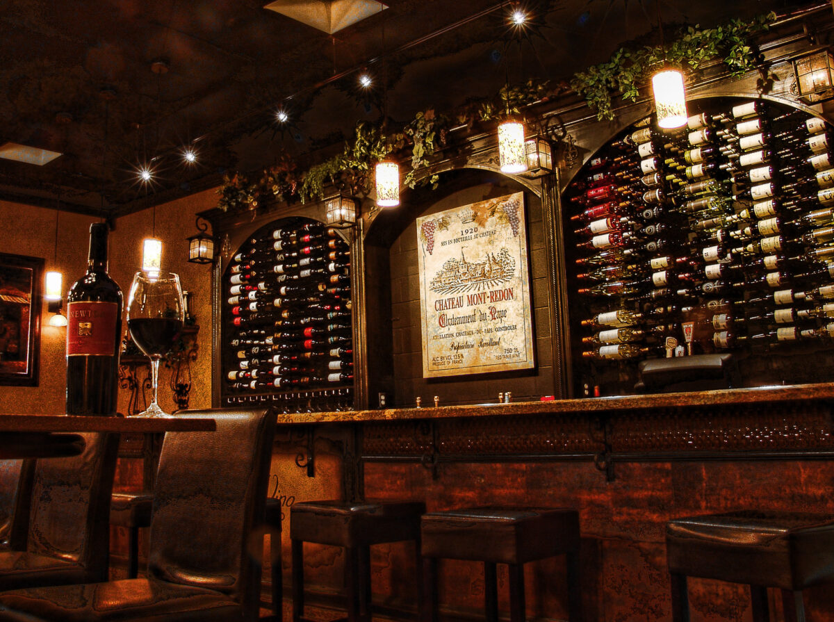
The famous horseshoe-shaped bar wasn’t chosen for style—it was built for efficiency. Its curve allowed multiple conversations to be filmed without breaking the natural flow between characters.
Though the set was large, warm amber lighting and close camera framing made it feel intimate. The beer taps poured colored water, and the background chatter came from carefully timed sound design.
Still, it felt real enough to make viewers wish they could order a drink there.
Seinfeld Apartment
Seinfeld’s apartment was intentionally cramped, a nod to the limitations of New York living. Every prop—from cereal boxes to magazines—was real but swapped often to dodge licensing conflicts.
The geography, though, made no sense. Kramer’s door opened to nothing but a plywood corner, and the hallway didn’t align with the building’s exterior.
Despite this, the space became iconic, proof that logic matters less than familiarity.
The Fresh Prince of Bel-Air Mansion
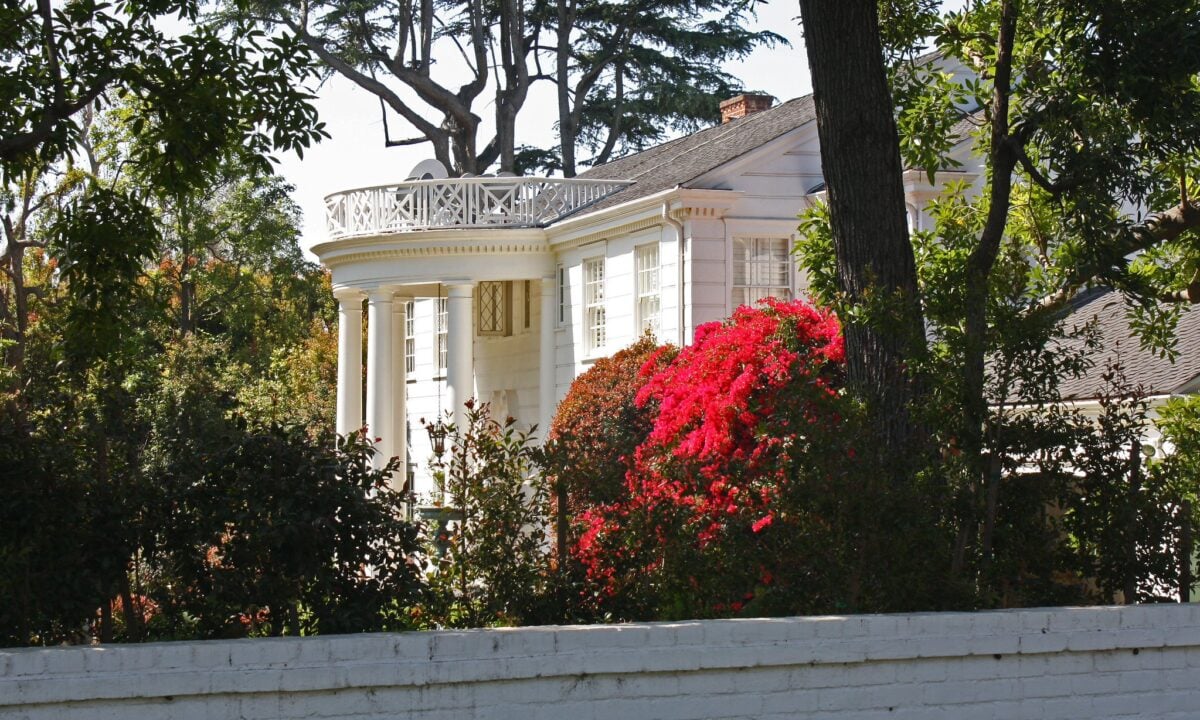
That marble foyer gleamed on-screen, yet the materials were far from expensive. The staircase led nowhere, ending at a small platform hidden by curtains.
The mansion’s grand exterior was a real house in Brentwood, but the cast never filmed there. Still, everything—from chandeliers to polished floors—was arranged to exude effortless wealth.
It sold the illusion beautifully, even if it was all smoke and mirrors.
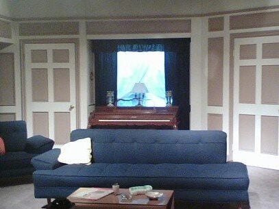
Full House Living Room
The Tanner home, built on Stage 24 at Warner Bros., never came close to San Francisco. Its front door opened to a painted city backdrop, while the staircase ended halfway up. Yet it worked.
Familiar props filled the space season after season—the same mug, a slightly crooked picture frame, and a rug replaced so often it became a running joke. Each detail helped make the house feel genuinely lived in.
MAS*H 4077 Camp

Half of the set was constructed indoors, while the other half stretched across a California ranch that doubled for Korea’s rugged terrain. The “Swamp,” where the main characters lived, suffered constant damage from wind and dust storms.
Not ideal. Even so, the contrast between the two filming locations gave the series its realistic grit. You could almost feel the heat and chaos of wartime.
Star Trek: The Original Series
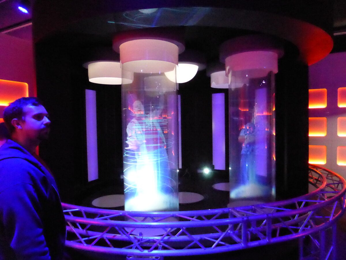
The Enterprise bridge looked futuristic on screen—sleek, glowing, full of purpose. In reality, it was mostly plywood, paint, and colored light filters.
The control panels didn’t function; actors memorized blinking light sequences to make their actions appear coordinated. The transporter effect relied on glitter and lighting fades, yet it felt revolutionary.
Despite this simplicity, the bridge became a symbol of adventure and exploration.
When Illusion Became Home
These sets weren’t just scenery—they were cultural anchors, as familiar as real places. Built from careful design and a little cinematic deception, they created comfort, nostalgia, and entire worlds inside soundstages.
That’s the real magic of television: transforming make-believe into something that feels unmistakably real.
More from Go2Tutors!

- The Romanov Crown Jewels and Their Tragic Fate
- 17 Halloween Costumes Once Considered Taboo
- Famous Hoaxes That Fooled the World for Years
- 15 Child Stars with Tragic Adult Lives
- 16 Famous Jewelry Pieces in History
Like Go2Tutors’s content? Follow us on MSN.