Secrets Behind Symbols We See Every Day
Every day, you walk past innumerable symbols without ever thinking about them. The emoji you use in text messages, the arrow on a delivery truck, or even the icon you tap to turn on your laptop.
They all appear so commonplace, as if they have always simply been there. However, if you look more closely, you’ll discover that the majority of these commonplace symbols are full of intriguing backstories, clever meanings, and occasionally design choices that have become cultural icons.
Consider it this way: Symbols are universally understood visual shorthand, regardless of the language spoken. They clear up confusion, save time, and occasionally even narrate centuries-old tales.
Here are 13 common symbols that you most likely see on a daily basis, along with the hidden meanings behind them.
The FedEx Arrow
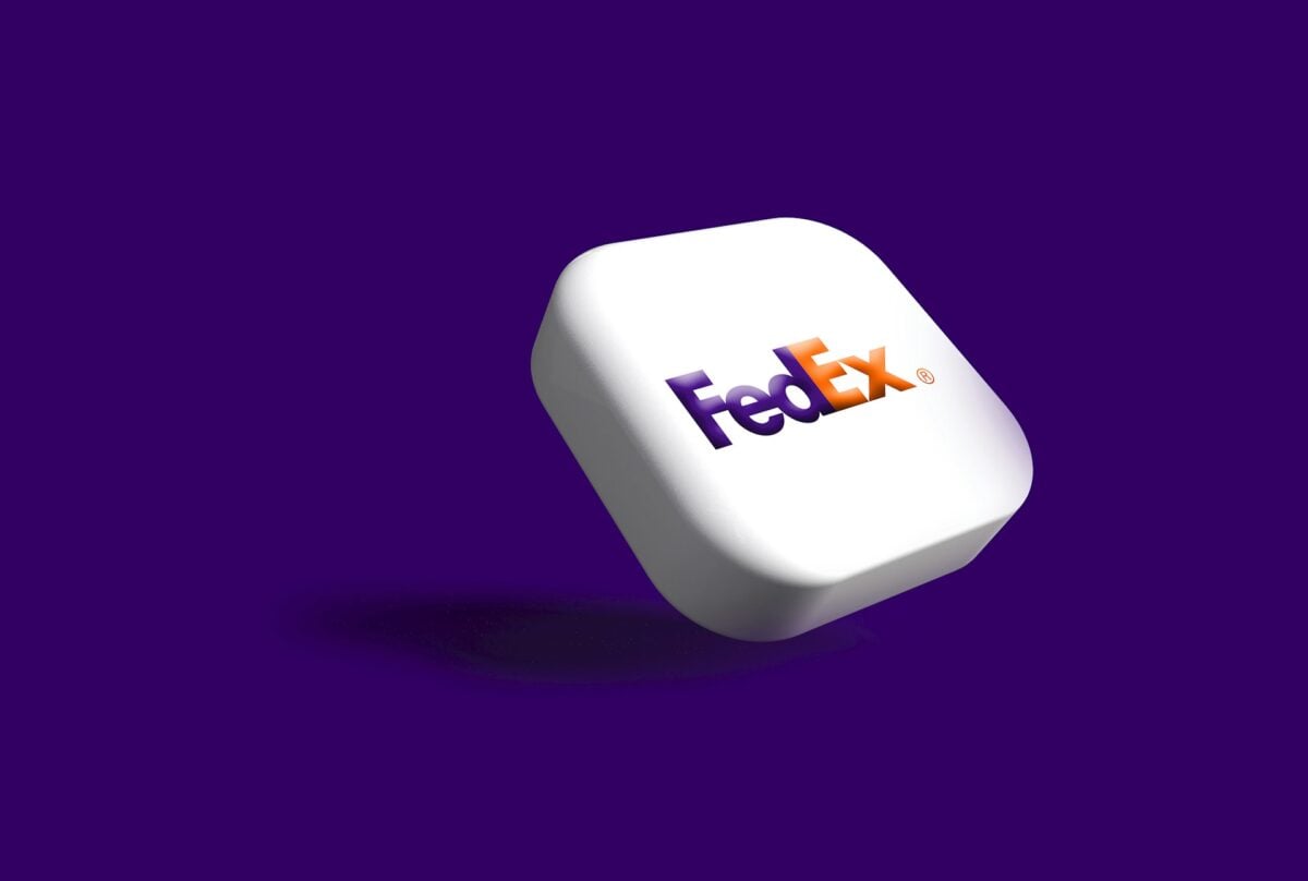
Look closely between the ‘E’ and ‘x’ in the FedEx logo and you’ll spot a perfect white arrow pointing forward. Designer Lindon Leader deliberately created this effect by pairing Futura Bold with Univers 67, carefully adjusting the spacing until the negative space formed an arrow.
After testing over 200 versions, this design perfectly captured the company’s focus on speed and precision. Most people never notice it on their own, but once you see it, you can’t unsee it.
Amazon’s Smile

That cheerful orange swoosh under Amazon’s name does double duty as both a smile and a directional arrow. The design team at Turner Duckworth created this symbol to represent customer satisfaction while cleverly connecting the letter ‘A’ to ‘Z’, showing that Amazon offers everything across the entire spectrum of products.
The smile concept proved so effective that it now appears on shipping boxes worldwide, turning ordinary packages into instant brand recognition.
Like Go2Tutors’s content? Follow us on MSN.
The Power Button
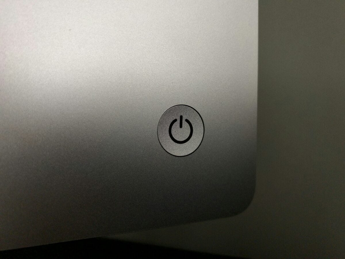
Every electronic device you own has this symbol: a line poking through a broken circle. The design comes straight from binary code, where ‘1’ means on and ‘0’ means off.
Engineers standardized this combined symbol in the mid-1970s as IEC 60417-5009, merging both states into one icon that works on a single push button. It communicates the toggle function perfectly without needing any words, which is why you see it on everything from laptops to microwaves.
Bluetooth’s Viking Heritage
That distinctive B-shaped tech symbol on your phone combines two ancient Norse runes: Haglaz (ᚼ) and Bjarkan (ᛒ), representing the initials ‘H’ and ‘B’. The technology honors King Harald Bluetooth, who united Denmark and Norway in the 10th century.
The name perfectly captured the technology’s purpose of uniting different devices and communication protocols. It’s a brilliant bind rune that connects ancient Scandinavian history to modern wireless convenience.
USB’s Trident
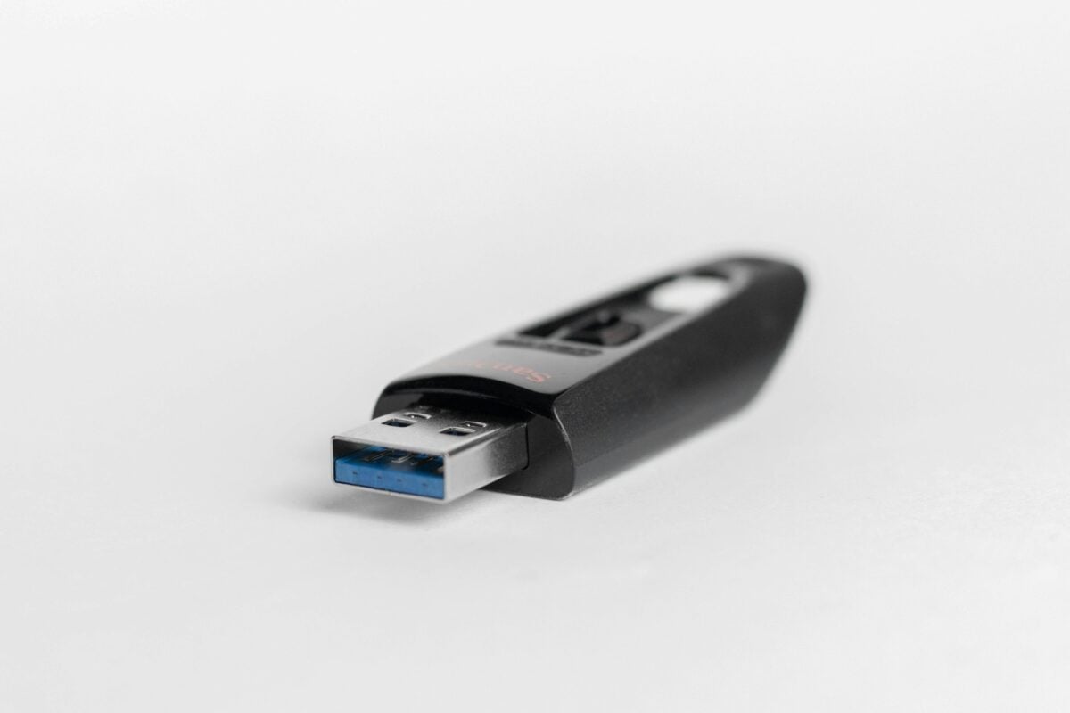
Ever flip a USB connector three times before it finally plugs in? That symbol stamped on the port was inspired by Neptune’s trident, chosen specifically to represent universality and connection.
The three prongs branching from a central point each end with a different shape—circle, triangle, and square—representing the variety of device types this universal connector can handle. It’s a mythological reference that perfectly captures the ‘universal’ part of Universal Serial Bus.
Like Go2Tutors’s content? Follow us on MSN.
The Heart Shape
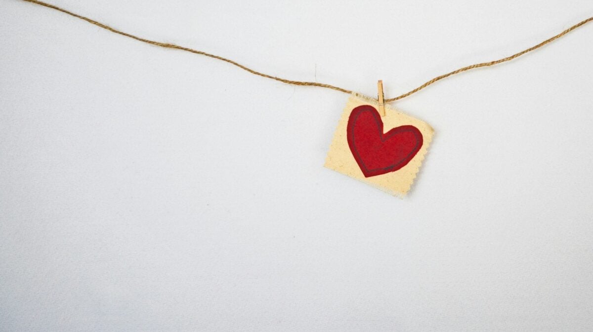
The heart symbol we use for love looks nothing like an actual human heart, and its true origins remain debated among historians. Possible sources include the silphium plant seed used in ancient Rome, stylized ivy leaves from medieval art, or simplified depictions of actual anatomy from early medical drawings.
Regardless of which theory holds true, the symbol has transcended its mysterious beginnings to become the universal icon for love and affection.
The Ampersand
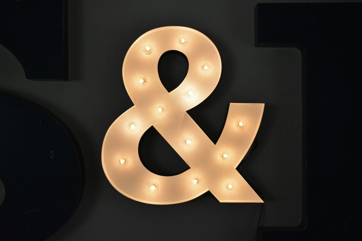
That curvy ‘&’ symbol started as efficient handwriting by medieval scribes who needed to write the Latin word ‘et’ (meaning ‘and’) repeatedly. Over time, the letters merged into one flowing character.
In 19th-century American schools, children often recited it as the last letter of the alphabet, saying ‘and per se and’, which gradually slurred into the word ‘ampersand’. Now it’s everywhere from company names to casual texting.
Recycling’s Möbius Loop

College student Gary Anderson designed those three arrows chasing each other in 1970 for a contest sponsored by the Container Corporation of America during the first Earth Day movement. The continuous loop represents the never-ending cycle of materials being processed and reused.
While the three arrows have since become associated with reduce, reuse, and recycle, Anderson’s original design simply emphasized the circular nature of recycling itself.
Like Go2Tutors’s content? Follow us on MSN.
Peace Sign
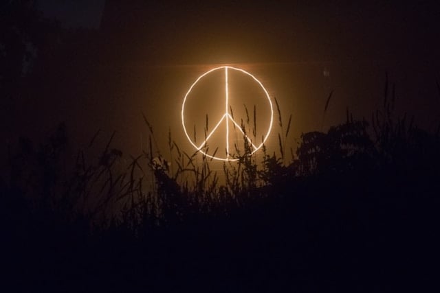
British designer Gerald Holtom created this symbol in 1958 for the UK Campaign for Nuclear Disarmament by combining semaphore flag signals. The downward lines represent the letter ‘N’ and the center line represents ‘D’, standing for nuclear disarmament.
The circle surrounding these signals represents Earth. Though it became iconic during the 1960s peace movement, the symbol never lost its original anti-nuclear message.
Yin and Yang

The swirling black and white circle, properly called the Taijitu, comes from Chinese philosophy and shows how opposite forces actually complete each other. ‘Yin’ represents the shaded side of a mountain while ‘Yang’ means the sunlit side.
The small dot of opposite color within each half is crucial—it shows that within darkness exists light, and within brightness exists shadow. This concept of cosmic balance influences traditional Chinese medicine, martial arts, and Feng Shui.
Radioactive Warning

Scientists at UC Berkeley developed this warning symbol in 1946 to represent atomic radiation danger. The design features propeller-like shapes radiating from a central point, representing particles bursting outward from an atom.
The original used magenta or black on a yellow background for maximum visibility. Its bold, almost aggressive appearance was intentional—something this dangerous needed a symbol people would immediately recognize and respect.
Like Go2Tutors’s content? Follow us on MSN.
Pedestrian Crossing
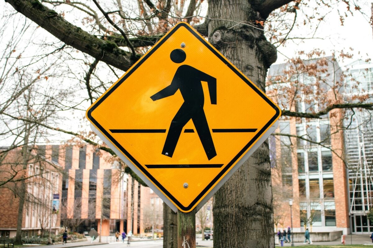
The zebra crossing debuted in the UK in 1949 as part of road safety improvements championed by officials including James Callaghan, who would later become Prime Minister. The British Ministry of Transport designed these bold black and white stripes specifically because they couldn’t be missed by drivers.
The high-contrast pattern works in any weather condition and translates across cultures without needing words, making it one of the most successful safety symbols ever created.
Hazard Warning Triangle
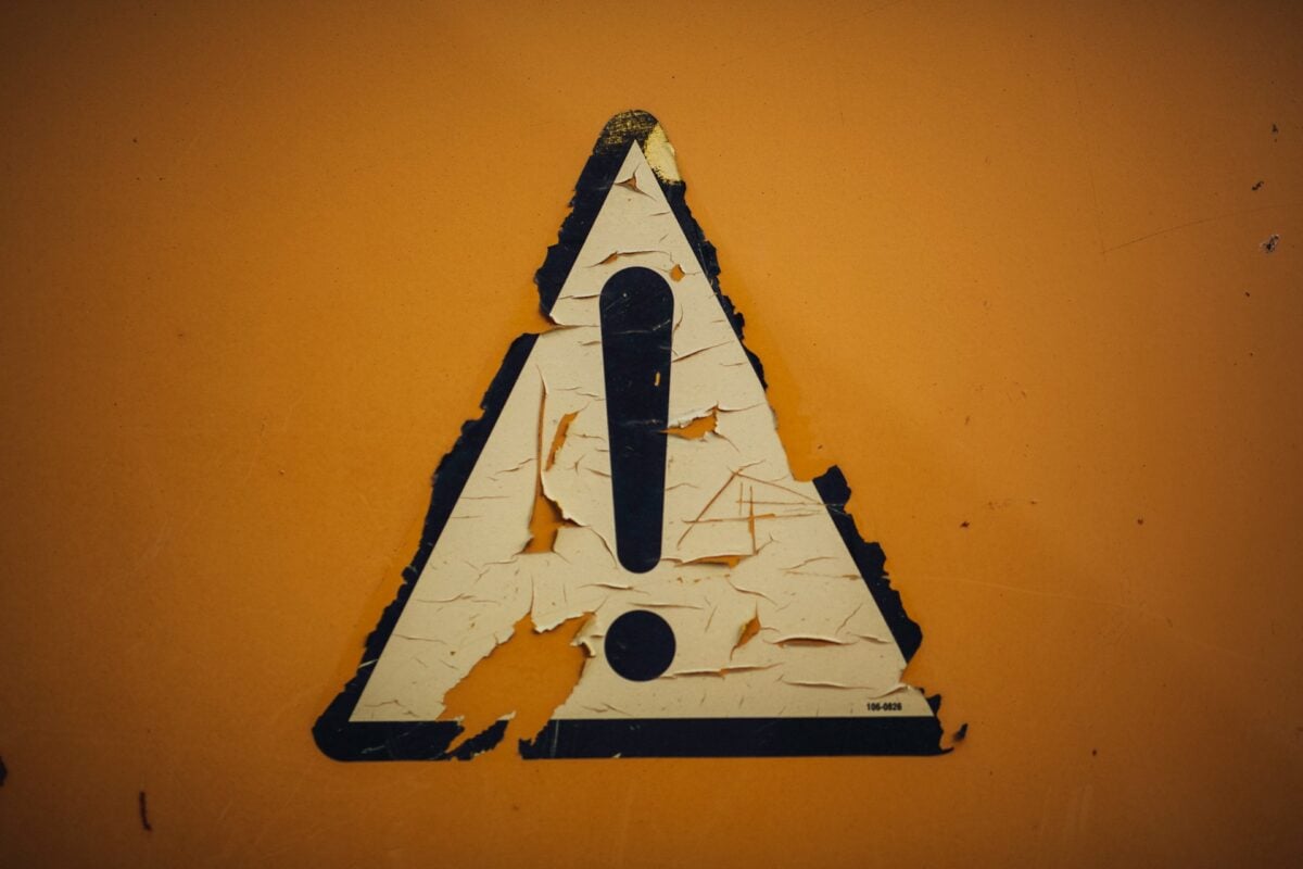
That simple triangle with an exclamation point became part of ISO 7010 safety standards because triangles naturally grab attention with their sharp angles and geometric visibility. The exclamation mark adds urgency without language barriers.
This combination creates an instant visual alert that works across industries, from construction sites to chemical labels. The angular shape stands out even in your peripheral vision, which makes it perfect for warnings.
When Symbols Speak Louder
These symbols demonstrate that effective design doesn’t have to be overt. The most effective ones operate silently in the background, conveying intricate concepts in a moment without uttering a single word.
Some were inspired by ancient history to address contemporary issues, some developed from practical needs, and some were painstakingly planned by teams of designers. Consider the hidden tales that are right in front of you the next time you’re waiting for your computer to start up or unpacking a delivery.
More from Go2Tutors!

- 16 Historical Figures Who Were Nothing Like You Think
- 12 Things Sold in the 80s That Are Now Illegal
- 15 VHS Tapes That Could Be Worth Thousands
- 17 Historical “What Ifs” That Would Have Changed Everything
- 18 TV Shows That Vanished Without a Finale
Like Go2Tutors’s content? Follow us on MSN.