See The Plan Teachers Are Using To Educate Your Kids On Academic Inequality
Inequality is a controversial topic, but that hasn’t stopped public school teachers from teaching it in their classes. Educators, despite the objections of some parents, hare taking on this hot topic and giving kids the training they think they need. But how are they doing it? Here’s what we know about one of the biggest ways teachers are working inequality education into their lesson plans for your kids.
One way they’re using is through a series of graphs. is for teachers to set up a teaching plan to discuss these widening inequalities. They can discuss how these inequalities can be found in segregated neighborhoods and schools of differing quality. But not only can teachers and students discuss it, but they can also see it. In this teaching plan, teachers can offer tangible through graphs.
One way teachers are preaching inequality is through a series of graphs. In particular they’re using The New York Times Learning Network. Since 1998, The New York Times’ The Learning Network has offered content to help people teach and learn. They offer every school day, new and fresh resources for the classroom that start with lesson plans and continue on with quizzes and contests for students. One of their newer lesson plans focuses directly on academic inequality.
In this academic inequality focused portion of the lesson plan, perceived inequalities across our academic landscape are thoroughly discussed. Students will be taught to see from the beginning the troubling academic gap between white students and their Hispanic and black peers in public schools. They are also going to be expected to understand that one of the main reasons for this huge gap is that a much higher proportion of Hispanic and black children come from poor families. In fact, The Educational Project at Stanford University recently published a report where analyzed math and reading test scores from across the country claiming to confirm just how the socioeconomic conditions surrounding these young students matter.
The Data Teachers Use To Prove Inequality To Students
The lesson plan offered by The Learning Network consists of five graphs, each one taking on a different perspective as it pertains to academic inequality.
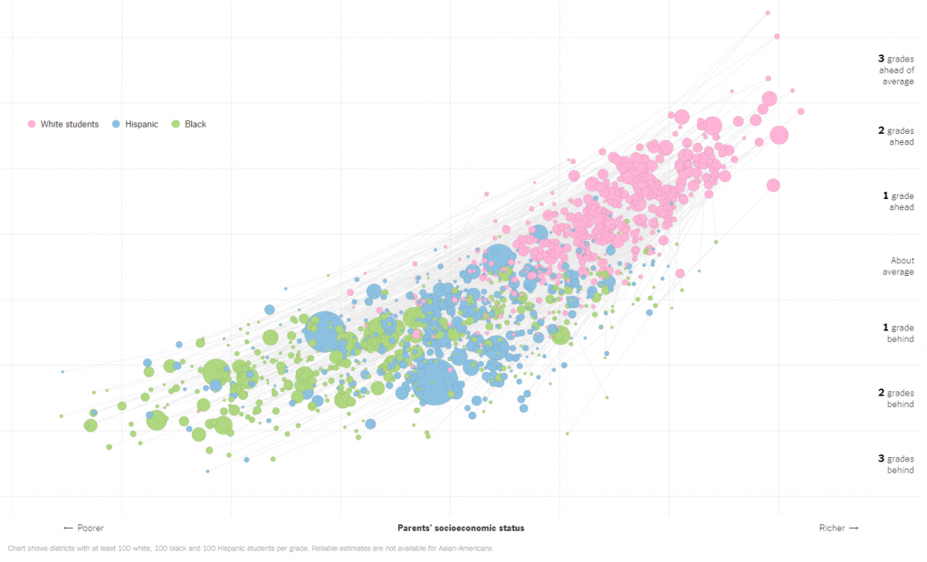
In the first graph, a question is posed: What is the relationship between race, socioeconomic status, and education achievement? The graph that follows takes data from a 2016 news article, Money, Race and Success: How Your School District Compares, and presents to students a candid look at where, based on race, students sit in academic achievement.
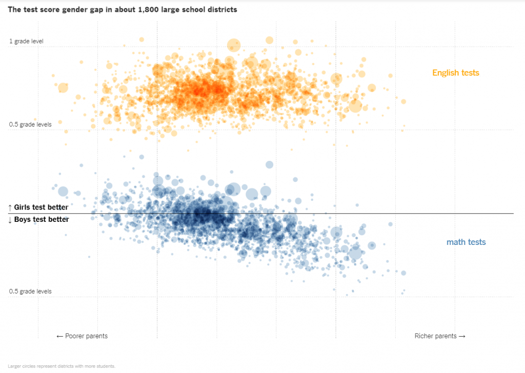
The second graph poses the question: What is the relationship between gender, socioeconomic status, and education achievement? This information was pulled from a 2018 article, Where Boys Outperform Girls in Math: Rich, White and Suburban Districts, and shows in detail where boys test much better than girls and how their economic background plays a large part in it.
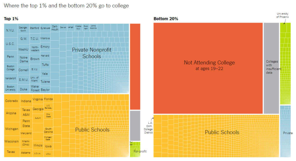
The third graph asks the question: What is the relationship between family income and where you go to college? Taking information from the 2017 article, Some Colleges Have More Students From the Top 1 Percent Than the Bottom 60. Find Yours, the graph breaks down the drastic gap between where the top 1% go to college versus where the bottom 20% go.
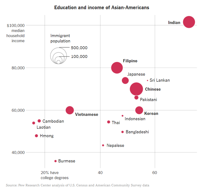
What does education inequality look like in the Asian-American community? is the fourth question posed in the academic inequality lesson plan. The data compiled on the graph, which came from the 2018 article, How ‘Crazy Rich’ Asians Have Led to the Largest Income Gap in the U.S.,” speaks to both the income and education of Asian-Americans.
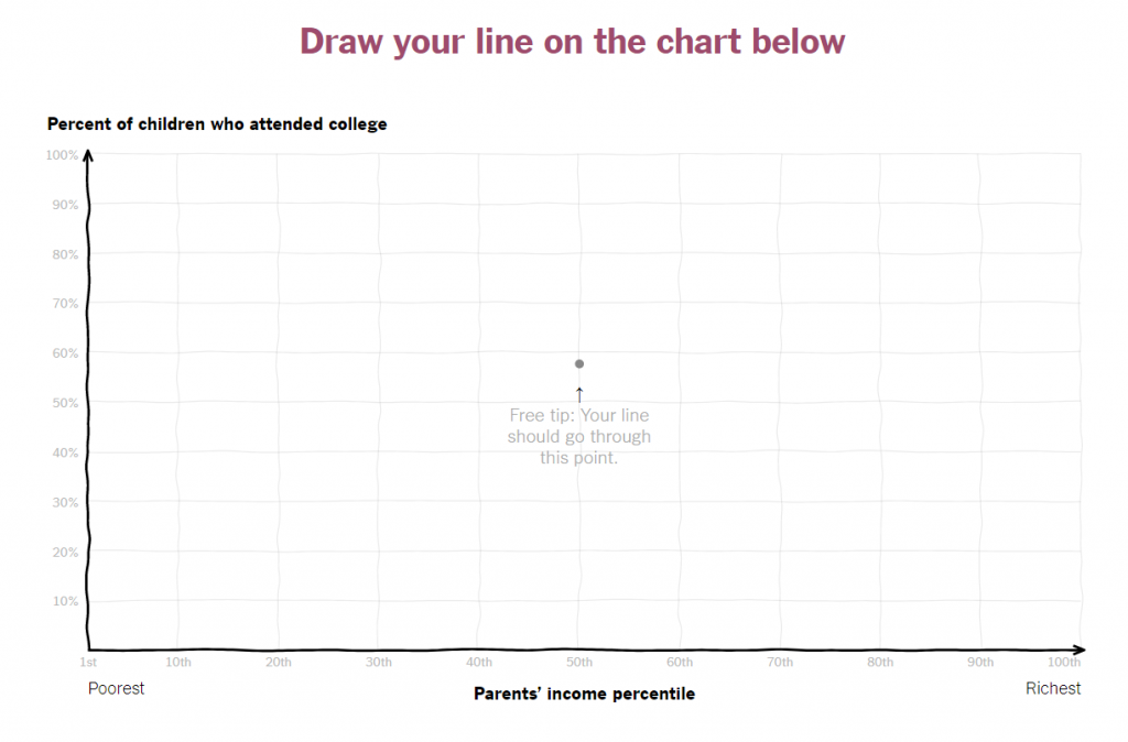
The fifth and final graph on academic inequality asks: What is the relationship between family income and a child’s chances of attending college? This graph allows students to become more involved as they are asked to draw a line on the graph that corresponds to a parents’ income percentile and the percent of children who attend college. This graph comes from a 2015 article titled, “You Draw It: How Family Income Predicts Children’s College Chances.”
Questions of inequality are a difficult subject. Critics of the above inequality lesson plan say that not only is it racist, it’s also biased. While it is true that there is often a lot of bias in data, proponents use a new technique called “equitable data science” to ensure the data conveys they idea they want kids to learn. Those supporters insist this is vital information and the key to making people not color blind, but anti-racist.
Opponents of inequality education usually lump inequality education in as a component of Critical Race Theory, which has caused a firestorm of parent protests across the country. But if you’re the kind of parent who does want your kids thinking about race, now you know some of the tools teachers are using to get it in their brains.
Consensus on the value and accuracy of such teaching or not, inequality is being taught to kids in nearly every public school in every state across the United States. In some states, it’s even required training for teachers.