Unseen Details in Movie Set Design
Movies pull us into other worlds, and while most viewers focus on the actors and the action unfolding on screen, there’s an entire universe of intentional details hiding in plain sight.
Set designers and production teams spend months crafting environments that tell stories all on their own, embedding clues, symbolism, and references that most people never catch on a first viewing.
These aren’t accidents or happy coincidences.
They’re deliberate choices that add layers of meaning to every frame.
The art of hiding details in movie sets has become something of a competitive sport among filmmakers, and for good reason.
When a viewer spots something unexpected during their third rewatch, it transforms a passive experience into an interactive treasure hunt.
Here’s a closer look at how production designers use their craft to create worlds that reward the most observant audience members.
The origin of intentional hiding
The practice of tucking secrets into movie sets didn’t start with modern blockbusters.
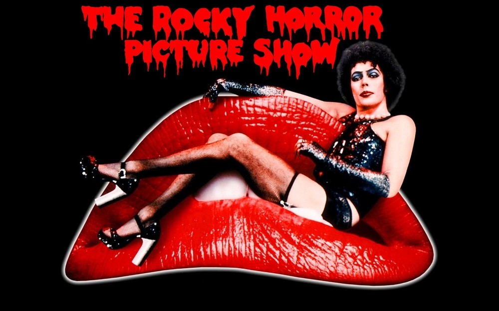
One of the earliest documented examples comes from the 1975 cult classic The Rocky Horror Picture Show.
Before filming began, the cast and crew held an Easter egg hunt on set, but they didn’t manage to find all the hidden eggs.
Rather than delay production, they simply left them there.
If you watch closely, you can spot actual Easter eggs nestled under Dr. Frank N. Furter’s throne, perched on top of a lamp in the main hall, and near the lab lift.
What started as an accident became a beloved part of film history, giving birth to the term ‘Easter egg’ for hidden details in movies.
Kubrick’s architectural impossibilities
Stanley Kubrick took set design to almost obsessive levels with The Shining.
The Overlook Hotel isn’t just unsettling because of the story, it’s architecturally impossible by design.
The carpet patterns shift direction depending on where Danny is standing.
The canned goods in the pantry are arranged to form subliminal messages.
Windows appear in rooms that should be interior spaces with no exterior walls.
None of this is accidental.
Kubrick wanted viewers to feel subconsciously uncomfortable, even if they couldn’t quite pin down why.
The hotel itself becomes a character, disorienting and trapping both the characters and the audience in a space that doesn’t follow the rules of reality.
Pixar’s recurring classroom
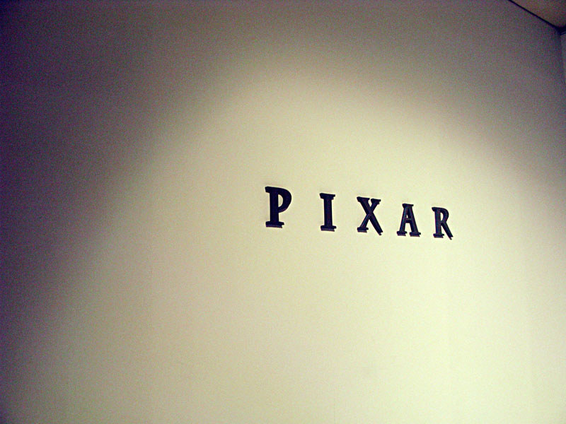
Nearly every Pixar film features the number ‘A113’ somewhere in the frame.
It appears on license plates, room numbers, file codes, and countless other background elements.
This isn’t product placement or a magic number pulled from thin air.
A113 refers to a classroom at the California Institute of the Arts where many Pixar animators studied.
It’s a small thank-you to the place where their careers began, hidden in plain sight across decades of films.
What makes it brilliant is how naturally it blends into each movie’s world, never drawing attention to itself but always there for those who know to look.
The Godfather’s orange prophecy
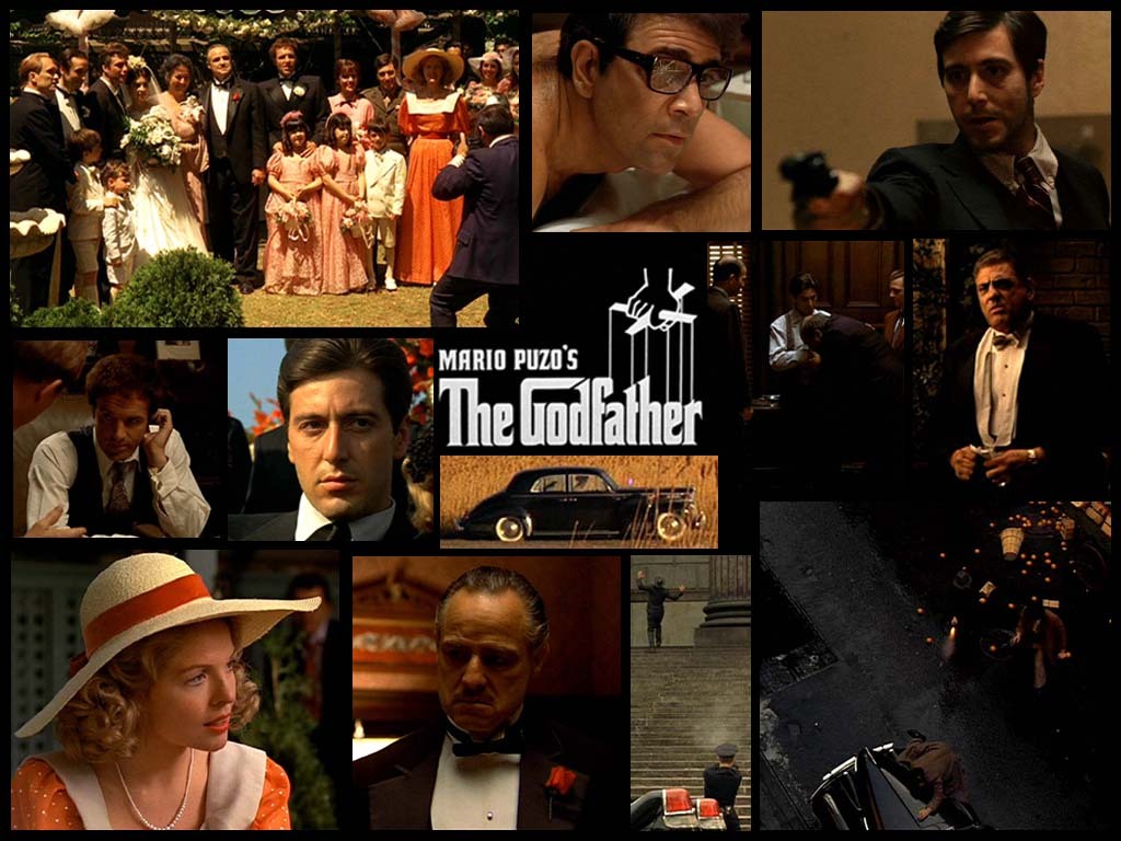
Francis Ford Coppola used oranges throughout The Godfather trilogy as a visual marker of impending death.
Whenever oranges appear in a scene, whether someone is eating them, buying them, or they’re simply sitting on a table, violence or death follows shortly after.
Don Vito Corleone is shot while buying oranges.
Oranges are present at the table before his fatal heart attack.
The symbolism runs through all three films, turning an ordinary piece of fruit into one of cinema’s most ominous props.
Most viewers might notice oranges appearing frequently but miss the pattern entirely until someone points it out.
Tarantino’s fictional brand universe
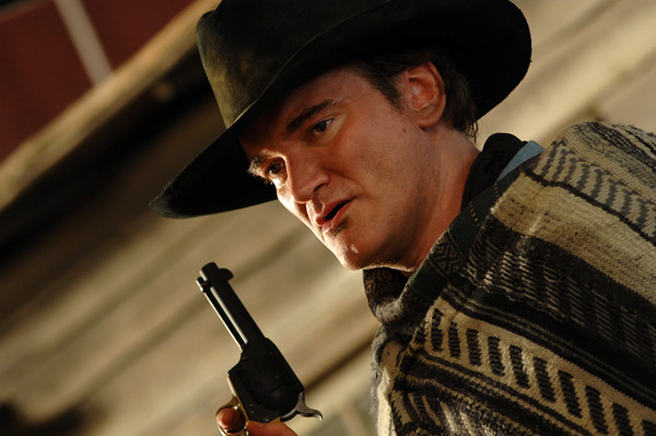
Quentin Tarantino created an entire fake nicotine brand called Red Apple that appears across nearly all his films.
The brand first showed up in Pulp Fiction and has since made appearances in Kill Bill, Inglourious Basterds, and The Hateful Eight.
It’s Tarantino’s way of building a cohesive universe where all his films exist in the same reality, connected by these small commercial details.
He does the same with Big Kahuna Burger, a fictional fast-food chain that characters reference and consume across multiple movies.
These touches create a sense of continuity without requiring viewers to catch every reference.
Fight Club’s coffee commentary
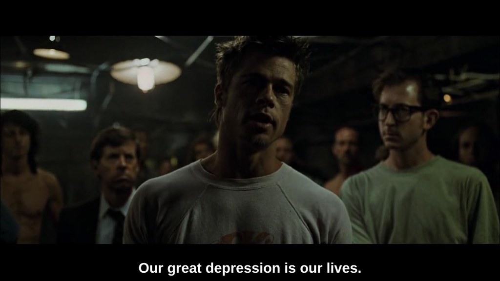
David Fincher revealed that there’s a Starbucks cup visible in every single scene of Fight Club.
Most viewers never notice because the cups blend into the environment so naturally.
The presence of this ubiquitous brand serves the film’s critique of consumer culture, demonstrating how corporate branding has become so omnipresent that we no longer register it consciously.
The cups appear in apartments, offices, and even more unexpected locations, making a statement about how consumption has infiltrated every corner of modern life.
The fact that most people miss them entirely proves Fincher’s point more effectively than any dialogue could.
Coraline’s shifting reality
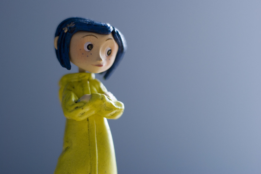
Stop-motion animation allows for control over every microscopic detail, and director Henry Selick used that to brilliant effect in Coraline.
Each time Coraline visits the Other World, her bedroom subtly changes.
Furniture shifts position slightly. Shadows grow harsher.
Colors become incrementally more saturated and then begin to fade.
The changes are so gradual that viewers sense something’s wrong without being able to identify exactly what.
It’s a visual representation of how the Other Mother is slowly tightening her grip, communicated entirely through set design without a single line of explanation.
The production built over 150 sets and created around 250 fully articulated puppets to achieve this level of detail.
V for Vendetta’s literary rebellion
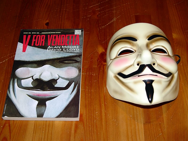
Every frame inside V’s hideout tells a story.
The walls are covered with banned books, forbidden artwork, and vinyl records of music the totalitarian government has outlawed.
Production designers didn’t just fill the space with random props.
They chose specific titles, artworks, and albums that represent the ideas and culture the regime in the film has attempted to erase.
Viewers who pause and read the spines of books or examine the posters see exactly what V is fighting to preserve.
It’s a library of resistance, meticulously curated to show what’s at stake without spelling it out in dialogue.
Wes Anderson’s symmetrical obsession
Wes Anderson’s films are immediately recognizable by their distinctive visual style, and set design plays a massive role in creating that aesthetic.
In The Grand Budapest Hotel, production designer Adam Stockhausen created a hotel that exists in multiple time periods, each with its own color palette and design language.
The pink and purple glory of the hotel’s heyday gives way to drabber colors in later scenes.
Every element, from the smallest prop to the largest architectural detail, was chosen to contribute to the film’s unique look.
Anderson’s trademark symmetry isn’t just stylistic flourish, it creates a sense of order and control that makes moments of chaos more impactful when they arrive.
Cameron’s Titanic accuracy
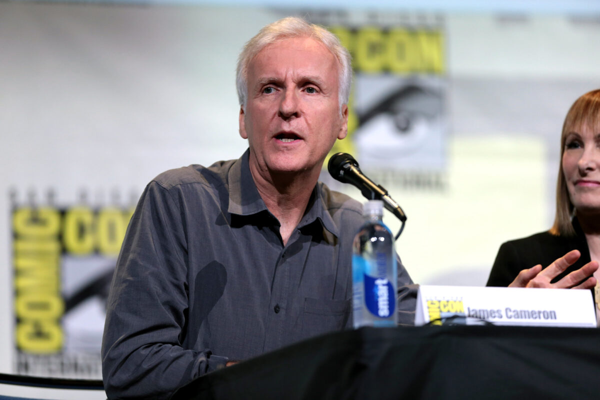
James Cameron’s obsession with historical accuracy in Titanic extended to details most viewers would never notice or verify.
He rebuilt the ship’s interior based on original blueprints. He hired deep-sea divers to film the actual wreckage.
He even corrected the star field in the night sky after astrophysicist Neil deGrasse Tyson pointed out that the constellations were wrong for that date and location.
The china patterns match those used on the real Titanic.
Background passengers are dressed in period-appropriate clothing down to the correct number of buttons.
Cameron went so far as to include visual references to real passengers who were on board.
None of this is necessary to tell the story, but it creates an authenticity that viewers feel even if they can’t articulate why.
Del Toro’s dual worlds
Guillermo del Toro’s Pan’s Labyrinth uses set design to distinguish between two realities: the harsh world of post-Civil War Spain and the dark fantasy of the labyrinth.
Every element in the real world is designed with hard edges, muted colors, and oppressive architecture that reflects the brutality of the fascist regime.
The fantasy world has organic shapes, deeper colors, and ancient stone that suggests something older and more primal.
The contrast isn’t subtle, but the specific choices within each world create layers of meaning.
The fascist captain’s pristine, orderly environment reflects his need for control.
The labyrinth’s crumbling, overgrown spaces suggest nature reclaiming what civilization tried to dominate.
Why it matters now

These hidden details transform movies from disposable entertainment into works worth revisiting.
They reward attention and create communities of viewers who share discoveries with each other.
In an era where films are designed to be consumed quickly and forgotten, production designers who embed meaning into every frame are pushing back against that trend.
They’re crafting environments that have as much to say as the script itself, creating visual essays that unfold across multiple viewings.
The best movie sets don’t just provide a backdrop for action.
They actively participate in storytelling, whispering secrets to anyone patient enough to watch and listen.
That’s not just good craftsmanship.
It’s art hiding in plain sight, waiting to be discovered.
More from Go2Tutors!

- The Romanov Crown Jewels and Their Tragic Fate
- 13 Historical Mysteries That Science Still Can’t Solve
- Famous Hoaxes That Fooled the World for Years
- 15 Child Stars with Tragic Adult Lives
- 16 Famous Jewelry Pieces in History
Like Go2Tutors’s content? Follow us on MSN.