Websites from the 90s Still Online Today
The internet looked completely different in the 1990s. Websites had blinking text, bright backgrounds, and sounds that played automatically when you opened a page.
Most of those early sites disappeared as technology changed and companies updated their look. But some corners of the web stayed frozen in time, keeping their original 90s design intact.
These digital relics still exist today, and visiting them feels like stepping into a time machine. Here are some of the most interesting websites that have survived from the earliest days of the internet.
Space Jam

Warner Bros launched the Space Jam website in 1996 to promote the movie starring Michael Jordan and Bugs Bunny. The site has every classic 90s feature you can imagine, from tiled backgrounds to chunky navigation buttons.
It still works exactly as it did nearly 30 years ago, complete with a ‘Jam Cam’ section and player stats for the Tune Squad. Warner Bros could have taken it down or redesigned it dozens of times, but they left it alone as an accidental monument to 90s web design.
Zombo.com

This site launched in 1999 and consists of nothing but a loading screen with a voice telling visitors they can do anything at Zombo.com. That’s it.
The voice loops endlessly while colorful dots bounce around the screen, and the site never actually loads into anything else. It became a cult favorite precisely because it does absolutely nothing, making it either the most pointless website ever created or a brilliant piece of internet art, depending on who you ask.
Heaven’s Gate

The Heaven’s Gate cult created their website in the mid-90s, and it remains online today as a stark historical record. The group maintained the site to share their beliefs before their mass departure in 1997.
Former members still pay for the hosting and keep everything exactly as it was, including the visitor counter and outdated HTML. The site serves as a sobering reminder of that tragedy and preserves a piece of internet history that documents a real event.
Berkshire Hathaway
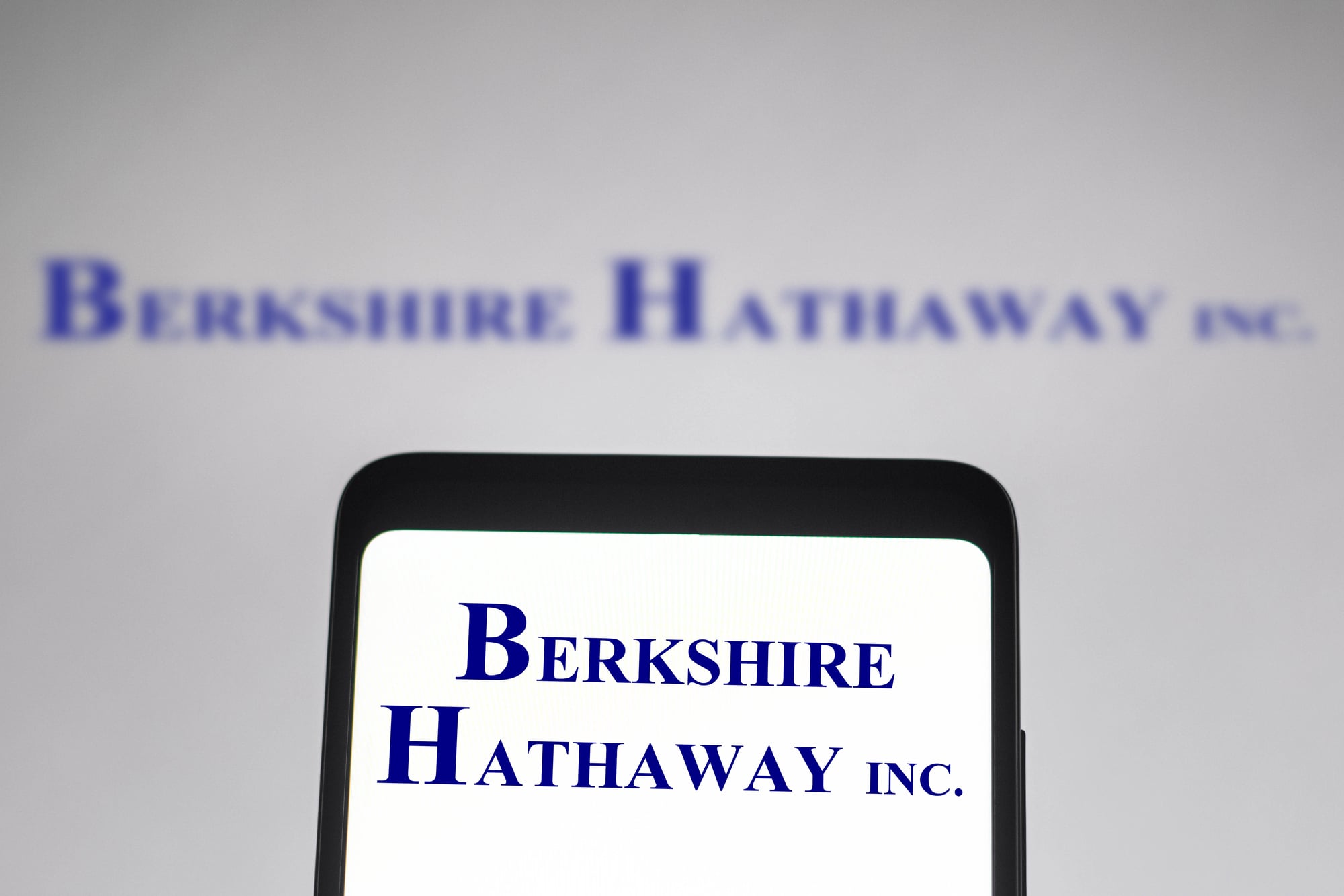
Warren Buffett’s company runs one of the most bare-bones corporate websites on the internet. The Berkshire Hathaway site looks almost identical to how it appeared in the late 90s, with plain text links on a white background and zero graphics.
Buffett apparently sees no reason to change it since the site delivers information without any fuss. For a company worth hundreds of billions of dollars, the website looks like something a student made in an afternoon HTML class.
The Original Drudge Report Design

Matt Drudge started his news aggregation site in 1997, and while it has updated its links daily for decades, the layout barely changed. The site still uses that classic single-column format with blue hyperlinks on a white background.
No ads clutter the sides, no videos autoplay, and no pop-ups interrupt the reading. The simplicity actually makes it load faster than most modern news sites, which is probably why Drudge never bothered to redesign it.
Budweiser’s Wassup Campaign

Budweiser’s ‘Wassup’ campaign became a cultural phenomenon in 1999, and the beer company kept the original promotional website alive. The site features the guys from the commercials, downloadable clips, and interactive features that made sense back when internet videos were a novelty.
Everything still works, from the sound clips to the animations, giving visitors a perfect snapshot of what brands thought was cool at the turn of the millennium.
Hampster Dance

One of the internet’s first viral sensations, Hampster Dance launched in 1998 and featured rows of animated hamsters dancing to a sped-up song. The creator, a Canadian art student, made it as a competition with friends to see who could generate the most web traffic.
The site became so popular it crashed multiple times, and eventually got sold and commercialized. The original version still exists in archived form, complete with the intentional misspelling of ‘hamster’ and all those repetitive GIFs.
Dolly the Sheep Announcement

The Roslin Institute in Scotland announced the first cloned mammal on their website in 1997, and they preserved the original announcement page. The page explaining Dolly’s creation uses simple text and basic formatting that shows how scientists shared groundbreaking news before social media existed.
Links on the page still work, taking visitors to explanations of the cloning process written in straightforward language. The institute kept it online as an important piece of scientific history.
The First Website Ever

Tim Berners-Lee created the very first website in 1991 at CERN, and while the original went offline, CERN brought back a copy of how it looked in 1992. The site explains what the World Wide Web is and how to create web pages.
It contains nothing but text and hyperlinks, showing just how basic the internet started. CERN maintains it as an educational tool and a tribute to the beginning of the web as everyone knows it today.
CNN’s O.J. Simpson Trial Coverage
CNN preserved its 1995 coverage of the O.J. Simpson trial, including the original webpage layouts and navigation. The site captures how news organizations first adapted to online reporting, with text updates that sound almost quaint compared to today’s live blogs.
Visitors can still browse through the trial timeline and see how one of the biggest news events of the 90s played out on the early internet. The fonts, colors, and layout all reflect that mid-90s aesthetic.
FogCam

San Francisco State University started FogCam in 1994, making it one of the oldest continuously operating webcams in the world. The camera points at a view of the campus and updates with a new image every few seconds.
The website design got minor updates over the years but still maintains that basic 90s webcam page look. The camera has been watching the same spot for over 30 years, creating an unintentional time-lapse of how the campus changed.
Martindale’s Calculators Online Center

This massive directory of online calculators launched in 1997 and still uses its original format with colored text on gradient backgrounds. The site catalogs thousands of calculators for everything from engineering to cooking, all organized in long lists with minimal formatting.
It looks exactly like a reference page from the geocities era, but it still gets updated regularly with new calculator links. The owner clearly sees no reason to modernize something that still works perfectly fine.
The We Didn’t Start the Fire Lyric Database

Someone created a website in the 90s that breaks down every reference in Billy Joel’s song ‘We Didn’t Start the Fire’ with explanations and links. The site uses frames, which were huge in 90s web design, and features that classic combination of black text on a gray background.
Each lyric gets its own explanation page, and the navigation requires clicking through individual frames. The site remains a helpful resource for anyone trying to understand Joel’s rapid-fire history lesson.
Miracle Fruit Man

This personal website from the 90s documents one person’s obsession with miracle fruit, a berry that makes sour foods taste sweet. The site has animated GIFs, visitor counters, and walls of text describing miracle fruit experiments.
It perfectly represents the era when anyone could make a website about their weird hobby and just leave it online forever. The webmaster apparently lost interest but never took it down, so it sits there as a time capsule of 90s internet passion projects.
Pacific Bell’s Interactive Museum

Pacific Bell created an online museum in the 90s to show the history of communication technology, and portions of it still exist. The site uses clickable image maps, which were a big deal before everyone figured out better navigation methods.
Visitors can explore old telephone technology through clunky interfaces that take several clicks to get anywhere. The company didn’t maintain it, but the pages still load because some server somewhere keeps hosting them.
Welcome to Netscape

Back in the 1990s, Netscape showed up as the go-to name for surfing online, its homepage waiting just like it always did. That original logo stands out clearly, alongside straightforward menus guiding users through support pages.
Instead of heavy visuals, small images appear – built to run fast even on slow phone-line internet. Now, coming across this version feels odd, yet familiar, pulling memories forward from long ago.
Before Google’s browser took over or Apple pushed their own choice, one company ruled how we moved around the web.
Cher Believe Website by Warner Music
A blast from the past, Warner Music’s promo page for Cher’s 1998 smash ‘Believe’ remains live – every quirk intact. Flashing backdrops pulse behind text while sound bites launch without warning.
Instead of fading into digital dust, this relic runs just like it did decades ago. Click around, and you’ll find lyrics tucked beside pixelated images.
Video snippets stutter now, thanks to outdated codecs nobody uses anymore. Yet somehow, each clunky transition feels intentional.
Long before playlists ruled, labels built these mini worlds online to sell a single track. This one survived, frozen in time – a neon-lit museum piece from pop’s dial-up era.
When Web Design Stayed the Same
Left running by accident or forgotten bills, these old sites stayed online without anyone fixing them. Though shaped by chance, their survival reveals shifts in how we now connect through screens.
A loud color here, a slow menu there – each odd detail captures an era when building pages felt like guessing. Without plans or trends guiding choices, every click back then uncovered something strange.
Hidden among modern networks, they sit untouched, found only when curiosity leads down paths few travel anymore.
More from Go2Tutors!

- The Romanov Crown Jewels and Their Tragic Fate
- 13 Historical Mysteries That Science Still Can’t Solve
- Famous Hoaxes That Fooled the World for Years
- 15 Child Stars with Tragic Adult Lives
- 16 Famous Jewelry Pieces in History
Like Go2Tutors’s content? Follow us on MSN.