14 Popular Products That Were Once a Different Color
Many iconic products we recognize instantly today didn’t always look the way they do now. Colors play a crucial role in brand identity and consumer perception, influencing everything from appetite to purchasing decisions. What seems permanent and unchangeable now often evolved through years of redesigns and marketing shifts.
Here is a list of 14 popular products that once sported completely different colors, showing how even the most recognizable items have transformation stories behind them.
Coca-Cola Cans
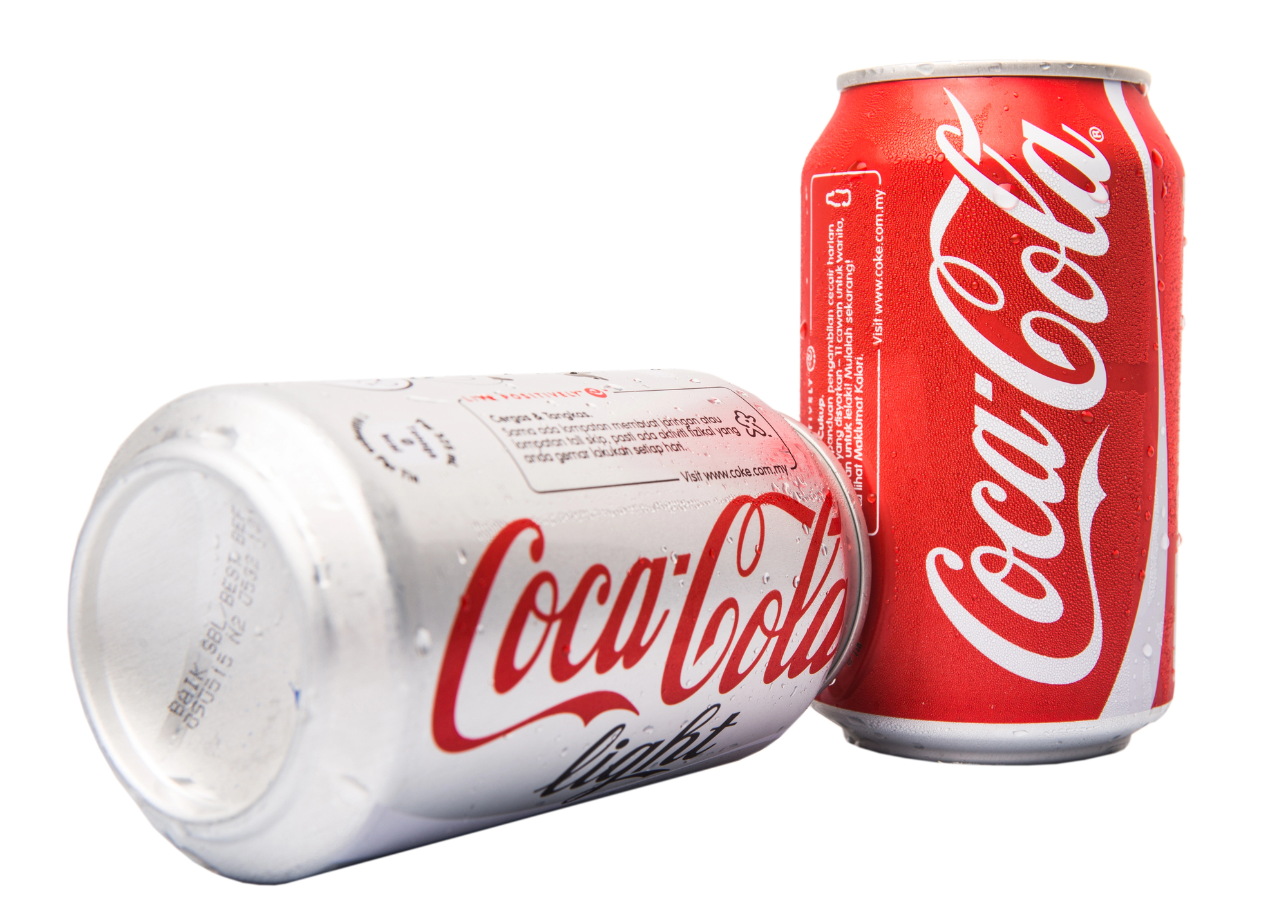
The iconic red Coca-Cola can wasn’t always the vibrant shade we recognize worldwide. Before the 1950s, the cans featured a muted greenish-blue color that gradually gave way to the now-unmistakable red.
Apple Logo
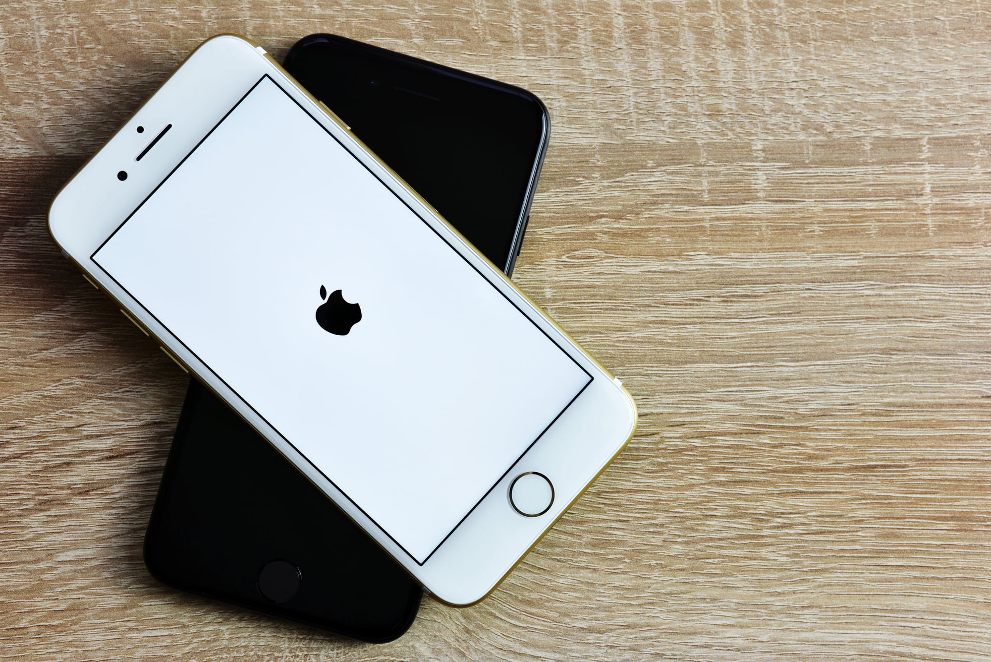
Apple’s sleek monochrome logo was once a rainbow-colored symbol. Designed in 1977, the striped apple represented creativity and remained until Steve Jobs opted for a minimalist redesign in 1998.
Like Go2Tutors’s content? Follow us on MSN.
UPS Trucks
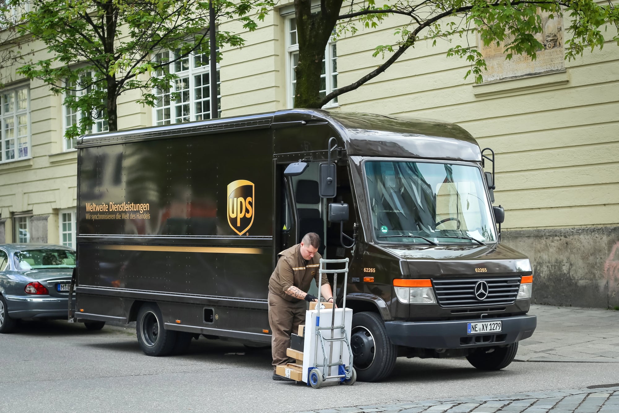
UPS trucks were originally painted bright yellow like school buses. The switch to brown in 1916 aimed to evoke luxury and reliability, similar to the prestigious Pullman railcars.
Starbucks Logo
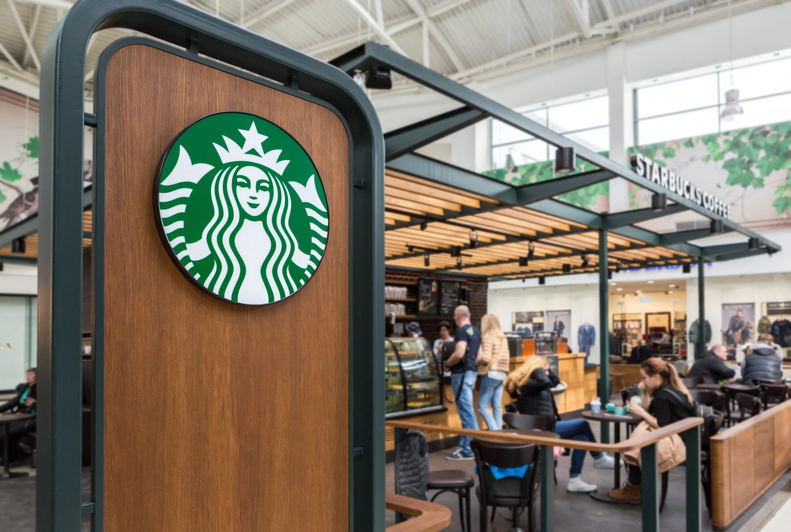
Starbucks originally used a brown logo when it opened in 1971. The green emblem we now know was introduced in 1987 to reflect freshness and the brand’s growing café presence.
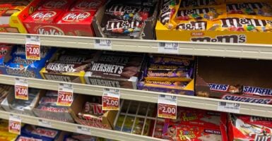
M&M’s Candies
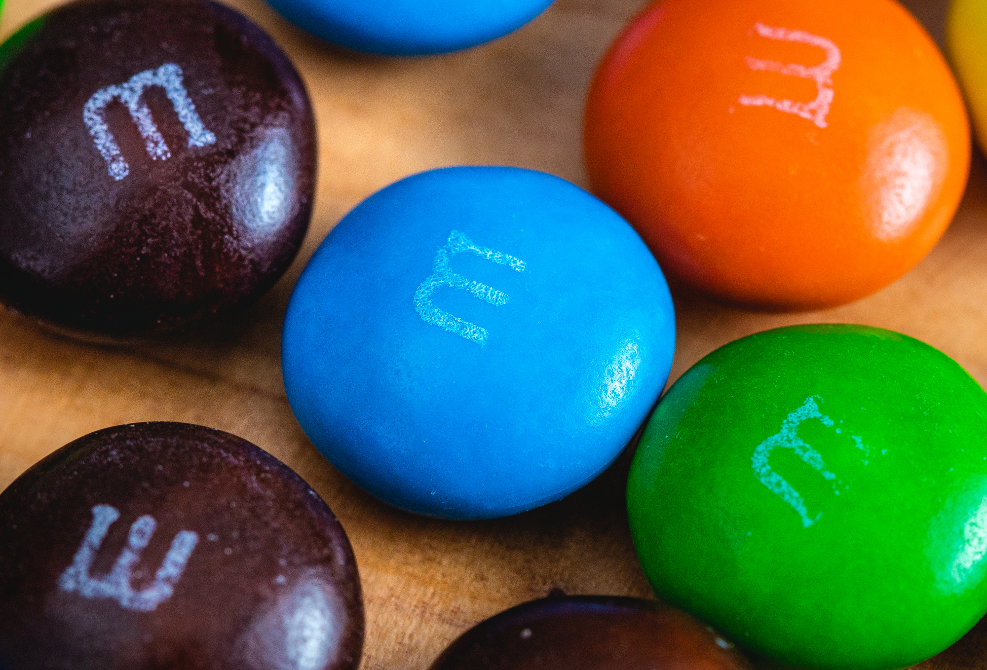
M&M’s didn’t always include the blue candy we see today. Blue was added in 1995 after a public vote replaced the tan pieces that had quietly replaced violet decades earlier.
Like Go2Tutors’s content? Follow us on MSN.
Pepsi Logo
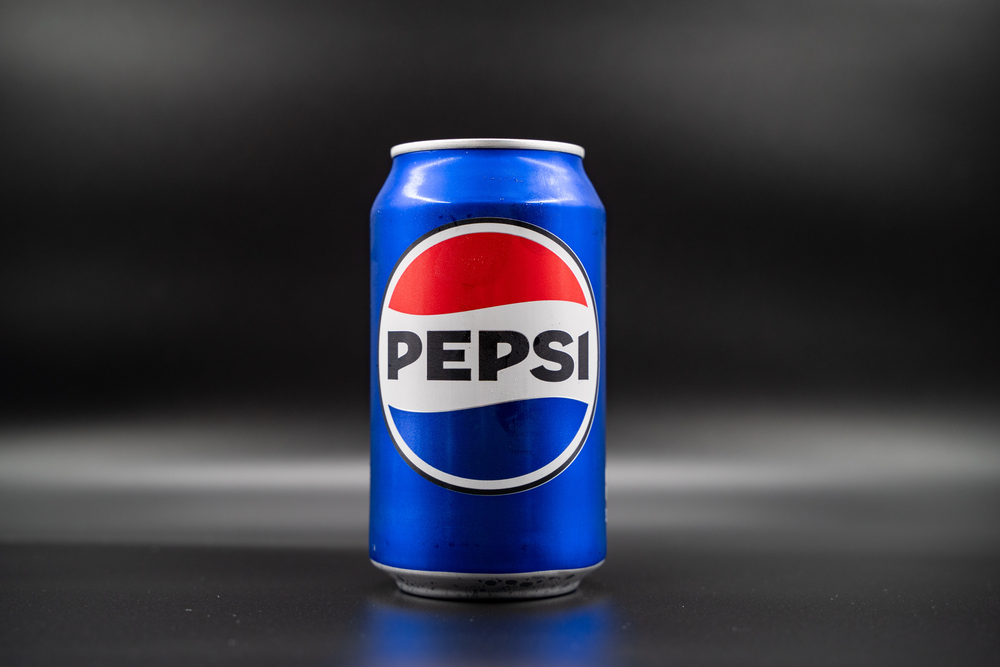
Pepsi’s original logo in 1898 was red without the patriotic palette we know today. The red, white, and blue design emerged during World War II to reflect American pride and differentiate from Coca-Cola.
Tiffany Boxes

Tiffany’s famous blue boxes are so iconic that the color is trademarked. Yet, the brand originally used yellow packaging until adopting the now-signature blue in 1845.
Post-it Notes

Post-it Notes were nearly pink instead of yellow. The yellow hue became standard simply because it was the color of the only scrap paper available during development.
Like Go2Tutors’s content? Follow us on MSN.
Facebook’s Interface

Facebook’s blue color scheme wasn’t just a stylistic decision. It was chosen because Mark Zuckerberg is red-green colorblind and can see blue most clearly.
Barbie’s Hair
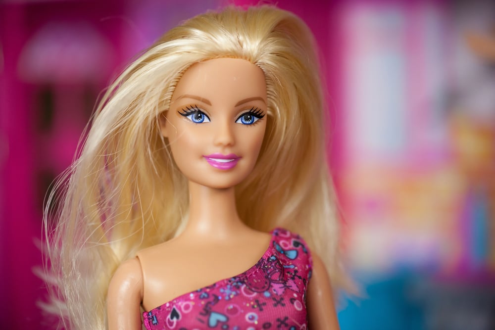
The first Barbie dolls came with either blonde or brunette hair in 1959. While both were offered, the blonde version gained more attention and became the doll’s enduring look.
Nintendo Switch
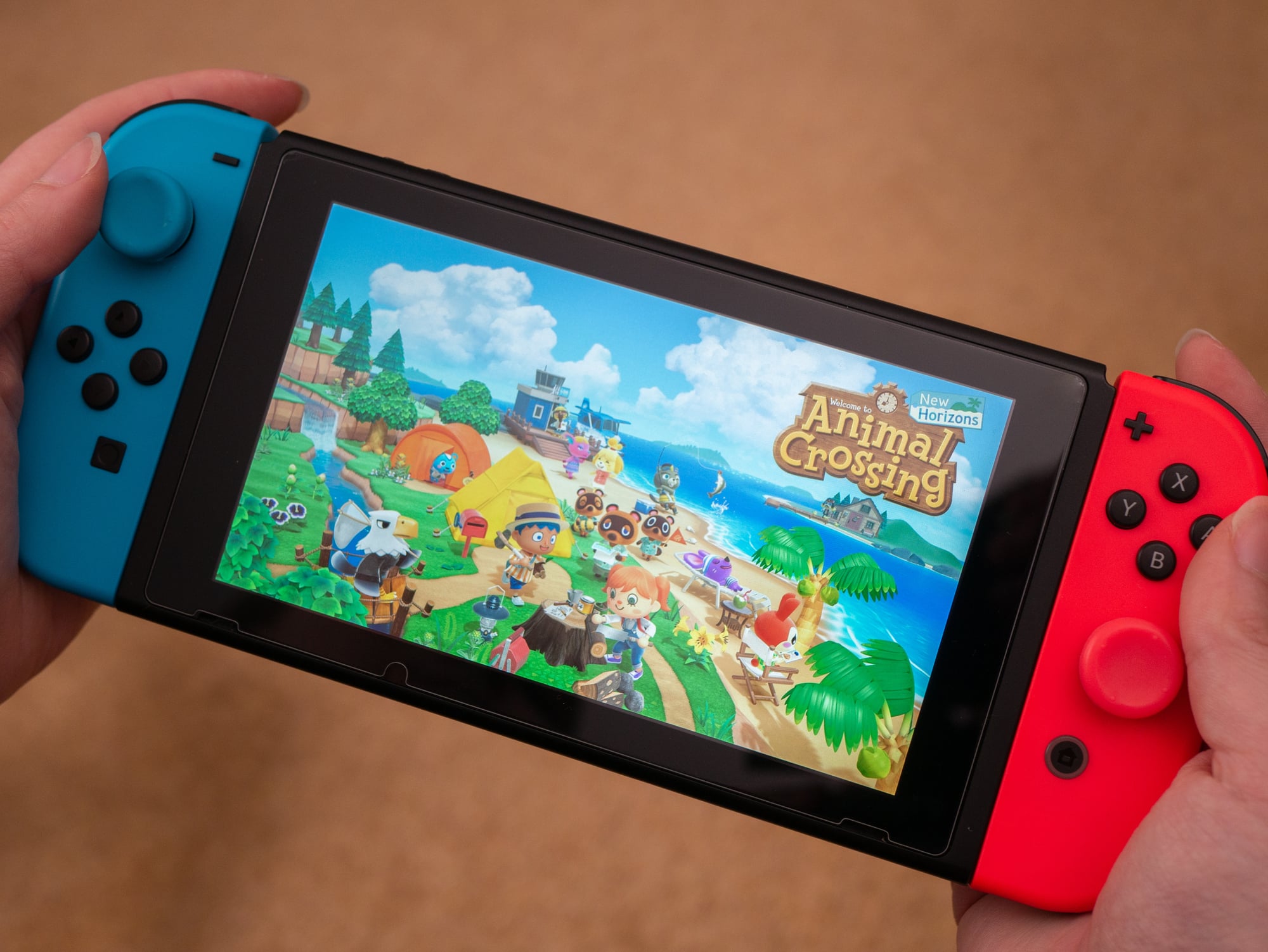
Early prototypes of the Nintendo Switch featured plain gray controllers. The red and blue colors were introduced to enhance its playful image and draw attention to its modular design.
Like Go2Tutors’s content? Follow us on MSN.
John Deere Tractors

John Deere’s earliest equipment wasn’t green and yellow but painted black. The switch around 1905 improved visibility in fields and eventually became iconic branding.
Gatorade
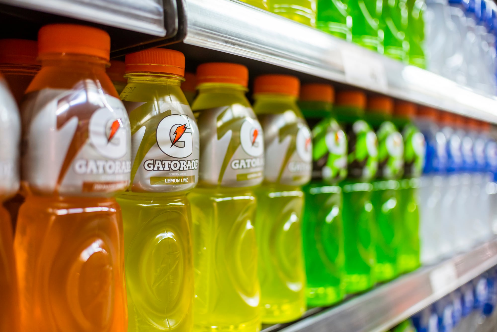
The first Gatorade was a pale, barely colored lemon-lime drink. Over time, it evolved into brightly colored varieties to stand out and appeal to consumers visually.
FedEx Logo
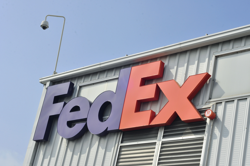
FedEx originally launched with a red, white, and blue logo under the name Federal Express. In 1994, it rebranded with the bold purple and orange scheme that helps define its various services.
Like Go2Tutors’s content? Follow us on MSN.
Color’s Lasting Impact
These color evolutions highlight how branding is never static. What feels timeless today often started as an experiment, proving that visual identity is both strategic and ever-changing.
More from Go2Tutors!

- 18 Unexpectedly Valuable Collectibles You Might Have Lying Around
- 15 Things Every Teenager in the ’70s Did That Teens Today Wouldn’t Understand
- 15 Strange Things People Have Tried to Ban (And Failed)
- 15 Inventions That Were Immediately Banned After Being Created
- 20 Actors Who Were Almost Cast in Iconic Roles
Like Go2Tutors’s content? Follow us on MSN.