16 Logos You Probably Didn’t Know Belonged to Famous Rock Bands
Rock history is written in sound, but it’s also told through symbols. While everyone recognizes the Rolling Stones’ tongue or AC/DC’s lightning bolt, countless other bands created iconic logos that slipped into the background of pop culture.
These symbols appeared from concert posters to vintage t-shirts. Quietly shaping the visual language of rock without most people realizing which bands represented.
Led Zeppelin
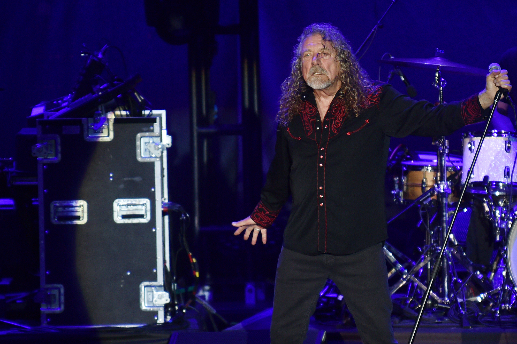
The four mysterious symbols weren’t just album art. Each band member chose a personal sigil for “Led Zeppelin IV” – Jimmy Page’s intricate “ZoSo,” John Paul Jones’s interlocking circles, John Bonham’s three interlocking rings, and Robert Plant’s feather in a circle.
These became the band’s unofficial logo long after 1971.
Pink Floyd
That prism splitting white light into a rainbow spectrum became one of rock’s most recognizable images. Storm Thorgerson designed it for “The Dark Side of the Moon” in 1973, but the symbol transcended the album to represent Pink Floyd’s entire cosmic worldview.
Rush
The red star inside a circle – known as the “Starman” – appeared on nearly every Rush release from 1975 onwards (though you might not have consciously registered it, the symbol became so embedded in rock iconography that it feels like it was always there, which is precisely the mark of a logo that worked).
Neil Peart, their legendary drummer and lyricist, was drawn to the design because it suggested both celestial mystery and human ambition – themes that ran through Rush’s entire catalog like underground rivers. And yet the band never officially explained what the symbol meant.
Even so, it appeared on everything from album covers to stage backdrops to merchandise for decades.
The Who

Two simple letters inside a circle became the visual shorthand for controlled chaos. Roger Daltrey suggested the basic concept, but it was the context that made it work – seeing those letters on a bass drum just before it got destroyed on stage, or printed on a poster advertising another night of maximum R&B volume.
Black Sabbath
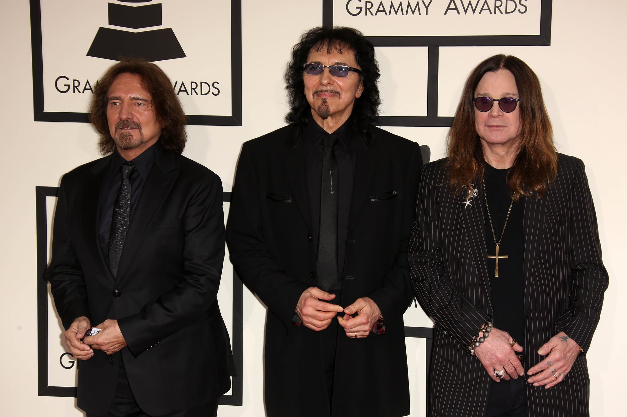
The band’s name spelled out in gothic lettering isn’t just typography. Tony Iommi and the band developed this particular font treatment in the early 1970s, with its slightly medieval, slightly sinister character perfectly capturing their sound before you heard a single note.
Metallica
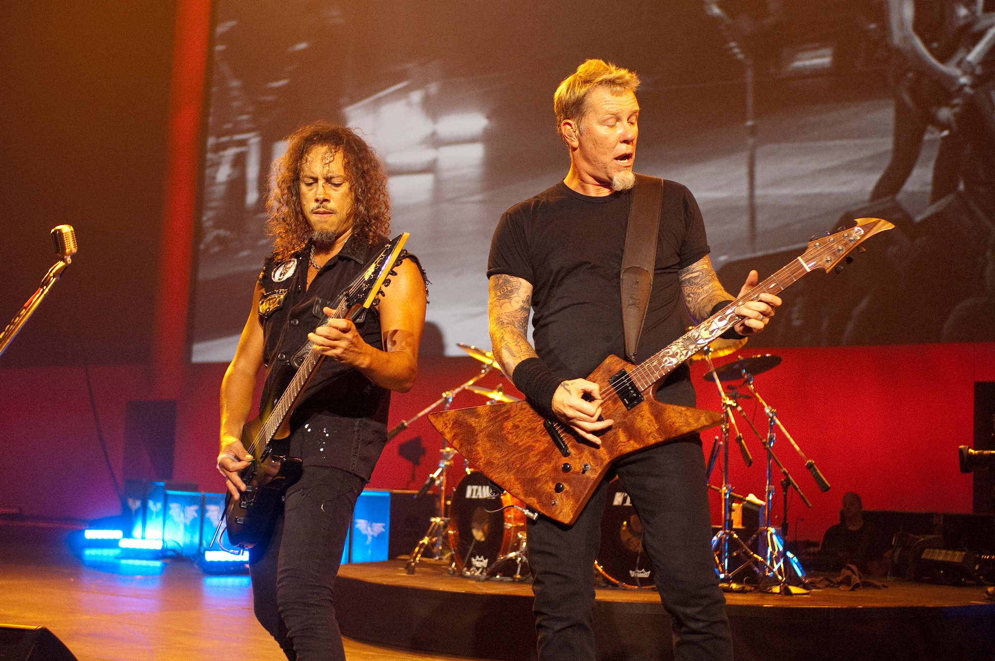
That jagged “M” built from what looks like broken metal or shattered glass (the design came from James Hetfield’s own sketches, refined over months of touring in cramped vans where band members would doodle on everything from setlists to gas station napkins, and the final version emerged from this collaborative process of constant revision and road-testing).
The logo first appeared on “Kill ‘Em All” in 1983 and became more recognizable than many corporate brands. But here’s what makes it work: the letterform actually looks like it was forged rather than designed – which matches perfectly with a band whose music sounds like machinery coming to life.
So the symbol and the sound reinforce each other in ways that feel accidental but probably weren’t.
Deep Purple

The band name rendered in a specific purple gradient became their calling card. Simple concept, but the execution mattered – that particular shade and the way it faded from dark to light captured something about their music’s dynamic range.
Judas Priest
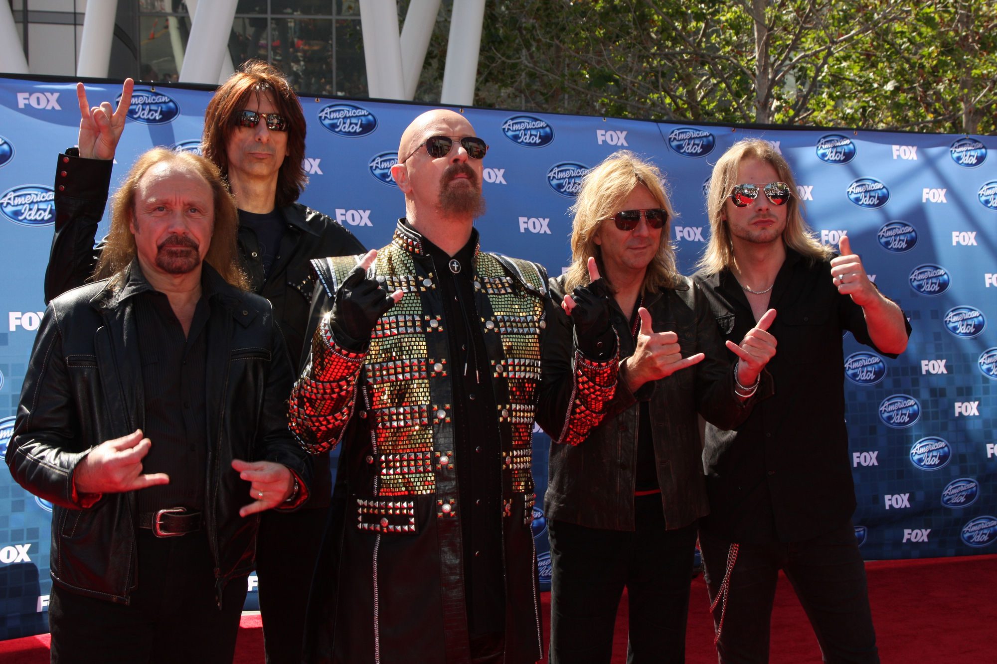
The gothic lettering paired with metallic textures created heavy metal’s visual template. Rob Halford’s leather-and-studs aesthetic found its graphic equivalent in this logo treatment, which appeared consistently from the mid-1970s forward.
Iron Maiden
Eddie the Head gets all the attention, but Iron Maiden’s logotype (that particular blend of medieval and modern letterforms, with serifs that look vaguely like sword points or armor details, appeared alongside Eddie on nearly every release and became the consistent thread connecting decades of artwork).
The font choice wasn’t accidental – it needed to work whether Eddie was a cyborg, a pharaoh, or a zombie, and somehow it always did. And the logo had to be readable from the back of massive festival crowds while still looking good embroidered on a jacket.
Which is saying something about design that actually functions rather than just looking impressive in a portfolio.
Motörhead
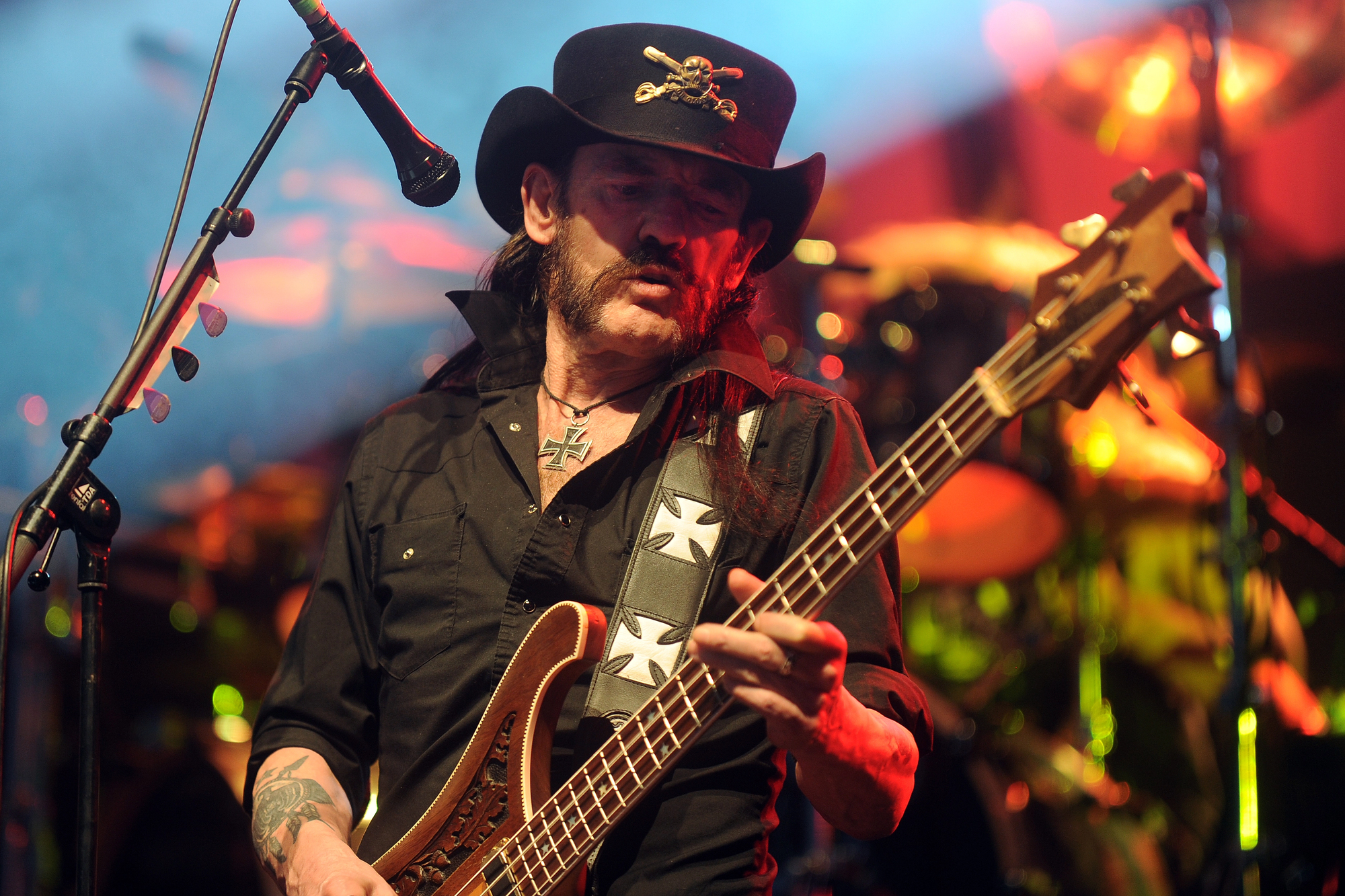
That umlaut over the “o” wasn’t just Lemmy being difficult with pronunciation. The entire “Motörhead” wordmark, with its specific lettering and that Germanic touch, became a logo that suggested both speed and danger – appropriate for a band that played rock and roll like a controlled demolition.
Kiss
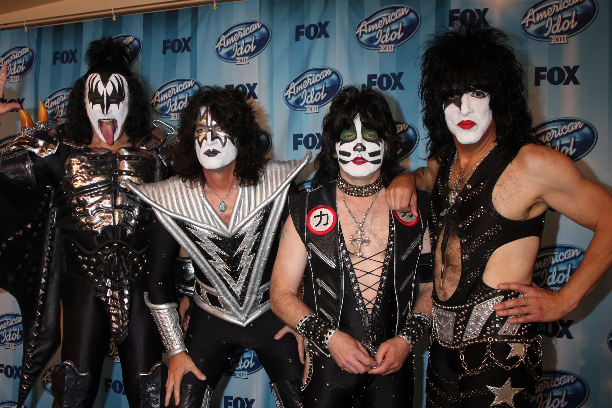
Beyond the makeup, Kiss developed a distinctive logo treatment where the double “S” letters resembled lightning bolts. Gene Simmons and Paul Stanley refined this design in the early days, and it became as important to their brand as the face paint.
Queen

The ornate crest that Freddie Mercury designed combined the zodiac signs of all four band members into something that looked like royal heraldry. Two lions for Leo (John Deacon and Roger Taylor), a crab for Cancer (Brian May), and two fairies for Virgo (Mercury himself), all surrounding a crown and the letter Q.
Def Leppard
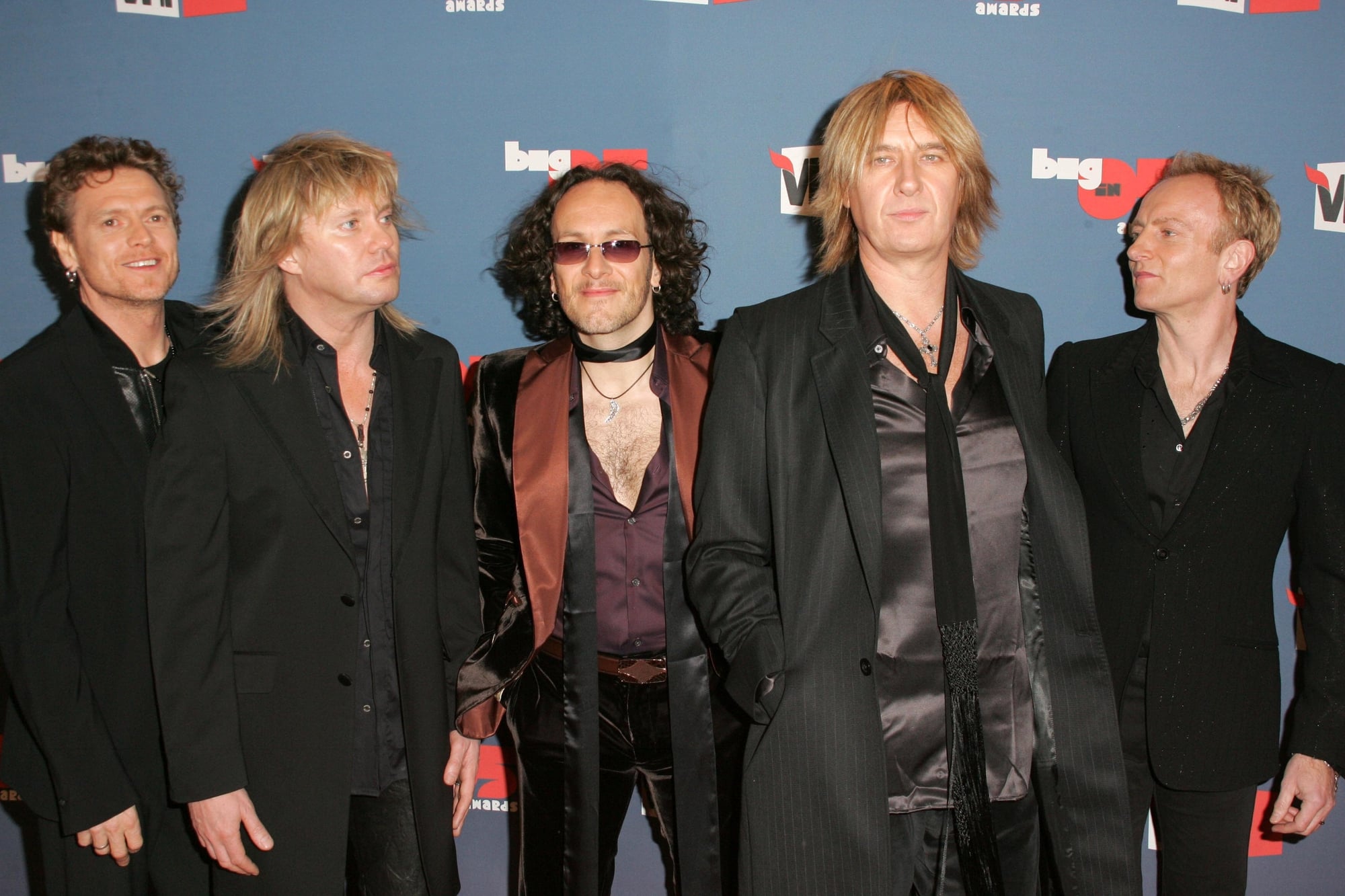
The name treatment with that distinctive “Def Leppard” font and the triangle symbol appeared consistently throughout their career. The geometric simplicity contrasted nicely with their maximalist production style – visual restraint balancing musical excess.
Thin Lizzy
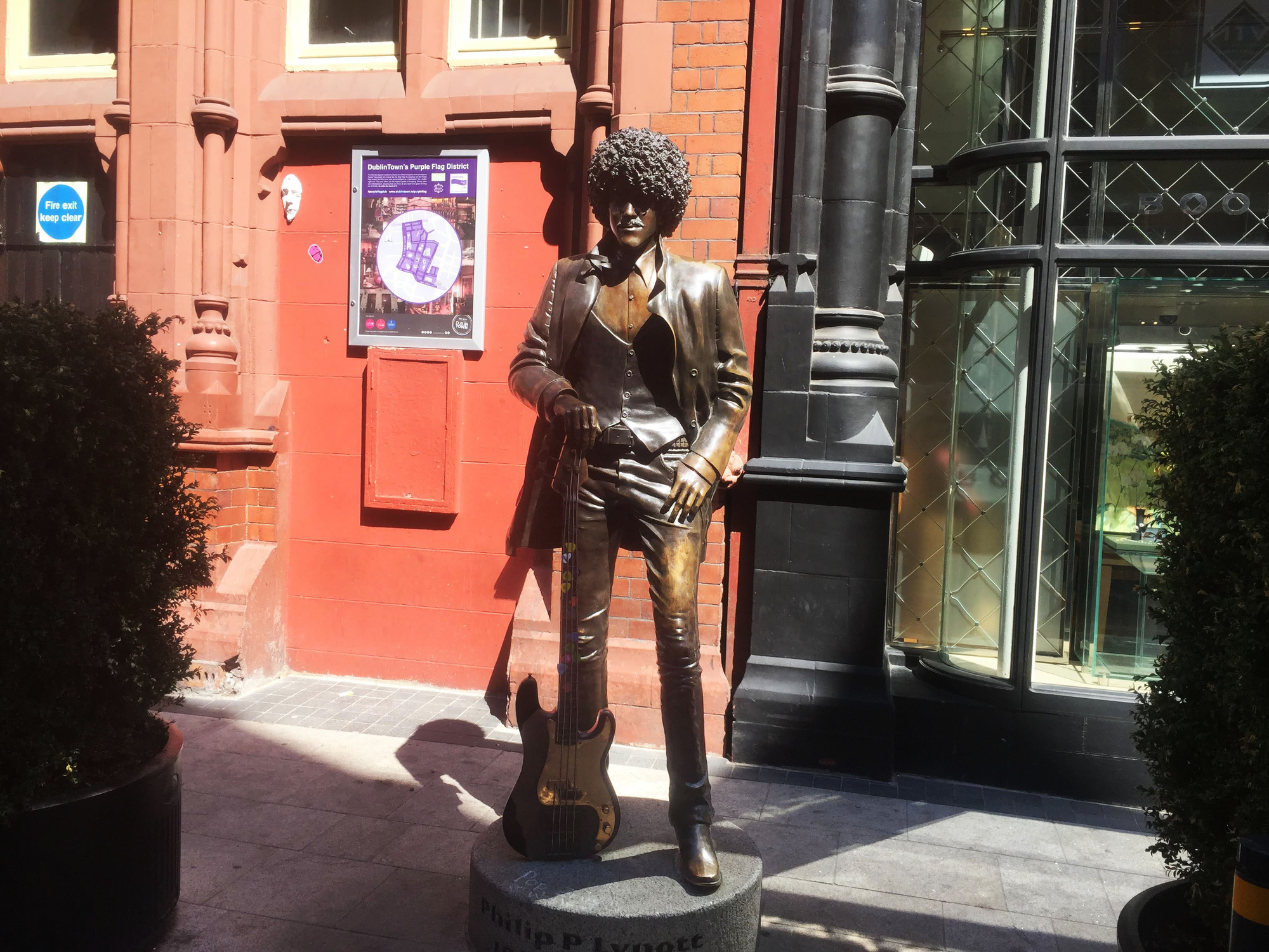
Phil Lynott’s band developed a Celtic-influenced logo that incorporated traditional Irish design elements into rock typography. The interweaving letters suggested both the band’s Dublin roots and their twin-guitar attack – two elements braiding together into something stronger.
Boston
That spaceship logo was as important as Tom Scholz’s guitar sound in defining the band. The UFO emerging from or heading toward a guitar-shaped planet perfectly captured their cosmic arena rock ambitions, and it appeared on everything from album covers to concert backdrops.
Blue Öyster Cult
The hook-and-cross symbol – officially called the “Kronos” – became one of rock’s most mysterious logos. The band claimed it represented the intersection of time and space, but it looked ancient and futuristic simultaneously, which matched their science fiction-influenced hard rock perfectly.
The Sound That Shapes the Symbol

These logos worked because they emerged from the music rather than being imposed upon it. The best rock band symbols feel inevitable – as if the sound itself carved out a visual representation and left it behind for everyone else to discover.
That connection between what you hear and what you see explains why these particular images stuck around long after radio stopped playing the songs.
More from Go2Tutors!

- The Romanov Crown Jewels and Their Tragic Fate
- 13 Historical Mysteries That Science Still Can’t Solve
- Famous Hoaxes That Fooled the World for Years
- 15 Child Stars with Tragic Adult Lives
- 16 Famous Jewelry Pieces in History
Like Go2Tutors’s content? Follow us on MSN.