20 Designs That Made Things Worse by Being “Too Efficient”
Design is supposed to make life easier. When done right, it saves time, reduces effort, and feels almost invisible. But sometimes, in the rush to be clever or save space, designers go a little too far.
What’s left behind is not comfort—but confusion, annoyance, and the occasional injury. Some of these designs were meant to help, while others tried to save a few seconds.
In the end, all of them just made things harder for everyone else.
Touchscreen Car Controls
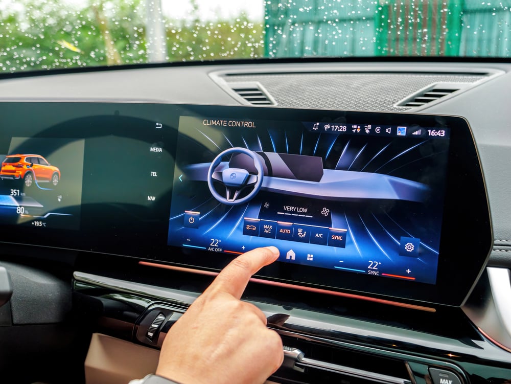
The idea sounds neat—ditch the knobs and go digital. But when drivers have to tap through three menus just to turn on the defroster, that’s not efficient. It’s dangerous. Eyes should be on the road, not poking at a glowing screen during rush hour.
A simple button would’ve worked better.
Open Floor Office Plans
This setup was sold as a way to boost collaboration. In reality, it mostly increased noise and distractions.
Everyone hears every call, cough, and bag of chips being opened. Instead of teamwork, people whisper or wear headphones just to focus. Privacy vanished, and productivity didn’t really go up.
Bathroom Faucet Sensors
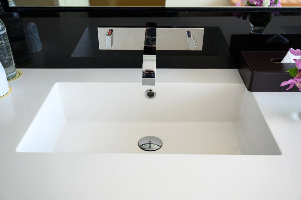
Automatic sensors were supposed to be cleaner and faster. Instead, they often miss your hands or shut off mid-wash.
People end up doing a weird hand dance just to get water. In public places, it becomes more frustrating than helpful. Sometimes, old-fashioned handles just get the job done better.
Frameless Glass Showers
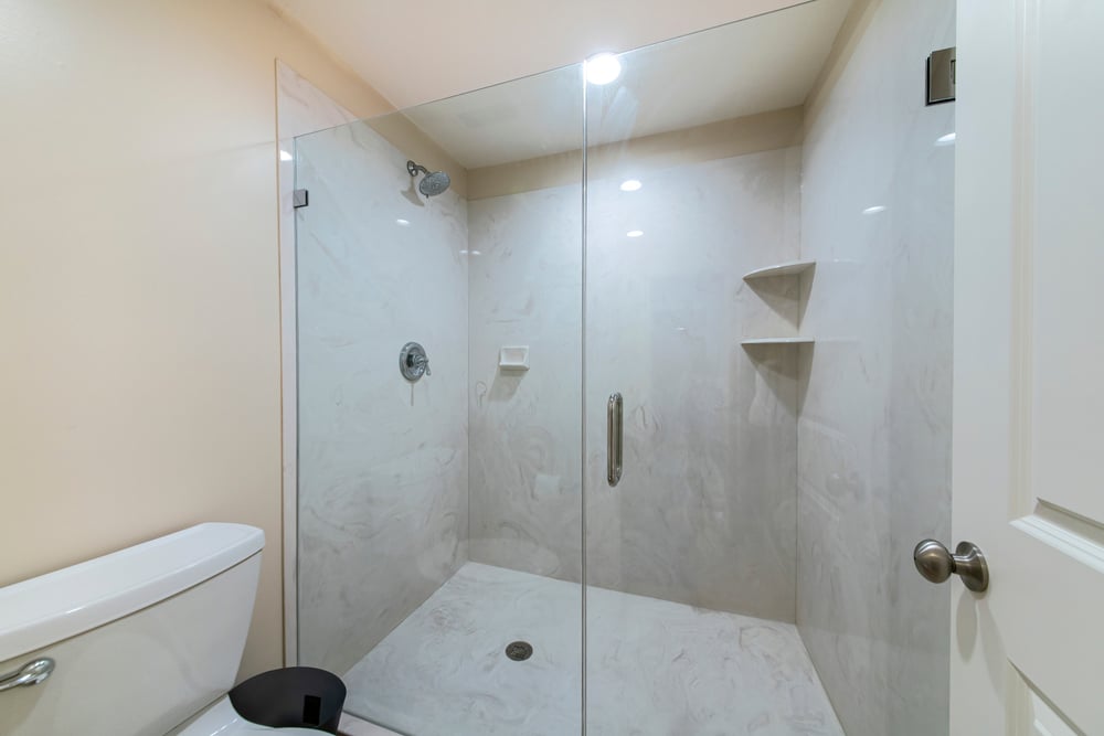
They look sleek and modern, but no one talks about how water floods the entire bathroom floor. There’s no proper barrier to keep things dry, and once you step out, a slippery mess is waiting.
Not exactly user-friendly, unless mopping after every shower counts as good design.
Overly Complicated Coffee Machines

Modern coffee machines now come with touchscreens, Wi-Fi, and thirty drink options. But sometimes, all someone wants is a simple cup of coffee. Instead, they end up stuck in a menu maze, trying to guess which icon starts the brew.
What used to take one step now takes five.
Endless Scroll Websites

The goal was to keep users engaged. However, removing the bottom of a page made it hard to find the footer or return to a specific spot. Scrolling forever isn’t always helpful.
People lose track of where they were, and it’s easy to feel lost, even while still on the same page.
Microwave “Quick Start” Buttons

One button to heat anything sounds great—until it just blasts food with no control. That “Add 30 Seconds” button often overheats, overcooks, or makes soup explode.
Instead of efficiency, it becomes a guessing game. Not every meal needs a jet engine.
Invisible Door Handles

They look cool—no knobs, no handles, just a sleek panel until someone can’t figure out how to open it. Pushing? Pulling? Sliding?
It’s a puzzle every time. Especially awkward when strangers watch as you fail at a basic task like entering a room.
Hotel Room Light Systems
Hotels love to show off tech. But when turning on the lights requires a full lesson, that’s a problem. Guests shouldn’t have to tap five switches or use a tablet just to find the bathroom at night.
Sometimes, the “smart” lighting systems feel anything but.
Compact Folding Furniture
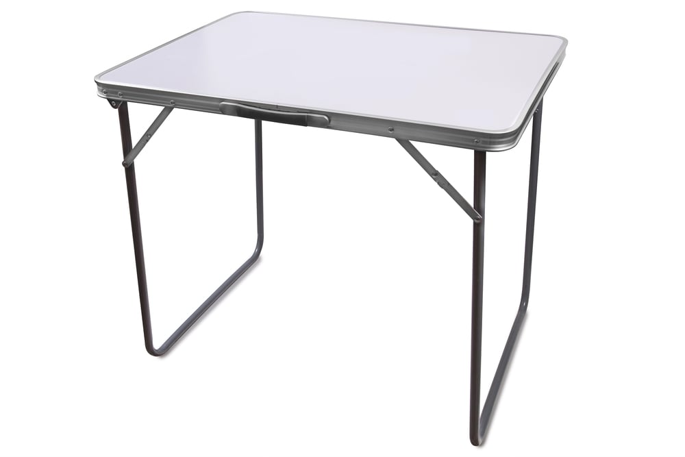
These designs were made for small spaces. But if it takes five minutes, an instruction video, and some light sweating to fold out a chair, that’s not efficient.
The more compact it gets, the harder it becomes to use quickly. It ends up staying folded forever.
Refrigerator Water Dispensers With Hidden Sensors
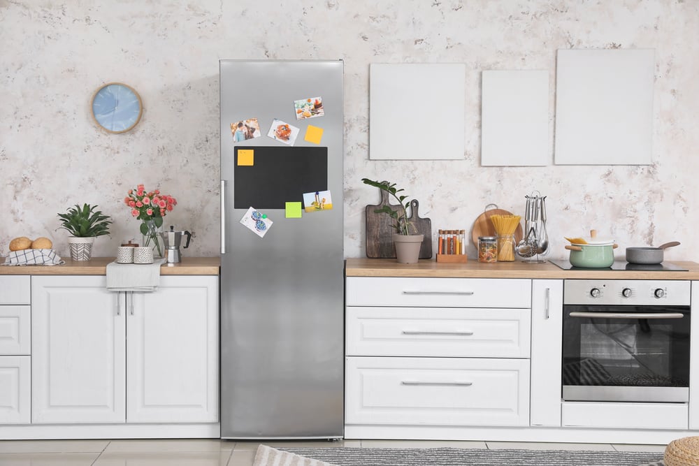
To get water, you now need to press in the exact right spot. And if you’re even slightly off, nothing happens.
Or worse, water sprays everywhere. They were meant to look clean and high-tech, but they turned something simple into a guessing game.
Self-Flushing Toilets
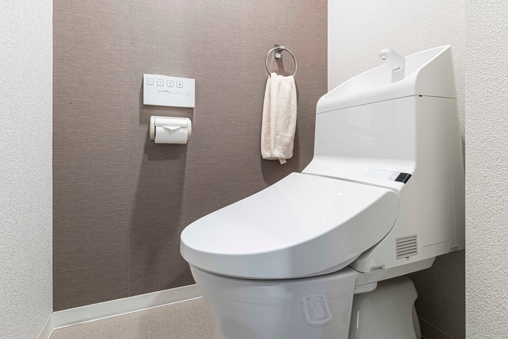
It was supposed to be more sanitary. Instead, people jump out of their skin when the toilet flushes unexpectedly.
Sometimes it flushes mid-use. Sometimes it won’t flush at all. Either way, it adds unnecessary stress to something that should be simple and private.
Multi-Function TV Remotes
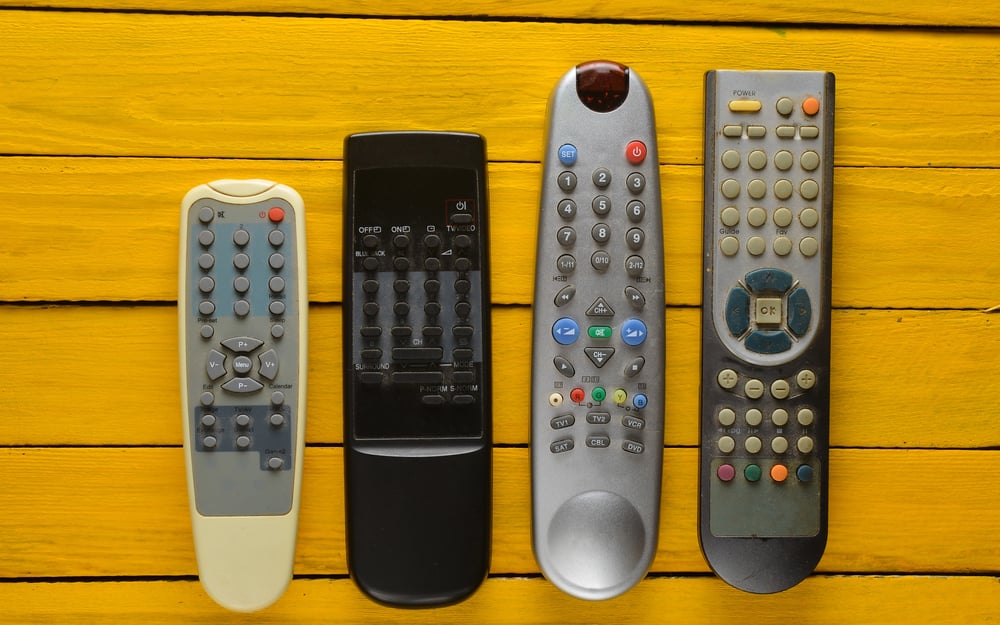
These remotes can control everything—from the TV to the fridge. But with hundreds of buttons and no clear labels, even changing the channel becomes confusing. Many people end up just using their phone or asking someone else.
Too much power becomes a problem when nobody knows how to use it.
Over-Optimized Grocery Store Layouts
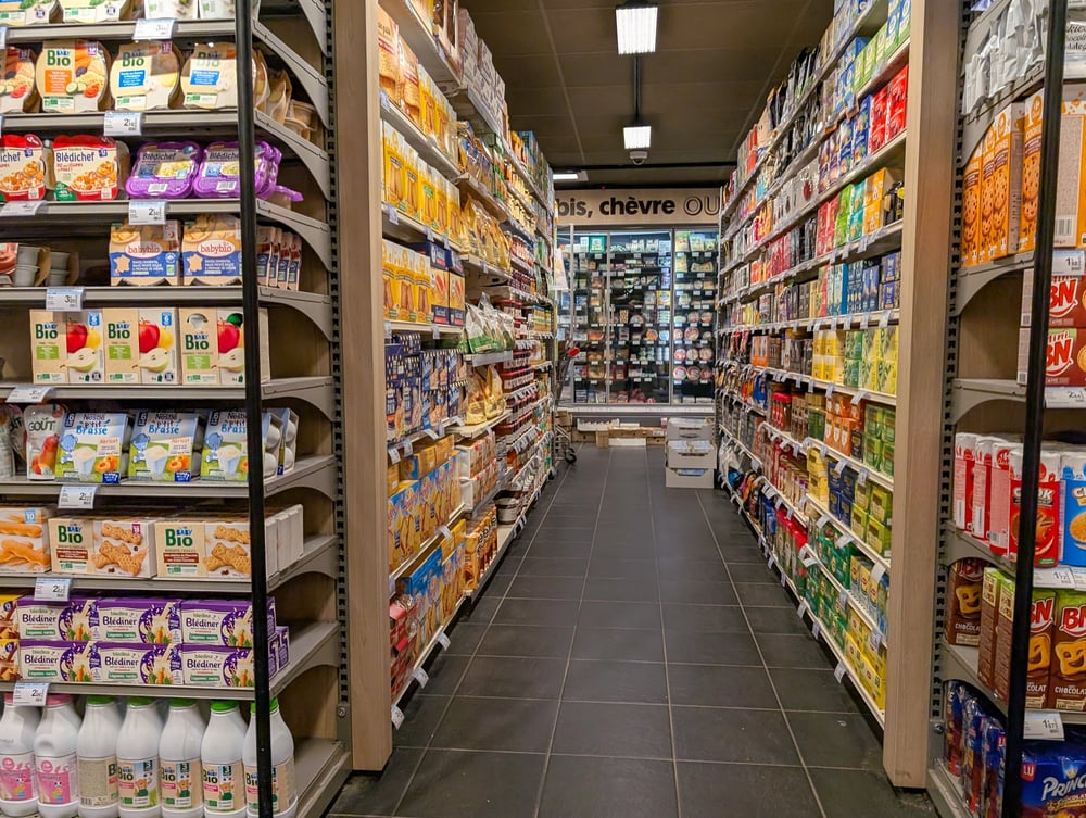
To increase sales, stores hide basics like milk or bread in the back, forcing shoppers to walk through the entire store. But for someone in a rush, this is annoying.
Instead of convenience, it feels like a trap. It wastes time and energy—on purpose.
Flush Door Designs in Public Buildings

These doors sit completely flat against the wall, with no obvious way to open them. It’s supposed to look clean and seamless.
But when people push, pull, or try to slide and nothing happens, it just feels awkward. No one should have to solve a riddle to leave a room.
App-Only Parking Meters

Getting rid of coins and cards seemed like progress. But not everyone wants to download an app just to park for five minutes.
These meters become impossible to use with poor signals or a low phone battery. Efficiency should never mean exclusion.
Minimalist Elevators With No Floor Buttons

Some buildings use a touchscreen or an outside panel to select floors. But once inside, there’s no way to change your mind or add a stop.
If someone gets in late or presses the wrong number, they’re stuck. A simple button would’ve fixed everything.
Hidden Trash Cans in Public Spaces

Some parks and malls try to hide trash cans behind sleek panels or designs. But when people can’t find where to toss their trash, garbage ends up on the ground.
A design is not efficient if it makes people give up trying to use it correctly.
Password Masking on Logins

The stars that hide your password were meant to protect you. But they make it easy to mistype without knowing it.
And now you have to retype again and again. On personal devices, this “efficient” feature just slows things down.
Over-Engineered Door Closers

Some doors are so tightly engineered they swing shut like a bear trap. The goal was security and speed.
But for kids, older adults, or anyone carrying groceries, it’s a hazard. Instead of welcoming, it feels like the door is fighting you.
What Worked on Paper, Flopped in Real Life
There’s a thin line between smart design and overthinking things. Many of these “too efficient” ideas came from a good place—trying to help, save time, or look modern.
But real-life use doesn’t always match the original plan. When design forgets about the user, it stops being useful.
Good design should feel easy, even invisible—not like solving a puzzle just to turn on the lights.
More from Go2Tutors!

- The Romanov Crown Jewels and Their Tragic Fate
- 13 Historical Mysteries That Science Still Can’t Solve
- Famous Hoaxes That Fooled the World for Years
- 15 Child Stars with Tragic Adult Lives
- 16 Famous Jewelry Pieces in History
Like Go2Tutors’s content? Follow us on MSN.