21 Maps From the Colonial Era That Got It Wrong on Purpose
A map feels like a fact. The coastlines are where they are, the borders run where they run, and the relative size of things is what it is.
That feeling of factual authority is precisely what made maps such effective tools of colonial power — and precisely what made some of the distortions in those maps so consequential. Not all colonial-era cartographic errors were deliberate. Some were the inevitable result of working without satellite data, without consistent survey methods, and without any agreed global standard for how to project a spherical world onto a flat page.
But some distortions were deliberate, and the distinction matters. What follows covers both — the intentional and the structural — with an honest account of which is which, because the effects of both are still visible in the maps most people use today.
The Mercator Projection’s Size Distortion
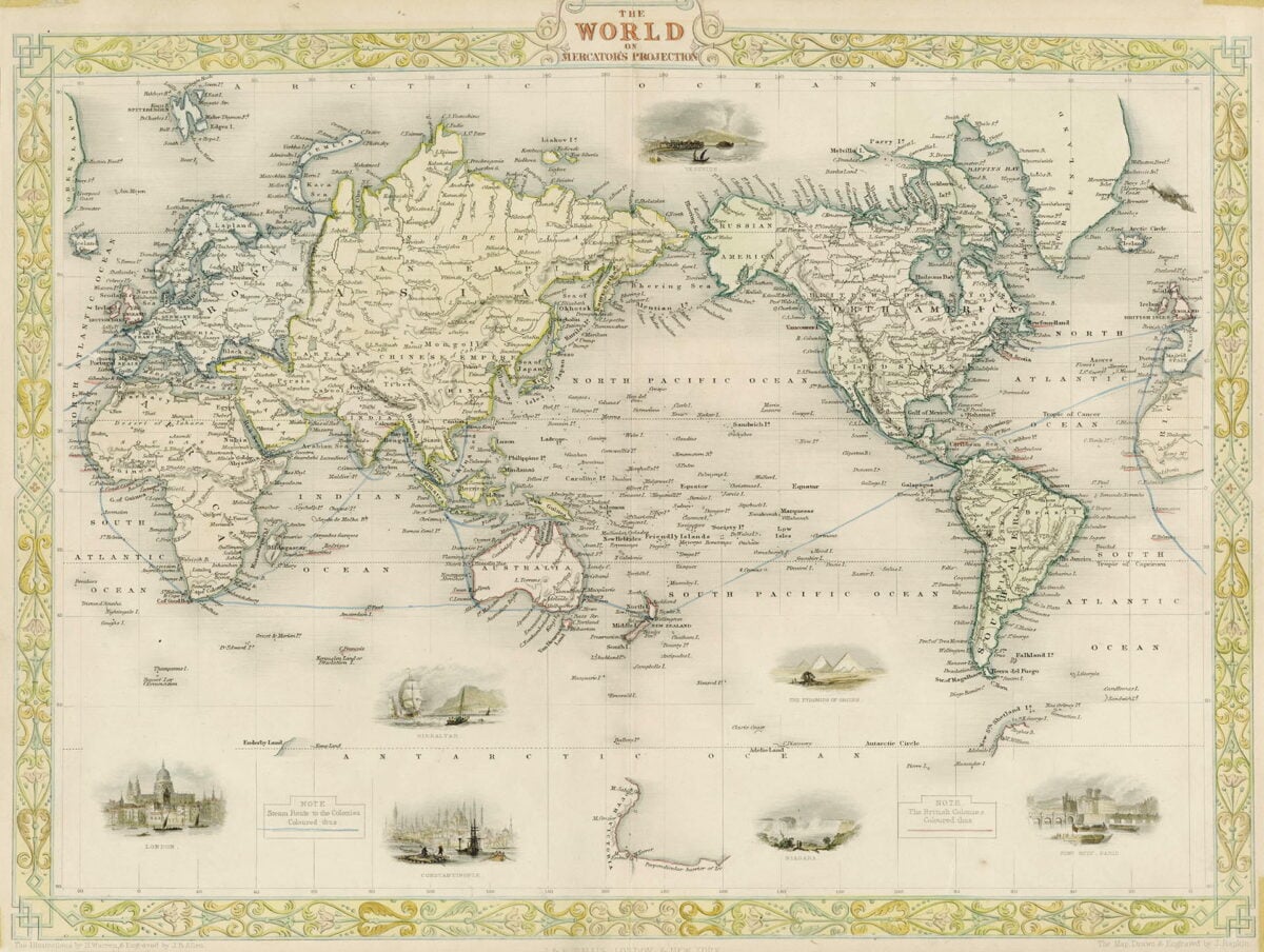
Gerardus Mercator published his world map projection in 1569. The mathematical trade-off he made — preserving the angles that navigators needed for accurate sailing charts, at the cost of distorting relative size — was a genuine technical decision, not a conspiracy.
But the effect of that decision has been significant and lasting. In the Mercator projection, landmasses near the poles appear dramatically larger than they actually are relative to landmasses near the equator.
Greenland appears roughly the same size as Africa. In reality, Africa is approximately fourteen times larger. Europe appears much larger than South America. In reality, South America is nearly twice as large as Europe.
The projection that became the standard for wall maps in schools and offices worldwide — often without explanation of its limitations — placed the equatorial regions that were colonized at the bottom, shrunken, and the colonial powers in Europe near the top, enlarged.
Terra Australis Incognita
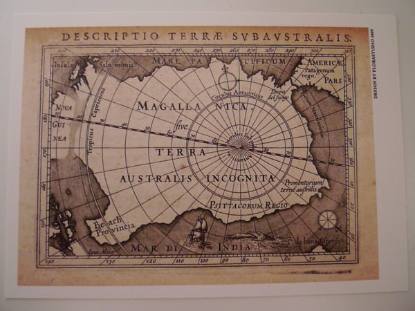
For centuries, European maps showed an enormous southern continent — Terra Australis Incognita, the Unknown Southern Land — occupying most of the space below 40 degrees south latitude. It appeared in maps from Ortelius, Mercator, Blaeu, and dozens of other major cartographers of the 16th through 18th centuries. The continent was drawn with mountains, river systems, and coastlines.
None of it existed. The theoretical logic was that a southern landmass must exist to balance the weight of the northern continents — an assumption dressed up as geographic knowledge.
When James Cook sailed below 40 degrees south in 1773 without finding land, the theoretical continent was finally removed from most maps. Its presence for two centuries had shaped exploration priorities, colonial ambitions, and territorial claims in ways that were not immediately undone by its removal.
The Blank Interior of Africa
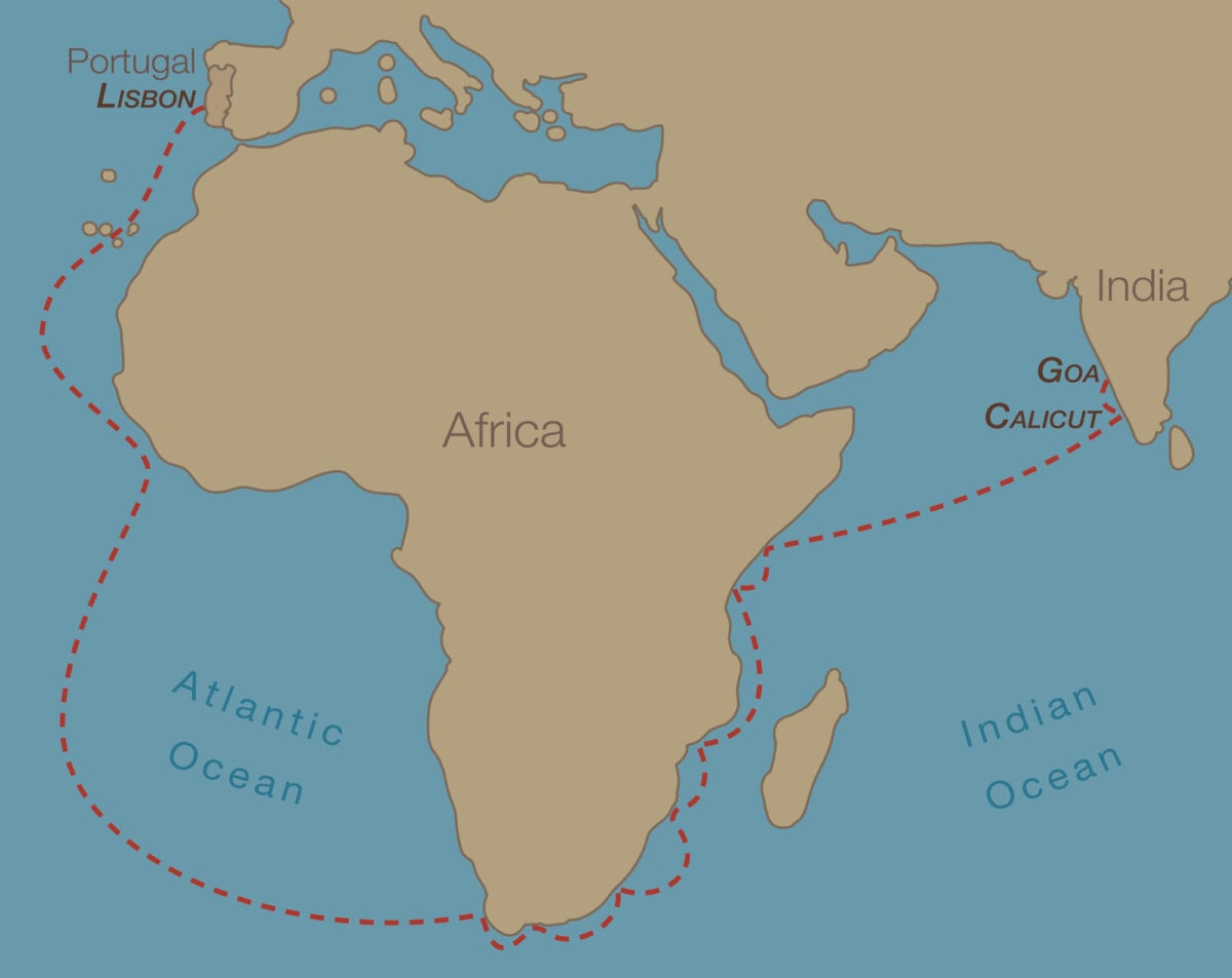
European maps of Africa in the 18th and early 19th centuries showed detailed, accurate coastlines — the result of centuries of coastal trade — and almost nothing in the interior. The interior was labeled “unknown” or simply left empty.
This is sometimes presented as honest cartographic humility: mapmakers only drew what they knew. But the effect of the blank interior was politically significant: it represented African territories as unclaimed, unexplored, and by implication, available.
The actual complexity of the interior — the kingdoms of Kongo, Dahomey, and Great Zimbabwe; the trade networks of the Sahel; the urban sophistication of Timbuktu — was largely absent from European maps not because it was unknown to everyone, but because European cartographers had limited access to it and limited incentive to represent it accurately.
The Berlin Conference Map (1884–85)
The map produced to facilitate the Berlin Conference — at which European powers divided Africa among themselves — was not a geographic document but a political one, and the lines drawn on it reflected negotiating positions rather than any relationship to the territories they divided. The mapmakers worked largely without knowledge of local topography, ethnic boundaries, language groups, or existing political structures.
Straight lines were drawn across the continent because straight lines were easy to negotiate and easy to draw. The result was a set of borders that divided more than 1,000 ethnic groups, separated related peoples, and enclosed rivals in the same colonial units.
Most of those borders became the borders of independent African nations, because the colonial powers had made them the only administrative reality that existed.
The Imperial Federation Map (1886)
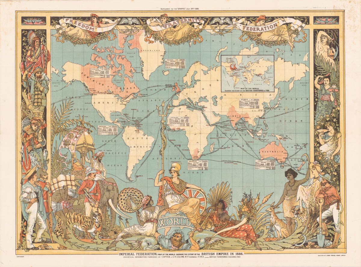
Produced to advocate for formal federation of the British Empire, the 1886 Imperial Federation Map showed Britain’s global possessions in vivid red, with sea routes connecting them and Britannia herself draped over the globe at the bottom. The map was not a neutral geographical document — it was designed to make the Empire look natural, permanent, and beneficial.
Britain was placed visually at the center of a web of connections. The territories of the Empire were shown without reference to their existing populations, political structures, or resistance to colonial rule. The map was openly propagandistic, and its creators did not hide this: it was produced by the Imperial Federation League specifically to build public support for a political position.
The Dutch East India Company’s Navigational Monopoly
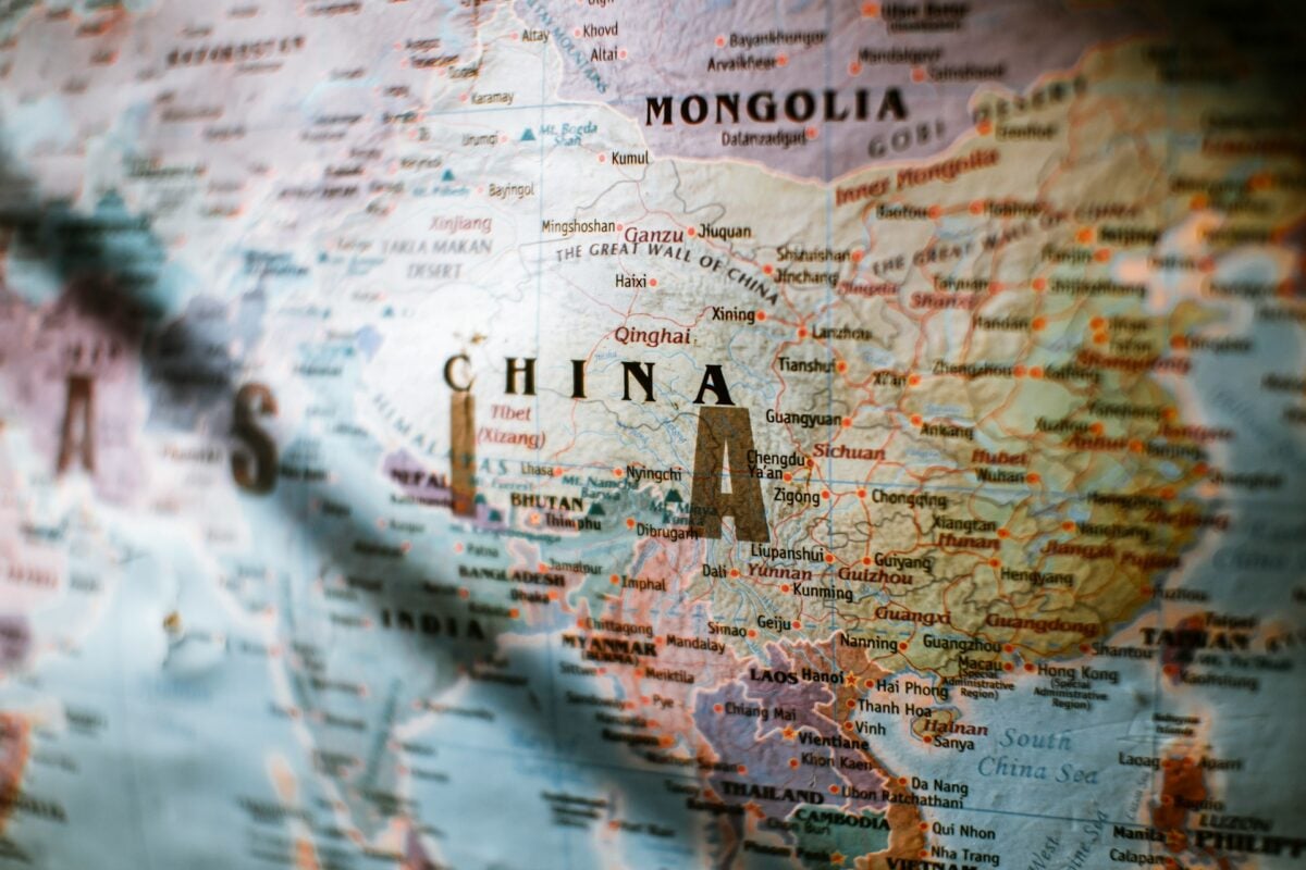
The Dutch East India Company deliberately withheld and manipulated navigational charts of Asian sea routes in the 17th century to maintain its trade monopoly. Accurate charts of the routes to the Spice Islands were company secrets — mapmakers who produced them for the company were prohibited from sharing them, and the company destroyed charts rather than let them fall into competitors’ hands.
The public maps available during this period showed deliberately vague or inaccurate coastlines in areas where the VOC operated, because accurate knowledge of those coastlines was worth more to the company than any other asset it controlled.
The Mapping of Palestine Before 1948
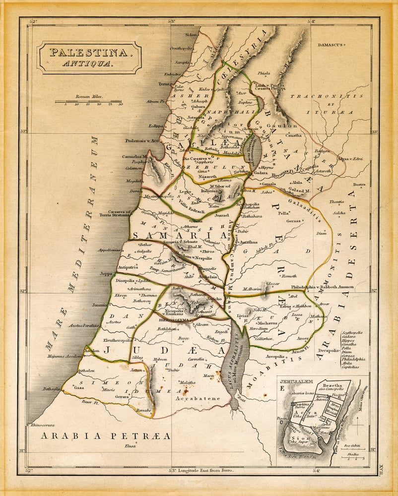
British Mandate-era maps of Palestine drew administrative boundaries, named settlements, and defined territorial units in ways that created political facts on paper before they existed on the ground. The specific choices made in these maps — which settlements were named, which were transliterated from Arabic and which from Hebrew, how municipal boundaries were drawn — shaped the legal and political arguments that followed the end of the British Mandate.
The maps weren’t neutral records of what existed. They were administrative tools that created what would exist, and the competing claims they produced have never been resolved.
The Sykes-Picot Map (1916)
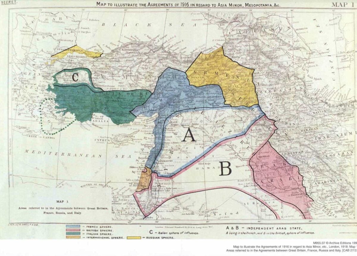
The map drawn by Mark Sykes and François Georges-Picot to divide the post-Ottoman Arab world between British and French spheres of influence was produced without reference to existing political structures, ethnic boundaries, or the populations who lived there. The famous straight line of the Iraq-Syria border — which runs with unnatural precision across the landscape — was drawn as a diplomatic compromise between two European diplomats who had different administrative goals in the region.
The borders it produced have been contested ever since, and ISIS explicitly cited the Sykes-Picot line in its propaganda when it bulldozed the Iraq-Syria border crossing in 2014.
The Radcliffe Line (1947)
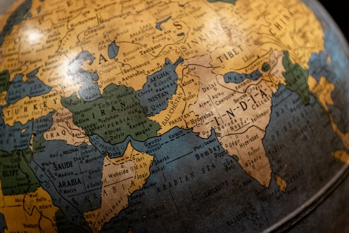
Cyril Radcliffe had never visited India when he was given five weeks to draw the borders that would divide the subcontinent into India and Pakistan. The maps he was working from were incomplete, his understanding of the specific communities that would be divided was limited, and the speed of the process meant that local knowledge was often overridden by administrative convenience.
The line he drew divided the Punjab between countries, cut irrigation systems from the farms they served, and placed specific communities on the wrong side of borders that their members had no role in choosing. The resulting partition produced one of the largest forced migrations in human history — between 10 and 20 million people displaced — and the borders themselves remain disputed.
The Mappa Mundi’s Distorted Geometry
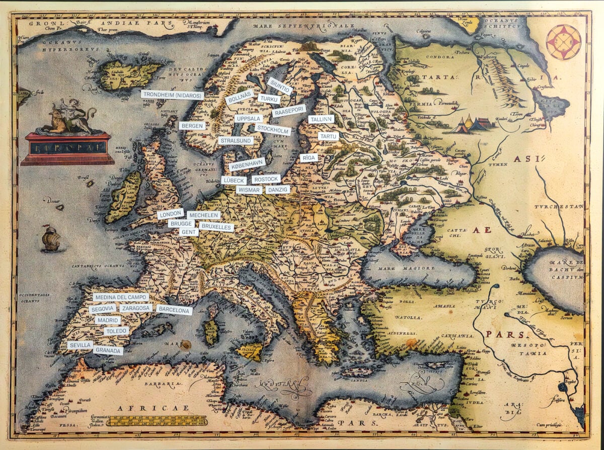
Medieval European mappae mundi placed Jerusalem at the center of the world and oriented the map with east at the top (toward the Garden of Eden) rather than north. The geographic distortions this produced were enormous — Asia was drawn as a vast space at the top, Europe and Africa compressed into the lower regions, and the southern lands populated with monstrous peoples who became less human the further they were from Jerusalem.
These maps were explicitly theological and political documents rather than geographic ones, and their distortions encoded a specific worldview about who mattered and where civilization was centered. The cartographic convention of placing north at the top, and specific regions at the center, was established later by European mapmakers who made different but equally political choices.
Spain’s Deliberate Withholding of New World Geography
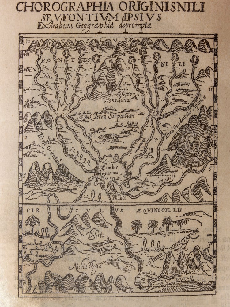
After Columbus’s voyages, Spain classified its geographic knowledge of the New World as a state secret. The Casa de Contratación, Spain’s trade and exploration authority, maintained a master map — the Padrón Real — that was continuously updated with new exploration data and was strictly controlled.
Cartographers who leaked information could face execution. The deliberate suppression of accurate geographic information about the Americas for more than a century meant that other European powers, working from incomplete or stolen maps, made claims and conducted explorations based on systematically inaccurate information.
The shape of the world that most 16th-century Europeans understood was shaped by what Spain chose to reveal and what it chose to conceal.
The Labeling of “Dark Continents”

Colonial-era maps used specific terminology to describe unexplored or poorly mapped regions — “terra incognita,” “unknown,” “darkest” — that did more than simply note gaps in European geographic knowledge. These labels attached political meaning to geographic uncertainty: regions that were “dark” or “unknown” were implicitly available, ungoverned, and open to European claims.
The African interior was labeled “Dark Africa” on maps that were being consulted by colonial administrators deciding what territories to claim. The label was not a neutral description of limited knowledge — it was a political designation that erased the existing governance, populations, and cultures of the regions it covered.
The Doctrine of Discovery and Terra Nullius Maps
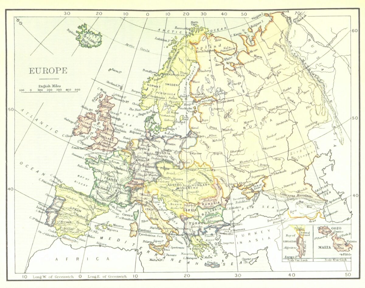
The legal doctrine of terra nullius — the claim that land not formally occupied by a recognized sovereign could be claimed by European powers — required maps that showed territories as empty even when they were inhabited. British colonial maps of Australia in the late 18th and early 19th centuries frequently showed the interior as uninhabited land available for settlement, despite the presence of Aboriginal Australian populations that had occupied the continent for at least 65,000 years.
The legal fiction of terra nullius was enforced through cartography: if the map showed no people, the land was available. The doctrine was not formally overturned in Australian law until the Mabo decision of 1992.
The Marking of “Savage” and “Civilized” Territories

Colonial maps routinely used visual coding to distinguish between territories considered “civilized” — meaning under European or European-influenced governance — and those considered “savage” or “barbarous.” These distinctions appeared in map legends, color schemes, and the naming of territories.
The consistent effect was to represent territories under colonial rule as improved by that rule and territories outside colonial control as deficient and in need of it. The visual language of the map made colonial expansion look like an organizing project rather than a conquest.
The Downgrading of Non-European Cities
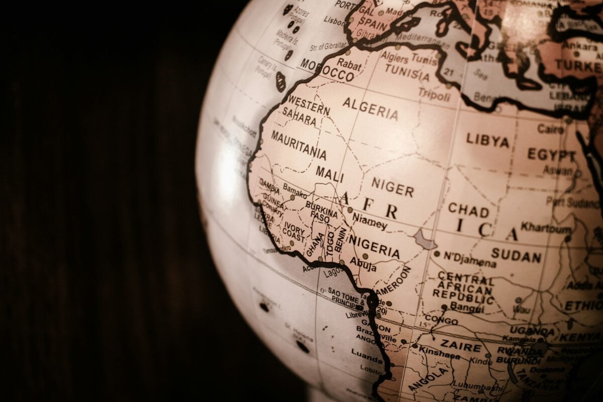
Colonial-era maps of Asia, Africa, and the Americas frequently showed European trading posts and mission stations as named, sized, and prominently marked locations, while existing cities of equivalent or greater size were named inconsistently, spelled using European approximations of local names, or omitted entirely. Timbuktu — a major center of Islamic scholarship and trade with a population in the tens of thousands at the height of the Mali Empire — appeared on some European maps and was missing from others, depending on whether the cartographer had access to Arabic sources.
The inconsistent treatment of non-European urban centers in colonial mapping created a global picture in which European civilization was the reference point against which all other settlements were measured.
The Renaming of Geographic Features
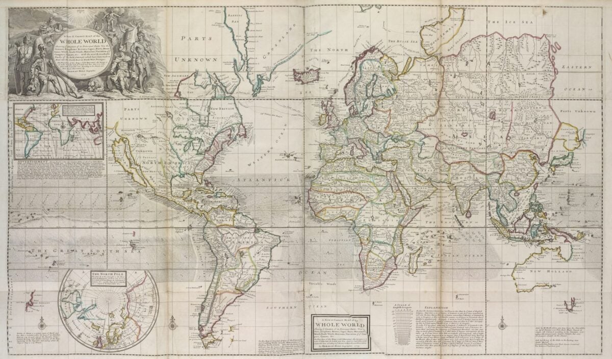
Colonial maps replaced existing place names with European names, either for the convenience of European administrators who couldn’t pronounce local names, or deliberately to establish European claims to territories. The renaming process was both a practical administrative act and a political one: a place that appears on a map with a European name has been, in some sense, Europeanized through the act of mapping.
Rivers, mountains, capes, and entire regions were renamed after European monarchs, explorers, and saints — names that appear on maps today in countries that achieved independence from those same colonial powers decades ago, and where the question of whether to restore original names remains active.
The Exaggeration of Colonial Territory
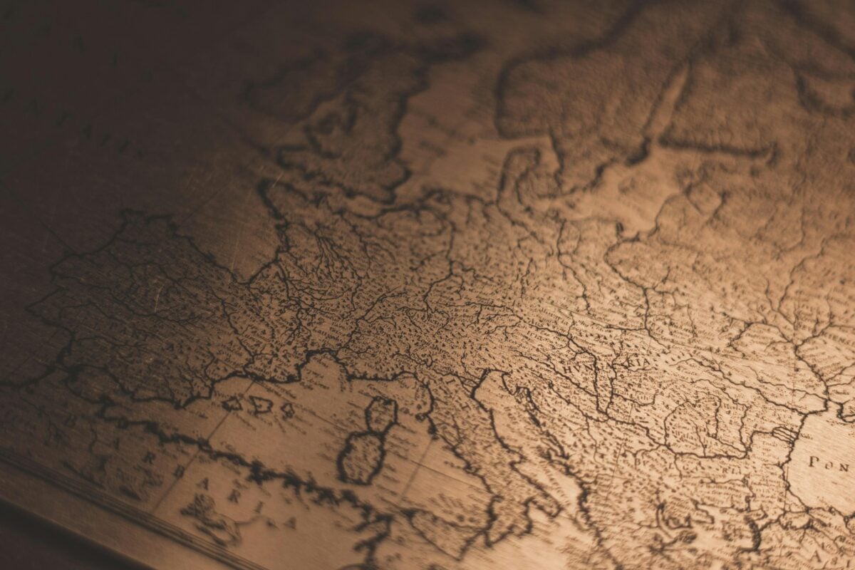
Maps produced to support specific colonial land claims — particularly in Africa during the Scramble — routinely exaggerated the size of territories claimed by the commissioning power or underrepresented the territories claimed by rivals. The same physical geography could appear differently on a British map versus a French or German map of the same region, depending on which power’s claims each map was designed to support.
This wasn’t simply nationalism — it was a deliberate technique in territorial disputes where the map itself was presented as evidence of a prior claim. The argument “but it’s on our map” was used in diplomatic negotiations as if the map were a legal document rather than a political one.
The Centering of Europe
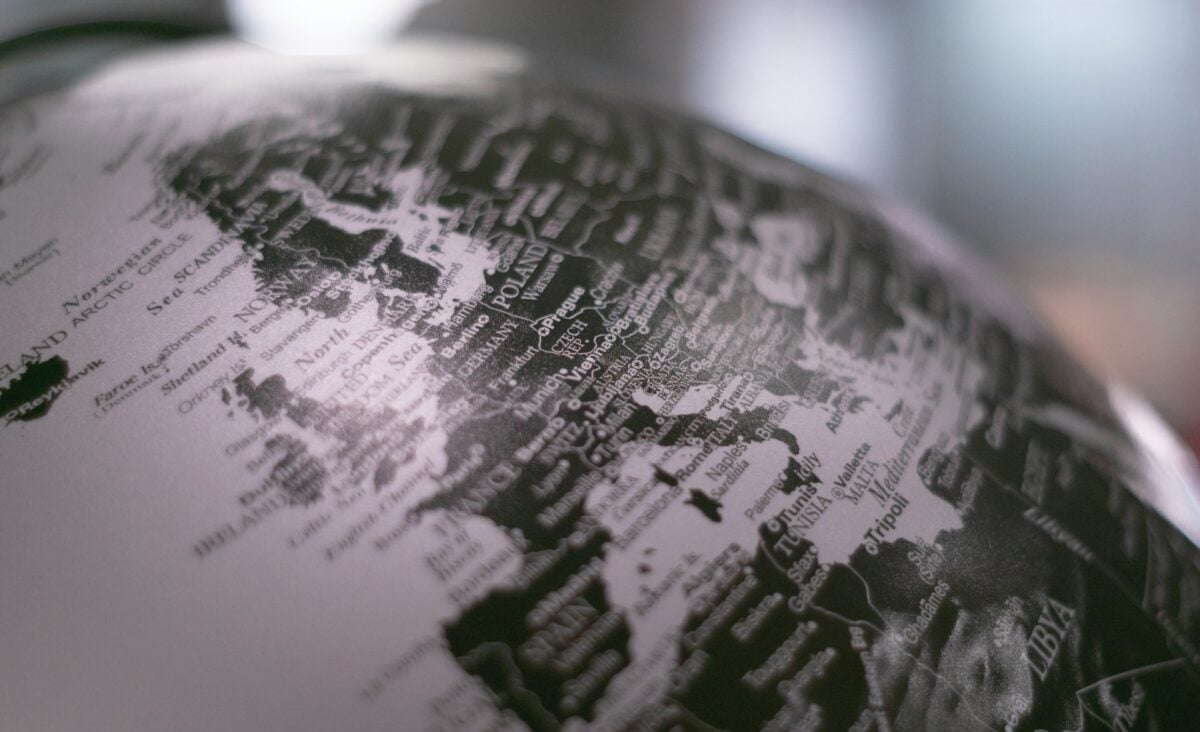
The convention of placing Europe at the center of world maps was not geographically determined — it was a political choice that European cartographers made and then naturalized over centuries. The familiar world map with the Greenwich Meridian at center was established by British cartographic convention and adopted globally through colonial influence.
Alternative centering systems — with the Pacific at center, with the Americas at center, with no center at all — produce maps in which Europe’s position looks different, which is to say its position looks more accurate. The centered-on-Europe world map remains the dominant form in most educational systems worldwide, even in countries that have no historical reason to view Europe as the center of anything.
The Omission of Indigenous Geographic Knowledge
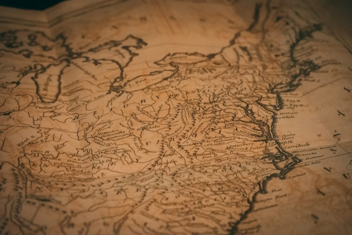
Colonial maps frequently reached places where European surveyors had never been by copying, without attribution, from indigenous geographic knowledge — information provided by local guides, traders, and leaders who knew their territories in detail. The process of incorporation was systematic: indigenous knowledge was used to produce the map, and then the map was presented as European scientific production, erasing the knowledge systems that had made it possible.
The resulting maps were often more accurate than purely European surveys would have been, but the indigenous geographic knowledge they encoded was stripped of its context, its original frameworks, and its rightful authors.
The Treatment of the Equator and Tropics as Boundaries
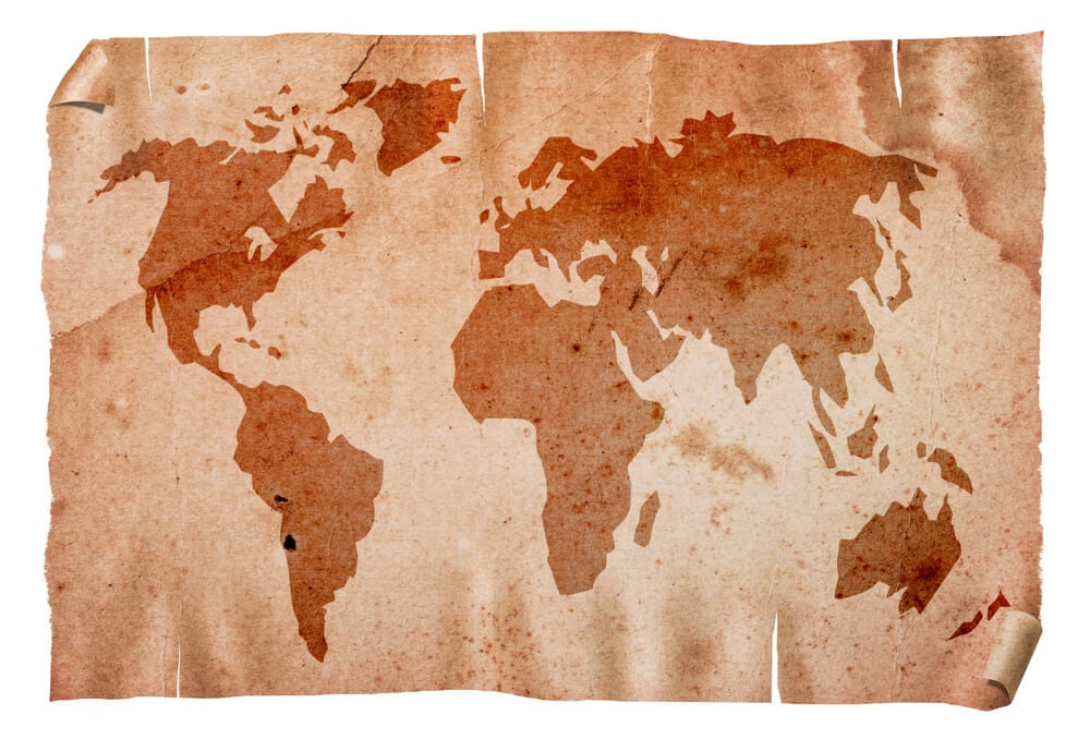
Colonial-era maps consistently used the tropics and equator as implicit boundaries between the civilized north and the dangerous or primitive south — a geographical convention that encoded a racial and climatic theory about where serious civilization was possible. The “torrid zone” between the tropics was shown on some maps with symbols indicating heat, danger, and exotic wildlife, while the temperate zones above and below it were shown as the natural home of settled agricultural civilization.
The climatic theory that made this visual language seem scientific — that hot climates produced laziness and disorder while temperate climates produced industry and civilization — was used to justify colonial rule in tropical regions as a corrective to geographical determinism. The maps encoded that justification into geography itself.
The Persistence of Colonial Borders
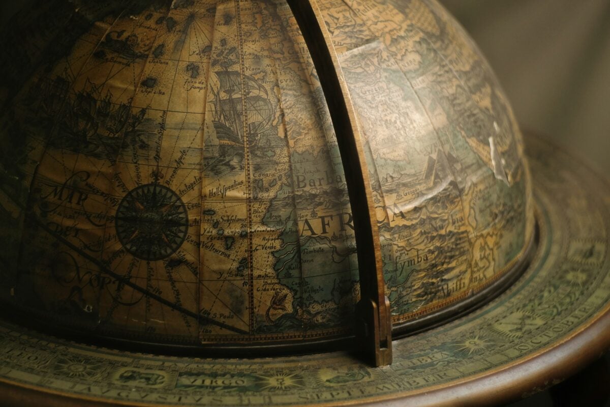
The most consequential cartographic legacy of the colonial era is not any specific map error but the system of borders that colonial mapping produced and that were inherited, with minor modifications, by independent states. The borders of most African nations run along the lines drawn at Berlin in 1884–85. The borders of most Middle Eastern states run along the lines drawn by Sykes, Picot, and their successors.
The borders of South Asian nations run along the Radcliffe Line. In each case, the political map inherited from colonialism has created states that contain populations who did not choose their configuration, separated peoples who share language and culture, and enclosed rivals who have spent decades managing the tensions that the colonial mapmakers didn’t account for because they didn’t particularly care to.
The map didn’t create all of these conflicts, but it gave them their current shape.
What a Map Is Actually For
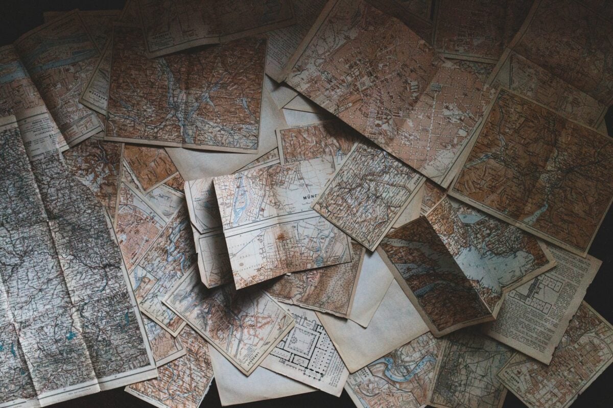
Every map is a simplification. The act of reducing a three-dimensional world to a two-dimensional page requires choices, and choices have politics behind them.
The cartographers who worked for colonial powers weren’t all cynical propagandists — many believed they were making scientific contributions to geographic knowledge. But the structures they worked within, the interests they served, and the assumptions they encoded into their work produced a visual language of the world that still shapes how most people understand it.
The most useful thing to know about a map is who made it, why they made it, and what they needed it to show. A map that answers those questions honestly is doing something different from a map that presents itself as simply the way things are.
Most of the maps in this article were the second kind. Some of the most influential ones still are.
More from Go2Tutors!

- The Romanov Crown Jewels and Their Tragic Fate
- 13 Historical Mysteries That Science Still Can’t Solve
- Famous Hoaxes That Fooled the World for Years
- 15 Child Stars with Tragic Adult Lives
- 16 Famous Jewelry Pieces in History
Like Go2Tutors’s content? Follow us on MSN.