25 Propaganda Posters from the Past Century That Revealed More Than Their Creators Intended
Propaganda works by controlling what an audience sees. The irony is that the tighter the control, the more the image ends up revealing — about the fears of the people who commissioned it, the anxieties of the society it was aimed at, the contradictions it was trying to paper over.
The most studied propaganda posters in history are not remembered because they successfully deceived their audiences. They are remembered because they told too much truth, or told a different truth from the one intended, or told the truth only once the world changed enough for the original lie to become legible.
Looking back at a century of political image-making, the most revealing thing about these posters is not the message on the surface. It’s the one underneath.
“We Can Do It!” (USA, 1943)
The J. Howard Miller poster produced for Westinghouse Electric in 1943 was not a government campaign. It was an internal corporate poster displayed for approximately two weeks to boost morale among factory workers — including women who had recently entered the workforce.
It was barely seen during the war. Its second life began in the early 1980s when feminist movements rediscovered it, and what had been intended as a management tool became one of the most reproduced images of female empowerment in the twentieth century.
The irony is complete: a poster made by a corporation, for a corporation, which was supposed to make women work harder and ask fewer questions, became a rallying image for the movement those women’s granddaughters built.
“Lord Kitchener Wants You” (Britain, 1914)

Alfred Leete’s famous poster of Lord Kitchener pointing directly at the viewer was not the ubiquitous image it later became — it was first a magazine cover for London Opinion in September 1914, only later adapted as a poster.
What the image revealed, despite its confident posture, was the fear at the heart of the British military establishment: that volunteers would not come forward in sufficient numbers.
Britain was the only major European power that relied on voluntary recruitment at the start of the war. The pointing finger and the direct address were an attempt to create a personal sense of obligation that the state could not yet legally impose.
Conscription arrived in 1916, suggesting the poster’s success was partial at best.
Soviet “Beat the Whites with the Red Wedge” (Russia, 1920)

El Lissitzky’s geometric poster for the Bolsheviks — a red triangle driving into a white circle — is now celebrated as a landmark of Constructivist design. At the time it was a piece of battlefield communication aimed at a largely illiterate audience, using shapes rather than text to identify enemies and allies.
What it revealed was the genuine uncertainty of the Bolshevik position in 1920: the Civil War was not won, the outcome was not guaranteed, and the Red Army needed to communicate its goals to populations who could not read the slogans.
A confident regime in full control of its territory does not need to reduce its enemies to geometric shapes. The brilliance of the design came directly from the desperation of the situation.
“Degenerate Art” Exhibition Posters (Nazi Germany, 1937)

The posters and materials promoting the Entartete Kunst — the exhibition of art the Nazi regime had confiscated and condemned as degenerate — were intended to demonstrate the corruption of modernist and Jewish culture. Instead, they drew the largest audience of any German art exhibition in history: over two million visitors in four months in Munich, with lines stretching around the block.
The works intended to be condemned were, to many viewers, obviously good. The Nazi propaganda apparatus had inadvertently produced the most popular modern art show Germany had ever seen.
The competing exhibition of officially approved Nazi art, held simultaneously, drew far fewer visitors.
“Loose Lips Sink Ships” (USA, 1942–45)

The careless talk campaign run by the US Office of War Information was designed to prevent civilians from inadvertently revealing military information to enemy agents. What it inadvertently communicated was the government’s profound anxiety about civilian loyalty and discretion — an anxiety that shaded into an atmosphere of mutual suspicion.
You did not know who might be listening. Your neighbour might be passing on information.
The poster trained Americans to treat ordinary conversation as potentially treasonous. The infrastructure of suspicion the posters built was not dismantled when the war ended.
Much of it transferred directly into the Red Scare culture of the following decade.
German “Why I Am National Socialist” Posters (1932–33)

The personal testimony posters used by the NSDAP in the 1932 elections — featuring ordinary workers and farmers explaining their conversion to National Socialism in their own words — were designed to create an impression of grassroots authenticity.
Read now, they reveal something more disturbing: the exact anxieties the party was exploiting.
Unemployment. Loss of status. The perception that Germany had been humiliated. The fear that social order was disintegrating.
The posters are a catalogue of genuine grievances, cynically harvested.
Soviet “He Who Does Not Work, Neither Shall He Eat” (USSR, 1920)

This poster, adapting a biblical phrase to Leninist ends, depicts a pyramid of social classes — clergy, aristocrats, bourgeoisie, soldiers — riding on the backs of workers and peasants.
It was intended as an image of class oppression that the revolution had corrected. What it also shows is who the new Soviet state perceived as its domestic enemies in the immediate post-revolutionary period: not foreign powers but the traditional Russian social hierarchy that was still very much present and, in 1920, still fighting.
The specificity of the figures — the priest, the general, the businessman — reflects the paranoia of a government that was not yet secure.
“Your Country Needs You” Variations (Britain and USA, WWI and WWII)
The “pointing figure” format — a generic authority addressing the viewer personally — was used across multiple nations and multiple conflicts because it worked. But the very directness of the appeal reveals something about how governments understood the relationship between citizen and state in wartime.
The viewer is not asked to consider the cause, weigh the merits, or make an informed decision. The viewer is told that the decision has been made for them and that their only role is to comply.
The pointer leaves no room for deliberation. This was not incidental to the design — it was the design.
Chinese Cultural Revolution Posters (China, 1966–1976)
The Great Proletarian Cultural Revolution produced posters of extraordinary visual energy — workers with raised fists, heroic peasants, rivers of red.
What they reveal now is how desperately the movement needed to demonstrate enthusiasm it could not always generate organically.
Participation in the Cultural Revolution was compelled. The people depicted as joyfully smashing old culture were often compelled to participate under threat of social ruin or worse.
The gap between the ecstatic faces in the images and the terror that attended the actual events is the most important thing about these posters, and it is entirely visible to anyone who knows what was happening while they were being printed.
“Keep Calm and Carry On” (Britain, 1939)
The “Keep Calm and Carry On” poster was designed in 1939 and almost never publicly distributed. It was held in reserve for a specific scenario: mass civilian panic following a German invasion.
The government printed over two million copies and kept them in storage, waiting for circumstances that, ultimately, did not arise.
The image’s modern ubiquity — it became perhaps the most reproduced motivational image of the twenty-first century — transforms what was essentially a crisis management tool into an aspirational lifestyle statement.
What the poster actually said about the Britain of 1939 was that its government genuinely anticipated a full-scale invasion and was not certain its population would remain composed.
Soviet Poster Depicting American Racial Injustice (USSR, 1950s–1960s)
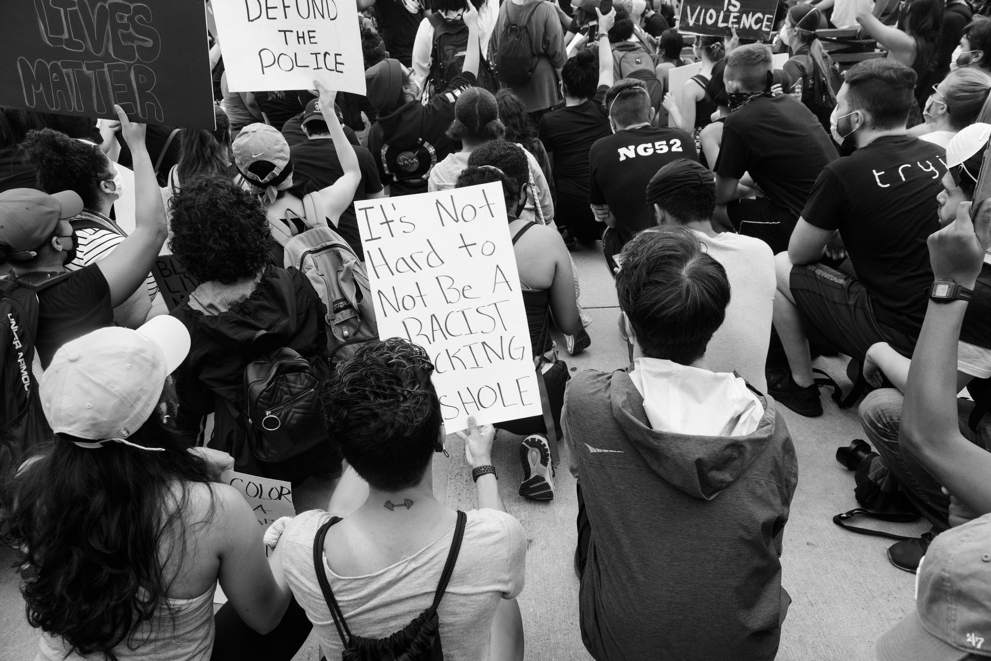
Throughout the Cold War, Soviet propaganda regularly reproduced images of American racial violence — the use of police dogs against protesters, the killing of civil rights demonstrators — as evidence that American democracy was fraudulent.
The intended message was that capitalism produced oppression. What the posters also did was accurately depict events that were actually happening.
American critics who objected to Soviet propaganda on this point were in the awkward position of denouncing the messenger while the events depicted continued.
The propaganda was effective not because it invented its subject but because it selected from reality.
Nazi “Eternal Jew” Exhibition Posters (Germany, 1940)
The posters advertising the Ewige Jude travelling exhibition, which toured Nazi-controlled Europe to dehumanise Jewish populations, are studied today as documents of the bureaucratic mechanism of genocide — how hatred was manufactured at scale and made official through cultural institutions.
What they also reveal is fear: the Jewish population of Germany, at the time the exhibition was created, represented less than one percent of the country’s citizens.
The scale of the propaganda apparatus assembled to depict them as an existential threat tells you more about the insecurities driving National Socialism than about the actual population being targeted.
“Dig for Victory” (Britain, 1940s)

The British Dig for Victory campaign encouraged civilians to grow their own food as a response to wartime rationing.
It revealed, without intending to, how severe the government expected food shortages to become — and how much of the burden of feeding the country was being distributed downward onto individual households.
The campaign was presented as patriotic participation. It was also a frank acknowledgement that the state could not guarantee food supply and was asking its citizens to compensate.
Japanese “Asia for Asians” Imperial Posters (1930s–1940s)
The posters promoting Japan’s Greater East Asia Co-Prosperity Sphere depicted Japanese expansion into China, Korea, and Southeast Asia as a liberation of Asian peoples from Western colonial domination.
They were produced for both domestic and external audiences.
What they inadvertently documented was the specific form of racial hierarchy that Japan was imposing — with Japanese culture, business, and military authority at the top of a new Asian order.
The promise of liberation from one colonialism was functioning simultaneously as the marketing material for a replacement. This was not lost on the populations of occupied territories, who frequently resisted both.
American “This Is the Enemy” Posters (USA, WWII)

American wartime posters depicting Japanese military figures used visual dehumanisation that was markedly more extreme than what was applied to German or Italian enemies — a distinction that reflected the pre-existing racism of American society and had direct consequences in the internment of Japanese Americans from 1942.
The propaganda both reflected and reinforced the assumption that Japanese Americans were potential enemies by association.
The posters did not create the internment policy, but they made it culturally legible in a way that equivalent imagery of German Americans did not.
Stalin-Era “Happy Soviet Family” Posters (USSR, 1930s)

The posters depicting smiling Soviet families in comfortable apartments, surrounded by food and children and clean clothing, were produced during the same years as the Ukrainian famine, the Great Terror, and the forced collectivisation that killed millions.
The happiness in the images was not recorded — it was manufactured as a counterpoint to conditions that the government could not acknowledge.
Looking at these posters knowing what was happening during their production, they function as a kind of inverted document: the brighter the image, the worse the reality it was designed to conceal.
“An Appeal to You!” Soviet Collectivisation Posters (USSR, 1930)

The posters urging peasants to surrender their land and join collective farms were produced as policy was being enforced through confiscation, deportation, and starvation.
They used the language of voluntary community participation for a programme that was anything but voluntary.
Reading them beside the historical record of collectivisation, the gap between the visual language of invitation and the reality of coercion becomes the central fact about them.
British Anti-German Propaganda from WWI (Britain, 1914–1918)

British posters depicting German soldiers as baby-killers and rapists — drawing on and embellishing reports of atrocities in Belgium — created a climate of such intense anti-German sentiment that it made post-war political settlements significantly harder to negotiate.
The propaganda succeeded in its immediate wartime goal of sustaining public anger and military recruitment.
It contributed substantially to the punitive terms imposed on Germany at Versailles, which many historians identify as a significant factor in the destabilisation of the Weimar Republic and the subsequent rise of National Socialism.
The propaganda’s long-term effects were the opposite of what its creators intended.
Mao’s Little Red Book Campaign Materials (China, 1966)

The visual culture surrounding Mao Zedong’s Quotations — the posters depicting workers and soldiers clutching small red books aloft, ecstatic, their faces turned upward toward the light — was produced in quantities that exceeded the output of almost any other propaganda campaign in history.
What the scale reveals is the degree of enforcement required to maintain the fiction of spontaneous mass enthusiasm.
A population that genuinely revered its leader does not require this volume of reminders.
The prolificacy of the imagery was the measure of the doubt it was trying to overcome.
American Cold War “Duck and Cover” Materials (USA, 1950s)

The American civil defence campaign of the 1950s, which suggested that citizens could survive nuclear attack by sheltering under desks or in basements, was probably never believed by the government officials who commissioned it.
What it reveals is not naïveté but a specific calculation: that maintaining the appearance of a survivable nuclear war was necessary to sustain public morale and to avoid the paralysis that honest information would produce.
The duck-and-cover posture is now used as shorthand for absurd official optimism.
At the time, it was a rational propaganda strategy for managing an unmanageable reality.
Soviet Space Race Posters (USSR, 1957–1969)

The glorification of Soviet cosmonauts in the posters of the Space Race era served multiple functions simultaneously: celebrating genuine technical achievements, positioning the Soviet system as superior to capitalism, and directing public attention toward the sky at a time when conditions on the ground were far less celebratory.
The beauty of the imagery — clean lines, primary colours, figures rising toward the stars — was proportional to the need to distract from agricultural failure, housing shortages, and political repression that continued throughout the period.
Nazi “Blood and Soil” Agricultural Posters (Germany, 1930s)

The Blut und Boden campaign produced posters depicting idealised German farmers as the foundation of the racial and national community.
Healthy men, blond families, good earth.
What the campaign inadvertently exposed was a major vulnerability the regime was trying to address: Germany had been an increasingly urban, industrialised, cosmopolitan society, and the Nazi idealisation of rural virtue was a response to the reality that most Germans no longer lived that way and had no particular desire to return to it.
The vigour of the campaign was the measure of its failure to describe anyone’s actual life.
American “Buy War Bonds” Posters (USA, WWII)

The war bond campaigns asked civilian Americans to lend money to the government for the war effort.
What they revealed was the degree to which the war was being financed through domestic debt rather than taxation — a choice that reflected the political difficulty of wartime tax increases and the government’s calculation that voluntary purchasing was preferable to mandatory sacrifice.
The posters that framed financial investment as patriotic duty were doing ideological work for a specific economic policy, though almost nobody at the time would have described it in those terms.
Vietnamese Anti-American Posters (North Vietnam, 1960s–1970s)

North Vietnamese propaganda posters depicting American soldiers as aggressors and Vietnamese women as resolute defenders were distributed domestically to maintain support for the war effort in the north.
Their visual language repurposed many of the conventions of Western propaganda — the strong central figure, the patriotic colour scheme, the direct gaze — and turned them against the country that had largely invented those conventions in their modern form.
Studied alongside the American propaganda produced about the same conflict, they illuminate how the same visual grammar could be deployed in entirely opposing service.
Imperial Japanese “Greater East Asia” Co-Prosperity Maps (1940s)

The maps produced to illustrate the Co-Prosperity Sphere placed Japan at the centre of a radiating Asian order, with surrounding territories positioned as beneficiaries of Japanese leadership.
They were produced for both domestic and foreign audiences.
What they could not conceal — to any observer who knew the geography — was the degree to which the “sphere” was simply a map of Japanese military occupation.
The propaganda required the audience not to know what was happening inside the territories being depicted as liberated.
What Propaganda Reveals About the People Who Made It

Propaganda is most useful to historians not as evidence of what its creators wanted people to believe, but as evidence of what those creators were afraid of.
The targets of the message reveal the anxieties of the sender.
A government that needed to tell its people they would survive a nuclear attack was a government that could not afford to tell the truth.
A regime that required millions of images of ecstatic workers was a regime that had produced very few ecstatic workers.
Reading propaganda against the grain — not asking what it wanted its audience to see, but what it inadvertently showed about the people who made it — is one of the more reliable methods of understanding the history it was produced inside.
The image that was supposed to close down thought tends, when examined later, to open it.
More from Go2Tutors!

- The Romanov Crown Jewels and Their Tragic Fate
- 13 Historical Mysteries That Science Still Can’t Solve
- Famous Hoaxes That Fooled the World for Years
- 15 Child Stars with Tragic Adult Lives
- 16 Famous Jewelry Pieces in History
Like Go2Tutors’s content? Follow us on MSN.