26 Nba Uniforms Fans Remember from the 90s
For most of its history the NBA dressed like a league that trusted block letters and two colors. Then the 1990s arrived with dye sublimation, expansion money and a marketing department that had discovered teal.
Within a few seasons, chests carried dinosaurs, mountain ranges and cartoon rockets.
Some of these designs were worn in the Finals and some barely survived a single winter. Nearly all of them were mocked at the time, and nearly all of them have since been reissued at a markup.
Charlotte Hornets Teal Pinstripes
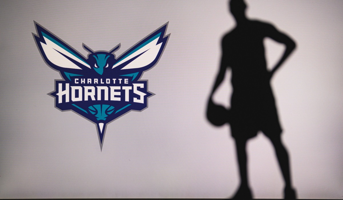
Menswear designer Alexander Julian, a North Carolina native, drew up the expansion Hornets’ look for their 1988 debut, and it defined the club through the decade that followed. He chose teal and purple, added pinstripes and put pleats in the shorts, a tailoring touch no other team bothered with.
Julian has said he asked to be paid in Carolina barbecue instead of a fee. Larry Johnson, Alonzo Mourning and Muggsy Bogues made the jersey a national best seller in the early 1990s, and Charlotte led the league in attendance eight times while wearing it.
Teal turned up on several other teams before the decade was out.
Toronto Raptors Purple Dinosaur
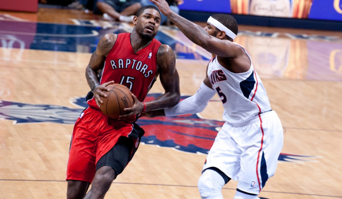
Toronto’s expansion team took the floor in November 1995 wearing a red raptor dribbling across a purple jersey, with jagged pinstripes that looked like claw marks. The name came out of a nationwide contest held in 1994, one year after Jurassic Park filled theaters, and the timing was no coincidence.
Damon Stoudamire won Rookie of the Year in the design, and a teenage Tracy McGrady and a rookie Vince Carter both wore it before the club simplified its look in 1999. Purists hated it on sight.
Children, who bought most of the replicas, did not share the concern, and the dinosaur returned as a throwback two decades later.
Vancouver Grizzlies Teal With Totem Trim
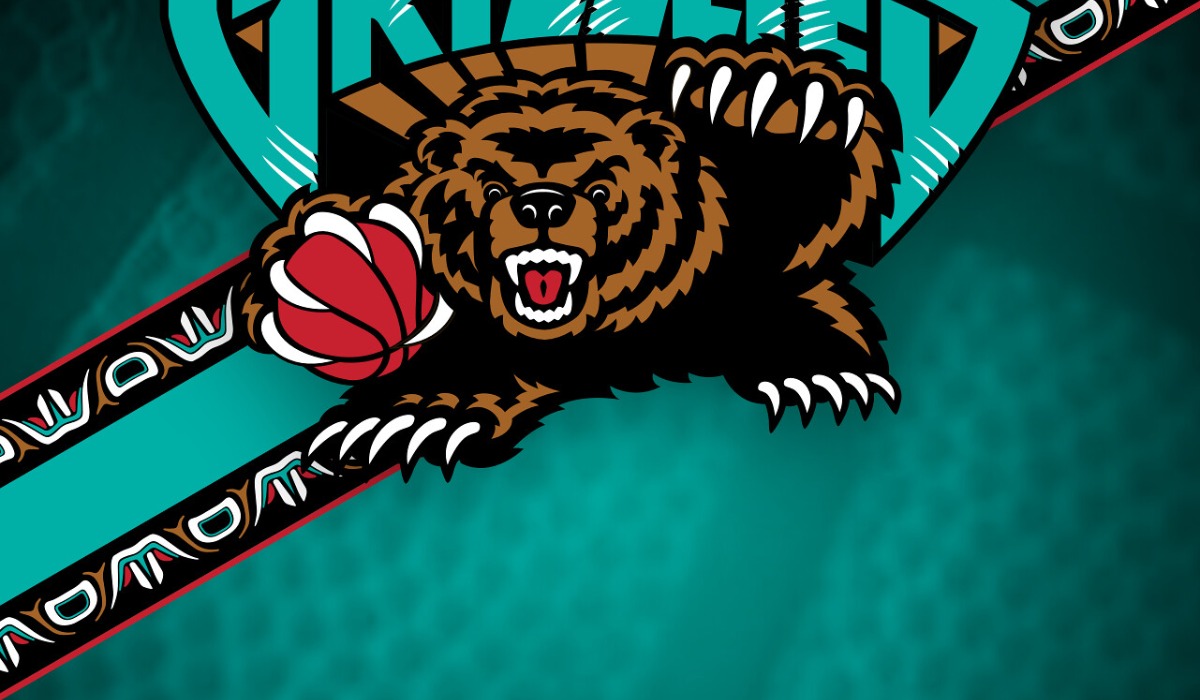
Canada’s other 1995 expansion club went with turquoise road uniforms, oversized lettering and bands of trim patterned after the Indigenous art of the Pacific Northwest. Bronze, red and black filled out a palette that no previous NBA team had attempted.
Bryant Reeves, the seven-foot center nicknamed Big Country, became the face of the design, which is one of the stranger sentences the decade produced. Vancouver lost often, including a 23-game losing streak in its first season, and the franchise left for Memphis in 2001.
The uniform has aged far better than the win totals, and the Memphis club has brought it back more than once as a throwback.
Phoenix Suns Sunburst
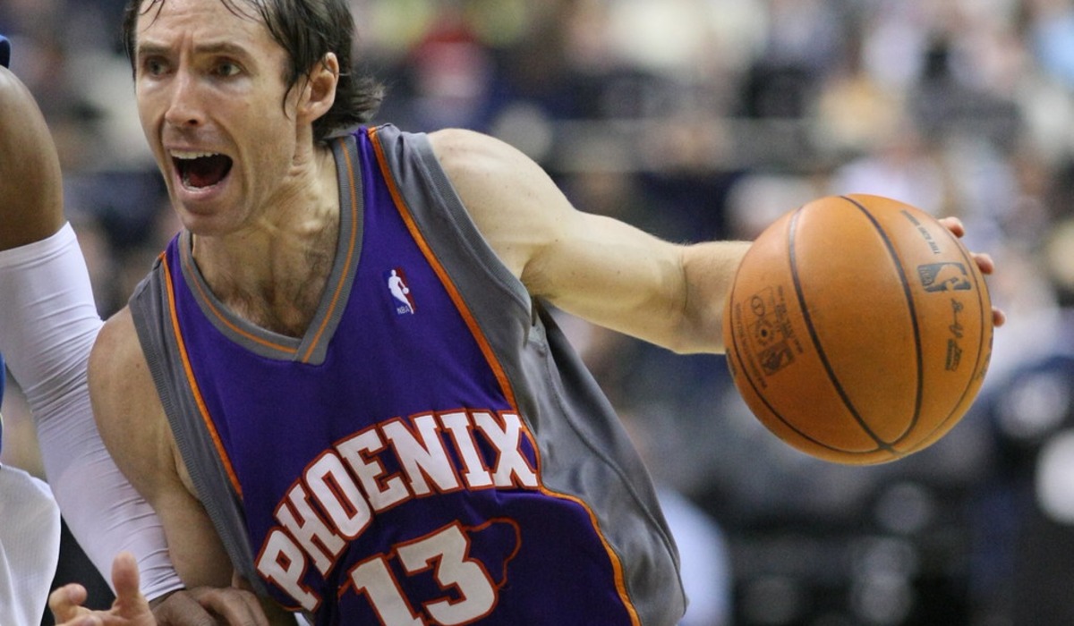
Phoenix reinvented itself in the summer of 1992. The Suns traded for Charles Barkley, moved into the new America West Arena and unveiled a uniform with a streaking sun blazing diagonally across the chest.
The first season in the design produced 62 wins, a Most Valuable Player award for Barkley and a trip to the 1993 Finals, which Chicago won in six games. A black alternate arrived a couple of seasons later and became a favorite of its own.
Kevin Johnson, Dan Majerle and later Jason Kidd all wore the sunburst before the team retired it in 2000, and it remains the look most associated with the franchise.
Houston Rockets Navy Pinstripes
Houston won championships in 1994 and 1995 wearing plain red and yellow, then celebrated by throwing the entire look away. The replacement, introduced for the 1995-96 season, used navy, red and silver, with pinstripes and a cartoon rocket that had a snarling face and appeared to be circling the team name.
Hakeem Olajuwon, Clyde Drexler and, from 1996, Charles Barkley wore it through the back half of the decade. Fans in Houston were openly unenthusiastic, since the old colors came with two banners attached.
The pinstripes lasted until 2003, when the club went back to red and has stayed there since.
Atlanta Hawks Giant Hawk
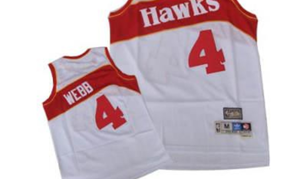
No team committed to the sublimated graphic harder than Atlanta did in 1995. The new jersey spread a red hawk with open wings across the full chest, over a background that faded from red into black.
The team name was squeezed in above the bird almost as an afterthought. Mookie Blaylock, Steve Smith and Christian Laettner wore it first, and Dikembe Mutombo joined them in 1996 to win Defensive Player of the Year awards in it.
Atlanta moved on in 1999 to something quieter. Throwback versions have been among the franchise’s better sellers, which suggests the bird was simply ahead of its audience.
Milwaukee Bucks Deer Alternate
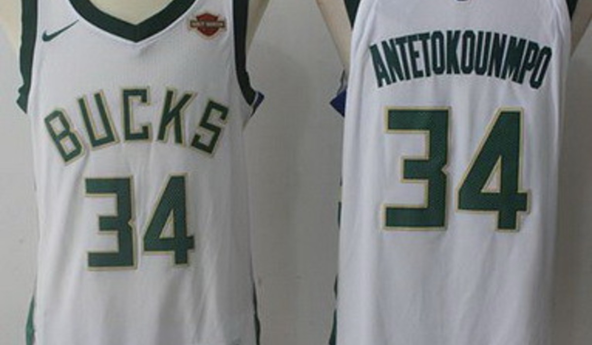
Milwaukee dropped its long-running green and red in 1993 for purple and forest green, along with a new logo showing a stern, forward-facing stag. Two years later the club added a green alternate that placed an enormous version of that deer across the front of the jersey, antlers reaching toward the shoulders.
Glenn Robinson, the first overall pick in 1994, and Ray Allen, acquired on draft night in 1996, were the main men to wear it. The alternate was gone before the decade ended.
Purple held on until 2006, and the giant deer has since reappeared as a throwback for fans who missed it the first time.
Detroit Pistons Teal Horsepower
Detroit spent the Bad Boys years in red, white and blue, which made the 1996 switch to teal all the more jarring. The new logo showed a horse head with a flaming mane and chrome exhaust pipes, a play on horsepower in the home of the American auto industry.
Burgundy, yellow and black trimmed the uniform, and Grant Hill was its unquestioned star for four of the five seasons it lasted, leaving for Orlando in 2000. Older fans never warmed to it, and the club returned to its traditional colors in 2001.
Hill’s teal jersey still turns up at Pistons home games, usually on people too young to have seen him play.
Utah Jazz Mountain Range
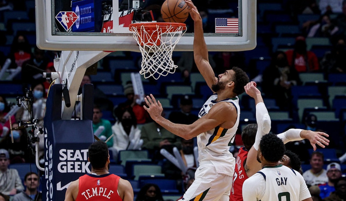
Utah had worn essentially the same music-note uniform since the franchise left New Orleans in 1979. In 1996 the Jazz replaced it with a purple road jersey featuring a snow-capped mountain range across the chest, trimmed in copper and teal.
The timing was perfect. John Stockton and Karl Malone reached the Finals in both 1997 and 1998 in the new look, losing each series to Chicago in six games.
Michael Jordan’s last shot as a member of the Bulls, in June 1998, was taken in Salt Lake City against the white home version, which means the mountains appear in one of the most replayed clips in league history.
Orlando Magic Pinstripes
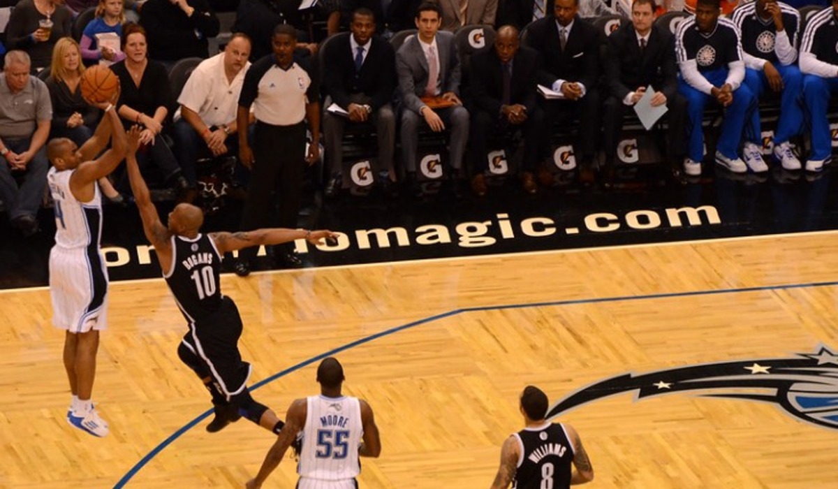
Orlando entered the league in 1989 with pinstripes, a wordmark that swapped a star for the letter A and a color scheme of black, silver and electric blue. The design looked sharp on an expansion team and better on a contender.
Shaquille O’Neal arrived as the first overall pick in 1992, Penny Hardaway followed on draft night in 1993, and by 1995 the Magic were in the Finals, where Houston swept them. A blue version of the jersey joined the rotation during those peak seasons.
O’Neal left for Los Angeles in 1996, the pinstripes were dropped two years later, and the club has been reviving them ever since.
Seattle SuperSonics Dark Green Redesign
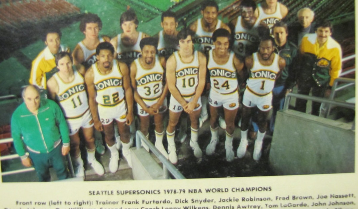
Seattle swapped its familiar green and gold in 1995 for a darker green with red and bronze accents and a new wordmark across the chest. The accompanying logo dropped the old skyline and gave the Space Needle a prominent place.
Whatever fans thought of it, the team’s response was immediate, with 64 wins in the 1995-96 season and a Finals appearance against Chicago that ended in six games. Gary Payton won Defensive Player of the Year that season and Shawn Kemp dunked on most of the Western Conference in the same jersey.
The club went back to a classic green and gold look in 2001, seven years before leaving town.
Cleveland Cavaliers Black, Blue and Orange
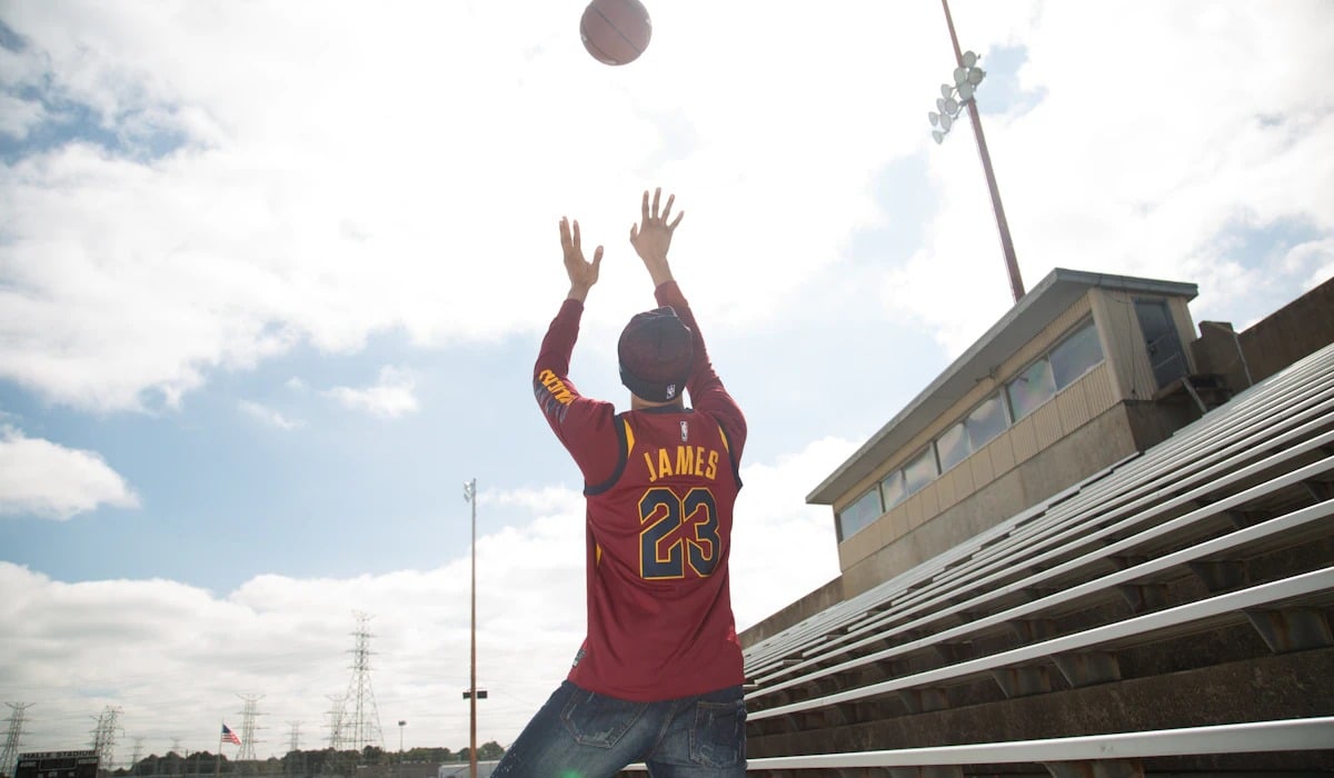
When the Cavaliers left suburban Richfield for the new Gund Arena downtown in 1994, they also left behind the blue and orange block lettering of the Mark Price and Brad Daugherty years. The replacement added black as a primary color and ran a jagged splash of light blue across the jersey, as though someone had thrown paint at it.
Coach Mike Fratello’s teams of the period played some of the slowest, lowest-scoring games in the league, which gave viewers plenty of time to study the design. Terrell Brandon and later Shawn Kemp were its headliners.
The splash was toned down later in the decade and dropped by 2003.
Golden State Warriors Lightning Bolts
Golden State returned to its renovated Oakland arena in 1997 after a season in San Jose and marked the occasion with a full rebrand. Navy and orange pushed aside the traditional royal blue and gold, lightning bolts ran down the sides, and the new logo featured a muscular blue figure clutching a bolt.
The character, named Thunder, also became the team mascot. Antawn Jamison and later Jason Richardson and Baron Davis played in versions of the design, which survived until 2010.
Thunder himself was retired earlier, after the Oklahoma City franchise took the name in 2008. Few rebrands captured the late 1990s taste for comic-book aggression quite so completely.
Denver Nuggets Rainbow Skyline
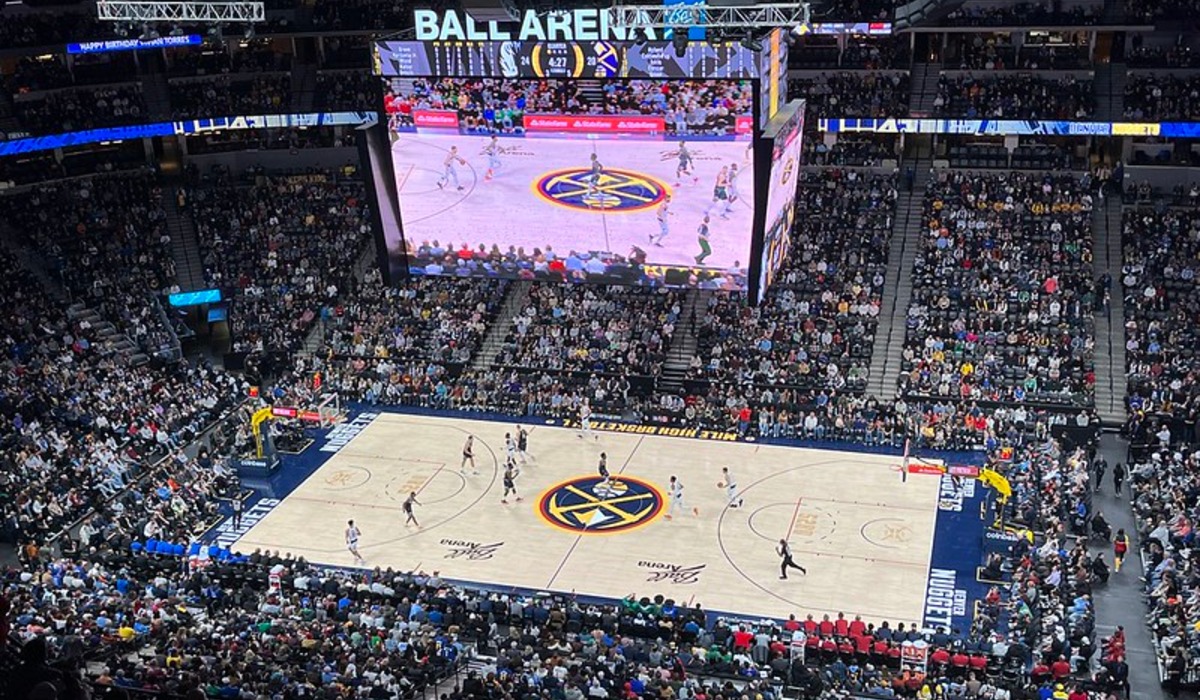
Technically a product of the early 1980s, the rainbow skyline belongs on this list because it was still on the floor through the 1992-93 season. The jersey stacked bands of color behind a blocky city skyline and a mountain peak, a graphic that looked like an arcade cabinet.
Its 1990s chapter included Paul Westhead’s run-and-gun teams, which scored and surrendered points at a pace the league had rarely seen, and the first two seasons of Dikembe Mutombo’s career. Denver replaced it in 1993 with a sober navy, gold and wine palette.
The rainbow has since become one of the most requested throwbacks in the sport.
New Jersey Nets Tie-Dye Road Uniform
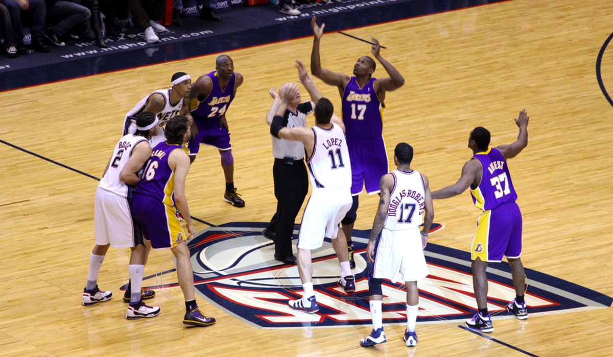
For the 1990-91 season the Nets wore a road uniform that faded from blue to white in a mottled pattern that everyone immediately called tie-dye. It lasted exactly one season.
Derrick Coleman, the first overall pick in the 1990 draft, won Rookie of the Year in it while the team lost 56 games, and the club switched to a more conventional design the following fall. Short life spans tend to help a uniform’s reputation, and this one is now far better liked than it was in the Meadowlands.
Brooklyn revived it as a Classic Edition uniform for the 2020-21 season, three decades after it was shelved.
Philadelphia 76ers Shooting Stars
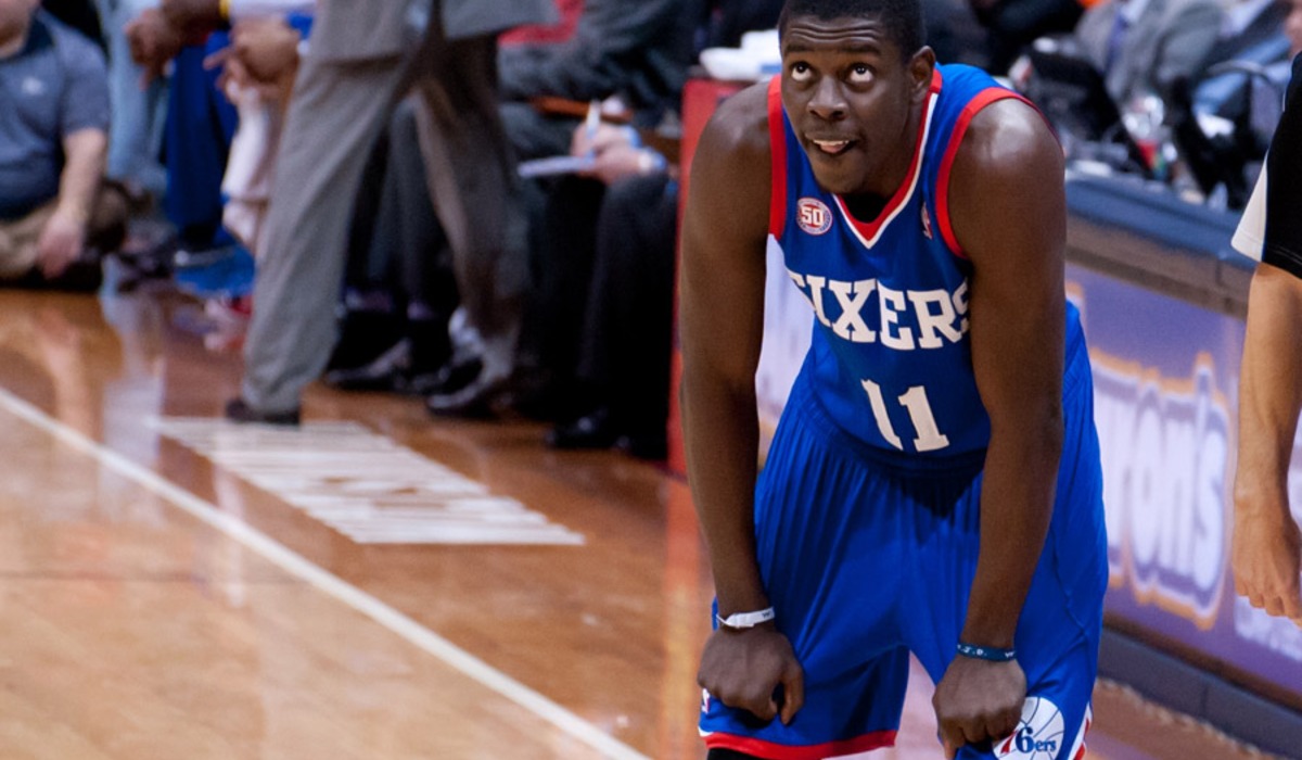
Philadelphia had one of the cleanest looks in the league through the Julius Erving years, and in 1991 the club decided to complicate it. The new uniform, made by Champion, sent a band of multicolored stars curving up from the shorts and across the jersey.
Charles Barkley wore it for one unhappy season before his trade to Phoenix in June 1992, and the teams that followed him were among the worst in franchise history. By 1994 the stars were gone, replaced by a simpler red and blue set.
The design is remembered mainly as the backdrop to Barkley’s exit, though it has a small, stubborn following among collectors of the era.
Allen Iverson’s Black Sixers Uniform
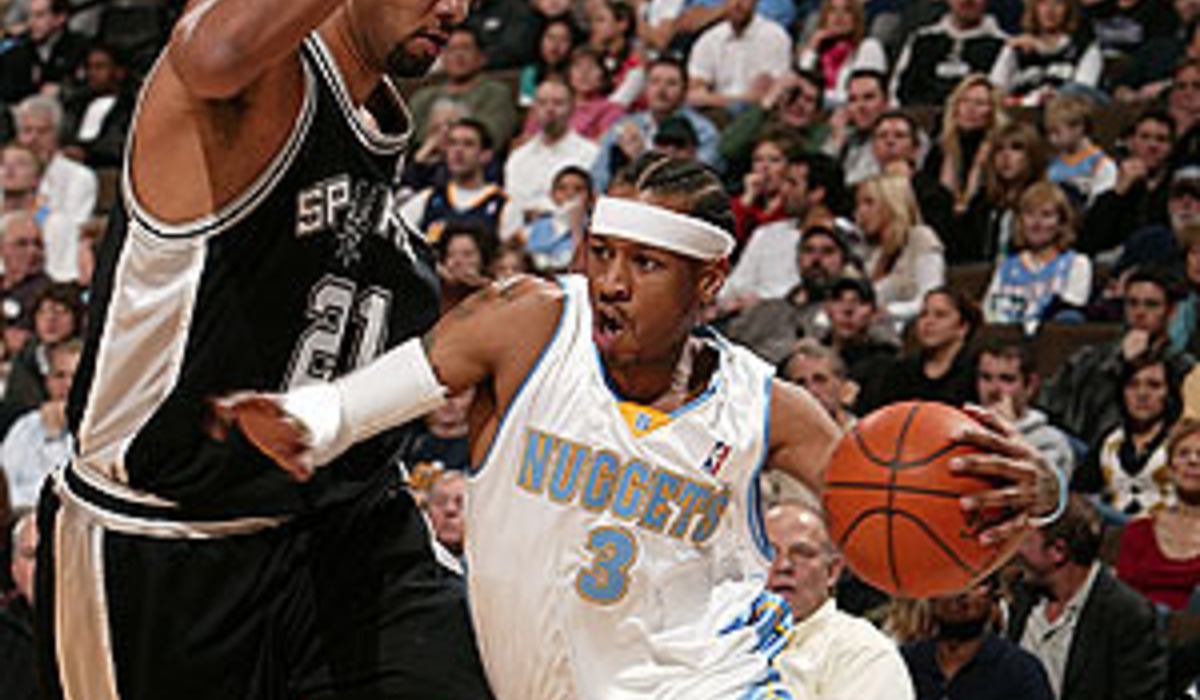
The 76ers abandoned red, white and blue as primary colors in 1997 and came back in black, with gold, silver and red trim and a new logo. The change coincided with Allen Iverson’s second season and the arrival of coach Larry Brown.
Iverson’s cornrows, arm sleeve and loose-fitting black jersey became a package that influenced how a generation of players dressed. Philadelphia wore the black set in the 2001 Finals against the Lakers and kept versions of it until 2009.
Traditionalists were relieved when the old colors returned, yet the team has repeatedly brought the black design back, and it sells out when it does.
Chicago Bulls Black Pinstripe Alternate
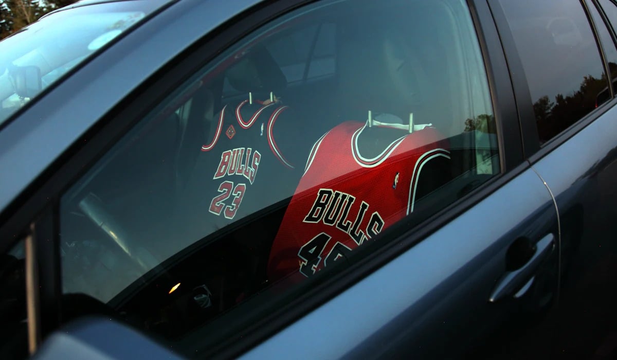
Chicago’s home white and road red barely changed in the Jordan years, which made the black alternate with red pinstripes stand out. The Bulls introduced it for the 1995-96 season, the year they went 72-10, and wore it on the road in selected games across two seasons.
Michael Jordan, Scottie Pippen and Dennis Rodman all appear in it in photographs from that record run. A plain black alternate without the stripes replaced it for the 1997-98 season.
Because it was worn so rarely by so famous a team, it became one of the most popular replica jerseys of the decade, and Chicago has revived it several times.
Miami Heat Original Uniforms
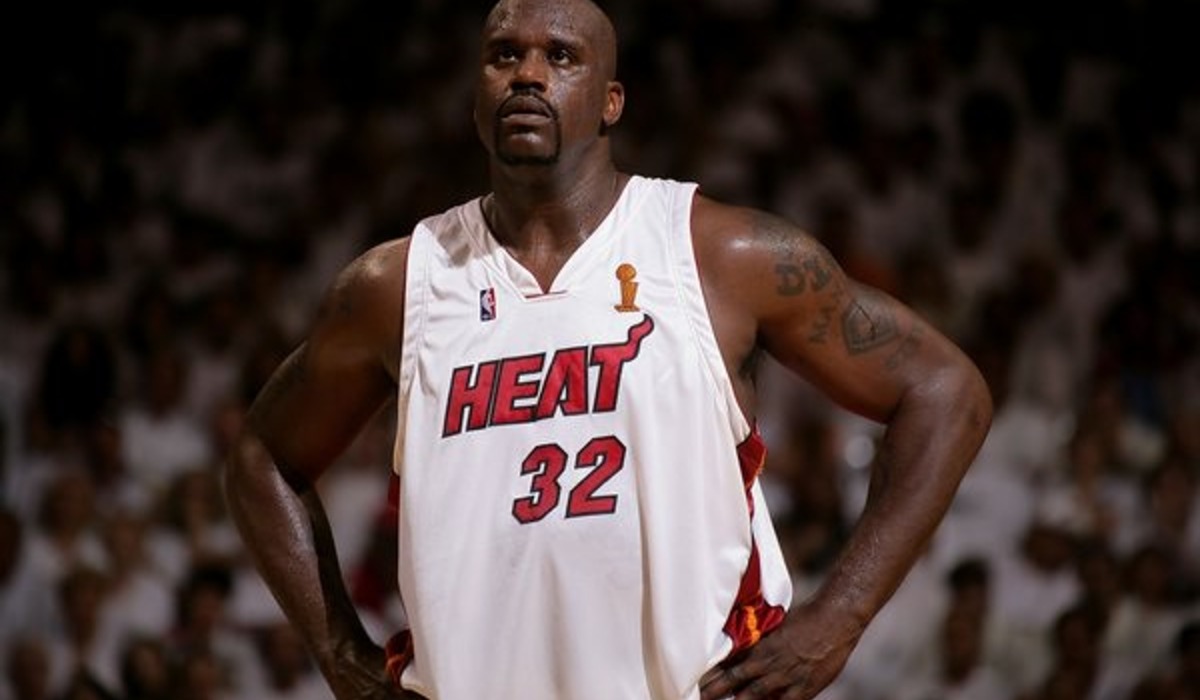
Miami joined the league in 1988 and kept its first uniform through nearly all of the 1990s. The look was simple by expansion standards, with white at home, black on the road and red and orange trim that ran down one side only.
The chest carried the team name, while the flaming hoop logo sat on the shorts. A red alternate was added in the middle of the decade, around the time Pat Riley took over the franchise and traded for Alonzo Mourning in November 1995.
The Heat redesigned in 1999 as they prepared to move into a new arena on Biscayne Bay.
Minnesota Timberwolves Tree Line Trim
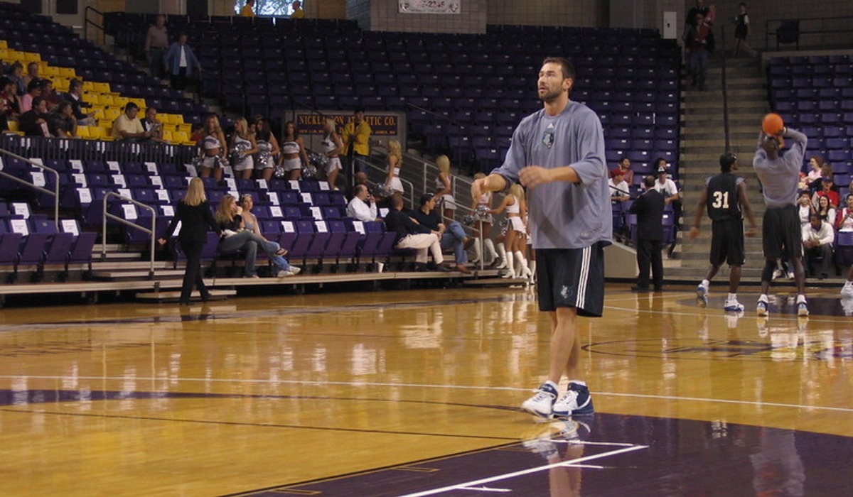
Minnesota’s 1996 redesign added black to the palette, a snarling wolf to the logo and a row of green pine trees around the collar and along the hems of the shorts. The tree line was the detail everyone noticed, a bit of north woods scenery stitched onto a uniform.
Kevin Garnett, drafted out of high school in 1995, grew into a star in it, and Stephon Marbury joined him after a draft-night trade in 1996. The Timberwolves reached the playoffs for the first time in 1997 wearing the new look.
With modifications, the trees stayed on the uniform until 2008, and fans have missed them since.
Sacramento Kings Black and Purple
Sacramento retired its red, white and blue in 1994 and adopted purple, black and silver, a palette no one would have predicted for a franchise that traces back to Rochester in the 1940s. The standard road uniform was black with purple trim.
The alternate was stranger, split down the middle into a purple half and a black half, with a checkered stripe down the side. Mitch Richmond was the team’s lone star for most of the period, and the Kings made the 1996 playoffs in the new colors, their first trip in a decade.
Purple has remained the club’s signature color ever since.
Washington Wizards Rebrand
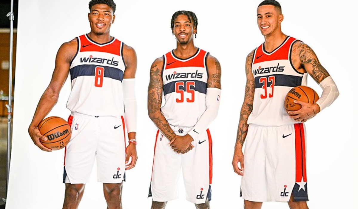
Owner Abe Pollin announced in the mid-1990s that the Washington Bullets would change their name, citing gun violence in the city and the 1995 assassination of his friend Yitzhak Rabin. Wizards was chosen from a fan contest whose other finalists were Dragons, Express, Stallions and Sea Dogs.
The team debuted the name in 1997 along with blue, black and bronze uniforms and moved into the new MCI Center that December. Chris Webber, Juwan Howard and Rod Strickland were among the first to wear the design.
It stayed in use, with a gold alternate added later, until the franchise went back to red, white and blue in 2011.
San Antonio Spurs Fiesta Warm-Ups
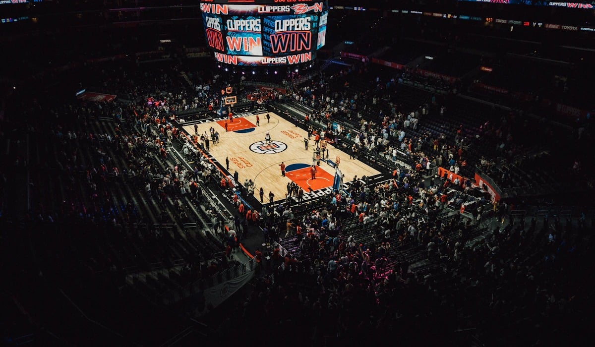
On the court the Spurs of the 1990s wore the same silver and black they always had. Everything around the uniform was another matter.
The team logo introduced in 1989 set the wordmark against streaks of teal, pink and orange, colors drawn from the city’s annual Fiesta celebration, and those streaks appeared on warm-up jackets, shooting shirts and the floor of the Alamodome. David Robinson and, from 1997, Tim Duncan warmed up in them on the way to the 1999 championship.
The colors never reached a game jersey during that era. San Antonio finally put them on one with a City Edition uniform for the 2020-21 season.
Indiana Pacers Flo-Jo Design
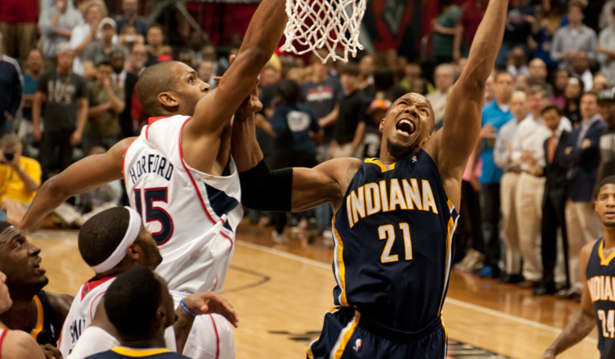
Florence Griffith Joyner won three gold medals on the track at the 1988 Seoul Olympics and was nearly as famous for the racing outfits she designed herself. In 1990 the Pacers unveiled a uniform credited to her, with angled stripes sweeping up one side of the jersey and shorts.
The idea of approaching her reportedly came from a team intern. Indiana wore the design through the 1996-97 season, a span that covers Reggie Miller’s rise and the team’s first trips to the conference finals in 1994 and 1995.
Miller’s famous eight points in 8.9 seconds at Madison Square Garden came in the blue road version.
Dream Team Uniform From Barcelona
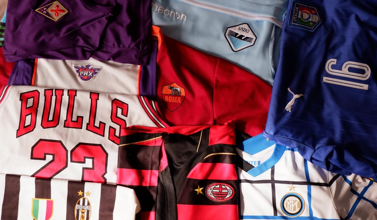
At the 1992 Barcelona Olympics, NBA players represented the country for the first time, and the roster of Jordan, Magic Johnson, Larry Bird and nine others won its games by an average of more than 40 points. The uniform was straightforward, with USA in red block letters on white or navy.
The drama came at the medal ceremony on August 8. The official podium warm-ups were made by Reebok, and several players had contracts with rival shoe companies.
Jordan draped an American flag over his shoulder to cover the logo. Replicas of the jersey have stayed in production, in one form or another, ever since.
All-Star Game Teal From 1996
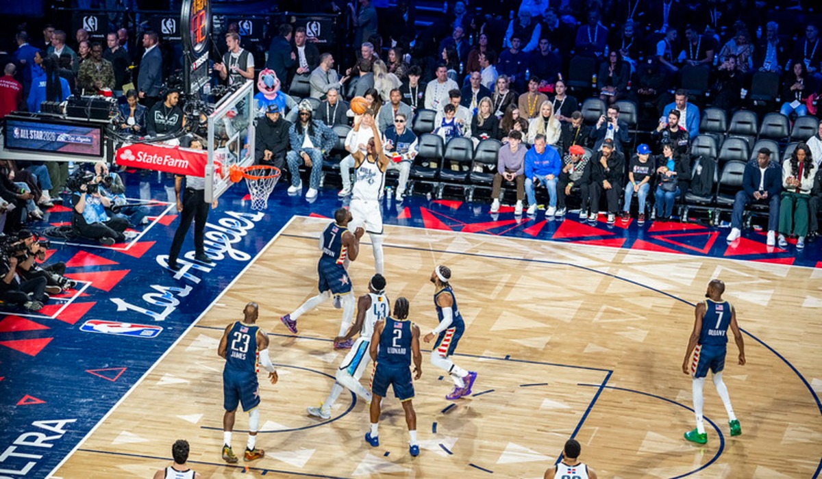
The league used to design special uniforms for each All-Star Game, and the 1996 edition in San Antonio is the one people remember. Played at the Alamodome on February 11, the game featured the East in bright teal and the West in white, with a chili pepper in the chest logo and southwestern colors everywhere.
Michael Jordan was named Most Valuable Player in an East victory, and a young Shaquille O’Neal and Penny Hardaway shared the floor with him. Beginning the next year the league had All-Stars wear their own team uniforms, a practice that lasted until 2002 and left the teal as a high-water mark.
Teal Fades, and Then It Comes Back
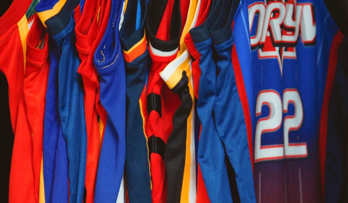
Most of these designs were gone within a few years of the decade ending. Teams that had chased teenagers with cartoon logos spent the 2000s retreating to navy, red and respectability.
The explanation at the time was that the experiments had been a mistake, a fad the league was glad to be done with.
That verdict did not hold. The children who wore the replicas grew up, acquired incomes and went looking for the dinosaur and the mountains again, and the league obliged with throwback nights and reissues.
A uniform that seemed embarrassing in 2003 now reads as the look of a specific, well-loved era. Taste in sports design turns out to run on roughly a twenty-year delay.
MORE FROM GO2TUTORS!

- The Romanov Crown Jewels and Their Tragic Fate
- 13 Historical Mysteries That Science Still Can’t Solve
- Famous Hoaxes That Fooled the World for Years
- 15 Child Stars with Tragic Adult Lives
- 16 Famous Jewelry Pieces in History
Like Go2Tutors’s content? Follow us on MSN.